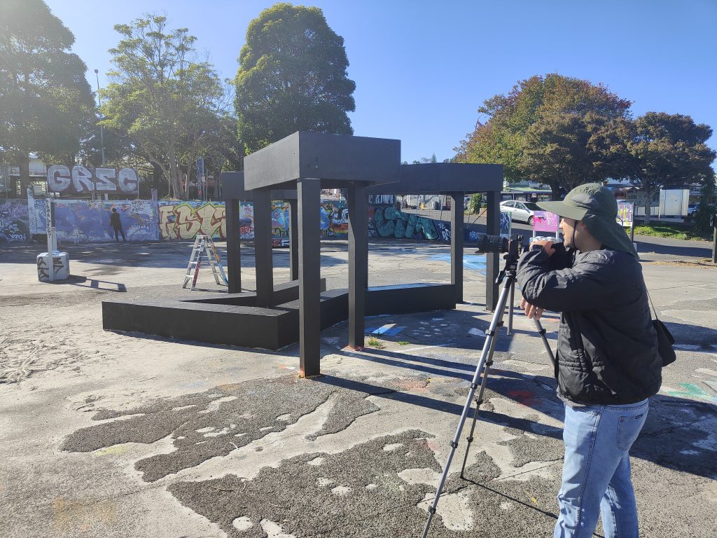
Pener arrived in Ōtautahi following a 30-hour flight from his hometown of Olsztyn, Poland. Since 2020, such long haul flights have become a rarity for many of us, the world seeming a more distant proposition, despite our enduring digital connections. Here in Aotearoa, our geographical isolation has provided a protective barrier as we have viewed the rest of the world from afar. Across the globe, our shared challenges have been experienced through distinctly different lenses.
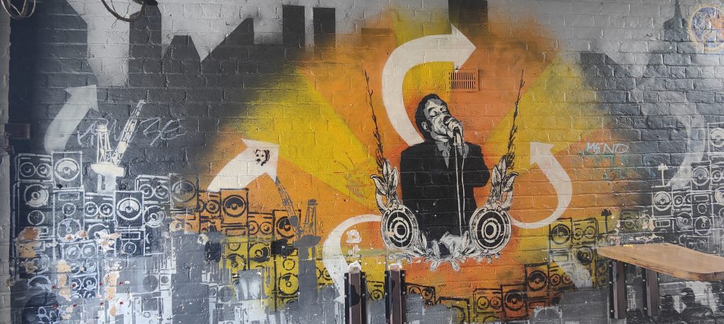
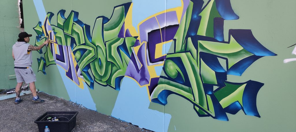
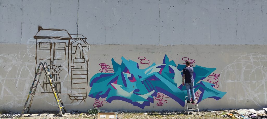
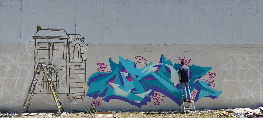
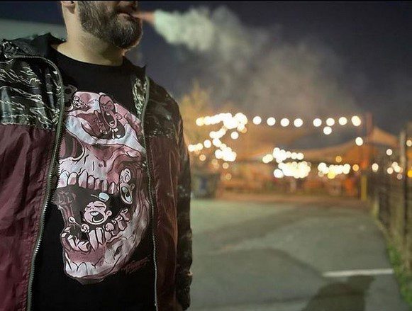
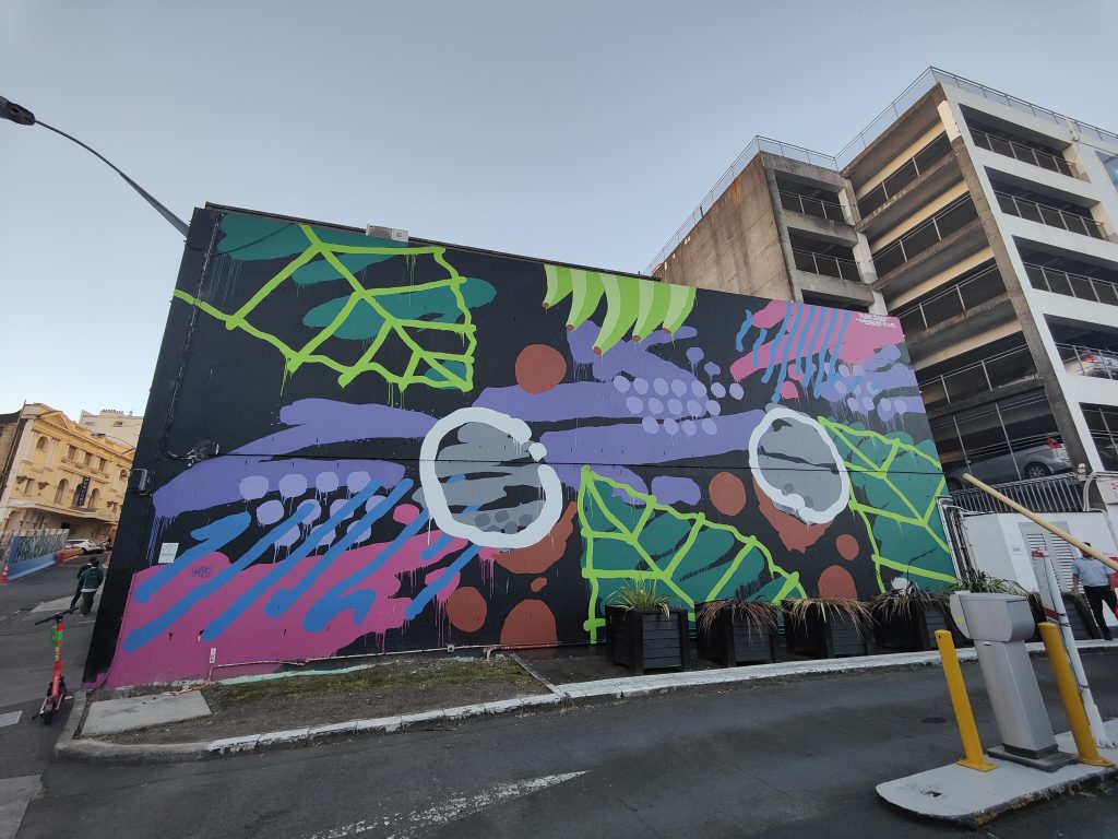
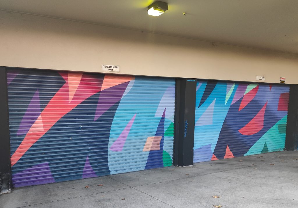
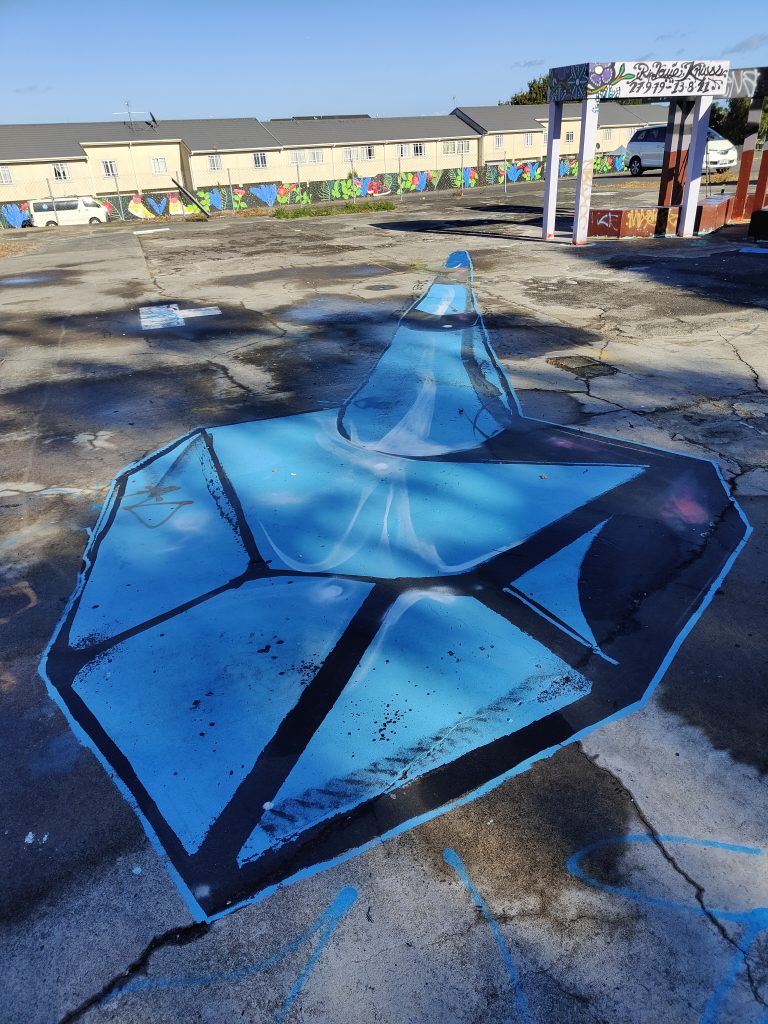
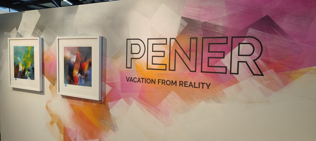
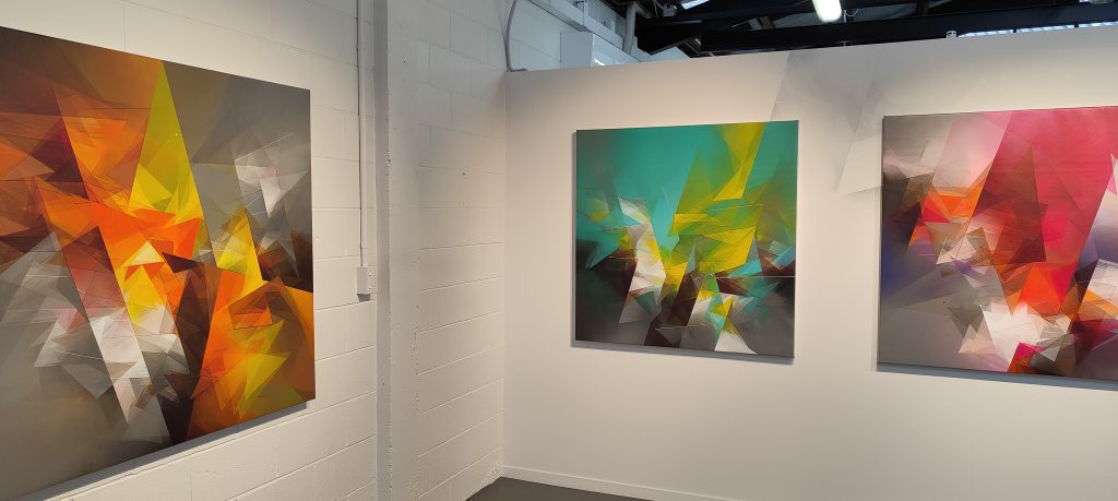
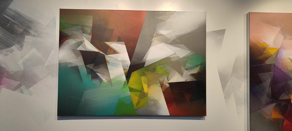
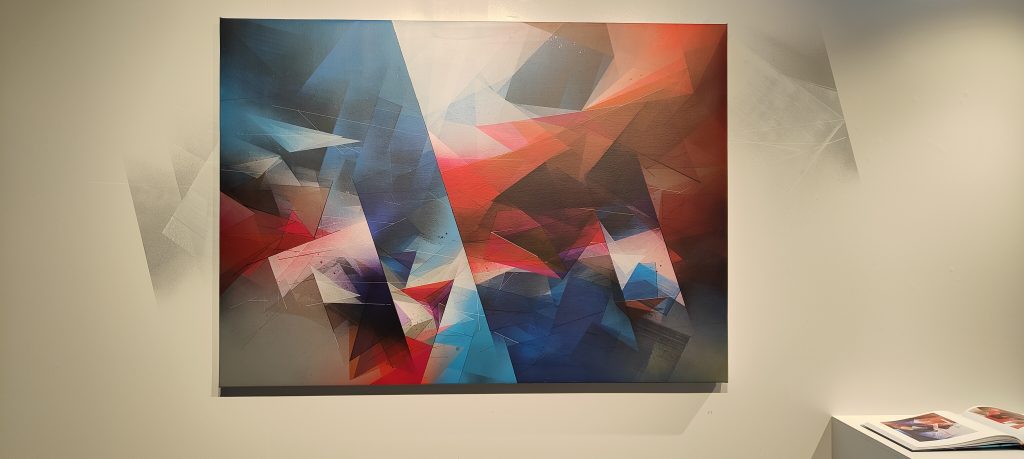
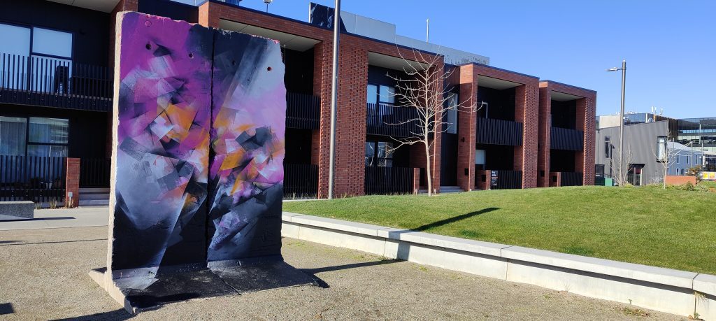
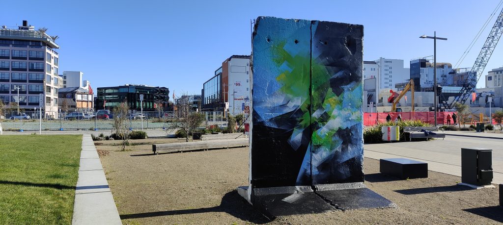
For Pener (born Bartek Świątecki), this adventure to the bottom of the world provides an escape, a Vacation from Reality where he can explore a new landscape and find new inspirations away from his daily routines. As an abstract artist, Pener’s work is also an escape, his jagged, evocative compositions engaging the viewer in an internal exploration as they are immersed in a fragmented field of glass shards, shattering in our presence and suggesting some new path to follow. A leading figure in an exciting generation of Polish abstract and non-figurative artists, Pener’s background in graffiti, and a longer lineage of the Polish avant-garde, inform his practice; the influence of geometric abstraction and deconstructed letter-forms are equally evident, deployed through sharp line work, overlapping forms and a sophisticated use of colour that is both intense and undeniably intriguing.
The ability of Pener’s paintings to speak to deeper, more purely emotional sensations does not mean they offer no reflection of our challenging contemporary environment. Indeed, these fractured compositions feel incredibly apt in light of our increasingly divided ideologies and vocal dissension and conflict. But Pener’s paintings do not agitate, they are reflective, ruminative, and ultimately they emanate a sense of the hopeful; as if after the break, piecing things back together is the necessary next step.
Before he crossed the tarmac and settled into the distraction of in-flight movies on his lengthy flight, I posed Pener a few questions about his hopes for Vacation from Reality, his experiences in Poland, the potential of abstract art, and why Poland has become a hotspot for non-figurative practice…
____________________________________________
With all of the turmoil of the last three years, what are your feelings as you embark on your first journey to Aotearoa New Zealand?
Yes, this will be my first time in this part of the world. I am very excited and a little scared. The thirty-hour flight will be quite an experience!
What has life been like in Poland, and Europe more generally, throughout the Covid Pandemic?
It has been a strange time. It has been very difficult and emotionally complicated, probably the same for all of us. It’s hard to live in fear for such a long time and be constantly informed by the Government and television about more bad things. It has been a very strange time from a sociological point of view.
Has your art been an important coping mechanism? Have you found art as a vital part of your ability to make sense of all this?
You know, this is interesting because almost nothing has changed in my studio. For many years I have been trying to make painting a daily routine, make it something I have to do. I sometimes enter the studio just to clean it up. The studio is my asylum and my space. Throughout the entire period of lockdowns and online meetings, I worked in the studio and prepared new paintings.
Of course, there were no exhibitions and no trips to paint large walls, but it is only a matter of perspective. Last year I painted a few walls in my hometown. In the end, is it important that the wall is in Olsztyn or Dubai? I’m not so sure…
As an abstract artist, you have stated you start with an emotion and the process, and when I look at your work, I can’t help but feel it captures the anxiety and emotional fracture of contemporary society. Is that intentional or a result of our ability to read abstraction as we need to?
I often get the impression that the paintings are a bit like mirrors in which we can look at our emotions. My paintings calm me down and give me peace. Often, in the process of painting, I freeze in front of a painting. I look at it for so long that I stop thinking. It’s the same feeling as if you swim for a long time in the swimming pool or climb in the mountains and stop thinking about everyday problems. It takes you somewhere inside or outside.
Probably everyone has a slightly different interpretation of works of art – which is very interesting. Some people see specific shapes in them, others only feel emotions. I am very happy when someone interprets my paintings in a way that I did not know and did not notice.
How much does the process guide your end product? How do you understand when a painting is finished – or are they a constant work in progress?
It is very complicated and I don’t have a clear formula for it. I paint emotionally. I don’t really use a sketch, so I don’t know where the painting will lead me. Of course, after so many years of painting, I often know what will work or what I can do to close and finish a composition. But I prefer to be surprised by something new at the end.
Colour, in addition to line, is so important in giving your paintings their sense of space, energy and emotional qualities, how has your palette developed over time?
At the beginning I wanted to create the impression that the painting is not created by human hands, that it is mechanical, mathematical.
Over time, I have noticed my paintings become softer. Their structure is still geometric, but transparent layers penetrate each other differently. They have different feelings, they are softer, less dramatic.
The same thing happened with color. In the works for this show, the beginning was a grey composition on which I applied a color. It’s a bit like turning the whole painting process around. It is a very tight series of paintings, I think.
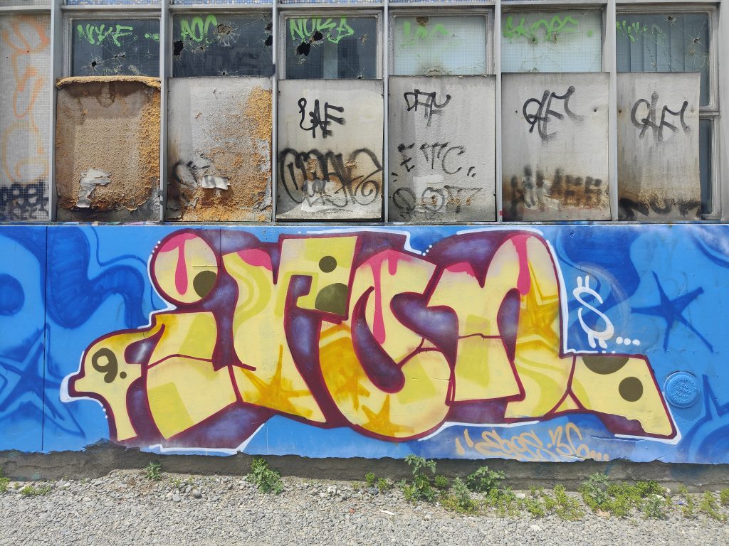
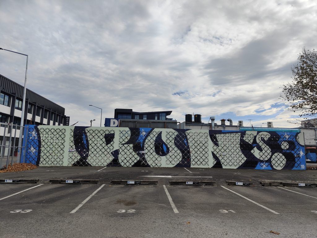
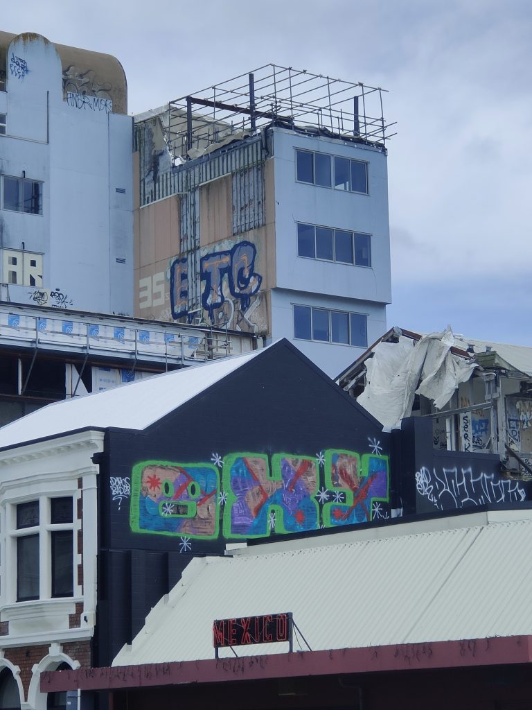
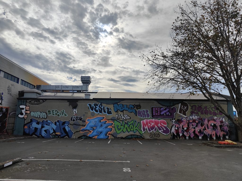
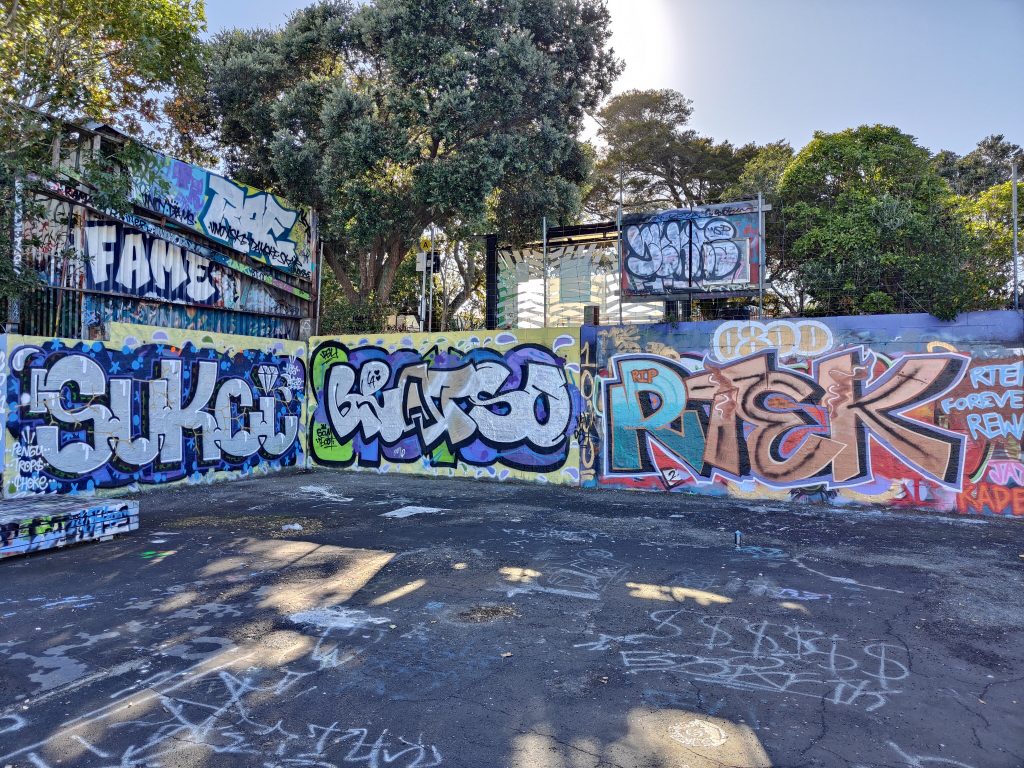
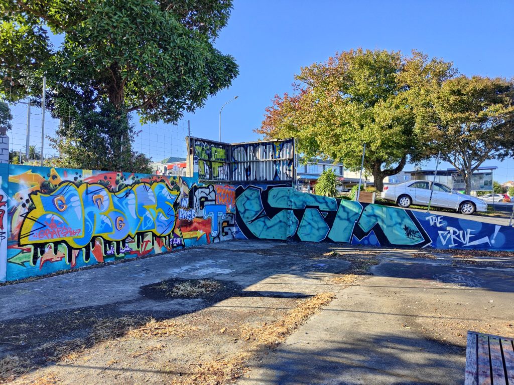
What is it with Poland that has ensured such a strong generation of non-figurative/abstract artists? Some from the world of graffiti, others from contemporary practice, what is the shared influence, if you can identify it?
It was probably influenced by many elements. Władysław Strzemiński’s Theories of Seeing or books by professor Stanisław Fijałkowski. In Poland after the war, the avant-garde painting groups referring to the works of Malevich or Kandinsky were very strong.
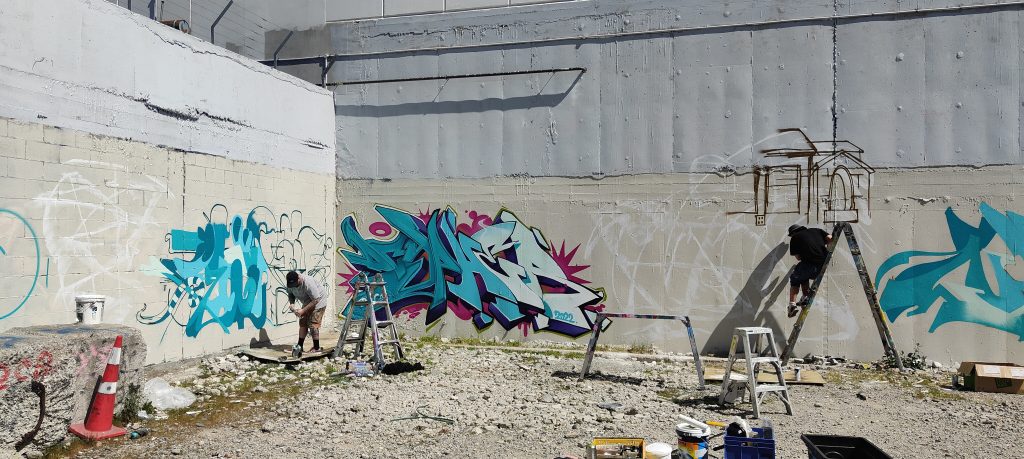
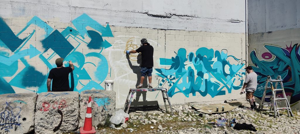
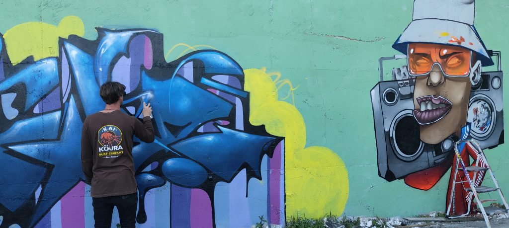
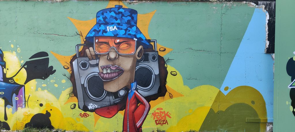
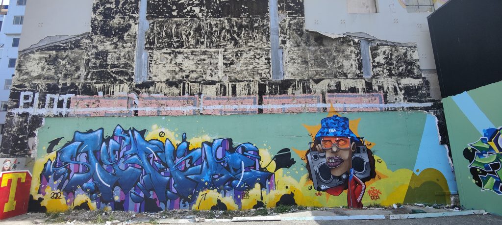
In my case, two things influenced me very strongly; my classic painting education at university, and the world of graffiti. Painting walls gave me a lot of freedom and confidence. The world of fine art gave me all the painting technology. I created a mix out of the two worlds, which is where I feel best, a world somewhere in between.
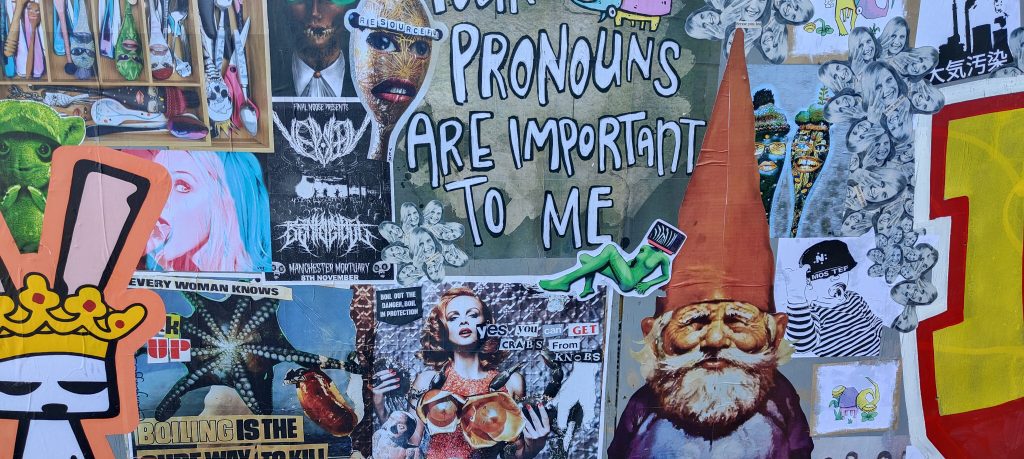
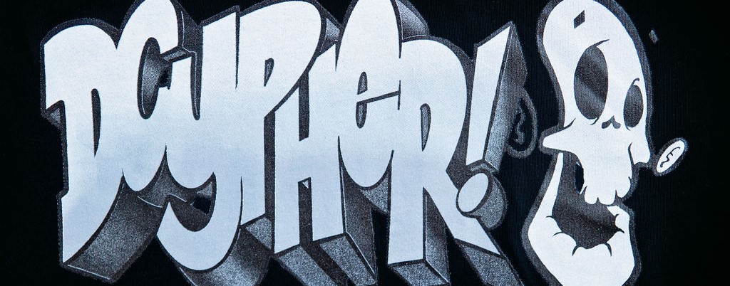
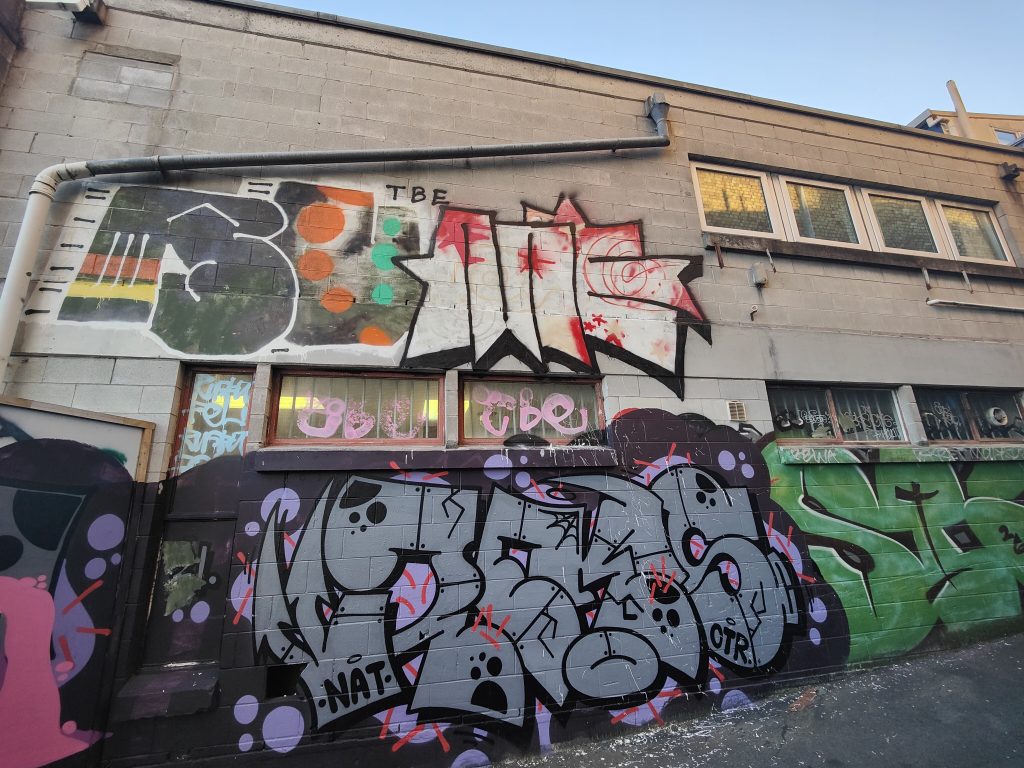
How enduring has graffiti been for you as an aesthetic influence? I can see some ideas of the dissolution of letterforms in your work, do you still feel like you are harnessing that influence, or is it more incidental now?
I am very strongly associated with graffiti, with the energy and aesthetics. My escape into abstraction happened very quickly, around 2003 or 2004. But all the time the base in all the walls from that period were letters, my name. I think they are somewhere all the time.
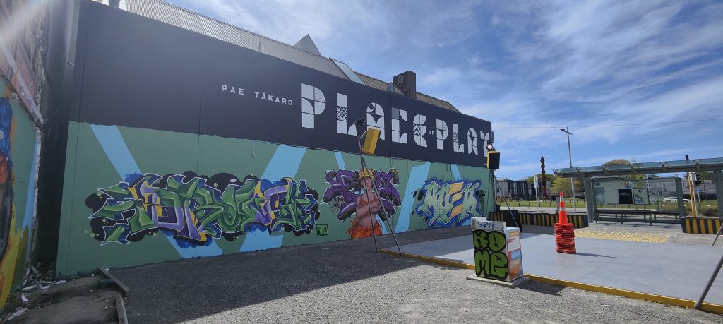
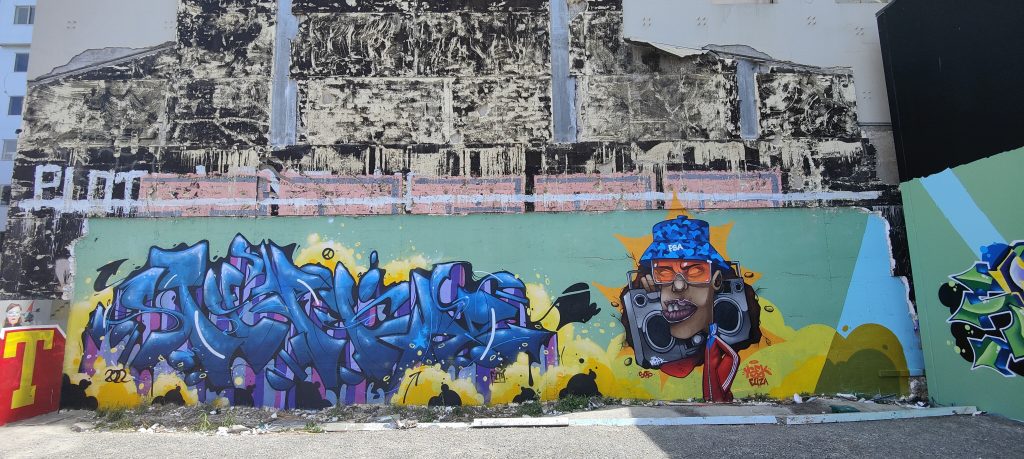
The transition from studio to mural practice seems quite fluid for you, but of course, it entails such different environments. How do you differentiate the two in your approach? Is the whole world a studio, or the studio an extension of the streets? Or do you recognise the difference?
It is one and the same, only the tools and the scale change. Sometimes a large wall requires a simplification of detail. On a large wall, I cannot achieve such a depth of color and saturation, but having such a huge space allows the gesture to look much better. I often repeat the composition that I paint on a wall on canvas in the studio and vice versa. At the moment, I see them as one and the same.
How did the decision, or opportunity to come to New Zealand originate? Obviously you have a luxury in Europe of relatively easy travel, New Zealand is quite a distance. What did you know of the country? Do you know much about our artistic cultures?
This is a huge logistical and financial challenge. Jenna and Nathan have done a lot of hard work for which I am very grateful. I have been working with Fiksate Gallery for several years and I do follow what is happening in New Zealand.
But I must admit that I don’t know much. I remember a few artists from my studies at university; Colin McCahon, Rita Angus and Ralph Hotere, who made a huge impression on me. Hotere’s work reminded me of the Spanish artist Antoni Tàpies, whom I love to this day. Last year I discovered Judy Millar, whose work I admire a lot. That’s about it, except of course, Flight of the Conchords and Taika Waititi!
To return to an earlier question, the title for the show Vacation From Reality can be understood in different ways, obviously referring to the experience of visiting New Zealand, but also due to the ability of abstraction to break from reality. But as I suggested, abstraction really allows reflection over a deeper sense of reality; emotional and visceral experiences. Do you reflect on that idea when you consider how your art affects and impacts people?
Communing with art makes us better, more sensitive, more delicate people. I have a lot of my friends’ work at home, and I am very connected with some of them. I have one painting by Krzysztof Syruć which I look at differently every time. At first it seemed terribly dark to me, now after a few years, it has given me so much good energy and became super colourful and positive. It’s amazing how we emotionally grow into certain colors and shapes.
What are your hopes for the way people will receive the show? What type of experience do you hope to create for people?
I am very curious about this exhibition and how it will be received. I hope the paintings will bring a lot of good energy and warmth in this rainy and cold time.
On a personal level, what do you hope to experience in Aotearoa New Zealand?
Rest and a lot of fun- that will charge my batteries!
____________________________________________
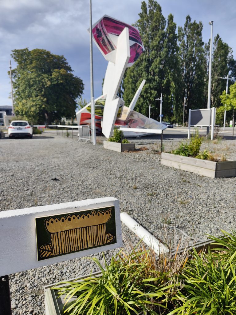
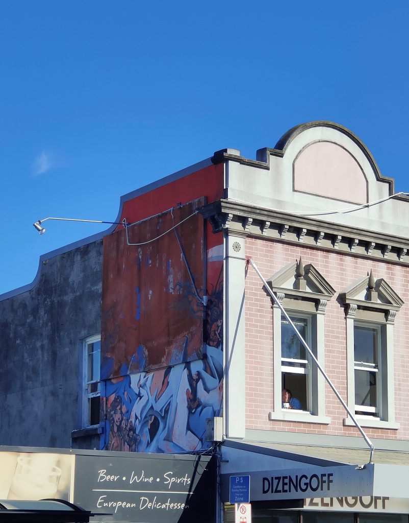
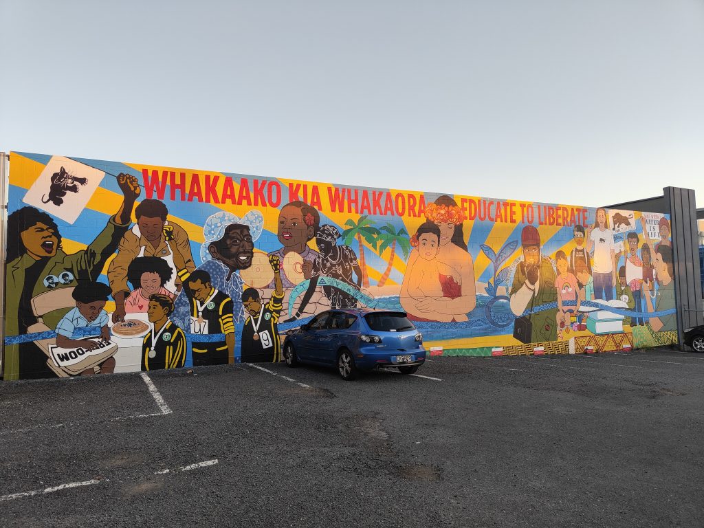
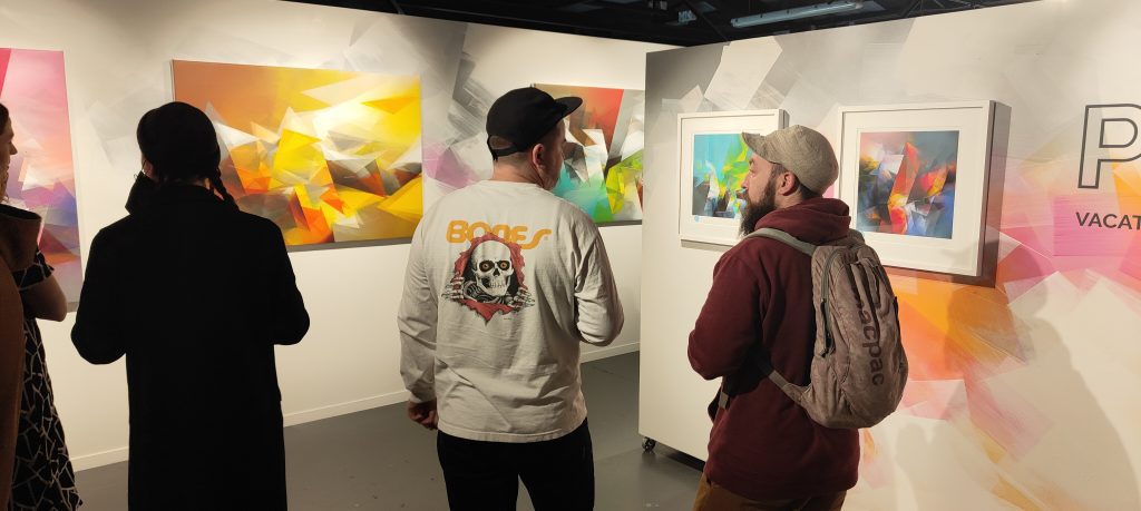
Vacation From Reality runs at Fiksate Gallery, 54 Hawdon Street, Sydenham until August 13th, 2022.
(The introduction to this text was re-produced in the catalogue for Vacation From Reality. Portions of the interview were re-produced on the Brooklyn Street Art website)