
At the end of March, we were stoked to pop along to the Giant Cans Space on St Asaph Street and check out a new collaborative production going up, created by our mate Jonny Waters and his Toi Ora art therapy group from Purapura Whetu.
Continue reading “The Things We Love To See…”Category: Photo Essay
A Home Away From Home – Jay ‘Daken’ Skelton at Ronald McDonald House
For over 20 years, Ronald McDonald House Christchurch, located on Cashel Street, has provided a ‘home-away-from-home’ for families travelling to Ōtautahi for medical treatment. A welcoming space for whānau to find respite from hospital rooms, Ronald McDonald House provides warm hospitality in tough times, a truly vital service that removes further stress for families already dealing with so much.
Continue reading “A Home Away From Home – Jay ‘Daken’ Skelton at Ronald McDonald House”CHOMP – the Paste-ups of Earwig Magazine @ CoCA, 21 February – 29 March
Entering its final few days, don’t miss out on CHOMP at CoCA, an exhibition of the paste-ups of Earwig magazine curated by Ōtautahi-based graphic designer Claudia Long.
Continue reading “CHOMP – the Paste-ups of Earwig Magazine @ CoCA, 21 February – 29 March”EveryBody – A Group Exhibition @ 192 St Asaph Street, 19-29 March, 2026
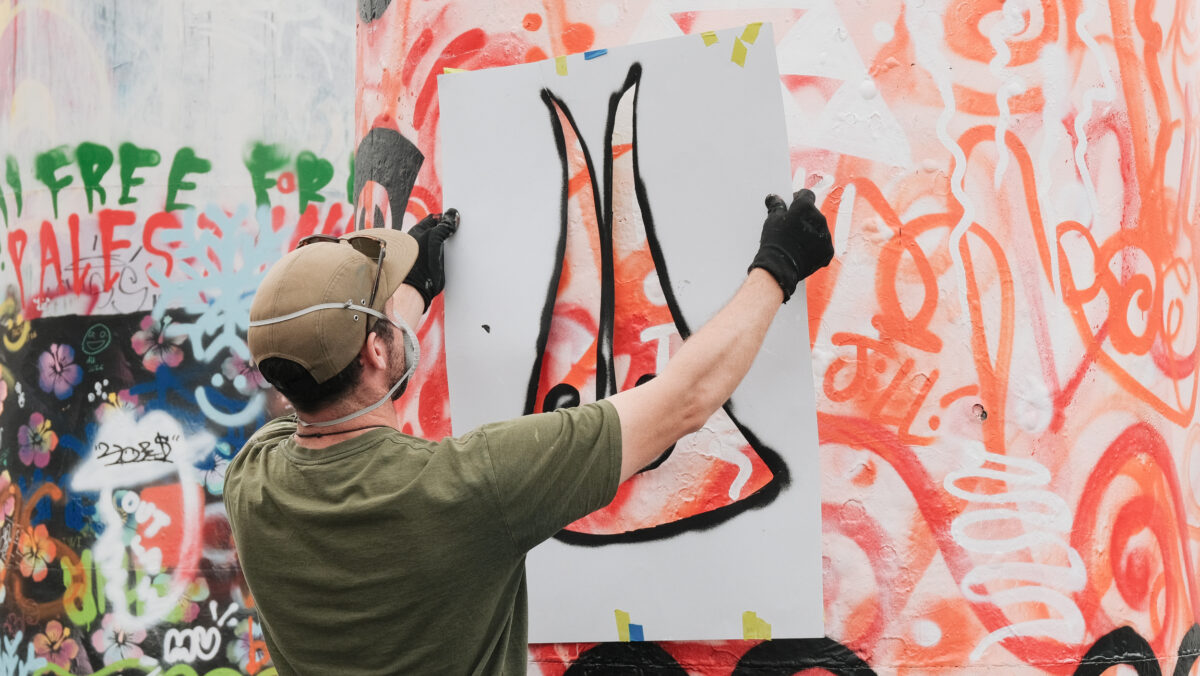
Presented by Curators Chamber and Kyla K Design, EveryBody is a group show “celebrating the human form in all of its diverse expressions – strength, identity, vulnerability and desire.” Spotlighting twenty artists from diverse backgrounds, EveryBody is a sprawling collection of work that reflects a broad range of responses to the figurative thematic framework. The body is, of course, a constant but complex concept within creative practice, raising questions around identity, physicality, autonomy, representation and connection.
Continue reading “EveryBody – A Group Exhibition @ 192 St Asaph Street, 19-29 March, 2026”Yarnarchy ’25 – An Interview with Kate Finnerty
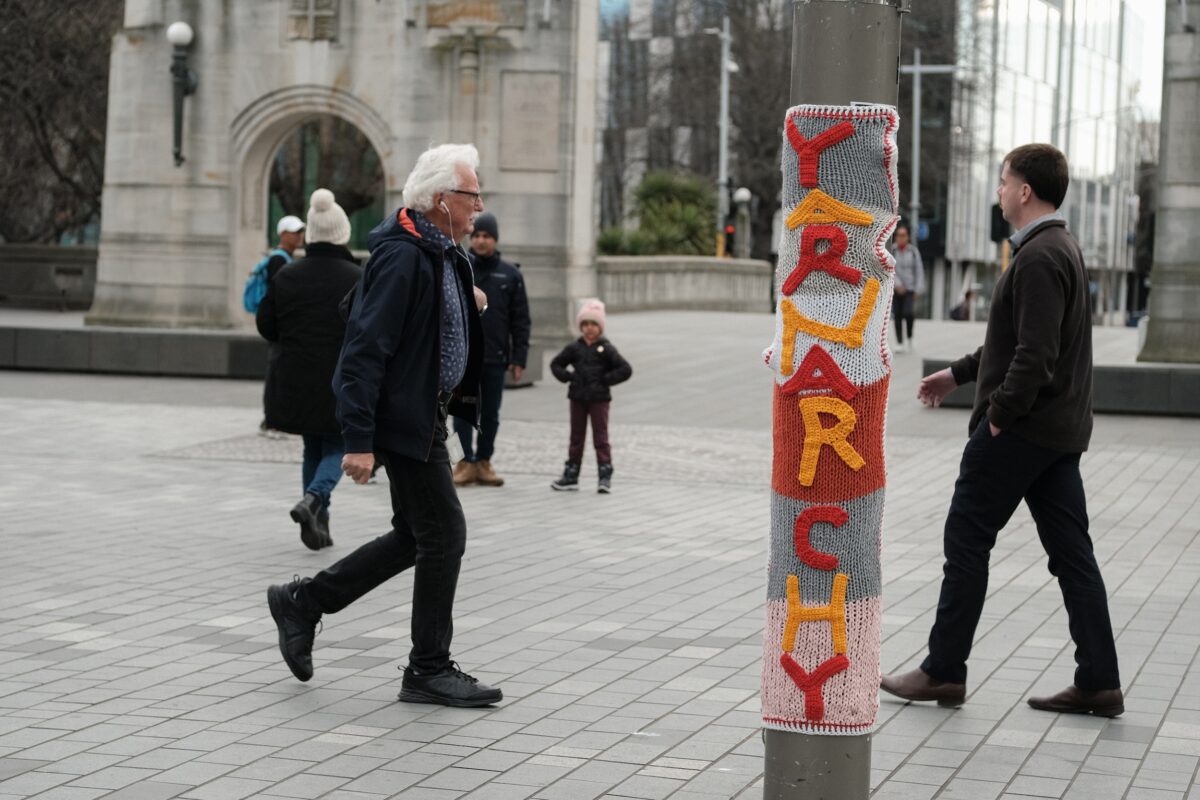
Gap Filler’s Yarnarchy is a unique part of Ōtautahi’s urban creative scene — a festival dedicated to yarn-bombing and craftivism that celebrates both the power of urban intervention and the ability of urban craft to engage a diverse audience and community of artists — turning those with a passion for craft into street artists! Founded by Gap Filler’s Play Programme Coordinator Kate Finnerty, Yarnarchy is a vibrant activation and reconsideration of the city that is now into its fourth year. Growing and evolving over the last three festivals, 2025 is now in full swing, with an array of surprising artworks installed and a special collaboration with the amazing Jolt Dance — a local organisation that empowers people through the accessibility of dance. We chatted with Kate about Yarnarchy, the roots of the event, its evolution and why it is such a powerful experience…
Continue reading “Yarnarchy ’25 – An Interview with Kate Finnerty”The Little Street Art Festival 2024 – A Recap of Aotearoa’s Most Unique Street Art Festival!

With the countdown now beginning for the 2025 Little Street Art Festival, we thought it was a perfect time to recap the 2024 incarnation of the little festival with a big heart! Staged in December 2024 (which in itself is hard to fathom in the midst of our grey, bleak winter), the 2024 Little Street Art Festival was the second staging of the event, and presented a new roster of artists and activations – bringing fresh ideas around urban creativity to Ōtautahi – expanding the discourse around how art can exist in our streets, a reminder that small can be impactful and artists need not be restricted solely to the 2D format of muralism. Avoiding a curatorial theme, the 2024 Little Street Art Festival embraced diversity of narratives and materials, opening up new possibilities for artists and exposing audiences to fresh uses of urban space.
Continue reading “The Little Street Art Festival 2024 – A Recap of Aotearoa’s Most Unique Street Art Festival!”Flare Ōtautahi Street Art Festival 2025 – A Photo Essay Recap…
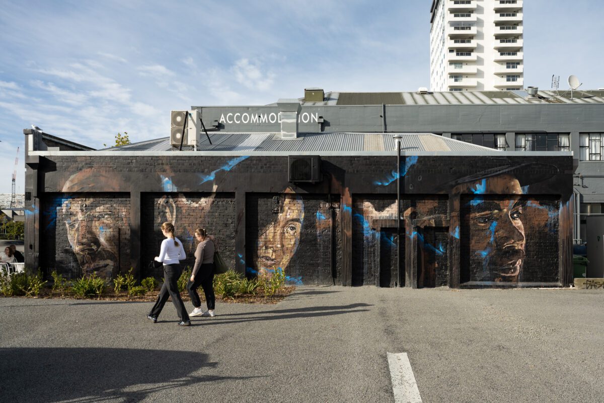
It is hard to believe that three months have flown by since the 2025 Flare Ōtautahi Street Art Festival coloured our city’s walls with a flurry of activity and energy! A triumphant return for the mural festival, the 2025 iteration drew huge crowds, enthusiastic media coverage and, of course, a collection of impressive artworks that further cement Ōtautahi Christchurch as the urban art destination of Aotearoa. From colourful abstractions, striking portraits, and bold typography to sky-high surrealism, complex graffiti and poignant cultural narratives, Flare covered a range of bases stylistically and thematically. With more than 19 large-scale works and a series of activations, Flare 2025 was indicative of a city completely enamoured with turning our streets into canvasses and embracing possibility!
We thought that with the cold months now well and truly here, it would be an ideal time to bring some fire and warm some souls with a reminder of Flare’s goodness – so join us for a little stroll through memory lane with a visual recap of Flare Ōtautahi Street Art Festival 2025!
Continue reading “Flare Ōtautahi Street Art Festival 2025 – A Photo Essay Recap…”FILTH Crew – Trains, Plains, and a Lasting Legacy…
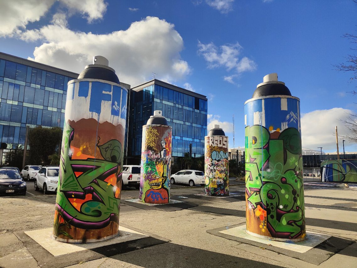
The legendary FILTH Crew are the latest artists to transform the ‘permanent’ Giant Cans on St Asaph Street! In late May, Morks, Lurq and Tepid added some fresh funk with their collaborative production that references so many of the things that have shaped this long-running, one-of-a-kind creative collective. While the cylindrical cans present a unique proposition and challenge, the FILTH Crew have long made use of unusual surfaces and environments – from city walls, to trains, to the surroundings of Te Wai Pounamu’s rivers and plains. In their work for the Giant Cans, these influences are made clear, as we found out from Morks:
“Our concept for the cans was to match all three cans. We wanted to represent the South Island, using the Southern Alps and Canterbury Plains. We chose the colour blue for the ‘FILTHS’ signature font up at the top of the cans, to represent the Southern Alps, which appear inside the letters. Our pieces’ colour schemes were based on and influenced by pounamu, being endemic to the South Island. We brought in elements of the West Coast, Fiordland, Western Southland and the Nelson Districts as well. We added the harakeke overlapping the pieces to bring all the elements of South onto the cans.” The effect is lively, meaningful and evocative of the surrounding environment just beyond the city’s doorstep. The production feels proudly familiar.
Continue reading “FILTH Crew – Trains, Plains, and a Lasting Legacy…”The Giant Cans – Notepad, Incubator, Constantly Changing Canvas…
With the upcoming refresh of the three ‘permanent’ art cans at the St Asaph Street Giant Spray Cans site, we have been thinking a lot about these unique surfaces and their evolving appearance. While the three cans to the west serve as commissioned installations, with a revolving roster of artists and crews decorating the cylindrical forms, the other three cans, situated to the middle of the space (closer to the basketball court) are a type of legal wall space, an open source option for people to adorn with markings and makings of all kinds. The impact of each set can be strikingly different. The cohesive ‘permanent’ designs serve as aspirational inspiration, but the more haphazard patina of the ‘legal wall’ cans can be equally as interesting – from signals of presence to gestating visual ideas, the cacophony of tags, handwritten messages, characters, patterns and icons are a wide gamut that becomes a thick layer of paint.
Continue reading “The Giant Cans – Notepad, Incubator, Constantly Changing Canvas…”Postcard from Mexico
Mexico is a hotbed of colourful culture – from the heritage of Aztec history, the muralist movement, the folkloric expressions, energetic graffiti and more recently, the emergence of a contemporary mural style infused with all of these influences…

Mexico is a hotbed of colourful culture – from the heritage of Aztec history, the muralist movement, the folkloric expressions, energetic graffiti and more recently, the emergence of a contemporary mural style infused with all of these influences… Last year we were lucky enough to spend some time in Mexico, visiting Mexico City and Puerto Vallarta and capturing some arty goodness. It can’t be understated how massive Mexico City is, bustling and colourful, the juxtaposition of traditional graffiti, fun street art, murals and public art a reflection of the city’s diversity. With only a couple of days to explore, much of the art we found was in the Condesa area where we stayed, but we also were able to witness a huge amount of art as we travelled outside the city to the impressive pyramids of Teotihuacán, murals, slogan typography and of course the frescoes of the ancient Aztec city itself. Puerto Vallarta is renowned as a bright, vibrant destination, and the collection of murals throughout the city most certainly adds to that profile – often displaying elements of local culture and history…
Continue reading “Postcard from Mexico”