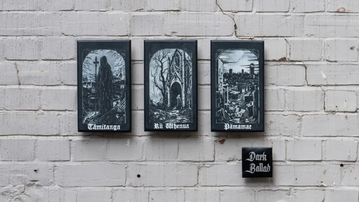
With a unique aesthetic and process for the world of urban art, Dark Ballad has established himself through a series of striking works across Ōtautahi, including gothic-inspired paste-ups and a woodblock tablet series for the 2023 Little Street Art Festival, as well as an ever-expanding collection of collaborations that range from prints to t-shirts. Working with figures from the worlds of fine arts and graffiti, these collaborations are always fresh, and through their ultimately one-of-a-kind woodblock printed aesthetic and finish, they are retain a key point of difference from more mass-produced clothing offerings. In addition to his technical output, Dark Ballad has also been involved in community arts initiatives, including curating the Carve surfboard art trail in New Brighton for the Duke Festival of Surfing in early 2025, a public art installation featuring over a dozen local artists. With such a wide range of activity, we thought it was well overdue we sat down with the ‘Master of the Dark Arts’ for a chat about his experiences, his philosophies and what might come next…
Continue reading “Dark Ballad – A Deep Cut”Tag: Christchurch artist
Chaos of Calm – Joel Hart at QT Queenstown
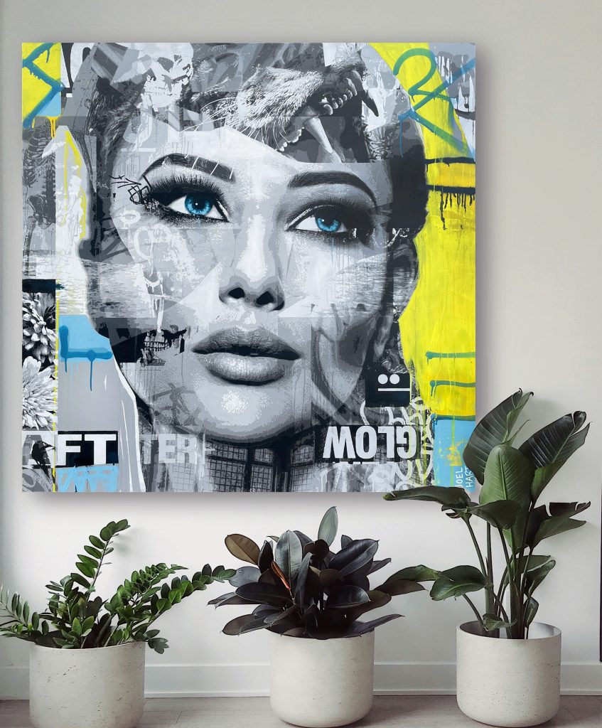
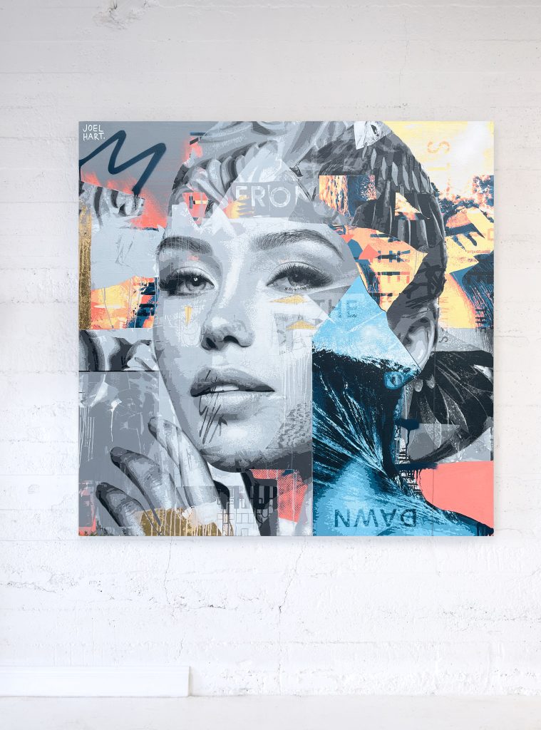
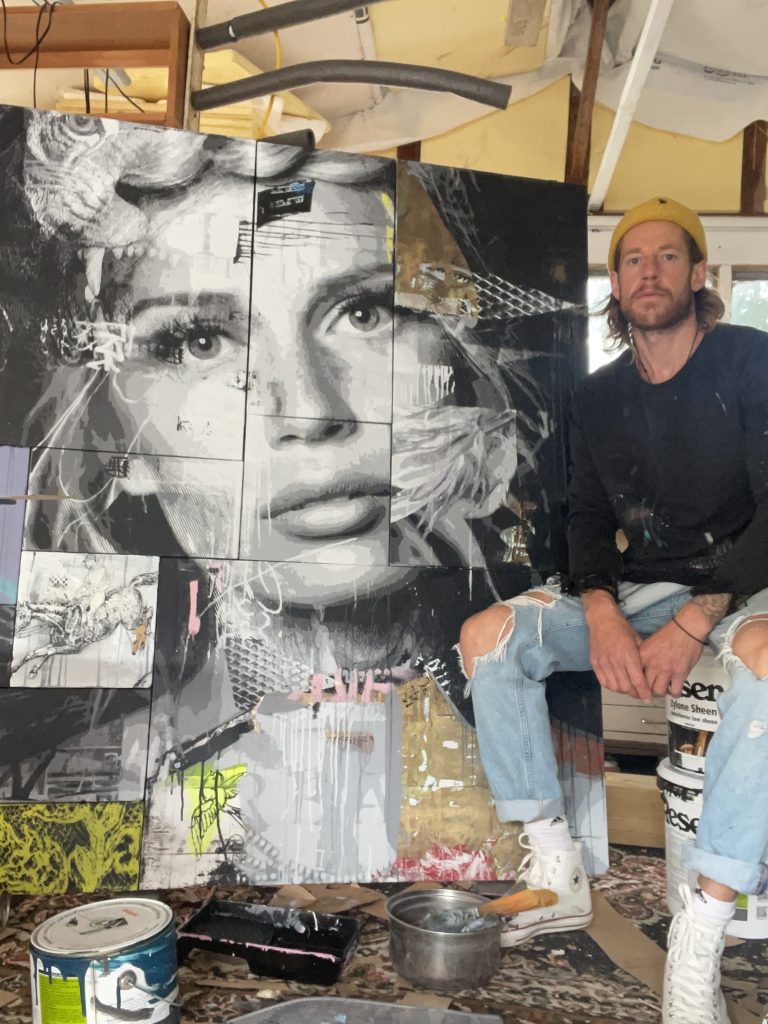
Joel Hart’s captivating new body of work will be on show at Gallery 6 – the 24 hour gallery inside the stunning QT Queenstown. The gallery space, established on level six of the lakeside hotel, will host Hart’s newest series for six months from the 18th April. The Ōtautahi artist is excited to present Chaos of Calm, a suite of paintings that aim to capture “a moment in time where the boundaries between dreams and reality are blurred.” As snapshots of a thought or a dream, the pieces juxtapose Hart’s signature striking figurative imagery with abstracted aspects and suggestive forms that evoke an external manifestation of the character’s internal dialogues. Deploying a fragmented effect, where the surfaces are composed of smaller pieces fitted together into a patchwork, the works serve as a reflection of our complex multi-faceted identities and experiences. If you are in Queenstown, amke sure you head along to Gallery 6 and catch this alluring show…

Tom Kerr’s Nebraska @ Absolution
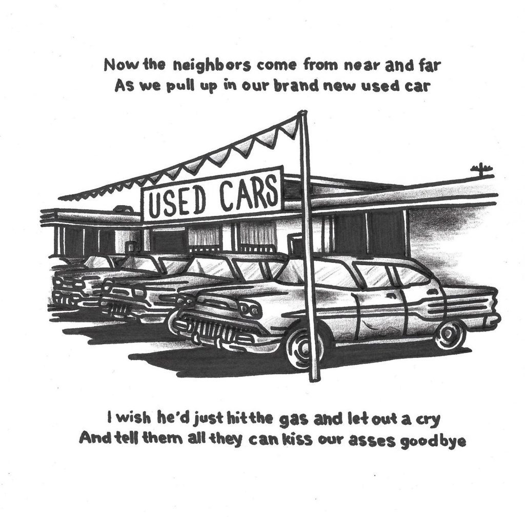
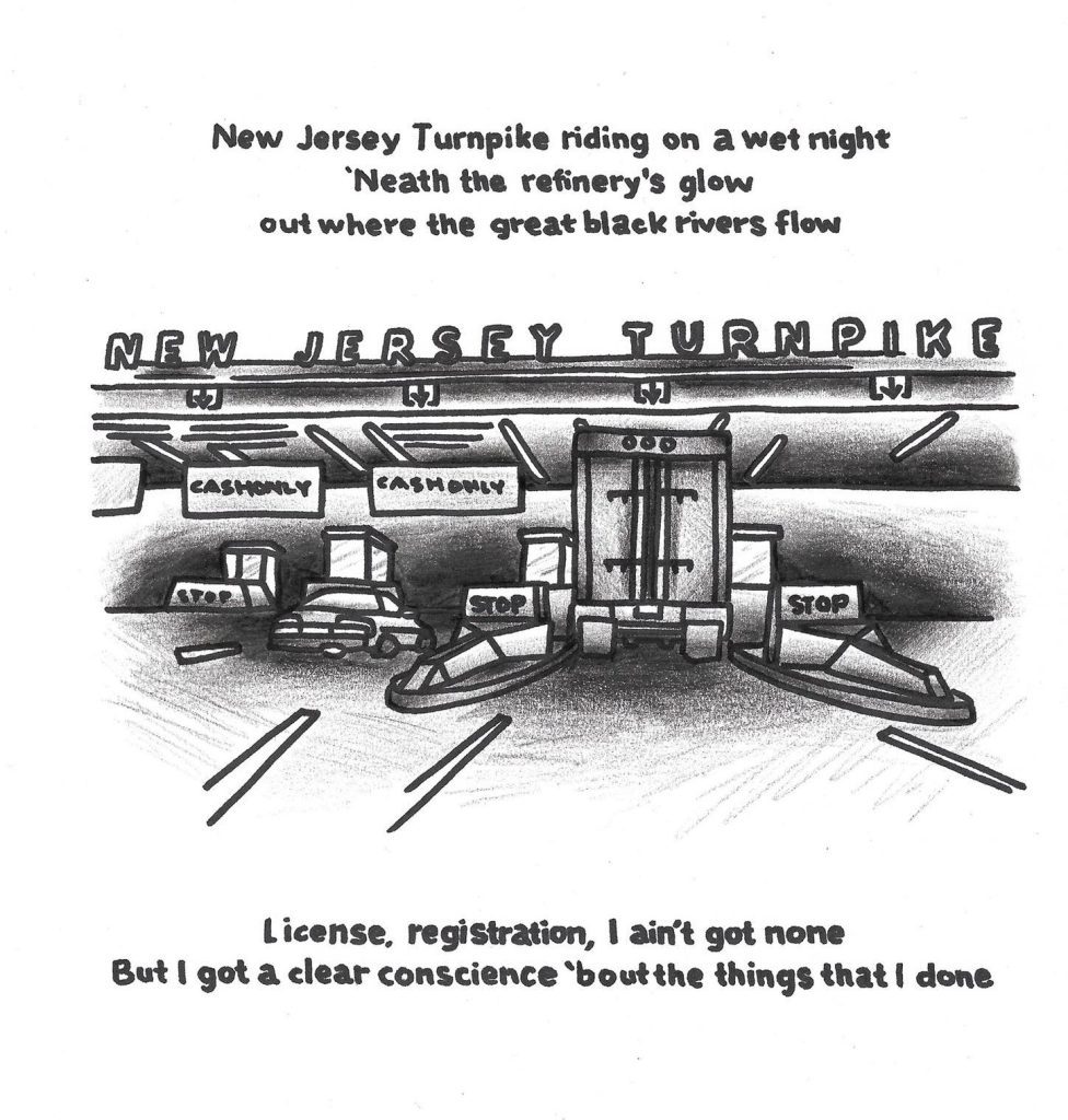
I remember seeing Tom Kerr’s tattoo flash drawings illustrating lines from Bruce Springsteen’s iconic 1982 album Nebraska on Instagram around two years ago. As a long time fan of the musician, I was an immediate intrigued. The album, famously recorded in Springsteen’s bedroom on a four track recorder, stands as one of the New Jersey native’s most celebrated works, devoid of the stadium rock scale and instead focussed on Springsteen’s intimate Americana story telling. I reached out to Tom at the time and he told me of his plan to draw imagery for every song, I was excited to see what would come from the project. It may have taken some time, but finally the suite is ready for exhibition as a complete body of work. As you can imagine, I was excited to sit down with Tom and we sermonised about Springsteen, Nebraska and the process of making these works…

I have always found, depending on prevailing tastes, that it can sometimes be hard to admit that you are a Springsteen fan, you never know response you are going to get! For some people, it’s still the flannel shirt and Born in the USA, but there is, of course, this whole other side to Springsteen. How did you kind of come across his music?
My dad is a huge fan, so growing up, Springsteen classics were always playing, especially Born in the USA and Born to Run and stuff, but I think getting older and being a young adult, I just resented Springsteen and thought for so long it was just dad music. Then my really good friend Dan, who probably has the best taste in punk music I know, was like, have you listened to Nebraska? I was like, nah, I don’t really rate any of Springsteen’s music, it’s all dad rock or whatever. I think he said something like, forget everything you know about Springsteen before you listen to this album, it’s not a big band, there are no saxophone solos or type of shit. I was really into lo-fi music, recorded songs, and I got more and more into that and through that I went back to Springsteen’s wider catalogue and listened to Born to Run and that’s when I fell in love with all the classics. You get to an age when you realise the music your parents loved is good. As a kid, you push so hard to be like, I don’t want to like the music my parents liked, I’ve got better taste than they do. But then you grow up and realize that Elton John and Springsteen and Cat Stevens, and all those dudes are flawless musicians…
The idea of Springsteen being ‘dad rock’ was so strongly entrenched from his mega star status in the 80s, but I was always more into his early, kind of romantic street poet aesthetic, the storytelling, the Magic Rat and stuff like that, and then Darkness on the Edge of Town, The River and eventually Nebraska continue that storytelling vein in a darker tone. Born to Run is about escaping, but those later albums are about being trapped, or what happens when you don’t get out, and I think as you get older, there’s something about that idea…
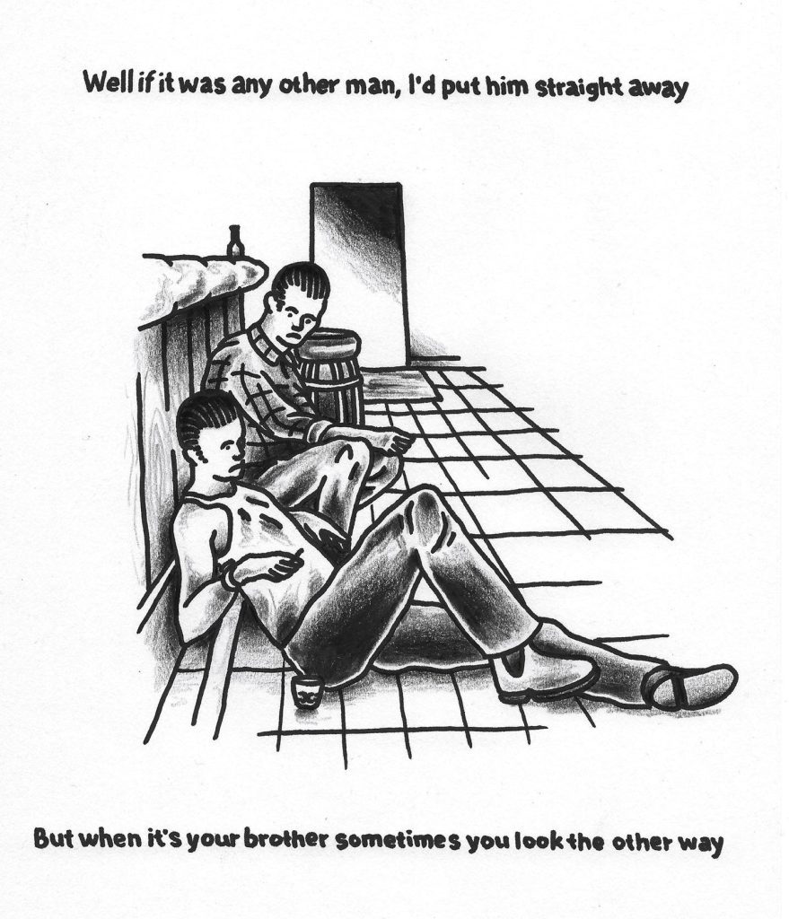
With Nebraska, the songs are so well done, you listen to Johnny 99 or Highway Patrolman and they go for three minutes and you know everyone in the song, you know about their dreams, their aspirations. The song ends and you are like, how have you painted such a picture with like three chords and just like talking about these guys? He tells us how characters went to war, how the farm didn’t work, about having a brother who is a loose cannon and shit, I couldn’t tell someone that much information in just three minutes…
They are short, yet they are almost cinematic in scope and vision. The other interesting thing is Springsteen’s influence on the New Jersey punk scene, right? The Dropkick Murphys, The Gaslight Anthem, he’s had this interesting standing where the broader public have this perception, but the people in the know have a different understanding…
I think it comes from digging a little deeper. Born in the USA was his commercial success, it was in the 80s and there was so much marketing when they made that album, they made him shave and go to the gym to look like a working-class farm boy or whatever. But in reality, if you look at photos from Greetings from Asbury Park, he’s wearing a beanie, he has long hair and is wearing bell bottoms and shit, and he’s the complete opposite of what most people think of Springsteen…
The ripped arms, the sleeveless flannel shirt, the headband, but then you go back to that earlier ‘Skeeter’ persona, the leather jacket and the oversized beanie, the scraggly beard, hanging around in Asbury Park, playing bars like The Stone Pony…
The E Street Shuffle kind of stuff…
Born in the USA is interesting though, it is really misunderstood, it is actually an album that’s way darker than everyone perceives, there is actually a kinship with Nebraska…
Nebraska was all demos. I think they did The River and they toured it and then Bruce wanted to break off from the E Street Band and become a solo musician or he wanted to break off from the concept of what The E Street Band were doing, so he recorded these demos and when he took them to the label, they were like, this isn’t happening, so he went back in the studio and did Born in the USA. In the Born in the USA tours they do live versions of Johnny 99 and a few more of the demos that were in Nebraska actually ended up on Born in the USA, like Working on the Highway. I think they tried them all as full band songs and half of them just flopped…
Born in the USA was written to be much more sparse, right? Originally the songs were stripped down versions, the title song was more bluesy and, of course, No Surrender is the most punk song in his catalogue…
We learned more from a three-minute record than we ever learned in school… So good!
But it’s lost in that full band bombast…
Even the song Born in the USA, when you ask a person on the street if they know the lyrics, most people are going to say, I was born in the USA and I was sent down to kill the yellow man… It sounds really redneck, like I’m proud to be an American and shoot Commies and all that sort of shit, but then you listen to it and it’s like, I lost my job at the plant, I came back and no one thinks I’m a hero, all my mates are dead, they didn’t come back, it’s the same narrative as Forrest Gump…
Born in the USA was co-opted by Ronald Reagan and the Conservatives as a rallying slogan and it has just never escaped that association. Although, since Springsteen came back with The Rising, and his role post as a sort of post-9/11 poet laureate figure, his politics have been made much clearer. His work has always fluctuated between big arena sounds and more intimate albums, like The Ghost of Tom Joad and Devils and Dust, but Nebraska definitely stands out…
Apparently, when they finally got into the record pressing stages of Born in the USA, he still had the tapes for Nebraska and every single time he got into a room with an engineer, he was like, we’ve got to put it out. I think they finally agreed to do a small run as a mini album, but it was recorded so poorly that every time they tried to cut it to a record, the lathe would bounce out of the record. They went through like five engineers or something to finally actually mix it properly because it was just like boombox recordings and the mics were too loud or there was not enough going on…
As a musician yourself, does the story behind the making of Nebraska, which Springsteen recorded on a four track in his bedroom, add to the allure of the album?
Yeah definitely. There’s so much information around and half of its fake, half of it is bullshit. The best story I’ve heard about it was that it was recorded on a Tascam four track, so to bounce it down to tape, you then record it on a boombox or a normal two track or stereo tape recorder. So, Springsteen bounced it down from a four track to a boombox and then he’d take that boom box out on a row boat and go fishing in an estuary. Apparently the boombox fell into the water and he waited for the tide to go out to get it back. The boombox was fucked but the tape was fine, so they washed out the tape and that’s why it’s got so much filth and grit to the music. It’s a great story, but I have no faith in it being real…
A real fishing tale…
Four tracks have a tape speed, so if you have a 40-minute tape, if you record on half speed, you get like 80 minutes. A lot of people think that Springsteen had the tape speed like just slower, but then whoever mixed it down for him, knocked it back to 12 o’clock, so if you try and play guitar to the songs, they are like a quarter step out of tune, and not in E or E flat, but like halfway between, which gives it this weird quality. I think people subconsciously resonate with it because it’s not an E chord or an E Flat chord like most bands would write music in, it’s something slightly different…
So, you play his songs?
Originally, I thought it would be cool to put on the show and have a different musician play each song from the album. I’ve got Johnny 99 and Reason to Believe down, but the rest of them are so hard to play. I don’t know if it’s because he recorded the guitars and then did vocals over the top, or it’s just his style, but there are some sentences I just can’t get through being able to strum it right, especially Reason to Believe and the bit about the preacher standing with the Bible and the congregation’s gone home, it bounces up and down differently to the way you strum a guitar. It’s probably just his style, but every time I get to that mark of the song, I fuck it up, it’s so hard…
So, the exhibition is based on your response to each song?
Kind of, I’ve basically just drawn the image each song painted in my head. When I drew them, I wasn’t tattooing yet, I was still building, but I would draw after work three nights a week and I eventually just ran out of ideas. I had listened to the album a couple times and it hadn’t really resonated yet, but I valued Dan’s taste in music so much that I was like, it has to be good if he recommended it. I ended up working on a job by myself and instead of using a work radio I just wore headphones and I listened to the album. I used to always skip Nebraska [the first song and title track] because Atlantic City is such a banger, but I finally listened to Nebraska with headphones and the lyrics were clearer and the song is just about a guy and his girl killing ten people and getting the chair. I just thought it would be pretty cool to draw a guy sitting on an electric chair with his girl sitting on his lap. I was drawing so much after work and I just needed more briefs, so I was like oh, I’ll try to Atlantic City next week and then after I’d done three songs, I was like, well I have to do the whole record now and then they just sat for ages…
It became a ritual…
Every week, yeah. Instead of listening to the album, I would just listen to the one song I had to do that week, all week, to really try and close my eyes and think what the snapshot would be.
What was that process? Did you find yourself gravitating towards types of imagery or certain phrases?
Yeah, certain phrases…
Was there a consistency across the phrasing that you were picking out of each song? It seems to me a pretty cohesive album…
I think probably being a New Zealander and listening to songs written by a Jersey boy recorded on tape or whatever, lots of things in my head kind of had that Sopranos or old American movie type stuff. For Mansion on the Hill, I just had this big American, gothic-like Addams Family mansion…
There is some really memorable imagery throughout the album, like in Atlantic City: “Well, they blew up the Chicken Man in Philly last night…”
So good. There’s a really good newspaper photo of the Chicken Man’s house, his front door is like Ground Zero, like there’s just weather boards everywhere. Originally, I thought the Chicken Man was a go-to fried chicken spot and they blew it up because it had been abandoned or fallen apart, like the Santa Monica pier where the Z Boys surfed, which had fallen into such disrepair the Fire Department never showed up. I was like oh, the Chicken Man must be a restaurant, and then I read about the crime families and stuff, and it’s actually a guy…
Were you doing research to inform the imagery as well, or were you wanting a more pure response to the lyrics?
I think with the tattoo style and so much being reference based, I was trying to find actual references to draw on and still trying to capture the imagery from the song. The drawing I did for Johnny 99, I found a shot from a hostage scene in a movie, but then I had to draw one of them as Johnny 99, and one of them is a gas station attendant, so I had to research clothing a gas station attendant would have worn in America in the 50s or whatever, and try and make it look a little bit old school. So that was fun, having the image in your head and trying to draw it and portray it as more than a feeling because at the end of the day, it isn’t actually an image, it’s just an overall vibe that you’ve got in your mind…
Did you revisit any over time?
They were drawn and that was it. I think too, because the idea was to do one a week, and because I’m always trying to find shortcuts, one of the songs I didn’t initially rate that much, like My Father’s House, I would have been quite happy to skip it and just do it at the end, but I just knew if I did all of them and left that one until the end, I would have just skipped it and never done it. As a result, having to listen to My Father’s House for a whole week, by the end, I was like, this is such a great song…
So, when you were originally drawing them, were you drawing them as tattoo flash?
Yeah, the expectation was just that people would get them tattooed. People responded to them really well, but no one actually got them tattooed. I drew them ages ago, so I thought I will see what happens, if I tattoo them or not. But then a couple of years ago I was like, I need to do a zine and an exhibition. The space at the shop [Absolution] was already booked out for like a year, but I saw that the 40th anniversary of the album was coming up in two years’ time so, I thought, two years is ages away but it would work. It flew by because of Covid, so I was like oh shit, two years already! Time to do the show…
It feels like a traditional tattoo style is a really good fit with the album. I know the most immediate association is the black and white album cover image, but if you were to turn Nebraska into an art style, I kind of think it would be black and white photography and traditional tattoo flash…
At the time, my main medium was a Sharpie pen and black colouring pencil. It still is now, but instead of using a Sharpie I use a point 6 Artliner, so it’s just a little bit smaller. But the thing I love about a Sharpie, especially for text, is that if you make the text too small, things like a lowercase E, get the bleed in the eye of the E and it becomes solid, it’s the same as if you were using a typewriter and the ink was too runny, all those things close up. In traditional tattooing, because the lines are so bold, if you do them too small the lines go close together, so all the designs have to be very contrasting to the skin that you don’t tattoo, so all the lines have to be far apart. So, for instance, if you are tattooing a hand, you don’t bother doing all four fingers because you know it will just blow out and become black, so you imply the form. On Nebraska because a lot of the songs are demos, a lot of the details are implied; the harmonica solos, and you know when he does those high pitch screams, I feel like a lot of those are his way of saying this is where the sax solo would go… Because it’s just a tape recording, there’s no thought put into it. I will play four bars, and I will whistle, or I’ll play harmonica, and in the studio we can decide whether it’s going to be sax or synth. That’s kind of the beauty, because its good enough. People will be led to believe it’s a conscious decision and it’s the same with tattooing with a really big needle, you are kind of governed by how much freedom you have, so the decision you make is that less is more, I guess. You can sort of imply something in same the way you would imply a sax solo by just humming, and people will go I love how you are humming that bit and you go, I didn’t know what else to do…
When you look at the works now and when you think about displaying them, does it make you more aware of the album’s narrative?
I think what hammered that home was the introduction I wrote for the zine. I wrote it as a dedication to everyone who is described in the album; everyone who ever felt like going on a killing spree with their girlfriend, or wanted to live in the big mansion on the hill, or fell out with their parents and that sort of shit. The last song is Reason to Believe, so it comes around to a dedication to all these people who went through all this shit and somehow, even though you are at the end of your rope, there’s something to believe in that is bigger than we all are, and then the album just ends. So, there is that conscious story-telling that is so good, you can’t believe that the sequencing hasn’t had a heap of thought put into it, we’ll close it out with this song about faith, and he doesn’t even mention that it’s in God, he just mentions that there is something that makes you get out of bed each day…
That reason can be so many things; the person you wake up next to, the vision of that house you grew up in, everything that precedes that song can be one of those reasons to believe…
Like in Open All Night, I drew a nice car, but he talks about having this car up on blocks, working on it. It’s probably a shitter, but he loves it and that’s probably his reason to believe, this rad car…
Cars are such an important image in Springsteen’s songs…
Nebraska is about the first ever spree killer, the first person to kill in a car crossing state lines. In his autobiography, Springsteen talks about how his Nana or someone told him in an electrical storm you can’t get electrocuted in a car because of the rubber tyres, so in the book, he’s like, when I was a little kid whenever there was a lightning storm I would run out of the house right into the car, and then I proceeded to write songs about automobiles for the next 40 years of my life. His whole career comes back to this story of cars being like a saviour…
So, what do people need to know about the show?
It opens at Absolution on Friday the 30th of September, which is also the 40th anniversary of Nebraska, technically it would be Saturday, Friday in America, but yeah, it starts at 6pm. I’m thinking I might give away a prize for the best Springsteen outfit, but I’m going to try and encourage people to think outside the box and not dress like Born in the USA Springsteen, which I think is the whole point, educating people that there is a Springsteen behind the Boss. Like Dan said, forget everything you know about Springsteen, this is the record. If you don’t like Springsteen yet, hopefully this one is the one…
I’m not sure how I’m going to lay it out yet. It’s rare to not see a tattoo artist use an iPad now, even I use an iPad, but back in the day, you used to do everything on tracing paper first, then you would do a nice one on paper. I’ve still got the tracing paper drawings from these works, so I’m thinking, because Nebraska was a demo album, I might hang all the final artworks and then around the corner I might hang all the tracing paper works and the lino cuts and all that sort of stuff. I was thinking I might use a string line to line everything up but I might leave it up, highlighting that Nebraska was a working idea that wasn’t supposed to be finalised and left like that…
What’s the one line from Nebraska that you think best sums it up?
I probably change my mind every day when I listen to it, but right now it’s probably in Reason to Believe:
Take a baby to the river, Kyle William they called him
Wash the baby in the water, take away little Kyle’s sin
In a whitewash shotgun shack an old man passes away
Take his body to the graveyard and over him they pray
It all happens in the same breath of air, someone’s in, someone’s out. We are all just doing it. Reason to Believe is probably my favourite song on the album, as much as I love Atlantic City, but Reason to Believe is so good, there’s the line about the girl waiting for Johnny to come back, there’s the wedding, the preacher standing with the bible but the bride didn’t show and the congregation’s gone home. It’s a tough one, actually maybe it’s the opening line:
Seen a man standin’ over a dead dog lyin’ by a highway in a ditch
He’s lookin’ down kinda puzzled, pokin’ that dog with a stick
Got his car doors flung open he’s standin’ out on Highway thirty-one
Like if he stood there long enough that dog’d get up and run
It’s a vivid image, right?
It’s such a wicked lyric, like did he see that or just make it up? I like the idea of someone just standing there being like, c’mon, get up man, this can’t be it… It might come back to the death of the American dream, poking it with a stick is not going to get it going again, you just have to get back in your car and keep driving.
But it’s the reason to believe, it might not get up and run, but you can hold onto something, hope is always there…
Or you could be the dog, hoping someone might poke you and not just keep speeding past…
Tom Kerr’s Nebraska opens at Absolution Tattoo and Body Piercing, 6pm, Friday 30th September, 2022.
Follow Tom on Instagram…
Tune! with Smeagol
Tattoo artist, painter of gory monsters and creatures, maker of miniatures and custom toys, illustrator, Smeagol describes himself as having his “fingers in all the pies”. This wide ranging creativity makes it understandable that his taste in music would be equally diverse. After sending a killer playlist of 10 tracks that span the alt 90s vibes of Jane’s Addiction, the verbose wordplay of Aesop Rock, the energy of Misfits, the grooves of Modjo and even the croon of Chris Isaak, he explained 30 might have allowed him to fully cover his eclectic tastes. Oh well, it looks like we will just have to have more volumes of Tune! with Smeagol in the future…
____________________________________________
Ironically asking a near deaf artist their favourite songs is probably a bad idea, but my art and lifestyle revolves heavily on music. From birth my parents enforced a good taste in music so to say, 70s staples like Led Zeppelin and Fleetwood Mac, Jimi Hendrix, and on and on…
My childhood was straight 80s and 90s baddassery. Grunge and alternative was life: Nirvana, Alice in Chains, Soundgarden, Stone Temple Pilots, Garbage… In between then and now, I’ve picked up on every genre in between and I literally listen to anything, hip hop mainly, but rock, metal, dance, DnB, soul, 90s trash, punk… Gimme something I haven’t heard please! Thanks for listening to my Ted talk.
Jane’s Addiction – Jane Says
Queens of the Stone Age – Burn the Witch
Aesop Rock – No Regrets
King Geedorah – Take Me To Your Leader
KMD – Sweet Premium Wine
Misfits – Hybrid Moments
Modjo – Lady (Hear Me Tonight)
Chris Isaak – Wicked Game
Ramirez – The Fo Five
Freddie Gibbs and Madlib – Giannis (feat. Anderson .Paak)
Follow Smeagol on Instagram to see all of his creative goodness!
Stay tuned for more editions of Tune! soon…
The Paste-Up Project – with Cape of Storms
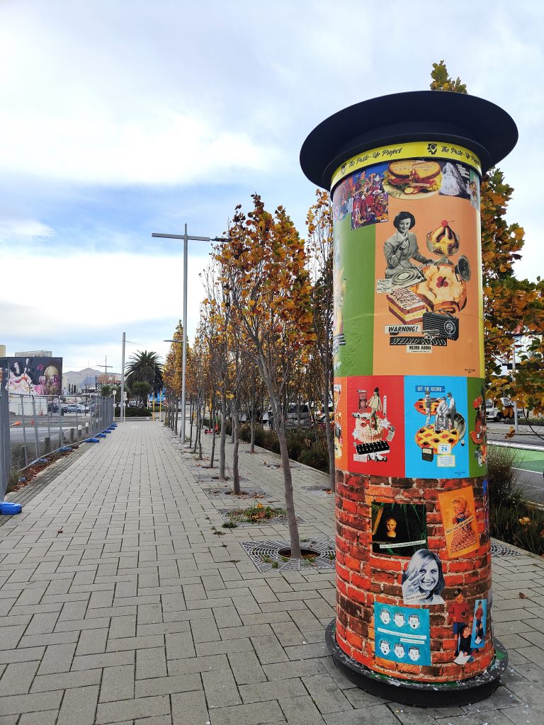
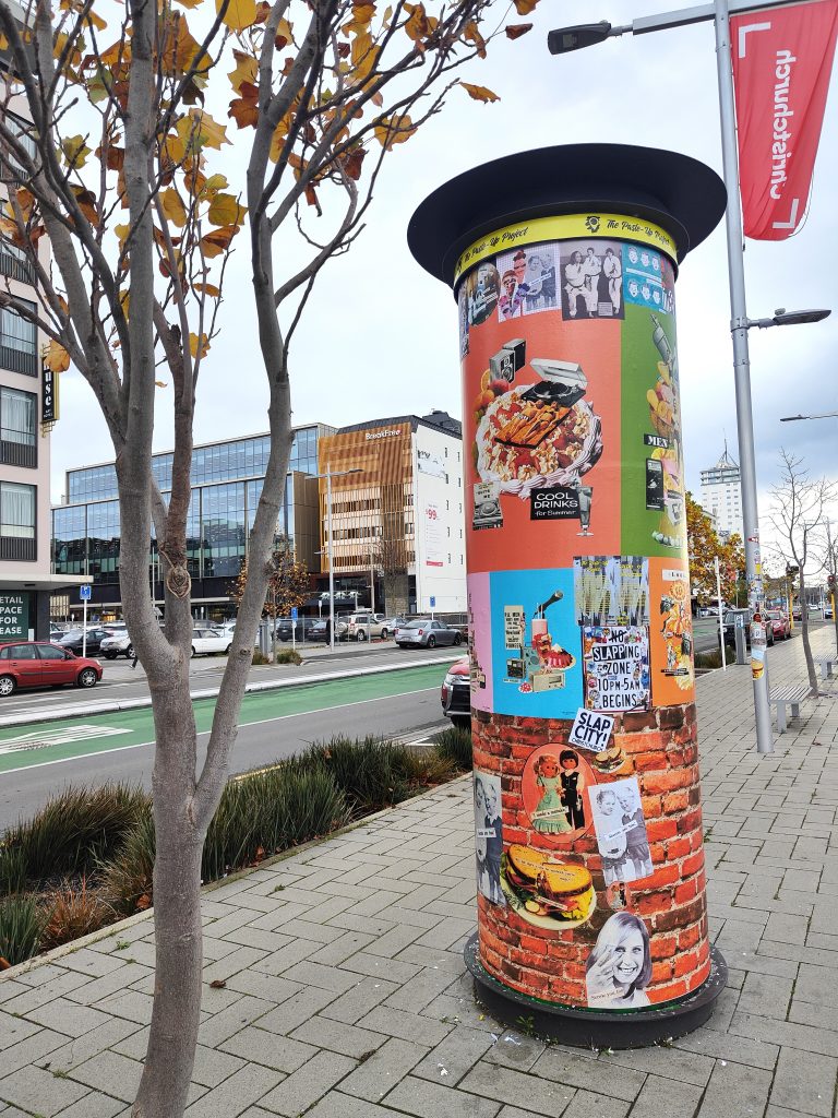
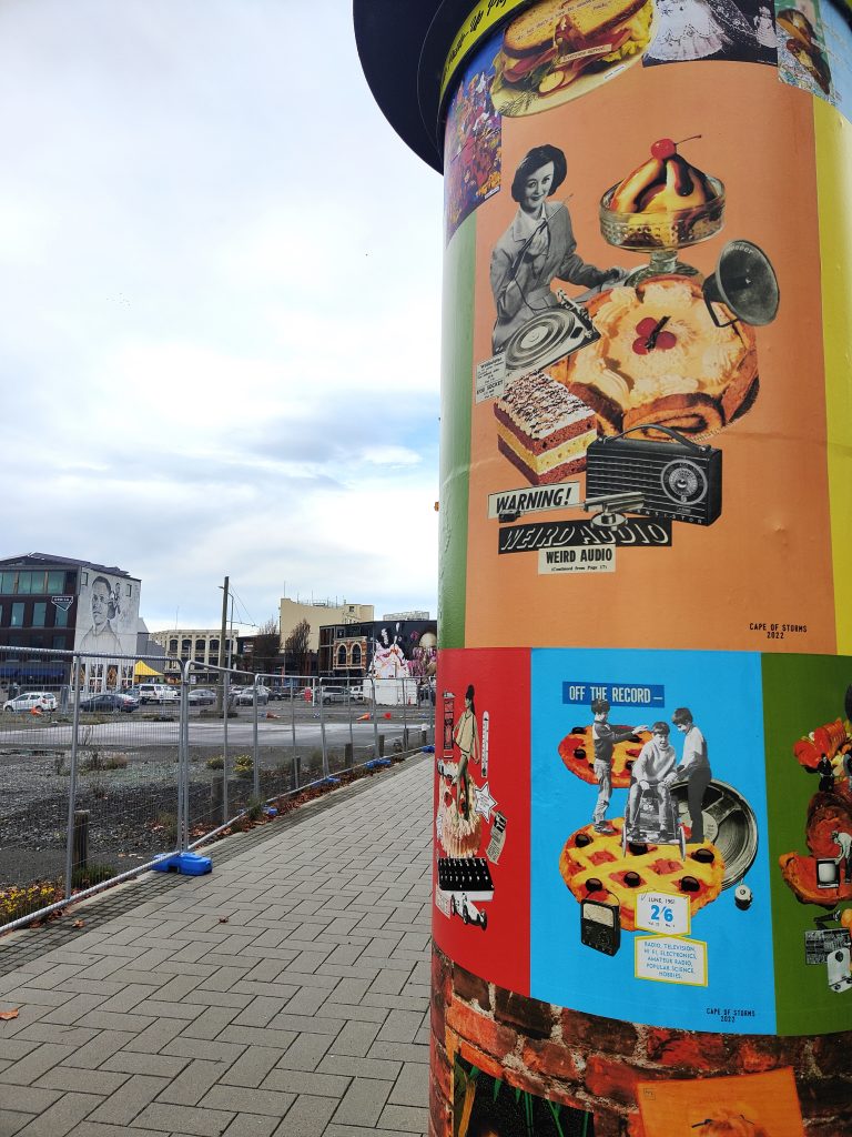
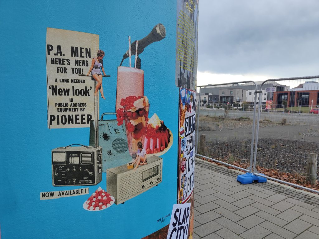
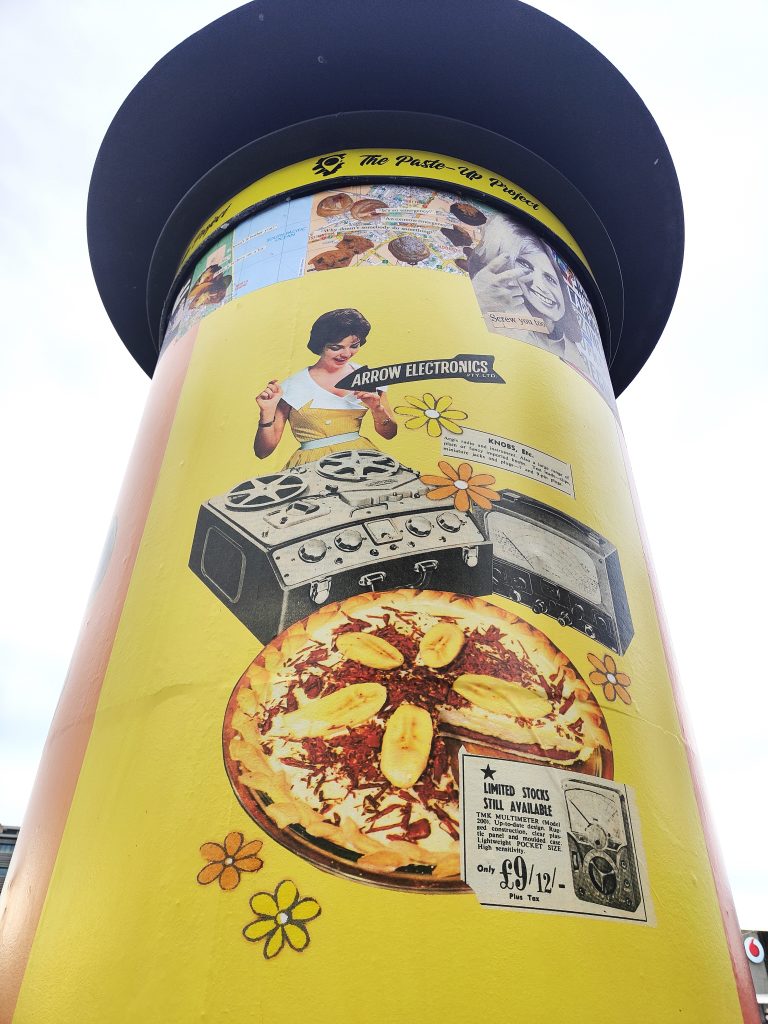
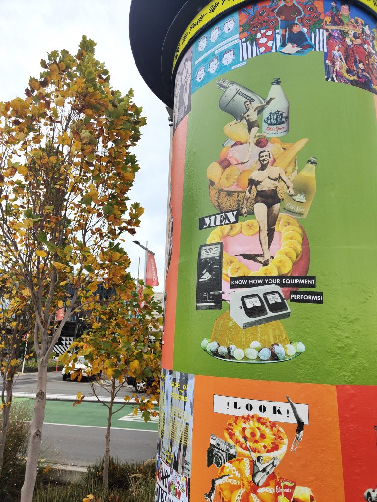
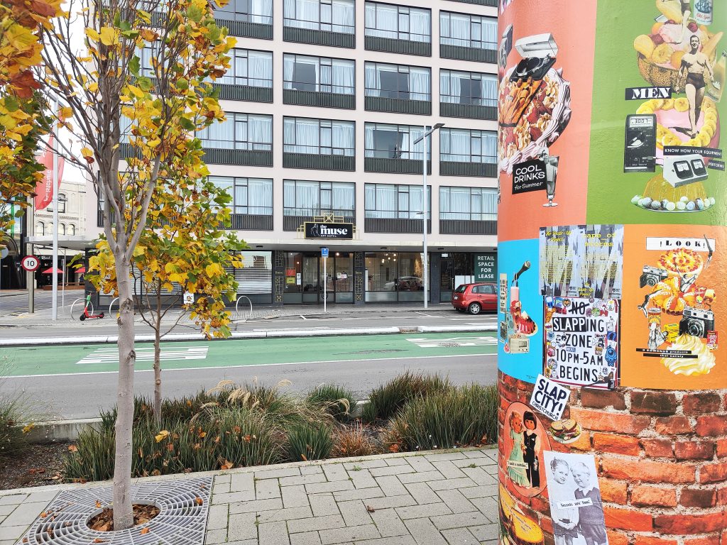
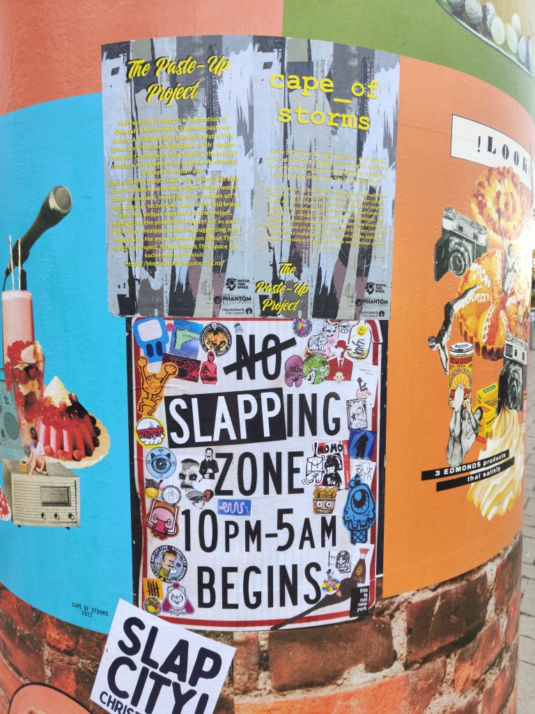
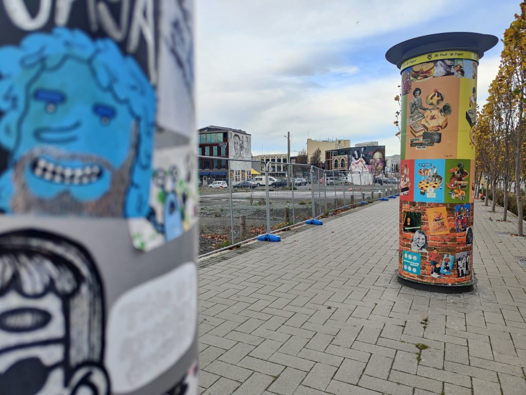
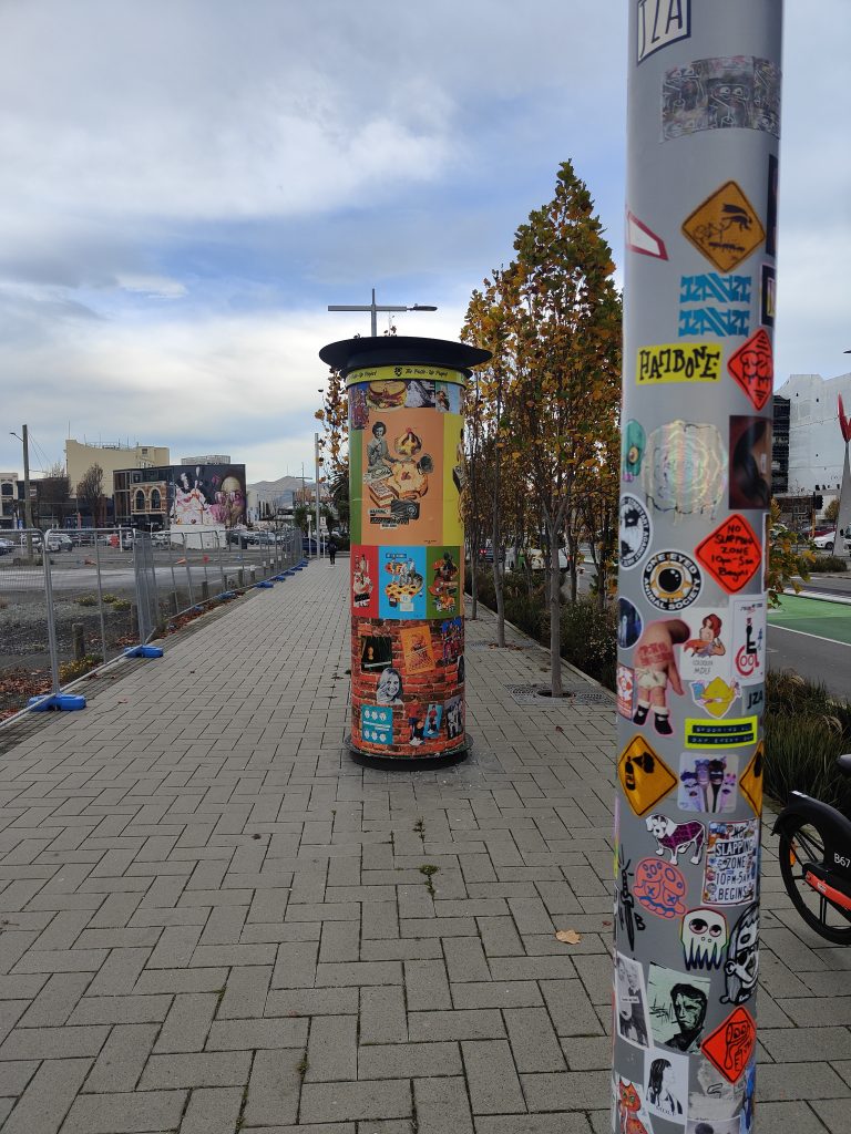
Urban collage artist Cape of Storms became the third contributor to the Paste-Up Project in early June, her bright installation completed in glorious sunshine. The concept, drawing on the artist’s experiences acclimating to life in Aotearoa through the lens of humorously juxtaposed vintage magazine and advertising imagery, provided a reflection of the advertising often found in our urban environment, almost tricking the passing audience into a sense of normality. Upon closer inspection though, the bollard was filled more playful and acerbic content, including a brick wall section packed with a wide range of images. The result was a bold production with electric colours gleaming in the sun, simultaneously covert and unmissable.
But, then the weather changed and the installation was faced with a slew of challenges. As torrential rain hit Christchurch, the paste-ups started to peel and soon, it seemed as though people had pulled the pieces off, leaving the bollard naked in places. Luckily, part of Cape of Storm’s concept was the incorporation of friends’ work to be added over time, and this unfortunate series of events provided the opportunity to refresh the bollard on a large scale.
Cape of Storm’s installation has not only provided a bold burst of colour, but a fascinating narrative that ties into the nature of both paste-up art and the process of making art in the urban environment…
____________________________________________
Kia ora! Would you like to introduce yourself?
I am Cape of Storms, a Christchurch-based collage artist, I collect obscure retro images and phrases and put them together in a fun and quirky way.
What was your initial reaction to the Paste-Up Project proposal?
I was very excited by the concept, and also daunted in equal measure at the sheer size and scale of the bollard surface area. I typically work no larger than A3-sized pieces and often very detailed and refined. It takes hours to hunt out and combine different images together into one cohesive new image. I hand-cut and glue everything with just a pair of scissors or a small craft knife, arrange and overlap, and then carefully glue everything together. Some of my pieces are comprised of 30 or more smaller images and words! So, the challenge of this project was filling in all that open space. In the end my approach was to try to go big, but also fill the space with as much as possible to keep it interesting and provide a piece of art that had several dimensions to it.
With two artists having already contributed to the project, were you primarily interested in doing something different?
Yes, I was keen to do something unique to my style and stay true to that – I think my art style is so significantly different to both Teeth Like Screwdrivers and Bloom n Grow Gal‘s that it wasn’t too hard to be different!
What is the central theme of your installation and how does it relate to your existing work?
The installation is a progression or continuation of a new style I have been working on for about a year now, which I am really enjoying.
I have titled the series covering the bollard Foreign Objects. Being a foreigner living in New Zealand, I am continually getting to grips with my identity and trying to relate to my surroundings, often times feeling like a fish out of water. As a lover of nostalgia, I found myself combining these two themes.
Throughout this series I intentionally tried to create a silly, nonsense, imaginary world that could reawaken nostalgic memories in the viewer. Over a period of months I sourced hundreds of different found images – from old cook books, special interest magazines, newspapers, catalogues and children’s books from bygone eras. Things I remember seeing in my mother and grandmother’s house during my childhood growing up through the 90s. To many younger people, these images might seem totally foreign or out of place in modern times, as they are simply just not in common use any more. So through this use of retro “foreign” objects and arranging them together in weird, silly and fun ways, they all come together and are recognisable and familiar as a whole, something that the viewer can relate to. I tried to select a range of bright candy colours for the background which would stand out on the grey inner-city street-scape around the bollard. The candy-coloured palette also reinforced the nostalgic theme. For me, this ended up being very effective at inviting the viewer in from a distance, to come up closer and look at the bollard in more detail, particularly in the heart of winter!
The brick wall section running along the bottom third of the bollard and the very top section running like a ribbon all around is a collection of my existing collage art that I have been pasting up on the streets of Christchurch over the past two years. It was nice to include these on the bollard as well, alongside the more considered poster series that I created especially for this project.
You decided to remove the spacers on the bollard, making it one consistent 360 degree surface – which makes the experience more continuous, was that the thinking?
I didn’t like the “frames” or physical boundaries the spacing strips created, I wanted each individual poster to look like another part of the imaginary world I was creating. I also wanted to encourage the viewer to walk right around the bollard and see the image as one continuous surface.
You have included some big prints but also some collaborative spaces, what was the intention of the brick wall?
The brick wall section was intended to be a space where the wider Slap City collective group of artists would jump in and slap up various individual pieces, just as we do on our regular paste-up missions around the city.
Unfortunately due to the intense winter weather over the last month and the group not being able to meet up so frequently, we weren’t able to get in and fill that area before about 80% of the bollard surface was damaged in the torrential rain.
But the damage to the bollard has now cleared even more space, so if we are able, we will try and cover the empty spaces up again in between now and when Mark Catley inherits the bollard – I’m very excited to see what he’s got planned!!!
Printing the large posters became quite a process, working with the team from Phantom, has that changed your thinking around your work more widely? And what other challenges did the whole process throw up?
I knew I wanted to print everything with Phantom – they are the experts and their prints are of amazing quality and designed to be more durable and last out in the elements (sadly the record-breaking wet weather we’ve experienced over the last month took its toll!). The trickiest part was maintaining resolution when scaling up from original A4 or A3 size to A0 size. I was really worried that the images would look pixelated and poor quality. In the end I put all my scanned images through a free online tool called The Rasterbator which I hadn’t previously used much before, but is very popular among paste-up artists, especially Teeth Like Screwdrivers, who encouraged me to get into using it. Luckily this helped tremendously in keeping the images sharp and looking half-decent. I then asked the assistance of the very talented Tom Horton, the printer at Phantom, and he worked his magic, did some test-prints and the posters came out so much better than I could have ever imagined!
The next trickiest part was the installation itself, which I found very challenging having never done anything of that size or nature before. My design relied upon the posters going up very neatly and level, and the curved surface was seriously difficult to work with, and certainly will not be under-estimated in the future. I was so lucky to have the help of my partner who is a painter, as well as Vez and JZA who were able to help me paste up high (as I embarrassingly have bad vertigo when up on ladders!). This project has again made me appreciate what a special, supportive group of people we have in the Slapcity collective, coming together to do awesome stuff, promoting our many and varied street art mediums and just generally have a cool time together.
What does the Paste-Up Project represent for you as an artist who works in the paper medium? Has it given you ideas for where you might be able to take your work next?
I was totally blown away by the opportunity to prepare a legitimate art installation all in paper-based form. We have a lot of murals and graffiti/paint/spray-based pieces all around the city, so it was really encouraging to receive a project like this especially for paper-based art. For me personally, seeing the sheer scale of the prints, and printing on very high-quality paper has added a whole other dimension to where I think my art could go in the future, and I can see new possibilities for future projects with scaling up and going big. Finding a way to cost-effectively create large prints and in a format that is durable enough to withstand the winter elements and last a little longer out in the streets is a serious challenge for paper-based artists.
Is there anyone you want to thank?
Watch This Space for the support and patience, also for the help cleaning off and preparing the bollard surface ahead of the installation! Phantom Billstickers – Tom, Jake and the team. The Christchurch City Council’s Enliven Places fund for funding and the opportunity. Teeth Like Screwdrivers for the advice, tips and tricks. Vez and JZA for the help pasting up on the day and going high up on ladders when I wasn’t brave enough! Bongo and Neil Swiggs for the donation of some seriously good old books and magazines that I used in a few of the collages. The Slapcity crew for the support & a source of creative inspiration.
And my partner Fernando for allowing the complete take over of my time and helping with the installation!
Stay tuned for our next artist announcement for The Paste-Up Project!
Follow Cape of Storms on Instagram for more collage-y paste-y goodness!
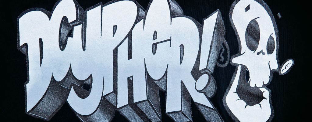
Gearing Up – Dcypher Apparel
Since returning home from a stint living in Los Angeles, Dcypher has quickly cemented his reputation and one of Aotearoa’s most talented and prolific mural artists, without missing a beat with his signature graffiti pieces. With his artistic roots firmly planted in graffiti and skate culture, his art has always teemed with the energy of street culture. Much of Dcypher’s work, including his graffiti, reflects the urban cityscape and elements of urban culture, making for the perfect aesthetic for his latest undertaking – the street wear line Dcypher Apparel.
T-Shirts have long been a staple of urban culture; the DIY fashions of Hip-Hop and Punk have celebrated the statement potential of the garment, while the physicality of skateboarding means loose-fit comfort provides a practical attraction. From Jimbo Phillips’ iconic Santa Cruz Screaming Hand, to the Bones Brigade, Powell-Peralta and Vision Street Wear designs, Zoo York and OBEY, tees have been a way to proclaim your cultural, political and stylistic affiliations. Likewise, t-shirts provide creatives with a canvas that reaches a wider audience, stretching beyond the wall or the gallery.
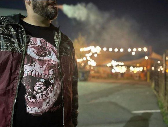
As a skateboarder and graffiti artist, t-shirt designs were a natural progression for Dcypher, his bold illustrative and graphic style translating well to the printed format, while his imagery was already attuned to the urban wear aesthetic. Inspired by the likes of Evan Hecox’s Chocolate Skateboards, he began dabbling in the idea of t-shirt designs while still in Los Angeles, producing images for his CBS crewmates. Dcypher initially considered an online, made-to-order approach, scaling down overheads, but the hyper competitive US market made it a tough proposition to crack.
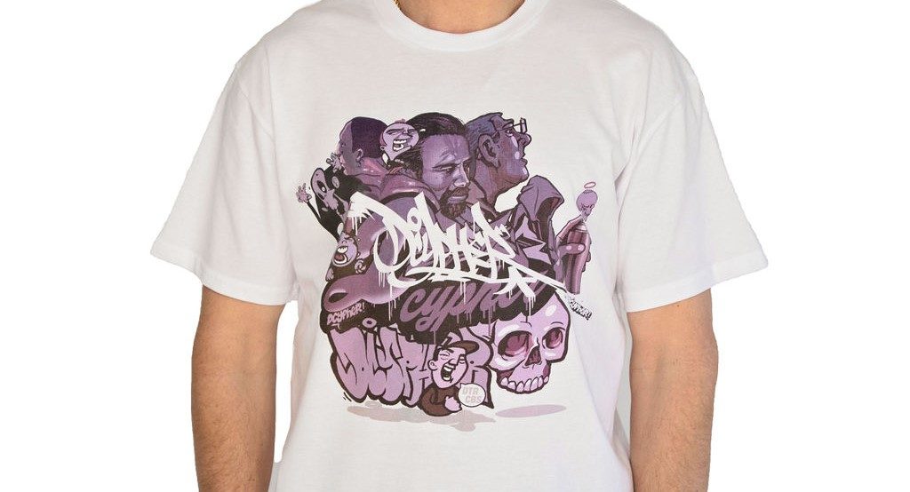
By the time he returned to Aotearoa, Dcypher had collated a stockpile of t-shirt images. Enter Tim Ellis, founder of fashion company Movers and Shakers. Dcypher had met Ellis through Truth Dubstep, when the artist had worked with the musicians on logos and promotional designs. Ellis brought the industry know-how, connections and capital to Dcypher Apparel, allowing the artist creative freedom to put his designs onto tees and into the world as creative director. The Dcypher Apparel brand was born.
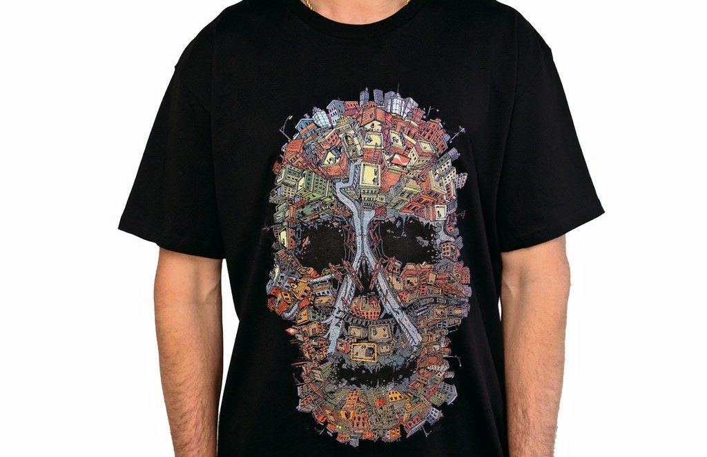
While initially hesitant to use his hard-earned graffiti name as the brand identity, it has ultimately proved beneficial due to his reputation in the urban art world. As creative director, Dcypher leads the designs, but also ensures he has input in where the shirts are stocked, choosing locations based on their connection to skate and graffiti culture, providing the right audience for the brand and a sense of authenticity. There is always a tricky line between making a brand accessible and still elevating it above mass-produced fast fashion, making sure it gets into the right hands – urban wear and youth culture is all about influence. Locally, the tees are available at Embassy on Colombo Street and Encompass at The Tannery, as well as further afield at Cheapskates Wanganui, Fusion in Wellington, Pavement in Dunedin and The Plugg in Kaitaia. Dcypher acknowledges these locations guarantee the right audience and, vitally, respect the cultures that gave birth to the brand.
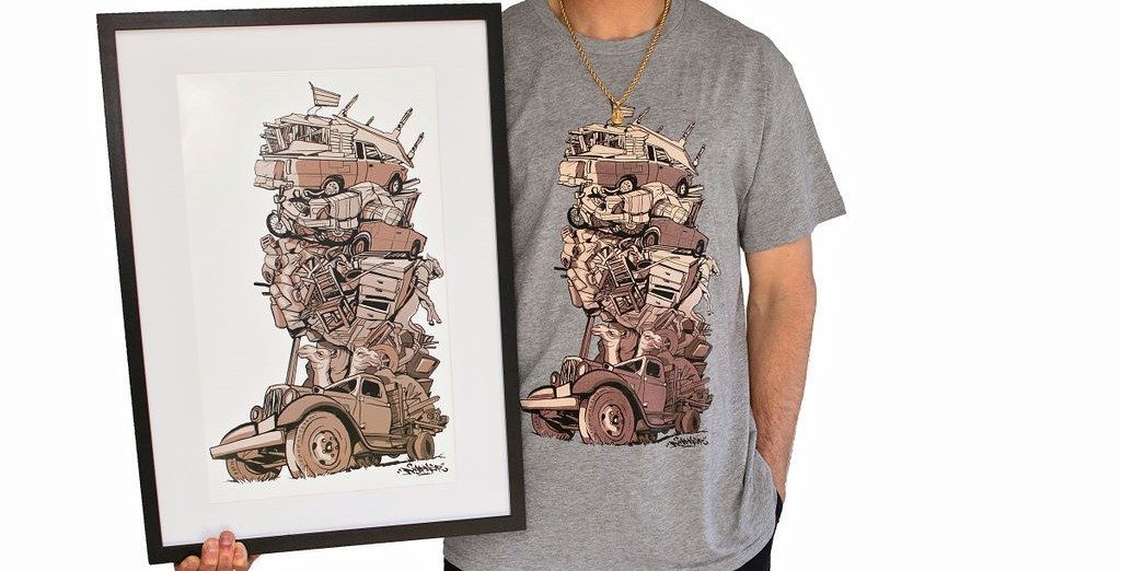
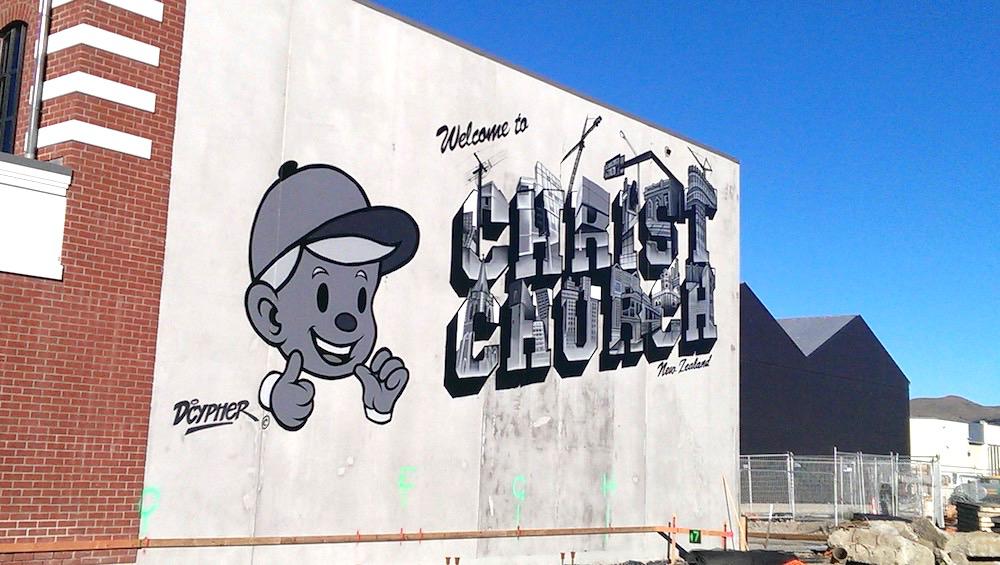
Although Dcypher’s personal style leans towards the understated these days, favouring a plain black tee, the lure of a t-shirt serving as another platform for his art is undeniable. Rather than developing a completely new approach, Dcypher’s t-shirt designs are drawn from his mural, wall, studio and digital designs, the artist feeling his way through the process and making changes where needed to suit the cotton canvas. And yet, the designs can also be unique from large-scale works, which often require more compromise. The t-shirt graphics are free-form, following the artist’s interests as they develop, rather than being proscribed by briefs from above. The designs (on upsized tees, as preferred by skaters who value the freer movement) feature urban landscapes, Dcypher’s signature skulls, characters and graffiti pieces, sometimes all worked together. Other works take on specific narratives, from corporate greed to Noah’s Ark and Eastern influences. Dcypher’s iconic, but now obscured, Welcome to Christchurch postcard mural (the text mid-construction in reference to the rebuild), has also been rendered as a design. With a growing range, Dcypher continues to develop new ideas for seasonal release, including the exploration of glow-in-the-dark printing.
As an artist brand, Dcypher Apparel is less concerned with fashion trends, and more about the art and aesthetic as a reflection of Dcypher’s style. T-shirts, with their broad appeal and ability to reach a wide audience, allow the artist and his art to engage audiences in new ways. As Dcypher suggests, young people don’t often buy art, but they do buy t-shirts, and he hopes his tees can connect the two worlds.
For more about Dcypher Apparel’s range and for stockists, follow @dcypher_apparel on Instagram or visit https://dcypher-apparel.myshopify.com/
Josh Bradshaw – Things I Thought You’d Say or Don’t @ Absolution
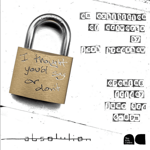
I got lucky with Absolution having their planned exhibition for June/July fall through last minute so with short notice I put my hand up to fill that slot. It’s been three years since my last show I’m pretty sure. Funnily enough, the last one was at Absolution too, so having my first show under my real name, making work in a completely different style, it feels right to have it in that space. I think most of the internal processes in the early stages of the research, developing concepts, mapping out ideas and weaving the work together to create a full show haven’t changed for me at all, it’s when I start physically making the work that the differences start to show up. I don’t have to do any mental gymnastics or justify to myself any compromises of my original ideas or warp any of the work to fit a particular style that I used to feel trapped by. Now it’s a much more free flowing and natural process. I’m not limiting myself and the work can go wherever it wants and needs to, I’m just along for the ride.
What was the genesis this specific body of work?
This body of work, which is still ongoing, came about because of the perfect storm of how much time I’ve spent living and walking around the city over the last however many years, how my brain works when I’m falling down the rabbit hole of over thinking about how much of a backstory and future a padlock or brick or window of a construction site that I’ve just walked past could possibly have. The curiosities, attitudes, mysteries and visual elements that come from all of my interests that I’ve had my whole life, like skateboarding, punk music and compulsively having to make stuff, added in the mix is how you get to this latest body of work.
You are adopting a range of techniques, is that about seeking something, or just a reflection of creative freedom?
Both for sure, I really enjoy the act of the reveal of printmaking and repeatedly trashing and scanning things and all of the not knowing what’s going to show up when printed or not. The element of surprise often determines what techniques need to be applied or removed on the next layer. With this loose approach comes that sense of freedom which in turn encourages even more experimentation. It’s a fun, self-feeding cycle. The themes that run through the show itself are based off a wide range of scenarios and materials from the city, which lends itself well to using a bunch of different techniques also.
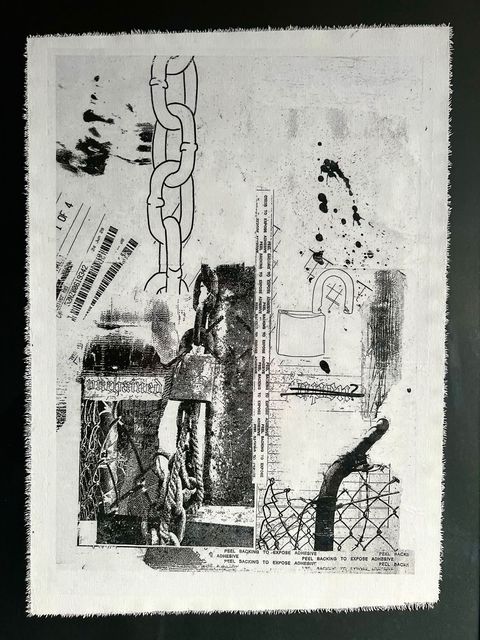
Tell me about the title for the show, it is evocative, but when you think about it, it doesn’t quite make sense, or at least, it doesn’t read quite right…
I made a lot of this work in reference to not only how we view things ideologically but also physically. Down to that moment of hesitation where stop and go back for that little look through the fence or broken window. The title of the show is an example of that little double take you have to do to see what’s going on. Things I Thought You’d Say Or Don’t is the awkward, only partially seen, peer through the fence version of “The things I thought that the city was saying/showing to me or maybe what it wasn’t actually saying”.
Black and white is predominant, is that intentional symbolically or a result of the techniques?
The lack of colour is a bit of the result of some of the techniques, like flattening out a collage with a black and white scan but I use it mostly to intentionally remove any of the context of the elements I use from the city. I feel that it encourages people to see something in a new light. Once you remove something from its intended purpose you can run wild creating a new life for that thing.
Do you make these works with the idea of exhibiting? I feel like they have a sense of fitting in various spaces/sites, like they don’t need white walls to exist, they have the practicality of punk in a way…
With the work being based on how we view our city and things from it, I think it would be just as interesting to see the work on a gallery wall as it would be to have it put up on a street wall or construction fence. There’s something satisfying about the idea of all the references and elements being taken and given new context and then being put back up in the city. I did however feel that it was about time to have a show again and as long as I got to present the work as a collection I was going to be happy. The black walls of Absolution is just the added bonus, I’m stoked they had the space open up for me.
The people need to be at Absolution on Friday the 3rd of June at 6-8pm to see the opening of the show. If you can’t make that date, the show is up for a few weeks and if you can’t make that either then feel free to just open your eyes the next time you are walking through the city, the exhibition has been on for the last 10 plus years…
____________________________________________
Things I Thought You’d Say Or Don’t opens 6pm, Friday, June 3rd at Absolution in The Arts Centre
For more of Josh’s work follow him on Instagram
Showtime! Jacob Yikes – Even in Darkness, Fiksate Gallery, April 1st, 2022
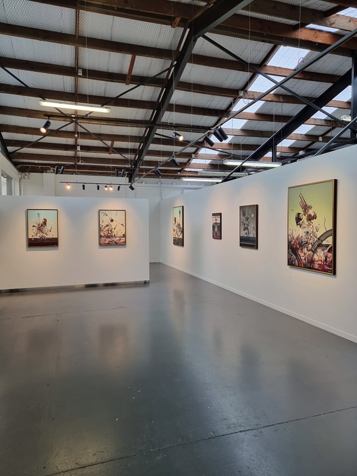
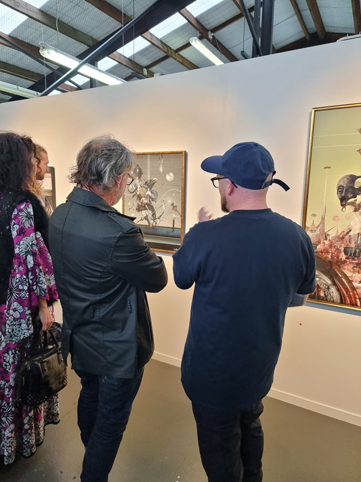
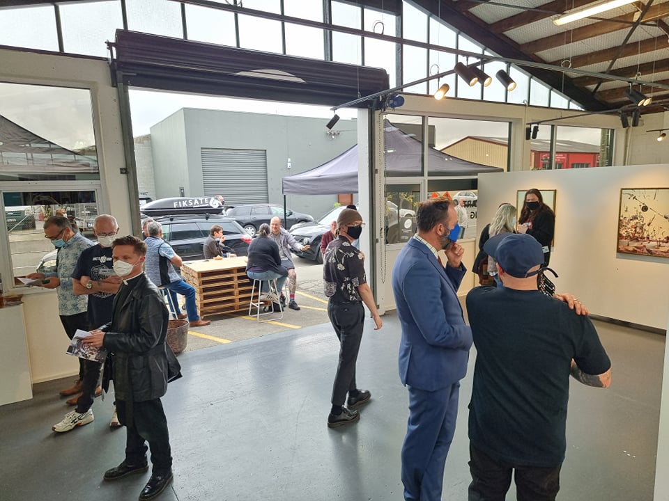
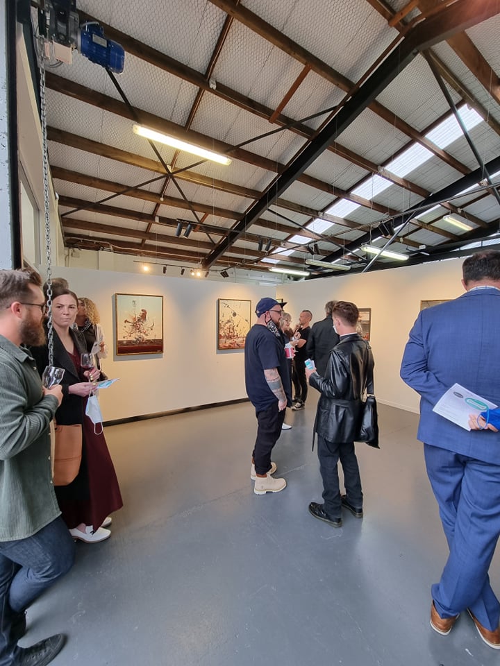
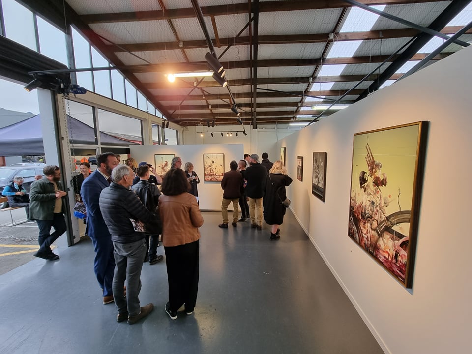
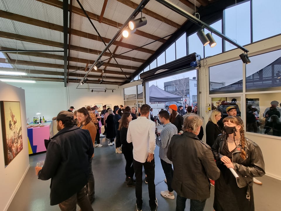
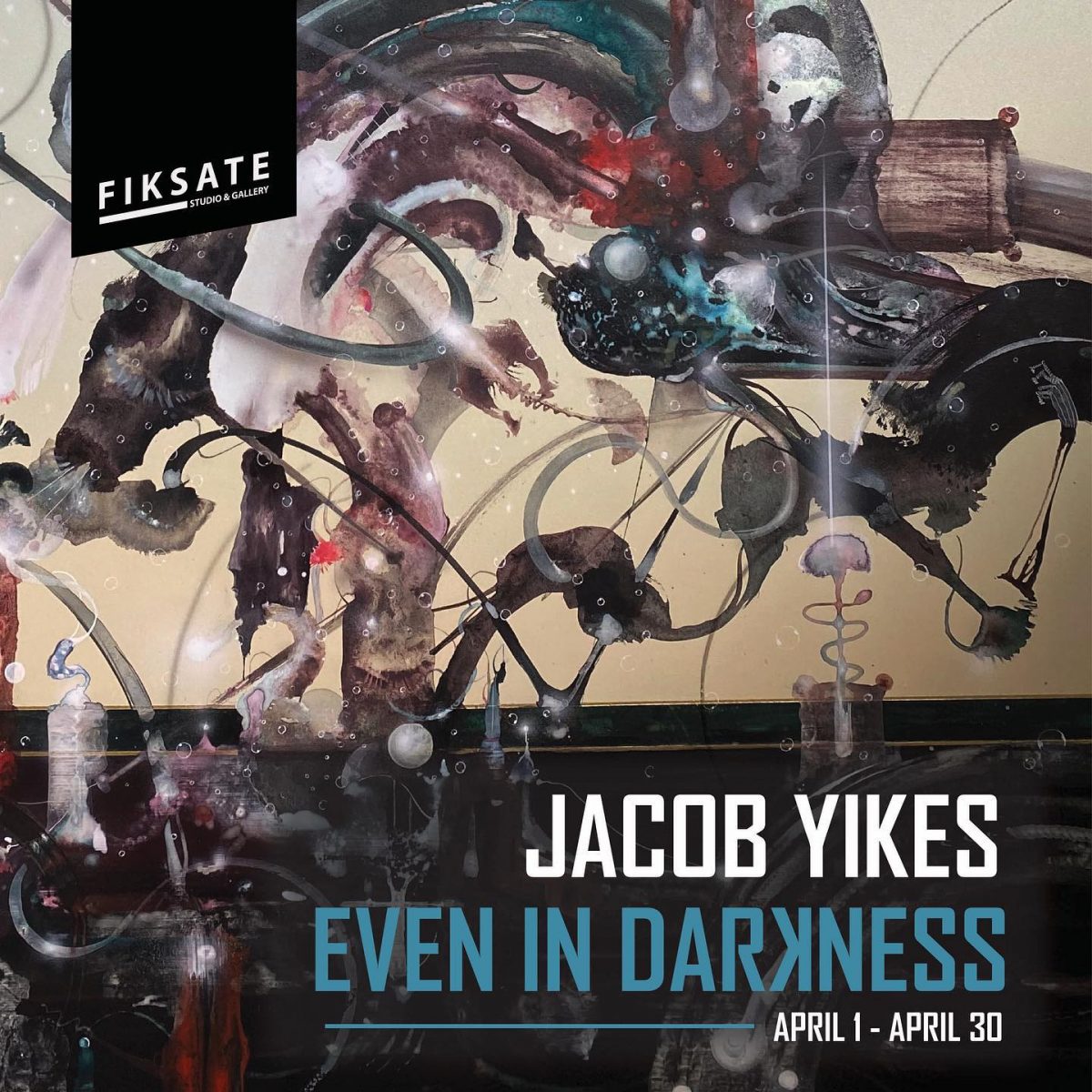
Jacob Yikes latest body of work, Even in Darkness, was unveiled at Fiksate Gallery on Friday, April 1st. The first solo show for the artist since 2018’s Bad Company (held at Fiksate’s former Gloucester Street premises), a reflection of the long road these paintings followed to realisation. A stunning collection of gestural, detailed, evocative and deeply resonant works, the crowd were enthralled by the incredibly honest, yet mysterious paintings. Drawn from the personal exploration of psychedelics to expand his consciousness and break his sense of ego, the paintings are an otherworldy experience…
All photos courtesy of Fiksate Gallery.
____________________________________________
Even in Darkness runs until April 30th at Fiksate Gallery, 54 Hawdon Street, Sydenham
Jacob Yikes – Even in Darkness @ Fiksate Gallery
We were lucky enough to visit Jacob Yikes in advance of his new show, Even in Darkness, opening at Fiksate Gallery on April 1st, 2022. We talked about the inspiration and genesis of the show; a body of work begun in the first nationwide lockdown of 2020. Rather than an interview, we were inspired to write about the show and the questions that arise from a deeply personal yet incredibly complex and psychological series of paintings…
The paintings of Even in Darkness are not easy to grasp. They are mysterious, evocative, and unsettling. They are filled with complexities. They are chaotic and dizzying while eerily still and quiet. They feel deeply personal and somehow universal and ultimately, not of this world. They are confident and assured, and yet they give little away, meaning must be teased out. There are familiar, recognisable elements, but the wider scenarios, and the juxtaposition of the disparate parts, proves beguiling and elusive. They reach for something unknown; they require surrender.
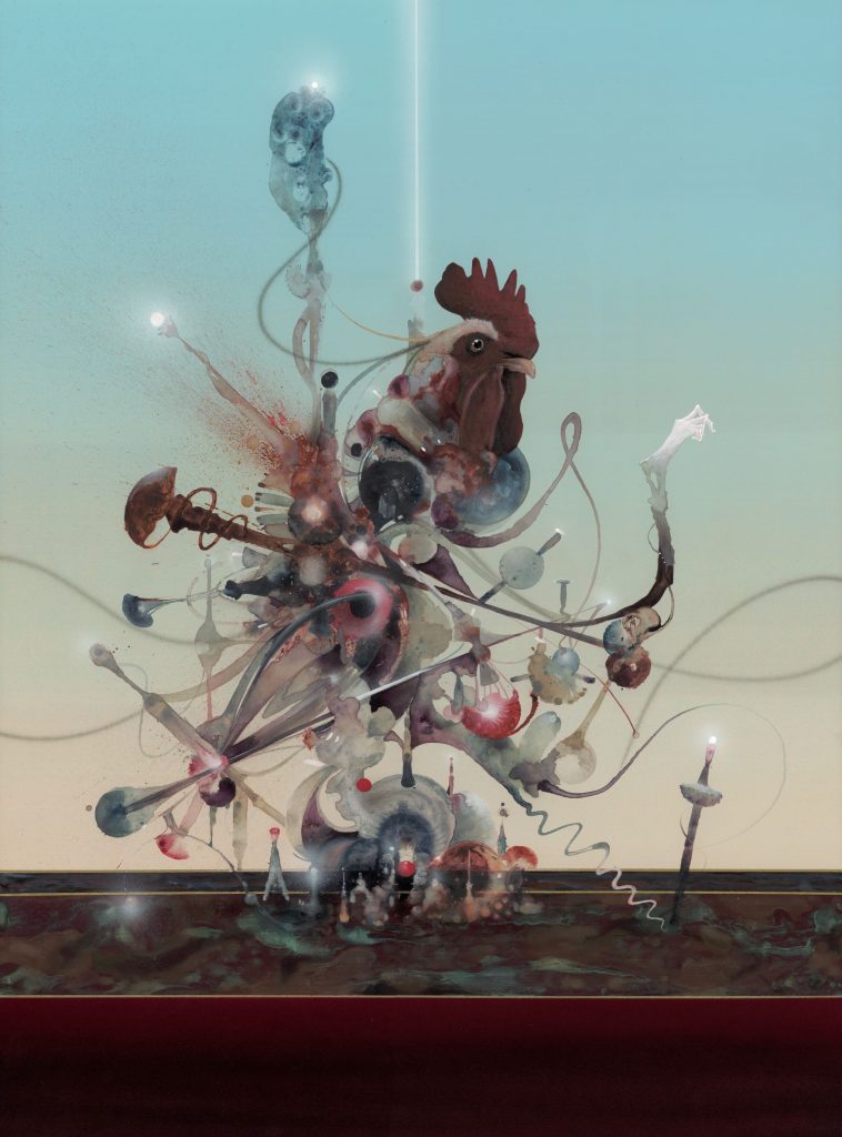
Yet this dilemma is not solely faced by the audience. The artist has navigated a darkened path through the genesis of these paintings, at times guided by an unseen hand, understanding only the need for the paintings to emerge. Even in Darkness represents the artist’s journey, not answers.
Even in Darkness is a direct result of Yikes’ experimentation with the spiritual and medicinal potential of psychedelics. Researching the use of plant-based medicines, Yikes explored strong doses of mushrooms as a way to unlock experiences and in particular to question his own understanding of ego, consciousness and reality. In a darkened bedroom, Yikes underwent a life-changing experience, communing with other-worldly forms. The intense experimentation allowed Yikes to break himself down and piece everything back together; a new, clean version of himself reborn in the aftermath.
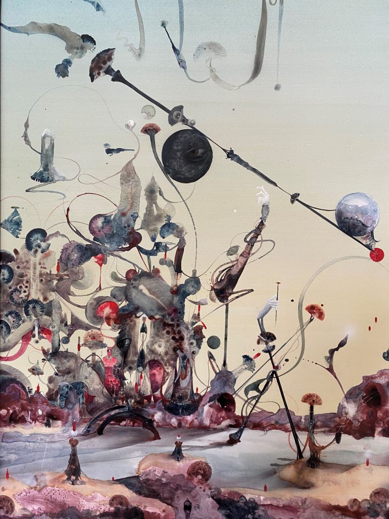
Powered by an energy beyond himself, painting became the process for Yikes to attempt to explore and decipher these essentially indescribable experiences. Painted through intuition and feeling rather than deep, focused thought, the paintings have guided Yikes, speaking to him and telling him when to work and when to step away, the artist willingly surrendering control.
Each painting in Even in Darkness has undergone the same process, beginning with the painstaking preparation of a pristine, smooth surface, layers of sanded gesso and paint creating a tabula rasa from which the image to spring forth. The blank slate a microcosm of the artist’s internal journey. With the artist working on multiple pieces simultaneously, each painting began to take shape, elements constantly built upon each other. There is a greater sense of spontaneity and fluidity in these works, an instability that suggests that these images are actively seeking form, attempting to piece themselves together, stewing, pulsing, growing and changing. This quality is evident in the lack of defined line work, the impulsive qualities of the materials and their application left to breathe and form, like smoke.
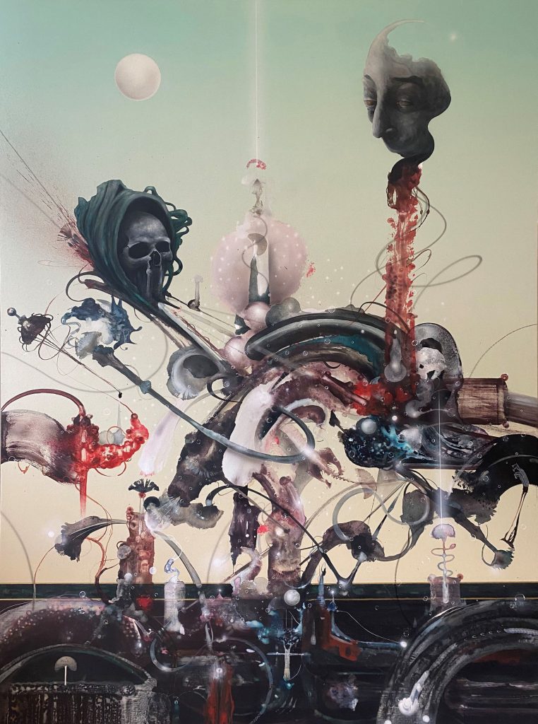
While less interested in representation, there are still recognizable elements across the paintings. In A Temple Full of Chemicals, a rooster serves to evoke ego, while in Death Came to Dinner, a black raven signifies death, both speaking to Yikes’ own experience of ego death. Grotesque faces and hands and beams of celestial light reaching across and through the scenes highlight the ethereal presence felt by the artist throughout his experience. Yet, other elements merely hint at something familiar; architectural and organic forms (notably mushrooms, the conduit that unlocked the artist’s access to these strange realms) amidst strange terrains provide a tether between the known and the unknowable. Similarly, the horizontal strips that occur across the works serve as a grounding device between this world and the domains beyond.
These paintings are challenging. They represent a challenge willingly taken on by an artist constantly pushing himself, both creatively and experientially. While they capture something beyond explanation, these paintings are also inviting. So, step into them, gaze deeply and explore, because even in darkness, there is light to be known.
Even in Darkness runs from April 1st, 2022 to April 30th, 2022 at Fiksate Gallery, 54 Hawdon Street, Sydenham
Tune! – with Dr Suits
Next up on Tune!, our ever-expanding playlist of the music that inspires our creative friends, is Dr Suits. If Dr Suits is painting in his studio space at Fiksate, chances are there is a classic Reggae, Ska, Dub or Rocksteady vinyl playing. With an impressive collection of vintage and re-released vinyl (trips to Ride On Super Sound are a common occurrence), the music is a strong influence on his creative process, setting the mood for for his work and manifesting in various ways. For Tune! Dr Suits takes us on a trip through these vital and influential genres…
____________________________________________
Music is a fairly important part of my creative process. I use music to help me get in a calm and consistent frame of mind. To do this, I like to play vinyl, predominantly Dub, Rocksteady, Ska and Reggae. The older the better. What I like about this music is its experimental and honest imperfections you can hear in the music. The artists are more about exploring a concept rather than trying to perfect a composition. Plus I generally love any old Jamaican music!
Playing vinyl means I’m engaged in the act of listening, its much more tactile. I like the physicality of flicking through the crate and experiencing the artwork, opening the cover, admiring the details on the insides and the sleeves. Each record will have 4-6 tracks on one side, this means every 20-30 mins of listening, in no time, I’m back there exploring the music again. So, although I like the tunes, I also love the vintage graphics, photography and bizarre outfits of early avant-garde experimentalists of Jamaica.
It’s hard to pick 5 albums, so I’m going to aim to cover the genres listed above…
Jackie Mittoo – The Keyboard King
The Skatalites – African Roots
Lee Scratch Perry – Cloak and Dagger
Studio one – Rocksteady Got Soul
Trojan Records – Rudeboy Rumble
Tune! is an ever-growing playlist of music that inspires our artist friends!

