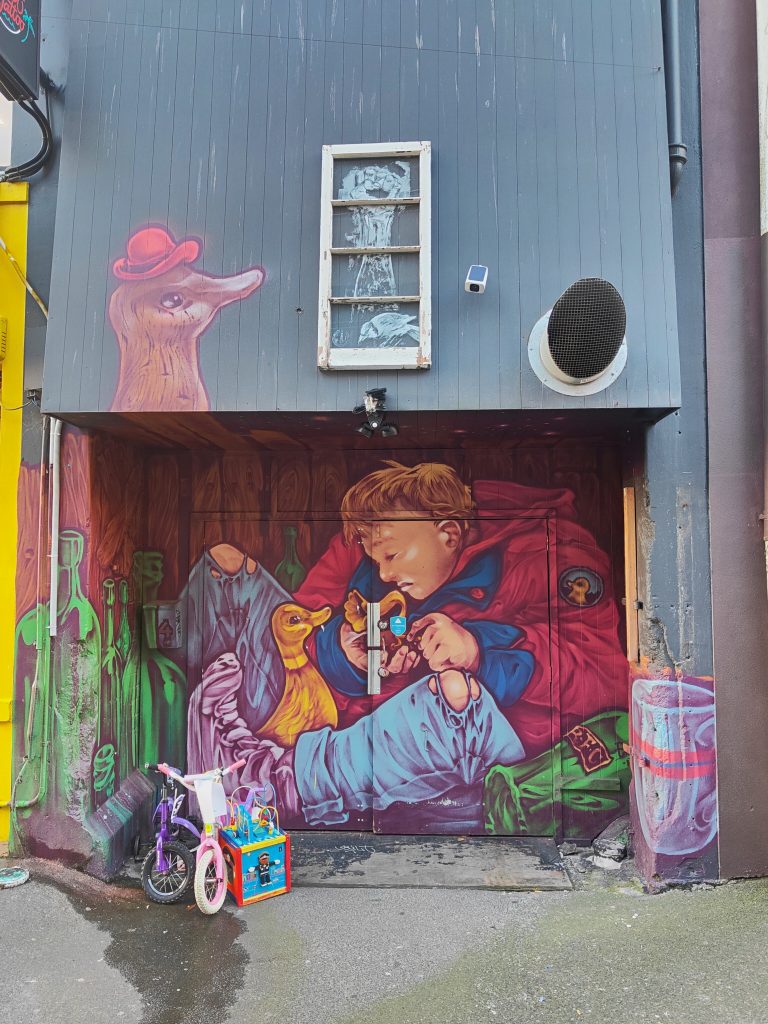
The next entry in our ever-growing playlist of music that inspires our favourite creatives comes from graffiti artist Peaz. With a mix of hip-hop, low-fi, pysch and blues, these cuts are a perfect blend and reflection of the artist’s tastes and a world view that is about the present and the importance of expression and experiences…
Peaz: I love all kinds of music, especially depending on which part of my life journey is being experienced. Everything from early psychedelic rock to the newer styles, doom, hip hop, blues, jazz and metal. Much like graffiti, I especially value artists with a message, who have a story to tell. There is a lot to be said for music and art that makes us look a little deeper and think a little differently. Most of the artists listed here constantly remind me of what’s really important in life and existing, much like being active as a writer. It’s about looking at the bigger picture and being here, now; living in every moment and expressing oneself as authentically as possible. It’s almost impossible to sweat the small stuff when creating and experiencing, so I suppose that’s what makes music more meaningful to me.
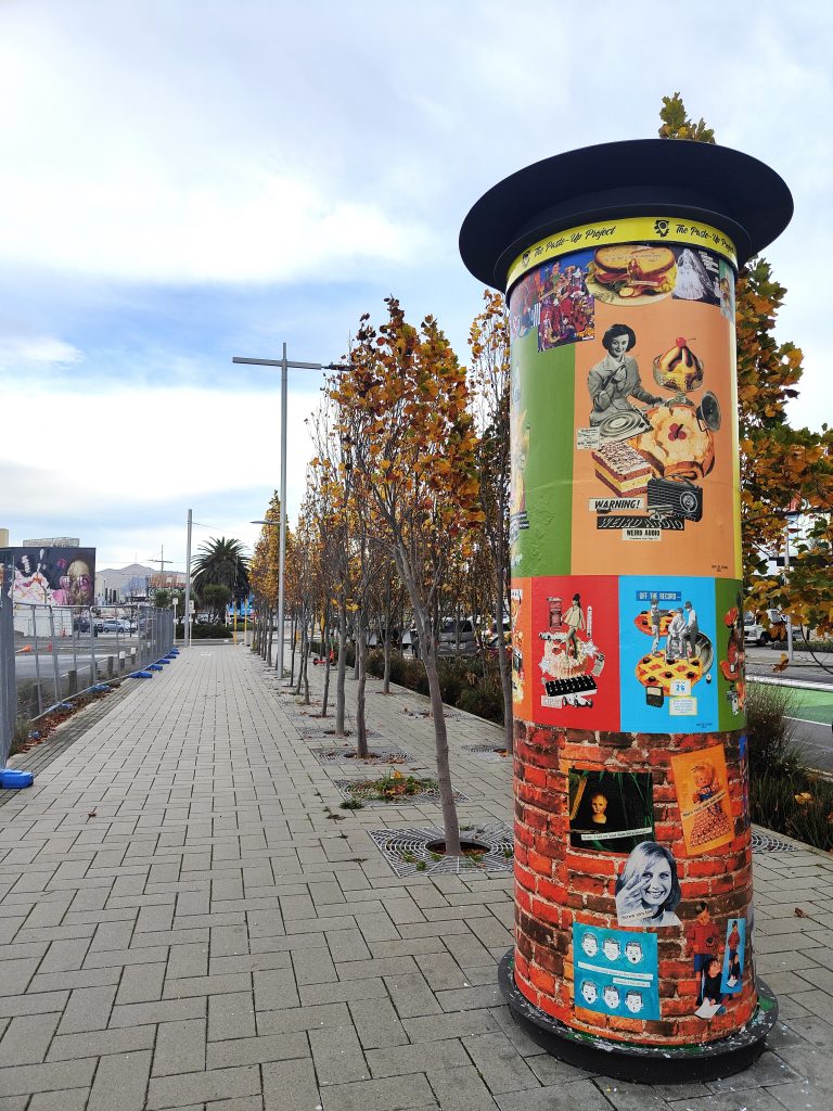
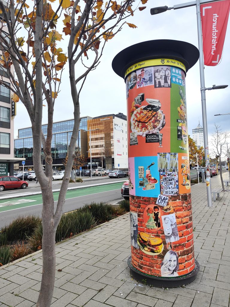
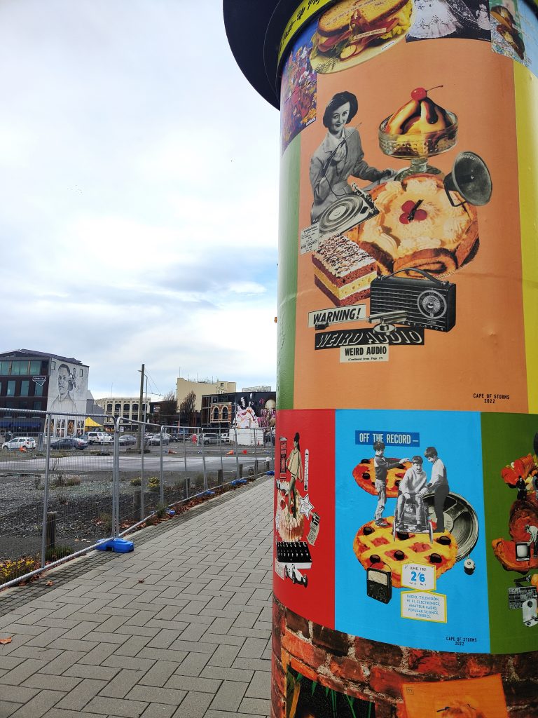
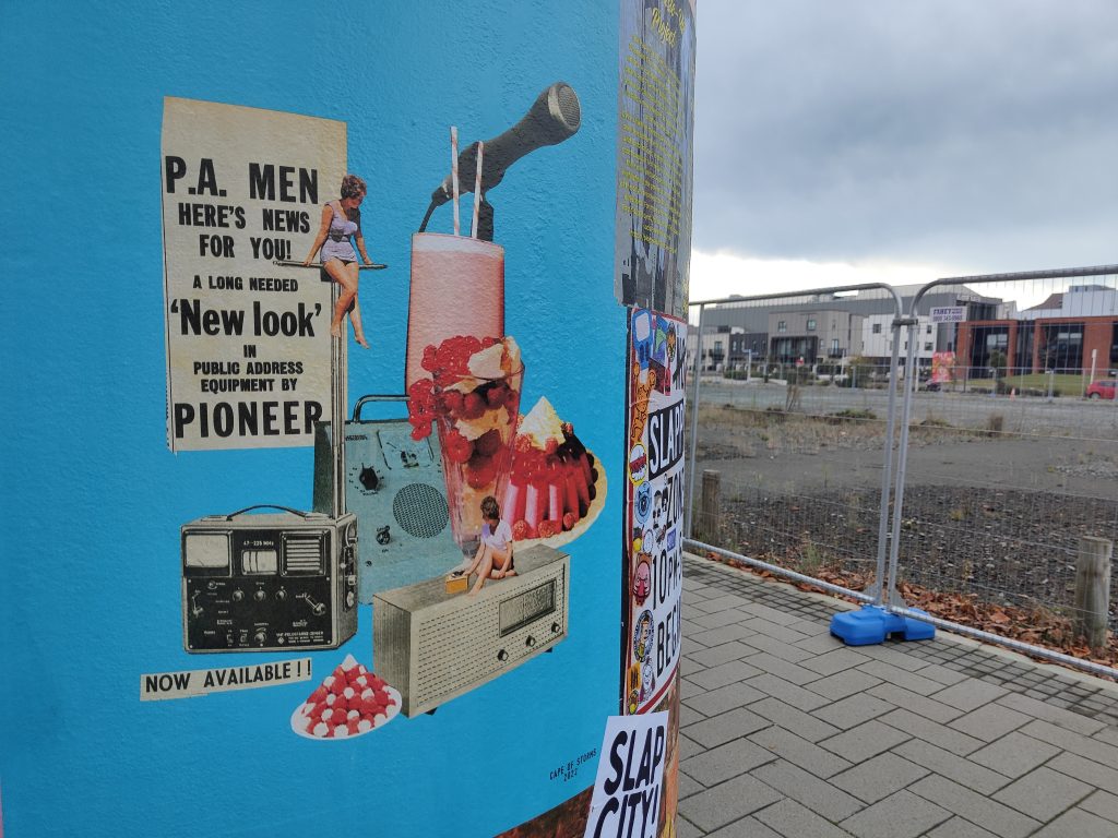
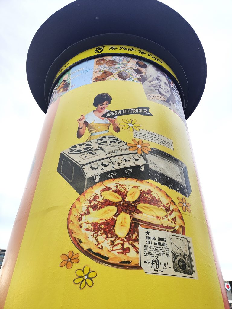
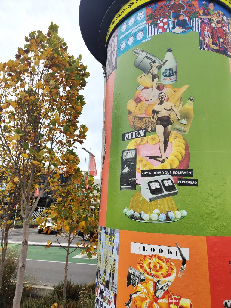
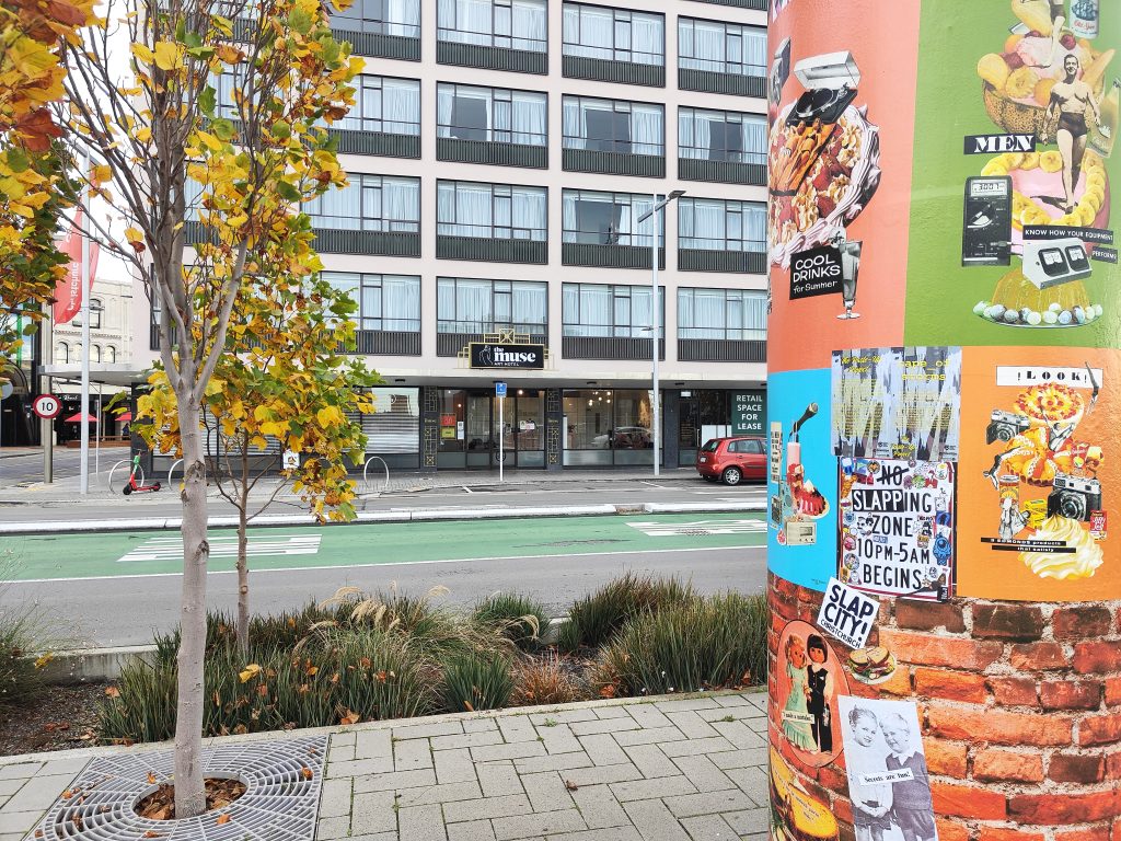
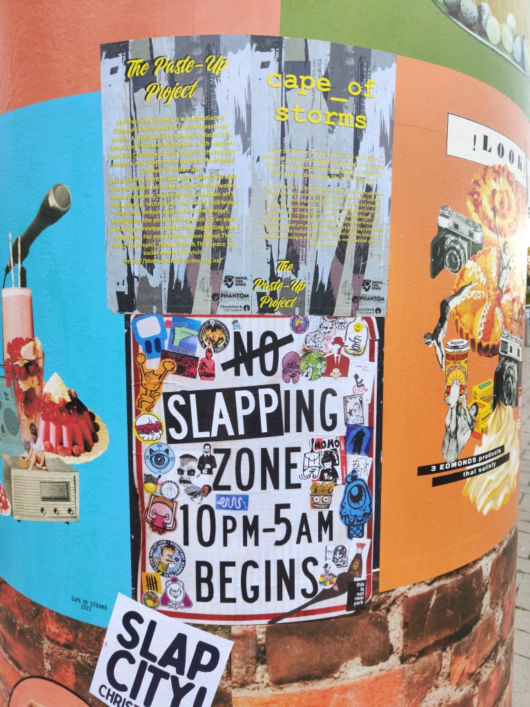
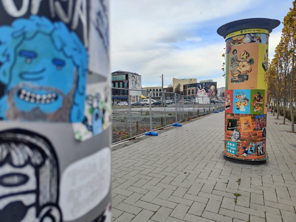
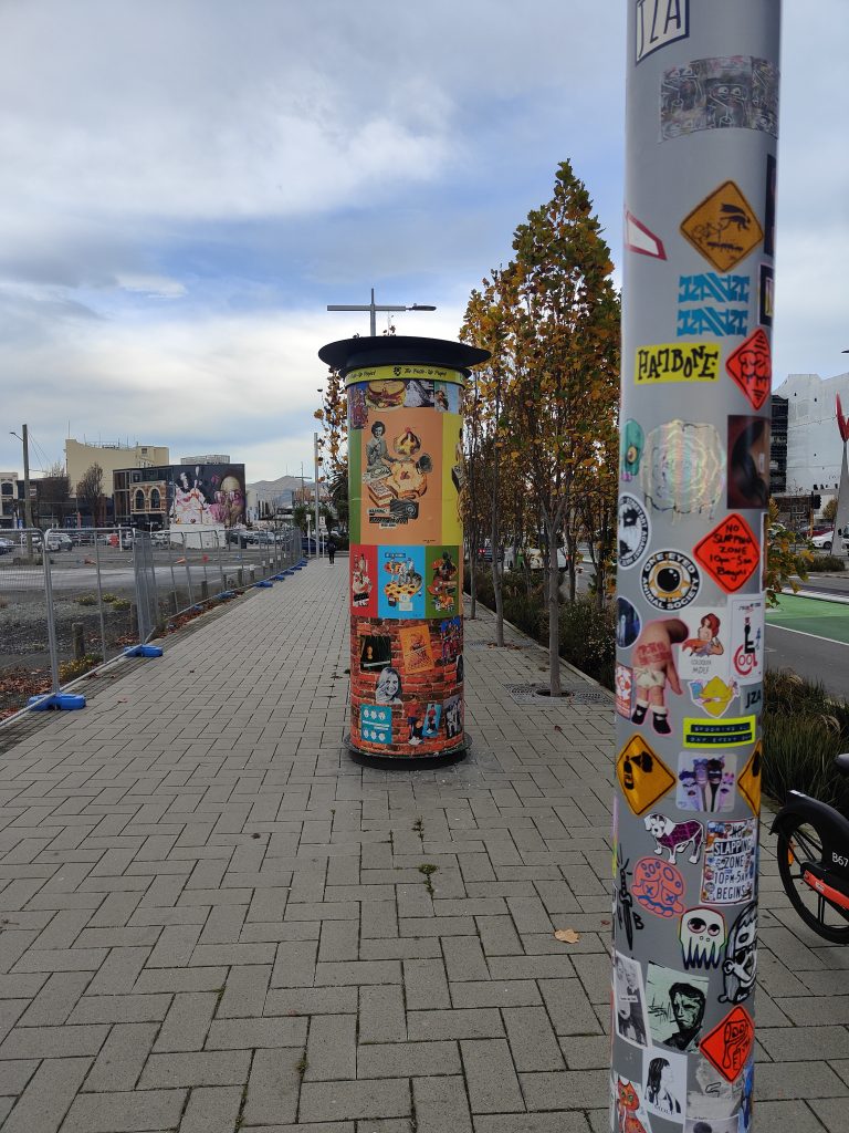
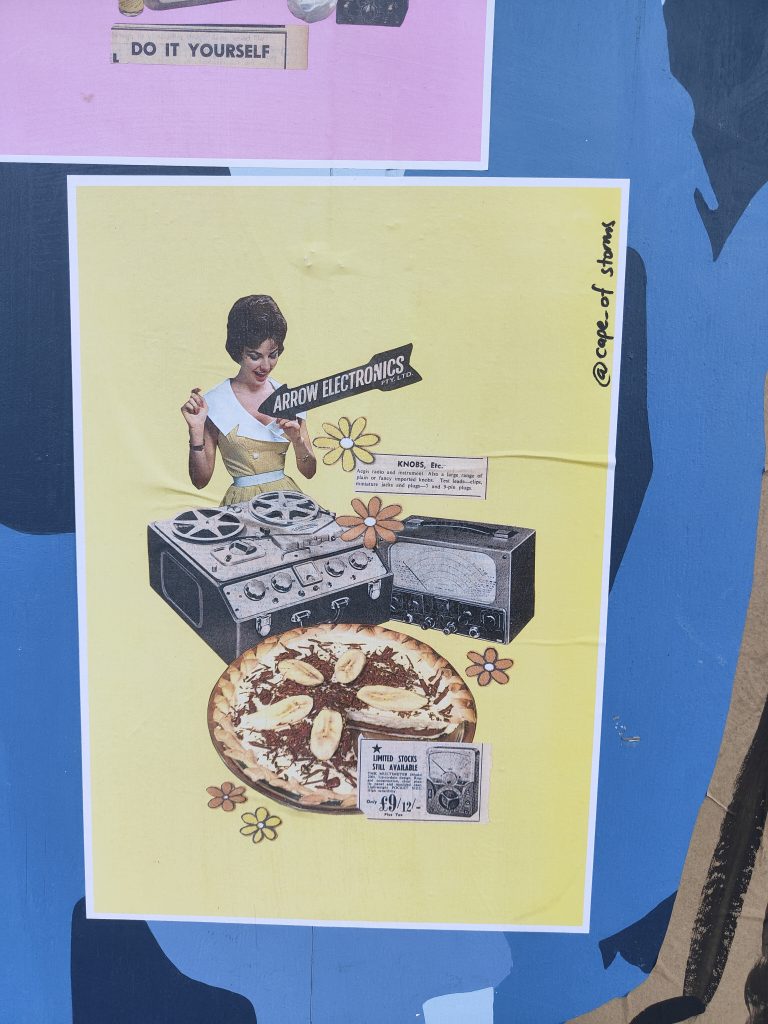
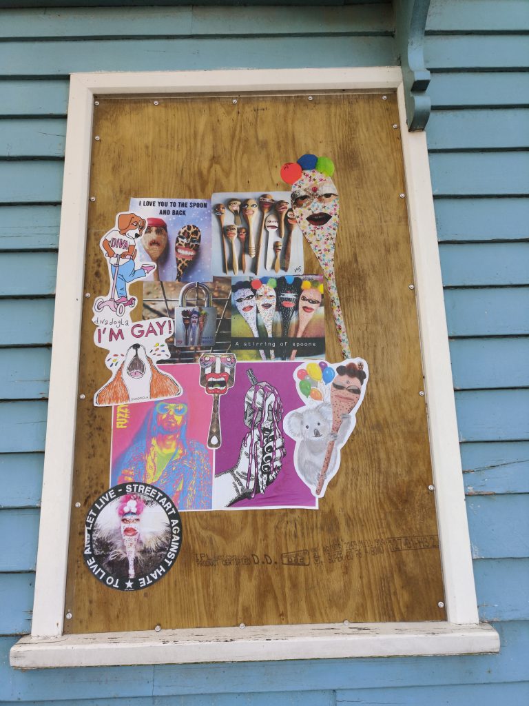
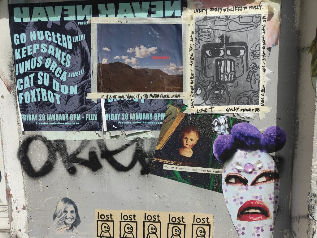
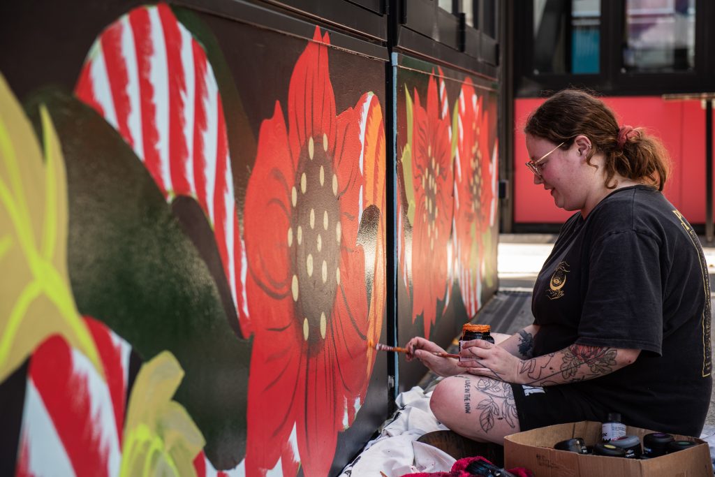
Urban collage artist Cape of Storms became the third contributor to the Paste-Up Project in early June, her bright installation completed in glorious sunshine. The concept, drawing on the artist’s experiences acclimating to life in Aotearoa through the lens of humorously juxtaposed vintage magazine and advertising imagery, provided a reflection of the advertising often found in our urban environment, almost tricking the passing audience into a sense of normality. Upon closer inspection though, the bollard was filled more playful and acerbic content, including a brick wall section packed with a wide range of images. The result was a bold production with electric colours gleaming in the sun, simultaneously covert and unmissable.
But, then the weather changed and the installation was faced with a slew of challenges. As torrential rain hit Christchurch, the paste-ups started to peel and soon, it seemed as though people had pulled the pieces off, leaving the bollard naked in places. Luckily, part of Cape of Storm’s concept was the incorporation of friends’ work to be added over time, and this unfortunate series of events provided the opportunity to refresh the bollard on a large scale.
Cape of Storm’s installation has not only provided a bold burst of colour, but a fascinating narrative that ties into the nature of both paste-up art and the process of making art in the urban environment…
____________________________________________
Kia ora! Would you like to introduce yourself?
I am Cape of Storms, a Christchurch-based collage artist, I collect obscure retro images and phrases and put them together in a fun and quirky way.
What was your initial reaction to the Paste-Up Project proposal?
I was very excited by the concept, and also daunted in equal measure at the sheer size and scale of the bollard surface area. I typically work no larger than A3-sized pieces and often very detailed and refined. It takes hours to hunt out and combine different images together into one cohesive new image. I hand-cut and glue everything with just a pair of scissors or a small craft knife, arrange and overlap, and then carefully glue everything together. Some of my pieces are comprised of 30 or more smaller images and words! So, the challenge of this project was filling in all that open space. In the end my approach was to try to go big, but also fill the space with as much as possible to keep it interesting and provide a piece of art that had several dimensions to it.
With two artists having already contributed to the project, were you primarily interested in doing something different?
Yes, I was keen to do something unique to my style and stay true to that – I think my art style is so significantly different to both Teeth Like Screwdrivers and Bloom n Grow Gal‘s that it wasn’t too hard to be different!
What is the central theme of your installation and how does it relate to your existing work?
The installation is a progression or continuation of a new style I have been working on for about a year now, which I am really enjoying.
I have titled the series covering the bollard Foreign Objects. Being a foreigner living in New Zealand, I am continually getting to grips with my identity and trying to relate to my surroundings, often times feeling like a fish out of water. As a lover of nostalgia, I found myself combining these two themes.
Throughout this series I intentionally tried to create a silly, nonsense, imaginary world that could reawaken nostalgic memories in the viewer. Over a period of months I sourced hundreds of different found images – from old cook books, special interest magazines, newspapers, catalogues and children’s books from bygone eras. Things I remember seeing in my mother and grandmother’s house during my childhood growing up through the 90s. To many younger people, these images might seem totally foreign or out of place in modern times, as they are simply just not in common use any more. So through this use of retro “foreign” objects and arranging them together in weird, silly and fun ways, they all come together and are recognisable and familiar as a whole, something that the viewer can relate to. I tried to select a range of bright candy colours for the background which would stand out on the grey inner-city street-scape around the bollard. The candy-coloured palette also reinforced the nostalgic theme. For me, this ended up being very effective at inviting the viewer in from a distance, to come up closer and look at the bollard in more detail, particularly in the heart of winter!
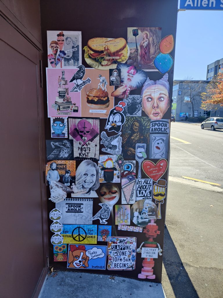
The brick wall section running along the bottom third of the bollard and the very top section running like a ribbon all around is a collection of my existing collage art that I have been pasting up on the streets of Christchurch over the past two years. It was nice to include these on the bollard as well, alongside the more considered poster series that I created especially for this project.
You decided to remove the spacers on the bollard, making it one consistent 360 degree surface – which makes the experience more continuous, was that the thinking?
I didn’t like the “frames” or physical boundaries the spacing strips created, I wanted each individual poster to look like another part of the imaginary world I was creating. I also wanted to encourage the viewer to walk right around the bollard and see the image as one continuous surface.
You have included some big prints but also some collaborative spaces, what was the intention of the brick wall?
The brick wall section was intended to be a space where the wider Slap City collective group of artists would jump in and slap up various individual pieces, just as we do on our regular paste-up missions around the city.
Unfortunately due to the intense winter weather over the last month and the group not being able to meet up so frequently, we weren’t able to get in and fill that area before about 80% of the bollard surface was damaged in the torrential rain.
But the damage to the bollard has now cleared even more space, so if we are able, we will try and cover the empty spaces up again in between now and when Mark Catley inherits the bollard – I’m very excited to see what he’s got planned!!!
Printing the large posters became quite a process, working with the team from Phantom, has that changed your thinking around your work more widely? And what other challenges did the whole process throw up?
I knew I wanted to print everything with Phantom – they are the experts and their prints are of amazing quality and designed to be more durable and last out in the elements (sadly the record-breaking wet weather we’ve experienced over the last month took its toll!). The trickiest part was maintaining resolution when scaling up from original A4 or A3 size to A0 size. I was really worried that the images would look pixelated and poor quality. In the end I put all my scanned images through a free online tool called The Rasterbator which I hadn’t previously used much before, but is very popular among paste-up artists, especially Teeth Like Screwdrivers, who encouraged me to get into using it. Luckily this helped tremendously in keeping the images sharp and looking half-decent. I then asked the assistance of the very talented Tom Horton, the printer at Phantom, and he worked his magic, did some test-prints and the posters came out so much better than I could have ever imagined!
The next trickiest part was the installation itself, which I found very challenging having never done anything of that size or nature before. My design relied upon the posters going up very neatly and level, and the curved surface was seriously difficult to work with, and certainly will not be under-estimated in the future. I was so lucky to have the help of my partner who is a painter, as well as Vez and JZA who were able to help me paste up high (as I embarrassingly have bad vertigo when up on ladders!). This project has again made me appreciate what a special, supportive group of people we have in the Slapcity collective, coming together to do awesome stuff, promoting our many and varied street art mediums and just generally have a cool time together.
What does the Paste-Up Project represent for you as an artist who works in the paper medium? Has it given you ideas for where you might be able to take your work next?
I was totally blown away by the opportunity to prepare a legitimate art installation all in paper-based form. We have a lot of murals and graffiti/paint/spray-based pieces all around the city, so it was really encouraging to receive a project like this especially for paper-based art. For me personally, seeing the sheer scale of the prints, and printing on very high-quality paper has added a whole other dimension to where I think my art could go in the future, and I can see new possibilities for future projects with scaling up and going big. Finding a way to cost-effectively create large prints and in a format that is durable enough to withstand the winter elements and last a little longer out in the streets is a serious challenge for paper-based artists.
Is there anyone you want to thank?
Watch This Space for the support and patience, also for the help cleaning off and preparing the bollard surface ahead of the installation! Phantom Billstickers – Tom, Jake and the team. The Christchurch City Council’s Enliven Places fund for funding and the opportunity. Teeth Like Screwdrivers for the advice, tips and tricks. Vez and JZA for the help pasting up on the day and going high up on ladders when I wasn’t brave enough! Bongo and Neil Swiggs for the donation of some seriously good old books and magazines that I used in a few of the collages. The Slapcity crew for the support & a source of creative inspiration.
And my partner Fernando for allowing the complete take over of my time and helping with the installation!
Stay tuned for our next artist announcement for The Paste-Up Project!
Follow Cape of Storms on Instagram for more collage-y paste-y goodness!
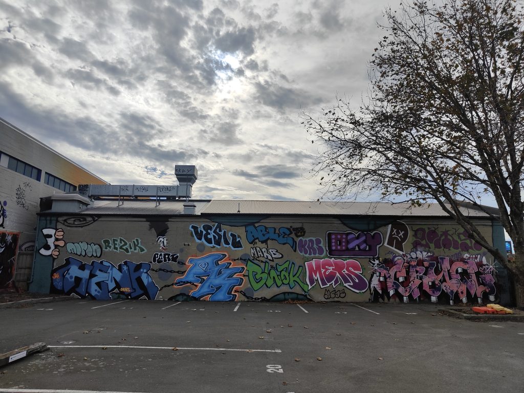
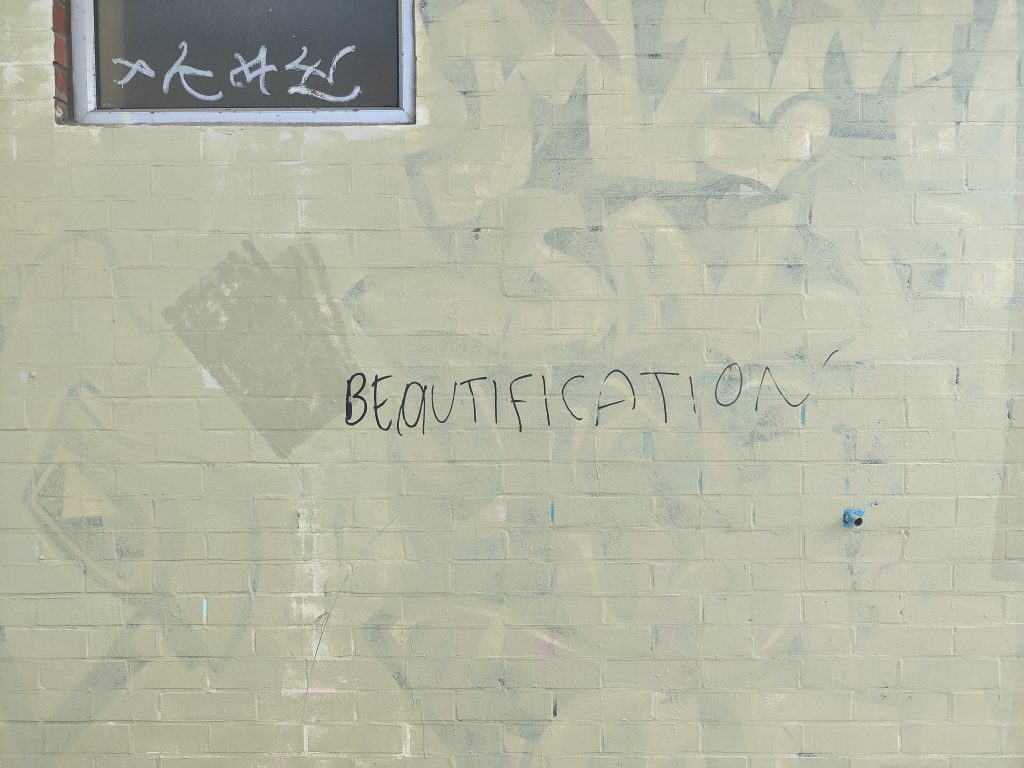
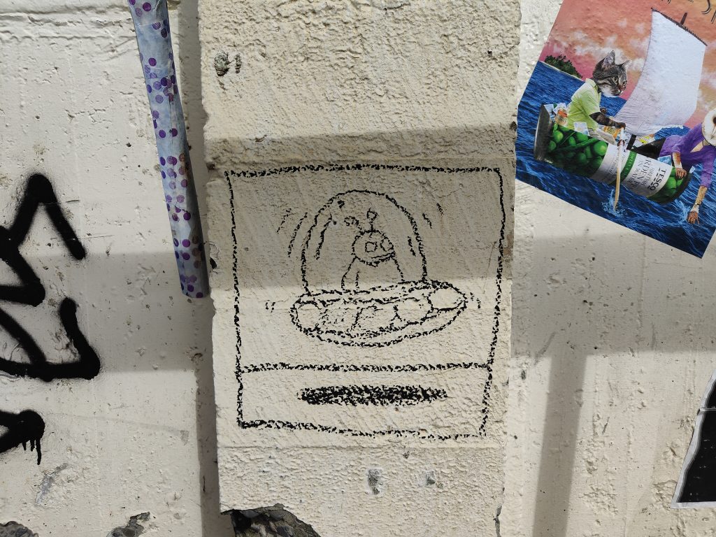
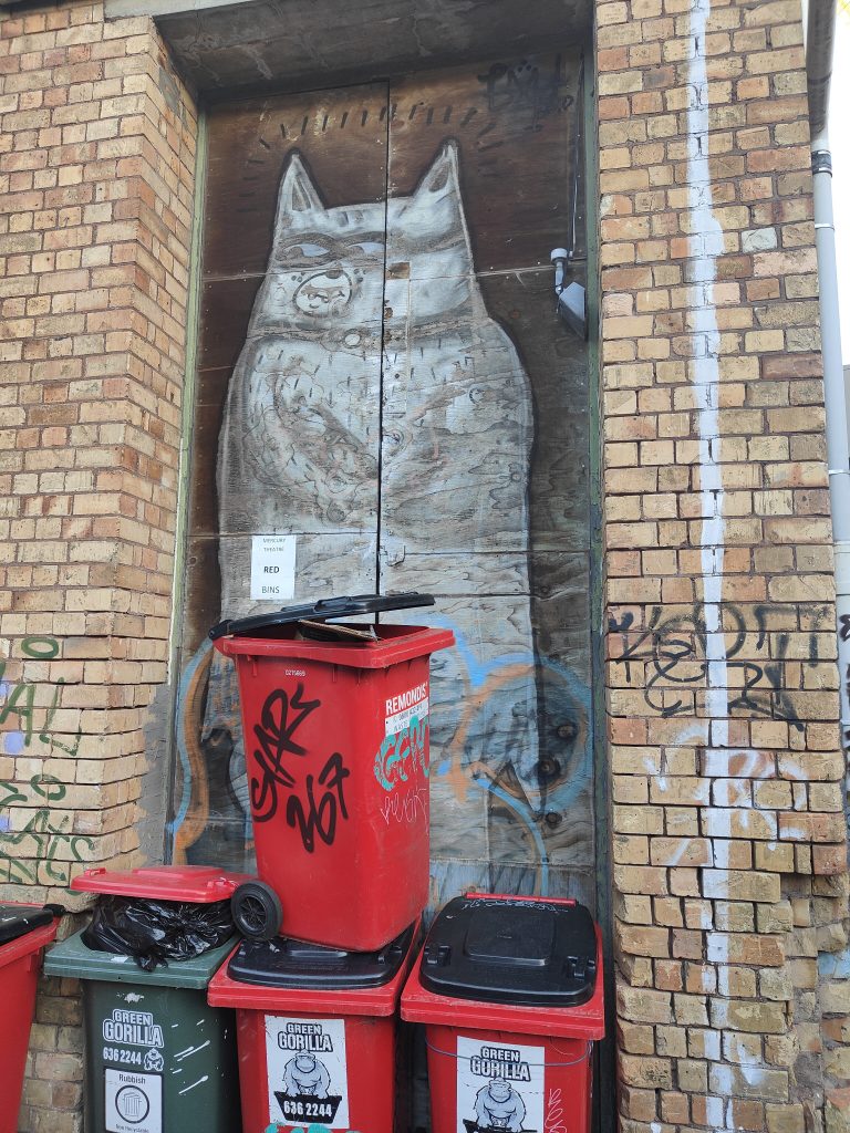
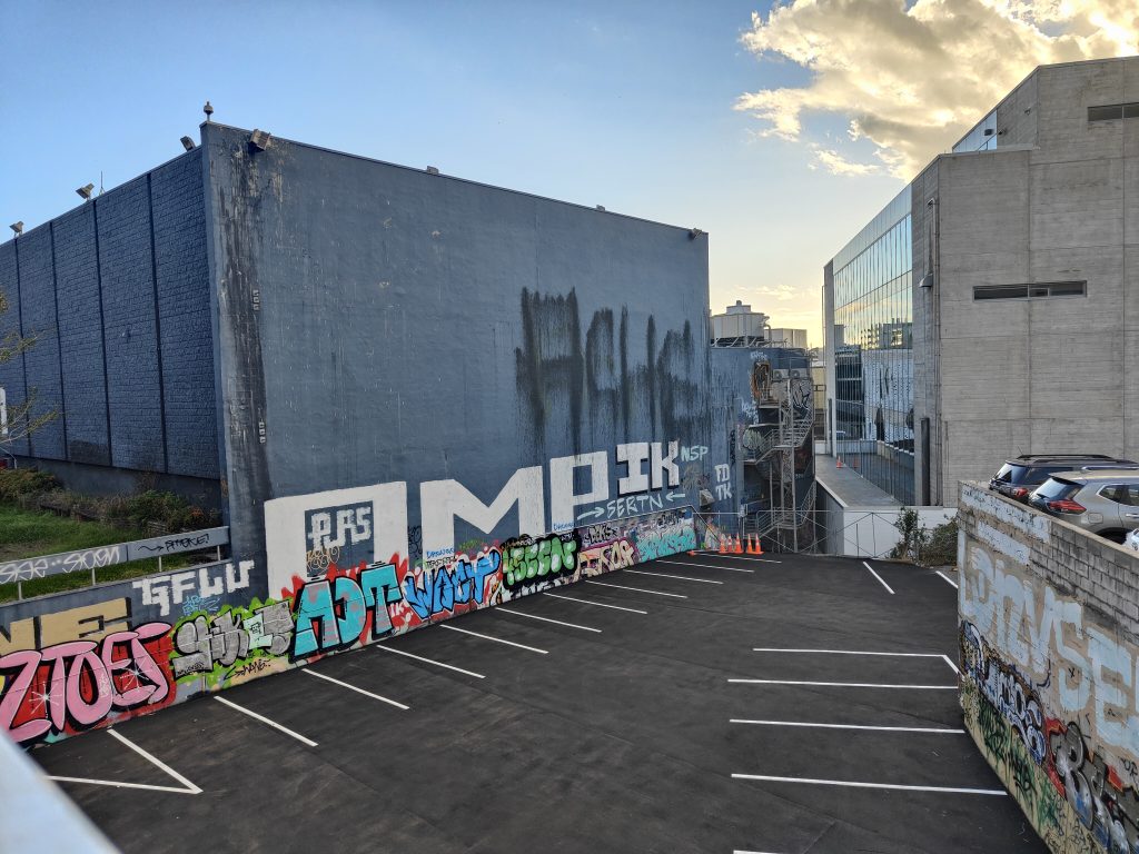
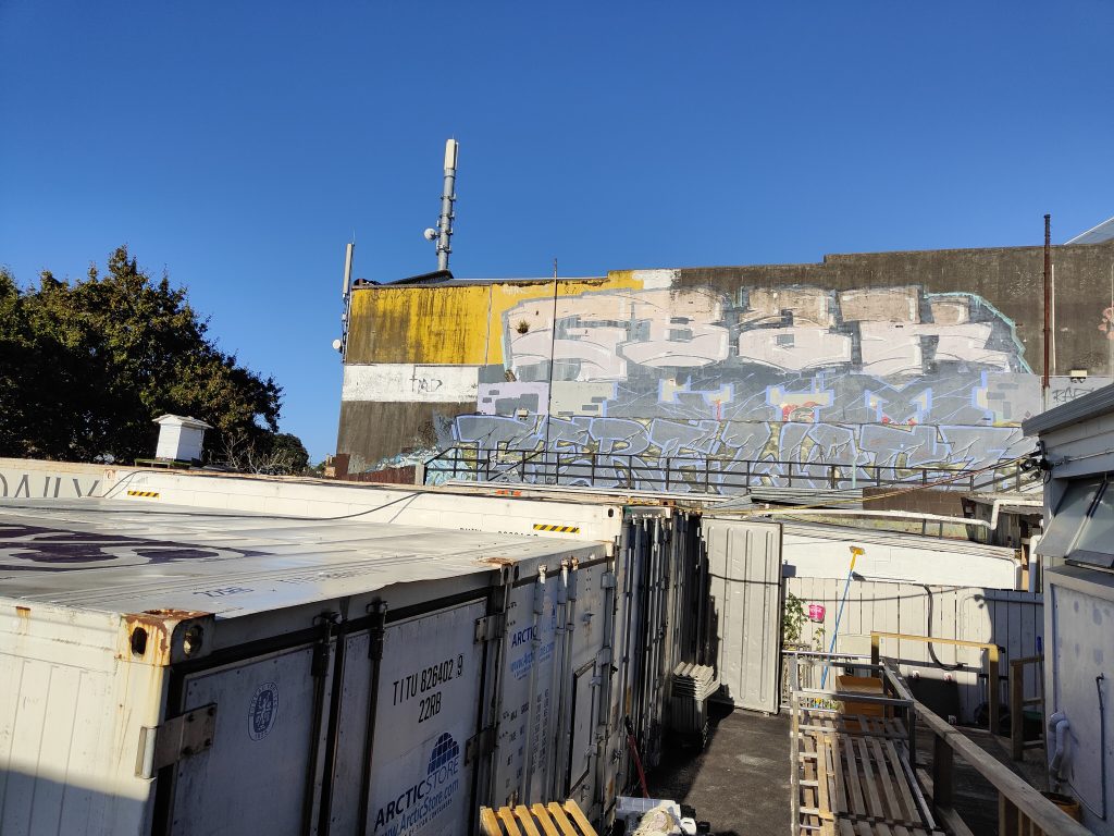
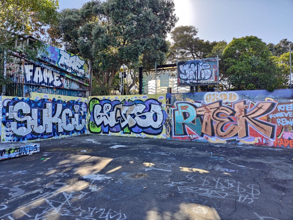
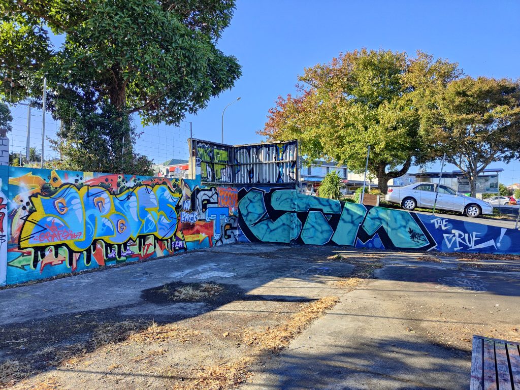
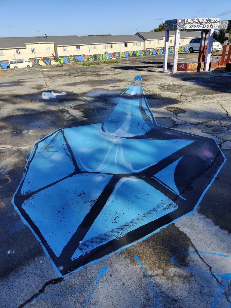
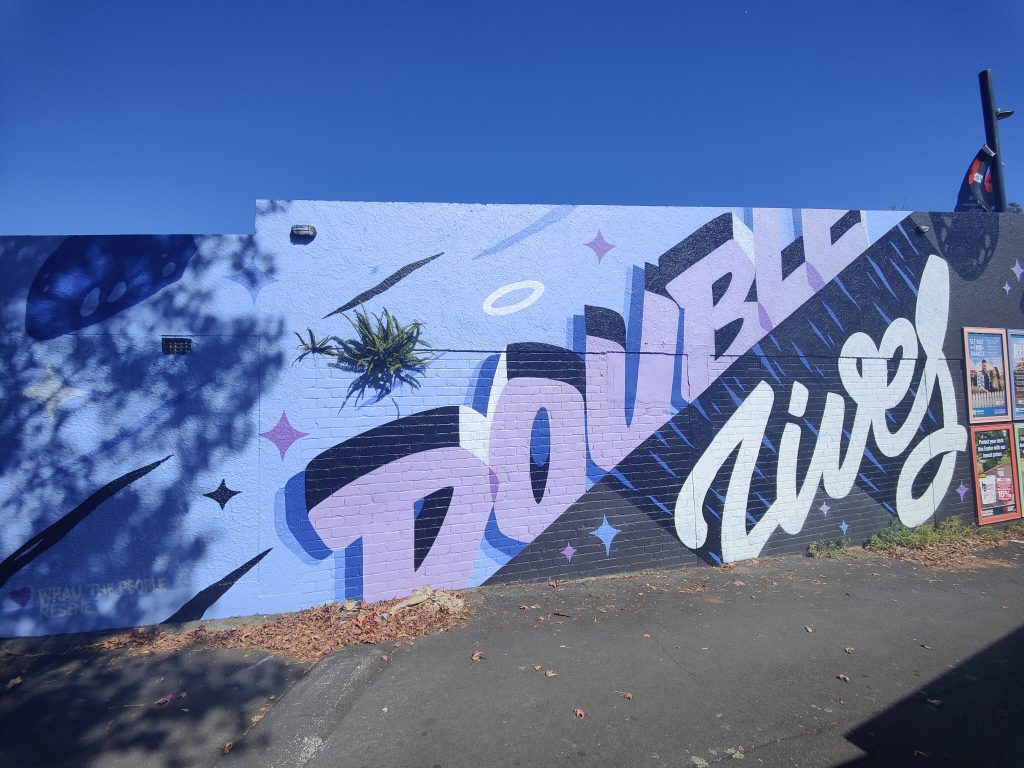
For the latest installment of Street Treats, we are serving up a selection of pieces, pastes, pixels, petals and beyond. From a reminder of an old pal’s legacy, to epic collaborations and tiny treats, the streets have provided a range of goodies. That is, of course, the joy of the urban environment as a setting for creative (and naughty) interventions, there is no curation. The result echoes the physical presence of our cities, where thousands, indeed millions of people interweave as they go about their own concerns, trials and aspirations. Any city is a collection of individual voices and the art of the streets reflects this diversity, each piece the compulsive expression of an individual that can be read in infinite ways by the passing audience. In a world where online communication has become increasingly toxic and antagonistic, the art in the streets provides something different, still capable of asserting beliefs and ideologies, but devoid of the escalating tensions or echo chambers of comment sections. Indeed, as one image attests, often the response to uninvited additions is not so much beautification as silencing, ensuring a monochromatic environment. So enjoy this platter of pictures and relax, our cities and our communities are not monolithic, and the streets provide the platform for that multiplicity…
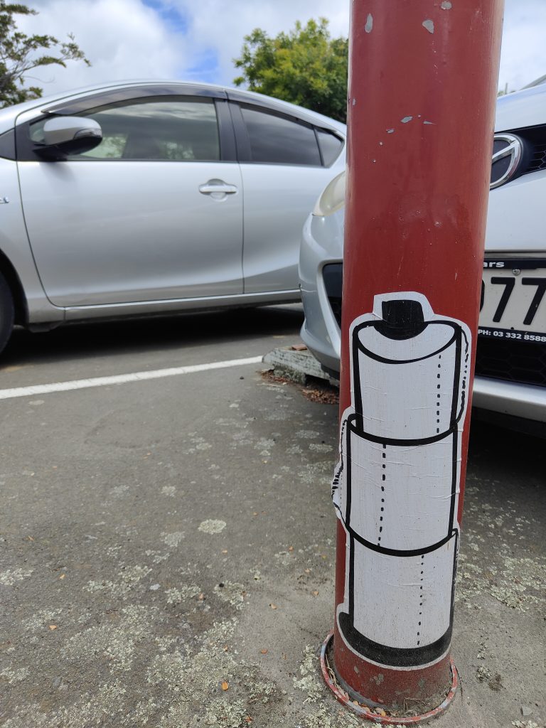
The necessities are vital…
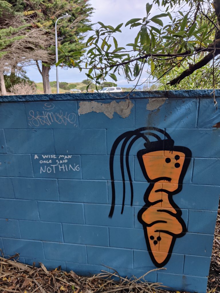
Wisdom is often silent. And old friends are found again – Carrot Boy in North Beach
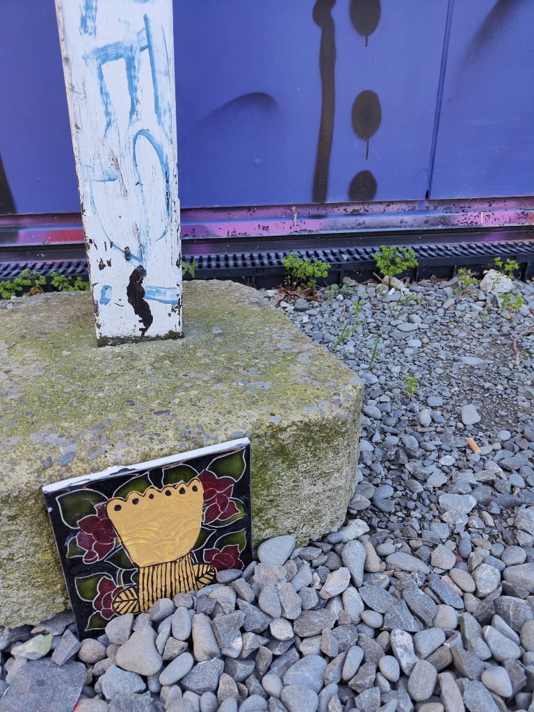
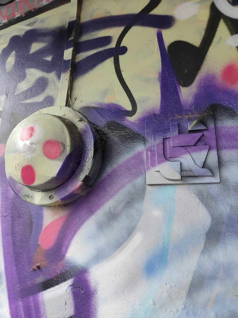
Bloom’s ceramic works provide small surprises across the city…
Especially in contrast to some larger works
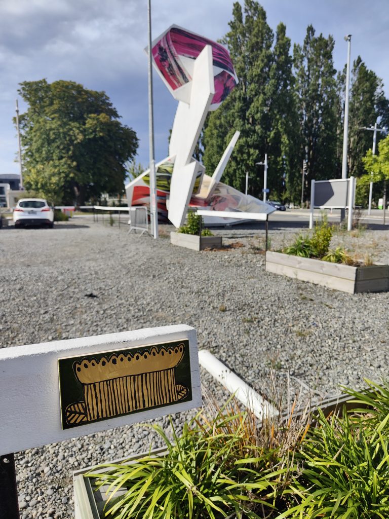
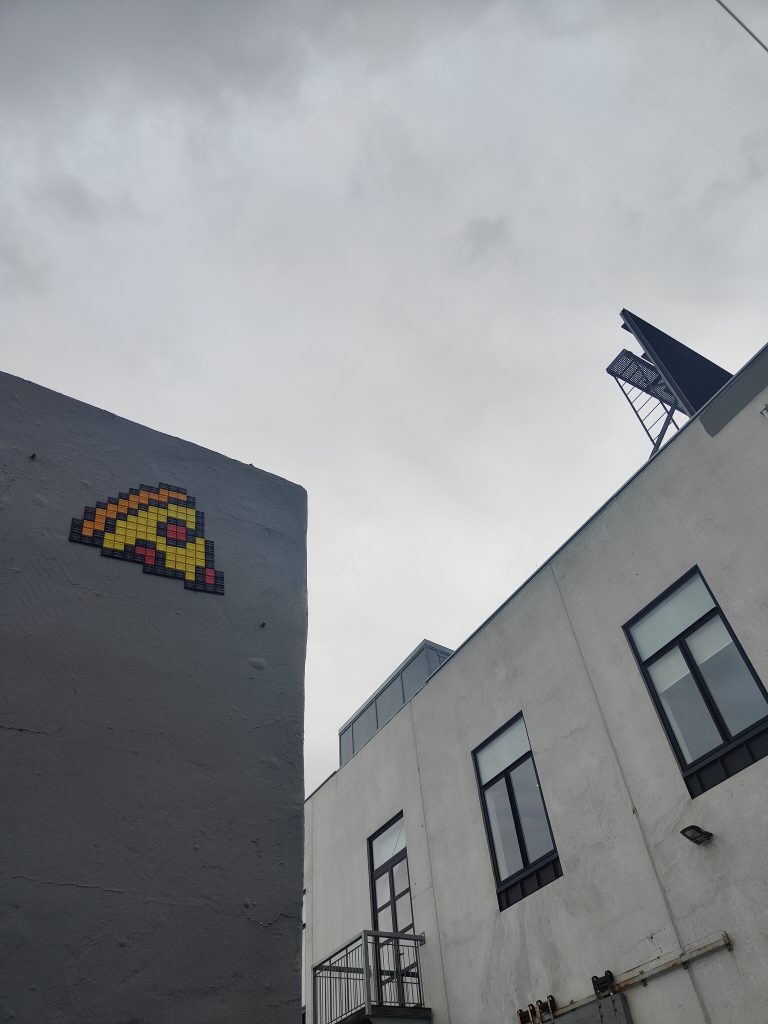
Ghostcat’s street pizza is a tasty treat
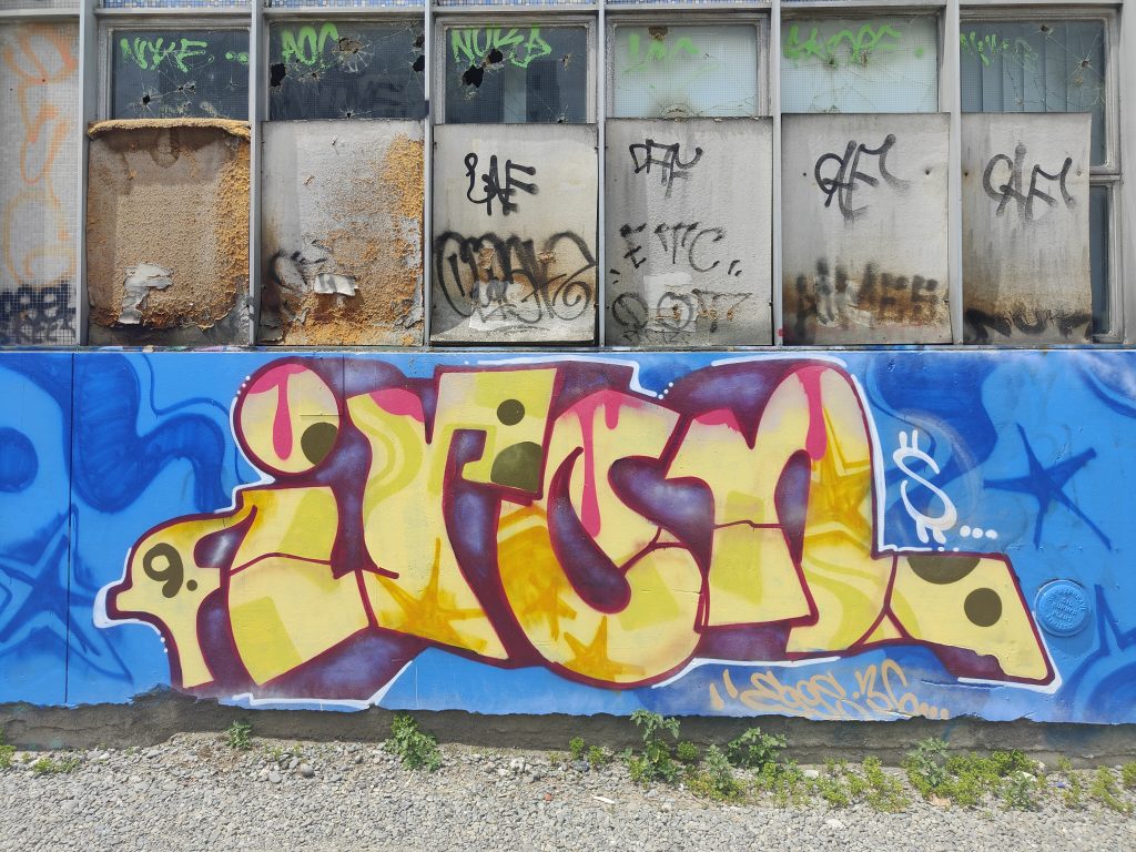
9 Iron shows the Hereford Street spot is still alive, for now
Big is good
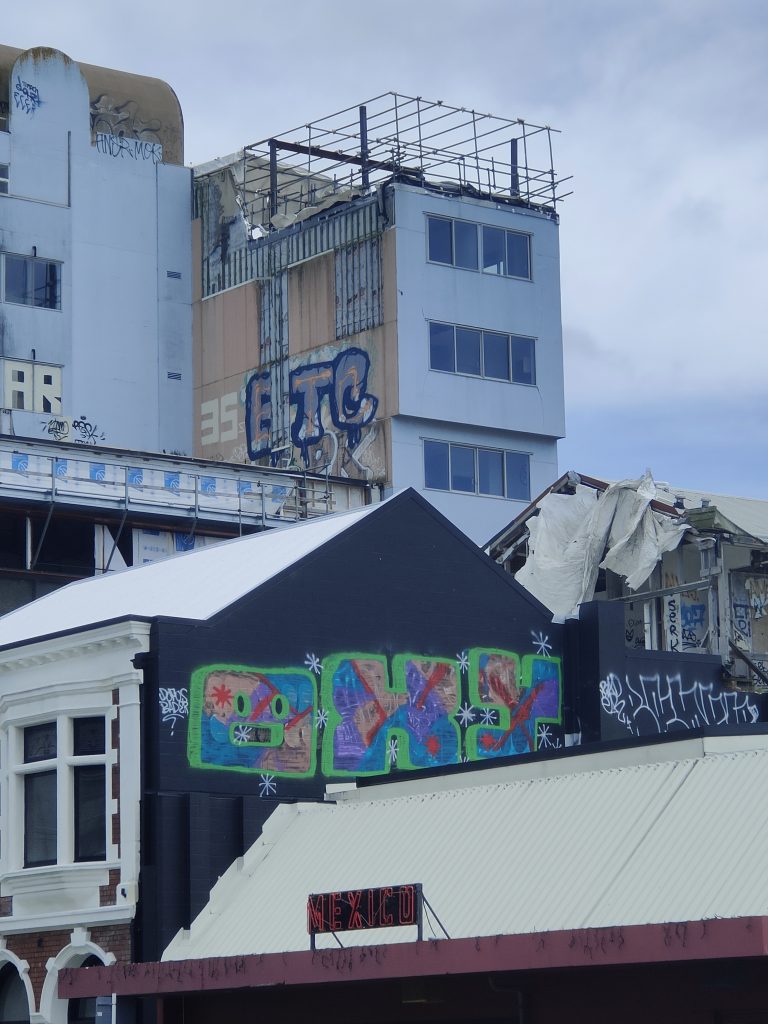
Oxy goes psychedelic
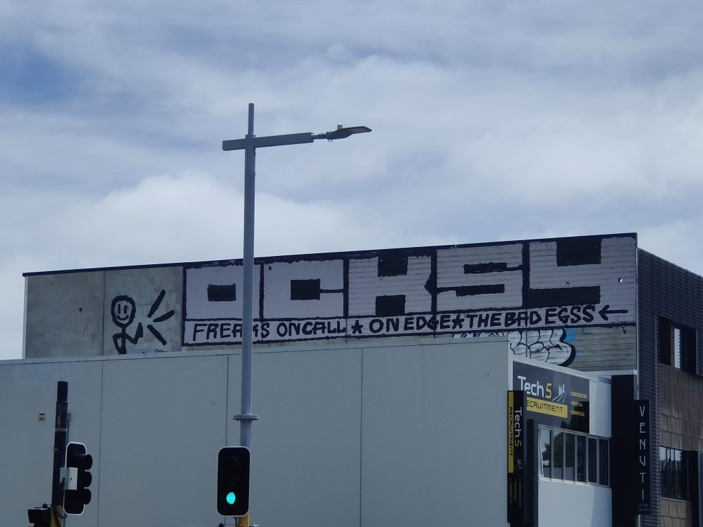
OCKSY’s on call
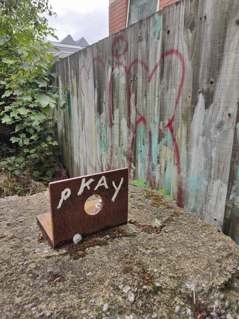
PKAY shows small, in the right place, can be effective…
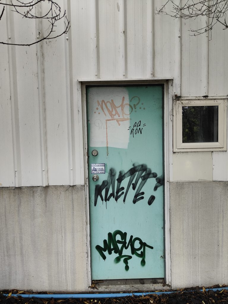
Anyone else a sucker for a beautiful doorway?
Drama above and an impressive collab below with a raft of names…
A Levi Hawken piece goes incognito
Beautification?
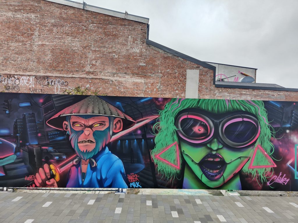
Cape of Storms’ newest works are vibrant reflections of nostalgic Kiwiana through the lens of new eyes…
Vez and friends Diva Dog and Fuzzy Logic
Who needs a billboard?
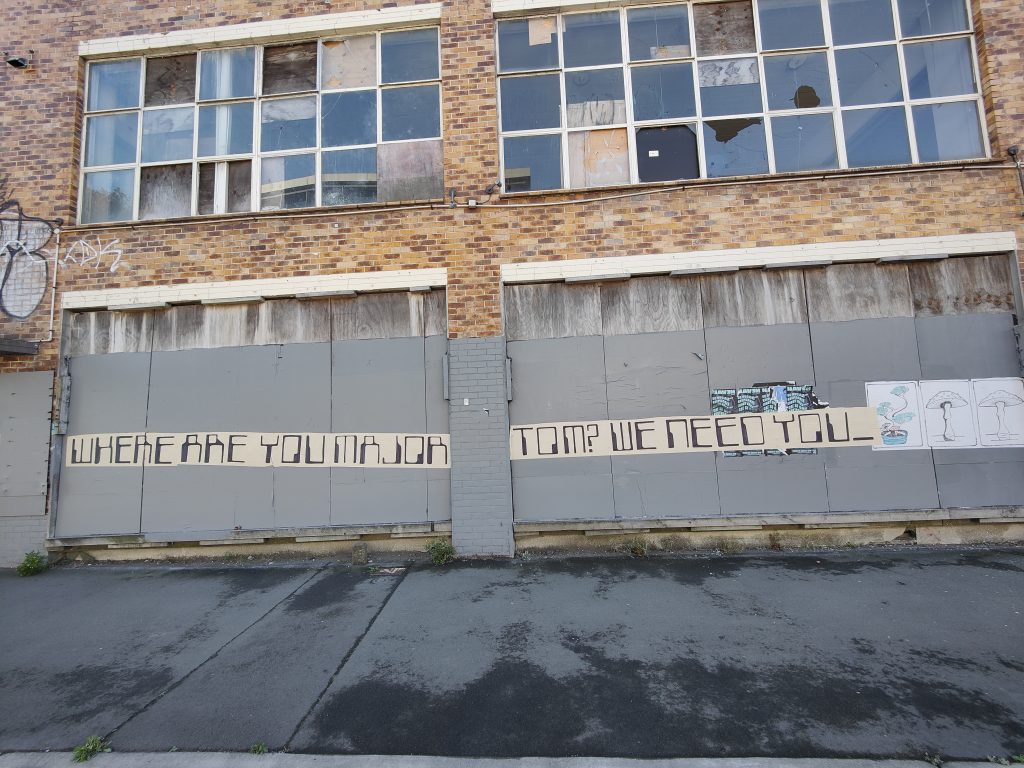
Major Tom? We need you…
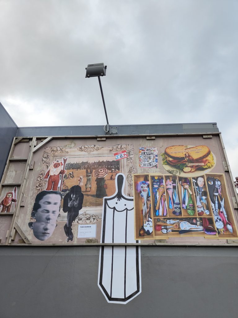
Cropping is everything… Cape of Storms, Vez, Lost Boy and more…
Lost Boy goes off planet
Mark Catley celebrated another May the 4th with some iconic Star Wars toys Bossk and Greedo (Han shot first?).
and a lesser known Power Droid (yes I had to look that up)
A trip to Auckland provided some stencilled goodies… From social commentary…
to pop culture riffs
and Component’s stunning balancing act.
This throw back from Askew
was set against more fresh work…
And a reminder of the city as a site for exploration…
May is the month when you can feel winter coming, daylight savings ends, the weather becomes just that little bit more unpredictable, and t-shirts start to be accompanied by warmer layers (just in case), yet we can also ignore these signs and enjoy the final throes of Summer’s waning presence. This May, we have enjoyed a range of treats, from the streets of Ōtautahi to gallery walls in Te- Whanganui-a-Tara Wellington, a beautiful secluded gem in Waltham, a haunting surprise outside one of our favourite bars and the odd geeky nightmare…
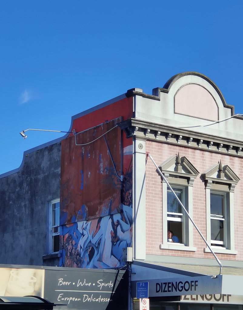
We welcomed the third artist to the Phantom bollard take-over The Paste-Up Project, with Cape of Storms adorning the circular structure with a signature blast of colourful retro collage posters. The installation, titled Foreign Objects, reflects on the adjustment to life in Aotearoa, highlighting Kiwi quirks through nostalgic compositions of food and fashion and vintage media. The appearance is easily mistaken for official poster advertising, until closer inspection reveals the acerbic humour – check it out on Manchester Street!
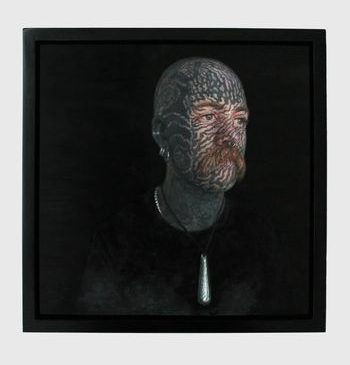
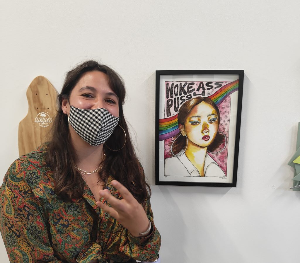
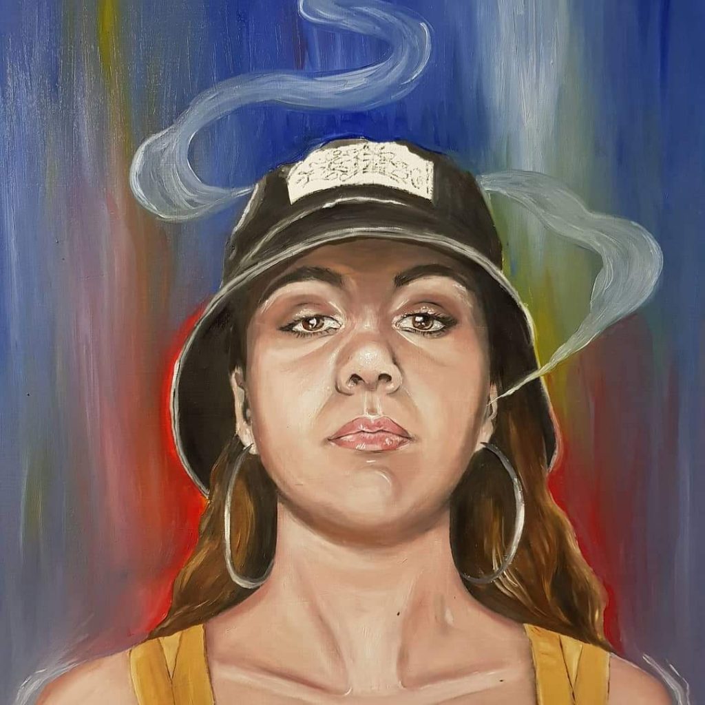
We’ve always known our pal Jessie Rawcliffe was super talented – now she has the certificate to prove it! Jessie’s striking portrait Richard, of Wellington tattoo artist Richard Warnock, was highly commended in the Adam Portraiture Awards at the New Zealand Portrait Gallery in the capital. From 351 entries, the Adam Awards exhibition was narrowed down to 45 works, with Jessie’s painting being placed in the top 7 by judges Linda Tyler and Karl Maughan.
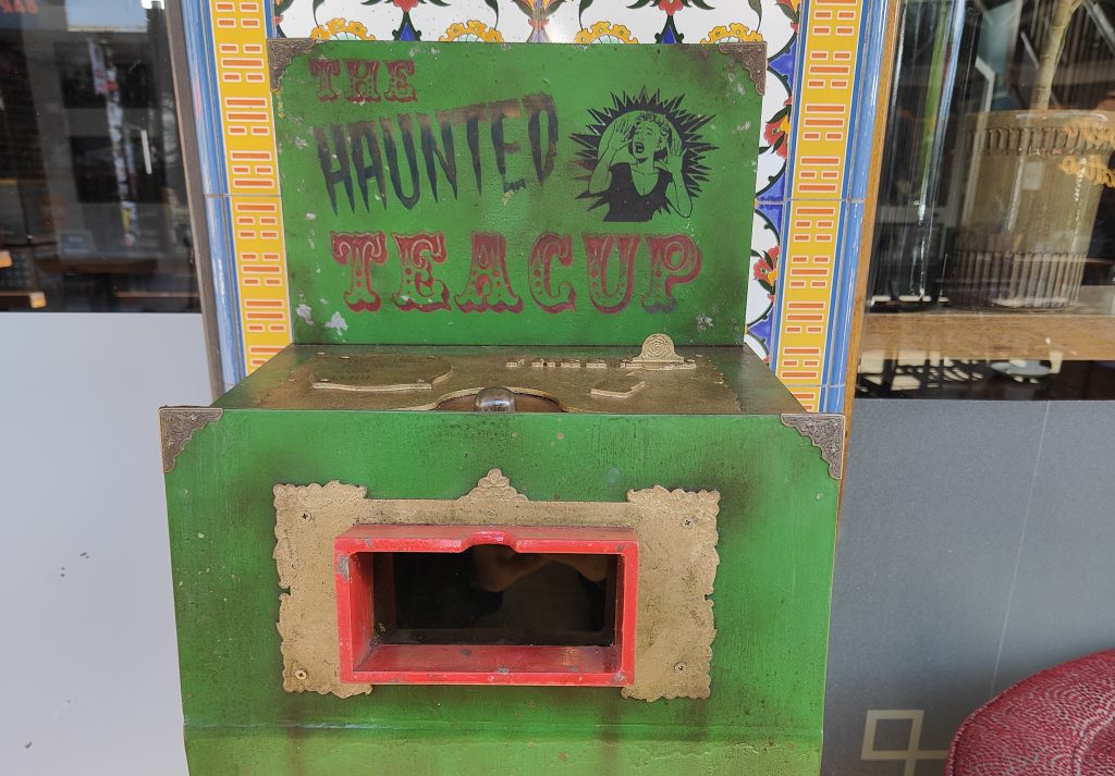
The Haunted Teacup
You may know about Watch This Space’s plans for The Little Street Art Festival in 2023 (if not, more to come soon!) – but did you know about Ghostcat‘s Haunted Teacup – a work created to exemplify the types of works the festival will celebrate? The worn Victorian-styled automata viewing box has been surprising viewers passing The Last Word on New Regent Street through May, drawing people in with the promise of a terrifying supernatural experience, but is it what it seems? Go and check it out… If you dare!
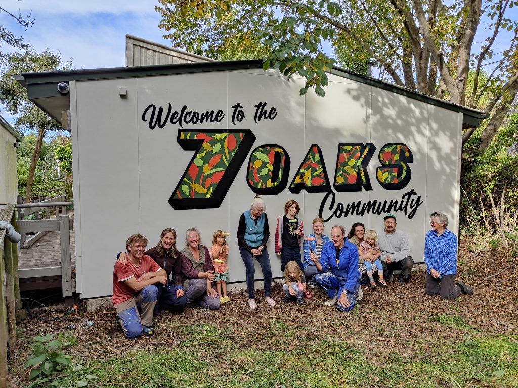
7 Oaks Mural
We recently had the chance to work with Life in Vacant Spaces and the amazing community at Waltham’s 7 Oaks – an incredible site where array of groups make use of a beautiful space. Together we created a participatory mural welcoming visitors to 7 Oaks, a team effort where 3 year olds and those just a little bit older all contributed to a mural that draws on the surrounding environment.
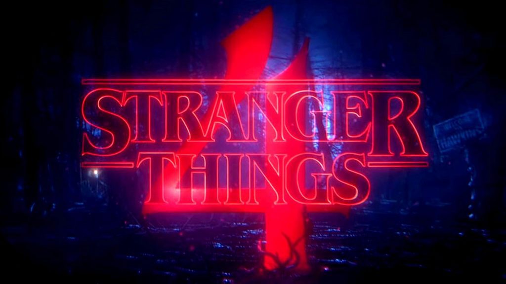
Return to the Upside Down
Last, but not least, is a shout out to my nerdy side (which is possibly 73% of me) and the long anticipated debut of season four of everyone’s favourite 80’s homage Stranger Things! I may or may not have binged all seven episodes in one night, but who is asking, really? I also may have already re-watched it and now wait impatiently for the final two episodes… Bada Bada Boom!
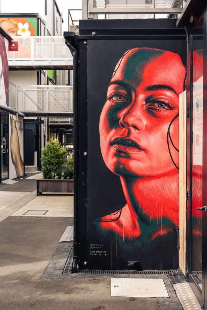
This month’s And That Was… is a special edition – dedicated to the impact of the Flare Street Art Festival across March (the festival opened on the 2nd and eventually came to a close on the 20th, an extended run). Who better to break down the highlights than Flare project manager Selina Faimalo, who gamely took on the challenges of such a multi-faceted event, and headline artist and pop-up gallery curator, Kophie Su’a-Hulsbosch (aka Meep). From the amazing murals to the additional elements of tours, exhibitions, panel talks and more, Selina and Kophie break down what made Flare such a success!
____________________________________________
The Flare Ōtautahi Street Art Festival was a conglomeration of large murals, a pop-up exhibition, graffiti art, guided tours and art talks.
The ARCC collective wanted the festival to be a collaborative event, with artists involved in the curation of the event and to incorporate traditional graffiti as well as street art. Dcypher, Ikarus and of course, Kophie, were eager to jump on board to have the most authentic festival possible. It is amazing to break down Flare by the numbers:
Flare became a 20 day festival with a total of 44 artists participating, including seven headlining artists, as well as a three-artist collaborative 3D mural and a three-artist projection installation, a ‘Wahine Takeover’ at the BOXed Quarter with four female artists, an exhibition featuring 21 urban artists, and a two-part graffiti jam with 35 artists. Flare saw the completion of 44 new artworks across the SALT District. More than 1200 visited Flare Central on High Street, with many taking home art from the pop-up exhibition, while 136 people joined the guided tours (and more just tagged along!).
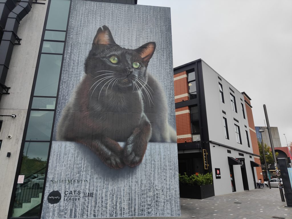
Overall, we had so many wins, including Koryu taking home Kathmandu’s People’s Choice Award (voted by FLARE attendees) and the heartwarming development of Olive the cat, star of SwiftMantis’ mural, finding a home when she was adopted from the Cat’s Protection League!
Koryu’s amazing A Hum – The Beginning and the End was voted People’s Choice winner for Flare 2022. Photo supplied by Flare Festival
Swiftmantis’ Olive was a very popular piece and when the feline was finally adopted, the story got its happy ending… Photo supplied by Flare Festival
In addition, these were our personal highlights…
Wāhine Takeover
Jessie Rawcliffe’s stunning piece as part of the BOXed Quarter Wahine Takeover… Photo supplied by Flare Festival
Kophie and I are the founders of The Conscious Club and until very recently we were based at The BOXed Quarter, an amazing part of SALT District with a variety of murals by different artists.
The Wāhine Takeover was added to the programme as when we were organising the graffiti jam, it became obvious that women graffiti artists are few and far between in Ōtautahi. Kophie took the initiative of choosing four wāhine to paint at the BOXed Quarter, adding a point of difference to the area and a diverse range of new artworks. The selected artists were Jen Heads from Fiksate Gallery, Lucia Kux from Berlin, who has a background in graffiti and is a tattoo apprentice, McChesney-Kelly Adams from Lyttelton, who specializes in realism and also has a tattoo apprenticeship and Jessie Rawcliffe, who specialises in highly detailed portraiture.
The Pop-Up Exhibition
Kophie was the driving force behind the pop-up exhibition at Flare Central
As well as being one of the headlining artists, Kophie also curated the Flare Central pop-up gallery. The exhibition was primarily a representation of Ōtautahi graffiti and street artists as well as art work from our headlining artists. The curation of the gallery was to be a homage to graffiti art as the art form that began street art and large-scale murals and adds vibrancy and culture to the city.
Offline Collective x Fiksate
An image from the Offline Collective X Fiksate collaboration
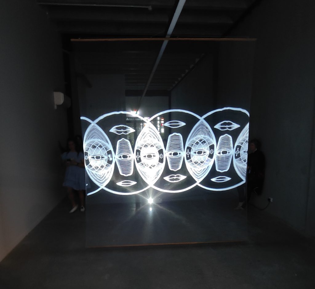
Offline Collective and Fiksate Gallery merged their creative outputs, mixing the work of local artists Dr. Suits and Jen Heads with Offline Collective’s renowned animated moving images. Overlaying visuals and interrupting the usually static images of both artists in two installations, the concepts were brought to animated life in an empty High Street space.
This installation was epic, exploring the murals at night and peering through the window on High St whilst eating an ice cream from Utopia (or even a few wines deep) was mesmerizing ! It was like seeing a Jen Head hologram from 2043!
Tours
We were so lucky with our selection of walls being so close together in the SALT District that all the murals were located within five minutes walk of each other.
Watch This Space facilitating the guided tours was absolutely amazing, Reuben’s passion and knowledge about the urban art scene had attendees hooked!! It created a sense of pride for residents learning about already existing art that they once just glossed over.
The great thing is, if you missed out you can still book in guided tour with Watch This Space!
Artist Panel
The Watch This Space: Flare Artist Panel was another highlight. One of the biggest struggles with Flare was hosting a festival in red light setting, as well as being in the peak of everyone catching COVID! (including me, LOL!), with a limit on gatherings of 100. We were so grateful to have access to equipment through WORD Christchurch to live stream this so those isolating and all across Aotearoa could tune in!
We had all our headlining artists on the panel apart from Elliot Francis Stewart and Wongi who couldn’t make it, so it was really great to hear the diverse stories; their backgrounds and their journeys to where they are now.
Graffiti Jams
Dcypher and Fuego, Graffiti Jam Part One. Photo supplied by Flare Festival
Yikes (left) and Dcypher, Ysek, Chile One and Ikarus (right) for the Graffiti Jam Part Two along Billens Lane… Photo supplied by Flare Festival
As the festival was extended (we had a few artists down with COVID!), we ended up having two graffiti jams!
We had 20 Artists painting at Graffiti Jam Part One and 15 artists at Graffiti Jam Part Two, and it was so much fun to get the community together to paint legally and incorporate traditional graffiti into Flare. We even had North Island heavyweight Fuego, who happened to be in town at the right time, get a piece in!
Dcypher and Ikarus had been such a huge part of helping put Flare together and they facilitated both graffiti jams. They have a mana in Ōtautahi that brought everyone together and had a great time.
Both laneways are special in their own way and walking down each one takes you on a journey of a range of styles like walking into a gallery on the streets.
We honestly couldn’t be happier with how the festival turned out. Even though we were in peak Omicron and in the red traffic light setting, it all came together through an epic community and residents supporting the arts! Fingers crossed we can do it all again next year, and actually hold the street party!
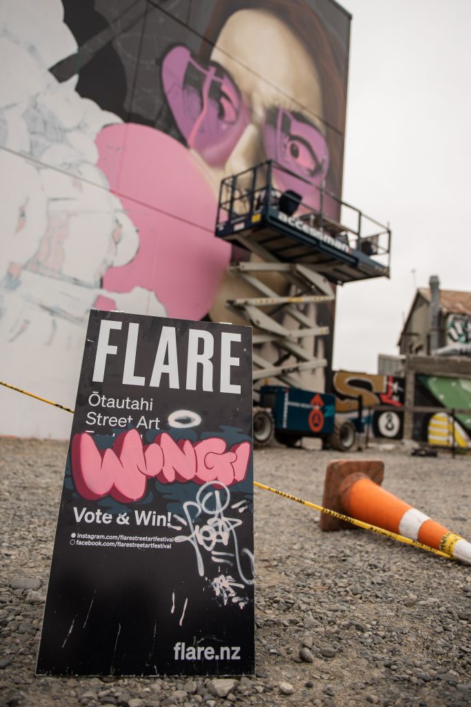
Wongi Freak Wilson produced this explosive piece for Flare, a fitting work for a the festival and its busy activations. Photo supplied by Flare Festival
Tāmaki Makaurau Auckland is a strange beast. It is the only mega-city in Aotearoa, and when you touch down from Ōtautahi it is hard to comprehend the sheer spread of the northern metropolis. While you can easily navigate Christchurch’s inner city in 15 minutes, Auckland’s urban centre seemingly sprawls on forever, with each area displaying a distinct identity. Our quick trip to Tāmaki meant we didn’t get to endlessly explore the diversity of the city, but we did get to see a fair bit of art. Of course, there is no chance we could have achieved a full coverage of the city, but what we saw, we loved. Auckland has the longest and largest history of Aotearoa graffiti and street art, so spotting a legendary figure’s name or character, whether fresh or faded, is always a possibility, but still exciting for a nerd like me, while you can always find a new name that is on the come up as well. It also has a truly urban feel, where you can get lost down alleyways, led by the trace of some preceding presence who was compelled to leave their mark. It is a real city, and it’s streets are always talking…
____________________________________________
Misery
Margarita Vovna
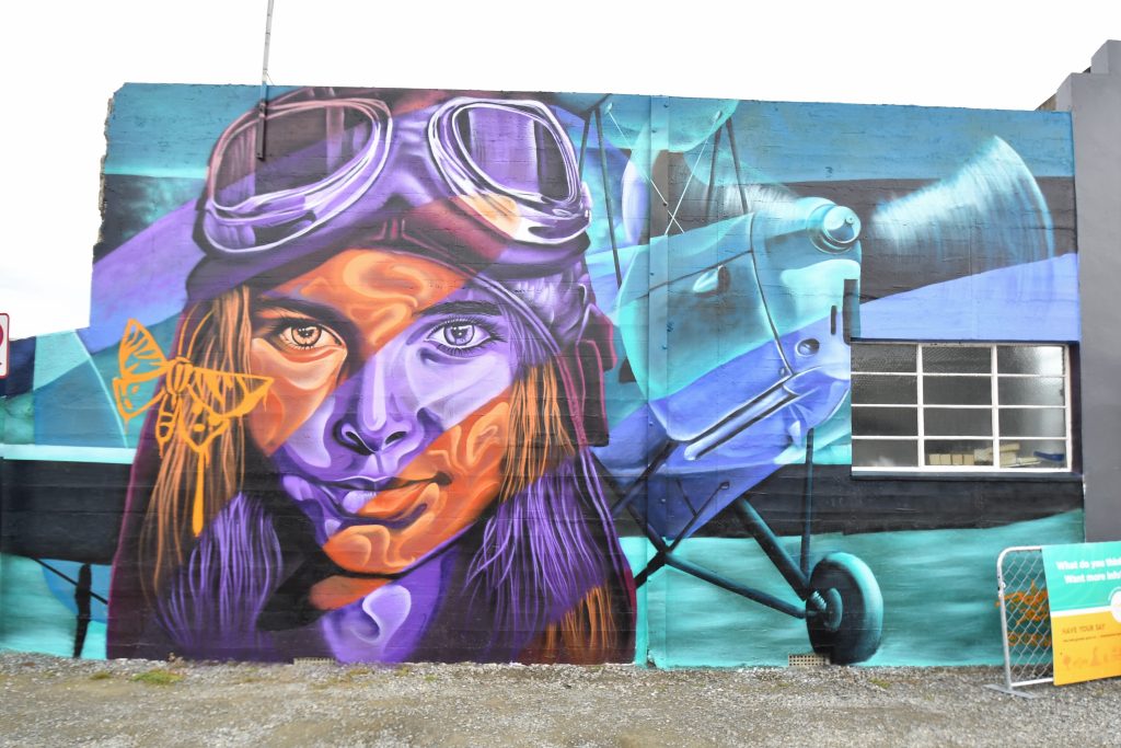
The Mercury Plaza and Sunset Tattoo, with a piece by Askew One above…
…with Deus nearby as well
Slime
03 Til Infinity by the Cut Collective
Askew One
And Askew One going way back on Ponsonby Road
BMD
Deus in blue…
Misery’s sculpture in K Road just outside St Kevin’s Arcade is a pretty fit…
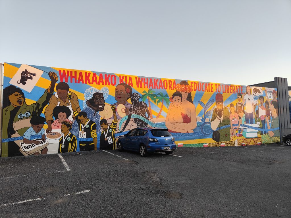
The Whakaako Mural Collective’s Once a Panther, Always a Panther
Urban wordfinder…
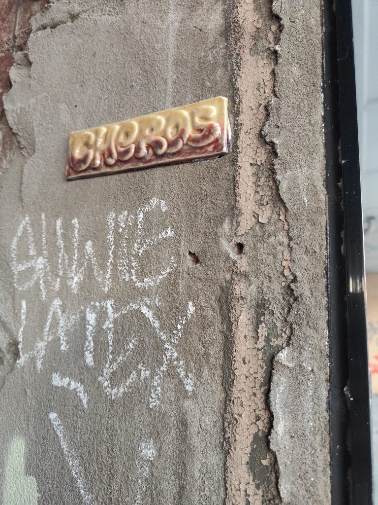
Cheros One gets around…
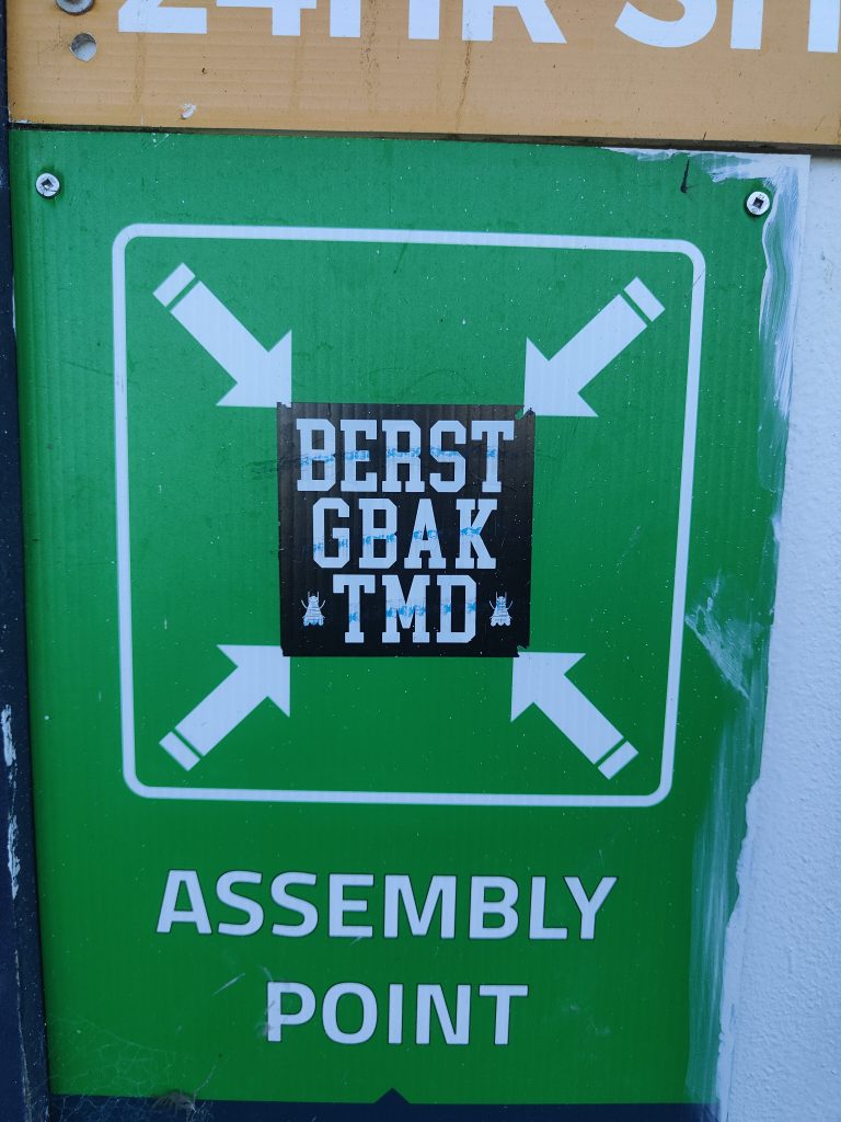
All roads lead to Berst
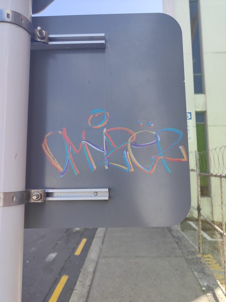
DMYZER in the grease
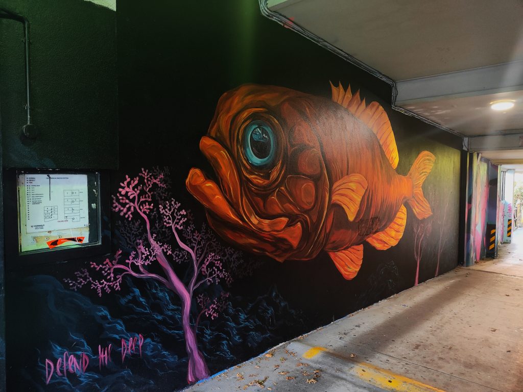
Cinzah’s first Defend the Deep mural
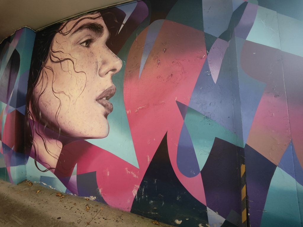
Margarita Vovna and Oscar Low/Trust Me
Finn Gerry Wilson
Oscar Low/Trust Me
Component
Haunt
Frail
GBAK throwback
LSD
A visit to the Avondale Pavilion awaiting Race A2D’s touch…
Avondale Art Park
Ares Artifex
Fluro
Shane Cotton near the Waterfront
Excellent…
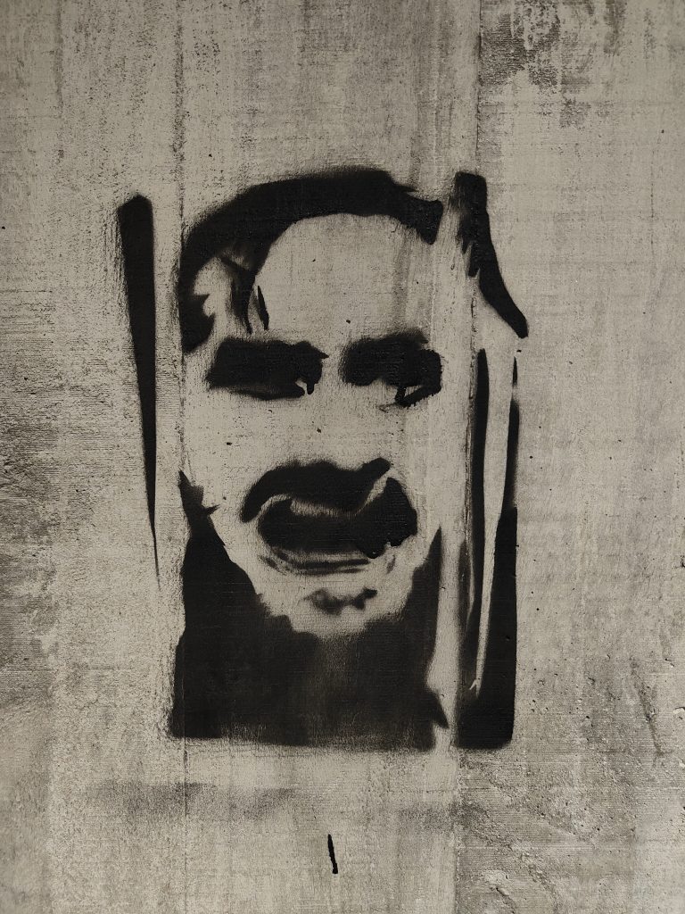
Here’s Johnny
Silence
Home Sweet Home
Even in a crisis
____________________________________________
Where should our next postcard cover? Let us know at [email protected]
Almost five years since Street Prints Ōtautahi, Christchurch’s last significant street art mural festival, Flare Street Art Festival provided a welcome shot in the arm for a city with an established reputation as an urban art destination. The brainchild of ARCC, a urban activation collective of local business people and place makers, Flare burst into life with a roster of seven headline artists painting huge murals and a flurry of additional activities.
Flare was built around the selection of massive new murals that would transform the SALT District and surrounding environs, landmarks that showed an impressive diversity, each artist flexing their unique styles, interests and intentions with creative freedom.
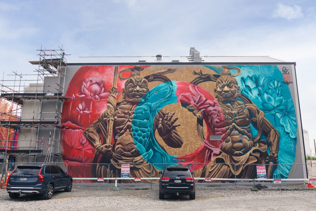
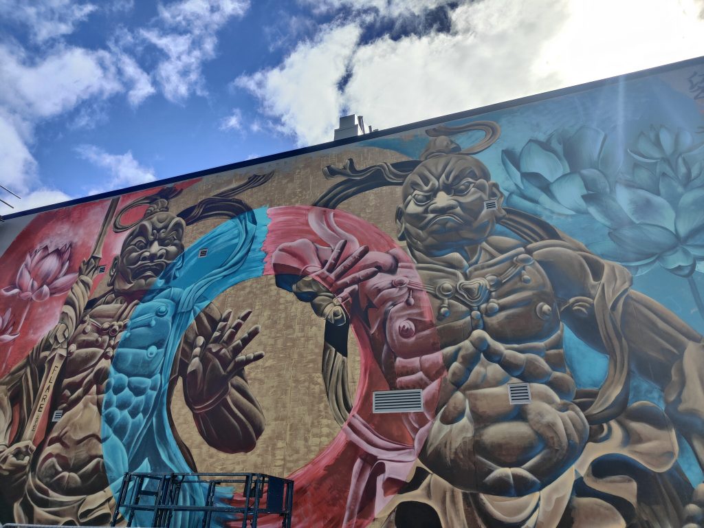
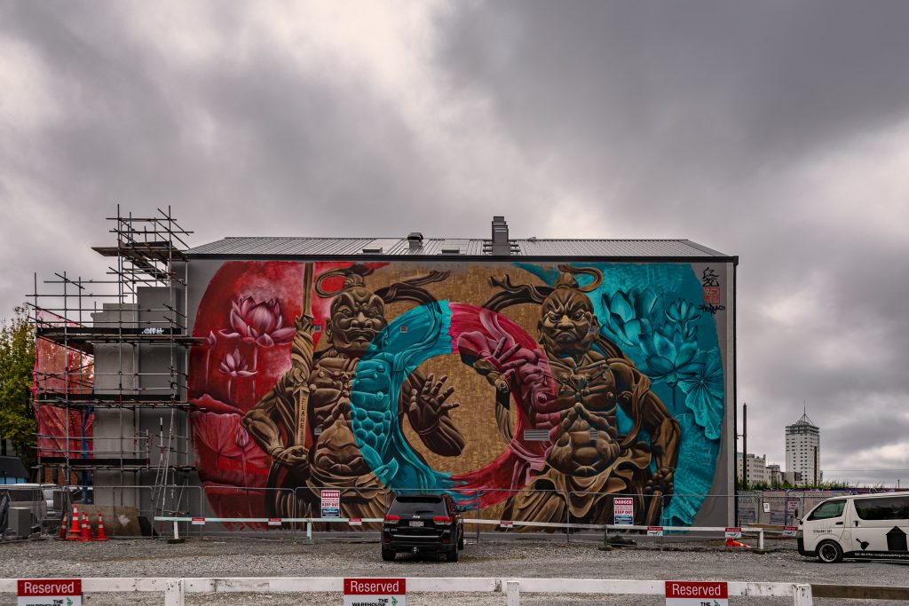
Koryu’s massive mural
The largest mural, on the side of the newly renovated Cotters Lane building, was completed by Koryu, a Japanese artist who has been based in Aotearoa since the 2020 lockdown, living in Geraldine but travelling across the country to paint murals. While relatively new to urban art, picking up a spray can just three years ago after visiting Melbourne, Koryu’s impressive depiction of fierce Niō warriors, guardian statues of Buddhist temples in Japan shows his quick development. The circular motif in the middle of the image suggesting the infinite quality of existence, the warriors themselves representing the beginning and end of all things (the open and closed mouths symbolic of the in and out breath, the first and last characters of the alphabet). The huge work, over 160 square metres, was a massive undertaking, filled with detailed musculature and gestural painting and aware of the shared experiences of Christchurch earthquakes and the Tohuku earthquake and tsunami in Japan in 2011 when both regions were struck by devastating natural disasters, making this work, a gift of guardians, even more resonant.
Wongi ‘Freak’ Wilson
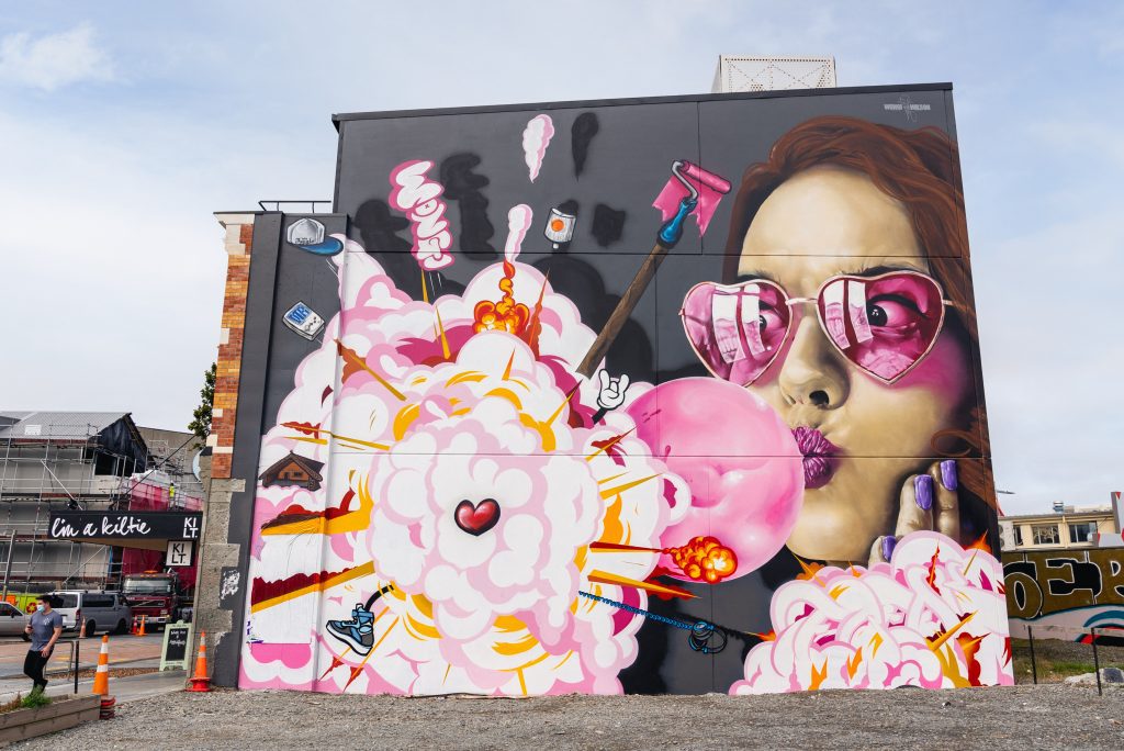
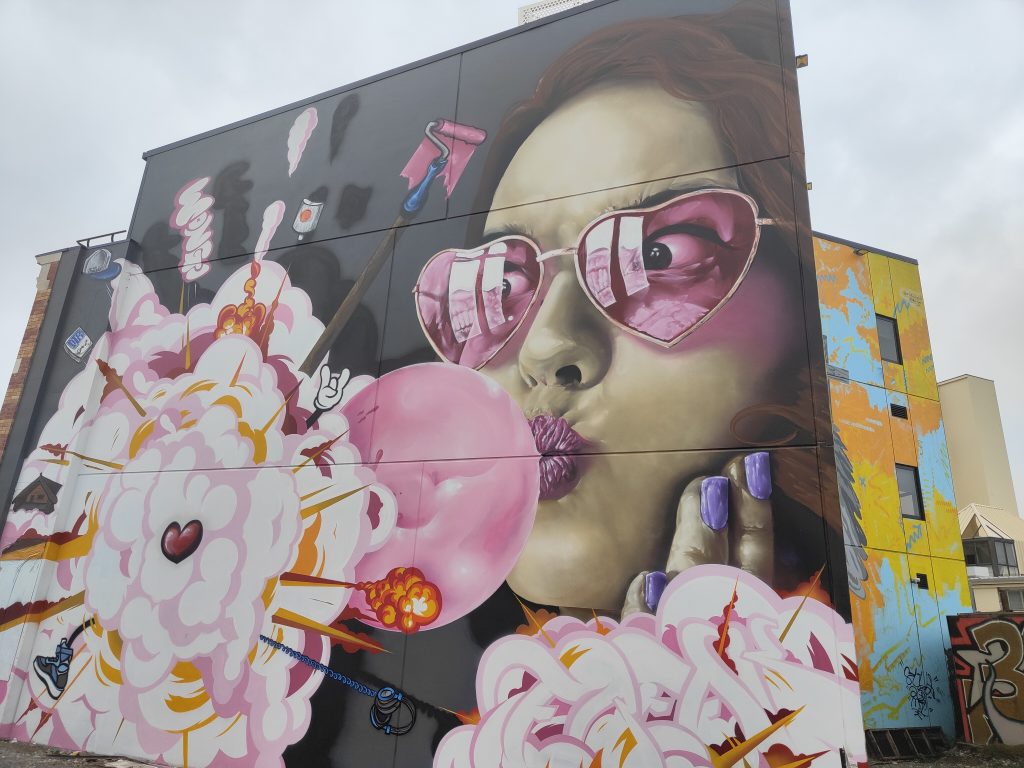
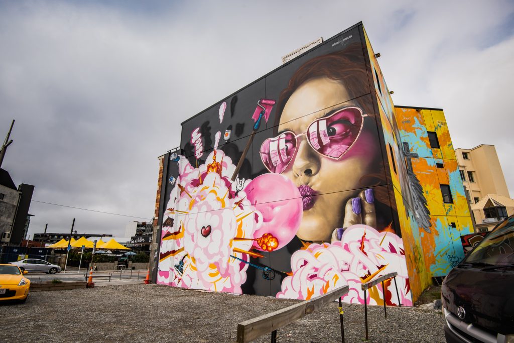
Nearby, overlooking Manchester Street, local artist Wongi ‘Freak’ Wilson displayed his technical skill with a vibrant depiction of a woman wearing rose-tinted glasses and chewing bubble gum. The pink gum exploding into a cloud of pop culture references, a baseball cap, a paint roller, headphones and more bursting out of the cloud. The combination of realism and pop-esque cartoon work a summation of Wongi’s style. The upbeat energy of the work infecting an area that still bares the scars of the city’s ongoing .
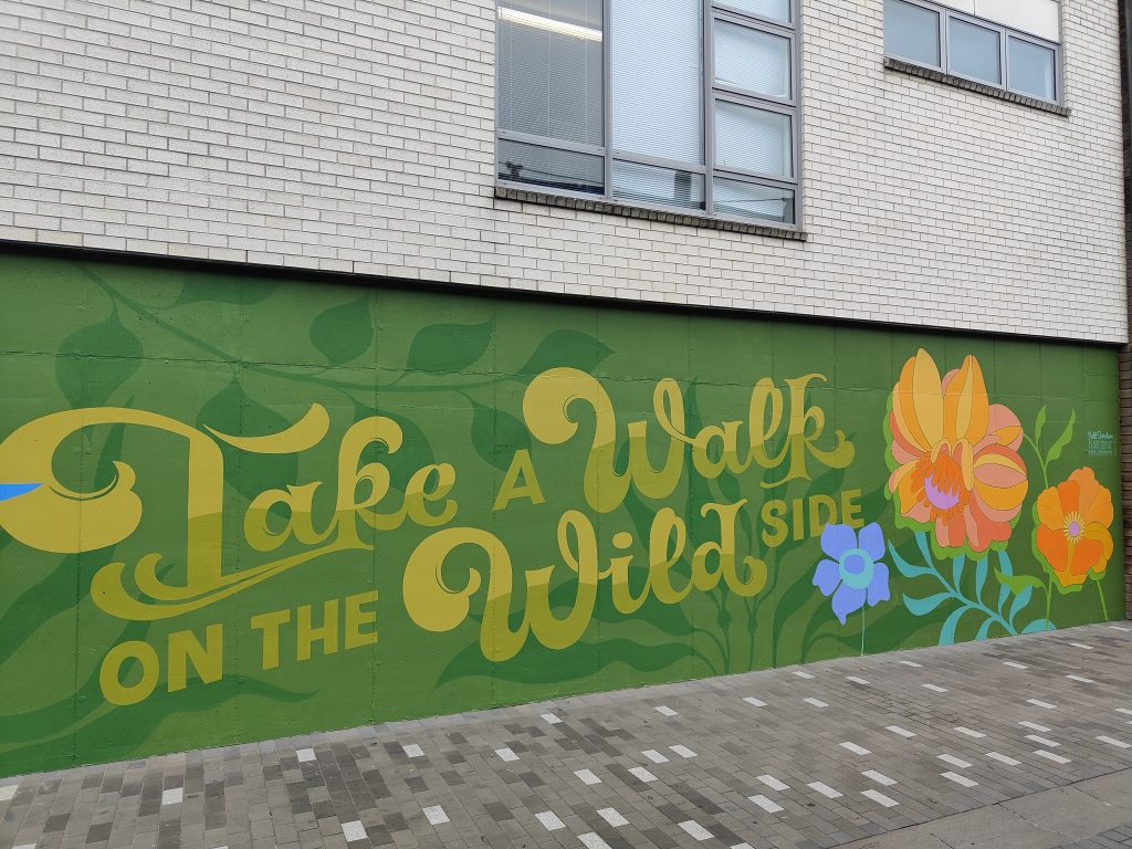
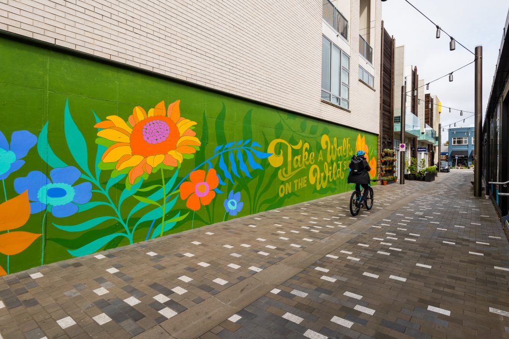
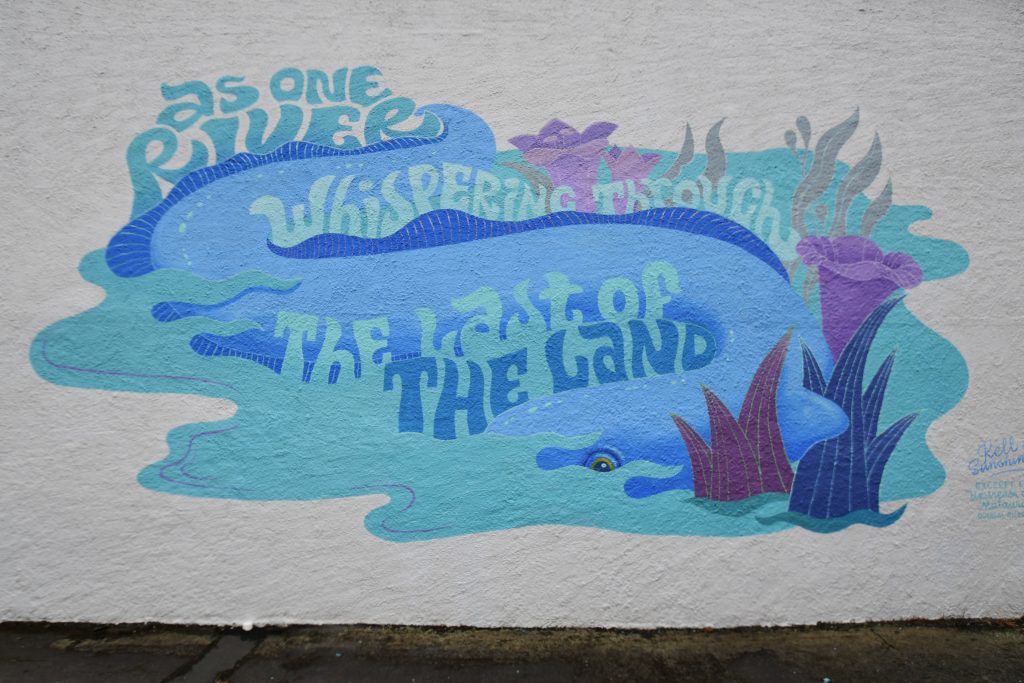
Detail of Kell Sunshine’s mural
Tucked down Memory Lane, behind the imposing SALT Mural by Paul Walters and Dcypher in Evolution Square, Gisborne artist Kell Sunshine added a rolling, lyrical mural, a beautiful contrast to the architectural and pared-back piece around the corner. Floral forms blooming and unfurling around the phrase ‘Take a walk on the wild side’, Sunshine’s mural reminds us of the need to break from convention and embrace our ‘wild side’ – a literal depiction of nature amidst the urban jungle. The 70s vibe is relaxed and the somewhat secluded placement allows for the viewer to stop and absorb the message before returning to the bustle of the city.
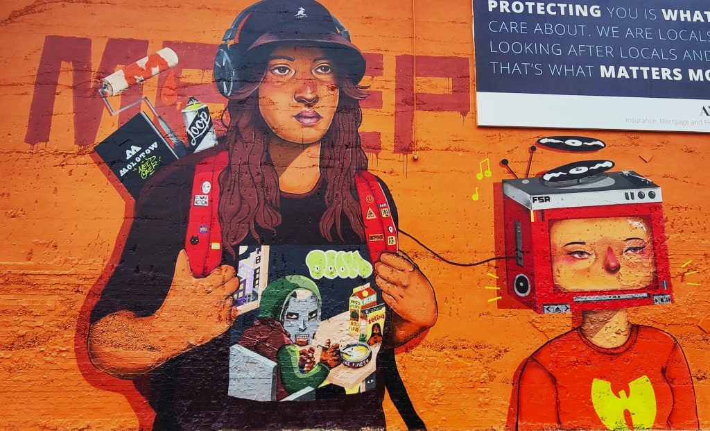
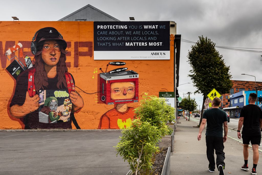
Meep on St Asaph Street
On St Asaph Street, homegrown talent Meep produced the largest work of her career, with a stylised self-portrait against a bright orange backdrop. The massive image shows the artist, with a backpack filled with paint, a roller and a blackbook, walking along the tracks (a traditional graffiti hot-spot and suggested by the large roller piece behind the artist), headphones plugged into a television-headed representation of hip-hop music – her constant companion (the homage to hip-hop cemented with the Kangol bucket hat and the MF Doom and Wu Tang Clan t-shirts). The strong representation of a female graffiti writer illuminating an often marginalised presence in a predominantly male sub-culture.
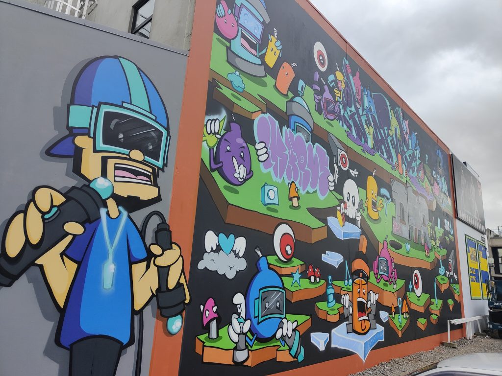
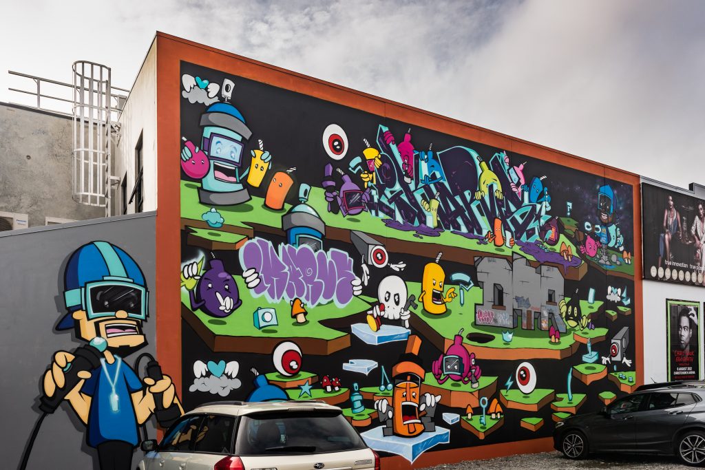
Ikarus on Manchester Street
On the corner of Manchester and Welles Street, local legend Ikarus of the DTR Crew recounted his own experiences in graffiti through the lens of an AR video game (a cartoon version of the artist shown in full AR goggle mode in the corner). The levels of the game move through the stages of graffiti, from tags to throw-ups and finally ascending to masterpieces, the obstacles and intricacies thrown in as well. The shout-out to traditional graffiti an important inclusion in a forum where the culture is often excluded in favour of birds and buildings. The shout out to the legendary Jungle acknowledging the legacy of those who have come before and the important role of mentorship through example.
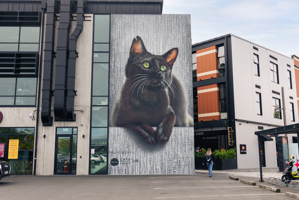
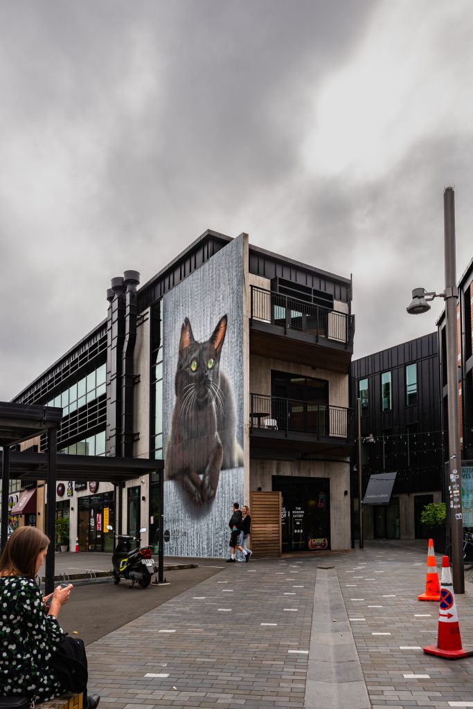
Olive by Swiftmantis
In the rear of the Little High car park on St Asaph Street, Palmerston North artist Swiftmantis continued his series of ‘Stray Stories’ with a huge depiction of black cat Olive, her green eyes surveying the surrounding area. The amazing detail reveals the feline’s character, her tattered ear a sign of her survival. Currently with the Cats Protection League of Christchurch. Olive, perhaps now the city’s most famous cat, is still looking for her forever home, the work serving to highlight her situation and to celebrate the work done by the Protection League. The image has already stopped hundreds in their tracks, wowed at the production and enamoured with the beautiful, majestic animal.
Elliot Francis Stewart’s mural closed the festival
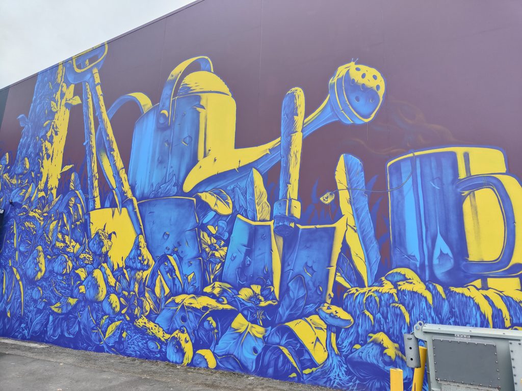
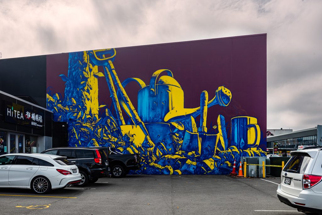
The final work, located on Manchester Street, was delayed when Elliot Francis Stewart was unable to make his way to Ōtautahi until the final (or at least the final official) day of the festival. Renowned as a supremely talented illustrator, Stewart drew inspiration from Christchurch’s ‘Garden City’ moniker to depict a sweetly nostalgic scene of a shovel and bucket in a garden. The electric colour scheme of blue, yellow and magenta highlights the intricate detail, the leaves, bark and even tiny lizards occupying the serene setting. It is a show stopper that draws you in, your eyes led across the incredible detail of the wall.
FUEGOS joined the Graffiti Jam
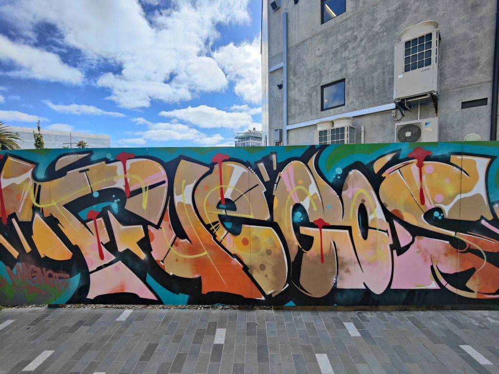
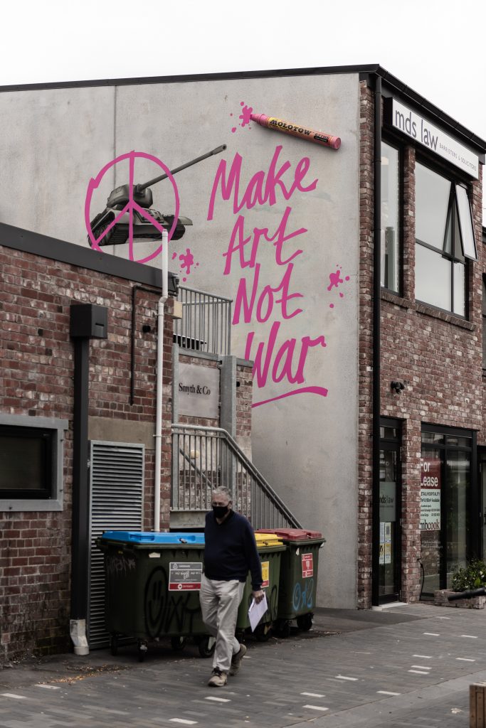
While these murals were the central focus of Flare, there was plenty more going on across the extended two week programme. Just prior to the official launch, Dcypher, Ghostcat and Dr Suits installed an anti-war 3D mural – an oversized Molotow pen fixed to the wall appearing to be the tool used to scrawl over the image of a tank in bright pink – a peace sign and the declaration ‘Make Art Not War’ defacing the symbol of military force. Just around the corner, Flare made use of a High Street shop as a pop-up gallery, featuring local and visiting artists, an array of art and apparel available. The pop-up served as the central hub for the festival, with artists hanging out and passers-by drawn in (our Watch This Space guided tours also departed from the pop-up space, while the Watch This Space Artist Panel was held at 12 Bar on St Asaph Street). An unassuming High Street space hosting a projection work, a collaboration between Fiksate Gallery and the Offline Collective, added a dynamic night-time presence to the festival. The BOXed Quarter’s collection grew with the ‘Wahine Takeover’; Jessie Rawcliffe, Jen-Heads, Berlin and MKA adding fresh paintings to the panels. The final Saturday of the festival saw over two dozen artists take over the lane ways surrounding popular bar Smash Palace with a graffiti jam, artists from different cities and generations lifting the veil from graffiti’s often mysterious presence as visitors could watch the paint being sprayed on the wall. Finally, on the last weekend, Billens Lane, next to Little High, received a make-over with fresh hoardings painted by Jacob Yikes, Dcypher, YSEK, Chile One, Ikarus, Tepid and Bols, adding further diversity to the collection of Flare works.
YSEK and Chile One on Billens Lane
With over 40 new works of art painted across the city, and over 30 artists involved across the festival, Flare served to connect the dots as an event that was for the city and the culture. This is an important element of such an event, recognising the need to support local talent and provide opportunities of varying scales, to raise the profile of urban art and foster the seeds of the city’s creative foundations. Of course, with new incarnations will come new challenges, from finding fresh walls to the massive task of finding money, but Flare has made a promising start, and we are already looking forward to 2023!
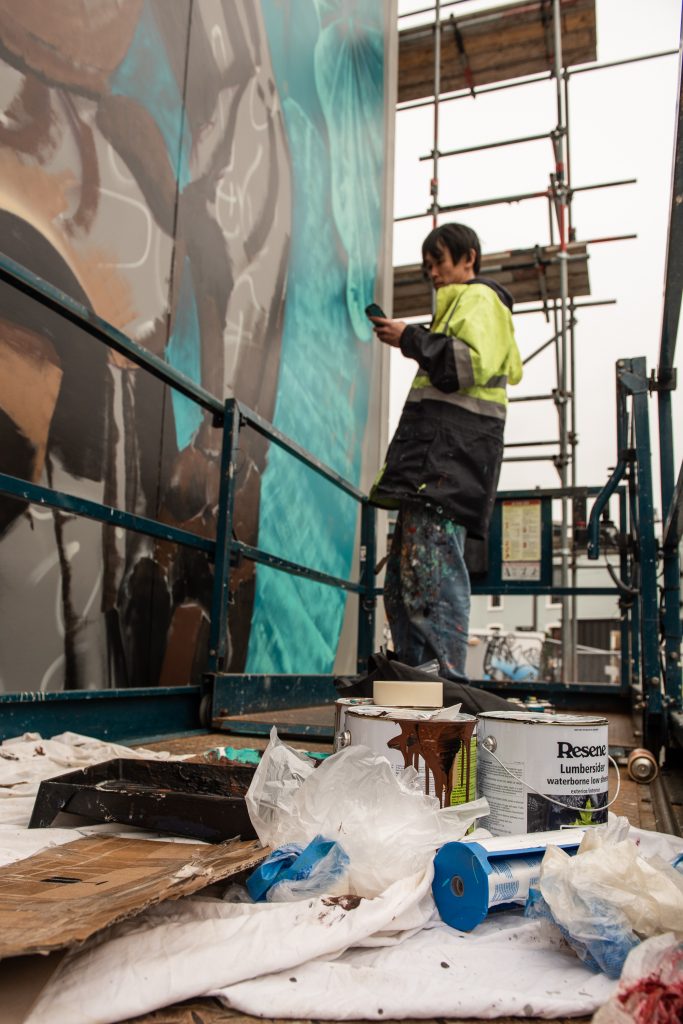
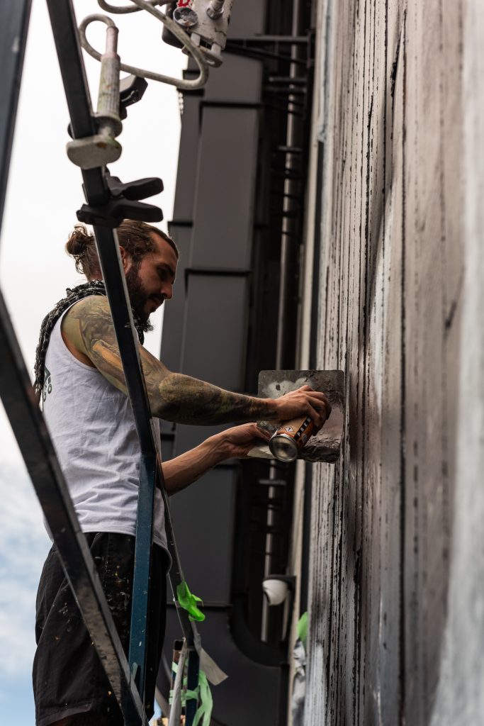
Flare Festival may have come and gone, but it’s legacy lives on – an array of amazing new murals and a bolt of energy in the local urban art scene putting graffiti and street art back in the limelight. The flurry of activity that saw a pop-up gallery, guided tours, panel talks, mural painting, graffiti jams and live painting sessions was a lot to take in – luckily we had our man, Centuri Chan, on hand to capture some of the magic…
____________________________________________
Ikarus DTR at work
Kophie’s blockbuster WIP
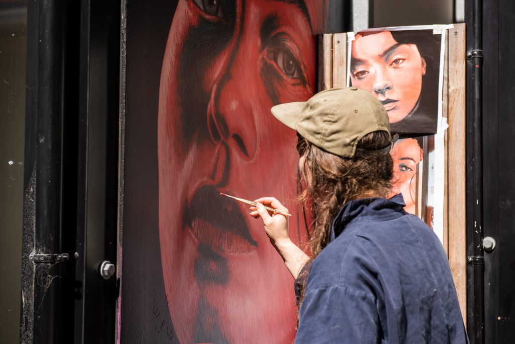
Jessie Rawcliffe painting at the BOXed Quarter Wahine Takeover…
MKA Artist at work in the BOXed Quarter
Koryu takes on the festival’s biggest wall
Wongi Wilson working at heights
Palmerston North’s Swiftmantis works on the stunning feline portrait Olive
Dcypher X Dr Suits X Ghostcat – Make Art Not War
Jen Heads at the BOXed Quarter
Elliot Francis Stewart’s amazing work meant the festyival lasted even longer
Ikarus’ graffiti game played through the levels of the culture
Kophie’s massive Hip Hop tribute was a highlight
The graffiti jam behind Smash Palace
Wongi’s explosive new work
Olive surveys her new domain
Jessie Rawcliffe’s striking work
Koryu massive mural
Kell Sunshine’s burst of colour
Centuri Chan is an Otautahi-based creative, photographer, tour guide, designer and LEGO builder…
Friday the 4th of March was a busy night, with two events marking the opening of significant urban art events in Ōtautahi, signalling an exploding energy in the local scene. First up was the opening event for the Flare Street Art Festival, held at the pop-up exhibition space on High Street, which is host for all the information you will need about the festival and a collection of work by Flare artists and a number of local stars. Across town at TyanHAUS, Slap City’s International Paste-Up and Sticker Festival was also celebrating it’s opening night, with the interior exhibition of work from across the globe completely taking over the space. We were lucky enough to make it along to both events, with a palpable sense of excitement permeating both spaces…
With both events taking place in the red traffic light setting, it was great to see the organisers ensuring people were masked up (except for a quick photo here and there!) and that group sizes were kept appropriate!
____________________________________________
Flare Street Art Festival opening event @ Flare Central, Friday, 4th March, 2022
Beginning with a opening address by Mayor Liane Dalziel, the Flare Festival launched on Friday (although artists had been at work on their walls since Wednesday the 2nd) at the Flare Central pop-up. The exhibited works ranged from Flare headline artists to a roster of local talent such as Chile One, Nick Lowry, Jacob Yikes, Ghostcat, Jen Heads and more. A relaxed vibe highlighted the feeling that such festivals bring, with new friendships and old connections re-established. Check out flare.nz for the festival’s full programme
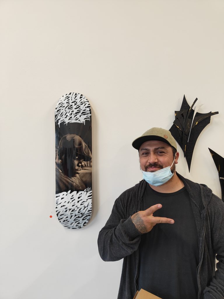
Chile One with his Biggie skatedeck, the piece was quickly snapped up by a lucky guest!
Local legends and DTR crewmates Dcypher and Ikarus
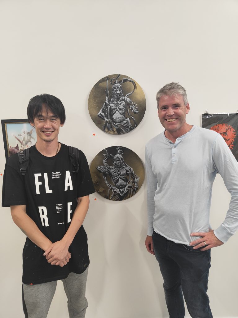
Flare artist Koryu 88 and ARCC trustee Hadley McLachlan with Koryu’s work (proudly now owned by Hadley!)
Kophie was the driving force behind the pop-up exhibition
Flare project manager Selina Faimalo got the chance to relax amidst her busy schedule
Fiksate’s Jen Heads and Flare artist Kell Sunshine enjoyed the night
Morks with a shout out to the orginators of the game
Once the sun went down, there was the chance to see the collaborative work between Jen Heads, Dr Suits and thr Offline Collective, an impressive light projection in an empty space on High Street
Slap City presents The International Paste-Up and Sticker Festival @ TyanHAUS, Friday, 4th March, 2022
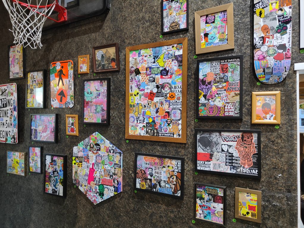
The Slap City collective have been an unmissable presence in the local scene over the last two years, their widespread community ensuring Ōtautahi has a thriving and diverse array of art in the streets. The International Paste-Up and Sticker Festival harnesses that diversity and community into an impressive exhibition and programme. Completely taking over the TyanHAUS space, the challenge proved to be where to start! Diving into the cacophonous selection of paste-ups, examing the sticker bombs or considering the Hello We Are exhibition, there was no shortage of attention grabbing activity! Follow the event on Facebook for more of the festival’s programme…
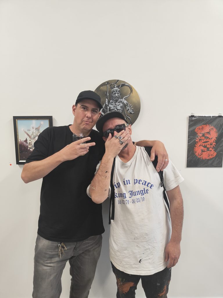
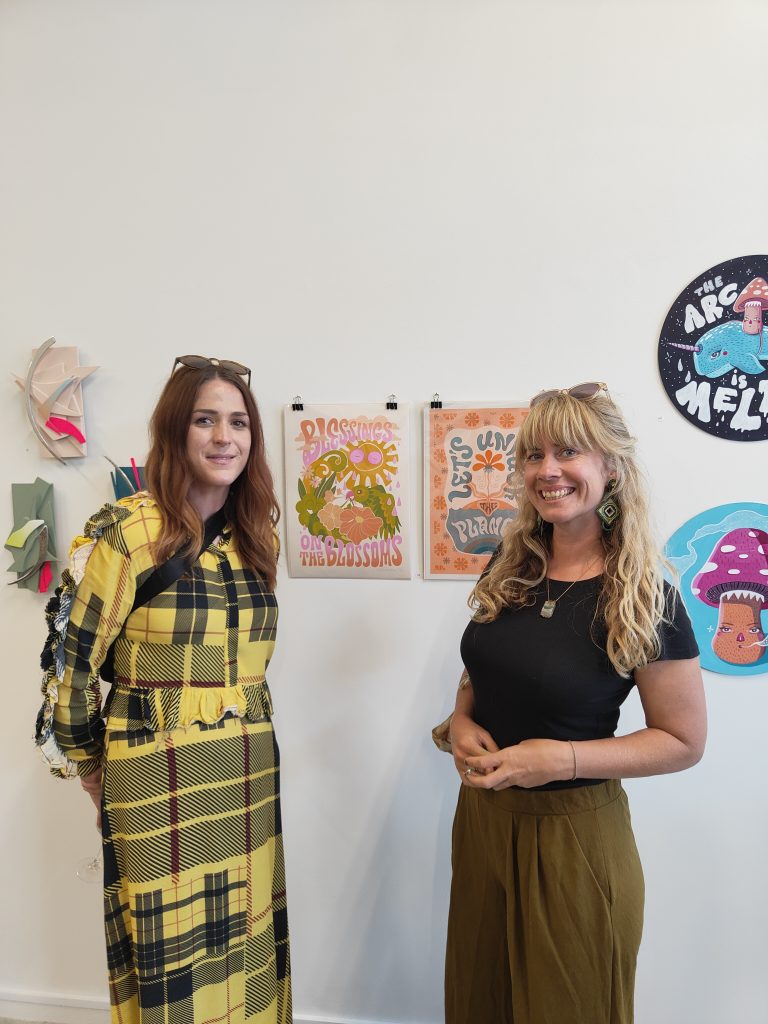
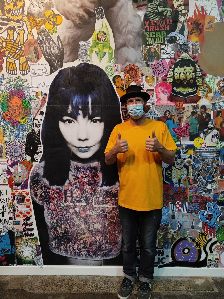
teethlikescrewdrivers and Vez welcomed visitors to the opening
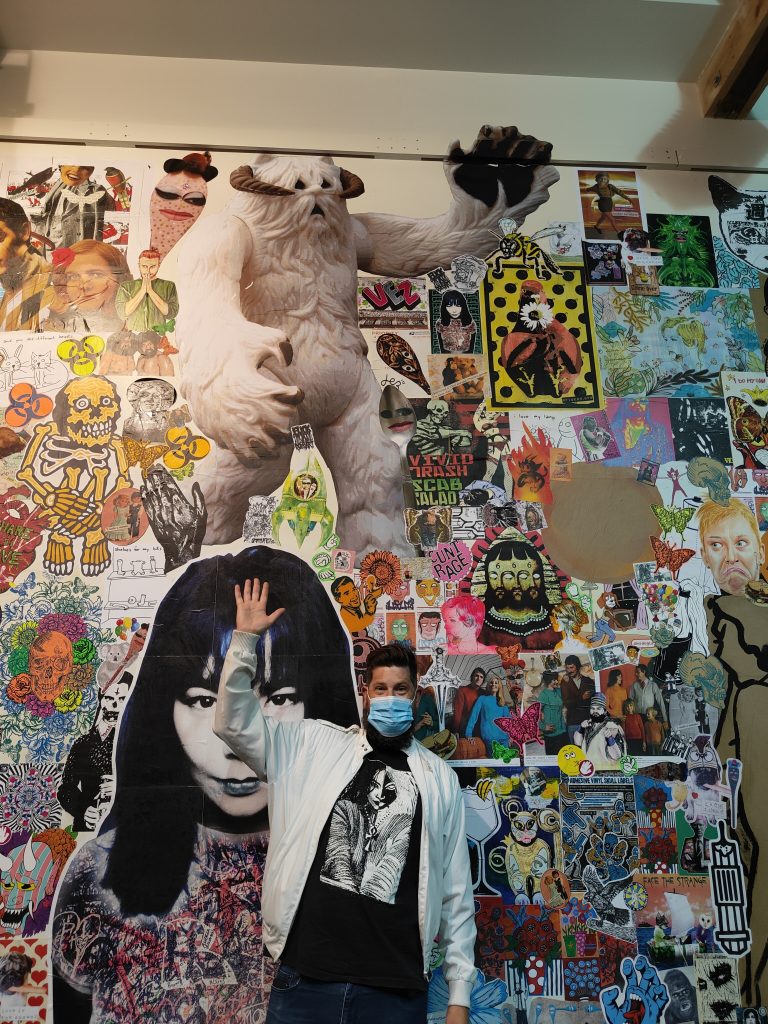
Mark Catley and his massive Wampa paste-up
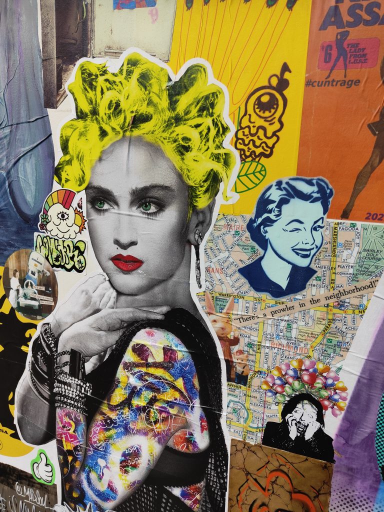
teethlikescrewdrivers was especially happy with The Postman’s massive Björk piece
Christchurch’s street art reputation is, in many ways, built on the legacy of festival events. The likes of From the Ground Up, Rise, Spectrum and Street Prints Ōtautahi established the city as a destination for artists to find opportunities and for a new audience to experience amazing examples of urban art in a setting that was forced to re-imagine it’s creative profile and identity. It has now been five years since the last significant festival was staged in Ōtautahi, but with the emergence of the Flare Street Art Festival, Christchurch is braced to once more flex it’s status as Aotearoa’s leading urban art city. We sat down with Selina Faimalo, project manager for Flare, to discuss the challenges of developing a street art festival in 2022, what Flare promises, and who we should be excited about…
____________________________________________
The Flare Street Art Festival is just days away, how are you feeling? Are the nerves jangling or is it just excitement?
I’m really excited to see it all, well nearly all, coming together! Obviously, I’m still a bit nervous because things can change between now and then, as we know, but we’re pretty fool-proof under the red traffic light setting. We’ve adapted.
What are some of the significant changes you have had to make?
We originally planned to have a large celebration of street art culture, hip-hop and urban art at the end of the festival. We were going to close down High Street and have a big market and festival with live music, dancing, skateboarding, food trucks, urban stallholders and a pop-up gallery, all sorts of things. That part of the festival had to be cancelled, so instead we’re doing micro events over the ten days; we’re going to have street art tours with Watch This Space, which we were always going to have, they can still go ahead. There will be tours on each weekend of the festival. We’ve still got a pop-up gallery and kind of hang out space, that will be open during the days. Fiksate and Offline Collective are collaborating and going to do some street art projections in some vacant spaces in the SALT District. We have the panel discussion with the artists, that is also with Watch This Space, with some of the headlining artists at 12 Bar, which will be an awesome way to interact with the artists and get to know a bit more about them. It’s going to be live-streamed as well, which is really cool as we can’t host as many people as we wanted to…
It still is a really good program. I think it is important for street art and mural festivals to provide chances to engage with different elements…
Absolutely.
The festival or market day would have been amazing, but I guess there’s a silver lining in that you can now perfect it for next year and grow the festival as a recurring event…
Totally, it might be a bit of a blessing in disguise. I’ve spent about eight months on the process of organizing this festival, so I think it gave us a lot more time to re-evaluate things and put that energy into different things. Obviously, it’s unfortunate that we had to cancel those elements, because we have musicians and vendors were relying on that income from the event. Cancelling those individuals and businesses was really sad, because you have already committed and turned down other bookings… It’s been tough for all in the events industry.
Wongi ‘Freak’ Wilson is one of the headline artists for the Flare Street Art Festival
Bringing together the wider urban art community is really important. As you said, there are the headline artists, but that’s not the whole picture, you’ve got other artists too, like the Fiksate team, the artists with work in the pop-up gallery and some smaller live painting events as well. There is a much wider array of people than the names on the posters…
It was important to involve as many Christchurch artists as possible, to make it inclusive and diverse, including, the “OGs” as well as the younger generations, as well as making sure there are female artists represented, who are not always as predominant in the street art scene.
Can you give us a little bit of background on ARCC, who are the organization behind Flare?
ARCC is a group of business leaders and place-makers, who just want to make a bunch of cool stuff happen in the city and revitalise what’s happening here. George Shaw from OiYOU! is a part of ARCC and is obviously a big advocate for street art and he recognised that a lot of the murals from the Rise and Spectrum festivals are not there anymore, as the city is being rebuilt the visual aspect of street art is not there as much, it’s being built in front of or covered, so he just wanted to bring that back, putting it on new buildings and filling these blank walls with street art again and retaking that status as a street art capital, we were obviously in the Lonely Planet as one of the street art capitals of New Zealand and the world…
A lot of that recognition came from the festival events, because you’re seeing a lot of work appear in a short time, there is a rush in activity that captures the attention. So, Flare becomes an important way of re-claiming that title. How did you come to be the project manager for Flare?
I’m actually a trustee of the SALT District, so I already knew about ARCC because a lot of the team are on the SALT District board as well and they had mentioned it. I was going along to the street art meetings and they were talking about it and I’d already been in touch with George anyway because I’d mentioned to him ages ago that I really wanted to do some type of hip-hop street art event and I wanted to know how you would make that happen. He said let’s keep in touch, maybe there will be something that we can do. I also run the Conscious Club with Kophie (Su’a Hulsbosch), we do social and environmental events in Christchurch, we’ve been doing it for the last two years, in which we weaved creativity into the majority of our events. We have held exhibitions together and shared creative working space with her for a while now. I’m not part of the street art community, but I’m a massive fan of street art culture and hip-hop in particular. I really wanted to do a hip-hop event, I talked with Red from the Hip Hop Summit about all the different things that we could do. George’s plan was to run Flare, but he had another exciting project come up. The timing wasn’t great for him to project manage Flare, so he asked if I would be interested in project managing it with his help and guidance, along with the rest of the team at ARCC helping out as well. As business leaders they have great connections to building owners to help make this happen. One of the biggest challenges of a festival like this is getting a building owner to agree to getting their wall painted without knowing what it will be, so without those connections and networks I don’t think it would be possible!
Local legend Ikarus of the DTR Crew is another Flare headliner for 2022
There’s a fine art to that side and you probably had to learn on the fly a little bit! You want wall spaces that are visible and attractive, but you also want to ensure that that building owners are supportive of artistic credibility and freedom. You have to find that balance of great walls with the right people, right?
Yeah, we’re telling artists they will have creative freedom, but obviously it can’t be anything offensive or inappropriate, and when we say inappropriate, like when we spoke to John Hutchinson of Team Hutchinson Ford, about painting his wall, he said as long as you don’t paint a Holden! It was little things like that, I just wouldn’t think about. In general I would say building owners can be a little bit conservative, and like to play it safe, might not want certain things on their walls, so it’s a balancing act of letting some know and showing them designs and then we will be surprising some!
I’m a big believer that part of the job of street artists is to bring the audience along, rather than being dictated to creatively to fit a popular trend that supposedly speaks for everybody. The reality is that we are incredibly diverse as a population, made up of individual voices, so why not let murals be a voice of an individual and in doing so, present a little bit of a challenge to the public audience to come with the artist rather than the artist having to go to the audience? What other skills that you maybe didn’t expect to draw on were needed to bring Flare to life?
I guess navigating the street art scene is something I didn’t know a lot about. I’m quickly learning it is tricky! Obviously, graffiti comes from the streets, which means there an element of rebel and conflict. Having people involved in the festival like DTR crew and Kophie, has helped with those situations. The panels along the Smash Palace pathway will be painted with local graffiti artists, and I don’t think that was my call as to which artists would be involved in that, so I asked Dcypher and Ikarus to facilitate that part of it, so they have led that part because they can navigate the relationships within the graffiti community. Even curating the headlining artists, that was tricky. George actually curated that aspect, but I was part of the conversation, and I don’t think I would have thought about who you should choose in case their work gets tagged over because they’re not respected in the street art community. That is a huge thing that I’ve learnt a lot about recently, if you put the wrong person on a wall, then it’s likely going to get continuously tagged over because they don’t have that respect or that mana in the community…
Kophie Su’a Hulsbosch is the third Christchurch-based headliner for Flare 2022
In terms of the final headlining artist roster, from Christchurch we have Kophie, Wongi ‘Freak’ Wilson and Ikarus, and from out of town are Elliot Francis Stewart from Auckland, Kell Sunshine from Gisbourne, Swiftmantis from Palmerston North and Koryu, who is kind of itinerant, kind of travelling around NZ, right?
Yeah, well, he’s based in Geraldine…
That street art mecca!
Yeah! He is based in Geraldine, but he travels a lot, he is originally from Japan.
Gisbourne’s Kell Sunshine is one of the visiting artists headlining Flare 2022
So out of that list, who are you excited to see?
Out of all seven? I mean, I’m going to say Kophie, big respect to the wahine! Being a woman in general is hard and being a woman street artist is even harder and I think she has really stepped up. she has been doing it for over ten years now and I think this is her time to leave a mark in her own city. She’s done commissioned murals but this time she gets to paint what she wants to paint and she’s so talented.
I’m a big fan of Kophie too, she is super talented and its great to see her given this platform. Anyone else?
I would say Koryu, I think his mural will be very cool! I’ve seen his design as well, so that’s why I’m really excited to see what he’s doing. I’ve been watching him this summer, watching every mural that he’s painted and it’s incredible.
He’s relatively new to it as well, right? But he’s developed a style that is both very distinctively his, and I think also speaks to his heritage, but also something that you can understand why the public gravitate towards the detail. It’s graphic and pictorial, you can easily see a crowd going, wow! He also just seems like a lovely guy! There is some amazing footage from South Sea Spray where he won the ‘People’s Choice’ award and he did a break dance because he’s a b-boy as well…
I know, he’s so amazing! That’s one thing I’m really sad about, as part of the festival we were going to have hip-hop and break dancing, and it would have been really cool to have a headline artist paint and dance!
Japanese artist, Koryu, now residing in Aotearoa, is another headline artist
Maybe he could still do that at the panel discussion!
I think so, just break it out!
So, the Flare Street Art Festival begins on the 2nd of March, when the headline artists start painting, but how can people find out more? How can people get involved in the various events?
They can head onto Facebook for the Flare Street Art Festival or the website which is flare.nz. The full program is on the website and if you want to book tickets to any event, you can do that online. I recommend having a look online because that will be have the right information, it is the digital age, we can update things!
____________________________________________
The Flare Street Art Festival is located across the SALT District with a range of activities – follow Flare on social media or visit their website for more information and booking options. Flare runs from the 2nd March until the 12th March, 2022.