
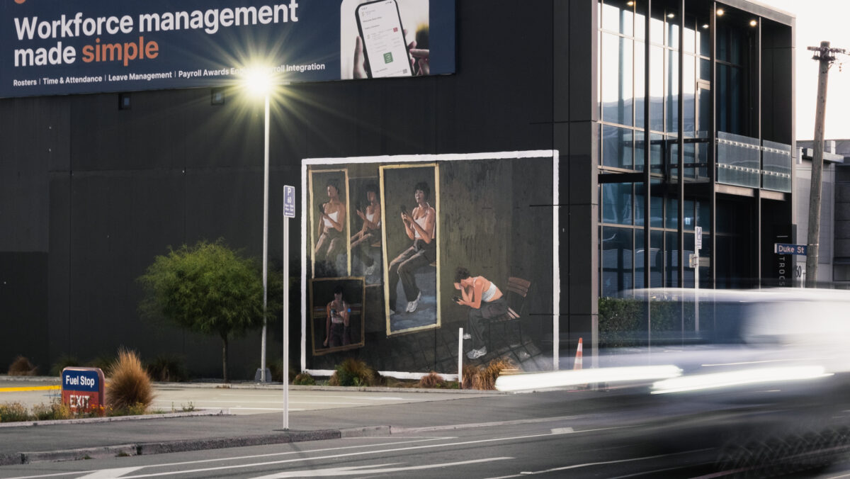
From the small Scottish town of Paisley, just west of Glasgow, via Melbourne’s iconic Everfresh Studio, Shaun Devenney travelled a long way to find himself painting in Ōtautahi. Establishing a strong reputation for his thoughtful, painterly ruminations on life, a kind of acerbic social realism informed by his Scottish sense of humour and an observational world view, Devenney’s deft brushwork and compositions are undeniably unique. His work is a reminder of the diverse potential of urban painting, eschewing conventions and traditions in favour of an aesthetic that is equally informed by the studio as the streets. With the assistance of Life in Vacant Spaces, we were lucky enough to help Shaun secure a wall to leave a legacy of his trip to Ōtautahi, and in doing so, we were able to spend some time with the artist. In between painting sessions, we sat down with Shaun for a chat about his travels, his trajectory as an artist, the distinctions between the streets and the studio, and the increasingly confusing world we face…
Continue reading “Shaun Devenney – If you don’t laugh, you’ll cry”Tag: Painting
Morks: The Busy Mind – Enter the Void @ Oxford Gallery and Two-Way Street @ The Central
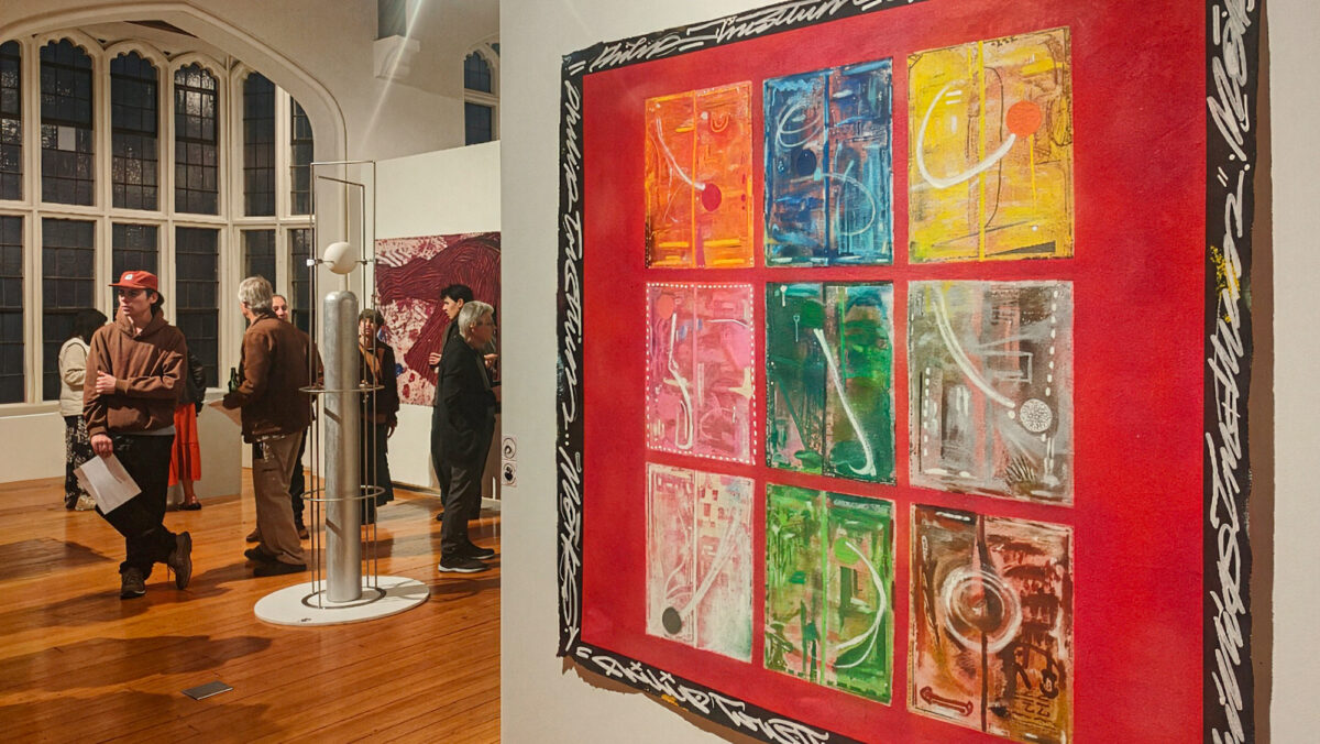
Over a career spanning multiple decades and ranging from graffiti and tattooing to his increasingly prominent studio output, Morks is a singular creative force. The artist from the foothills of the Southern Alps is in the midst of a busy period – opening two shows within a fortnight: the survey-like Enter the Void at Oxford Gallery – Toi o Waimakariri, where a range of works represent his myriad influences, from folk art to skateboarding, his military service, love of nature, tattoo, graffiti and more; and Two-Way Street at The Central in central Ōtautahi, a group show centred on the mentor-mentee relationship between Morks, sculptor Luca McDonnell, and the late Philip Trusttum, ONZM, one of Aotearoa’s most accomplished painters.
Morks and Trusttum developed a fast friendship in the last years of the older artist’s life, a connection that provided Morks with invaluable knowledge and guidance. While the two shows are decidedly different, Trusttum’s influence is clear, especially in the larger works on unstretched canvas – a format that pushes Morks’ exploration of colour, dynamism and scale. In the Enter the Void, Morks’ imagination runs free, found objects are transformed and juxtaposed with painted and illustrated two-dimensional works, creating a dizzying effect where the viewer is invited to immerse themselves in whirring life. Morks’ collection of works in Two-Way Street is more focussed, but highlights his growing confidence, a sense of maturity that ensures his paintings fit perfectly alongside those of Trusttum. The day after the opening of Two-Way Street, we took the drive out to Oxford, and after an obligatory pie from the Sheffield Pie Shop, we took in Enter the Void, before sitting down with the artist to discuss what has been a busy time – fitting for someone with a self-described busy creative mind…
Continue reading “Morks: The Busy Mind – Enter the Void @ Oxford Gallery and Two-Way Street @ The Central”The Things We Love To See…
At the end of March, we were stoked to pop along to the Giant Cans Space on St Asaph Street and check out a new collaborative production going up, created by our mate Jonny Waters and his Toi Ora art therapy group from Purapura Whetu.
Continue reading “The Things We Love To See…”Benjamin Work and Brendan Kitto – MOTUTAPU @ Te Uru – Waitakere Contemporary Gallery
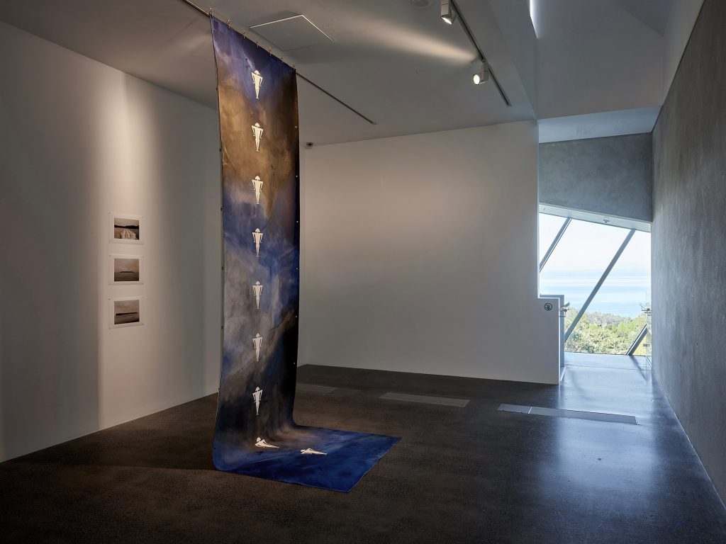
MOTUTAPU, a collaborative project by Tāmaki Makaurau artists Benjamin Work and Brendan Kitto, is the conclusion of a four-year exploration of the shared histories of Motutapu, or sacred islands, throughout Moana Oceania, including Tongatapu, Rarotonga and at the entrance to the Waitematā Harbour in Tāmaki. These sanctuary spaces, gateways for voyagers departing from and arriving at the mainlands, were where the lifting of tapu and making things noa (free from the restrictions of tapu) occurred, connecting navigators with their ancestors and kainga. For the artists, who travelled to three of the Motutapu locations and engaged with key knowledge holders, the journey became deeply personal, connecting to their own genealogy, centering on reconnection and reconciliation, joining communities across Moana Oceania through time and space.
The exhibition, built around the juxtaposition of Work’s evocative paintings (including the hanging Piha Passage and free-standing Mata Pā screens) and Kitto’s photographs of Motutapu ki Tāmaki Makaurau, Motutapu ki Tongatapu and Motutapu ki Raraotonga, is currently on show at Te Uru – Waitakere Contemporary Gallery (11 June – 11 September 2022), and includes the launch of an accompanying publication MOTUTAPU.
![]()
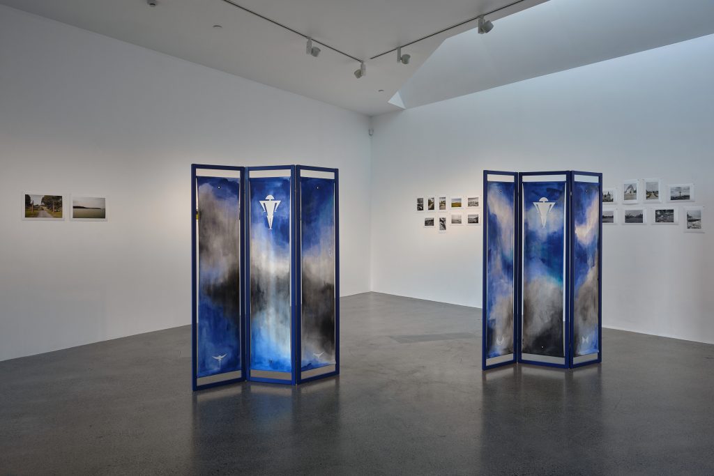
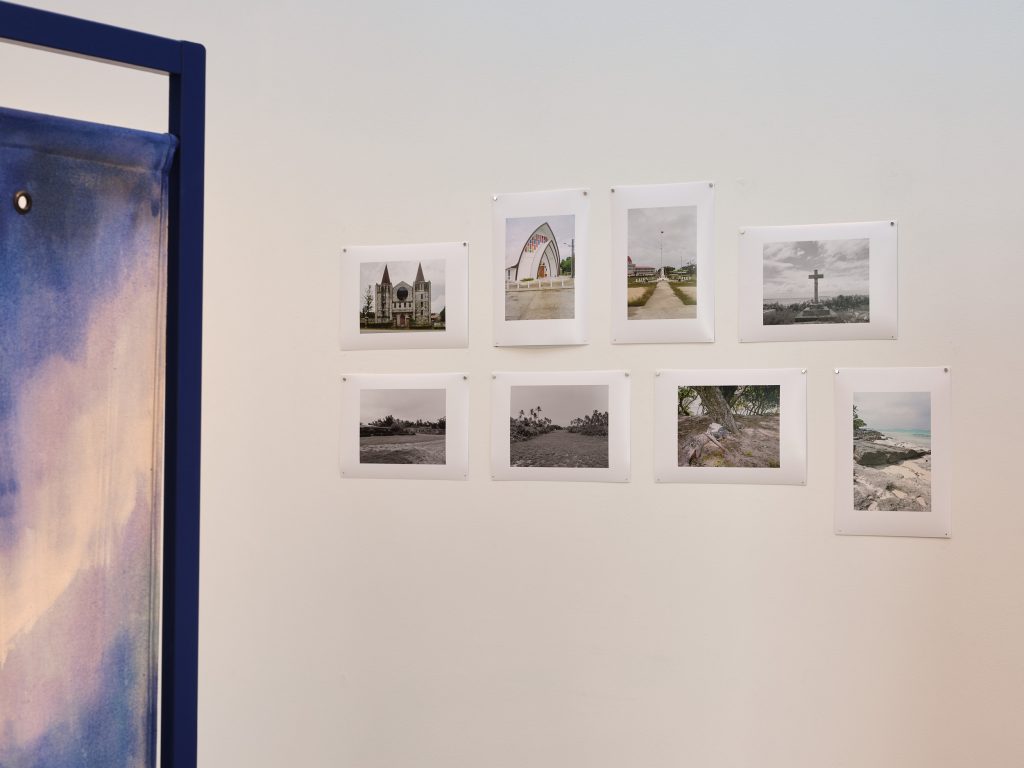
All photos by Sam Hartnett.
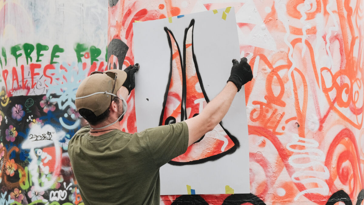
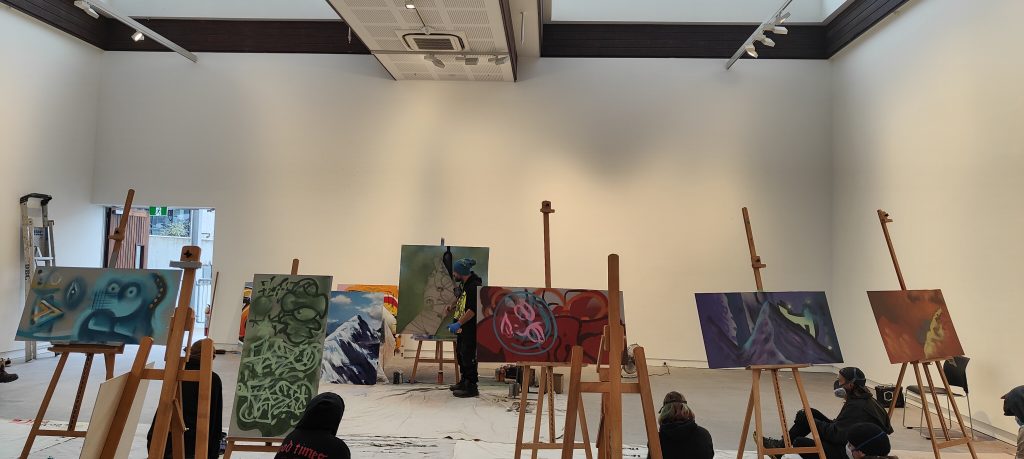
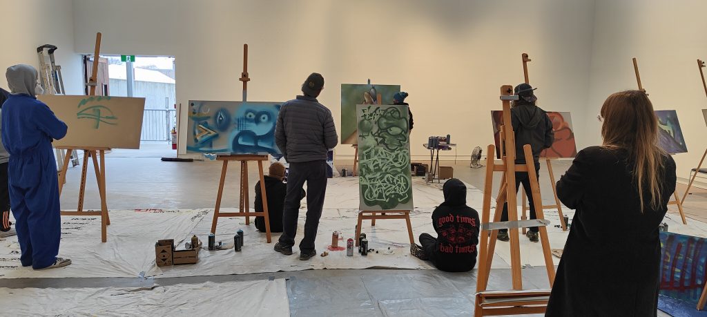
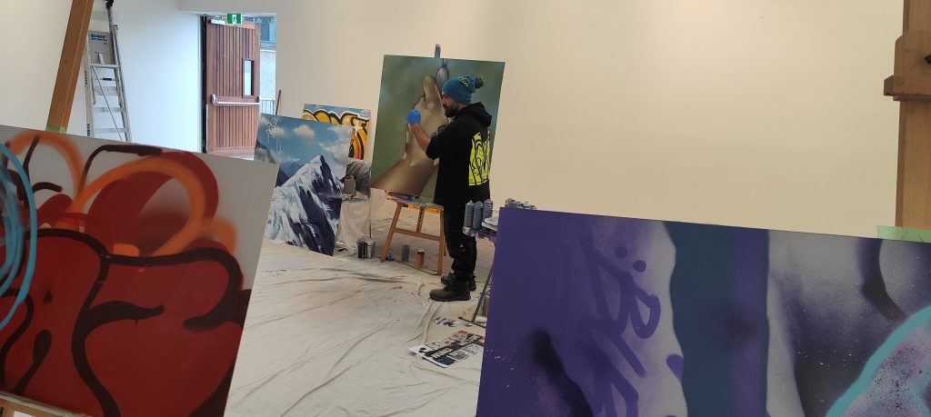
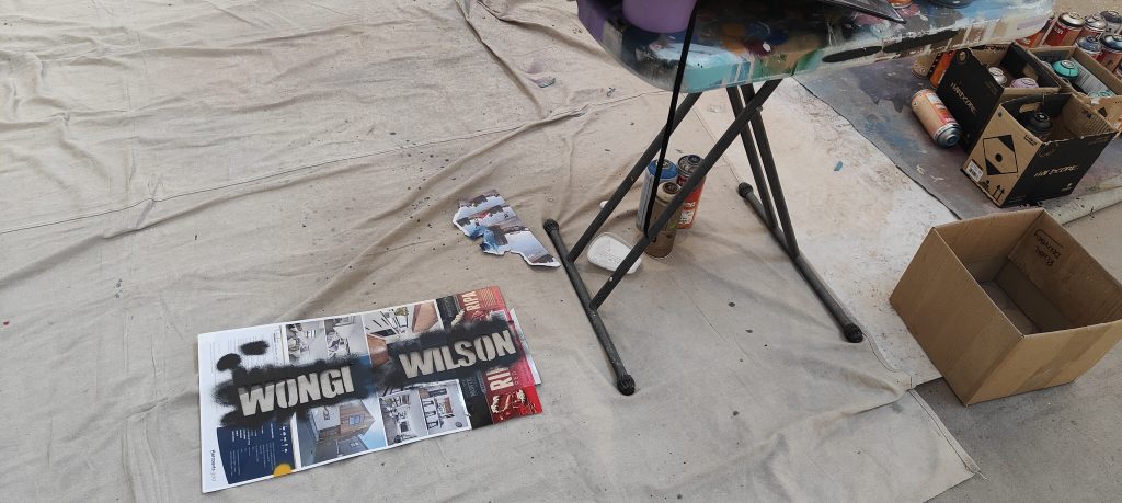
Exploring Aerosol – A Masterclass Workshop with Wongi Wilson
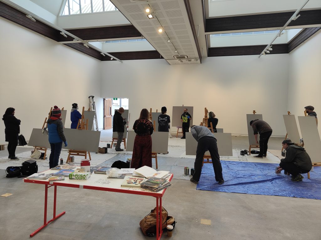
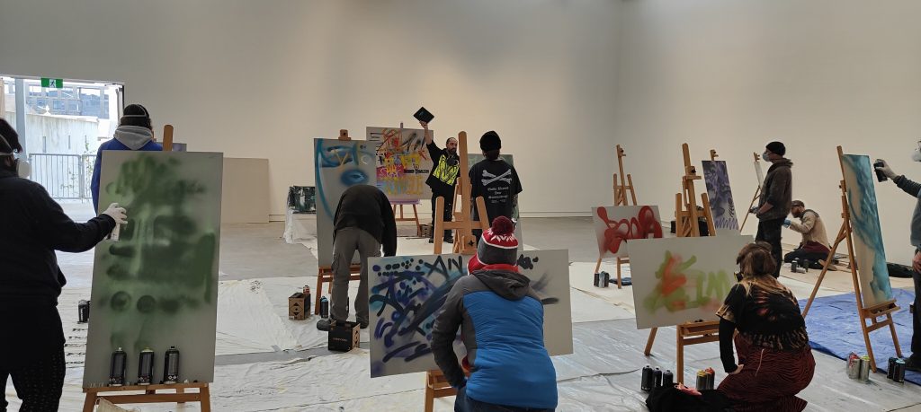
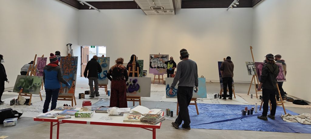
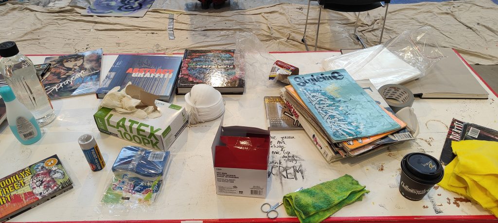
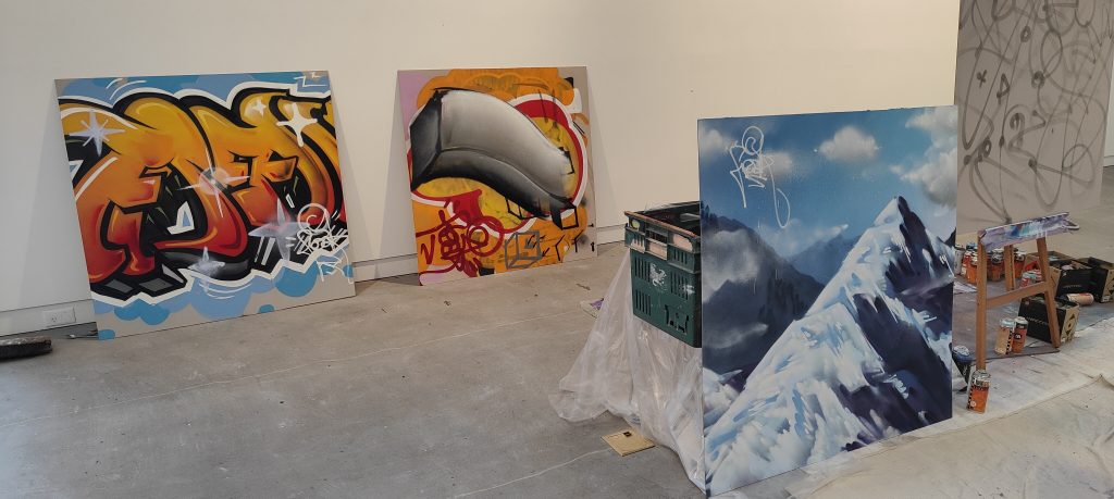
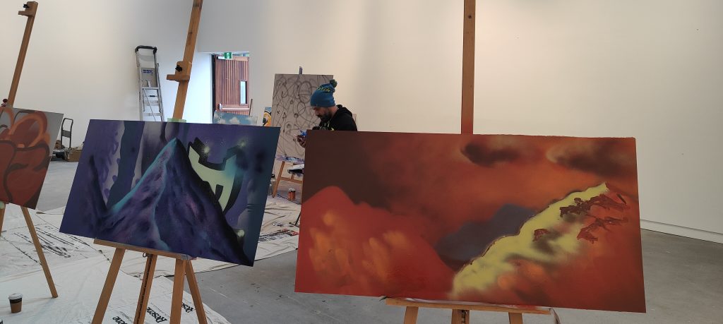
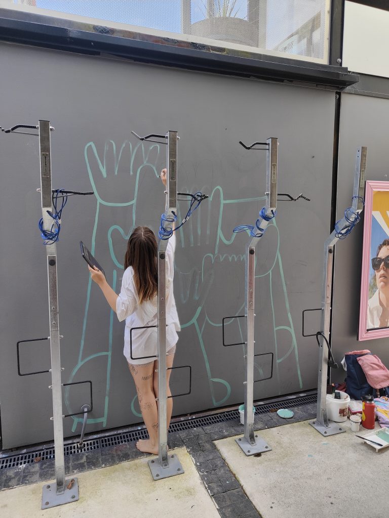
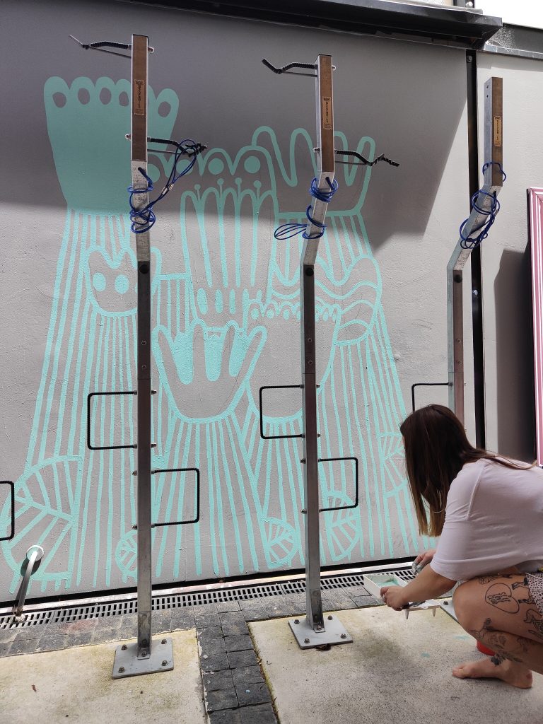
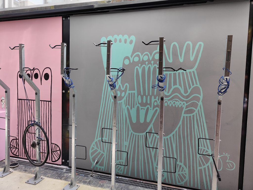
Back in June, we were lucky enough to work with local aerosol legend Wongi ‘Freak’ Wilson, Toi Ōtautahi and the Ministry of Culture and Heritage to deliver the free masterclass workshop Exploring Aerosol. Hosted at the iconic CoCA on Gloucester Street, where the white-walled upper gallery provided a stunning setting, attendees were given the chance to learn from Wongi’s mass of accumulated knowledge. Learning about the building blocks of graffiti as a gateway to can control, from the simple tag to the more developed three-dimensional effects of a larger piece, guests were let loose to explore techniques as Wongi presented his insights. The afternoon session dived into Wongi’s approach realism, from landscapes to his mastery of hands, the crowd in silent appreciation of how his images came together.
The free workshop was one of the first of a series of classes targeting practicing artists and providing the chance to expand technical skills. In developing Exploring Aerosol, the goal was to enable artists to develop aerosol techniques while also exploring how the spray can might be used for a variety of forms and styles, elevating the tool to a broader perception. With an energetic response (with limited spaces, not every applicant was able to attend), we hope this was just the first of future workshops that might explore the toolbox of urban art…
We want to hear from more people interested in these types of workshops and initiatives – let us know in the comments or via email to [email protected]
And That Was… May 2022
May is the month when you can feel winter coming, daylight savings ends, the weather becomes just that little bit more unpredictable, and t-shirts start to be accompanied by warmer layers (just in case), yet we can also ignore these signs and enjoy the final throes of Summer’s waning presence. This May, we have enjoyed a range of treats, from the streets of Ōtautahi to gallery walls in Te- Whanganui-a-Tara Wellington, a beautiful secluded gem in Waltham, a haunting surprise outside one of our favourite bars and the odd geeky nightmare…
____________________________________________
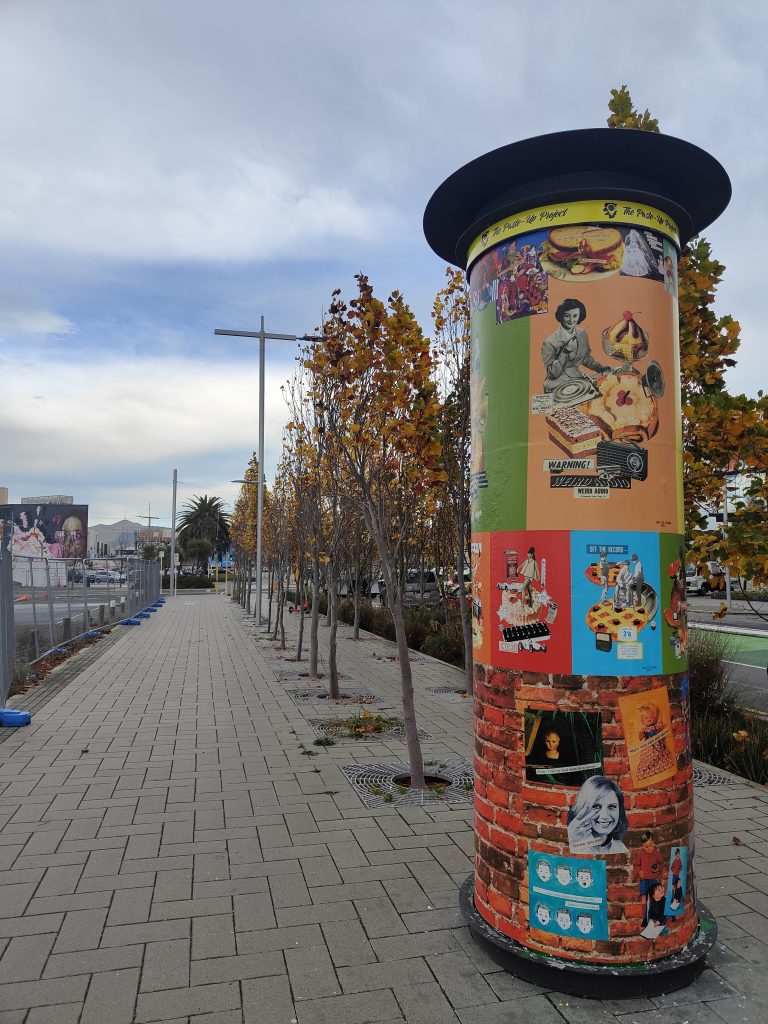
Cape of Storms – The Paste-Up Project
We welcomed the third artist to the Phantom bollard take-over The Paste-Up Project, with Cape of Storms adorning the circular structure with a signature blast of colourful retro collage posters. The installation, titled Foreign Objects, reflects on the adjustment to life in Aotearoa, highlighting Kiwi quirks through nostalgic compositions of food and fashion and vintage media. The appearance is easily mistaken for official poster advertising, until closer inspection reveals the acerbic humour – check it out on Manchester Street!
Jessie Rawcliffe – Adam Portraiture Award
We’ve always known our pal Jessie Rawcliffe was super talented – now she has the certificate to prove it! Jessie’s striking portrait Richard, of Wellington tattoo artist Richard Warnock, was highly commended in the Adam Portraiture Awards at the New Zealand Portrait Gallery in the capital. From 351 entries, the Adam Awards exhibition was narrowed down to 45 works, with Jessie’s painting being placed in the top 7 by judges Linda Tyler and Karl Maughan.
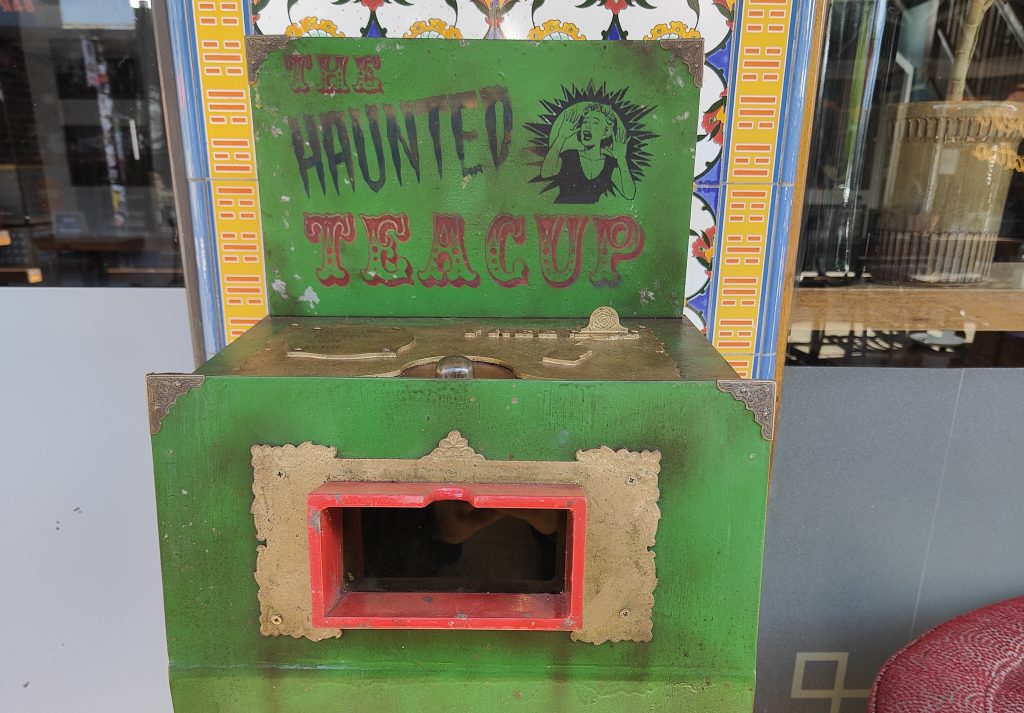
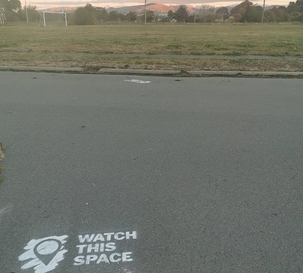
The Haunted Teacup
You may know about Watch This Space’s plans for The Little Street Art Festival in 2023 (if not, more to come soon!) – but did you know about Ghostcat‘s Haunted Teacup – a work created to exemplify the types of works the festival will celebrate? The worn Victorian-styled automata viewing box has been surprising viewers passing The Last Word on New Regent Street through May, drawing people in with the promise of a terrifying supernatural experience, but is it what it seems? Go and check it out… If you dare!
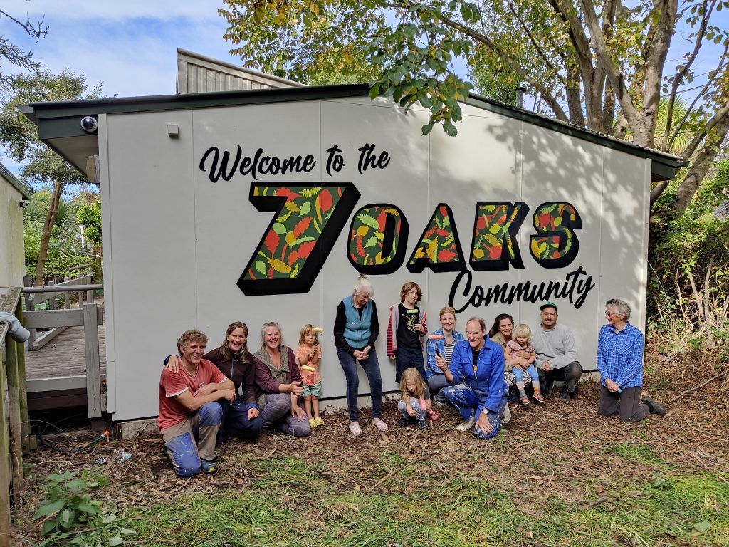
7 Oaks Mural
We recently had the chance to work with Life in Vacant Spaces and the amazing community at Waltham’s 7 Oaks – an incredible site where array of groups make use of a beautiful space. Together we created a participatory mural welcoming visitors to 7 Oaks, a team effort where 3 year olds and those just a little bit older all contributed to a mural that draws on the surrounding environment.
Return to the Upside Down
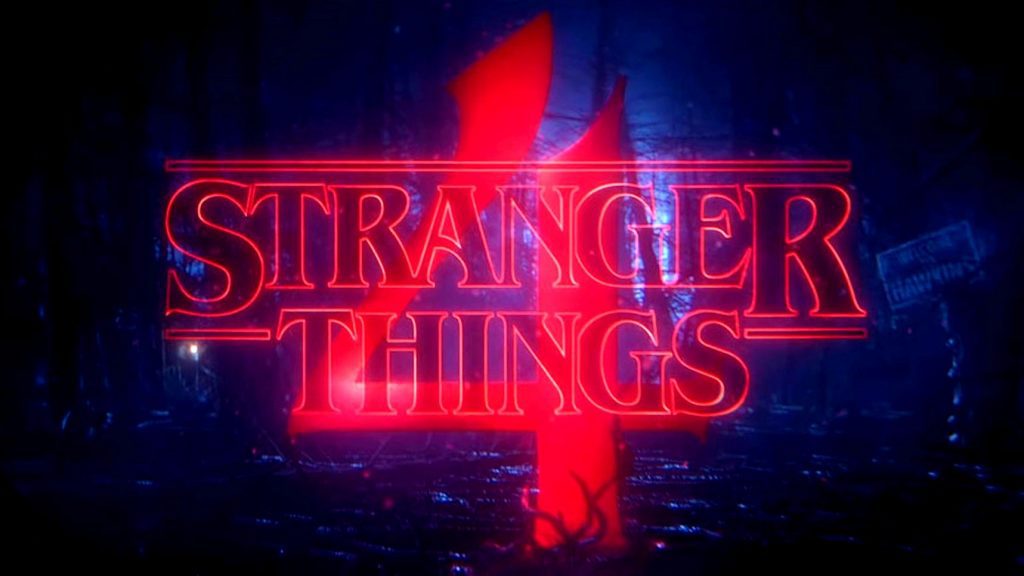
Last, but not least, is a shout out to my nerdy side (which is possibly 73% of me) and the long anticipated debut of season four of everyone’s favourite 80’s homage Stranger Things! I may or may not have binged all seven episodes in one night, but who is asking, really? I also may have already re-watched it and now wait impatiently for the final two episodes… Bada Bada Boom!
What made your May list? Let us know!
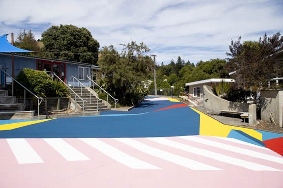
Dr Suits goes to Akaroa…
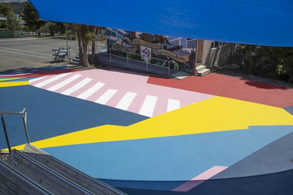
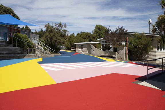
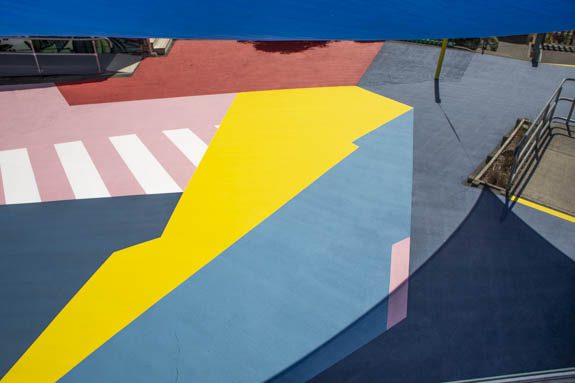
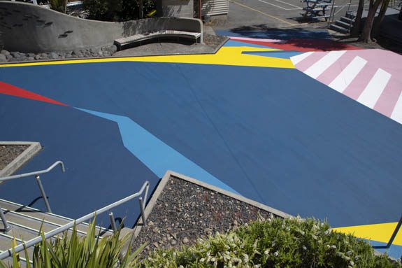
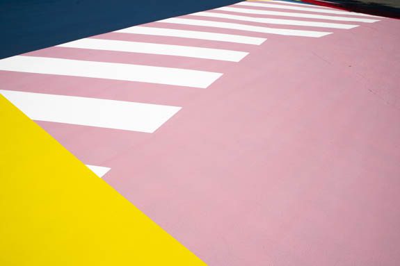
Back in November, we caught up with our good friend Dr Suits to chat about his experience at Taupo’s Graffiato festival, Aotearoa’s longest running street art festival, what he didn’t let us know at that time was he was in talks about a massive mural on the grounds of Akaroa Area School. Akaroa, the picturesque waterside township south east of Christchurch on Banks Peninsula, is not an expected location for such a project – but word of Dr Suits’ ability to produce bold, striking mural works had obviously spread. In January 2022, Dr Suits and Porta loaded up and headed to Akaroa to spend a week transforming the junior school with colour and the result, Polymorph, is stunning. When he got back we sat down to talk about the project and the technical process…
____________________________________________
How on earth did you find yourself painting such a massive ground mural in Akaroa?
It’s funny, the last thing I talked to you about was Graffiato (the street art festival in Taupo). As soon as I got off the plane in Rotorua after leaving Taupo, I checked my emails, and I had a message from Ross, the principal of Akaroa Area School asking if I would be interested in painting the junior area of their school. He didn’t really give away too much in terms of what he wanted, but it was quite exciting, especially having just painted at Graffiato…
You must have felt like you were on a roll! How did you get on their radar?
One of the teachers showed Ross an article about Crossings, the red zone work we painted last year, and he must have thought, that looks good, this artist can paint a ground! I have a ground that needs some paint, so it’s perfect…
Did Crossings inspire the concept or were they already sold on the idea of painting the ground?
They wanted to paint the junior ground and after a conversation with them, they had some really clear ideas about what they wanted. When they asked me to quote the area, I was like, far out, how have this school got the money for this? To go through the design process with a school, I’d imagine it would be quite a long process…
I imagine there are a lot of stakeholders that must be consulted…
Yes. Their ideas were directed at traditional games and instructing children to play in a certain way and interact with the space in a very traditional way, like we probably would have interacted with spaces when we were kids…
You mean like hopscotch, that sort of thing?
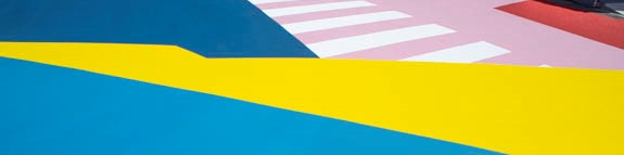
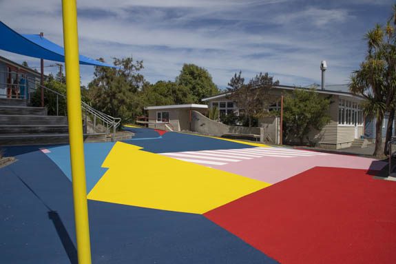
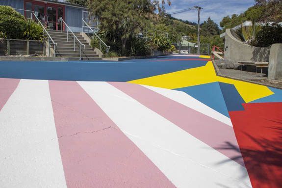
Yeah, like Four Square, roads to follow, those types of things. I knew I wasn’t going to have a lot of creative freedom, so I just quoted the job. Anyway, Ross got back to me and said we can’t afford that, which I was expecting, so I called him back and I said, what is your priority? Is it to have those traditional elements, or is it to get a whole lot of color on the ground? He said if we can get that area covered, that’s the priority. So, I got talking to him about how we could make that happen, just using a more mathematical approach to working out surface areas and ordering smartly, basically designing according to how much material would be used…
So, you figured out a formula to achieve that?
It was quite challenging. I hadn’t really approached the design process in that way before, I usually approach it more artistically. I’ve done it in fashion design, where you’re really conscious about material and how to maximize the design based on materials, so I kind of used that thinking. Basically, I tried to keep the design quite simple and geometric, because curves would slow me down, details would slow me down. I did a few concepts and gave them to my friend Roberto who put them into CAD, and he worked out their surface area, and then I calculated how much product I would need, and I tweaked it from there. I also had to consider the surface of the ground, because if it’s rougher, it’s going take more product, yellows and pinks will need more layers. So, I reduced the yellows and pinks and added more blues, because they cover the ground really well. It was all about efficiency, really.
You’re known for your color palette, particularly in your outdoor mural works and those pinks and yellows are pretty prominent. Was that a challenge to minimise those colors?
Yeah, it wasn’t a challenge as such, but I had to have some in there!
Did you use the paint product that you used for the basketball court in New Brighton?
A similar product.
Which is different to the standard paint that you used in the red zone. So, how did you go about sourcing the paint?
There were a few contenders, but it came down to durability and workability. I’d seen another company that used the same product, and I could see what it looked like in a similar context. I also had conversations with the sales rep. There are a few products within their range that are similar; some are acrylic, some are water-based, which is great, there were others that were chemical-based, which I wanted to avoid. I wanted to avoid playing around with solvents, which are unpleasant to work with and to clean up…
Particularly when you are doing such a massive job as well, that would have required a whole heap more gear just to get the job done…
Yeah. The paint company rep was great, he was really helpful. He probably got sick of me asking questions!
So, this product will be your go to from now on?
Absolutely, I got my head around how to use the product, putting the hardener in, laying it out. I had to get scales, a paint mixer and a few more things. The scales were a bit more expensive than I bargained for, but they came in extremely handy. I mean I couldn’t have done the job without either of those tools. There are different options for the application, the rep even recommended spraying it…
With a pressurized sprayer? Were you tempted?
Spraying would be OK if you had a sprayer, but you’ve got to take into consideration masking, the wind, clean up and waste, and I wanted to reduce waste. Basically, once this product is mixed together, you have to use it within 40 minutes.
Was it a case of the old ‘measure twice, cut once’, or was there still a little bit of figuring out as you went?
I used a grid system, which meant I could get pretty accurate with the layout and composition, which kept me to plan, but when we were putting down the first coats, if there was half a bucket of product left, I’d improvise and chuck it in somewhere to break it up a bit…
How close was the original design to the finished piece?
I’d say 85 per cent. There are a few add-ons here and there…
That’s always good for the creative process, right?
When I was designing it, I was working on such a small scale and when I actually got into the space, it was so much bigger than the piece of paper or the screen that I was working on. It definitely changes the perception of it. I think one of the coolest parts about the project was being immersed in that color as you’re working on it, really experiencing how colors change when you put them next to each other.
What was the area in square metres?
360 square meters.
Did you look at any comparable mural works in Christchurch? Do you know of any other similarly scaled works?
I didn’t even think about that. I was just focused on the task at hand. But, just to give you an idea of what that looks like, the longest straight line on it was 28 meters.
Wow! On that first day when you started painting or even just gridding it out, did you have to stop and ask yourself: am I going to be able to do this?
No, I’d done all that after I took the job on and designed it and been paid the deposit, that’s when I was like, shit! Am I actually going to be able to do this? It wasn’t until I went out there and had a good look around that I was like, OK, it’s not as big as I’ve built it up in my head.
Did it help as well that you had your trusty compadre, Porta, there with you?
Oh yeah! I’ve said it before and I’ll say it again, Porta’s the man!
There were certain restrictions based on the colour palette, and you had to encourage them to move away from including those ‘instructed play’ elements, but was the final design based on any particular concept or idea other than dynamic shapes and space for play?
That’s it, just dynamic shapes and spaces. I used my trusty collage technique. I cut out some shapes and piece them together, and just subconsciously come up with something.
Have you been able to get feedback yet?
I sent Ross a message on the first day back at school to ask about the big reveal on the first morning of school, his reply was: ‘Awesome!! Thumbs up’. So, I figured, it must have been a big day…
Was it disappointing that you didn’t get to see that first response of the kids yourself?
Yeah, I was a little bit, but as we were working on it, people would walk past daily and even when we had one or two blocks of color down, people were pretty excited. It really started coming together towards the end, I knew as soon as we got the yellow down it would really start to come to life, and then when we put the final blue down at the end, that just tied it all together.
You also added a little touch where you painted a pole bright yellow?
That pole’s funny because I’ve always wanted to do a sculpture exactly like that, with a just off axis yellow line…
You finally got to do it! I was going to say that one of the great aspects of projects like this, and we talked about this with your court in New Brighton, is the way they encourage movement of bodies through and across these spaces (which allows people to engage with and respond to abstract art, even unwittingly). It would be really cool to have a drone video that shows the students moving across the mural.
Ross got some drone footage, with his kids walking on it, not playing unfortunately, but it will be really cool to see. With the COVID situation, schools have been really encouraged to get kids outside, and this work will really help with that…
An unforeseen practicality! Doing something in a place the size of Akaroa, I guess the work would reach the whole township. You said some people came past and saw it, did you get a sense that people were hearing about it and the word was spreading?
I think so. I did have that realization that we could have quite an impactful reach. Basically, if you are a family in that town with kids, they go to that school, and if you grew up in that town, you went to that school. So, hopefully people will be really excited about what we added to the school. The school is a really amazing environment, it’s nestled next to a hillside, there are a lot of native trees and birds, it was really beautiful to just hang out there painting…
Now that you’ve done something to this scale, it sets the precedent. How do you go about finding some new places to paint?
The school got funding from the Ministry of Education for the project and a couple of other projects around the campus, so my next task is to put it all together in a nice little package and reach out to more schools, find out what the funding was and how to go about getting it. Then just push them to apply for the funding to get something like this…
You will be taking more notice of school grounds now I imagine!
There were a lot of restrictions around this project, which made it good for the first one of this scale. Those restrictions really helped make it achievable and set boundaries, so I couldn’t really go too crazy with the design and get in over my head, which could have easily happened. I was learning a new product, I was out of town, if I ran out of something it wasn’t like I could just nip down to buy something. The product had to be ordered in from Auckland. So, if I get another job, closer to home, I’ll be able to push it a bit further and explore the color palette…
Follow Dr Suits on Instagram to what he has in store next!
All images supplied by Dr Suits
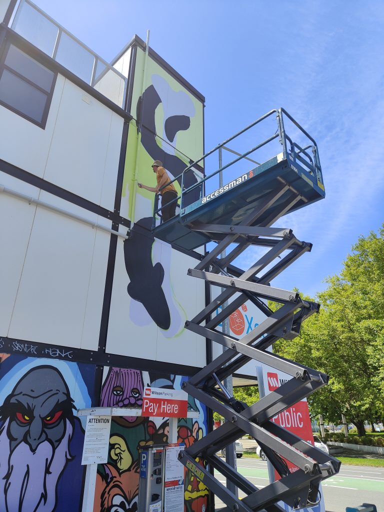
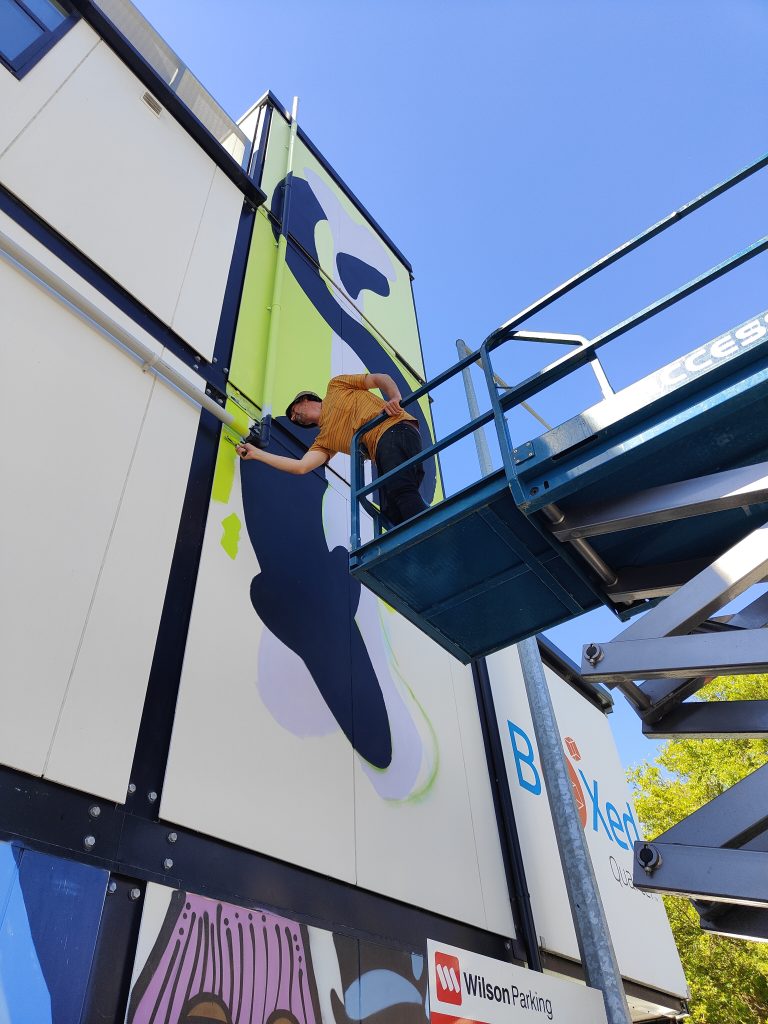
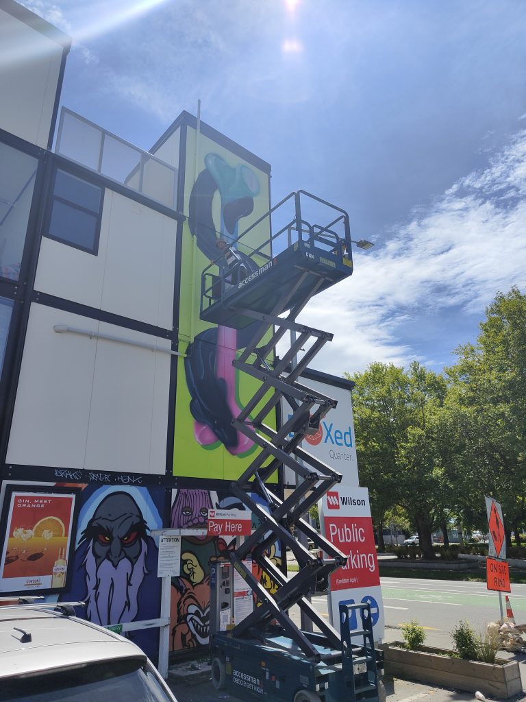
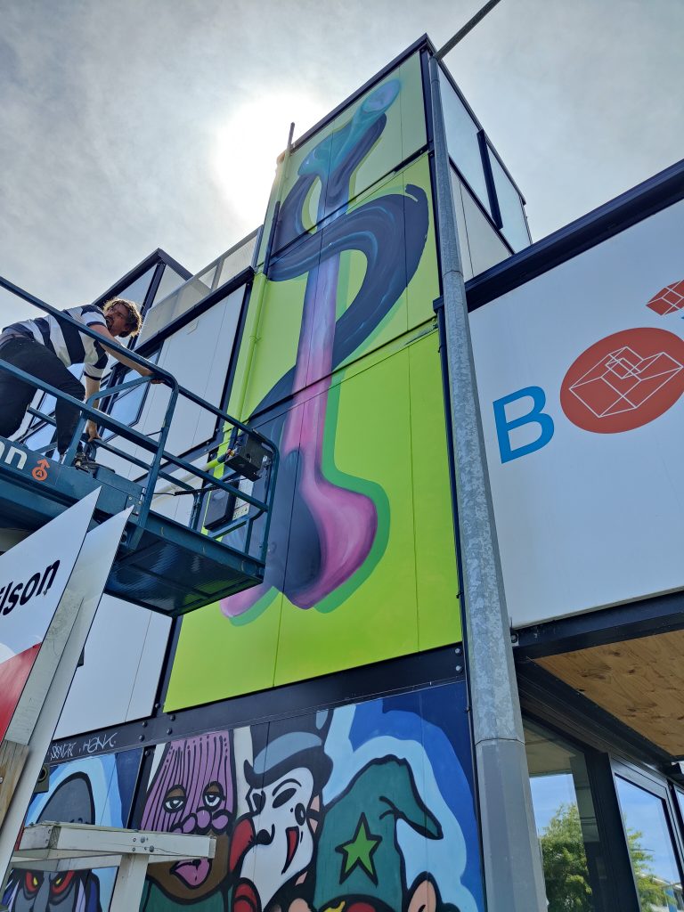
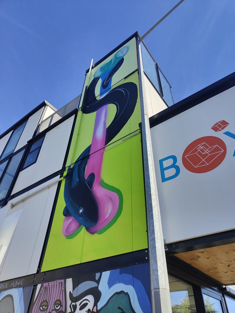
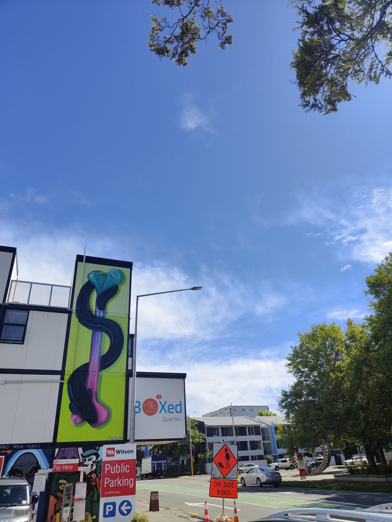
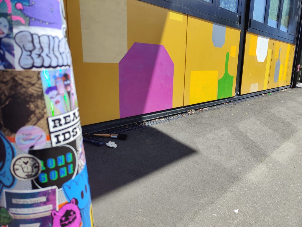
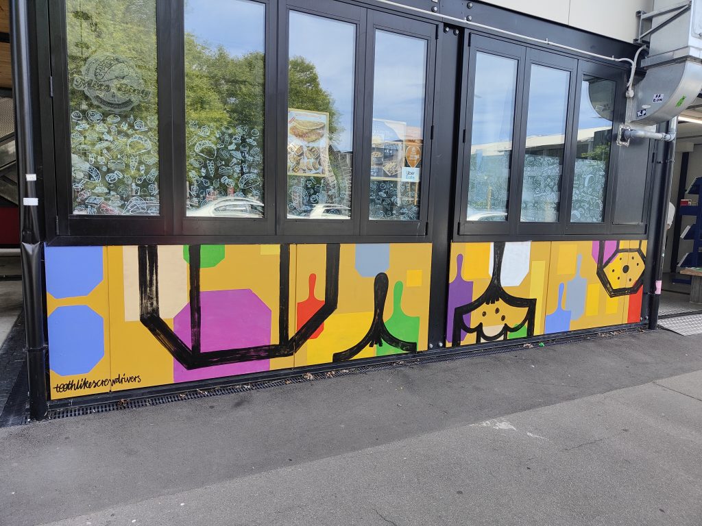
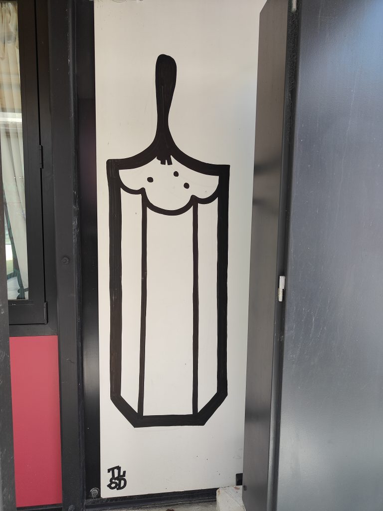
Nick Lowry, teethlikescrewdrivers, Bloom n Grow Gal and Bols @ the BOXed Quarter
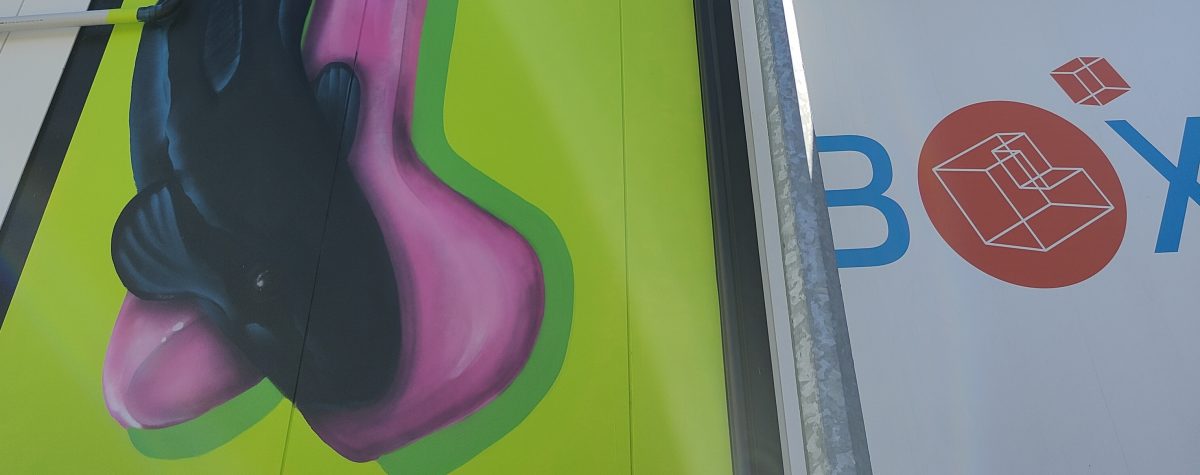
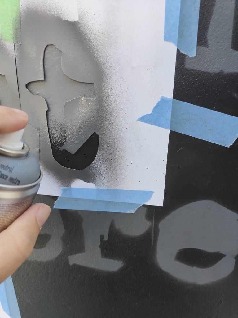
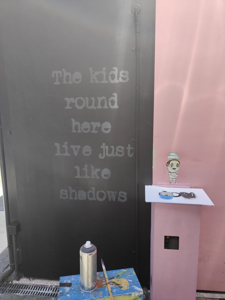
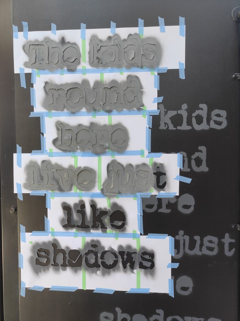
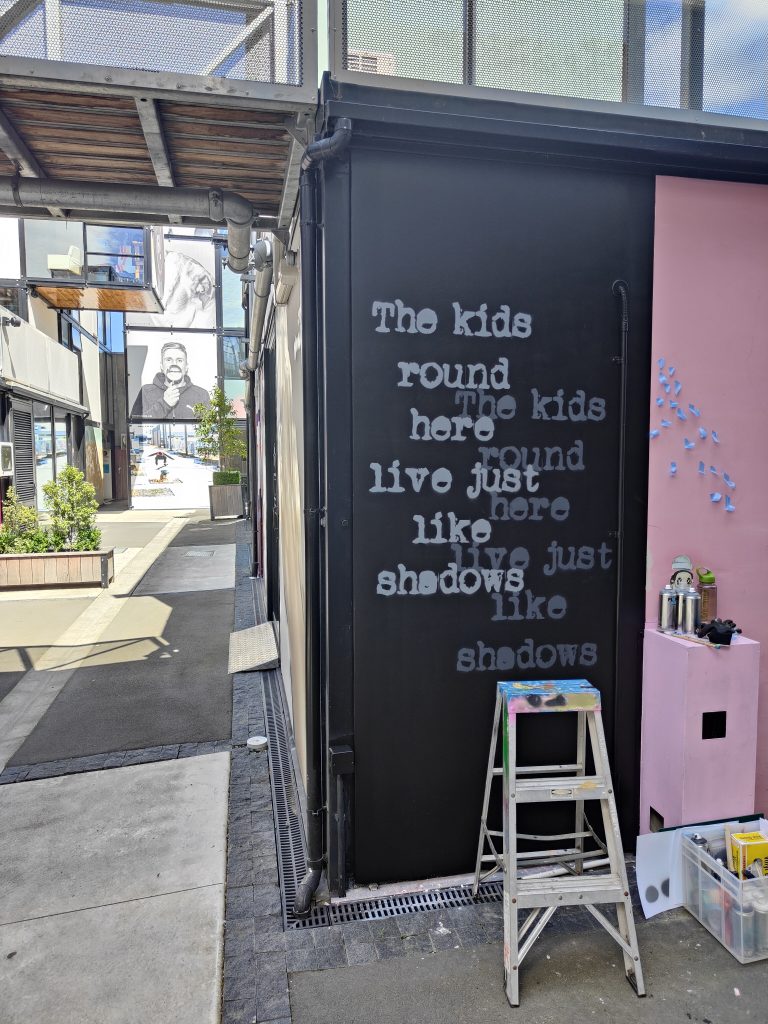
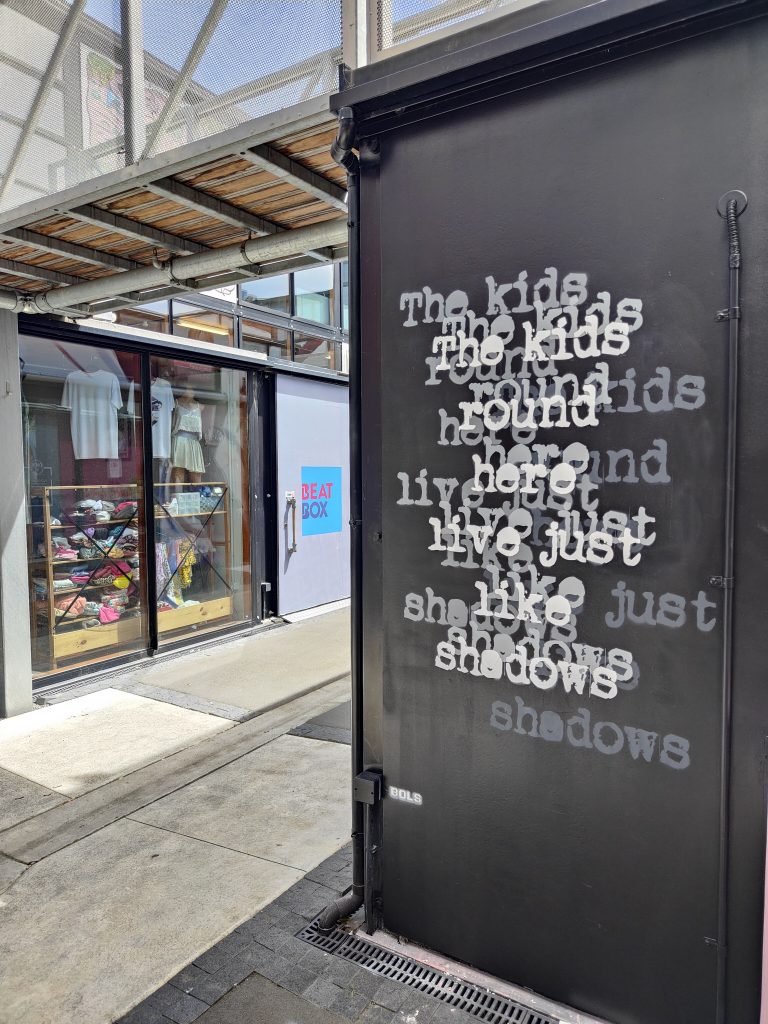
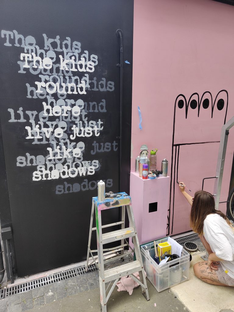
After a week of rain fall and grey skies, the sun returned just in time for a group of local artists to add to the already impressive collection of art on the many panels of the BOXed Quarter on St Asaph Street. Nick Lowry, teethlikescrewdrivers, Bloom n Grow Gal and Bols each brought their own styles to various panels throughout the complex, joining works by Wongi ‘Freak’ Wilson, Joel Hart, Meep, Chile One, Newen, YSEK, Mark Catley and more. Inside, Bols stencilled a multi-layered grey-scale text piece, reading ‘The kids round here live just like shadows’, a line taken from Bruce Springsteen’s epic Jungleland, while Bloom n Grow Gal’s flowers took root on nearby panels, boldly outlined and oversized. On Madras Street, teethlikescrewdrivers played off the existing buff patches to create a colourful swatch of squares and line-work pencils, bright colours buzzing against the rich ochre background. Around the corner, Nick Lowry went big, with a three-panel high piece featuring the evocative image of an eel wrapped around a bone, the background a shift of green tones. Reaching the top of the building, Lowry’s work is visible from far down Madras Street, a new beacon of the BOXed Quarter’s vibrant walls.
Let us know about your favourite new works around Otautahi by commenting on our social media, or send us an email at [email protected]!
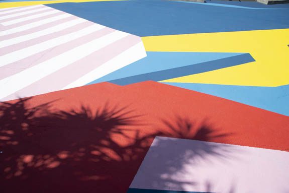
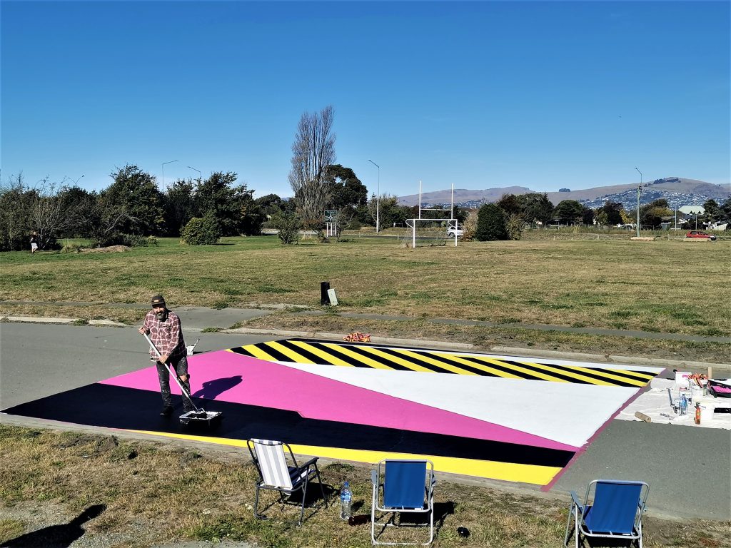
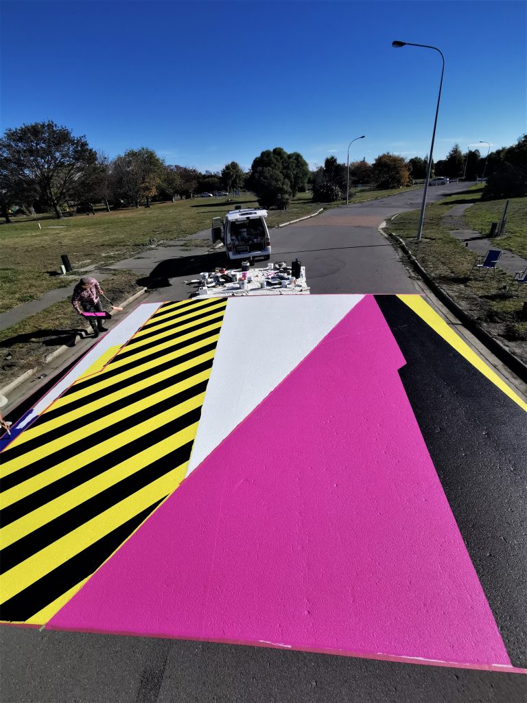
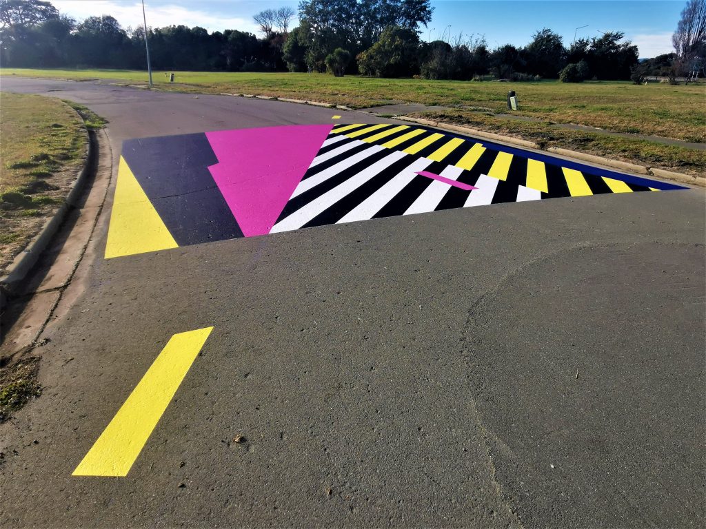
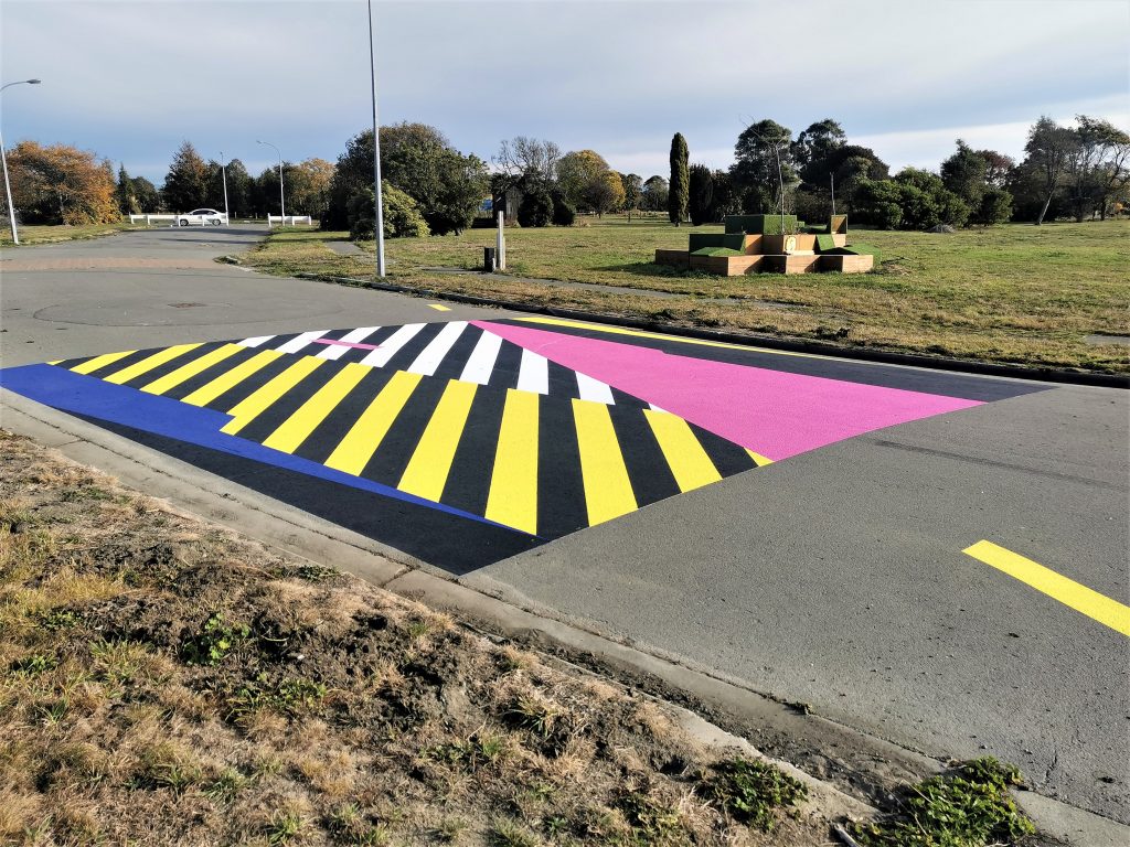
Dr Suits – Crossings @ The East X East Red Zone
Dr Suits’ bright abstractions have become notable over the last few years as he has eschewed the tendencies towards representation in favour of blocks of colour and dizzying diagonal lines. We were recently lucky enough to support the Fiksate-based artist as he produced Crossings inside the East X East red zone in Burwood. Applied directly to the now unused road of the green space, the work plays on the natural shadows and road markings to coat the concrete in bands of colour. Created over several days with fellow New Brighton legend Porta, the work buzzes with colourful blocks – yellow, pink, blue, black and white stacked and interlocked. With subtle details such as small yellow lines extending off the main body and slightly offset lines, the work is both rewarding of inspection and striking from distance. Dr Suits intended the work as an invitation to play, a work that people can explore from inside rather than gaze at from outside, adding another interesting element to the red zone environment and suggesting the possibility for more interventions…

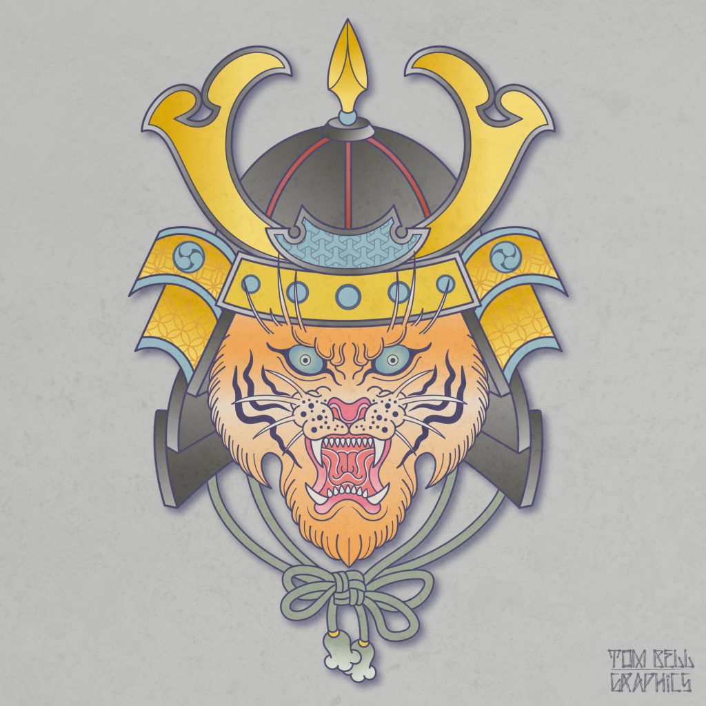
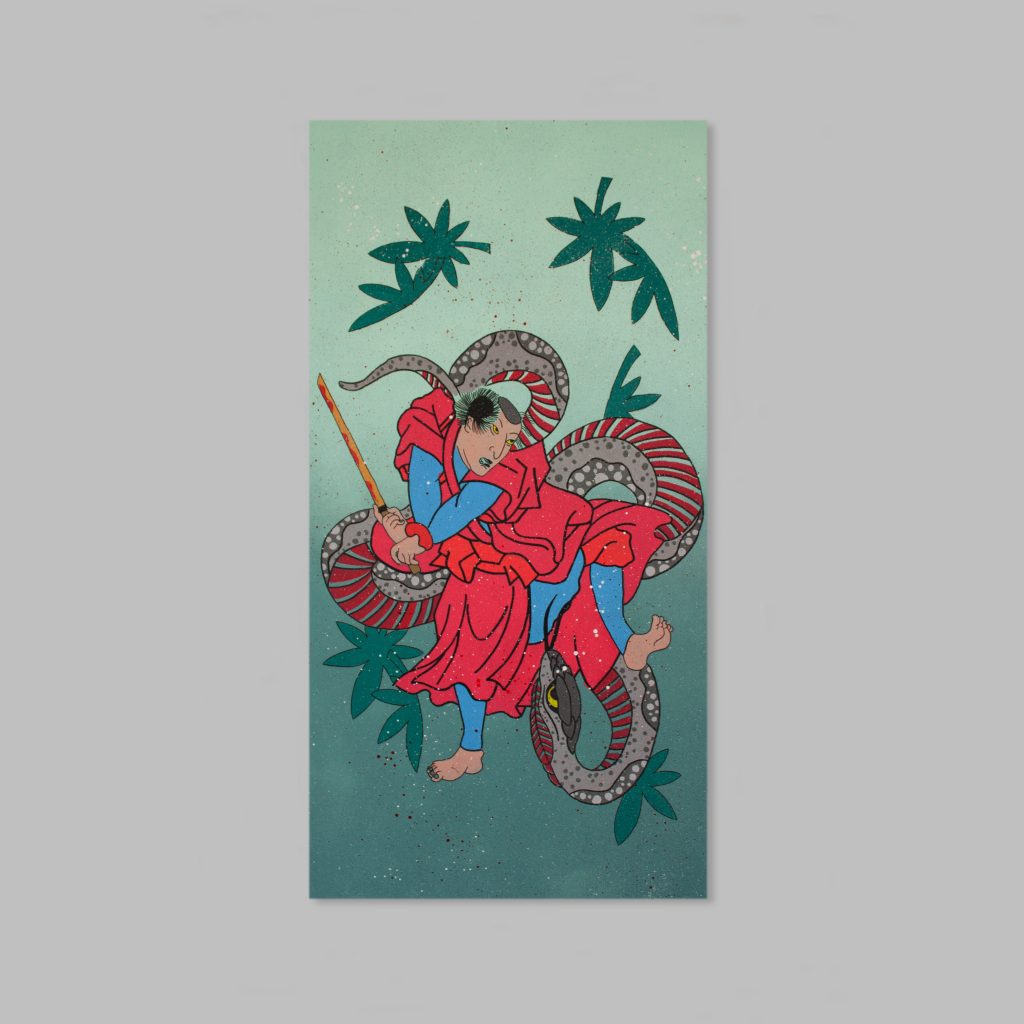
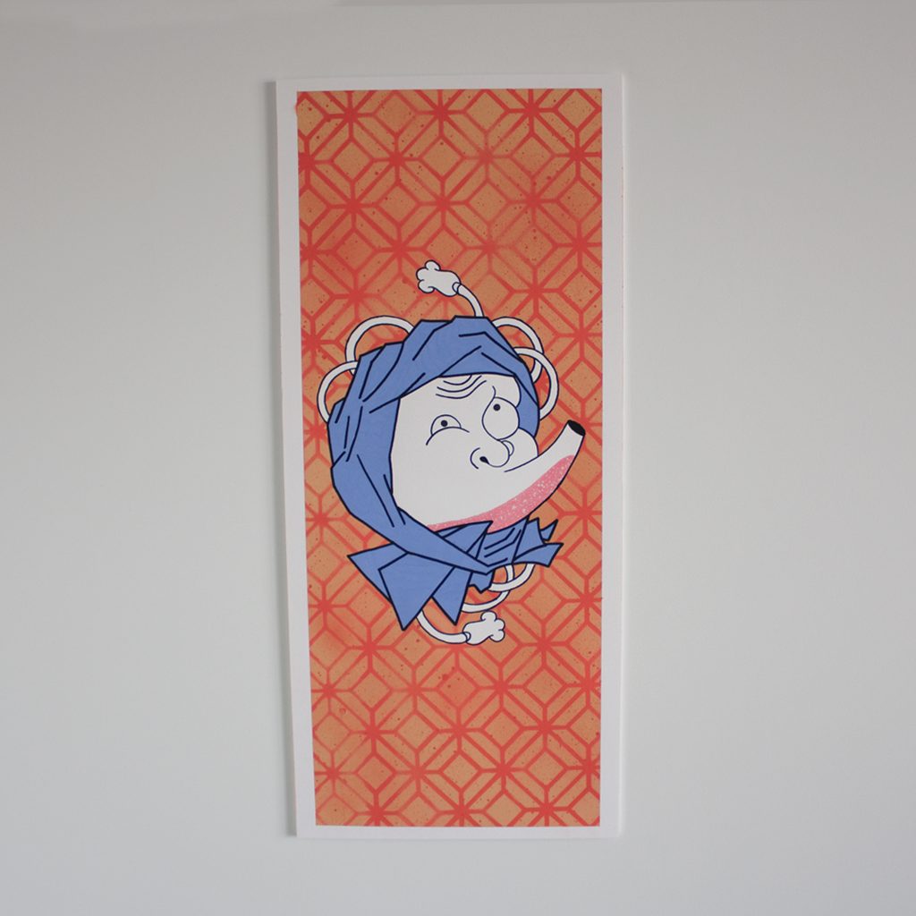
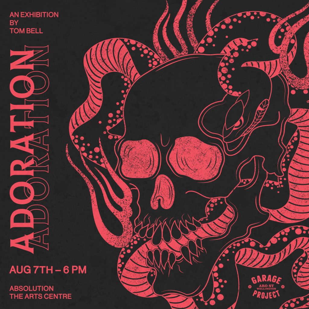
Tom Bell – Adoration @ Absolution
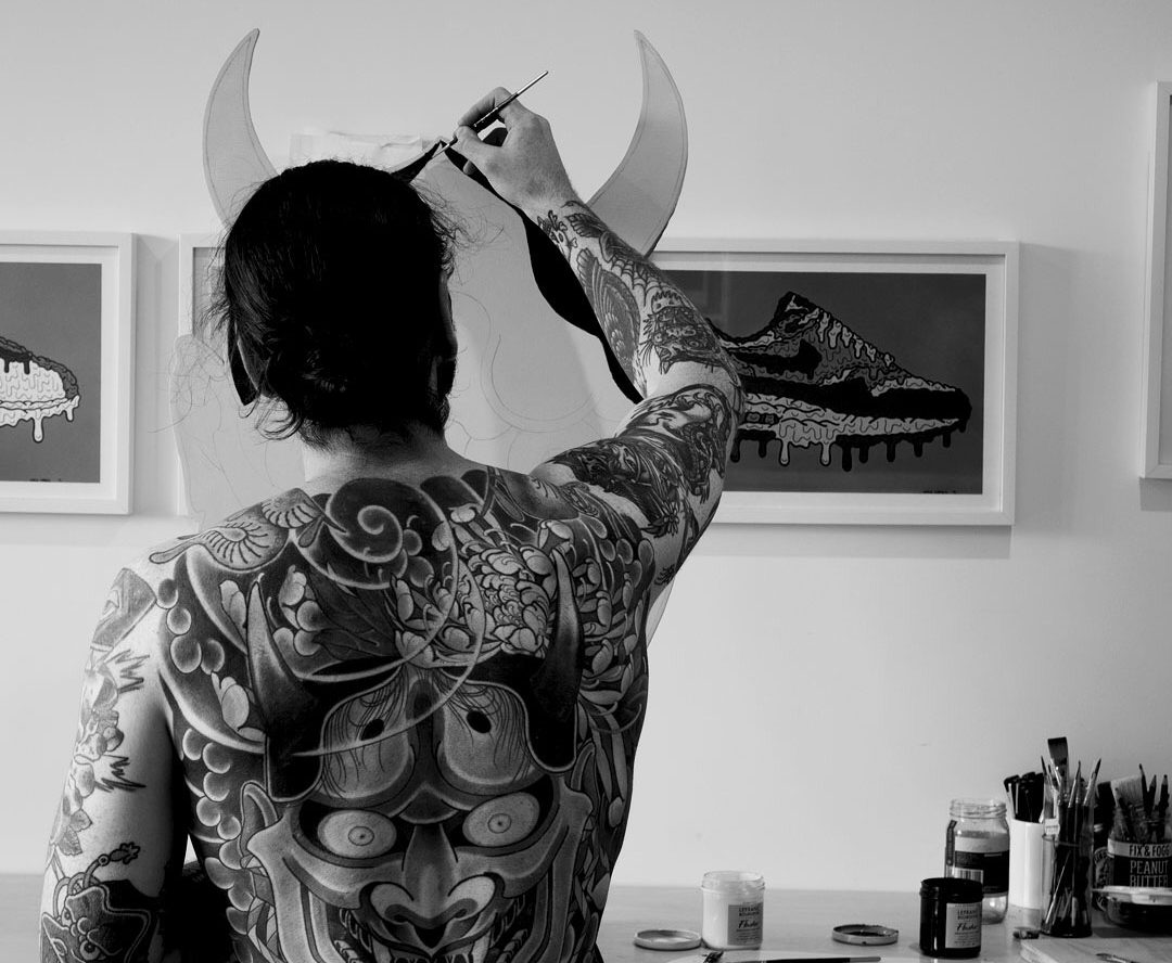
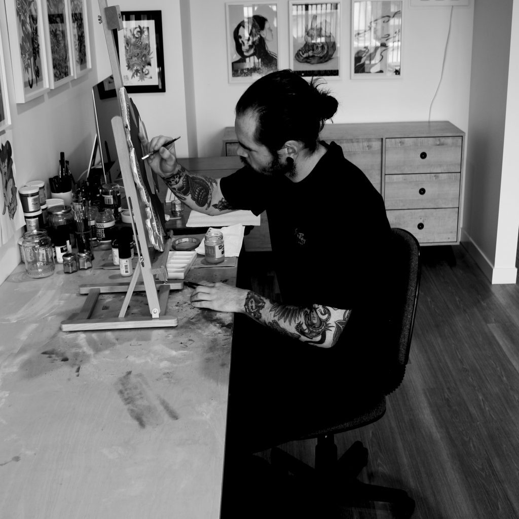
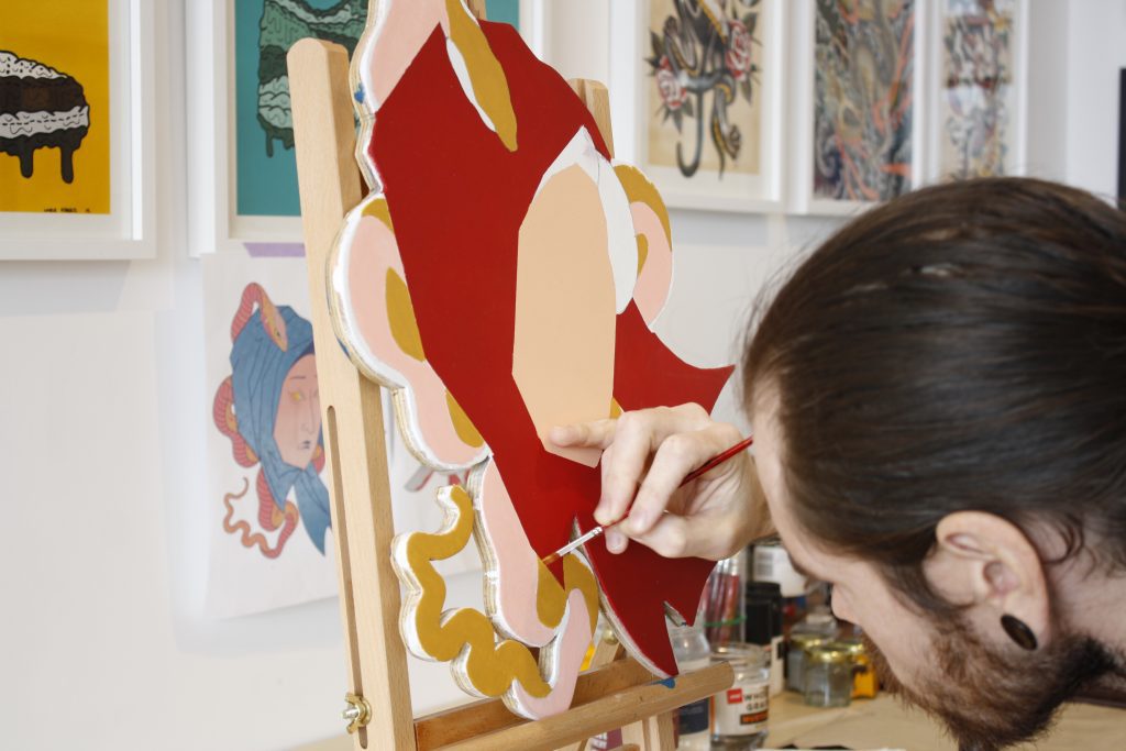
With everything that has happened in 2020 (so far), it seems like a long, long time ago that artist and designer Tom Bell told me he would be staging a solo show at Absolution this year. But while what seems like an age has passed, I have maintained a level of excitement about the exhibition Bell has come to call Adoration. The show features a body of work that combines both the artist’s established interest in the imagery and themes of Japanese art and culture, but with a new material approach, his digital rendering replaced by hand-painted cut-outs. The sense of reverence for the subject matter (the show’s title a reference to that debt) is empowered by the evidently pain-staking process of manual brush strokes. Bell’s works, whether paintings, stickers, digital prints, tiny enamel pins, t-shirt designs or illustrations, are alluring, their soft pastel colours and dynamic yet sparse compositions combining with the loaded symbolism of Japanese visual culture to feel both traditional and contemporary.
I met Tom a few years ago, he was with his ‘art fam’ as he calls them, at an exhibition opening at Fiksate. Since then his face has become a familiar one at places like Fiksate, Supreme and Smash Palace, always up for a yarn. But when we sat down to chat for this interview, I learned a lot more about him, from the Wellington-raised artist’s relationship with Christchurch, his interests in stencils and tattoos, and his journey to opening Adoration. Part of what made the discussion so engaging was Tom’s energy, he flew between thoughts, earnest and honest, clearly excited and invigorated by the upcoming show and what he had learned as an artist and a person over the last year.
I remember almost a year ago, or at least it feels like that long because of everything that has happened, you mentioned that this show is a farewell to Christchurch because you were planning to move back to Wellington…
Yeah, that’s still the plan [in August]. I’m originally from Wellington, but I have spent almost four years down here. It’s crazy because a lot of people have asked where I was hiding for those first two years! I moved down from Wellington for my graphic design job. At the time my now ex-girlfriend was from Christchurch, all her family were here, so I made the move. I really struggled making connections with people down here. Throughout my twenties I’ve struggled with social anxiety and that really put a big hindrance on me going out and going to shows and other social situations. For two and a half years the idea of going to an exhibition opening by myself, even if I knew people who would be there, would make me really anxious. I would think people are going to look at me and be like, who’s that dude? At the end of 2018 I decided I needed to face some of my weaknesses and get a control of my anxiety.
That social anxiety was a big obstacle for you obviously…
Yeah, the social anxiety was a big hindrance to me. I had people in Wellington say to me: ‘Dude, you should be getting out and trying to make connections in the art community, you’re a designer, you love your art, Christchurch has a really good scene, just start doing it…’ So, when all that happened, I just said, alright, I’m going to put myself out there. I reached out to Jessie [Rawcliffe] because we had started building a connection through Instagram, so I hit her up out of the blue and said you do a lot of collab work, would you be keen on doing one in the new year? She was like: ‘Hell yeah, that would be sick!’ We met up at Smash Palace and started talking about our creative interests. I remember her saying: ‘I paint skulls and girls, am I pigeon-holing myself?’ I said, nah, skulls and girls are ******* badass, and you can tell you really enjoy painting them. From there I was introduced to Josh [Bradshaw] and we’ve been hanging out ever since. I call them my ‘art fam’ and they have been great sounding boards for my creative journey over the last eighteen months. After attending a few exhibitions at the start of last year I started to meet everyone and it was great because it just happened organically.
I remember a conversation I had with Jessie and she asked me if I had painted before, and I said, yeah, but I was trash! She said I should get into painting and get away from the computer. So I did and I just got addicted to it, I was all in. From January to March I was painting every night after work, but I wasn’t showing anything to anyone. For me, a painting had to turn out the way I wanted, if it didn’t, it was trash in my mind, so I would put it under the bed and leave it. I think it was about April last year I finally did something I thought was pretty decent. I was comfortable enough to post it on social media and I had a lot of people reaching out to me saying they thought it was great to see me get away from the computer and to be working with another medium. I was like, well, my digital stuff is better than this, but I think people like this because it has more of a human element to it.
I think we appreciate that hand-painted quality in art, there is an evident authenticity…
I started realising that imperfections on a painting actually make it better because they show that human aspect. It doesn’t always have to be perfect, so what if you paint over lines or whatever, it gives it more character…
So that kicked off your re-acquaintance with painting?
Yeah. Last year for me was just a lot of trial and error. I was doing everything. I got back into using spray cans, because when I was studying, I started doing stencils, but it had been a while. I remember I did a life drawing class; I was terrible at figure drawing, but it was a requirement. I remember the tutor asking me if I painted stencils and I was like, yeah, how can you tell? He said he could tell from the way I drew with solid outlines. I had no concept of tone or shadow. When I was at high school I didn’t do anything creatively, I was quite sport-centric, rugby, rugby league, and my community in Wellington didn’t see art as a career path, you try to be the next All Black or rugby league star or you get a trade, that’s about it…
I see little difference between sport and art. They are both performances. Sport, at its heart, is about skill, technique, a type of aesthetic beauty, so the total partition between the two is strange, people from the arts world often hate sport, people from the sports world think of artists as weirdos…
In my early twenties, when you discover what you like and what you want to do as a career, I was into sports, but I was also really into art and creativity, and it felt like you couldn’t be associated with both. I got really hung up on that idea, because everyone from high school was like, ‘Oh dude, we hear you’re into graphic design and art and stuff, what’s all that about?’ I think now I totally resonate with friends from high school who were really good artists and they would say: ‘Our school sucks, sports get all the funding.’ I had quite a lot of friends who did art at high school, and they would always be moaning that the art resources were terrible, teachers would have to bring in a lot of their own stuff because they just didn’t have the funding for it…
There is a divergence in the way sport and art develop people, I think. In sport, people are eventually trained to follow rules and stick within structures and systems, whereas with the arts there is more willingness to break free. But as I said before, it’s not necessarily an inherent difference. If you think about sport at a more pure level, like pick-up games of basketball, or kids playing soccer in Brazilian favelas, or cricket in the streets in India, those instances are not official, it’s just the love of it and that’s where all the amazing skills and showmanship develop. It’s only once all those other aspects and structures come in, and a particular personality type is preferred, that the focus changes and that freedom is impinged. The same thing can happen in art schools as well. One of the amazing freedoms of urban art is that you are not beholden to convention. I assume your interest in stencils was at least to some degree an interest in what was happening in the streets outside of the institutional world, but there was also a clear connection to the aesthetic of graphic design…
When I first started studying, I came to Christchurch in 2010 and enrolled at the Design and Arts College to do a foundation course. The year before, I decided I wanted to do something creative, but I’d never done anything, so I looked into it and the foundation course in Fine Arts sounded pretty sweet. You did a bit of everything, photography, architecture, graphic design, life drawing, textile design. If you did well enough, you were offered a position the following year. Originally, I wanted to do photography. But when I took the digital media component of the foundation course, which really was an introduction to graphic design, the tutor said to me: ‘What do you want to do next year? I said photography, and he said I should consider graphic design because he thought I had an eye for it. So, from there, I was like alright, maybe graphic design is what I should do. At that time Exit Through the Gift Shop had just come out, and when I saw it my mind was blown! I watched it like four times over a week, and I was thinking, this is rad! These guys are doing stuff on the streets around the world, they are breaking rules, it’s controversial and it’s right in front of people. They’re not going to a gallery to see this, it’s out in the open, so I was like, it could be cool to start experimenting with stencils. I just started looking at YouTube tutorials to get the basics and then I went off on a tangent for like a year doing that. That was in 2010, and at the beginning of 2011 I met Zach Hart who was working at Ink Grave Tattoo at the time, I started getting tattooed by him and I learnt that he had a graffiti background. That grew my interest and I found out there are a lot of tattooists who have graffiti backgrounds. I’m also really into hip hop and there’s that association with graffiti also.
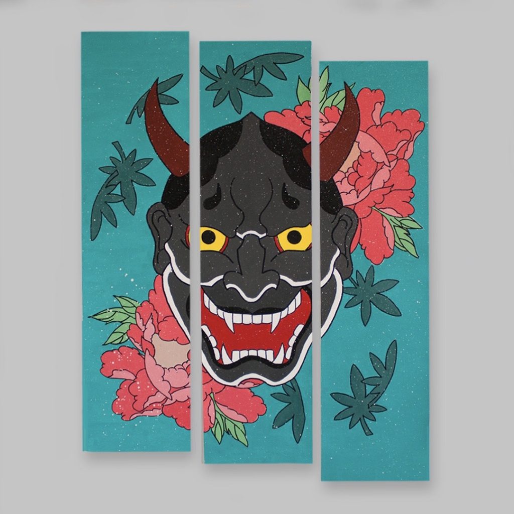
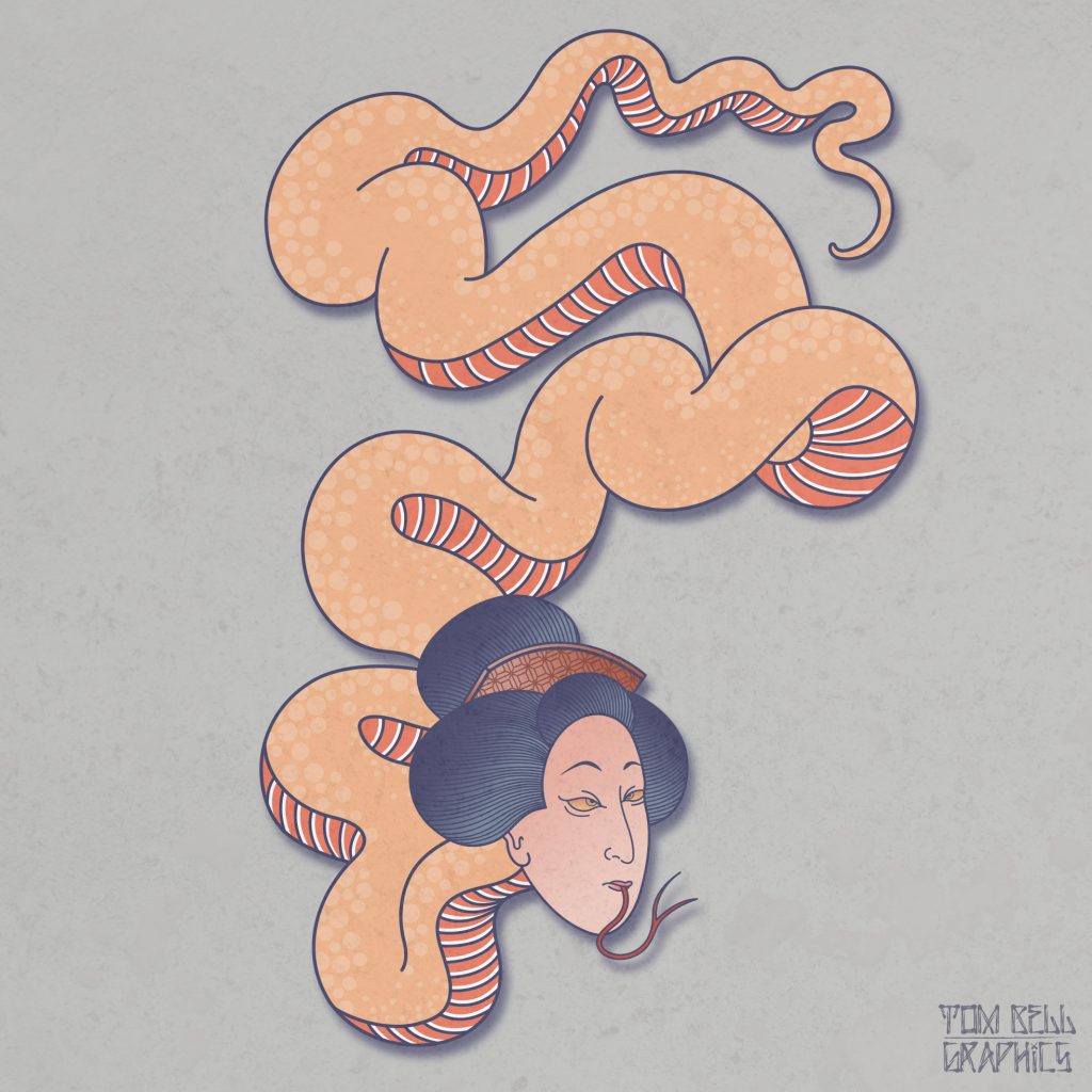
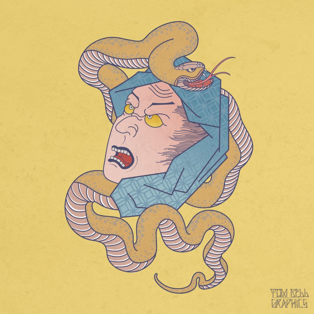
Since I was eight or nine, I’ve always been into tattoos. No-one in my immediate family has tattoos, but I just had a fascination with them. When I was eleven or twelve, I was at the library and I came across a book of Japanese woodblock prints from the early 1800s, and then I found a tattoo book and the images were pretty much identical. I kind of put my interest of Japanese art to the side when I was studying at university but in my mid-twenties I fell in love again with Japanese art and architecture. Since then it has just fully consumed me. My best mate is a tattoo artist in Wellington, he specializes in Irezumi [Japanese tattoos], and I have learnt a lot from him. I think the reason why I like Japanese art so much is that it’s very graphic, it’s designed to be big and in your face with bold outlines and flat colours, but there is still a sense of refinement that gives it a timelessness…
There is an important balancing act when you adopt a historical visual influence, you need to respect that lineage, but also make it fresh and not derivative. How do you approach that challenge?
It is about knowing the subject matter. For instance, a koi fish swims up stream and turns into a dragon, so if I was ever to draw a dragon or a koi, I can’t draw a tiger with it because they don’t go together. It would be easy for people to look at my work and think it’s just Japanese tattoo flash, so my contemporary take on it has been my choice of colour palette. I think my interest in Pop Art has contributed to my use of pastels, there’s a David Hockney piece, A Bigger Splash, it has flat colours, blues and caramels, and that was a big influence. It was painted in the sixties, but it still feels very fresh, so taking that and playing around with colours has allowed me to develop my own take on Japanese art while still sticking to the belief systems. I think some people try to reinvent the wheel and they forget about the fundamentals. My graphic design work is very minimal and with minimal design you’ve got no room for error, if you have one little thing that’s off, it’s going to stick out like a sore thumb, so I focus on the fundamentals with just smaller, subtle changes.
You were telling me earlier that it is only the last six months or so that you’ve become comfortable calling yourself an artist. That background in graphic design and digital work, how do they feed into your painting work, because they must be very different approaches…
When I first started painting again last year, it was tough. With design, when you don’t like something, it’s the classic ‘Command-Z’, undo, so I was very thorough in preparation. I would do a colour study and draw it on screen, colour it, print it out and then from that, paint it, doing like for like. It was very uniform. But eventually I started to just do a quick colour study on screen and then started painting, and now I’m at the point where I don’t do the colour study I just paint it.
Sometimes things look good on screen, but when I’m actually painting it, it doesn’t work. So, I think the last year has really taught me to be looser and freer when I’m working with my hands, to not be such a control freak. Normally I’m a perfectionist, especially with my graphic design work, it’s like, that’s terrible! Back to the drawing board! But when you make a mistake on a painting, when an outline has smudged, there’s a human element to it, and that’s something that I have probably learnt to appreciate. I went to a tattoo convention in New Plymouth last year and there was an artist whose paintings I love, and he was selling prints. I could see there were little imperfections in the print, and it was fine, I realized I’m just too much of a control freak. I think that freedom is why there’s been no ambition at the moment to go back to the digital side of things, because I like the fact that if you screw up a painting, you’ve got to problem solve on the spot and work with what you have…
I’ve always loved the idea associated with Margaret Kilgallen’s work, the wavering line. I think we need to attach to something human in an increasingly technologically-driven world, we become hyper aware of when something is perfect, and we recognize imperfection from another human and I think that is really important. You were talking about that idea of going back to painting being inspired by conversations with friends, that idea of community must be a really important part of where you are, is losing that when you move back to Wellington a daunting thought?
It hit me this week that I’m moving soon. I’ve got my two best mates coming down for the opening of Adoration, Mike Todd, a tattoo artist, and Jerome Taylor, who I went to high school with, who is a fashion designer. They are my creative community up there in Wellington. When I started getting tattooed by Mike, he knew I was painting on the side and he was giving me tips, like how tattoo apprentices learn, you trace a rose fifty times and by the twentieth time you should know how to draw a rose. He’s been a big part in me fundamentally learning how to paint the way I do. But in terms of what I’ve got here with Jessie and Josh and everyone else, I don’t have that. It’s a bit daunting, but I did it here, I just have to put myself out there. I’m from Wellington, so I should be able to connect a bit more if anything just because I’m local. I think having a show here will help open some doors up there. It’s funny, I already know I want to do another solo show in Wellington next year. I’ve already got ideas bubbling about what I want to do for my next show. It’s contagious, I reckon, it consumes you, but I’ve really enjoyed the process…
How did the show come together conceptually?
When I confirmed this show last year, I was still working at my old job, in a corporate structure, getting paid to do a job, and I just really felt like I was being controlled by the man. I didn’t want to sound like a temperamental artist, but I really struggled with being told to be creative within a certain framework or it wasn’t of value. So when I was coming up with themes for my show, I was thinking about basing it on entrapment and having conflicting thoughts in my head, and just lacking self-worth in a way, but then in January, I drew out my whole show in a wall plan to see if it was going to tell a story, and I realised it doesn’t have to, screw that! I’m leaving town soon, I just want to do something that I’m passionate about. It is filled with traditional Japanese influences but with a contemporary take. There are a few pieces where I have dissected objects and have incorporated other objects with them. Textures play an important part in my inspiration so I wanted to bring them in also. The show is about paying homage to Japanese art and culture, and that’s why I named the show Adoration, it’s about devotion and how I hold it dear to my heart.
We talked briefly about artists being pigeon-holed, do you ever think about that in terms of the Japanese influence in your work?
Totally, I always think to myself, am I pigeon-holing myself with my interests? The one positive to come out of lock-down was new ideas I want to paint when I move back to Wellington. It’s abstract, with no Japanese themes at all. I haven’t told anyone about it, I don’t know if I want to push this, I don’t know if I want to show anyone, I’ve done some real rough sketches and I don’t think anyone would expect it.
I assume they will likely see the light of day in Wellington, which means that while this show brings this chapter to a close, this new body of work might start the next chapter…
As much as it’s been a really good time painting the work in this show, I think this is the perfect time to start some more experimental stuff. A lot of people have asked why I don’t get into tattooing, because it makes sense with my subject matter currently. But I don’t want to keep exploring the same themes and imagery and that’s the connection people seem to make, that my Japanese- influenced work would translate to tattoo. It’s something I have warmed up to in the last six months as I’ve become more confident with the hand-rendered stuff, but tattooing is completely different from painting, it’s a whole new technique. Once I’m back in Wellington, I’m going to use the rest of this year to have a play around and try some experimental stuff, do more freehand work, which is something I have been working on for the last six months. I guess there has been a lot of personal growth down here in the last two years as well…
So, this is an important milestone…
It is an important milestone. About six months ago I realized that it makes sense to have my first show here in Christchurch, because this is where my creative journey really started. Obviously, I went back to Wellington after the 2011 earthquake and relocated to continue my studies up there, but really making things all started here, so it all makes sense. It’s like a goodbye gift, my time here is up, but this is where it all started for me. I never thought I would have a solo show, I never thought I would have my work in a public space where people would want to come see it. I think we all get a little nervous, like are people going to show up? I’ve had a lot of people reaching out to me saying they are looking forward to seeing the show. Getting messages like that has been really humbling.
That must be cool because as you have mentioned, the process of creating work and then the step of putting them out in the world can be scary. It’s a long and constantly changing road, the process and development, the failures, the changes of direction…
Yes, it’s a vulnerable position because you work on something for so long and then you think you are comfortable to show people, but once it’s in a public space, once it’s out there, then it could be well received or it might not be. It’s all part of it and I look forward to seeing how people interact with the show on Friday.
Adoration opens at Absolution in the Arts Centre on Friday, 7th August, 2020 at 6pm.
Follow Tom on Instagram and Facebook and check out his website…