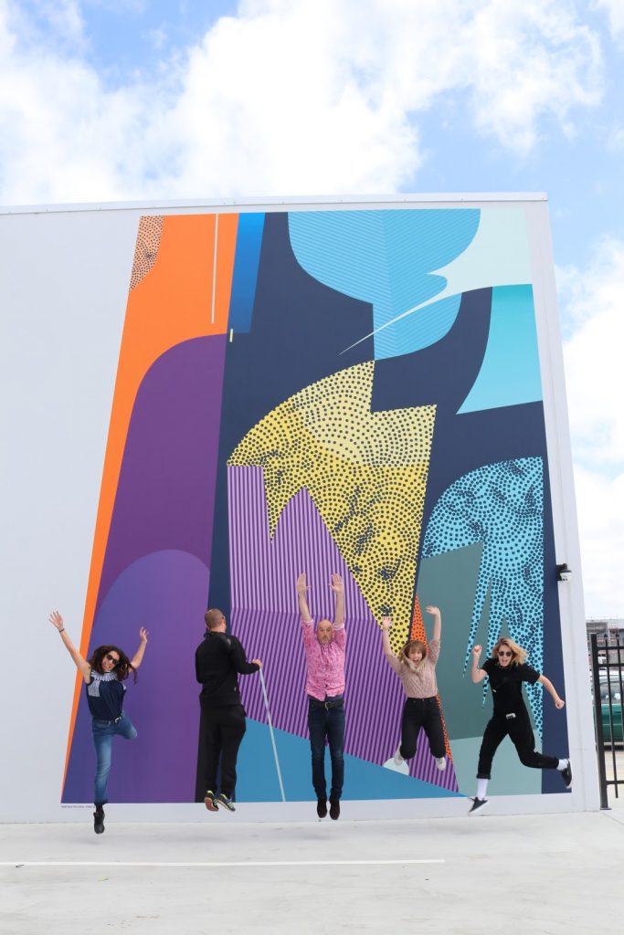
Actually, 2020 has been such a surreal and, truthfully, emotional year that it almost seems insensitive to joke about it. Between the Covid-19 pandemic, the loss of lives and livelihoods, the Black Lives Matter movement, the farcical post-election shenanigans in the U.S. and more, there has been real and wide-spread heartbreak and tragedy. While some developments will stretch beyond the 12 months of 2020, in part due to their enormity and the necessary concentration to effect meaningful change, it is still necessary to take stock of the good things in a year we mostly just want to be over. The And That Was… series has always been about those things that bring joy, from the seemingly incidental, to the showstoppers, so let’s finish 2020 with a recap of some good stuff from December. With the end of the year approaching and a flurry of projects and events taking place, thankfully there has been a fair bit to consider… (This month we took the reigns, but don’t worry, we are working on something with a whole bunch of friends for the coming days, so keep your eyes peeled!)
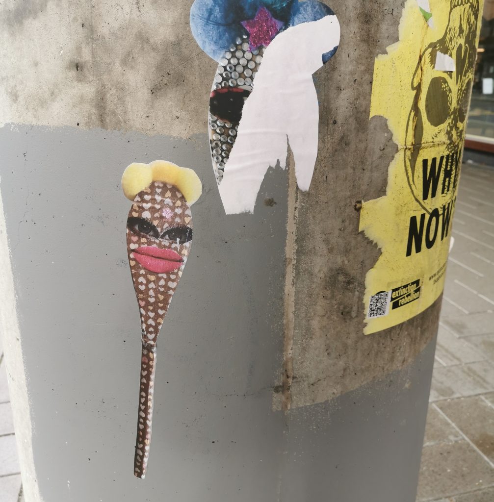
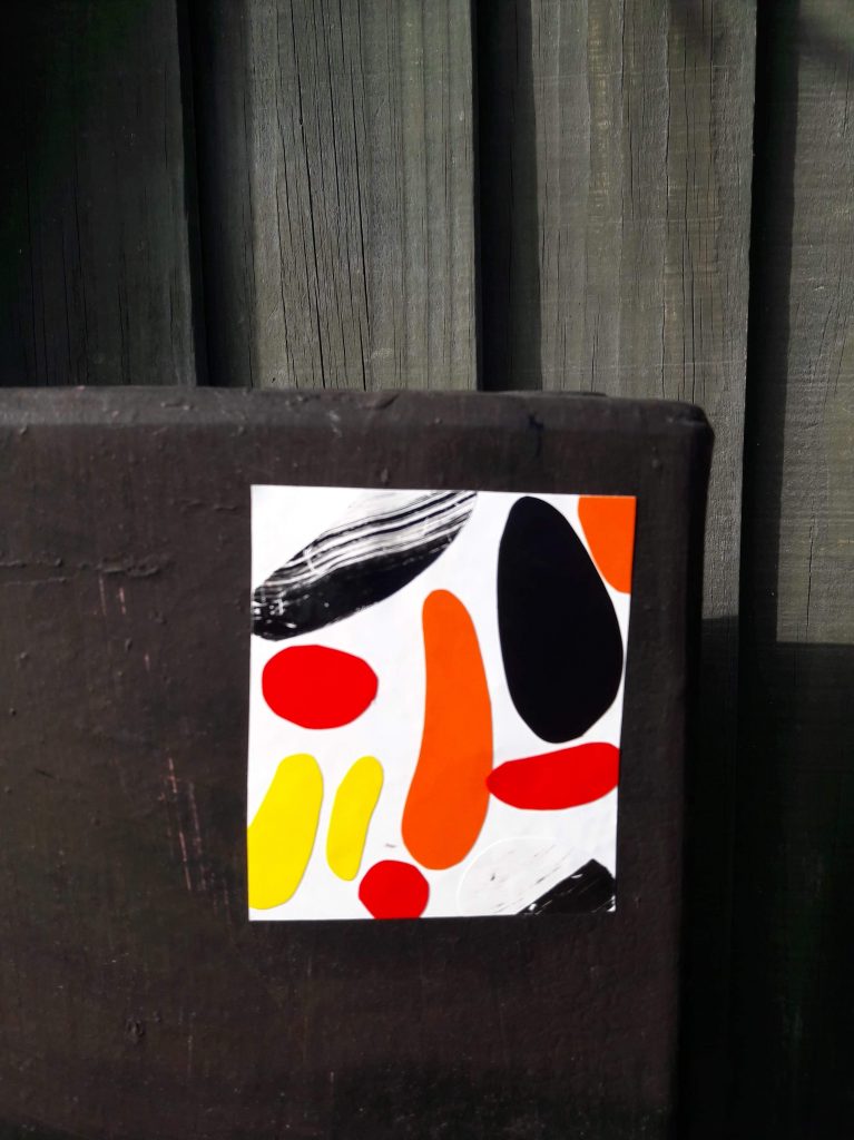
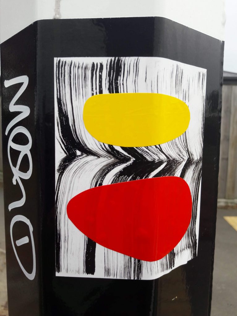
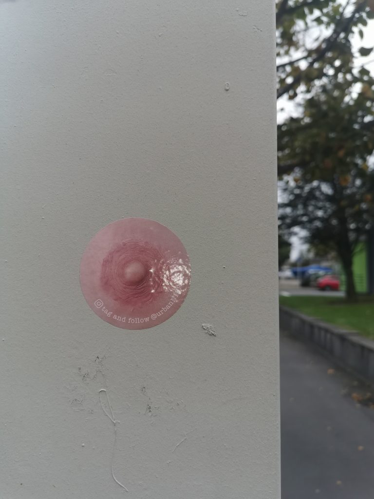
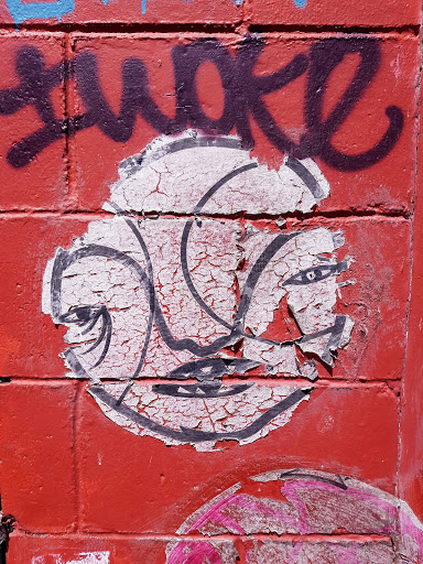
Mike Beer goes to the dogs…
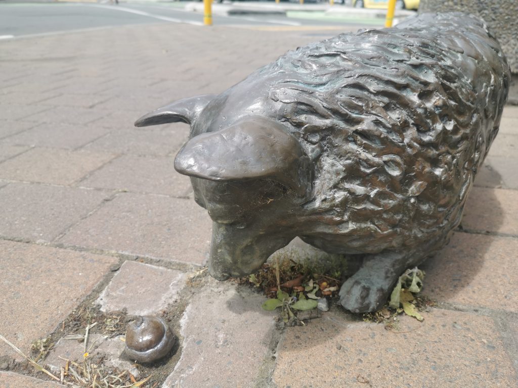
Mike Beer’s subtle addition to the corgi sculptures on High Street is easy to overlook…
You probably all know sculptor David Marshall’s three bronze corgis on High Street, right? I mean, they have been there for over a decade now. What you may not have noticed was that a few weeks ago, the dropped ice cream cone one pup inquisitively sniffed disappeared. Sniffing an opportunity himself, our new favourite scratch builder Mike Beer decided to create and install something a playful replacement, drawing on the influence of subversive guerrilla street sculptors. You may just need to check it out for yourself, but perhaps don’t get too close…
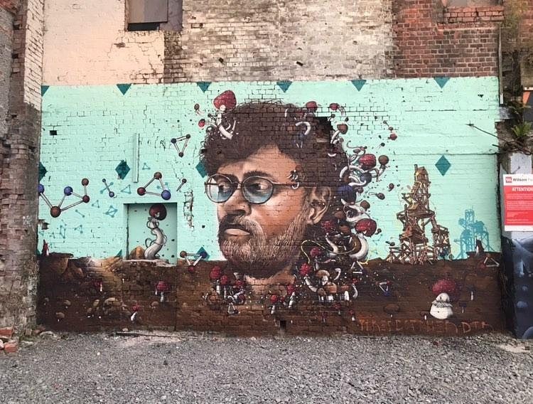
Dcypher dropping science…
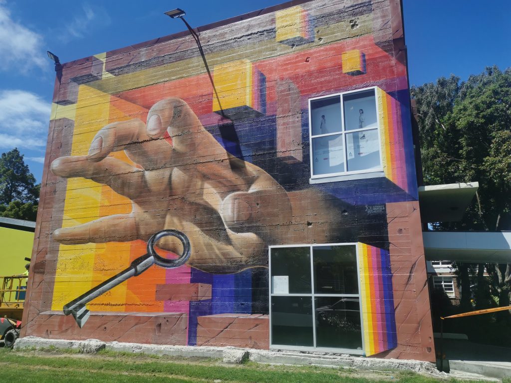
Dcypher’s impressive new work at Ara
With a massive wall exposed by the demolition of a section of the Ara campus on Madras Street, which incidentally also meant the eradication of the Vans the Omega mural produced back in 2013 to announce the coming Rise festival, a new mural seemed an obvious requirement. Into that void stepped Dcypher, filling the gap with a striking anamorphic mural. A giant hand reaches towards a silver key, suggesting the importance of the search for knowledge, all within a disintegrating framework that dissolves the built environment. It has already gained international attention on Global Street Art.
Glass Vaults at Space Academy
The return of live music must be one of the best things about the second half of 2020! Space Academy hosted Christchurch-based Glass Vaults in early December, the group touring their new Sounds That Sound Like Music album. Their unique psychedelic-pop is heading towards dreamy disco funk, and the live show was definitely a winner, culminating with the infectious 2017 track Brooklyn. Also, is the pocket of St Asaph Street now home to the Darkroom, Space Academy now the live music district of the city?
Distranged Design goes big…
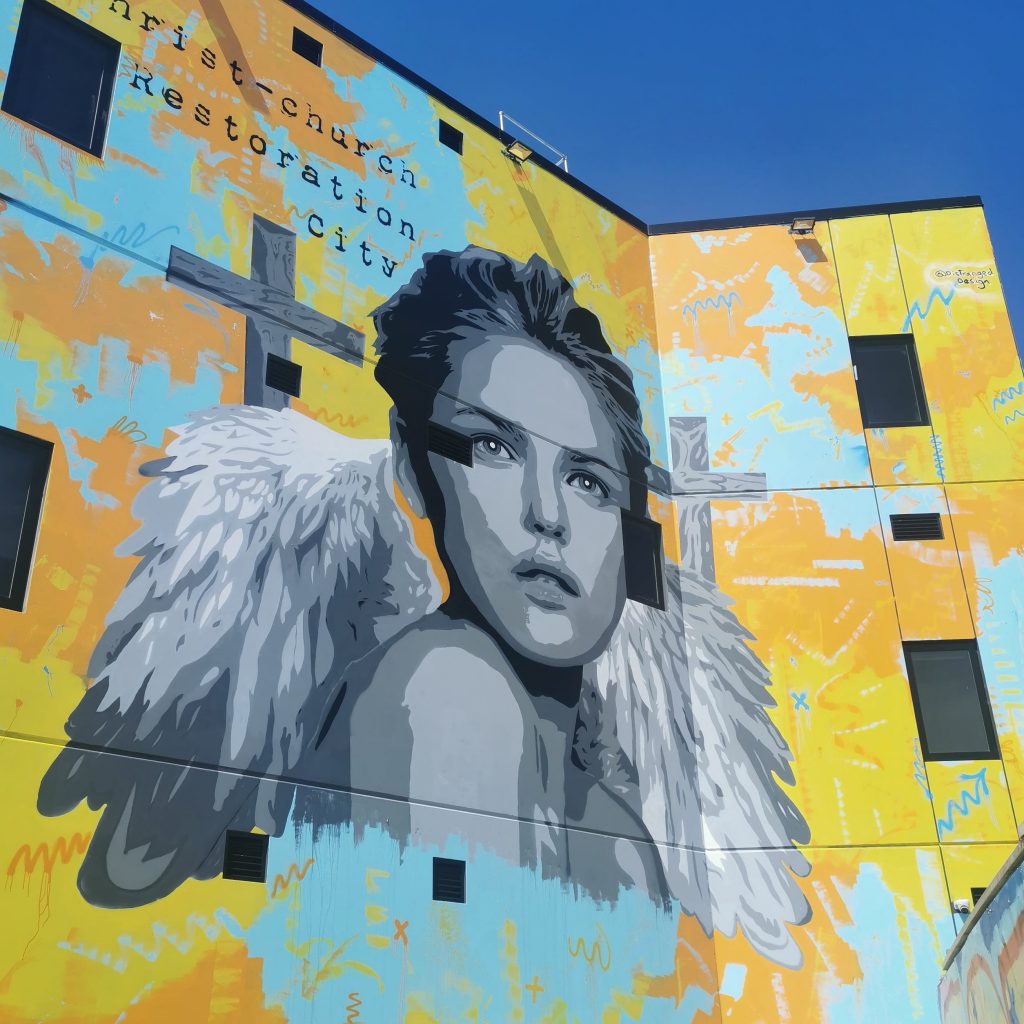
Distranged Design’s Christ Church Restoration City is the artist’s biggest work to date
Jacob Root (a.k.a. Distranged Design) has generally worked to a scale that reflects his stencil-based approach. But with a new technique that still allows his stencil aesthetic, the artist produced his biggest work yet in December. The work, visible from Manchester Street and Tuam Street, was commissioned by a local property developer and seemingly pays tribute to the lost churches around the city, titled Christ Church Restoration City and featuring an angel figure flanked by two crosses.
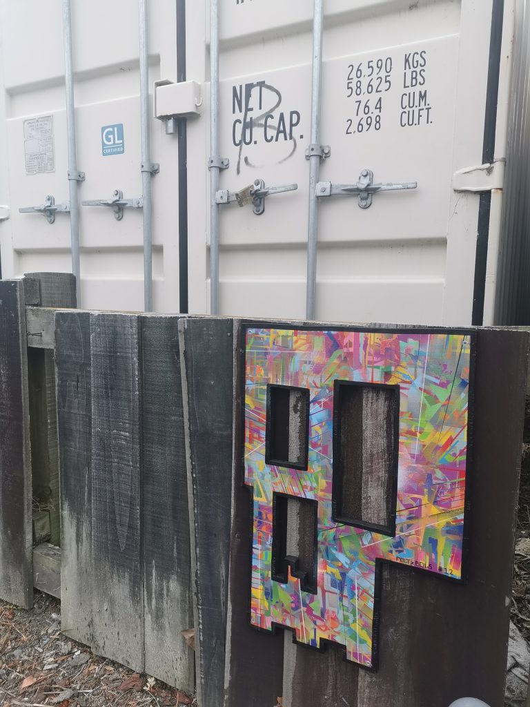
Fiksate find a new home
Fiksate closed the doors on their Gloucester Street location on December 27th and will re-open at their new Sydenham space in 2021 (Photo credit: Charlie Rose Creative)
Fittingly, the last And That Was… of 2020 (kind of, you’ll see…) ends with the beginning of a new chapter for a local institution. After two years and plenty of memorable exhibitions, Fiksate will close the doors at Gloucester Street, relocating to a new base in Sydenham (details to come!). With a new home and surely a dash of revitalising energy, it will be exciting to see what Jen, Dr Suits present in 2021…
Well 2020, what else can I say but, see you, wouldn’t want to be you! We do however, look forward to what 2021 brings, so stay tuned for future installments of And That Was…
Teeth Like Screwdrivers is one of those people who radiates enthusiasm. Not in the cheesy, annoying way, but simply through a desire to bring people together and to see things happen. I came across his pencil stickers before I met the man himself. They were the type of sticker I love, although simple, they pulled you in through a spark of the familiar that made you ponder, is that what I think it is? Since finally meeting the artist, I have followed Teeth Like Screwdrivers’ busy trajectory, his own prolific and expansive output, his global network of contacts and collaborators, and the formation of Slap City, a sticker and paste up club that that has brought together a diverse roster of artists. When we caught up, all of these factors became apparent both in the scope of our conversation, but also in the way Teeth Like Screwdrivers spoke, excitedly, almost breathlessly darting back and forth through topics. From his early days in Christchurch after arriving from the UK, to the formation of Slap City and his lock down sticker collab project, we covered a lot of ground, fitting for an artist who thrives on activity…
We first met at the giant spray cans, where you were part of a DTR crew workshop. I remember you just had this massive grin on your face enjoying the experience. Is a sense of community and participation a central concern for you? It seems that Slap City is very much about forming a community.
I’ve always organized stuff. When I first moved here, I started the Garden City Session [a Christchurch longboarding group], which I’m no longer doing but has now got like a thousand members. Within the first week of arriving in Christchurch, I got hold of Cheapskates and was like, right, who’s organizing something for skaters? They hit me up with Scotty who was doing Skate School and we did a couple of longboard ones and then it spiraled and spiraled and spiraled. We used to do pub crawls on skateboards. So, I was always the one organizing events, rocking up and being the hype man.
Christchurch’s Flavor Flav!
If I’m really interested in something, it is really easy to do. As a schoolteacher, if I’m doing a lesson I’m not into, it then it’s probably going to be shit, but if I’m into it, it’s going to be brilliant! So, with the sticker stuff, the same thing happened. Stickers were happening, of course they were, but I enjoy the hanging out and someone else going: ‘You could do this…’ It was the same with that DTR workshop last year. I don’t use spray cans, I’m not a graffiti artist. I’m as far from your stereotypical graffiti guy as you can get, but I wanted to see how it’s done. In my head I wanted to make my work look like a marker pen. I love markers, I’m a little bit OCD and I love the different thicknesses. So, I was like, how can I make spray paint look the same? I went and watched them and I realised you could put one line there, then you can do another line there and it cuts that first one back. That was all that was about. But I was loving it because I was surrounded by people who just knew their fucking trade, who were really good and they were just like: ‘You could do this, you could do this…’ I was like, this is brilliant! But I also realised there are lots of ways to do things. There was a really good Safe Kasper artwork on the cans a while back, he’d sprayed the bulk of it and then used a marker for the details, I was like, what the fuck? I can just paint the outline and marker the details which is essentially what I’m doing with a sticker, doing the background and then the marker over the top, so it made sense. But running shit is fun, that’s the joy for me. I like sitting at home and spending an hour just cranking out stickers, but I also like having other people around and bouncing ideas off each other.
Teeth Like Screwdrivers pencils on one of the giant spray cans at the youth space on Lichfield Street
Obviously within graffiti culture there has been this history of mentorship and camaraderie in terms of crews.
Skateboarding is similar, you learn, not from the masters directly, but an older person will go: ‘Actually mate, it will be way easier if you just pop your foot off the left and put pressure on there…’ It’s the same thing. I remember I went down to the cans the other day, the DTR crew were doing a big paint jam. I’m an outsider, like I said, I’m about as far away as you can imagine from graffiti writers, but they’re like: ‘Get in bro, grab a can, give it a go…’ I was like, really? It was wonderful.
I feel like when we talk about post-graffiti or street art, it can be more isolated, because you tend to be making something in advance, it doesn’t necessarily have the same sense of community or camaraderie, but undeniably the potential’s there.
Yeah, most people want to be nice, most people are good people, you go up to them and say I really love what you’re doing, can we do something together? They are probably going to say yes, just get in there and see what happens. The worst that can happen is they say no, in which case OK, cool. Christchurch is small enough that you will bump into the same people. If you’re doing something similar, chances are you’re going to bump into me, so that connection may as well be as easy as possible. I don’t know those DTR guys from jot, but they all remembered me from a year and a half ago.
Because Christchurch is small, the competitive element isn’t necessarily as strong as it might be in bigger cities where street cultures have diverged.
Vez is a great example. I saw her stuff all over the place before I met her, and she sent me a message saying: ‘I’m moving from England to Christchurch.’ I told her that I’d started this sticker thing and that she should come along, thinking she’s had artwork everywhere in the world, she won’t want to come! But she rocked up and was just like ‘Hi!’ Now I see her work everywhere and I know who she is and what her stuff is about, and that’s what it should be really.
The fact that Slap City is held at Fiksate is another example of that sense of community in the local scene.
There are lots of examples of it in other cities where people meet at a pub or somewhere where they’ve just got a big old table and they all sit around and just pass some shit around and share. I was like, why don’t I do that here? Then we just kept doing it, then we made it every two weeks rather than once a month. But again, it fits nicely at Fiksate. We go in, it’s super chill, we set the tables up and it’s just like a second wee family. We just chat, talk about what we’ve been up to the last couple of weeks. Someone will have some new things that they want to share, or they have worked on a whole bunch of new stickers and we all kind of pass judgment on them, in a good way!
A Slap City gathering at Fiksate as part of the Road to ZineFest, September 2020
In addition to that sense of community, has Slap City allowed you to do things artistically that maybe you wouldn’t have done by yourself?
I think I’m keener to get up in the streets. I mean I’m not your typical person who goes and puts things in the street, but you know, we go out and half of us go and have a beer afterwards. It’s all about walking around. People will rock up with some paste and we just go for it. So, I guess it’s not a solo sport anymore. I mean it is, it can be. I’ve spent many evenings just putting stickers up by myself, but there’s something more fun about there being a whole bunch of you. Someone will put one up and you try to put one higher, it’s just that kind of thing. But it could be anything, it could be a bike gang, it could be a record collecting crew. It’s having that little group around you who are just as enthusiastic as you.
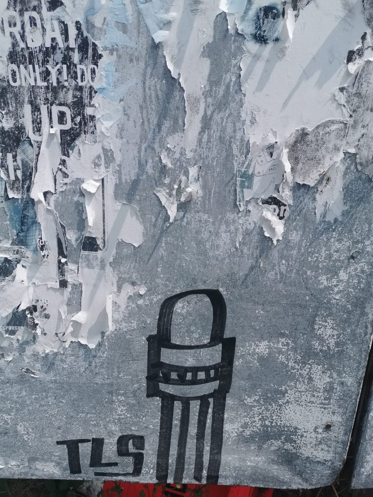
A Teeth Like Screwdrivers pencil sticker, 2019
That energy and excitement feeds everyone, and opens the gateway just enough for people to come through…
I mean we’ve got it all now. Suddenly it’s gone from me saying I can get a few people and we can do some drawing, to having this crew. People come and go but there’s probably six or seven regulars. Three of them are part of an exhibition at Fiksate [Vez, Bexie Lady and Cape of Storms are all featured in the show Perspective: Women in Urban Art], which is crazy! Bongo’s screen printing now, so he offered to do a run of a hundred stickers for this amount of money, and everyone was chucking money at him and that comes from just talking to people, getting shit done, you know? It is almost self-fulfilling. If I want to go and do some stuff on the street, then I can probably find someone keen to come along. Even if it is just wandering around and putting stupid stickers of pencils up, it doesn’t matter, that’s the fun of it. We are all very different, some crews have a particular style, especially with graffiti, but we’re drawing pictures on paper and sticking them up, it is different. One week a guy came and just did smiley faces, which was great!
People sometimes assume that there’s a right way to do street art.
Right, a particular highbrow view that you have to do this or that. I’m sure in the graffiti world there are styles and techniques that are passed on, but with stickers the joy is that they are literally just a marker pen and sticky paper. You could draw a picture of your own bum and it would count. Anyone can come along and draw funny little things on a piece of paper, and it counts. It doesn’t have to be ginormous.
Teeth Like Screwdrivers, Lyttelton, c. 2018
Touching on that idea of size, there has been a tendency in urban art towards placemaking and an increasingly big scale, and yet really placemaking is also about the small stuff.
I’m a big fan of the little things that are hidden away, the things that you don’t notice at first, but then you do and it makes them even more rad. Paste ups are fun because they let you work on a bigger scale than stickers. You can literally put up any size, but it’s still a smaller scale in terms of just drawing on a piece of paper and sticking it up on a wall. It’s generally never going to be higher than you can physically do it. I guess that’s why making stupid machines to put stickers higher up a wall amuses the shit out of me. There are a few that are up there and I’m just like, it’s so high off the ground! That’s pure amusement for me.
That idea of simply playing in the streets…
I did some pastes in Lyttelton with a mate of mine recently. So, Lyttelton has an issue with peacocks. Someone I might know really closely released a bunch of peacocks into the hills and the farmer on the top of the hill kicked off and started cooking them and eating them! So, me and said friend, we had a few beers and started pasting a whole bunch of peacocks around the port. One day I got a text message from him, he was at work and he said: ‘I think I’ve gone too big!’ He sent me a picture of a massive peacock poster coming out of a large format printer. There’s a spot above the tunnel and we pasted this huge thing up. I woke up the next morning and I’m a long way from the tunnel, my mate’s even further, but I could fucking see it! Everybody in port would be able to see it! It was like a big white postage stamp of a huge peacock head. We were just pissing ourselves because of the stupidity of it! I’m not trying to be artistic, it’s just genuinely hilarious, you paste a huge peacock so this woman who’s been killing them and eating them, every time she leaves port she sees a massive fucking peacock! We are still pasting little ones everywhere; we must have put fifty up throughout Lyttelton. They only lasted a wee while because it was shit paste, but I laughed so much.
A Peacock Liberation Front paste up, alongside work by Cape of Storms and Bexie Lady, 2020
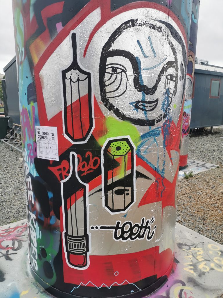
Speaking of repetition, how did your pencils come about?
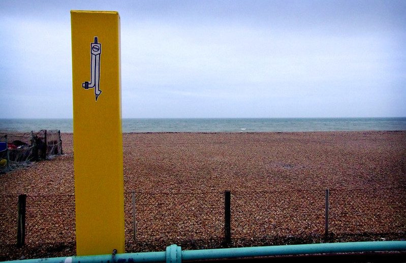
For my art A Level in the UK I made a bunch of skateboards and they had scratched up backgrounds painted to look like they had been skated on and then I added a white silhouette of different pieces of furniture. One of the silhouettes was a classic UK school chair, an orange pre-formed plastic chair with black skinny metal legs and a hole in the back. I realized I could tag it in one hit, and it was identifiable as a chair really quickly. So, for years I wrote FURNITURE, which is a lovely word to write by hand, it’s really gorgeous. I was tagging it and at the end of the E I would then move in and join the chair onto it, so that’s where I started. I realised it’s obviously a school chair, I’m a schoolteacher, it ties in, so what else could I tie in? I went to a compass, and actually I’ve got photos of doing quite big ones on the side of The Drawing Room in town, I even went on a bit of a tiki tour all over Melbourne and Sydney, just sticking stuff up. I did the compasses for a wee while and they were really simple, inspired by a particular genre of stickers at that time. Then one day I put a pencil in the compass, and I was like, oh, I really like that! So, I drew a few more pencils. They were square, so they had the rubber bit at the end with the metal, then they were triangular, pointed as if they had been sharpened by a sharpener. I got a whole bunch of small stickers, but I couldn’t draw the whole pencil on that size, so I just did the nib. But it didn’t really look like a pencil, it just looked like a triangle with the square side. But then when I scalloped it, suddenly it looked like my pencil, and then I thinned the lines. The first ones I did, there’s a few around still, they look like pencils, shaded and with straight lines, but you know, they looked too much like pencils, and it was taking me forty minutes to draw one because my inner OCD kicked in. I needed to make it quicker, so I dropped the end off, scalloped it, and put in the wee dots to make it look like it had been cut by a knife. There’s a book I’ve got called How to Sharpen a Pencil. It’s well worth finding because the boy’s a genius, he literally wrote a book about the different ways to sharpen a pencil. It has all these different pencils and who they are used for, there was this perfect one he called ‘The Architectural’ for architects. It’s really ironic but really funny. One of them was a really long-nibbed, scalloped version and I was just like, that is how I love my pencils! I just copied that and put in a few dots to show that it had been sharpened and now I just draw them non-stop. It’s just gone from there really.
A Teeth Like Screwdrivers compass, Brighton, United Kingdom, 2007 (photo credit: Butterstotch)
Was there an element of the phenomenology that Shepard Fairey talks about, taking something that might be meaningless but repeating it enough to make it meaningful?
Fucking over and over and over again… I’m a huge fan of The Toasters, a crew from the UK who just did outlines of toasters. I remember first seeing one of them in the mid-nineties and being like, why the hell would you make a sticker with a toaster on it? But also, why not? I wasn’t really into Obey, but there were The London Police, D-Face and a whole bunch of those guys around that time that were doing thick-lined icons on white backgrounds, repeating them so they became like a signature. I’m a handwriting nerd, I love a good-looking tag that’s really been thought out. I like drawing pencils; the lines work really well for me. I love the straight lines, and there’s enough individuality that you can make each one different. You can make them short, long, you can put stupid little rubbers on the bottom if you want to, you can write words on the side, there are lots of options. But it’s still always the same identifiable thing – everyone has seen a pencil. Even with the silhouette stuff, if you’ve seen the pencil and then you see the silhouette, you can see those two are related and maybe there will be a little link in your brain, like, I’ve seen that somewhere before… That is not my idea, I got that from The Toasters, doing the outline and people thinking what the fuck is that? It’s a fucking toaster! That sense of wonderment. People are like I’ve seen your sticker things everywhere, and I’m like great! That’s the point! There isn’t a purpose behind them, there is not some subliminal message, I’m not trying to alter what you’re thinking, I’m literally just drawing a stupid pencil!
Yet even without that intent, they do change the way people think because they are becoming more aware of their surrounding environment.
I think it was Erosie in a video about The Toasters, he says: ‘This is city glitter’, you know? It’s little sparkles that might brighten someone’s day and if it just does that once, if someone says: ‘I fucking know them! I’ve seen them!’ Then great, that’s all I need to do!
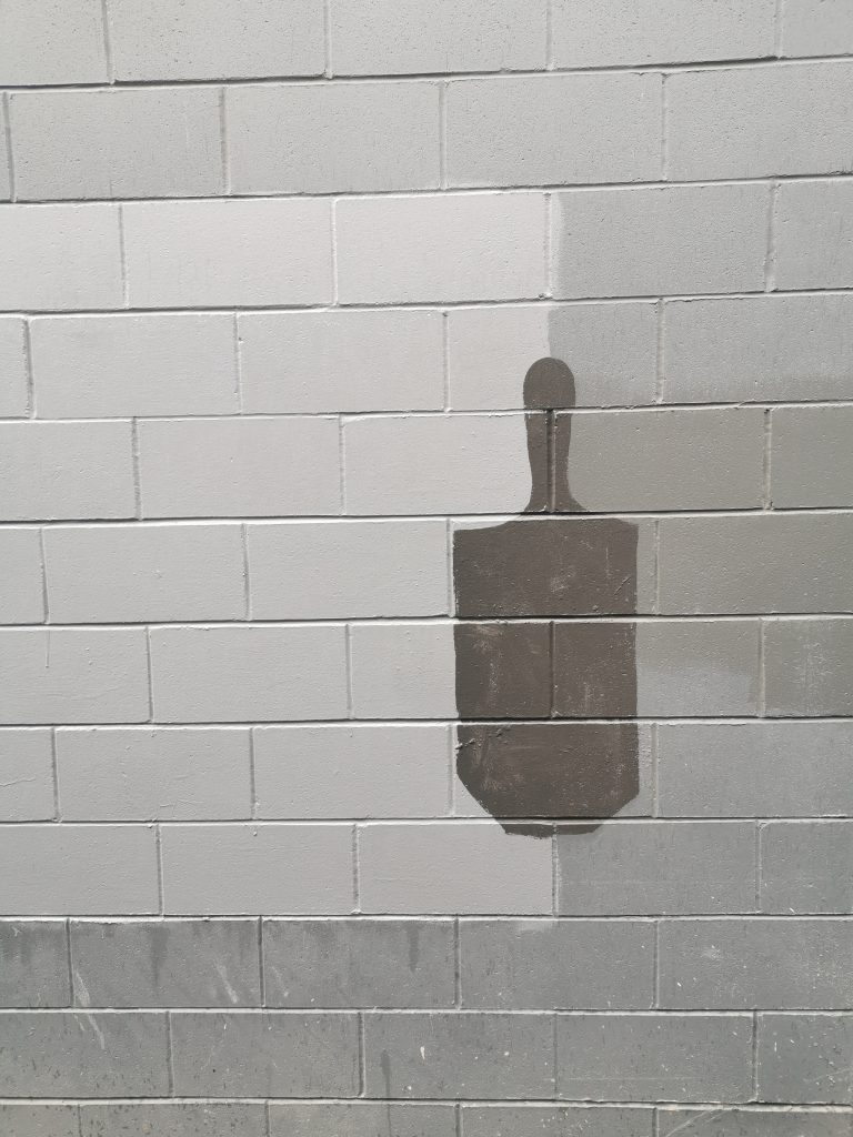
When you talk about the silhouette pencils, you are referring to your ‘bluff buff’ pieces, they remind me that the buff itself is essentially a bluff. We can look out and see the way that buff jobs just block out graffiti, they echo the shapes. I mean the most ridiculous buff jobs are the ones where you can still read the graffiti.
Yeah, they have just outlined it, you could go over it with a pen and it would fill in the gap perfectly. There are some great ones around!
A Teeth Like Screwdrivers ‘Bluff Buff’ in central Christchurch, 2020
No one is ever going to say that the buff itself is an act of beautification.
It’s like that PEEEP Trust, they are actually stencilling their logo onto the walls they buff! At first, I thought it was an artist signing their work. It’s like the classic ‘official’ graffiti walls, with a spray can and it just gets filled. But I googled PEEEP and it’s an actual fucking thing! They are paid, or at least they raise money to do that shit.
It speaks more to masking than improvement.
It is deliberate censorship rather than enhancement.
The pencil bluffs play on that…
I don’t have roots in this. But it creates a grey area. If I’m painting on the wall and someone pulls up, I just say someone wrote the word fuck on it and I’m covering it up, and they go, ‘oh shit, that’s OK mate, see you’. No street artist is going to be using a tub of grey paint and a paintbrush, so the moment they pull up, because it’s essentially a rectangle with a bit on the bottom and a bit on the top, I can square it off and be like someone drew a dick and I’m covering it up. So, it’s making it safer for me because I’m that person.
You mentioned your love of skateboarding, was that the gateway to sticker culture and graffiti?
Skateboarding came first. I had stickers on skateboards first. There is an art form to putting a sticker on a skateboard, there is a certain way you do it. You put it in a certain place because you know that it’s going to get fucked if you put it in a different place. There is also the branding. I’m not going to put any old sticker on my stuff, it’s going to be representing me and therefore that’s important. So, I guess the placement, the branding, it has all led to where it is today. I am still like, why the fuck would you put a sticker there!? You could have moved it four inches and overlapped that one and it would have looked brilliant! That’s my inner nerdiness coming out, but there is a certain way to do it. In Lyttelton, one of Bongo’s pastes was coming off, and I wanted to put my one up, so I took his off and re-pasted it just a bit to the right and put mine so they overlapped nicely. He was like: ‘Did you move my piece a bit?’ Well, I had to because mine overlapping yours makes both of them look better, if i hadn’t it would have fucked up both of our work!
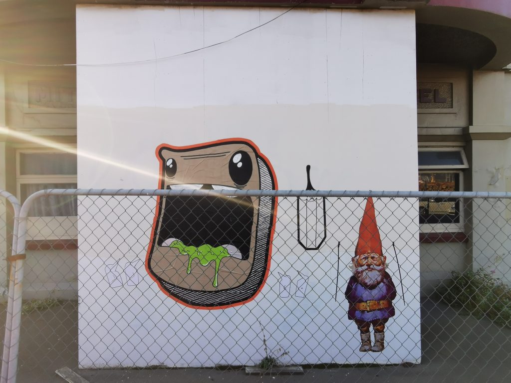
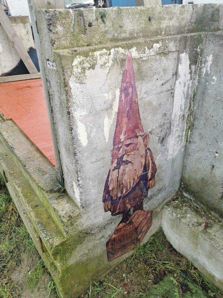
A Teeth Like Screwdrivers Gnome and Pencil beside a Bongo character, Lyttelton, 2020
That’s the thing about urban art, it doesn’t exist in a vacuum, it doesn’t exist in a white cube. The surrounding context of space gives it meaning, but also is part of the aesthetic. A mural on a wall has to work with whatever is going on there and it’s the same with a sticker. There’s a subtlety in terms of placement, and there’s also a mindfulness, right?
That’s trial and error too. The amount of times I’ve stuck a sticker up and it’s just slipped off. It’s all covered in dust and grime! But again, the buffs are a great example. You posted a picture of an alleyway somewhere, and instantly, I knew what had to happen! There’s a light grey, a dark grey, there’s an overlap, there is an obvious point for me to put a buff pencil. Again, it comes back to skateboarding. Skateboarders look at the world in a different way than most others, they will go past a spot and to anyone else it’s not a spot, but a skateboarder recognizes the fact that you could do a trick there, or you know, that curb’s looking really rad. It can be anything and the same thing applies to stickers and paste ups and graffiti, you see a spot and you’re like, ohhh, hello, that will work well…
It’s like those movie scenes where a character’s thought process is visualised and you see diagrammatic lines and mathematical equations in space.
Yeah skateboarders have that in spades! If you watch a skateboarder walking around town, you can just see the way they are trialing shit in their head. It’s just instinctive. I’m finding it’s the same with stickers, I’ve got a pile in my car and when I’m driving, I’m looking and thinking that spot would be perfect… Even colour is a part of it now, I never used colours in the past, I used white and black, now I’ve got all this colored vinyl. I’ve got this bright green, and I’m like, that will look so good on that wall, you know? It’s madness, it’s actual madness!
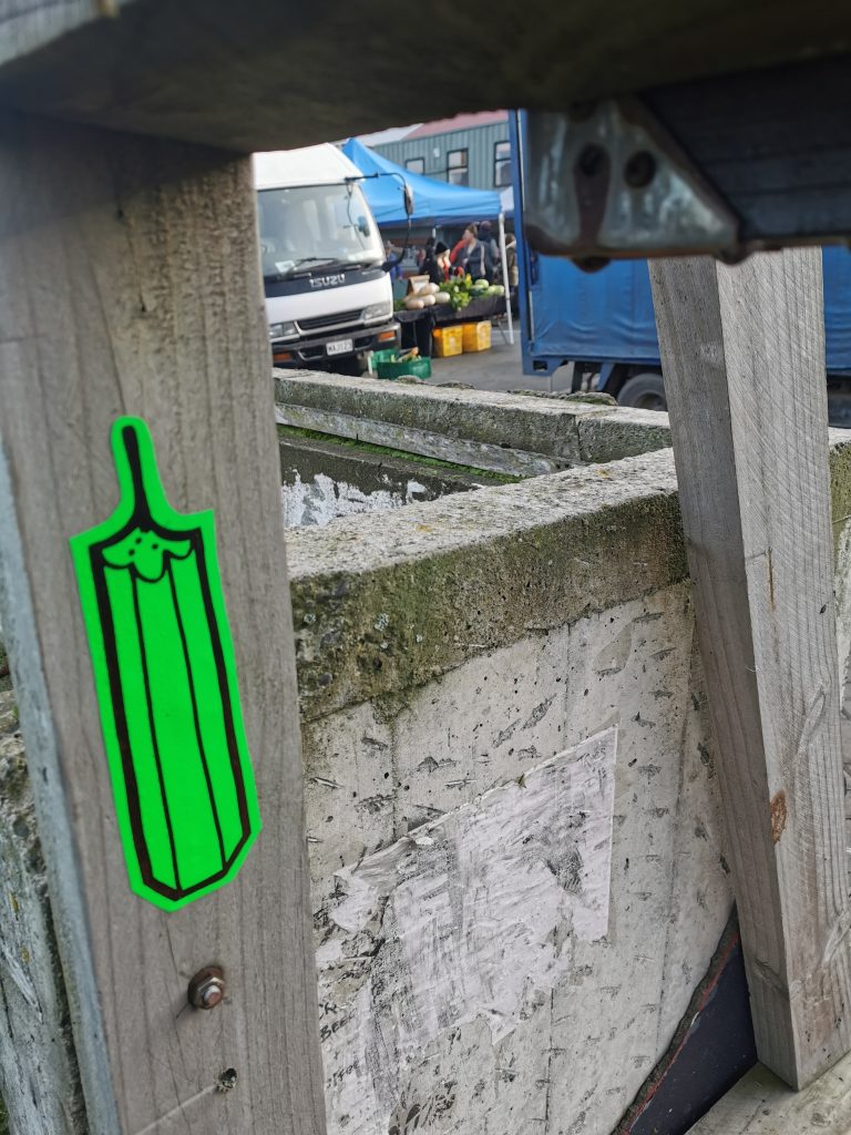
A vinyl pencil slap, Lyttelton, 2020
Urban art, graffiti, skateboarding, parkour, they are all tactical, they are always a response, and that’s the thing, they are constantly evolving. You can’t eradicate something that is not rigidly defined, things that can grow and evolve…
Certain styles of skating have come out of different cities because of the way that councils have tried to stop skaters. When rumble strips first came out in the UK, they were stated to be for blind people, so they can feel them when they are walking. But no, they are not, that’s bullshit. They were put there to stop me hitting it on a skateboard. But people were quickly figuring out how to go over them, doing tricks, and I fucking love that, it’s great.
It’s the same with graffiti, attempts to stop it are just going to change the way it occurs.
It’s just misdirection. I guess it is how cities get their style; if you’re in a city that’s heavy on trains, then a lot of train bombing is going to go down. In the UK, we didn’t have the train thing, so it was always on the buses, which is why stickers came about. You could get on the bus and just slap. If you lived in a city where there weren’t any trains coming through, you did the buses, because that was the next best thing.
And those different vessels mean different styles and techniques evolve in response.
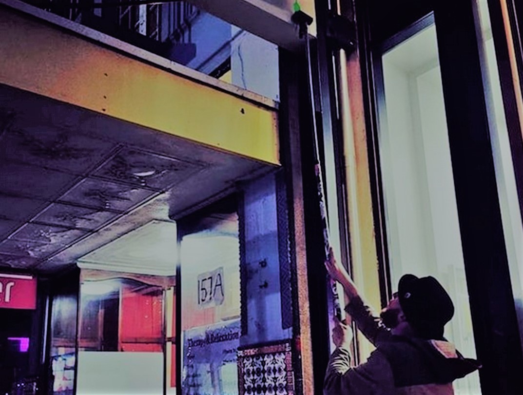
Which is interesting for Christchurch because we are a city of concrete tilt slab buildings. I mean there are some fucking wonderful huge murals, and they are street art, it is definitely art on the street, but it’s also blocked off and lit and fucking ginormous, you know, and I feel that maybe there’s more to it all. I mean, I look at that [gestures to a nearby decorated window] and I don’t know whether someone’s done that themselves or someone’s been paid to do that, and I think that’s a really nice balance. We are so full of the big mural stuff that you can get away with putting a big paste up and no one questions it.
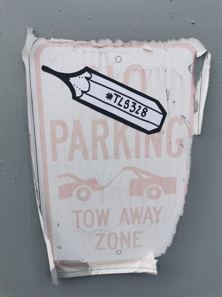
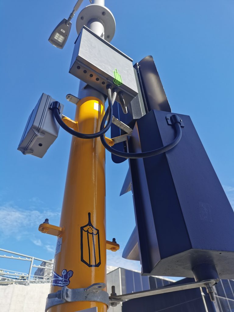
Small pencil stickers, Christchurch, 2020
With the breakneck change that the city’s gone through, it’s going to change the responses. So, it’s not just the eradication methods, it’s also the physical make-up. We had broken abandoned buildings that were perfect for graffiti writers to commandeer and then we had lots of exposed walls from buildings coming down which were perfect for murals, now we’re going to find more of these spaces that are more traditional spots, liminal spaces.
But weirdly they will be new! They will be sharp and fucking clean, perfect spaces, which for me, as someone who puts stickers up, I love that! The smoother the surface, the easier it is! I don’t want to deal with bricks and shit, I just want nice, clean walls. Also, the up and the down of this city, you know, there’s stuff on the floor, there’s stuff up high. We don’t have many high-rise buildings, so things stand out more. It’s got a sense of panorama.
Even from here, we can see the lay out of the city. There’s an expansiveness which is kind of inspiring in a way, because you don’t feel smothered or captured.
Or penned in. It also means that you’re not cliquing it, you know? I drive from Lyttelton to here, that’s the whole city, and it takes me fifteen minutes. So, there isn’t anywhere you can’t hit, which is fucking brilliant.
Which gives a real sense of possibility. Speaking of expansive, I really enjoyed watching your lock down collaboration project.
That came about as a lock down version of Inktober. Their first theme was like ‘green’ and then the next one was something else, and I couldn’t think of anything to do with my pencils for it. The collab thing is big in sticker culture anyway, so I just decided to write a list of twenty people I wanted do it with and I just put it out there. Then it became forty and then sixty and it just kept going. The concept is more of a mashup than a collab I guess, taking someone else’s art and doing it yourself in your way or blending your styles together.
You often use other people’s stickers to adorn things anyway, even if you’re not street slapping.
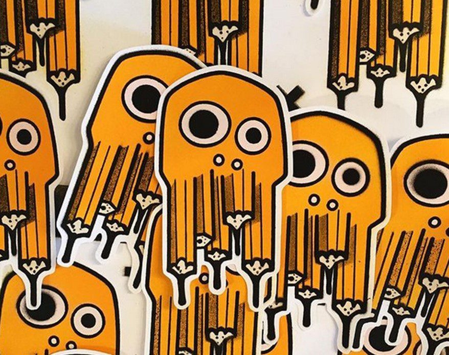
Yeah, exactly, so the mashup is just taking it to this next degree, I guess. MarxOne from up in Nelson, he is the fucking king, he has sheets and sheets and sheets of collabs with different people. As an artist, if someone does a picture of a pencil and they tag me in it, I’m not going to be like, that’s my pencil, don’t do that! That’s bollocks. But everyone has a style. I’ve tried characters and I’ve got a big fucking ginger beard character with a stupid bald head, who is basically me, and people now recognize that and that’s what it should be about and that’s the family thing again. No-one’s going to get pissed off, there’s no reason to, because someone’s literally saying: ‘I really like your shit, can I do my own version of it?’ You just go OK, send me a sticker when you’re done. I did one with Ocky Bop, one of his skulls with pencil’s for teeth. I just drew it and took a picture, and he’s like, I’m printing that shit! Now I keep getting tagged in all these pictures all over the world! It’s not complicated, I literally drew my pencils as his teeth on a sticker and now it’s gone everywhere!
Teeth Like Screwdrivers’ collab sticker with Ocky Bop, 2020
At the end of the day, that’s the beauty of sticker culture, it’s global nature. The internet has changed some of the ways we think about graffiti because now influence can be much wider, but graffiti still has an immediate localism to it. With stickers the mobility is unlimited, as you say, you’ve got pencils in cities all around the world and other people are doing it for you.
My favorite thing is that you send a pack to someone and they go: ‘Well I’m going to keep some for myself and put them in my black book because that’s cool, and I’ve got another fifteen, so I’ll put fucking five of them out in the street and I’m going to send ten to another five people…’
There’s a viral quality.
Yeah, for instance, my pencils, and my gnomes as well, they’re all over the UK and I haven’t sent a single one there. There is a guy called Spirit of Mongoose who is just printing a shit load. Which makes my job way easier. Of course, it’s not even my art, I just scanned a picture, but it’s the thought that this would happen.
A Teeth Like Screwdrivers Gnome, Lyttelton, 2019
The nomination is the act, and then as you say, someone else becomes part of it, and that comes back to family and community, this community is just much bigger than you ever realize until you start to make those connections and networks.
And it’s there all the time, it’s there and it’s getting bigger and bigger and more fun…
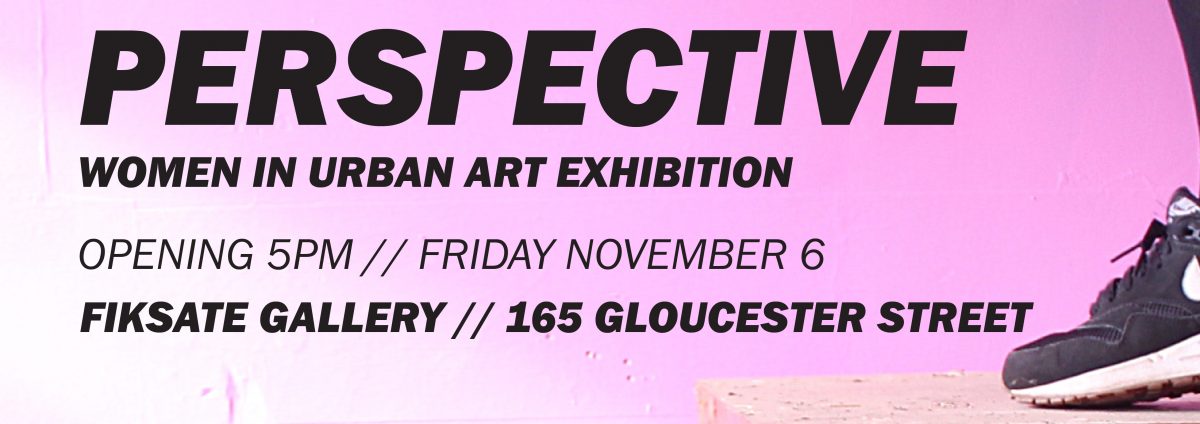
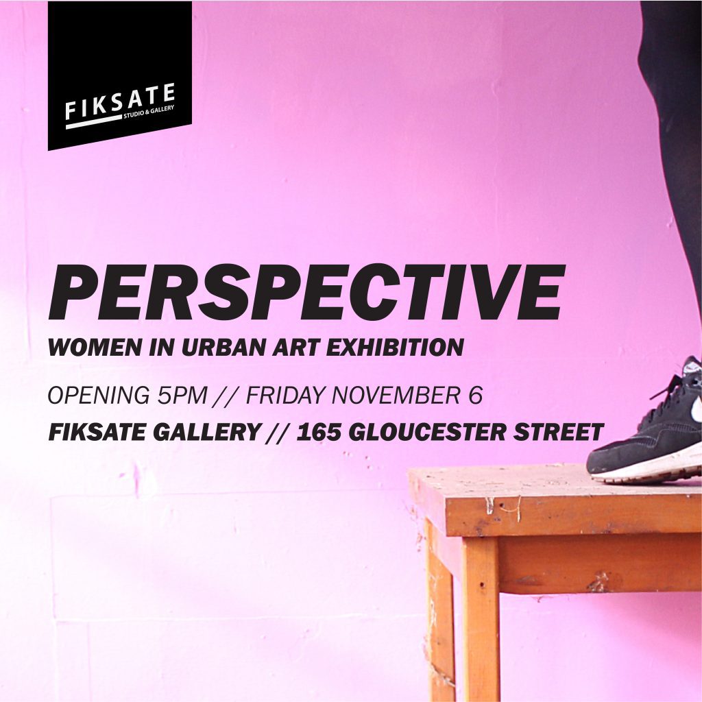
Urban art, and graffiti in particular, are viewed by many as masculine realms, physical, aggressive and competitive. But, the reality is that women have long had a vital role in the history of wall writing and street art, from subway graffiti writers like Lady Pink, to post-graffiti icons like Swoon, and leading members of the contemporary mural movement like Maya Hayuk. In Aotearoa, the female presence in urban art has also been notable, and Fiksate’s Perspective exhibition, opening on November 6th, brings together an array of artists to share their diverse experiences and reveal the myriad stories and pathways of women in urban art.
Organised by Fiksate owner Jenna Lynn Ingram (Jen_Heads), Perspective brings together established and emerging female artists from around New Zealand (and further afield), with a diverse range of practices, from typography-focussed graffiti writers to spoon-loving street artists, collagists, paste-up artists, photographers, videographers, traditional painters and mural artists. This diversity reveals the approach of Perspective, less concerned with an explicit historical narrative or thematic or stylistic similarities, the show primarily explores the scope of work of the collected artists, from Flox’s beautiful stencils to Kophie Su’a-Hulsbosch’s empowered portraits or Befaaany’s striking urban photography. In doing so, notions of the female urban artist are both celebrated and challenged.
Auckland artist Flox is one of the impressive line up included in Fiskate’s Perspective: Women in Urban Art Exhibition.
Local talent Kophie Su’a-Hulsbosch is part of the Christchurch contingent of the show.
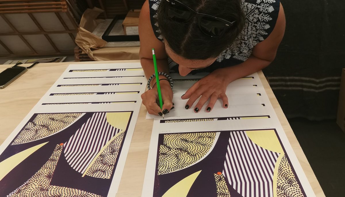
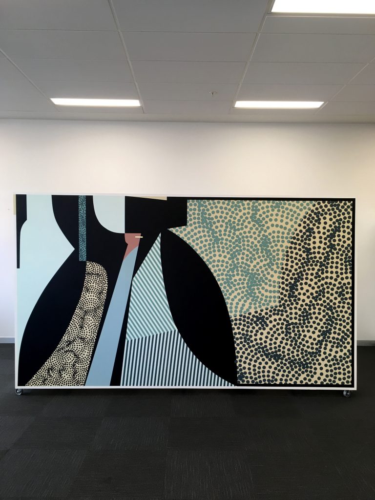
Accompanying the exhibition will be a limited-edition risograph zine, produced by Jane Maloney of M/K Press, providing additional insights into each artist’s background and further highlighting their varied experiences, from the challenges they have faced to the different environments that have fostered their approaches and nurtured their talent. While more fluid and non-binary gender identities may render gender specific exhibitions less necessary in the future, Perspective is an important moment in Aotearoa urban art, a celebration of some amazing talent.
Spoon-making street artist Vez highlights the diversity of the Perspective line up.
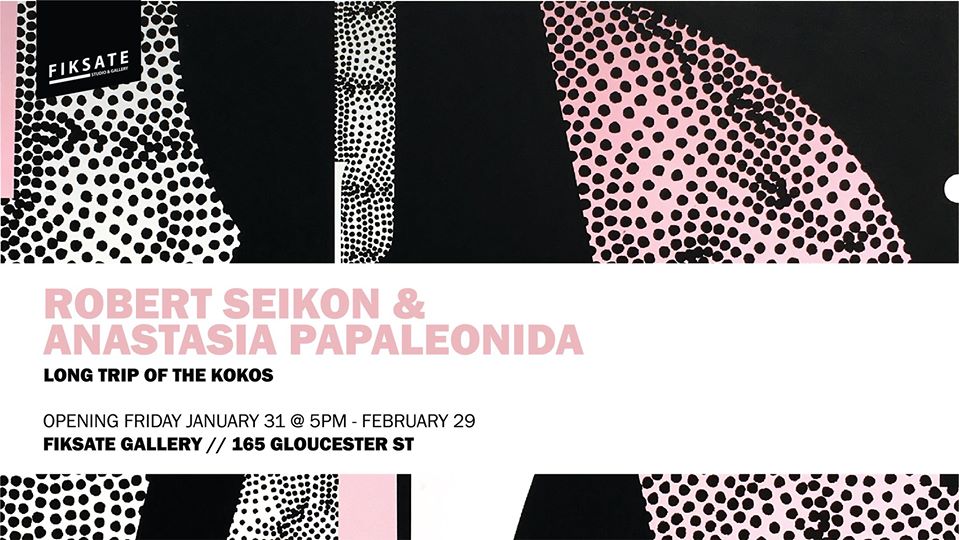
Perspective opens 5:00pm, Friday November 6th at Fiksate Studio and Gallery, 165 Gloucester Street.
And that’s half of 2020 gone already. Although lets be honest, this year has seen a fair amount of activity, some shitty, but others important and long overdue. This month’s collection acknowledges these struggles, as well as looking to the past, the future and art as a gateway to explore and consider more than our immediate preoccupations. From Askew One’s haunting risograph print with MK Press and Fiksate, to our tribute to graffiti legend Jungle and the countless voices he inspired as a rebellious actor in the local urban landscape, here are our favourite things from the month of June…
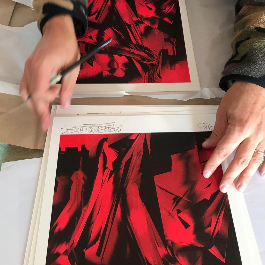
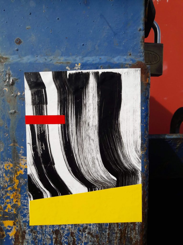
Askew One x MK Press x Fiksate collab
Askew One signs his MK Press x Fiksate collab risograph prints. (Photo credit: Elliot O’Donnell)
The month started on a high with the release of Askew One’s limited edition print as part of the MK Press/Fiksate artist collab risograph print series. Following Dr Suits’ initial release, Askew’s striking red and black abstraction continued the popularity of the concept, selling out in just hours. The work embraces and explores the qualities of risograph printing, while continuing his digital studies drawn from urban environments. The result is a twisting, jagged image filled with a sense of terror and dread due to the blood-like tone. Setting a benchmark for the series, you wouldn’t really expect anything less from Aotearoa’s finest, would you?
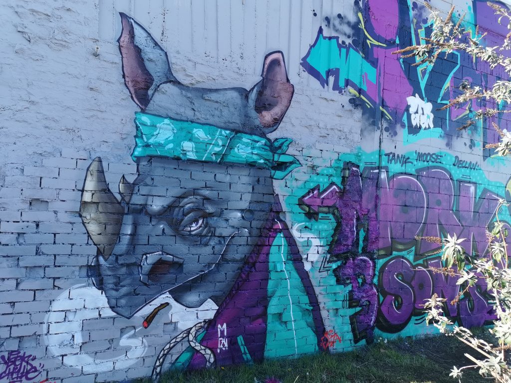
Graffiti jam for the New Brighton Outdoor Art Festival
YSEK’s rhino character from the New Brighton Outdoor Art Festival traditional graffiti wall.
The delayed and reconfigured NBOAF signed off with a traditional graffiti jam wall, with a number of local talents transforming a wall in the middle of New Brighton Mall. The green and magenta colour scheme tied the various pieces together, while individual styles and characters by YSEK and Dove ensured variety as well. The wall was intended to represent and celebrate traditional graffiti art, and as such was always going to draw criticism from some corners. The online discussion about the wall’s appearance was interesting to say the least, highlighting the ongoing and deeply held misconceptions and prejudices around graffiti, even when produced legally…
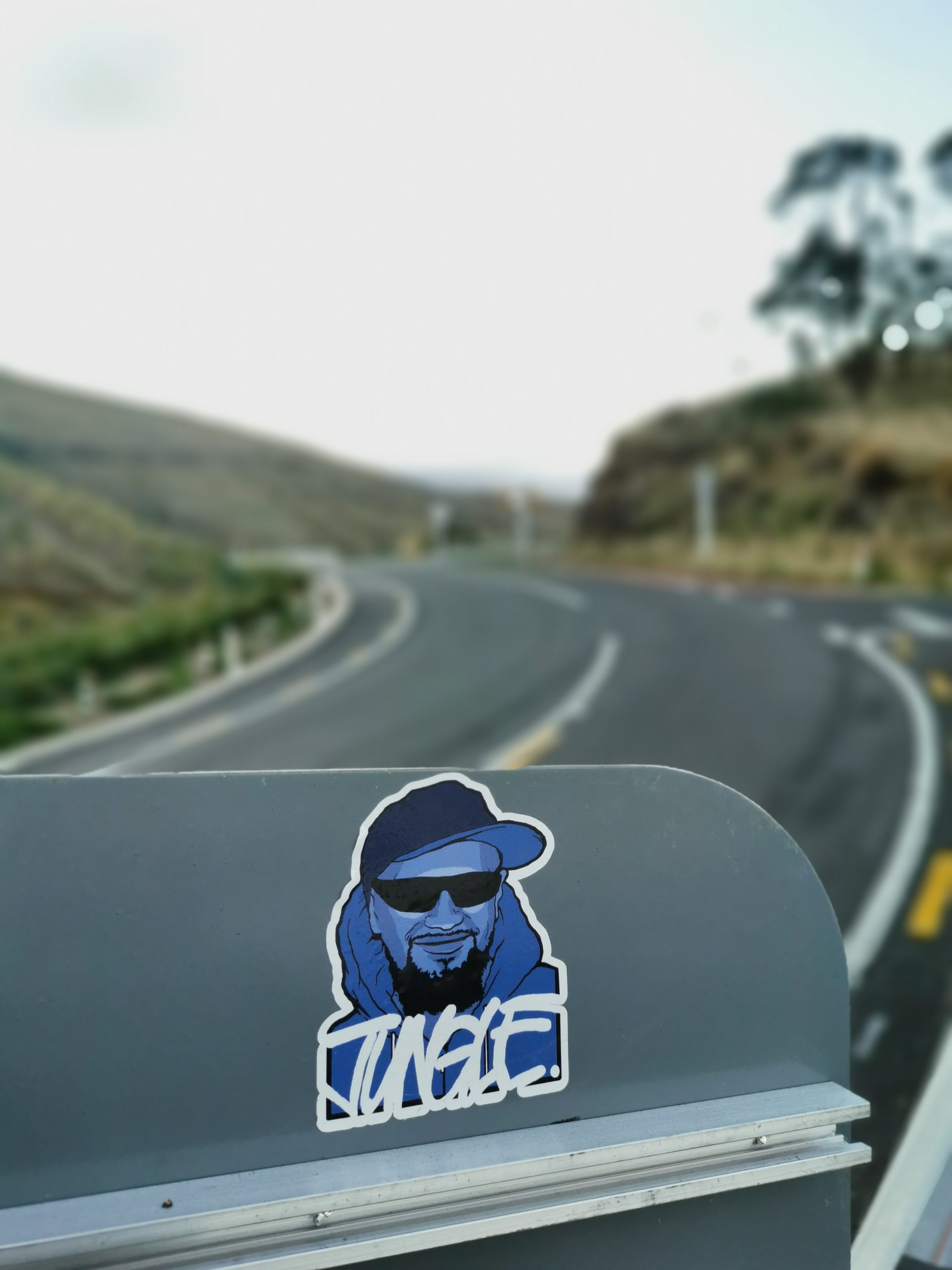
Jungle Tribute
A Jungle tribute sticker on Summit Road, February 2020.
When local graffiti legend Jungle passed away in March of 2019, Christchurch’s graffiti culture spoke by painting tributes across the city’s walls. I had discussed with Ikarus the idea of a larger written tribute that explored Jungle’s legacy, however, by the time we got to sit down with an eye on the one-year anniversary, lock down struck. In addition, what started as an interview with Ikarus, developed into a multi-generational project, stretching the process out. However, by June, the lengthy tribute was finally online. Hearing stories of Jungle’s influence, it was quickly apparent how consistent his impression was, a man who the city’s graffiti culture was indebted to, but also a character who influenced people by his charismatic personality…
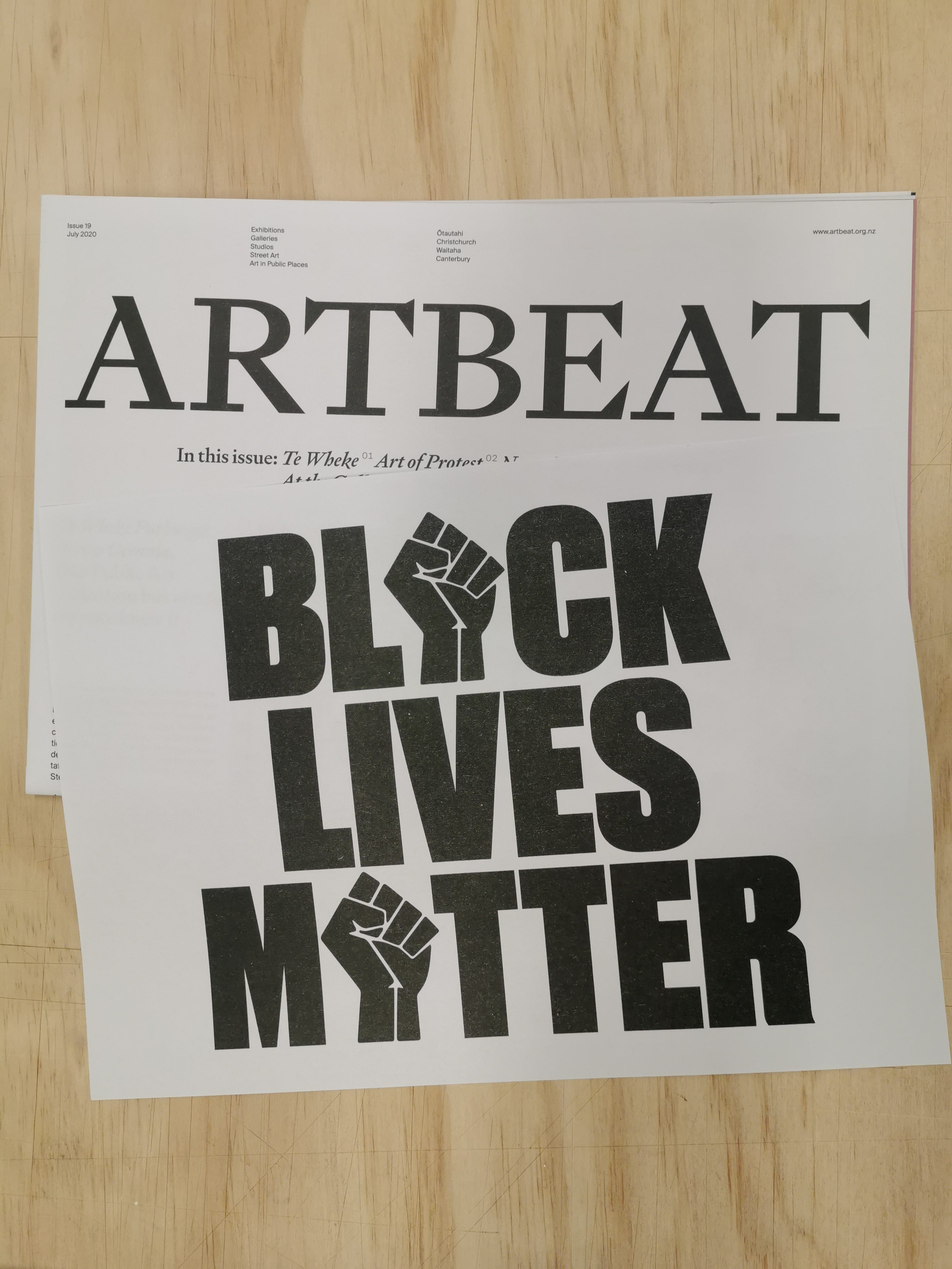
Black Lives Matter Protest Posters
June’s issue of Art Beat included an A4 risograph poster from the Posters for BLM archive. Pictured is Roydon Misseldine’s poster.
The latest issue of Art Beat, the visual arts newspaper edited by Dr Warren Feeney, featured an insert of A4 posters drawn from the shared archive Posters for BLM (@posters_for_blm). The three variations, by Stephen Powers, Sara Froese and local designer Roydon Misseldine, were risograph printed by MK Press and included inside the free paper. Importantly, the posters ensure visibility to the cause and serve as a reminder of the potential to raise a voice about oppressive systemic issues. While a small gesture, it attempts to continue this vital narrative. More posters are available for free download (for non-commercial use) from the archive, with a link in their Instagram bio.
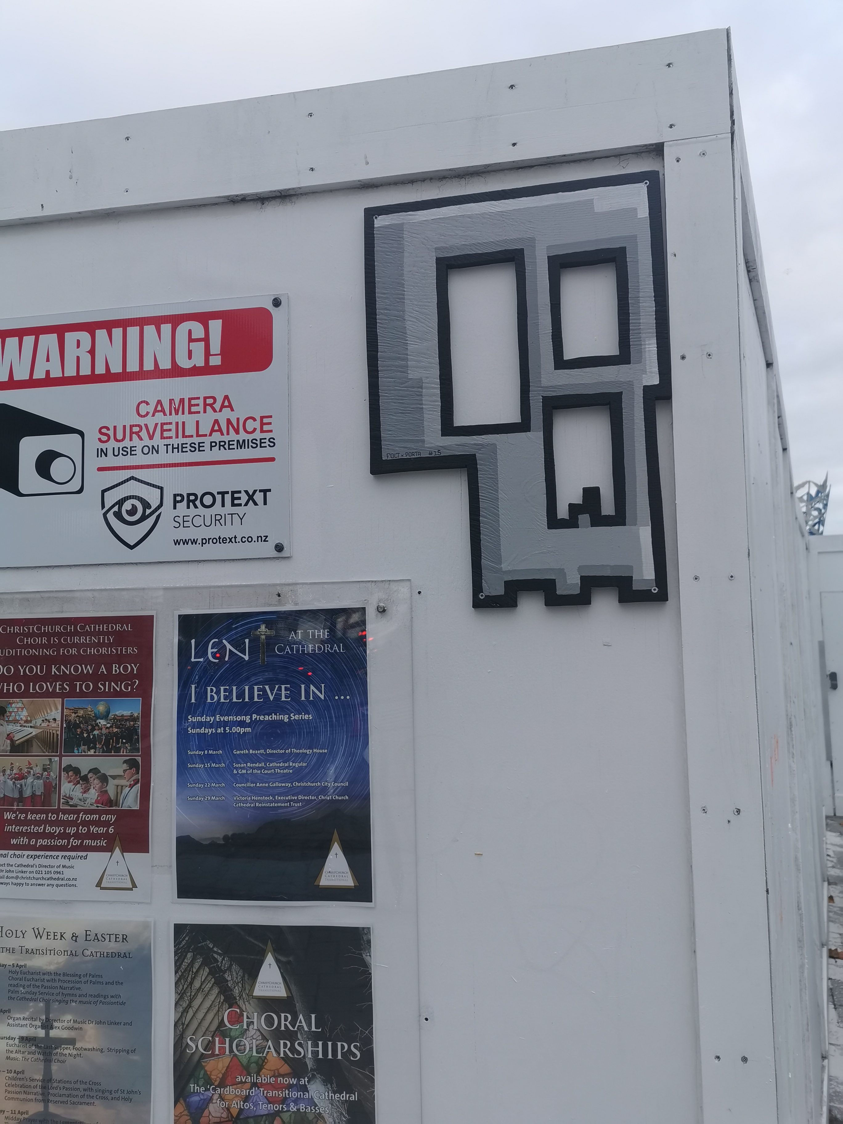
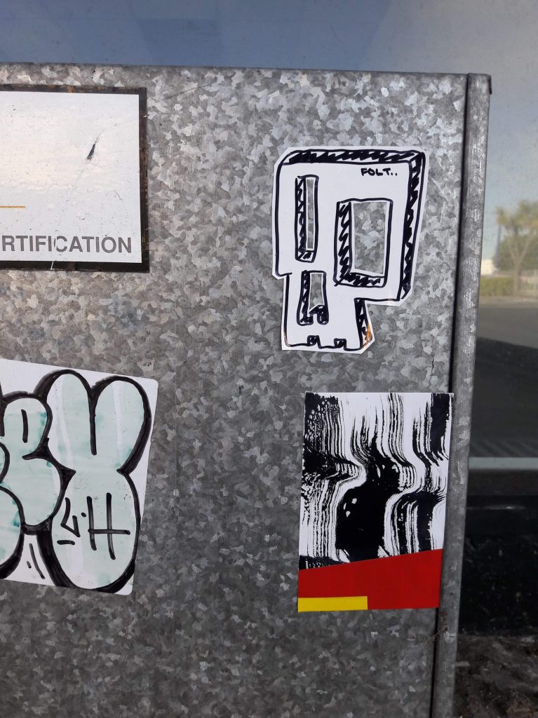
Porta x FOLT Skull Collab
The FOLT x Porta skull collab in Cathedral Square.
The collection of FOLT skull cut-outs continues to grow around the city (although many have disappeared as well, seemingly too attractive to collectors), and this subtle variation by Porta is a personal favourite. Porta’s recent investigation of pixelated video game aesthetics is utilised here, but with an understated approach, the granite colouring giving a bare concrete appearance that only reveals the highlights, shadows and blocky shapes upon closer inspection.
And that was June 2020, for me at least, let us know what you enjoyed over the month in the comments…
When Aotearoa entered the level 4 lock down as we faced the threat of Covid-19, many of us took to a daily walk within our bubbles, nominally for exercise, but if we are honest, as an escape from the confines of our homes, to remind ourselves that the world around us was still there.
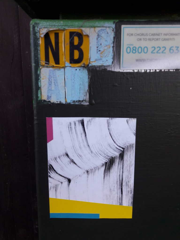
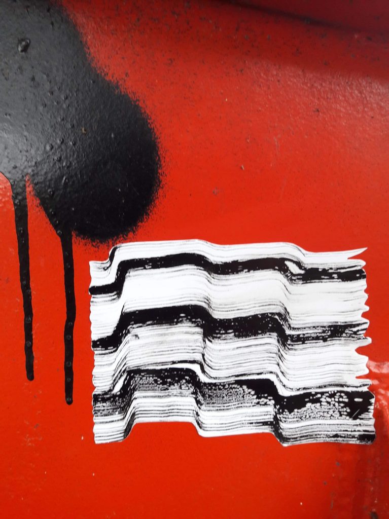
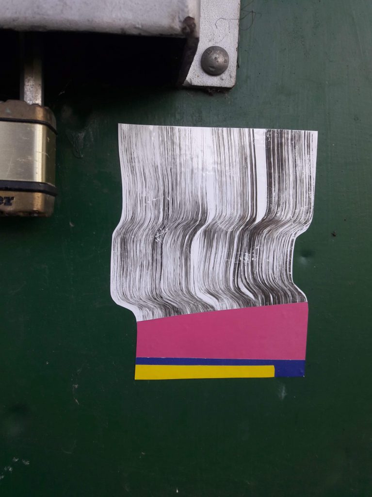
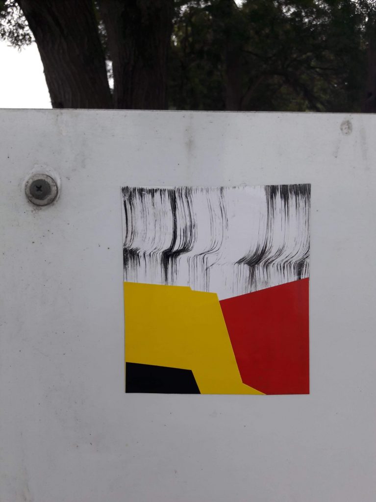
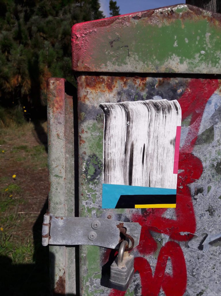
Luckily for me, my suburban surroundings provided plenty of points of interest, and chief among them were the constantly expanding series of stickers and paste ups produced by the prolific Dr Suits.
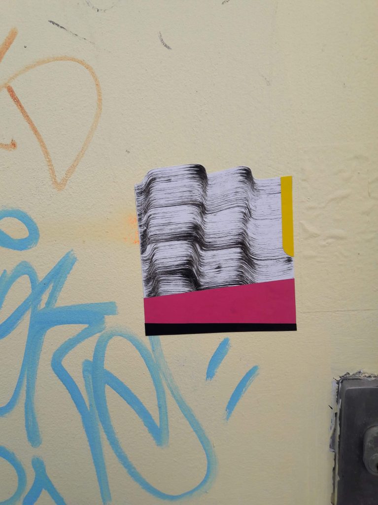
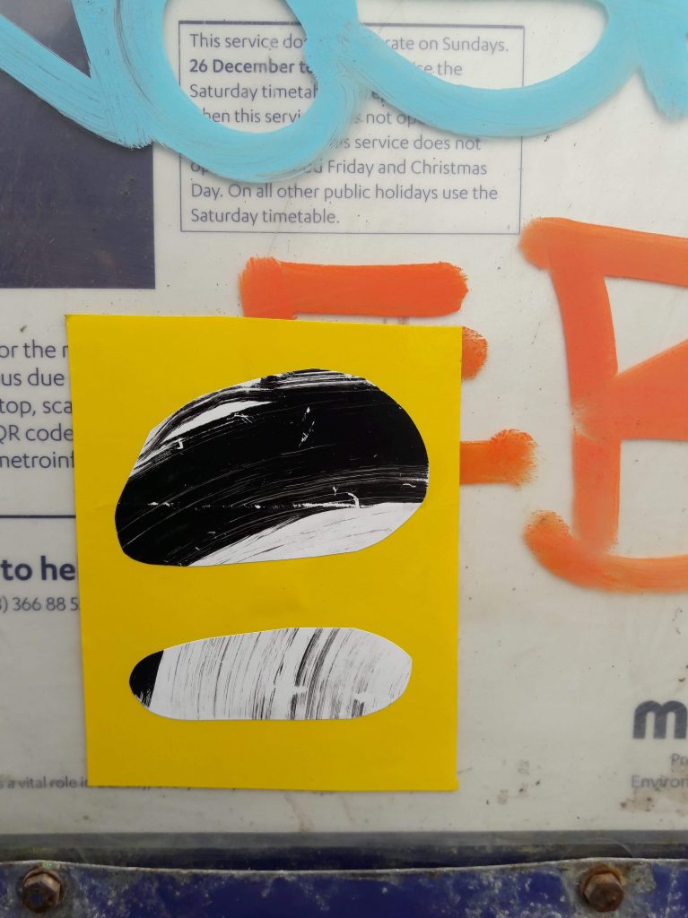
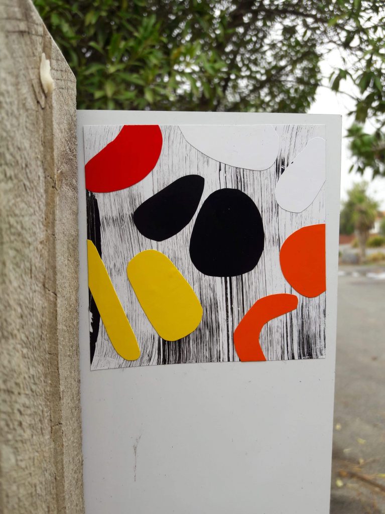
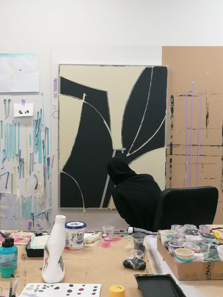
Dr Suits’ output over the last few years has shifted to a process-centric fixation with abstraction. As he has investigated materials and techniques, he has also grappled with the transference between street and studio. While he has produced a range of outdoor works (including commissioned murals and even a basketball court), the lock down period saw perhaps the most cohesive body of street work he has created. From small vinyl stickers to large-scale paste ups, sweeping textural waves and various geometric forms of flat colour were juxtaposed to create items of intrigue. To learn more about this flurry of creativity, we caught up with Dr Suits to talk about the inspiration and motivation for these (sub)urban additions and how extraordinary times have inspired his work…
The notable thing about this body of work was just how quickly it seemed to come to fruition and appear on the streets, was it something you had already considered, or were you specifically inspired by the lock down?
It was spontaneous really. I think a lot of my work happens like that, when I find a delicious tasting fruit, I feast on it, until there’s no fruit left.
When we entered lock down, we just raided the studio for a bunch of materials and resources with no clear plan of what we were going to do with them. We just wanted to make sure we had stuff to work with at home. The stickers were great because they were small, and I could just mess around in the lounge.
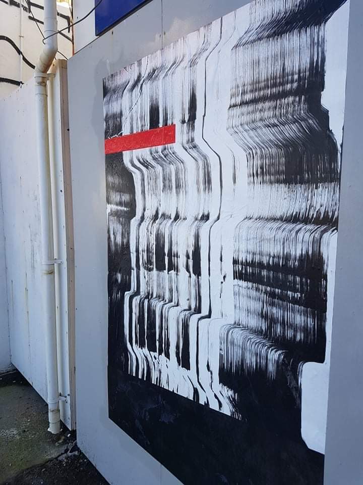
The stickers led to the much larger paste ups, a form that you have a bit of experience with…
They were something that just came out of the stickers. It was a similar process, I just wanted to do the stickers bigger. I had the materials, the paint, the paper, the glue. The beauty of paste ups is that you can work on them at home, and then it only takes ten minutes to install them, which was great for lock down. It reminded me of the post-quake period, when I first started doing paste ups, but I adapted them to my present artistic approach.
A lot of your previous paste ups were illustrative. These works are a clear reflection of your more process-driven abstract direction of the last few years…
I thought of a few ideas to do some illustrative paste ups with more on-topic commentaries, but I couldn’t find the motivation because I was too distracted with the process of making these stickers and just doing what seemed natural…
Do you connect these works in any outward sense to the Covid-19 pandemic?
I could probably think of something more specific if I wanted to, but they are a direct response to that situation because if I didn’t have that situation they wouldn’t have been created, so in some ways they are a direct response.
The paste ups and the stickers both use a collage technique, but they can be experienced very differently because of their materials and size. Were you interested in how people would respond to the different works?
It’s more driven by the process of creation. I know people are going to respond to them in their own way and that’s what I like about abstract art. People always see something that you don’t see or think something that you don’t think. Even though they use the same process, I wasn’t really thinking about it. Obviously, the paste ups don’t demand as much inspection because they’re so big that you can see them from afar, you may or may not notice that it’s collaged. I was just really enjoying the process of cutting the shapes and overlapping them and exploring different compositions. That is really similar to the way I previously would do it, but I would use Adobe Illustrator or something like that to play around with shapes and I would just pick the ones that I liked. But with the stickers, each one was a development, and I would just keep each one, it wasn’t just picking the ones that I liked and then using those as a composition to make into an artwork…
When you’re putting the paste ups on the wall, are they constructed with the final image in mind? I’m assuming they are applied on the wall in sequence…
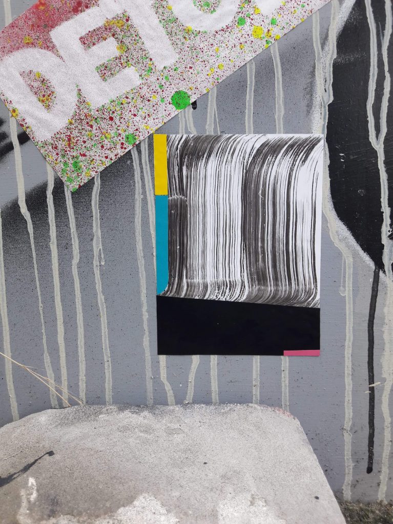
Yeah that’s right. With the stickers, I’d start with the background, with the brushy effect using the wide-tip Molotow marker, and then I would just cut shapes out of colorful vinyl, some which I’d spray painted first, and I’d play with compositions. Then I used those stickers to inform the larger paste ups.
Were you thinking about spots for paste ups in a different way to the stickers? I assume there was less planning around the stickers, whereas the paste ups would require some forethought…
There’s an abundance of spots out in New Brighton, so it’s not hard to find a spot. And during lock down it was so quiet, no one was around, I mean I could have painted them if I wanted to. At the time, I was more interested in the collage approach and finding those small imperfections where they are slightly offset and seeing the depth between the layers, the paper sticking on top of another layer which is on top of another layer and building up. The paper ripples and it creates little shadows and as it gets wet it shrinks and it might warp a bit, the stripe might move off to the side a little…
In terms of placement, what makes a perfect wall? It feels as if your works like to have room to breathe, but also it seems that geometry is an important consideration…
Definitely, I really like a wall to have similar or reflective elements that are going to make it relatable to the work. I like to have contrast, but I also like it to have some sort of unity. That balance is what I like in my work more generally anyway. You want it to stand out, but you want it to fit in, so I try to find texture or line or some shape or something in the composition of the space that’s going to contribute to the overall composition on the wall, like a box or a down-pipe, a color or a paint change or a set of windows.
Do you feel this has taken your studio work in a new direction?
Definitely. The stickers started developing with more curves and softer lines and the collage approach to the process is something I’ll take forward.
Your work seems to evolve in quite a fluid progression, with certain elements recurring and coming into focus, does it feel that way to you as you are working?
think with abstraction, it can be very sparse in terms of the elements you’re working with, so the changes are noticeable really quickly when you do change an approach or technique or some process behind how you make an image. I can really latch on to something just by changing that one thing and that change becomes a solid basis and everything else around that can change but you are still kind of keeping a consistency within the work.
There’s an anchor…
I like to have an anchor, especially with colour or shape or composition or texture. The anchor’s a link, you could look at it two ways; it’s a safety thing, I don’t want to jump too far away from what I’ve been doing, possibly because of fear, but also it keeps it recognizable from previous work so you can see a progression, that connection between where you are going and where you’ve been.
Has this series made you think about the street/studio balance?
I’d like to do more of the paste ups. I’ve got lots of ideas for those, but I can see them influencing my paintings as well. I want to take that same process, just do a little collage sticker and then maybe do a paste up or a painting directly from that, maybe try to do both, and just push that image out in more than one way…
Last month I ruminated that March was a strange month, of course, April was no less so, almost its entirety experienced in lockdown here in Aotearoa (only moving to ‘Level 3’ with two days to spare). The rest of the world was in a similar position, and with limited space within which to spread our arms, it felt like we started to notice things differently. Our immediate environment became unavoidable (those dirty windows, peeling paint or leaking tap), and the digital realm an escape where physical flee was impossible. As a result, this month’s list is compiled of those things I encountered in the suburban streets directly within my ‘bubble’, and those I enjoyed online. Surprisingly, in a month where the world essentially stopped and hunkered down, who would have thought a list of cool things would be so easy to compile!
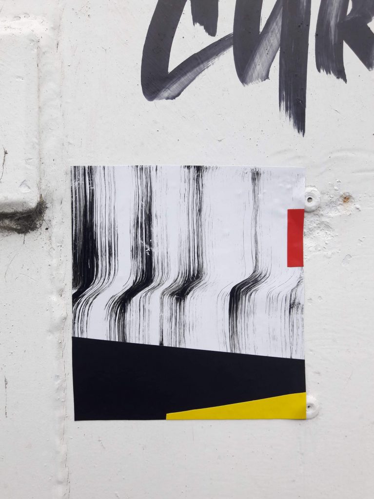
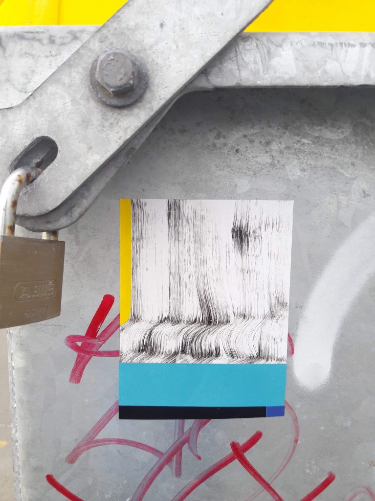
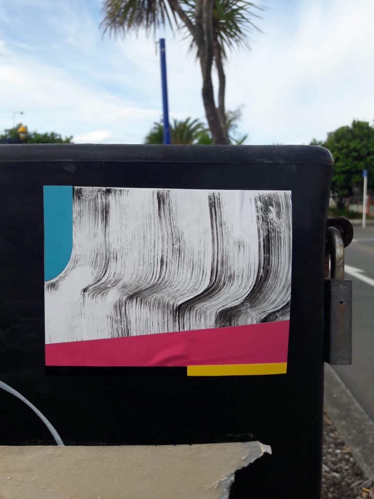
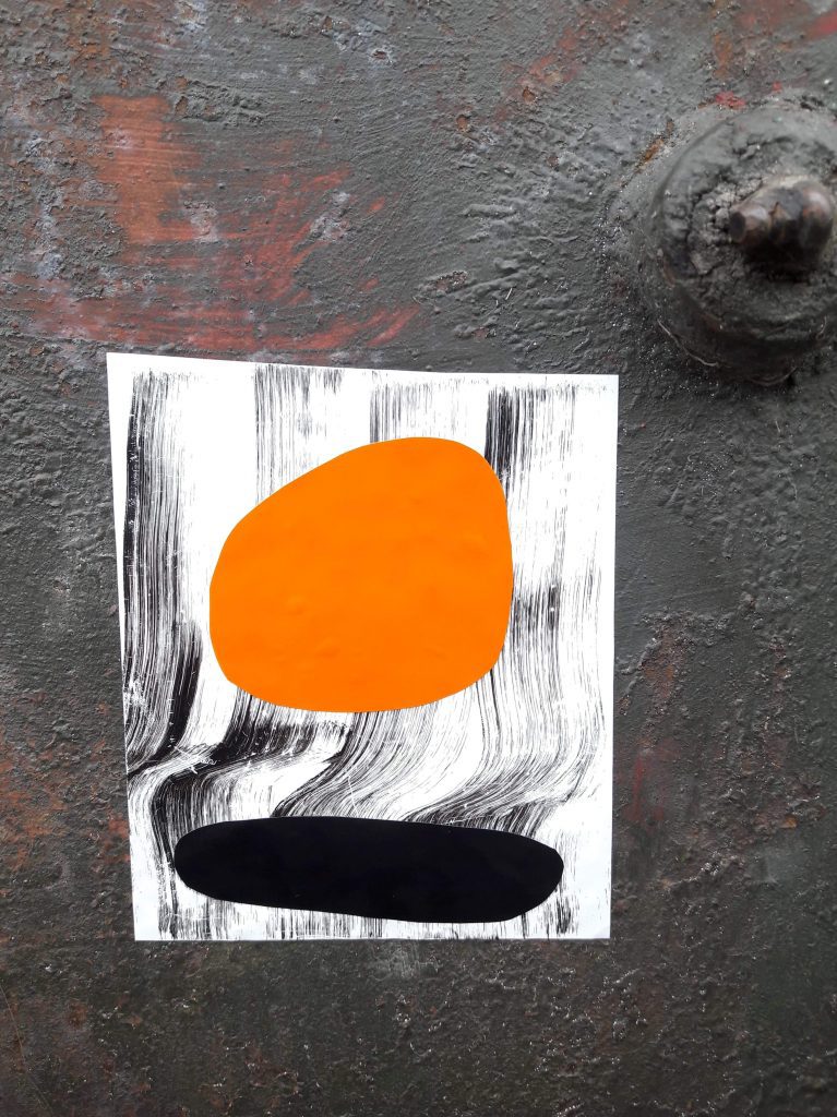
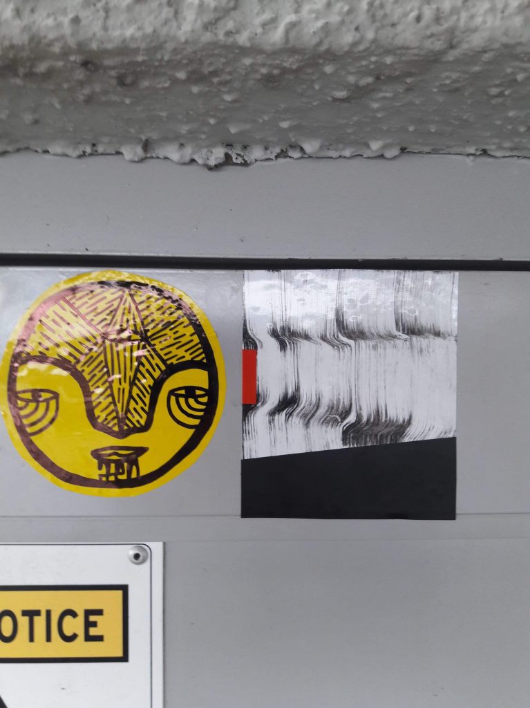
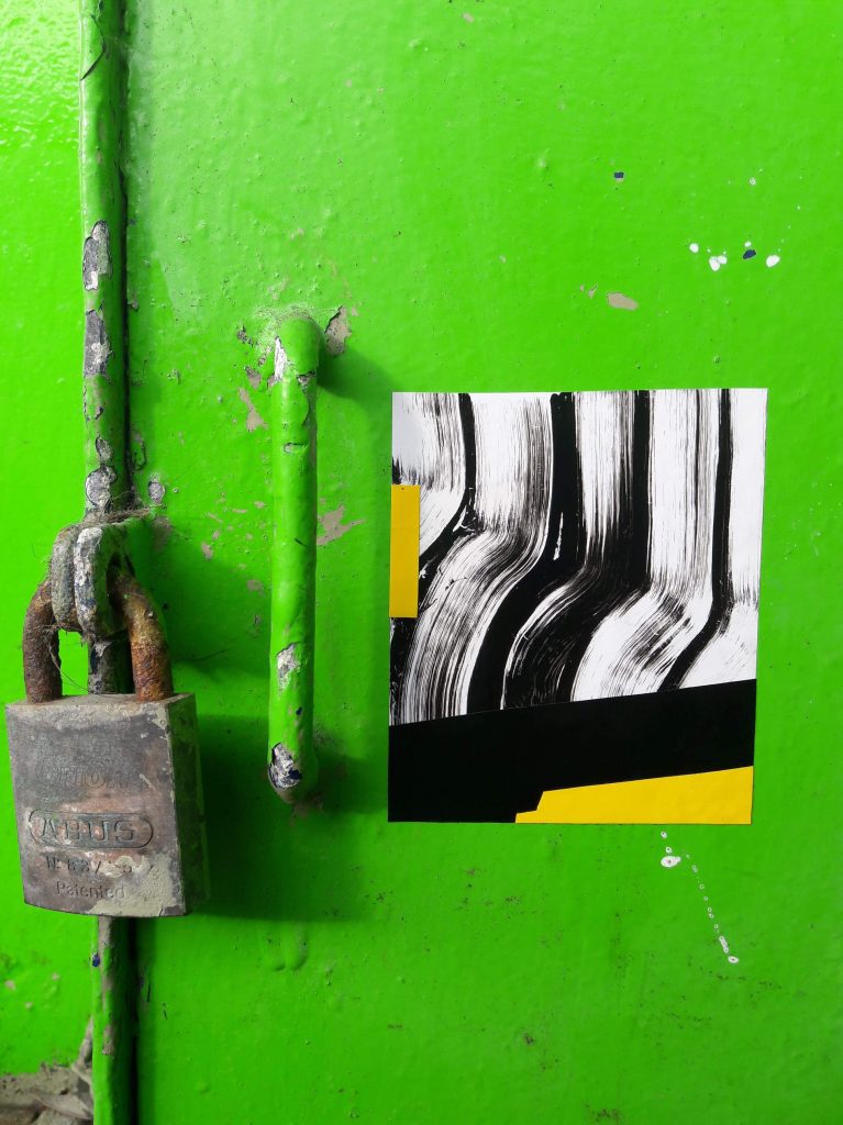
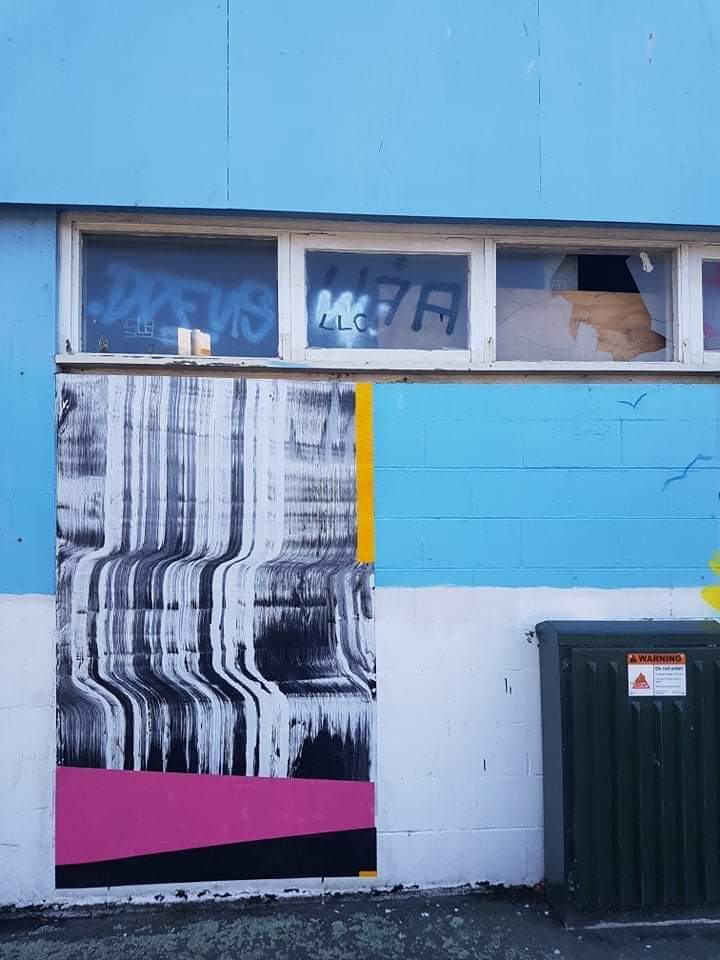
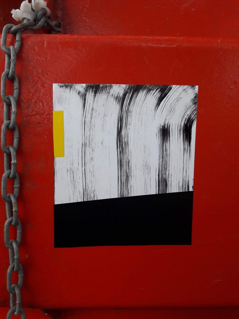
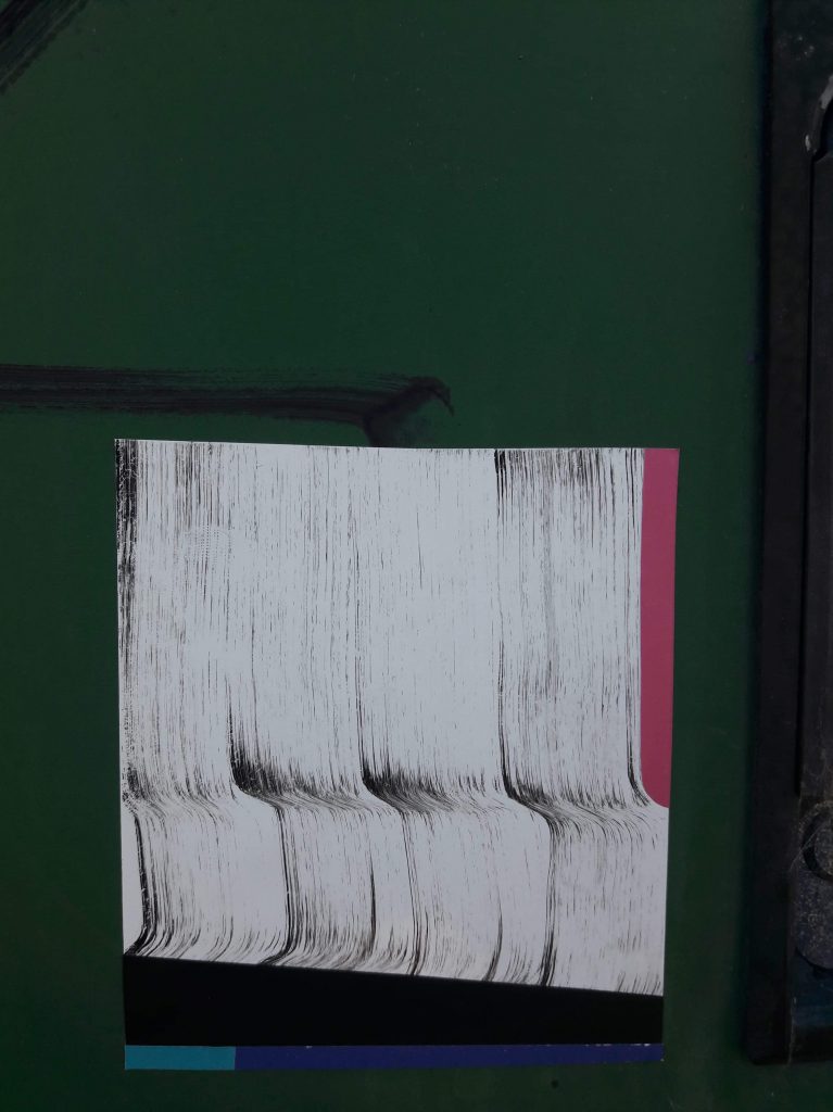
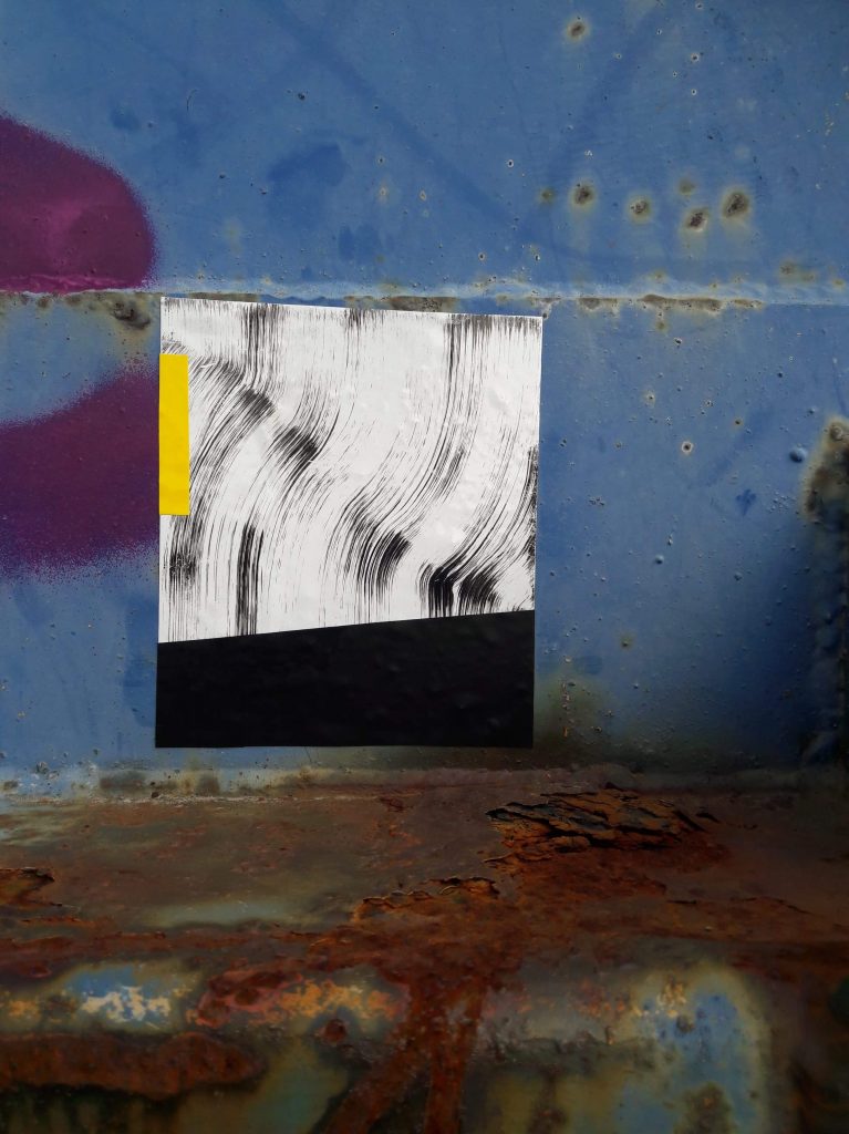
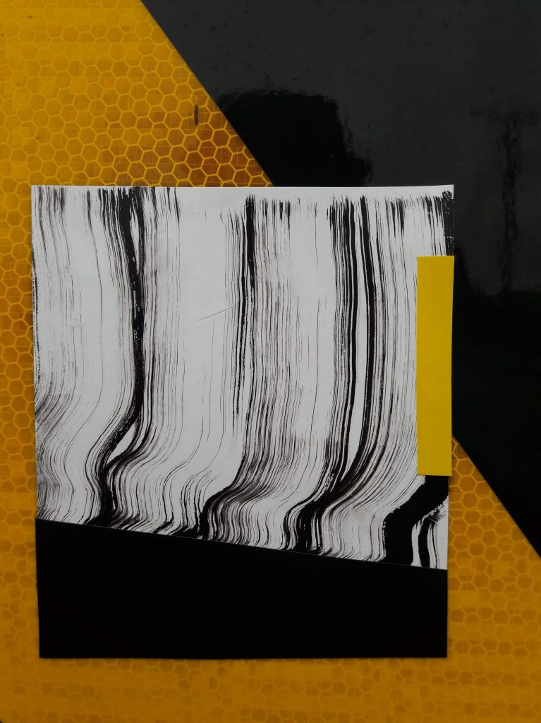
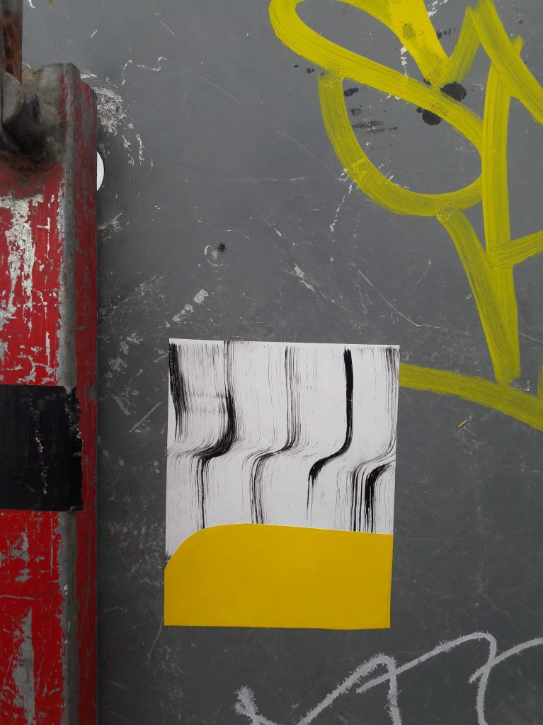
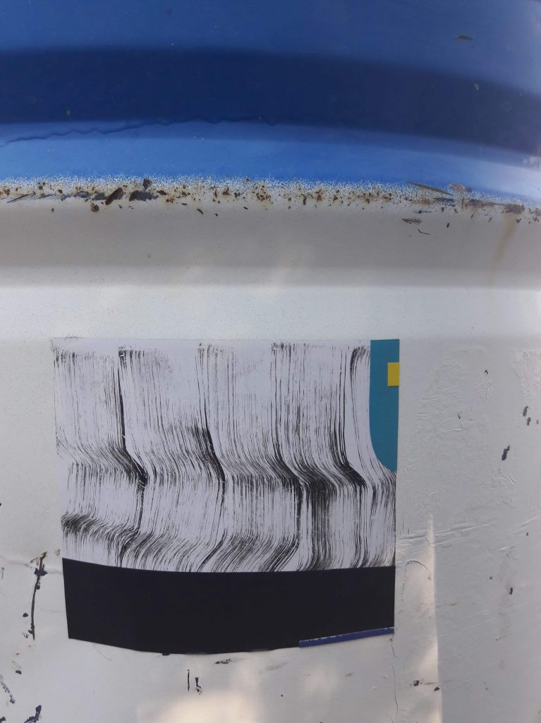
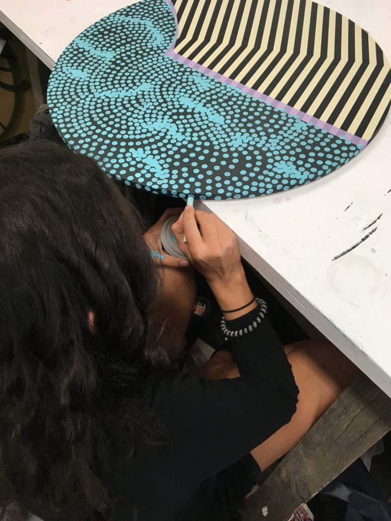
Dr Suits gets slap happy…
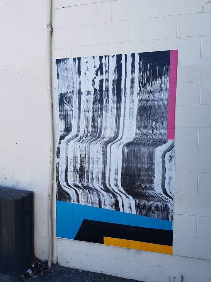
One of Dr Suits’ many collage slaps produced during the lockdown. (Photo credit Dr Suits)
The most ubiquitous presence of my suburban bubble has been the subtly diverse array of stickers and paste ups created during the lockdown by Dr Suits. Both tiny and oversized material variations on his abstract studio works on board and glass and his mural works, they are unmistakable, yet distinctive enough to make you stop and look closer. While they have a slick look from distance, their handmade qualities, pulled ink and vinyl cut-outs compiled together to form geometric and gestural collages, make them incredibly interesting to investigate.
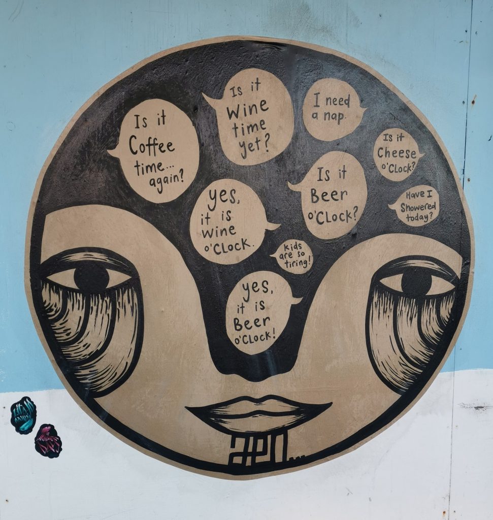
Jen_Heads asks what time it is…
Jen_Heads’ large Lockdown Jen Head paste up.
It wasn’t just Dr Suits representing Fiksate during the lockdown, Jen_Heads was also busy producing her iconic faces, including a large stay-at-home version featuring the questions we have all had swimming through our heads for the last five weeks… Surely it is beer o’clock, because I’m sure coffee time was like an hour ago, right?
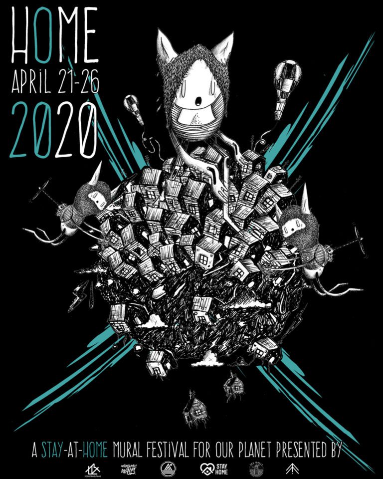
Home – A stay at home mural festival…
Cracked Ink’s poster for HOME: A Stay at Home Mural Festival, organised by Pangeaseed, Sea Walls, Alternative Arts Initiative, Whanganui Walls and Stay Home.
Speaking of staying at home (and how can we not at this time?), the good folks at PangeaSeed and the Sea Walls events, along with Alternative Arts Initiative and Whanganui Walls, created a unique response to the pervasive conditions, staging a mural festival where participants painted their own homes and shared across digital platforms. Alongside the ecological concerns at the heart of Pangea Seed’s spirit, this was also a consideration of how to unify artists and utilise art in this strange time. It proved popular, with hundreds of artists spread across the globe painting murals in their backyards and studio spaces. The programme also included conversations with artists and panel discussions, one of which I was happy to be part of, connecting with artists from far afield…
Artists share the love…
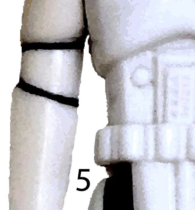
A section of Mark Catleys Stormtrooper paste-up print out he made available during the lockdown period
Lots of artists have been using their digital platforms to share their work, and some have even made their work, or specifically made things to be, available for people to use, a gesture of community. From Tom Kerr‘s lino cut sticker tutorial (see our post here), to Daken’s colouring in templates, and Mark Catley’s download-able Stormtrooper paste-up, artists have been sharing their talents and encouraging people to get cre-active (yes, I just coined a new term).
Kids take to the streets…
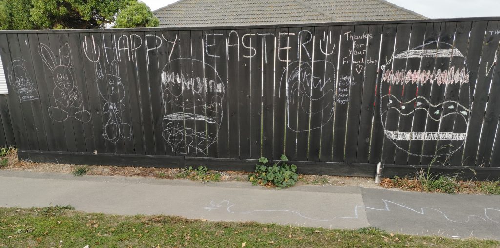
A suburban fence is adorned with an Easter message in chalk.
I have always believed in the human inclination towards public expressions and the lockdown, much like other periods of distress or great change, has seen people taking to the streets to leave their mark, express themselves of communicate with others. And I’m not just talking about the graffiti and urban art that I am normally fixated on. Footpaths have been commandeered by chalk wielding children, writing and drawing and subverting their function. Likewise, fences have been adorned with messages and symbols, symptomatic of the recognition of the potential of public space as a shared environment.
March 2020 will be a month that won’t be forgotten in a hurry. There were a number of things happening, from art-related shows and projects, to the anniversary of the Christchurch Terror Attacks (and the perpetrator’s guilty plea), all with the hovering threat of the Covid-19 pandemic spreading around the globe. Then, in the final few days of the month, the country, along with much of the world, was sent into lock down. Social distancing became the catch-cry, and with it, social events and occasions were postponed, cancelled or digitised (Houseparty anyone? No, maybe Zoom?) With such an overbearing event casting a long shadow, in the coming years it may prove hard to remember anything else from this month, but we thought it was best to reflect on the things that still excited us and share that goodness, from projects that brought communities together, to small moments caught unexpectedly, this was March 2020…
Halves on an Exhibition – Harry King and Reece Brooker
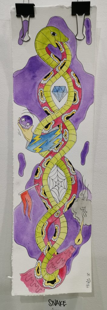
Snake by A Tribe Called Haz / Harry King from the exhibition Halves in an Exhibition? at Outsiders
March started with a sense of normality (despite what was happening around the world), when Friday nights meant you could go out and socialise. On March 6th, we headed down to Outsiders, the St Asaph Street skate store that for one night became host to Halves on an Exhibition?, a show by A Tribe Called Haz (Harry King) and Reece Brooker. King’s acidic and surreal style has developed over the last year, and his pop-up shows have an endearing anarchic and anti-traditional energy to match his work. Some of this newer body of work depicted seemingly post-apocalyptic landscapes that combined low-brow with decadence, devoid of presence and looking like the vacant scene of some horrific act, while others illustrated the clear influence of tattoo and skate culture with simple imagery. King’s art is proudly chaotic and laced with humour, but also shows an increasingly refined technical approach, his handling of line and watercolour notable in its confidence. Brooker was a new name for us. An arborist, his work added a different sense of materiality; painting circular panels cut from trees to frame his motley, at times fantastical characters.
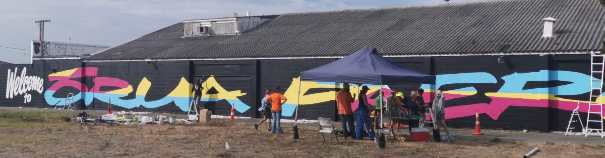
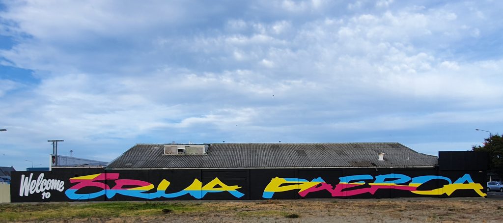
Welcome to Ōrua Paeroa
The Welcome to Orua Paeroa mural produced by the Fiksate Crew, the first event of the New Brighton Outdoor Arts Festival (Photo credit: Gavin Fantastic)
The day after Halves on an Exhibition, the Fiksate (Dr Suits, Jen_Heads, Porta and Bols) crew joined forces with the organisers of the New Brighton Outdoor Art Festival and members of the local community to produce a massive mural welcoming people to New Brighton. The graphic mural, with a bright segmented colour palette against a black background, drew on the Maori name for the area; Ōrua Paeroa (the name covering both the New Brighton and Travis Wetlands areas and referring to the place where the Easterly winds and the ocean meet), recognising the history of the suburb beyond its European call-back. The mural acted as a paint-by-numbers affair, the huge letters gridded out and people invited to paint sections. The result is an impressively bold addition to the neighbourhood. Unfortunately, while it was supposed to signal the upcoming NBOAF, the Covid-19 pandemic has seen the rest of the programme postponed indefinitely.
Urban Nipple
An Urban Nipple sticker outside Te Puna o Waiwhetu – The Christchurch Art Gallery
One of my favourite things about urban art and particularly smaller urban additions, such as stickers, is the ability to make you double take and look closer. Those small interventions that make you think you recognise something, asking yourself, surely that isn’t… is it? In doing so we are surprised and made more aware of our environment, often left with an urge to investigate, or at least a nagging wonder about what we just saw and who might have been behind it. I had that experience in early March, casually strolling past Te Puna o Waiwhetu – The Christchurch Art Gallery on Montreal Street. As I passed the Bunker and Jess Johnson and Simon Ward’s video arcade game inspired piece, a small circular sticker caught my eye. I did the double take as I passed, then stopped, back tracking. I was right, it was a nipple, an urban nipple on the lamppost. The sticker is one of a number of interventions under the Urban Nipple project (Instagram: @UrbanNIPPLE), intended to encourage the return of the banned nipple into our shared lives through humorous interactions, getting people to think about sexism and discrimination.
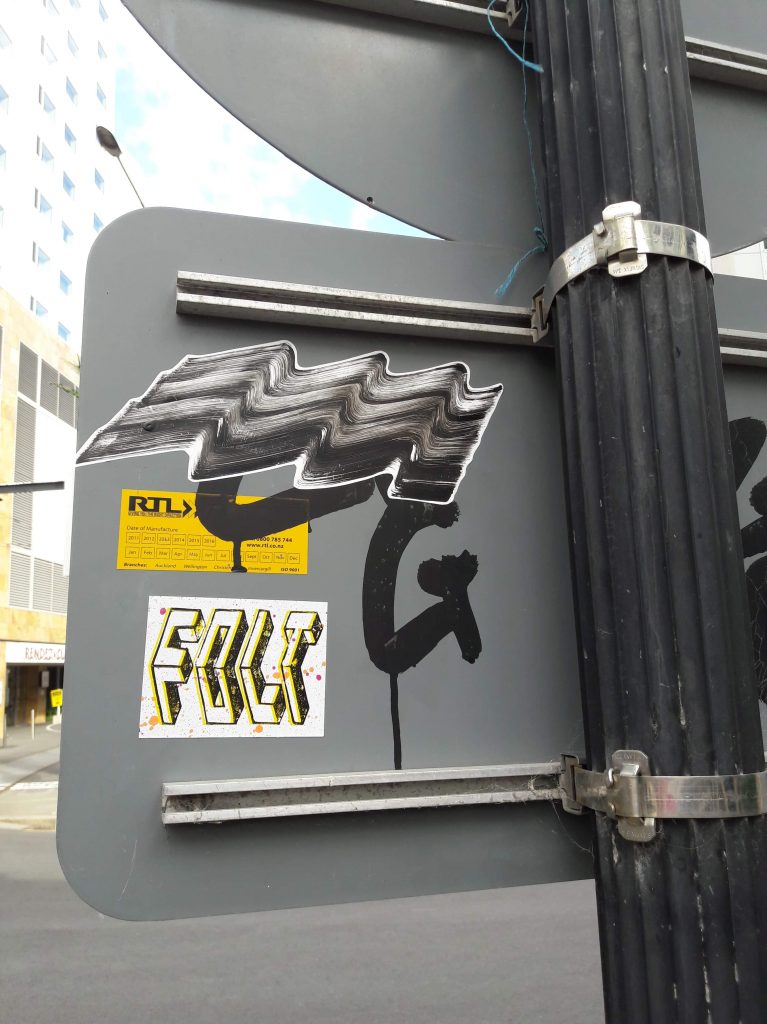
FOLT Skull Collabs
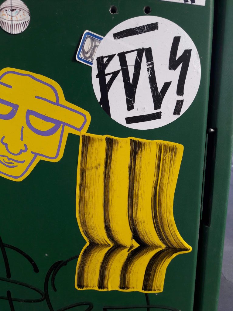
One of the FOLT x Bols collab skull cut-outs
I first started noticing FOLT stickers a few months ago, from the handwritten tags and deconstructed skateboards to the block printed, angular graphic versions, and they have been a personal favourite since. Recently, that sticker profile has expanded to sculptural installations, with an array of wooden skull cut outs appearing around the city. In March, the skulls were fixed to various sites, inviting people to hunt out the various incarnations. The skulls include both exclusive FOLT productions and several collaborations, including with local artists Bols and Jen_Heads. Hopefully we can see more in the future, because if the attention of the lady while I was photographing one was anything to go by, they are intriguing additions to our cityscape…
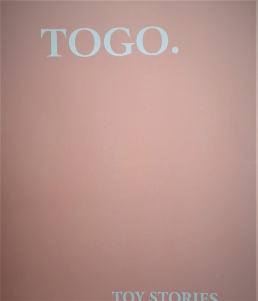
TOGO – Toy Stories
The cover of TOGOs Toy Stories publication
On a personal level, my month was made by the arrival of TOGO’s Toy Stories publication on door step. I was lucky enough to get a copy of the limited run, and I am glad I didn’t miss out. It is a beautiful thing, the understated cover concealing the funny anecdotes and intimate photographs inside. It is full of humour and importantly exhortations and revelations, celebrating graffiti’s compulsive rebellion. A combination of specific stories of memorable nights and close-shaves, mantra-like prose detailing the realities of graffiti life and photographs of urban space from the creases (a sense of the embrace of the perihperies permeates the grainy images), Toy Stories jumped the pile of books I have been meaning to read and has already been digested…
These were some of our favourite things from March 2020, what made your list? Let us know in the comments…
February flew by, right? I mean, it literally seemed like I blinked and it was over. But if there is anyone who can fit a lot into what seems like a little, it is Fiksate’s Jen Heads. The artist, MC, gallerist, and mother is always juggling a range of projects. So it was natural for her to compile And That Was… for February, after all, she has hosted international artists, been the creative force behind a cool festival presence, and taken in some sights and sounds. In no particular order, here are the things that made Jen’s February…
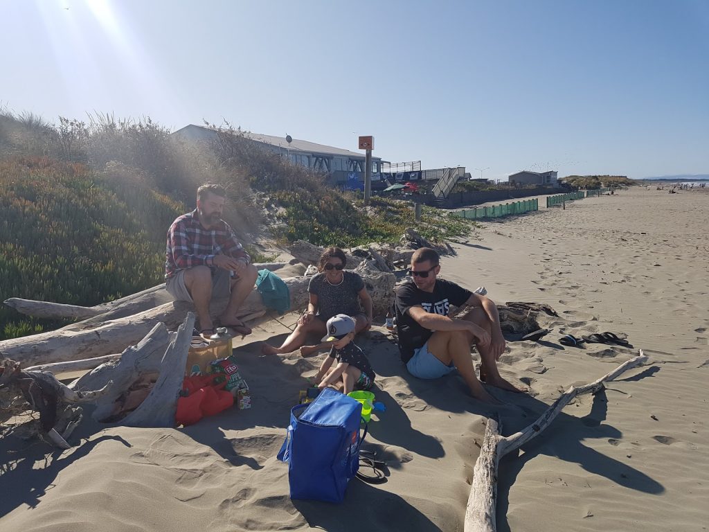
The honor of hosting international artists Robert Seikon and Anastasia Papaleonida at Fiksate was a highlight of January and February. Alongside watching them produce such high-caliber art, hanging out and getting to know them was awesome. We introduced them to faces and places around Christchurch, including our local beach, to which Robert responded: “super beach, very nice, very nice” (His accent was pretty epic!). They were the best people. <3
Seikon and Anastasia (R) enjoy the beach with Jen (behind the camera), Dr Suits and their son Frank.
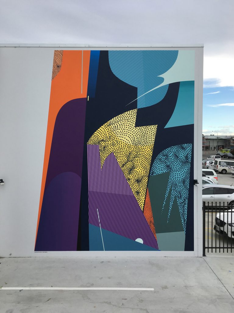
As part of their residency, I was able to facilitate a large-scale mural for Robert and Anastasia on private property for a pretty well-known local company. You can see the mural from the street if you are down Lismore Street (just respect their private property). It’s an amazing mural and using such bright colours pushed them out of their comfort zone. I feel Christchurch really lacks abstract murals, so this is an important addition to our city’s collection. I loved watching their process from start to finish. They work together so well, they are incredibly precise and fast. Inspiring.
Anastasia and Seikon in front of their massive mural with some of the Cosmic crew and Jen.
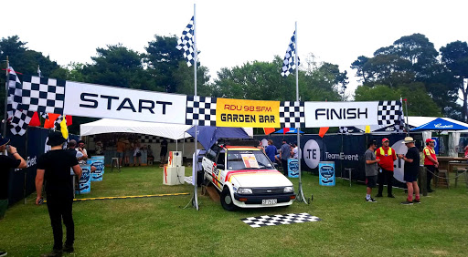
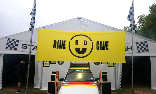
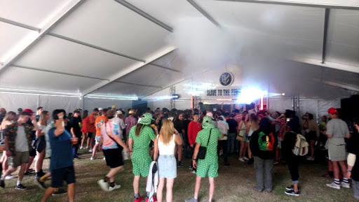
RDU 98.5fm had stages in three festivals this summer – Beer Fest, Nostalgia and Electric Ave. I was asked to realise the design concept for their crew and stages, based around the star of the show, Ziggy Starlet – a 1987 Starlet with a full sound system and DJ booth installation, it had a retro race vibe. In a pretty massive task I produced signage, banners and props for them. I am pretty stoked on the results!
The RDU installations at various festivals over the summer.
On a smaller scale, I found an aged Jen Head in New Brighton. It was like looking into the future…
A faded and deteriorating Jen Head in New Brighton.
As an MC, getting to meet and watch an idol of mine, Stamina MC, was a huge highlight! He performed live at the Sun & Bass BBQ gig at FLUX, Christchurch’s newest bar and venue, along with DJs Asides, Tbone and Patlife.
FLUX logo via Flux Facebook (@FLUX)
For the month of January Fiksate became a second home for itinerant artists Robert Seikon and Anastasia Papaleonida, the gallery’s first international residents. While Seikon is Polish, the couple are based in Greece, Papaleonida’s home country. That international flavor is further enhanced by their travels, with their arrival in Aotearoa following a stay in the Philippines and an exhibition in Taiwan. During their residency, I was able to spend time with the endearing duo. It was fascinating watching the two, who have been working together for almost twelve months, operate in the studio, each maintaining their distinct stylistic identity, while investigating the potential of collaboration. The artists alternate between a hyper-focus on their individual contributions and conferences around subtle details of composition and colour. But it is not just the studio where their collaborations flourish, with their work appearing on walls in numerous locations, including a number of works produced during their stay in Christchurch. While Seikon’s background in graffiti provides a lineage for this public practice, Papaleonida is relatively new to this approach, coming from a design foundation, bringing a unique consideration to their creative process. Their pairing has resulted in visually stunning works, where sharp, angular aspects contrast with organic elements, creating optical effects that invite the viewer to immerse themselves in the image, only to discover small, unsettling details that disrupt expectation, rewarding inspection. We caught up with Robert and Anastasia as their exhibition Long Trip of the Kokos drew near, taking in the sights and delights of Lyttelton, sitting down for a discussion about their experiences in Christchurch and New Zealand, their collaborative partnership and the differences working indoors and outside…
Welcome to Aotearoa! How long have you been in the country now?
RS: We have been here for one month already. It’s very nice.
AP: Amazing.
What are your perceptions of New Zealand so far?
AP: Everything is very organized and super clean! You are in the middle of nowhere and there’s a bathroom with a paper, it’s like, what the fuck?! And in general, the people are super nice.
RS: It’s not only the toilets that are clean! The grass is cut everywhere, fresh walls are repainted, everything is clean. You get the feeling you are at the end of the world, that you are very far away. But everyone is super friendly, you feel comfortable as soon as you get out of the airport.
As artists, do the distinct atmospheres of different cities and countries start to influence your work?
RS: It makes a difference for sure. Here for example, during our trip from the North Island to the South Island, the landscape was changing almost every hour. The landscapes in New Zealand combine parts of European landscapes all together, which is very interesting for us. All the colors and shapes we have seen during this trip have made a big impact on us.
Both of you work in abstraction. What specific influences have fed into the recurring motifs in your work? Have they come from real world references?
AP: For me, it’s about landscapes, plants, organic things…
RS: For me it is both the natural landscape and the urban environment. But in this case, for this exhibition, I think mostly the landscape, because we have worked with the memories that we have collected over the last few weeks of being in New Zealand. Sometimes I like to be inspired by the city, but here it hasn’t been the case. If we work with a wall in the city, the surrounding area is going to inspire the wall, but for this exhibition the influence is mostly the natural landscape.
One of the stunning landscapes that inspired the artists on the New Zealand trip…
There is an interesting interplay between your individual approaches; Anastasia, your more organic forms that seem to reference the cellular and biological, while Robert, your lines and geometric forms seem more hard-edged. While those aspects are quite distinct, the colors seem much more of a collaborative component…
RS: We enjoy talking about color.
AP: Yes, on this trip we have worked a lot more with color. In the past we didn’t have the opportunity to do that much, we were working a lot with black and white.
RS: In general, we like to use black and white.
AP: But, after this trip, travelling in the Philippines and here, the colors we have seen have been amazing and we have started to mix more colours. With all the work we have prepared for this exhibition, we have mixed I don’t know how many colors…
RS: We haven’t used straight black like we have before. Everything is mixed with something…
AP: The vision that we have for the exhibition is to create an atmosphere that is unique, which comes through not using straight black like we have in the past.
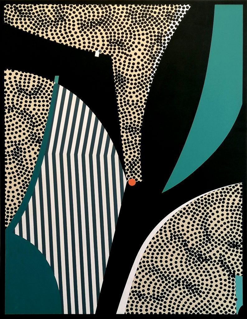
The wall painting inside Fiksate, part of the Long Trip of the Kokos exhibition, 2020.
This body of work has been created as part of your residency at Fiksate. You have noted the influence of your travels, but did you already have an idea of the work you were going to make when you arrived in Christchurch, or has the experience of the residency, the place and people, inspired the works as well?
AP: It has been interesting to work with other people around. For me, often when I’m working on something new, it takes time before I realize that something is happening for a particular reason. I can’t always see it at the time, but when I look back I can see that it came from somewhere…
I’ve noticed that your shared work station is very organized, from paint cups numbered in a spectrum of tints, to the way tools are laid out, is that something that has developed as part of your working relationship, or was it always evident individually?
RS: I think that is something we’ve both had from the past. Me, I always like to be precise and clean. We don’t even talk about it. We’ve got the same thinking in common…
Papaleonida at work on one of the pieces from Long Trip of the Kokos.
Seikon working on one of the works for Long Trip of the Kokos.
Is that sense of order intrinsically necessary to make the work look the way it does, or is it just a comforting aspect? I’m sure you are both very particular about the clean lines, the perfect dots, the sharp shapes and the smooth gradients, so that organisation must be important in achieving those effects, right? In the studio you can control those elements a little bit more, but do you have the same level of preparedness and organization when you’re painting outdoors?
RS: Oh yes, I like to prepare my bag the day before, so I am ready to have breakfast and go. Then, the morning before painting, I check everything is in my bag; the roller, the sketchbook…
AP: You need this, you need this… Outdoors, it’s like a small studio because you are spending hours in that place and you need your stuff in specific places, so it is free for the wall and for your movements…
There is a physicality to the way each of you work, a physical activity that goes into creating the details, from precise movements to more sweeping gestures. I’ve noticed that when you are working in the studio, while there are times when you’re both working on the same piece, often one of you is active and the other is either observing or off to the side, is that simply to give each other the physical space for these movements?
AP: To be honest I haven’t thought about that before, but maybe, now that you’re saying it, it does work like that, because when someone wants to do something more precise, you need to give him the space to do it…
RS: It’s a good observation. When we work, for example when Anastasia is working and I’ve got a small break, I’m also thinking about the things that I will do next, I’m waiting for Anastasia to move so I can get another answer, you know? It’s like, this little bit here is developing, so what is going to happen next?
AP: It’s not like we are doing sketches and they are the final product. When we create something, we will always add something new, because that touch goes like that, or this line goes like this, and we look at the balance and realize that maybe something new needs to be done. I think this is very interesting because we don’t really know what the final image will be.
RS: We don’t really know what will happen.
AP: And you build that slowly with small moves, it becomes a surprise…
Anastasia, it feels like your dots would have a more spontaneous nature, while Robert, your diagonal lines would be more carefully planned and constructed. But, is that actually the case, or are you both more balanced in your approach?
RS: The biggest similarity we have is that when we are working, we are super focused. You go inside an element and nothing can disturb you. Both of us are very focused on the process of our work. I don’t know, even if the lines or the dots are repeated forms, they can be created from elements all around us, even though they are clean, they can be natural as well.
Your studio output will become the exhibition, Long Trip of the Kokos, but you will also paint several outdoor commissions as well, each in very different settings. Is it important to get out of the studio?
RS: We like to change the environment around us. After spending weeks preparing the exhibition, we have had enough of the studio. We couldn’t start next week again in the studio. I like to have a change when I’m painting, it’s refreshing.
AP: What we will do on these walls will be a continuation of the inspiration that we have drawn from already. Although, with the Cosmic wall [a commission at the warehouse of iconic funk store Cosmic], we will work with a lot of colours, which is something we haven’t done much together. That will be very interesting for us…
The finished Cosmic mural, February 2020.
Do you ever reflect on being in the position where you can travel to places and leave something of a legacy through painting public works? Do they create a connection to place that average tourists don’t necessarily get?
AP: To be honest, I’m not thinking about that so much, that I will leave this wall as a legacy. It’s more about the process, the time that I’m spending doing it, the time that I’m painting, the people that are around, the interactions with people, the small talk, a question or a smile…
RS: And the moment you finish the artwork, that’s it. You are doing it until that final moment. I’m always crazy happy when I’m painting, when I’m doing something, then the moment I’m satisfied it’s finished, it is for other people from that point. I have made my thing, this is it. I’m very happy if someone gets positive vibes or can see something interesting, but I don’t need feedback. It’s all about the process, like Anastasia said, the process is going to stay in our memories.
The studio environment is secure, but also isolating, it is different from a public presence where those small conversations can more easily take place…
AP: It is very nice to have a connection with people, but also the work carries on, it is seen by people that you don’t meet, even if they don’t say anything, or they say or think something bad…
RS: But here we have been very surprised about how people have reacted to our art. We were traveling here without any expectations, we said: ‘let’s go to New Zealand and see what happens…’ But both of us are very surprised by how people have reacted…
In all of your travel, are there moments of engaging with people while working on a painting or mural that stand out?
RS: I mean, it doesn’t need to be anything special, it can just be small things, you know, you wake up and you see people and they’re happy in the morning…
AP: In Estonia, there was this old lady, every day she was coming and checking, without any expression. I mean every day, seven days we were there, and every day she checked with no expression. Then when we were finished, she finally said: ‘Yes, it’s nice.’
I wanted to ask about the title of the show Long Trip of the Kokos, what does it refer to?
RS: The story behind the title, comes from when we were in the Philippines. We saw a lot of kokos [coconuts] and they were traveling, somehow, they would go to the water, they were moved by the ocean, they would jump to the other islands. We thought maybe we are a little bit like these kokos, travelling and stopping here to make this small mark. This exhibition is the mark of these small travelers coming here to grow a little bit.
One of the works from long Trip of the Kokos, 2020.
This is an audience that you haven’t really had much experience with, but based on what you’ve experienced so far at Fiksate, and the people who have come through, have you been able to get a gauge of what you might expect?
AP: You know, we don’t really know what is going to happen…
RS: We are not expecting anything, but we don’t really make work in that way.
AP: All the thinking was to make these works because of the inspiration this experience has given us. It isn’t about what we will sell, it’s more about what we would love to present.
RS: We like working in this very expressive way. We have thoughts. We start to talk about it. We have a conversation, and then we say: ‘OK, let’s do it, why not? Let’s see what will happen…’ We didn’t expect anything, but we have already very positive feedback.
AP: Yes, although I am still not sure about how the audience will respond to our point of view on abstract.
Right, abstraction has become more and more prevalent within both urban contemporary and mural practice, but New Zealand can lag behind in some trends. Fiksate recently staged their Urban Abstract show and that was perhaps quite new for a lot of the audience, who might have been more accustomed to letter forms, figurative stencils and illustrations, and representational murals…
AP: I was thinking about that, because in most of the cities we have visited, the murals are pretty figurative, abstraction doesn’t seem to be as popular.
RS: But the abstract things here are on a good level. Sculptures or installations, they seem to be in good taste, which we were happy to see.
Robert, you have investigated translating your work into sculptural forms, right?
RS: Yes but not a crazy big amount, I am just beginning to touch on this direction. I started some years ago. It is not super easy to do, but I want to keep going because it gives me different positive vibes…
It seems like more and more artists are translating their work in different ways, into objects, installations, using light, projections, etc. It seems that more doors are open for artists from the urban realm, due to the popularity and visibility of muralism. Anastasia, how do you think your work would translate into a three-dimensional, or kinetic form?
AP: I have worked with smaller forms of sculpture, but I am probably more interested in installations. I have a lot of ideas, and I’m going to keep going with other projects.
Seikon and Papaleonida at work on the Cosmic mural, February 2020. (Photo credit: Jenna Ingram)
How do you operate in terms of having your own distinct paths as artists while still collaborating? Are you constantly working on your own things and then coming together for certain projects, or has it become more and more about the collaboration?
RS: We like to work in both ways, it depends of the project. Especially for this exhibition, it’s all about collaborative work. It’s nice for us to have the chance to involve our personal distinct paths and create something together.
AP: This is an interesting way to work because we have the opportunity for a dialogue.
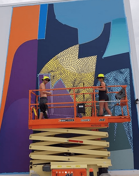
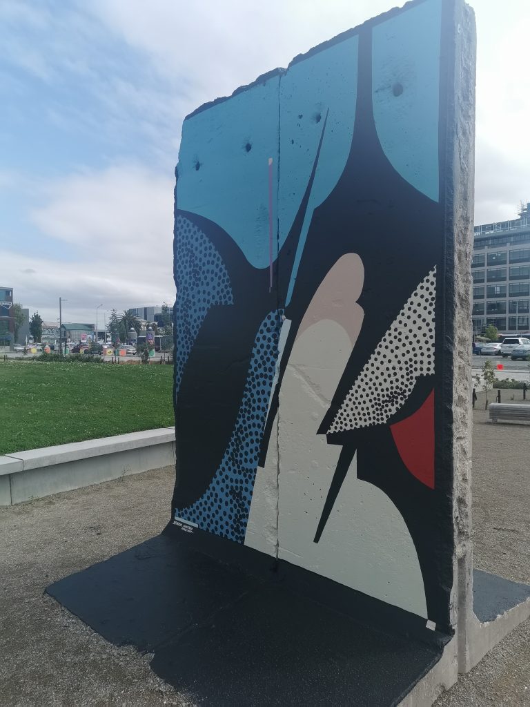
A collaboration between Seikon and Papaleonida on the Berlin Wall remnant in Christchurch, February 2020.
It has only been just under a year that you’ve been working together…
AP: Almost a year.
That’s a relatively short time, so there is obviously a lot more to explore within your creative partnership. But long-term working partnerships can sometimes see the distinctions between each artist deteriorate, and a unified aesthetic develop, is that something you are consciously trying to avoid, or do you see it happening?
RS: That is a very open question, because already this year, new things have developed that can support our personal projects and we obviously have days when we want to create something by ourselves. The process is going here and the process is going there and we can mix those possibilities together. It’s super open for us.
What do you have planned for the rest of the year? When do you leave New Zealand?
RS: We leave on the 10th of February. We will go back home to Greece, and then we have something in Germany and a project in France, another project in Slovakia and that’s it for the moment. Maybe a small holiday after that…
It seems like travel is just an engrained part of the urban art movement…
RS: It’s not for everybody though. I’ve got artist friends who do not travel at all, they stay in the studio and that’s it.
AP: And for some artists it is not that important, I mean they feel better in their studio. It depends on the artist.
RS: For me, travel is the research about new places. From when I started painting, my city started to be like, OK, I’ve seen all the streets, all the nice places, I’ve painted here, I’ve painted there, but I need to search for more possibilities. I need to see different things that could inspire me, collect new knowledge and have that energy, this is important in my creative process.
How do you make your work resonate with different places? With abstraction, you aren’t using explicit cultural references, which can be a minefield anyway. Is your visual language such a personal reflection that it doesn’t necessarily need to display that connection to place in any overt way?
RS: I started to realize this a short time ago to be honest, I was traveling for many years and just reached a point where I’ve got things that I start to talk about and understand more. Now, I keep collecting those ideas as I travel, and they come out in my work.
AP: I think it’s important to observe what’s going on in any country because I don’t want to offend anyone. For example, in the Philippines, black is very bad. It’s the color of death. The associations of black mean you don’t use it. We tried to find it in the paint stores, but you couldn’t. When we went there, we didn’t realize how important it was to not use black, but we adapted over the month we were there and we started to realize more things that were important for people there, especially since we were painting a lot on small houses in the middle of the forest.
One of the murals painted during Seikon and Papaleonidas stay in the Philippines, 2019.Another Philippines production, 2019.
The chance to do research isn’t as easy for some artists, who might not have the luxury of a site visit or to acclimatize, especially if you are moving from job to job and have to hit the ground running in any new place you find yourself…
RS: The perfect situation is where you come to the place and you’ve got some time to prepare, not just going to a place with the sketch, painting it and leaving…
AP: Although it might not be possible, because if you do a big mural, you often need to give something to the people to see…
RS: Yes, but for us, we like to say, this is the sketch but by the end it is going to be a bit different…
Do you want to say thank you to anyone from your time in New Zealand?
AP & RS: Thank you to Fiksate Gallery for the trust and to all crazy positive people that we met during our stay in New Zealand…
The first month of 2020 has raced by, but not without a heap of activity. The month started with an ominous red sun hovering above us with an almost artificial energy, and ended with some lovely summer weather. In between, there were BBQs, drinks, returns to the real world, and a flurry of activity within the world of urban art. From some overseas visitors, to established powerhouses and rising profiles, there was plenty to reflect on…
Long Trip of the Kokos
On the final day of January, the culmination of Robert Seikon and Anastasia Papaleonida’s residency at Fiksate was unveiled with the exhibition Long Trip of the Kokos. The collaborative works capture both a cohesive harmony, with subtle gradients and tiny details, while also proudly displaying each artists’ signature style: Papaleonida’s microbiological dots, squirming and humming, and Seikon’s crisp diagonal lines and spiky geometric shapes, providing optical illusions and paths of surveillance. From the clustered canvasses to the wall painting directly encountered when you enter the gallery, the show is filled with intriguing touches and impressive effects, washing over you without overwhelming. Long Trip of the Kokos is open until February 29th, 2020
Hip Hop Evolution – Season 4
I have a soft spot for Canadian rapper Shad, see his Pharcyde-inspired video for Rose Garden, and his likeable, intelligent, yet reverential nature has made him a perfect host for the Netflix series Hip Hop Evolution. As a fan of the culture’s history, he is never an overbearing presence, allowing the subjects to tell their stories. Hip Hop Evolution’s fourth season dropped in January and it quickly continued to dive into the various scenes and threads, including the rise of Bounce in New Orleans, and the emergence of super producers, which led me to nostalgically revisit N.E.R.D’s Lapdancefrom 2001…
Aaron P.K. in the Boxed Quarter
I was able to work with the BOXed Quarter and Aaron P.K. to install two large scale photographs, finally completed in late January. P.K. might be known for other street interventions, but his photography has always been eye-catching, capturing a slice of life in various settings, including those peripheral spaces that make the viewer aware of their isolation. The two images at the Boxed Quarter are distillations of urban exploration and graffiti culture, rooftop shots where the distant city glows, but the surrounding industrial fixtures remind of the precarious yet claustrophobic position of the photographer.
Seikon on Manchester Street
Alongside the exhibition with Anastasia Papaleonida, Polish artist Robert Seikon also produced a subtle, obscured wall painting, one that rewards more inquisitive viewers. Tucked away on Manchester Street, the square image uses Seikon’s signature barbed shapes to create an abstract composition that seemingly draws on the history of graffiti’s transformation of letter forms. The subtlety of the colours also seems perfectly harmonious against the blocks of buffed grey surrounding the painting.
Yikes and Dcypher pay tribute to Terence McKenna
With a spruce up of the Tuam Street carpark that has become an open-air gallery, Yikes and Dcypher added a tribute to American ethnobotanist Terence McKenna, whose advocacy for naturally occurring psychedelics is evident in the mushrooms and molecular structures that populate the image. The image combines many of Yikes’ signatures, while Dcypher’s mastery of the spray can is also evident in the portrait, a reminder that these two are right at the top of their game…