Street Treats, Vol. 5

This edition of Street Treats is eclectic and varied, ranging from playful whimsy to blunt anti-establishment messaging. That ultimately is the beauty of guerrilla practice (or in the case of some of these works, permissioned but free from curatorial censorship), the opportunity to say what you want, how you want. As contemporary muralism has taken over the popular image of ‘street art’, it has also transformed the imagery and ideology deployed. While this still results in some pretty stunning works occupying our skylines and there are, admittedly, different levels of input and freedom, it is left to the smaller interventions to speak in an unfiltered voice. The content is not always explicitly political, but the act itself is, always. So whether it is a beautiful surreal flower sprouting from a concrete pillar,  a constantly recurring pencil, playfully collaged scenarios, vibrant names or scrawled messages that question the colonial history of our city, look and listen, they are speaking to you and about us…

If you have submissions for upcoming Street Treats volumes tag us on Instagram or email your pictures to hello@watchthisspace.org.nz!

TMD: An Aotearoa Graffiti Story at The Dowse

“The rise of TMD as a creative collective has its origins in Auckland’s mid to late 90’s graffiti scene. The post-recessionary environment after the 1987 stock market crash was the perfect incubator for a thriving and vibrant Hip-Hop scene with a uniquely pacific slant. From the decrepit rail infrastructure to the abandoned buildings and vacant lots – the city provided an abundance of grey area where these young people could forge lifelong bonds, while cementing their sense of identity. With humble beginnings from this crew emerged its fair share of unsung and underground heroes as well as many of Aotearoa’s first global stars in the graffiti and large scale street art arena.” – ASKEW ONE (from The Dowse website)

There is no larger shadow in Aotearoa graffiti and street art history than Auckland’s TMD crew. While not the oldest graffiti crew in New Zealand, founded in 1997 by Phat1 and Adict, TMD has undeniably made an indelible mark on graffiti and street art culture both here and overseas. The collective has grown both in number (with over 35 past and present members, including international representatives from Australia and Germany, such as Vans the Omega, Sofles and WOW123) and scope, with its members ranging from recreational graffiti writers to professional artists, occupying streets, studios, galleries and beyond. Both collectively and individually the members of TMD have gained prominence here and overseas, from Phat1 and Diva’s (Charles and Janine Williams) Bird Gang mural work, telling stories of place through the symbolism of native birds, to Misery‘s instantly recognisable kitschy doe-eyed characters and Berst‘s dynamic letterforms and documentation of graffiti culture, where his online videos have an audience of tens of thousands.

The Mini Dairy inside the TMD: An Aotearoa Graffiti Story exhibition at The Dowse in Lower Hutt.

In recent years, urban art has gained more widespread attention, publicly through the rise of contemporary muralism and its ability to infiltrate our daily experiences, but also institutionally, with the likes of Rise at the Canterbury Museum (2013) and Paradox at the Tauranga Art Gallery (2016). The staging of TMD: An Aotearoa Graffiti Story at Lower Hutt’s The Dowse Art Gallery (who themselves have a history of urban art-related exhibitions dating back to the turn of the Milliennium), running from late March until June, is a welcome development. Rather than attempting to present a more generic survey or a one person show, the exhibition considers the broader cultural movement of graffiti within the tighter focus of the TMD crew while still spanning styles and historical narratives; contextualising both the roots of the TMD crew within the setting of mid-90s and early 2000s Auckland, and their current exploits, successfully packaging the complexities and trajectories of contemporary urban art and artists who have sprung forth from these rebellious beginnings, no longer held to any defined expectations.

One of the painted trains installed in the exhibition, the pair of carriages painted with ROCK and RETS pieces…

The exhibition, curated by Dowse director Karl Chitham with Christchurch-raised TMD member Pest5/Johnny 4Higher, is split between two distinct zones, an immersive installation space, featuring formative and contextual commentaries, and a more traditional white-walled gallery presentation that highlights the current work of crew members, spanning painting, sculpture, photography and more. This format allows the viewer to consider the significant journey undertaken by the crew, from an idea to unite disparate graffiti writers into a collective of diverse creatives, placing them within the wider narrative of New Zealand art while acknowledging the significance of graffiti culture to generations of young New Zealand creatives.

On entering the exhibition, visitors are greeted by a writers bench and a set of painted train carriages, with an echo of recorded discussions just audible. Smaller tags on the bench play off against the larger and more bombastic train pieces. The track setting highlights the centrality of train painting in graffiti culture not just locally, but internationally, although with a specific Aotearoa profile. Behind the bench is another slice of Kiwiana, an iconic corner dairy, a bastion of New Zealand childhoods across generations. The fabricated dairy, named the ‘The Mini Dairy’ (TMD), utilises all the nostalgic riffs, from the Tip Top-inspired signage to dollar mixtures (the lollies replaced with aerosol nozzles), neon star price points and an arcade video game machine (supposedly out of order). A cynical eye might point out that the dairy is primarily the exhibition shop, providing the opportunity to peddle merchandise, but it also has several conceptual references as an installation in its own right. Dairies served as a location youngsters not only congregated around, but also as a community hub that would often provide the opportunity for legal or commissioned murals on their walls prior to larger commercial projects becoming a reality. Furthermore, the dairy exemplifies how the creation of commercial goods has been embraced by urban artists, from clothing to vinyl toys, a trajectory that might make the more elitist fine art world shudder (think of the blowback against Kaws by art commentators), but is a reality for many to make an artistic career possible and their art accessible to an audience perhaps less likely to frequent an art gallery.

Across an imaginary road is a grungy flat, based on a former residence where crew members congregated. The sparse room provides historical references in analogue form with tags and drawings on the walls (including a roll call in the classic New Zealand Straights lettering style) and scattered photo albums, event posters and blackbooks, but also digitally – with videos from TMD member Berst’s Real Time web series playing on the boxy 90s TV, and an old PC for surfing websites such as ArtCrimes, an influential forum for the graffiti world and an inspiration to many TMD members. The worn surroundings, devoid of luxury, highlight the drive to make things from nothing and the dominant influence of graffiti on the lives of these young creatives and the evolution of the relationship between graffiti and the internet.

A roll call in iconic New Zealand straights, name-checking TMD crew members, inside the re-created flat space.

Tucked around the corner, a rotating selection of photographs (photographers and crew members Rimoni and OneDeap have been key documentarians of this history) adds a personal face, members depicted painting, posing, and playing, projected oversized on the gallery walls, imbuing candid moments with significance. Either side, collaborative wall paintings highlight the traditional graffiti approaches and styles of crew members, referencing the common form of crew productions, as well as providing a bridge towards the gallery space and the work artists have developed over ensuing years. These immersive spaces are informative (notably the stories are not given to you in wall text, they become part of the environmental detail – wafting audio, static encoded video, interactive elements and references in the most traditional urban forms – tags and wall writing, a fit for graffiti’s own historical recording which has for a long time been largely folkloric), providing important context for viewers before they cross the threshold into the white cube space.

A collaborative crew production and projected images by crew photographers inside the The Dowse exhibition.

The ‘Post-Graffiti’ gallery space features works that span the spectrum of practice. Book-ended by impressive works at either end; Benjamin Work‘s tapa cloth-inspired banner unfurled from wall to floor, drawing on the iconography of his Tongan heritage and Lady Diva’s subtle flag-like geometric abstractions  on wooden panels, suggesting references to carving and weaving that perhaps raise ideas of colonialism and imperialism, the spaces in between are filled with varied works. Askew‘s glimmering digital-influenced painterly abstractions that draw on the spectre of shifting human presence in our urban environments contrast with Deus’ (Elliot Francis Stewart) intricately illustrated coffee table, drawing the viewer closer to inspect the stunning graphic details on a mundane domestic object. Gary Silipa‘s unsettling and powerful installation filled with painted tyres, yellow chain links, tarpaulin and painted iconography sits near the still reverence of Berst’s pillar-like sculptural letter forms, light emanating from inside to give a celestial glow to an apparently devotional monument to graffiti. Other works highlight a raft of concerns, from social issues, cultural and national identity and self-reflection, to moments of everyday life, process-driven focus, riffs on the traditions and evolutions of graffiti writing and the urban environment and striking abstract ruminations. The diverse spectrum of themes, as well as styles, materials and approaches, suggests the personal creative journey of each contributor, and yet, there is an undefinable connection as well, the shared experiences and the original creative impetus of graffiti hang in the air, unifying the collection without requiring explicit threads.   

Paintings by Askew One in the Post-Graffiti section of the exhibition.
Gary Silipas installation in the Post-Graffiti section of the exhibition.
Lady Divas works in the Post-Graffiti section of the exhibition.

While the format may mean some viewers relate with specific elements more than others, the narrative of TMD: An Aotearoa Graffiti Story could not be told in one presentation style alone. As it was probably to be expected, the exhibition drew some criticism for the presence of tagging, but to pick such a quarrel is to miss the bigger picture. Graffiti writing brought these young people together and is part of their creative pathway. The presence of graffiti is a central and necessary part of the story, informing the narrative both socially and formally. TMD: An Aotearoa Graffiti Story revels in the celebration of collectivism and its empowering potential for individual members. As a representation of urban art’s roots and future pathways,  TMD: An Aotearoa Graffiti Story is surprisingly focussed. Rather than a pervasive survey of graffiti and street art in New Zealand, TMD: An Aotearoa Graffiti Story, nodding to those that came before and winking to the future, is grounded in the environments and relationships of the artists of TMD, a camaraderie that emanates throughout the history of this crew and the show itself.

TMD: An Aotearoa Graffiti Story at The Dowse Art Gallery runs until June 2021.

Street Treats, Vol. 4

High and low, under and above, inside and outside, protected and exposed. The city presents innumerable contrasts, all of which can provide opportunities for intrepid artists. From graffiti writers marking spaces no one else sees as useful or functional, to street artists creating moments of engagement in unexpected places, a city is always full of sites to explore and alter. From rooftops to wooden hoardings, lampposts to stop signs, revealing, playful and existential interventions can be found across and beyond our lines of sight. This diversity of locations is matched by the diversity of practice, with no material form invalid or off-limits; Chero One’s rocket ships, painted scrolls, or even hot sauce-filled buttons warning you not to do what you so urgently want to do. Always mimicking the visual culture that we come to expect, such interventions play on our tendency toward assumption. Popular culture rifs depend on your recognition of trends and eras, like digital memes, requiring some savvy understanding. Anti-advertising grasps the ubiquity and absurdity of commercial communications. Graffiti is an expected response to our dictum that success means having your photo on a billboard or the back of a bus. Ultimately, the streets are full of life, both official and unofficial, you just have to look closer and further, higher and lower, under and above, and start to sort out the relationships…

Dr Suits and the Art of Isolation…

When Aotearoa entered the level 4 lock down as we faced the threat of Covid-19, many of us took to a daily walk within our bubbles, nominally for exercise, but if we are honest, as an escape from the confines of our homes, to remind ourselves that the world around us was still there.

Luckily for me, my suburban surroundings provided plenty of points of interest, and chief among them were the constantly expanding series of stickers and paste ups produced by the prolific Dr Suits.

Dr Suits’ output over the last few years has shifted to a process-centric fixation with abstraction. As he has investigated materials and techniques, he has also grappled with the transference between street and studio. While he has produced a range of outdoor works (including commissioned murals and even a basketball court), the lock down period saw perhaps the most cohesive body of street work he has created. From small vinyl stickers to large-scale paste ups, sweeping textural waves and various geometric forms of flat colour were juxtaposed to create items of intrigue. To learn more about this flurry of creativity, we caught up with Dr Suits to talk about the inspiration and motivation for these (sub)urban additions and how extraordinary times have inspired his work…

The notable thing about this body of work was just how quickly it seemed to come to fruition and appear on the streets, was it something you had already considered, or were you specifically inspired by the lock down?

It was spontaneous really. I think a lot of my work happens like that, when I find a delicious tasting fruit, I feast on it, until there’s no fruit left.

When we entered lock down, we just raided the studio for a bunch of materials and resources with no clear plan of what we were going to do with them. We just wanted to make sure we had stuff to work with at home. The stickers were great because they were small, and I could just mess around in the lounge.

The stickers led to the much larger paste ups, a form that you have a bit of experience with…

They were something that just came out of the stickers. It was a similar process, I just wanted to do the stickers bigger. I had the materials, the paint, the paper, the glue. The beauty of paste ups is that you can work on them at home, and then it only takes ten minutes to install them, which was great for lock down. It reminded me of the post-quake period, when I first started doing paste ups, but I adapted them to my present artistic approach.

A lot of your previous paste ups were illustrative. These works are a clear reflection of your more process-driven abstract direction of the last few years…

I thought of a few ideas to do some illustrative paste ups with more on-topic commentaries, but I couldn’t find the motivation because I was too distracted with the process of making these stickers and just doing what seemed natural…

Do you connect these works in any outward sense to the Covid-19 pandemic?

I could probably think of something more specific if I wanted to, but they are a direct response to that situation because if I didn’t have that situation they wouldn’t have been created, so in some ways they are a direct response.

The paste ups and the stickers both use a collage technique, but they can be experienced very differently because of their materials and size. Were you interested in how people would respond to the different works?

It’s more driven by the process of creation. I know people are going to respond to them in their own way and that’s what I like about abstract art. People always see something that you don’t see or think something that you don’t think. Even though they use the same process, I wasn’t really thinking about it. Obviously, the paste ups don’t demand as much inspection because they’re so big that you can see them from afar, you may or may not notice that it’s collaged. I was just really enjoying the process of cutting the shapes and overlapping them and exploring different compositions. That is really similar to the way I previously would do it, but I would use Adobe Illustrator or something like that to play around with shapes and I would just pick the ones that I liked. But with the stickers, each one was a development, and I would just keep each one, it wasn’t just picking the ones that I liked and then using those as a composition to make into an artwork…

When you’re putting the paste ups on the wall, are they constructed with the final image in mind? I’m assuming they are applied on the wall in sequence…

Yeah that’s right. With the stickers, I’d start with the background, with the brushy effect using the wide-tip Molotow marker, and then I would just cut shapes out of colorful vinyl, some which I’d spray painted first, and I’d play with compositions. Then I used those stickers to inform the larger paste ups.

Were you thinking about spots for paste ups in a different way to the stickers? I assume there was less planning around the stickers, whereas the paste ups would require some forethought…

There’s an abundance of spots out in New Brighton, so it’s not hard to find a spot. And during lock down it was so quiet, no one was around, I mean I could have painted them if I wanted to. At the time, I was more interested in the collage approach and finding those small imperfections where they are slightly offset and seeing the depth between the layers, the paper sticking on top of another layer which is on top of another layer and building up. The paper ripples and it creates little shadows and as it gets wet it shrinks and it might warp a bit, the stripe might move off to the side a little…

In terms of placement, what makes a perfect wall? It feels as if your works like to have room to breathe, but also it seems that geometry is an important consideration…

Definitely, I really like a wall to have similar or reflective elements that are going to make it relatable to the work. I like to have contrast, but I also like it to have some sort of unity. That balance is what I like in my work more generally anyway. You want it to stand out, but you want it to fit in, so I try to find texture or line or some shape or something in the composition of the space that’s going to contribute to the overall composition on the wall, like a box or a down-pipe, a color or a paint change or a set of windows.

Do you feel this has taken your studio work in a new direction?

Definitely. The stickers started developing with more curves and softer lines and the collage approach to the process is something I’ll take forward.

Your work seems to evolve in quite a fluid progression, with certain elements recurring and coming into focus, does it feel that way to you as you are working?

think with abstraction, it can be very sparse in terms of the elements you’re working with, so the changes are noticeable really quickly when you do change an approach or technique or some process behind how you make an image. I can really latch on to something just by changing that one thing and that change becomes a solid basis and everything else around that can change but you are still kind of keeping a consistency within the work.

There’s an anchor…

I like to have an anchor, especially with colour or shape or composition or texture. The anchor’s a link, you could look at it two ways; it’s a safety thing, I don’t want to jump too far away from what I’ve been doing, possibly because of fear, but also it keeps it recognizable from previous work so you can see a progression, that connection between where you are going and where you’ve been.

Has this series made you think about the street/studio balance?

I’d like to do more of the paste ups. I’ve got lots of ideas for those, but I can see them influencing my paintings as well. I want to take that same process, just do a little collage sticker and then maybe do a paste up or a painting directly from that, maybe try to do both, and just push that image out in more than one way…


Follow Dr Suits on Instagram and find more of his work at Fiksate Gallery.

Photo Essay – ‘Street Stencils’ by BOLS

At the risk of losing the graffiti purists in the room, while the rebellious and dynamic aesthetics of graffiti were an awakening of how art could be more than what I had experienced as a child, it was stencil art that was a better fit for my personal mode of expression. There are numerous reasons; from the punk aesthetic of early styles, to the specific yet expansive potential of the process. It still embraced the physical nature of aerosol (hard and soft lines, over sprays), but there were also the intricacies of cutting, breaking down an image, and the plates that became stratified objects of interest themselves (from plastic sheets, to light card, or even cereal boxes, the chosen material reflects an important aesthetic decision). Importantly, there was also a conceptual aspect, beyond the stylistic and procedural; something harder to express but imbued within the apparent urgency of street stencils.

While I have spent many hours in small studio spaces cutting and spraying stencils, frustrated at the things that go wrong, exhilarated at the discoveries that unlock new directions, there is something about the presence of stencils in the streets, sprayed directly on rough concrete or worn surfaces. Street stencils are a contemporary incarnation of a primal mode of expression, utilising new cultural references and tools to navigate the current landscape, while exuding a sense of a longer, often political, always existential, lineage.

While it may be the accessible, iconographic visual language stencil artists have harnessed (such as the pop culture imagery almost universally favoured by stencil artists still finding their style) that attracts many, for me, it is this connection to history, the sense that a stencil still represents rebellion, revolution and anarchy. Furthermore, the mechanical nature of the process renders stencils democratic; anyone can cut a stencil and produce an image. Of course there are stencil ‘superstars’, but there are also countless anonymous stencils, reveling in that anonymity and the act of painting in the streets.

The following images have been taken from the last decade, from Ōtautahi, around Aotearoa and even abroad. Some are by well-known artists, others are completely anonymous. Some are fresh and sharp, others faded and obscured. Some are sprayed on surfaces that make the image harder to comprehend, others play off the graffiti covered walls. Some are figurative, some use phrases, some are explicitly political, others harder to decipher. But each is an example of someone acting out, becoming part of that lineage and grasping the inherent qualities of stencils…

A stencil of a fox in clothing spray painted on a plastic barrell.
PORTA, New Brighton, Christchurch, 2012
The name of Blek Le Rat, the famous French stencil artist sprayed on a wall
Blek Le Rat, Berlin, Germany, 2011
A stencilled image, pixellated like a retro video game, that appears to be a portrait with the word Like underneath
Like, Berlin, Germany, 2011
A stencil of a man with a noose around his neck, precariously balancing on a chair to stop his choking
Dotmasters, London, England, 2011
A stencil of a small giraffe on a concrete wall
Unknown artist, Christchurch, 2012
A famlous stencil by Banksy, an army sniper takes aim from above a shop, but behind him a child holds a paper bag, blown up and ready to surprise the sniper with a bang
Banksy, Bristol, England, 2011
The words Read Lenin stencilled on a graffitied wall
Read Lenin, Rome, Italy, 2011
 A stencilled image of a person holding something in their hands, looking closely at it.
Unknown artist, Barcelona, Spain, 2011
The words Stop Wars is stencilled in the style of the Star Wars logo
Stop Wars, Rome, Italy, 2011
A crowd of protestors are stencilled on a wall under the words Cultural Resistance
Unknown Artist, Rome, Italy, 2011
 A graffitied wall featuring stencils, one of which is a skull and cross bones, the other a portrait of a young boy
Unknown artist, Brussels, Belgium, 2011
The words Tromaville Health Club, a reference to the trashy 1980s Troma films, is stencilled on a wall
Tromaville Health Club, Brussels, Belgium, 2011
A stencil of a face with large glasses on a footpath in San Francisco
Kay, San Francisco, United States, 2011
A stylised skull stencil with the words Dead God above
Dead God, Christchurch, 2018
the name Franz is stnecilled in a diamond shape
Franz, Wellington, 2019
the instruction to Post No Bills is stencilled on a concrete pillar
Post No Bills, Wellington, 2019
a mid production stencil with the various stencil plates stuck around it
Bols, Christchurch, 2019

Follow Bols on Instagram

If you have an idea for a Photo Essay, let us know! Email submissions or concepts to hello@watchthisspace.org.nz or contact us on Facebook

Book Club

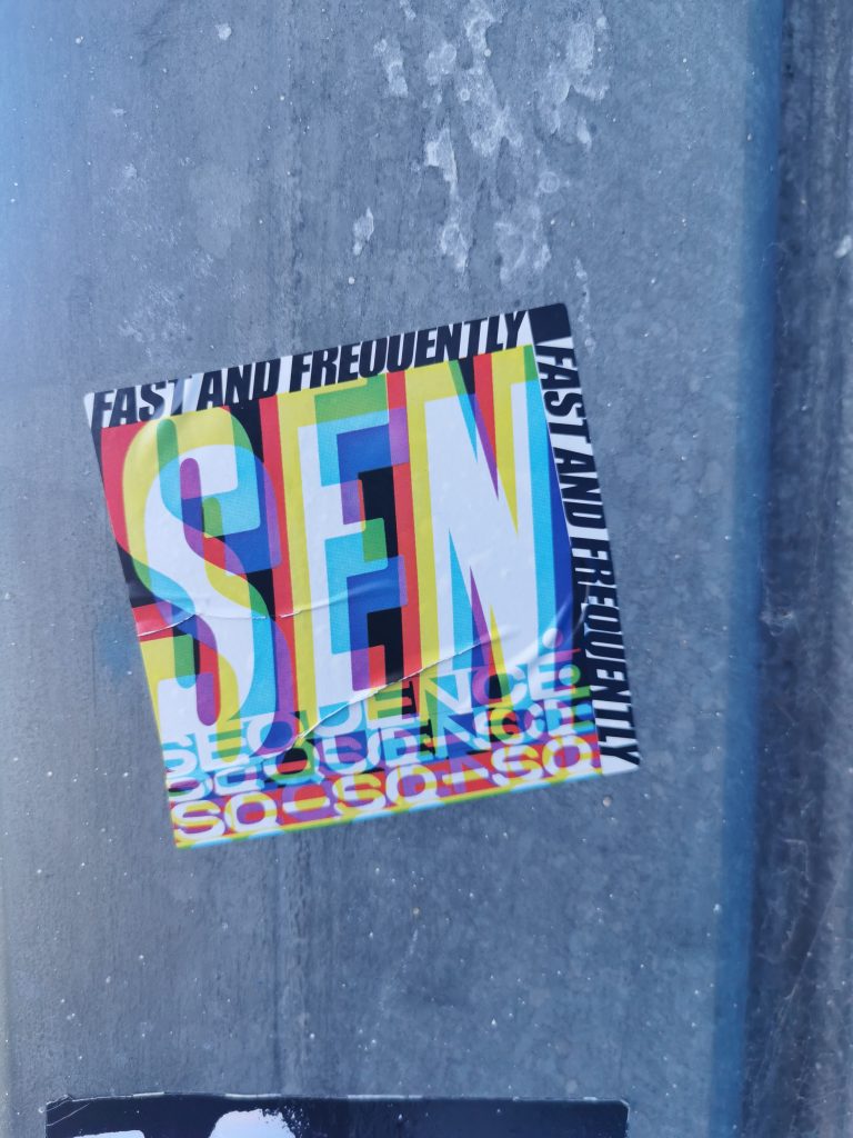
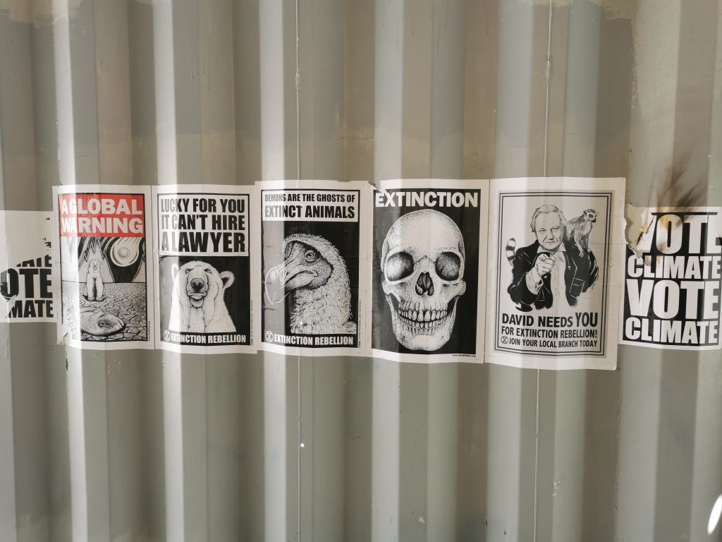
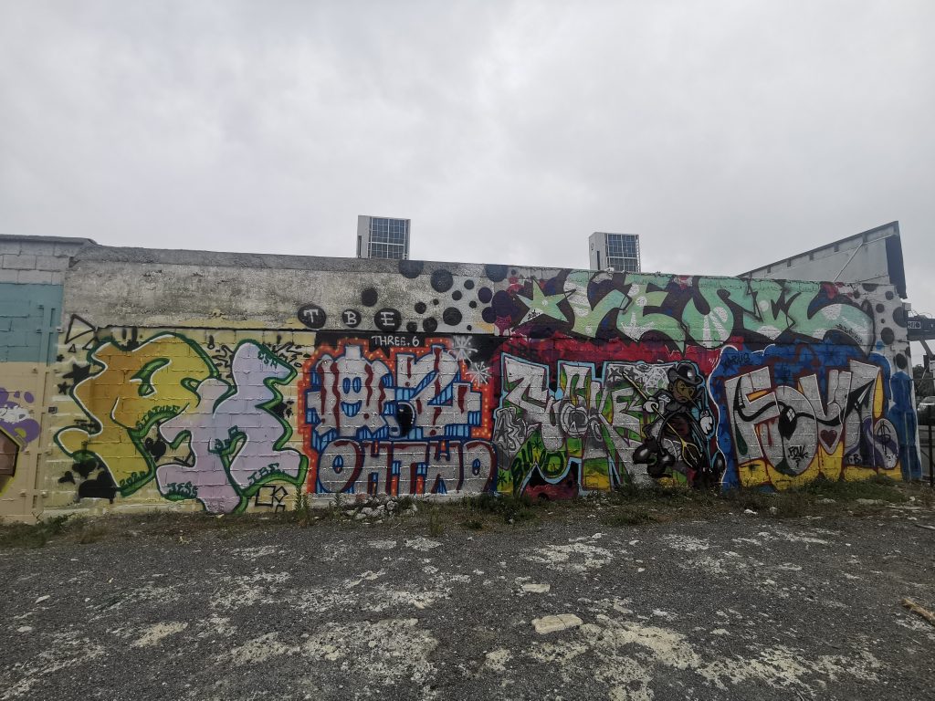
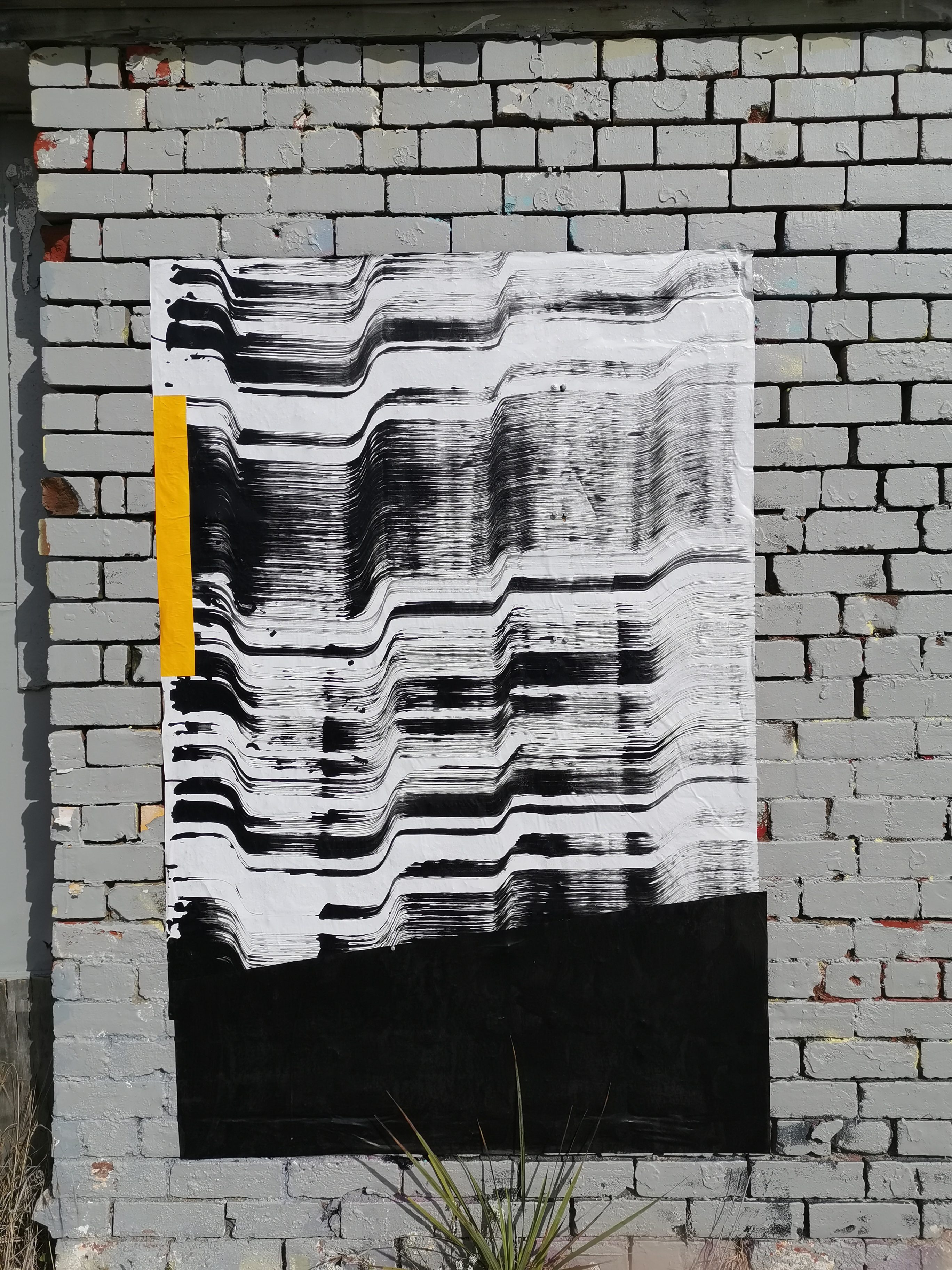
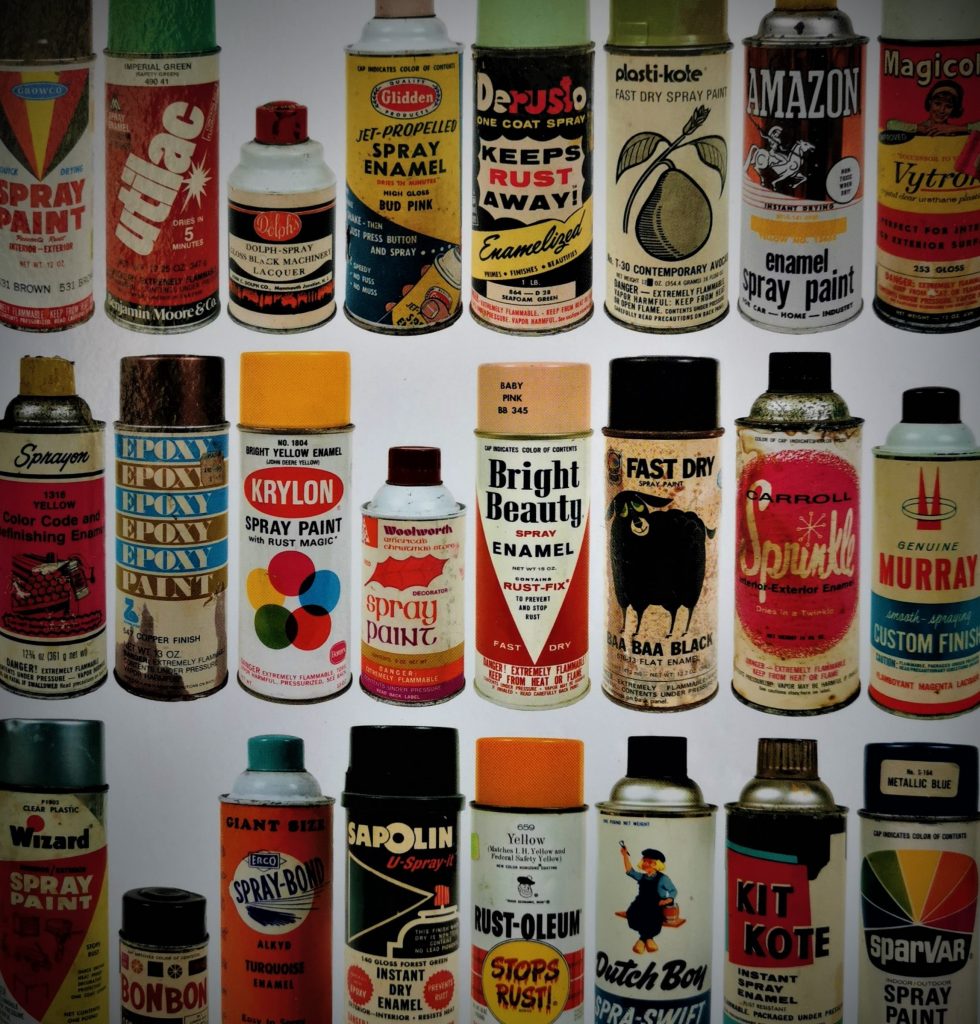
The Covid 19 enforced lock down period will have an undeniably massive impact on all facets of our lives, potentially permanently altering our routines. It is important maintain our mental health, and, for me, making and consuming art are vital aspects of my personal balance. I have been promising to catch up on the growing stacks of books at home for months and now I have this unforeseen time to finally make a dent. Urban art has a long relationship with the written word and documented image (graffiti itself is typographical, and slogan-based street art has a long lineage including The Gorilla Girls and John Fekner), from the early classics to the increasingly flashy publications of today. For an initially underground art movement, new publications (not to mention online content) emerge regularly, from big publishing houses or independent sources, echoing the complex (and at times contradictory) nature of contemporary urban art. Graffiti and street art books have spanned a range of approaches: seminal explorations of emerging creative cultures, academic studies, artist monographs, historical documents, surveys of themes and specific geographic locations, photographic collections and publications accompanying exhibitions and events.

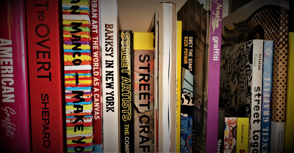
We figured this was a perfect time to discuss some of our favourite urban art books. This is not a ‘best of’ compilation, nor are these entries reviews as such. It is intended to show an array of books, each with something that grabbed us; from the conceptual content to the pure beauty of the physical object, or even historical importance, these are the pages we love. There are also plenty more not included here, books we plan to share with you in the coming weeks on our Instagram page (think of it like a book club), so please let us know which books you would include on your list…

Subway Art – Henry Chalfant and Martha Cooper (Thames & Hudson, 1984)

The cover of Subway Art, which features train painted with graffiti

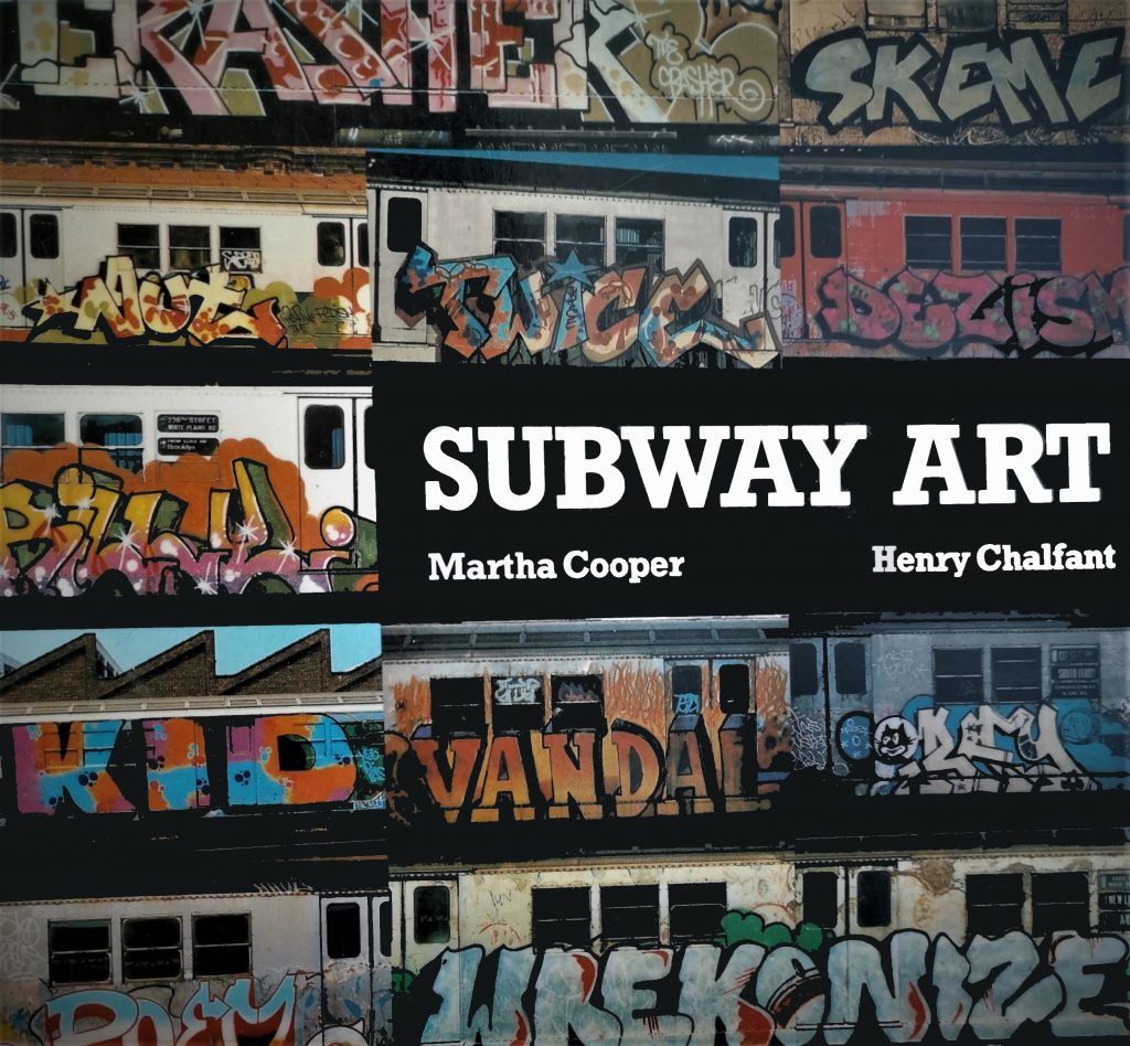
What else could start this list? Perhaps the most revered graffiti book of all time, Martha Cooper and Henry Chalfant’s 1984 documentation of the rising force of New York graffiti is responsible for inspiring waves of future writers. Tatty copies, sometimes photocopied, are regularly cited by graffiti artists as their introduction to the culture, used as a guidebook for early attempts. Part of the success of Subway Art comes from its accessibility, avoiding overwrought analysis and focussing on the visual images (Cooper and Chalfant are primarily photographers), but it was also perfectly timed, coinciding with the seminal documentary Style Wars (of which Chalfant was a co-producer with Tony Silver). To put it bluntly, if Subway Art isn’t in your collection, you aren’t doing it right…

Getting Up – Subway Graffiti in New York – Craig Castleman (MIT Press, 1982)

The cover of Getting Up a book, featuring the effect of spray paint

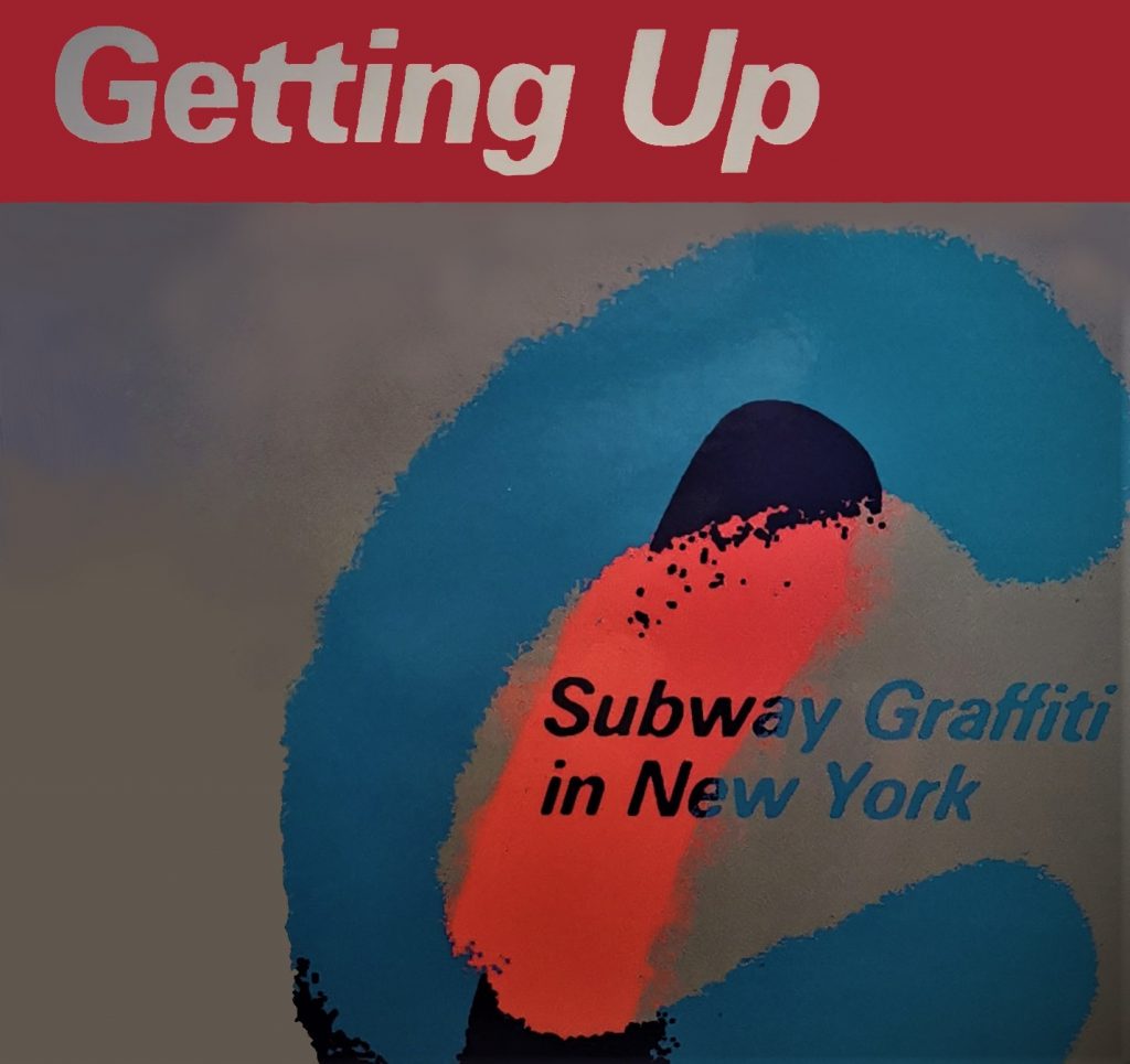
Craig Castleman’s 1982 tome on graffiti culture may not have quite reached the popular status of Subway Art, but it is, for some, equally as important. A sociological study of graffiti culture, Getting Up surveys the youthful graffiti subculture blossoming on New York City subway trains, documenting and explaining many of the concepts that remain central tenets of graffiti today. This might be more of a specialist read due to its academic nature (although it is concise and straightforward), but ultimately it is a reminder of graffiti’s extension beyond art or crime, and into something representative of an entire culture that has spread across the globe. Castleman’s candid interviews revealed the self-constructed community of graffiti and positioned it as a more complicated network than it was considered at the time.

The Faith of Graffiti – Norman Mailer and Jon Naar (Harper Collins, 1974)

The cover of The Faith of Graffiti, featuring a graffiti-ed train in New York

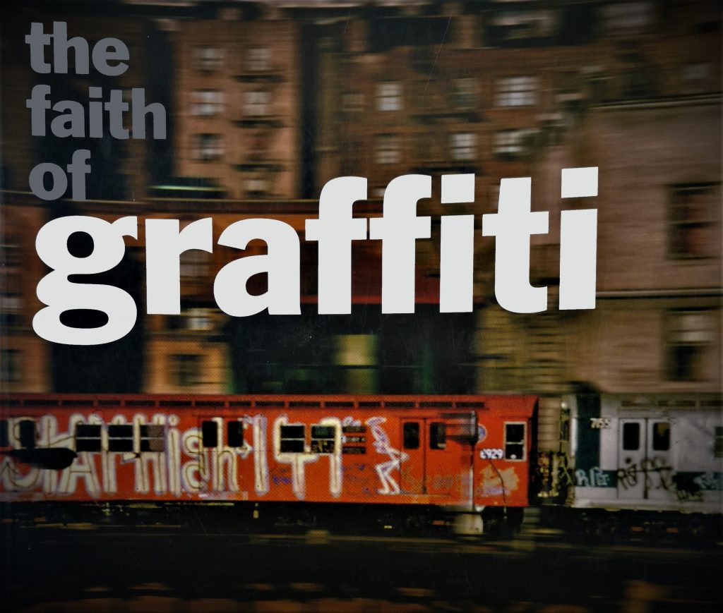
To keep the theme of important early writing going, The Faith of Graffiti is another example of how graffiti writing was capturing the public imagination in the early-to-mid 1970s. While many dismissed graffiti as a plague that was breaking down civil society, others were fascinated by its mysterious nature and practitioners. Norman Mailer, the well-known writer and social critic, brought his own flair to photographer Jon Naar’s images of the infant graffiti culture. Mailer takes on the role of aesthetic investigator (or A1 as his tag moniker in the style of his subject), and interviews members of the subculture before considering the city of New York’s political response to the youthful art movement and even making art historical comparisons. In a sense, Mailer’s stature gave graffiti a legitimacy it was never seeking. The words though are only part of the book, Naar’s photographs providing the necessary visual vibrancy that give Mailer’s writing life and context.

Wall Writers – Graffiti in its Innocence – Roger Gastman (Gingko Press, 2016)

The cover of the book Wall Writers, featuring a 1970s wall heavy with graffiti and posters

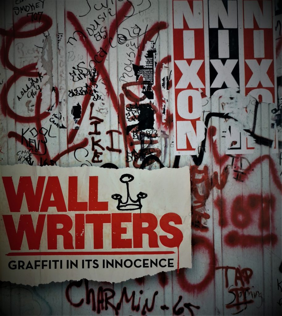
Roger Gastman’s Wall Writers accompanies a documentary of the same name about graffiti in its early days. It features an impressive number of interviews with key figures, including Cornbread, Taki 183, LSD OM, Snake I, Cay 161, Junior 161 and Cool Earl. It brings together the keys places, figures, groups and documentarians from the early phases of graffiti writing culture, including dalliances with the art world. Wall Writers unveils the social and historical climate that birthed graffiti as a subculture, including the birth of aerosol, the phenomenon of Kilroy Was Here, and advertising and social messaging. The fascinating social ephemera, along with the personal stories and photographs, make Wall Writers a beautiful production that comes close to what it was really like in those early days, perhaps just with cleaner pages.

The History of American Graffiti – Roger Gastman and Caleb Neelon (Harper Collins, 2011)

The alternate cover of The History of American Graffiti, featuring an array of vintage spray cans

Roger Gastman and Caleb Neelon’s thick survey of American graffiti essentially takes on an impossible task, the authors even admitting as much, recalling one interviewee declaring that: “Anyone who tries to tell you the history of graffiti is either a liar or a fool.” But while it can never be definitive, it is most certainly exhaustive, with stories and images from cities and regions from coast to coast, and including more specific offshoots of the culture (including freight train painting, graffiti inside galleries and the rise of street art). With images sourced from a huge number of contributors, it is a fascinating insight into how graffiti has mutated in different areas, and yet how consistent influences remain central. Its compartmentalised format also makes it more easily digestible, allowing readers to jump into different cities rather than following a traditional narrative.

The World Atlas of Street Art and Graffiti – Rafael Schacter (Yale University Press, 2013)

The cover of the book The World Atlas of Street Art and Graffiti, featuring a painting by Anthony Lister on a brick wall

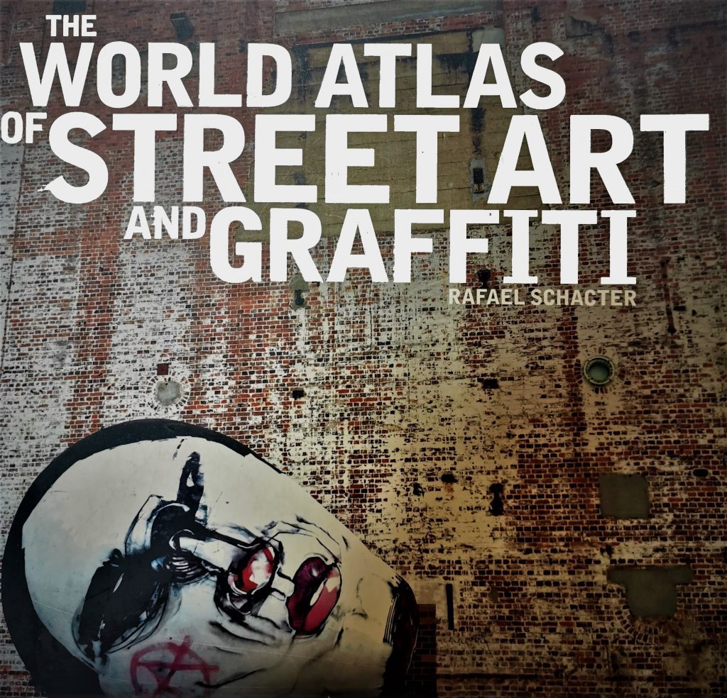
Rafael Schacter’s compendium of Independent Public Art (a term he adapts from Javier Abarca) is a globetrotting survey of the new school of public art practices that have emerged out of graffiti and post-graffiti. From ephemeral interventions to technological approaches, the litany of terms considered is intriguing: emotional advertising, symbolic figurative graffiti, conceptual vandalism, hacktivism, bibliographic bombing, and existentialist graffiti to name a few. A reminder of how far these interventionist practices have come, it is thoughtful and yet approachable. Unlike The History of American Graffiti, which attempts a similar, albeit more defined, geographic scope, Schacter’s Atlas does not seek to recount a history, but to take a snapshot of these artists and their diverse practices, and in doing so, reveal the growing maturity of contemporary urban art as a form of new public art. Schacter also includes a selection of maps made by artists to represent their hometowns, with favourites including Momo’s New York journey and Lush’s typical caustic cartography of Melbourne. For good measure it includes Askew and BMD in the ‘Rest of the World’ section.

Trespass – A History of Uncommissioned Urban Art – Ethel Seno, ed. (Taschen, 2010)

The cover of the book Trespass, featuring a yellow and black design and stencilled font

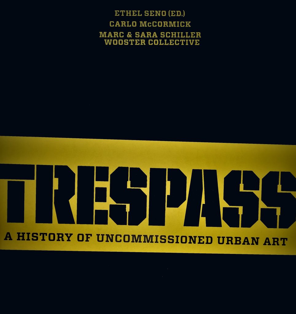
Edited by Ethel Seno and featuring contributions from Carlo McCormick and Marc and Sara Schiller from the Wooster Collective, Trespass is a more cerebral exploration of the rebellious aspects of urban art. Less pictorial (although still a good looking book), it is the essays that consider the various strands of un-permissioned art (even the distinction between terms such as illegal, uncommissioned and un-permissioned is an interesting discussion) within the urban landscape that take centre stage, from legal status, public space, and counter-consumerism, to urban folk art and environmental approaches. Trespass importantly reminds us of the importance of transgression in urban art, a fact that can sometimes be downplayed in blockbuster shows, crowd friendly festivals and commissioned (and especially commercial) projects. To celebrate such aspects is not an easy task in a published book, where external forces may require concession, but Trespass is able to build an interconnected history of urban art’s disruptive potential.

We Own the Night – The Art of The Underbelly Project – Workhorse and PAC (Rizzoli, 2012)

The cover of the book We Own the Night, featuring an aerosol painting of the title as par tof the Underbelly Project

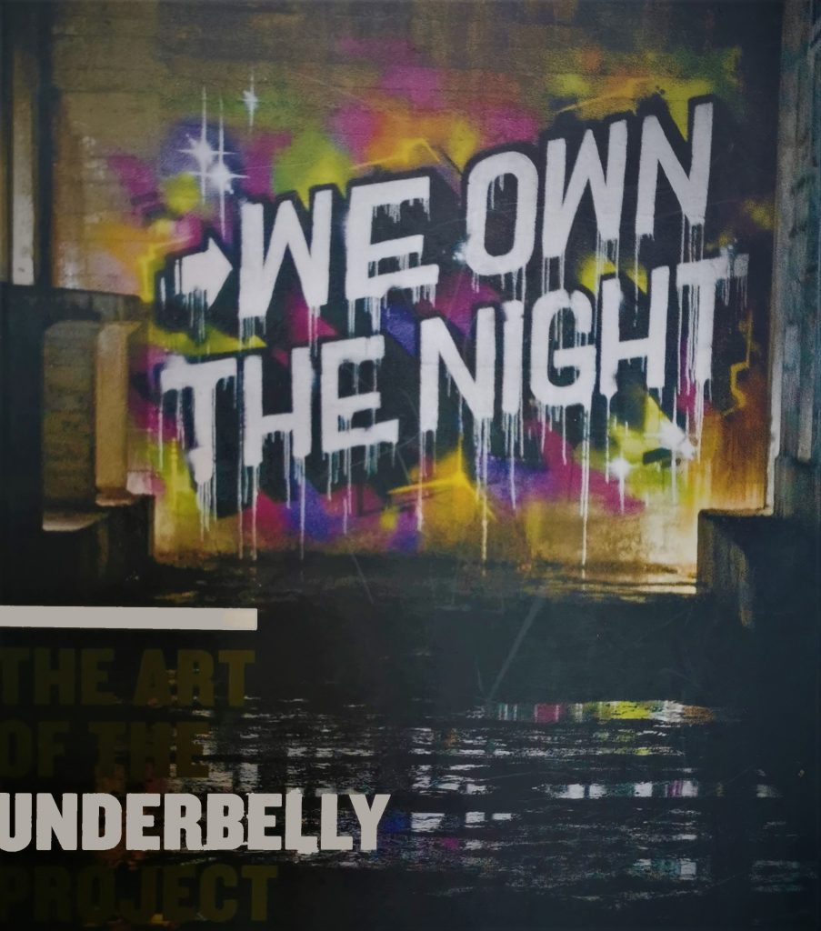
Workhorse and PAC’s documentation of the secretive Underbelly Project, which saw artists invited to paint an abandoned network of subway tunnels in New York, is like a ticket to an exclusive party. The project itself was so clandestine that even artists were blindfolded as they were taken underground. The book is a revealing insight into an inaccessible gallery now closed forever (or at least until a new generation of urban explorers finds the tunnels and its painted walls). The eerie setting is perfect for a book, silence is a key quality and reinforces the isolation of the project, while the spot-lit images, darkened in the corners, provide a sense of being amongst the creepy surroundings, unsure of each strange creak and crack. Spanning several years, The Underbelly Project saw an impressive array of talent paint the aged concrete, from Logan Hicks, Ron English and dabs Myla, to Dan Witz, Lady Aiko and Remi Rough. Much like Trespass, We Own the Night celebrates the rebellious and outsider qualities or urban art.

Flip the Script – A Guidebook for Aspiring Vandals and Typographers – Christian P. Acker (Gingko, 2013)

The black cover of the book Flip the Script with the title in blue

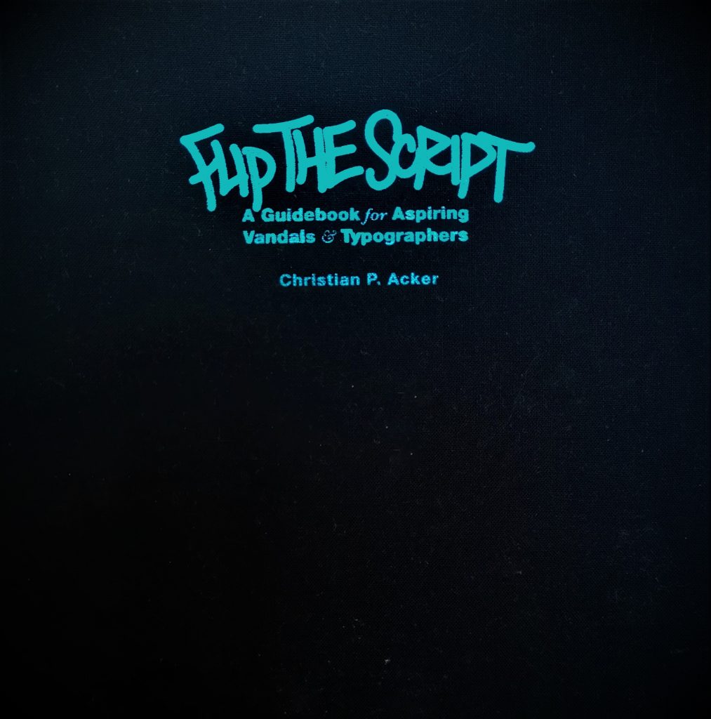
Christian P. Acker’s typographic text is similar to a number of font-inspired books, but is also a fascinating insight into regional hand-styles across the U.S. It is sweeping in locations and time periods, painstakingly recreating letter forms to create a database of styles, revealing the various folk inspirations behind little details. Contributors present full alphabets of their signature style, while Philadelphia’s Wickets are a uniquely specific example explored in depth as well. As the styles pile up, it becomes impossible to not start imitating as the intricacies are revealed and the reason behind those little details become apparent. Acker presents graffiti hand-styles as folk-inspired calligraphy, type designer Christian Schwartz comparing his field recording approach to ethnomusicologist Alan Lomax’s work with folk music in the 20th century. Flip the Script is also a beautiful book, bound in black cloth and restrained in a blue and grey palette, it is clearly a passion project.

InForm – New Zealand Graffiti Artists Discuss Their Work – Elliot O’Donnell (Reed, 2007)

The cover of InForm, with the title written in light in an urban environment

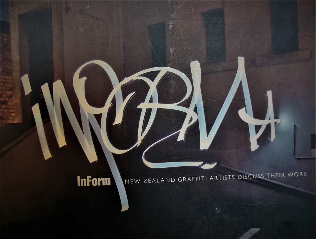
Elliot ‘Askew’ O’Donnell is not only one of Aotearoa’s most revered artists (let’s be honest, he is a global powerhouse now), he is also a key voice in the discourses around graffiti and urban art. After founding Disrupt with Pest5/Johnny 4Higher, Askew was already acknowledged as a leader of the New Zealand scene by the early 2000s, and InForm, produced in 2007, was another string to that bow. A combination of a snapshot of the scene and a process guidebook, it features the country’s biggest names, interviewed and then photographed painting, their pieces documented at each stage from outline to complete. It is an impressive undertaking for its time and reaffirms the primary status of graffiti in New Zealand urban art culture. While Auckland is heavily featured, and as expected the heavyweight TMD crew, Ōtautahi is well represented by Dcypher, Lurq and Pest5 (who had relocated to Auckland by that time).

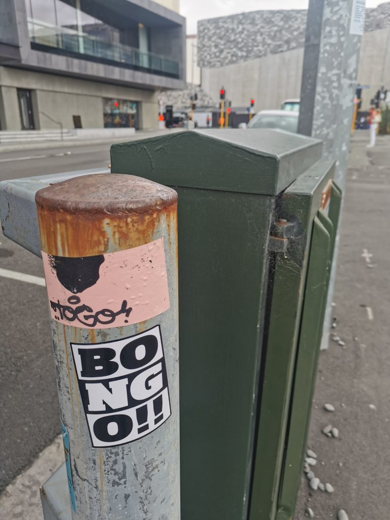
Toy Stories – TOGO (137k Gallery, 2020)

The pink cover of Toy Stories, with a plain white text

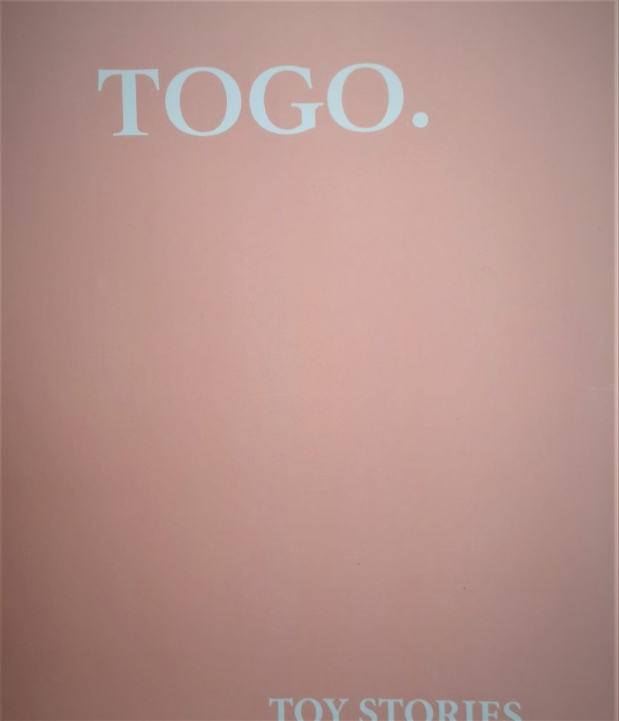
The newest book on this list, TOGO’s recently published Toy Stories might be one of my favourite things from 2020. The minimal cover, in TOGO’s signature pastel pink, conceals the energy that the nomadic artist is known for. Mischief and compulsion are central themes, captured in TOGO’s en scene photography and anecdotal writing, all based on real experience. Toy Stories makes apparent the feelings and sensory realities of graffiti and urban exploration, all with a combination of zine-like zest and elegant production. In many ways, this is a manifesto, part written word, part visual image, yet all direct, including the documentation of paint splattered garments and shoes, brushes, a balaclava and bolt cutters in a manner akin to a museum catalogue. Toy Stories is an impressive analogue addition to TOGO’s digital documentation of a graffiti artist’s life on the peripheries and a unique addition to Aotearoa’s urban art scene, a beautiful object as an artist book, and yet undeniably authentic.

So, that’s our list, what have we missed? Let us know in the comments and follow us on Instagram for more book club entries…

And that was… January 2019

Well, January flew by, right? We thought that since life is so hectic, and the worlds of urban art are often so fleeting and ephemeral, it would be helpful to recap each month with a kind of top five list, you know, like in the Nick Hornby book High Fidelity (or the John Cusack movie adaptation, where Jack Black steals the show, take your pick), or a truncated Letterman Top Ten. We will list five things that we loved during the previous month – from new works, big or small, to events and exhibitions, or even just general talking points. And of course, we would love to hear what you think, so jump in and comment, or send us a suggestion for our upcoming lists…

So, without further delay, here, in no particular order, is the inaugural ‘And that was…’ list for January 2019 (drum roll please…):

  1. Face Value @ Fiksate Gallery

Face Value Promotional Poster

The team at Fiksate followed up the Jacob Yikes exhibition, Bad Company,  with another impressive showing – the second incarnation of the Face Value: an exploration of portraiture, figuration, faces and characters through the lens of urban art. The show featured a range of talent, from emerging and established locals, to big names from wider Aotearoa and further abroad, such as Anthony Lister, Elliot O’Donnell (AskewOne) and Tom Gerrard (Aeon). Highlights included O’Donnell’s monochromatic apparition Chloe (Beta), the collective strength found in the juxtaposition of local artist Meep (Kophie Hulsbosch)’s bold self-portrait and the works of Auckland’s Erica Pearce, the elegant chaos of Lister’s Ballet Dancer, and Koe One’s typography-laced black and white portrait of urban youth.

  1. The Giant Cans get a makeover…
The Giant Cans got a make-over with new work by (L-R) Wongi 'Freak' Wilson, Fluro (Holly Ross) and Ikarus.
The Giant Cans got a make-over with new work by (L-R) Wongi ‘Freak’ Wilson, Fluro (Holly Ross) and Ikarus.

While five cans remain a constant open platform, the three cans that stand aside are designated as semi-permanent. Initially painted by Wongi ‘Freak’ Wilson, Ikarus and Jacob Yikes, in mid-January, the three metal sentinels were re-painted by Ikarus, Wongi and Fluro (Holly Ross), giving them some fresh evening wear for 2019. With Ikarus’ slick letterforms, Fluro’s elegant typography, and Wilson’s photorealism (with some nostalgic cartoon fun thrown in as well), the cans represent a variety of approaches and styles.

  1. Macadam Monkey chills in North Beach
Macadam Monkey's North Beach and Chill wall, Marine Parade, North Beach.
Macadam Monkey’s North Beach and Chill wall, Marine Parade, North Beach.

French artist Macadam Monkey spent several weeks in the city in late December and January, and he made the most of his time here. Hitting a few spots with his almost Art Deco-styled, elegant females as well as more traditional lettering, our favourite was probably his appropriately titled ‘North Beach and Chill’ wall beachside in North New Brighton. The refined (and recurring) colour palette of black \, grey, yellow and white added to the chilled vibe and the work itself seems to have the potential to be something of a small-scale landmark for the area (although time will tell of course…).

  1. Juse1, VRod and Torch in New Brighton
Juse1's B-Boy chilling in New Brighton.
Juse1’s B-Boy chilling in New Brighton.

It was something of a meeting of generations and locations when Wellington legend Juse1 visited Christchurch. He spent time painting with local writers VRod (who hails from Auckland but is based in Christchurch) and Torch, and while the Hereford Street spot was a blink and you’ll miss it deal (in fact there have been a number of pieces there that could have made this list, shout out to Tepid, Lurq, Ikarus, Dove and more), their sprawling production in New Brighton has shown more legs. The pieces add to a vibrant setting, and Juse’s iconic B-Boy character adds a perfect nod to hip hop culture, as if it is straight off a New York subway train circa 1982, albeit still fresh to death…

  1. Jonny Waters, Dizney Dreamz @ Anchorage
Jonathan Waters, Goofy, from Dizney Dreamz, mixed media on plywood cut-out, 2018

Dunedin-based artist Jonny Waters goes by a few names, but one thing is always consistent: his playful, twisted aesthetic, which was on full display in Dizney Dreamz at The Anchorage on Walker Street. Presented by Kin Art, the show featured a new series of Waters’ cut-out characters, this time iconic (and several overlooked) players from the world of Disney cartoons (his previous works have taken on Looney Tunes, Rugrats, Sonic the Hedgehog and The Simpsons). While the silhouettes are familiar and intend to invoke a feeling of nostalgia, the details take the viewer on an unexpected trip; eyes where they shouldn’t be, limbs and heads protruding from fresh wounds. All these features are accompanied by a fine technical detail, with layered sections, perfectly imperfect lines and a use of various media.