Counterfeit – A place for things that don’t have a place…

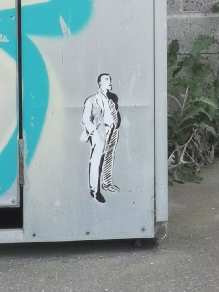
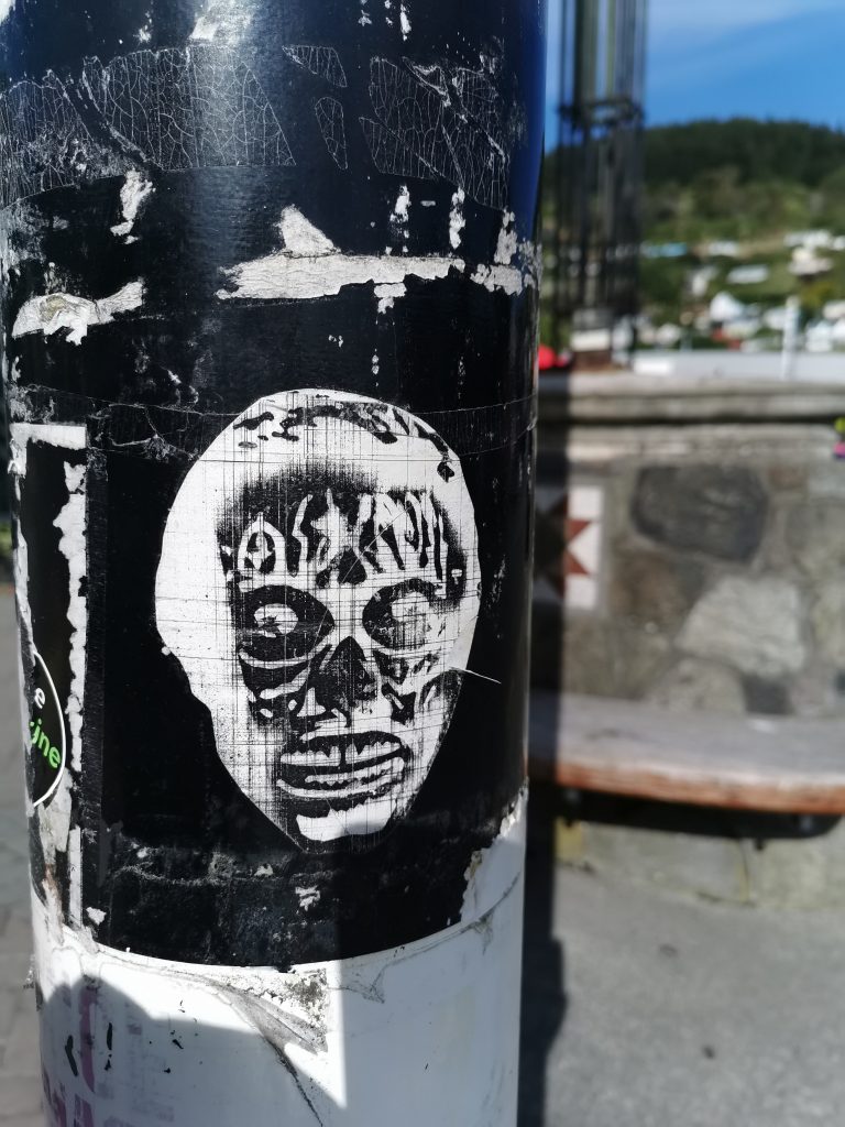
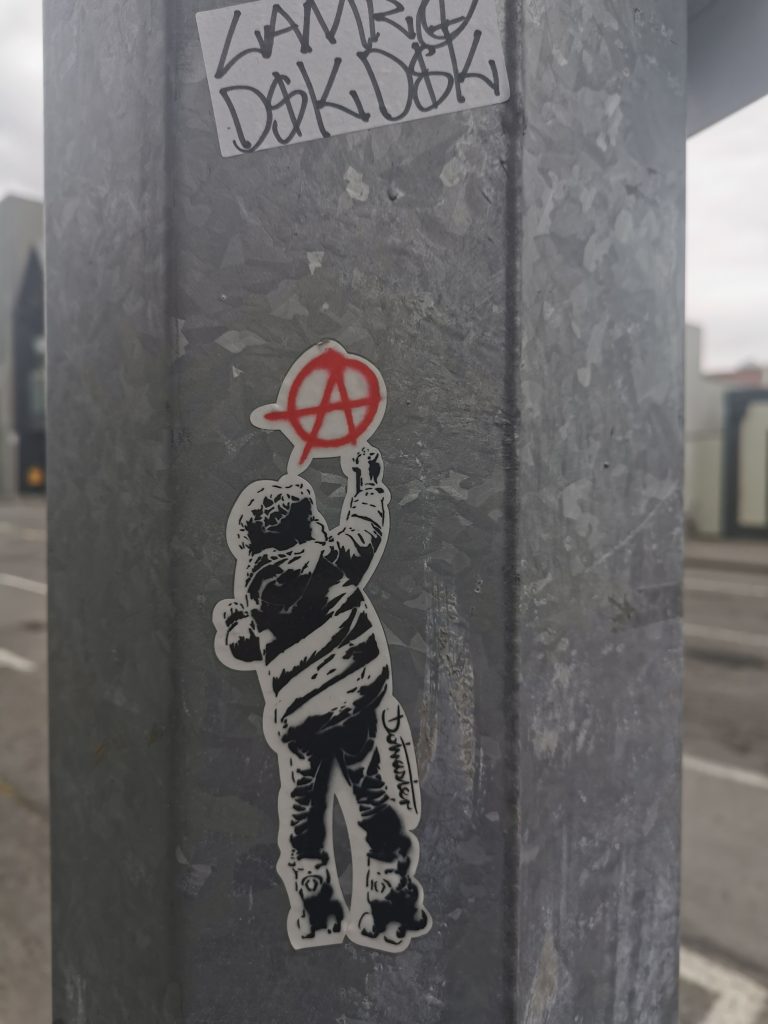
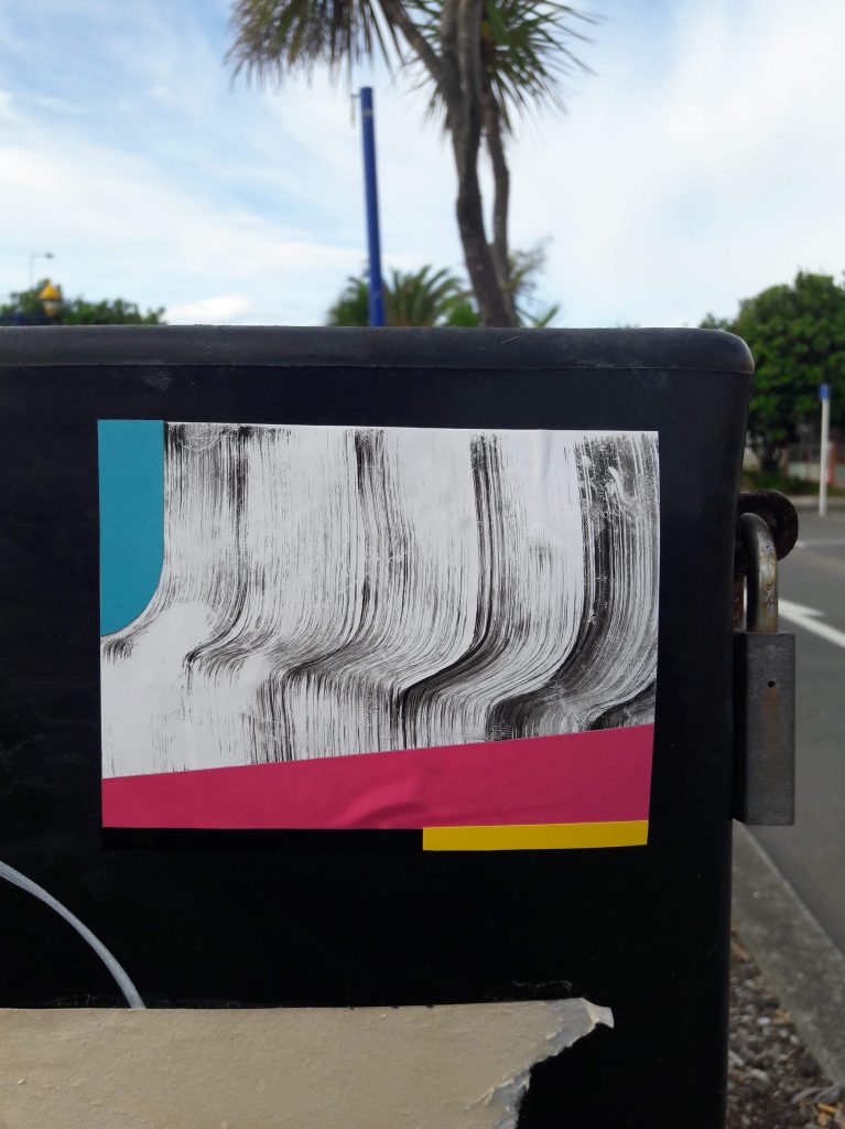
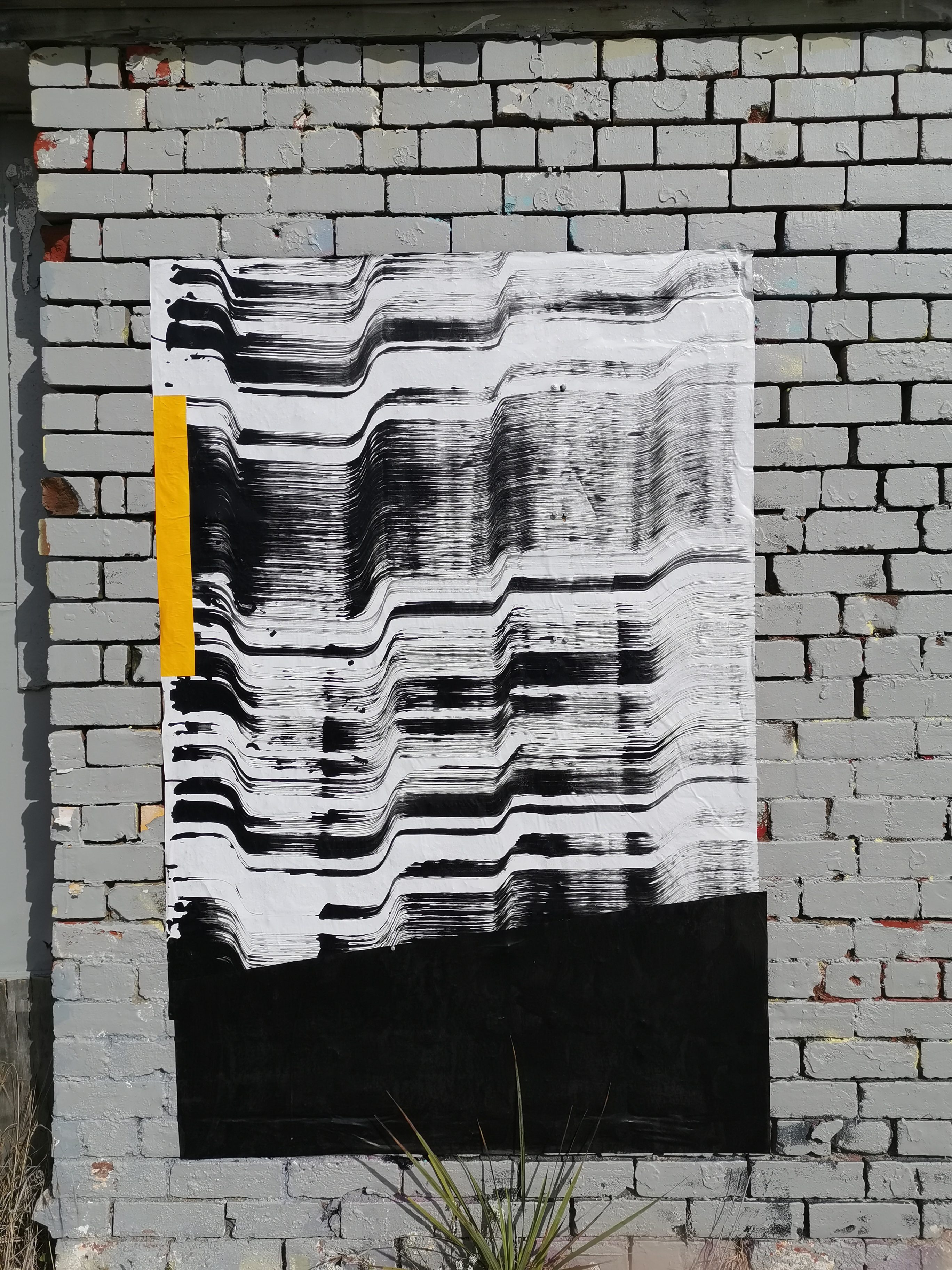
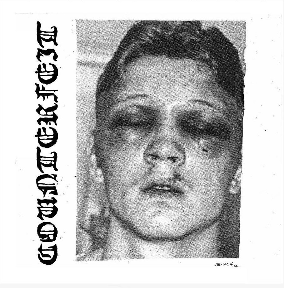
A few weeks ago, I was lazily scrolling through Instagram and a striking black and white image flashed past. I scrolled back and was drawn by the raw energy of a puffy face with a swollen black eye, the grainy image accompanied by a Gothic script reading Counterfeit. The stark minimalist look contrasted with a punky DIY quality and I was immediately intrigued, it was a nice contrast from a lot of the manipulated bluster of social media and I wanted to know more about this Counterfeit presence. When I visited the website, the content was an impressive reflection of local talent, from zine publications to photo essays, all capturing a sense of low-fi outsider attitude. After some low-level sleuthing I was able to connect with the semi-anonymous founders of Counterfeit, ‘J’ and ‘S’ and chat about the goals of the platform, the art it represents and how it is a “place for things that have no place’…

I must admit, when Counterfeit appeared on my Instagram feed, I was immediately intrigued by the raw aesthetic and by the mystery of not knowing anything about it, and I love when that happens, because it feels a bit more rare these days, to find something that feels new and authentic. What inspired you to start Counterfeit?  

J: It seemed like there was a lot of stuff that I love that hasn’t had a place to exist, stuff that was not ‘fine art’ enough to go in a gallery, and stuff that didn’t fit in aesthetically or stylistically with local group shows. I just felt like everything I wanted to see and the work by the people I like, there just wasn’t that space where you could see it. There are a whole bunch of rad people doing rad stuff, but it was all really separate and spread out and I just wanted a place where it could all come together…  

Did you think there were enough people making work that fit the Counterfeit aesthetic to make it work, or was it also about making a platform with the whole, ‘build it and they will come’ mantra? 

J: I felt like the work I was making didn’t fit in anywhere and I just noticed a fair few other people in the local art scene that I thought might have been in that same position, and then the more you start to think about it, the more you notice there are plenty more people out there you can try to pull in to be part of it…

S: From my perspective, when I started making and showing my work publicly, I noticed a fair few other artists whose work thematically aligned with what I want to see out there, within one show, one platform, one zine. By gathering all these artists under one proverbial roof we hope that it will draw in more people alike in one space. 

Image by Josh Bradshaw

How would you categorize the cross-section of art and artists presented by Counterfeit? There seem to be elements of skate culture, punk culture, zine culture, a kind of outsider art, there’s a sense of the urban influence… It probably doesn’t need to be pigeonholed, but did you spend time thinking about exactly what makes something right for Counterfeit or is that an ongoing and evolving discussion?

J: I reckon it’s easier to figure out what’s not it. All of the elements you mentioned are exactly all of the things we really like so are naturally drawn to. It’s quite obvious quite quickly when something doesn’t fit that, haha.  

S: What I looked up to was always somewhere else and when J and I came together, it was like, oh actually, there’s a big cross-section of people here who we find really appealing and it coincides with a lot of things that we really like, so it’s become much easier to understand what it is that fits on the platform.

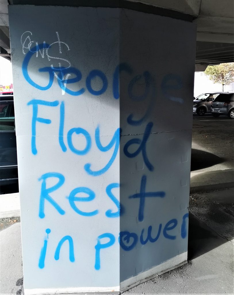
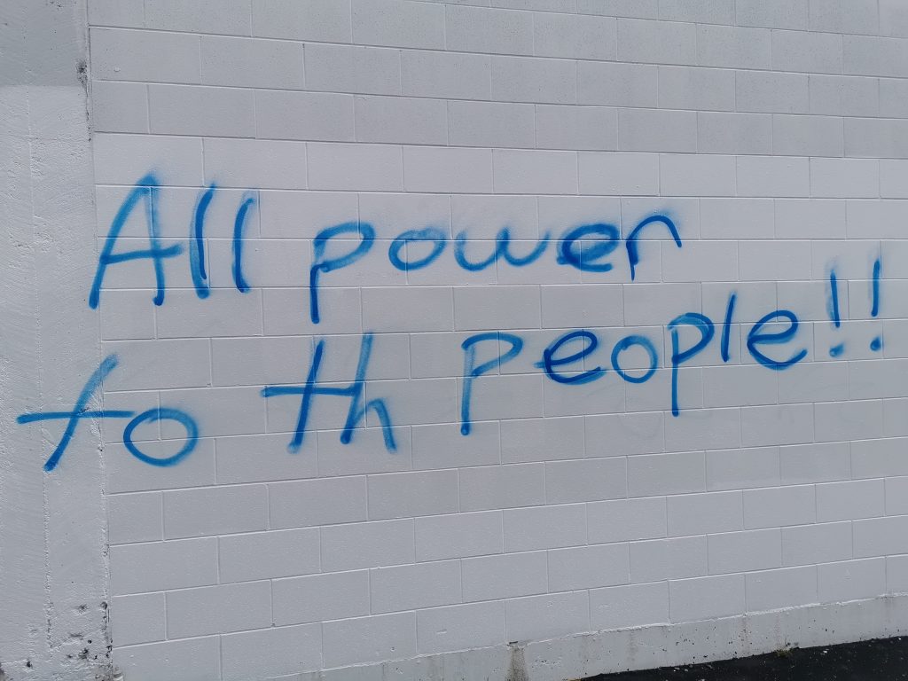
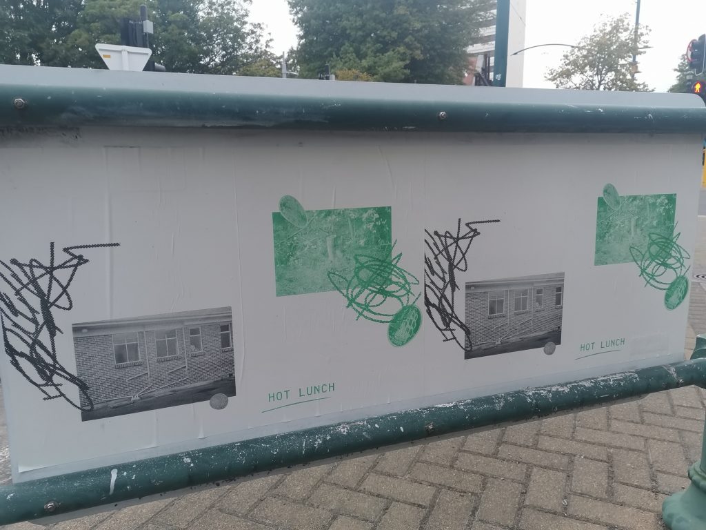
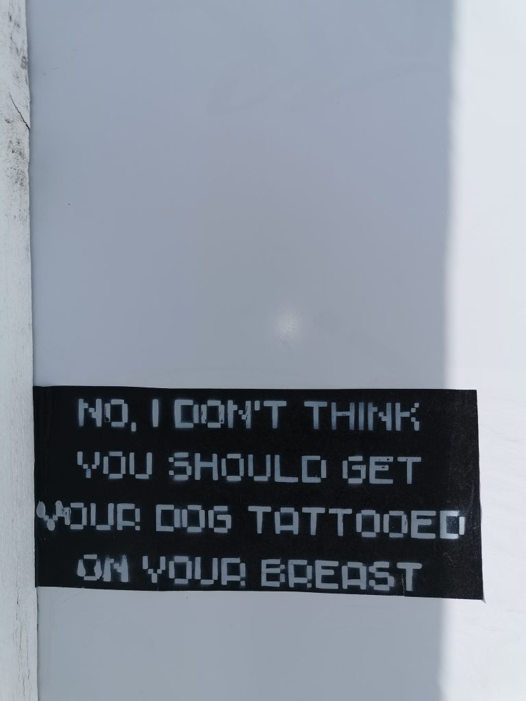
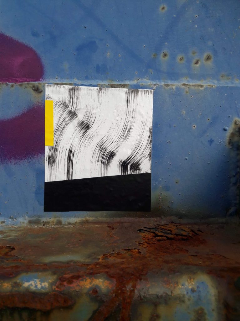
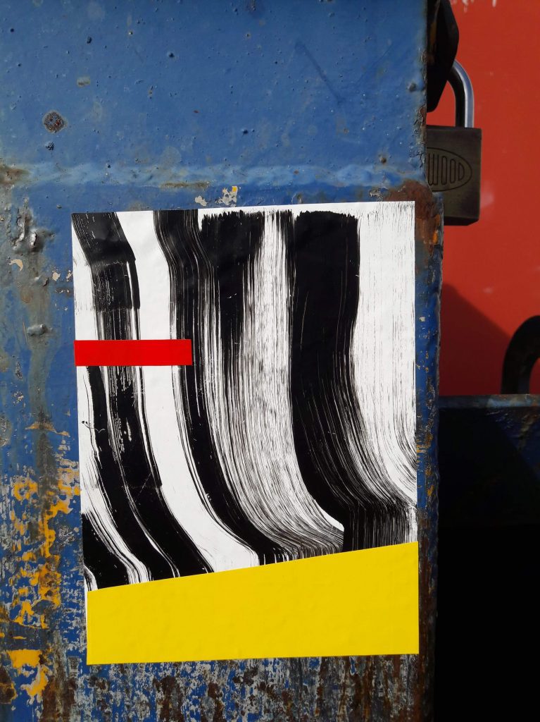
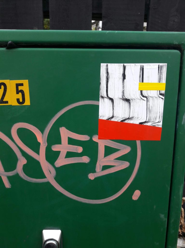
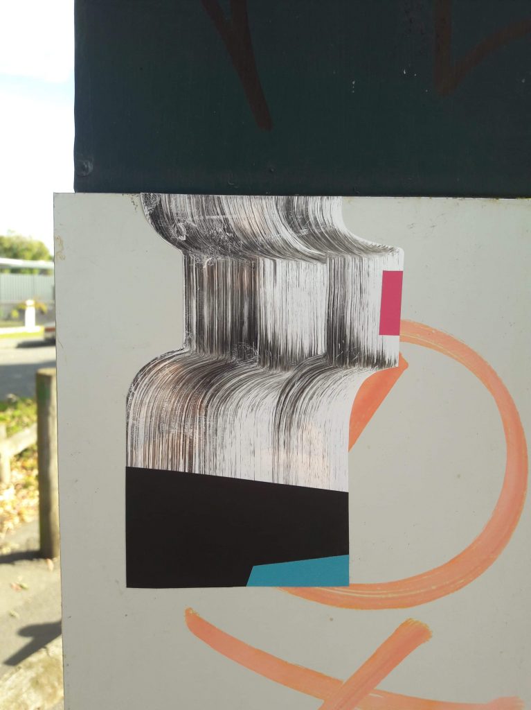
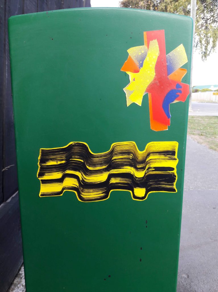
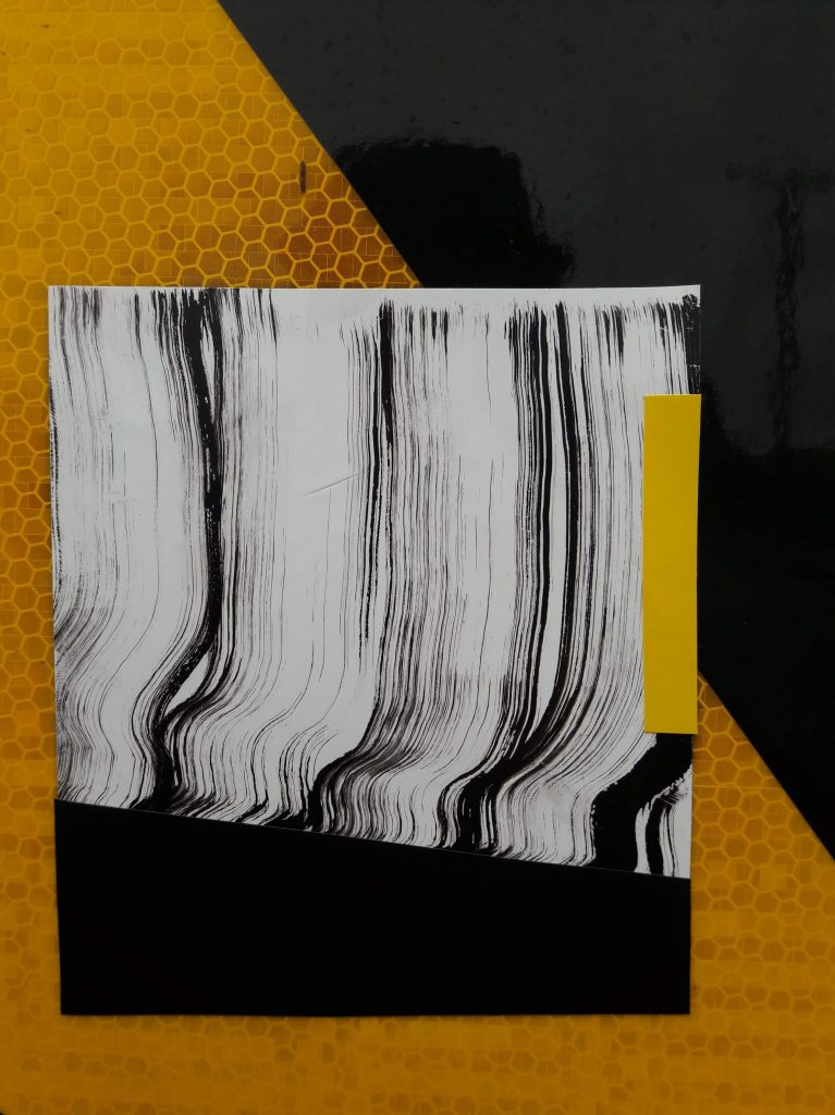
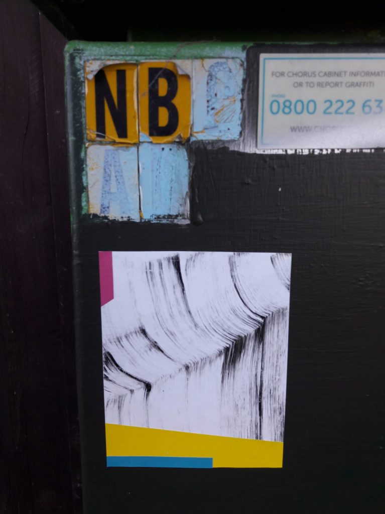
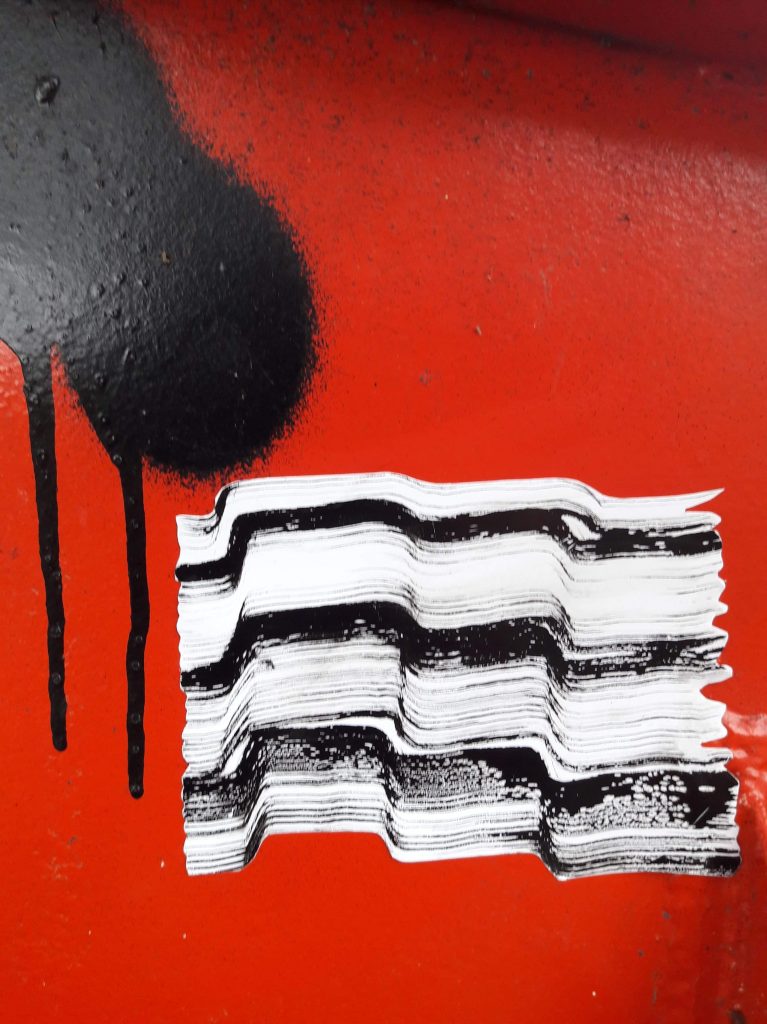
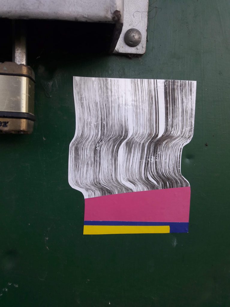
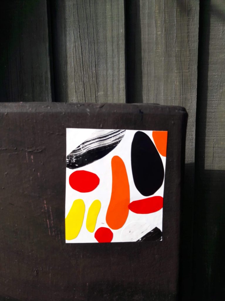
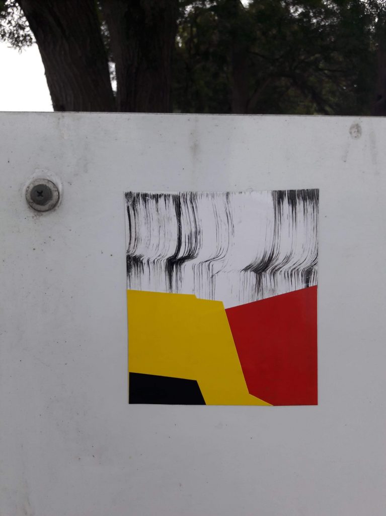
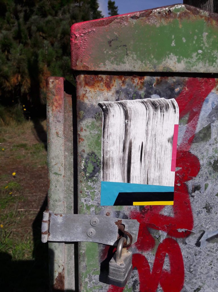
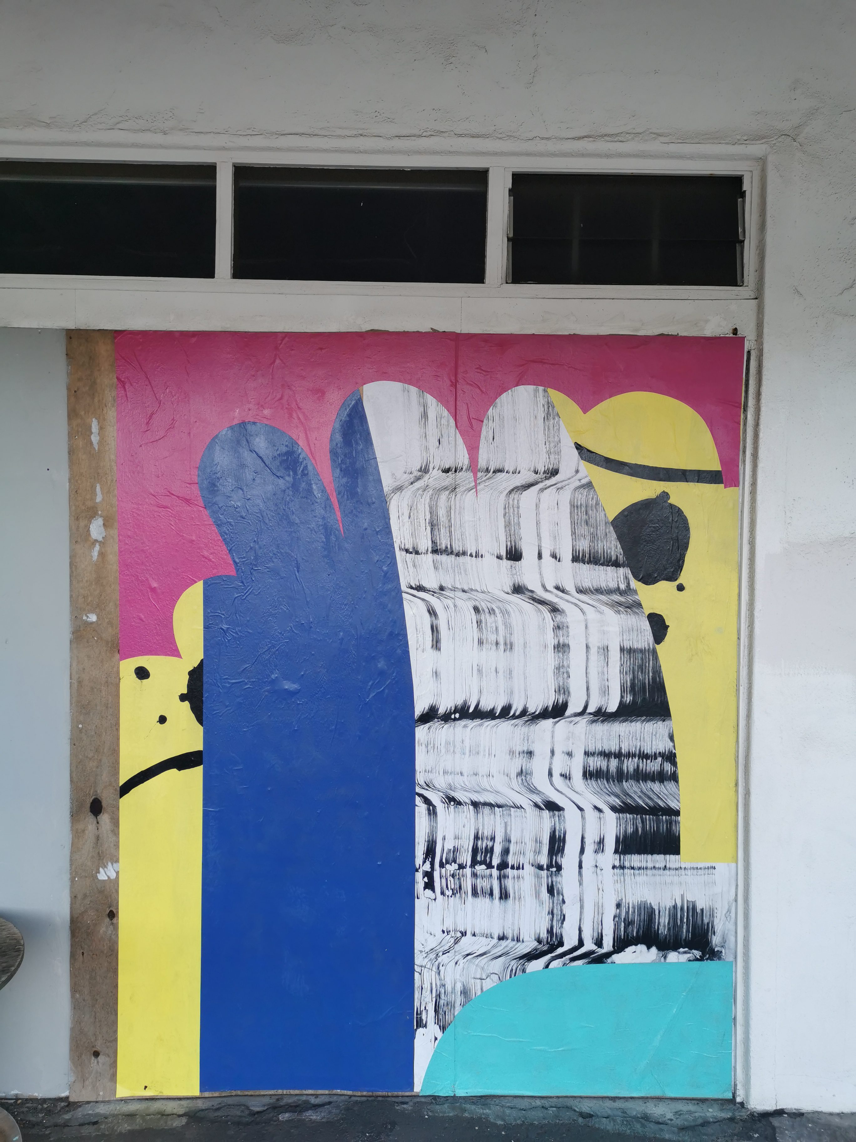
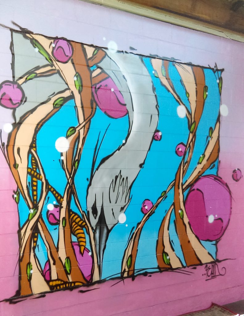
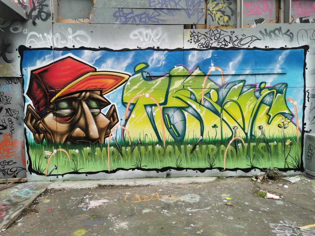
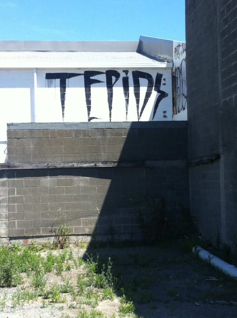
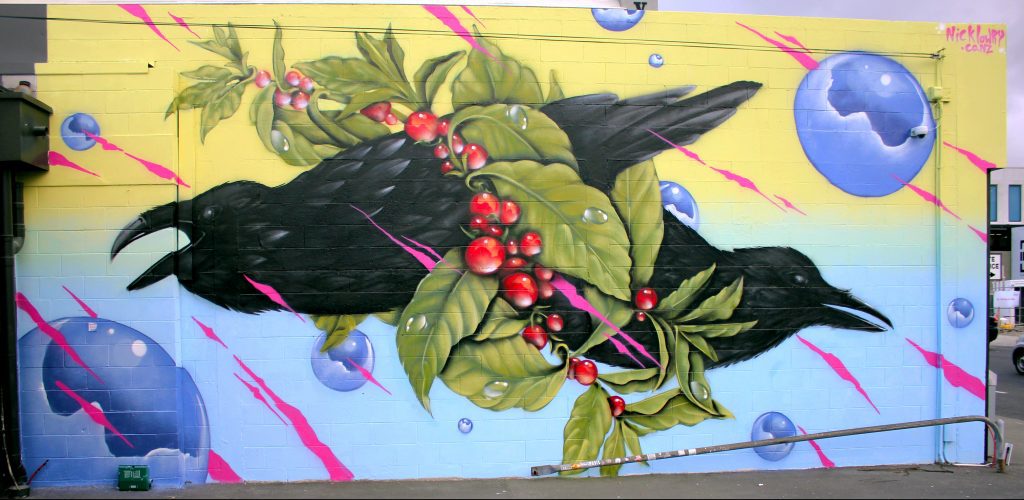
For me, elements of the Counterfeit aesthetic feel very Ōtautahi. The gothic text, the black and white, the grime, although the positive spin has been the bright and colourful post-quake city, the reality of being a cold damp Southern city feels fittingly represented by the Counterfeit aesthetic. Is that something you recognised, or is the influence more global than that?

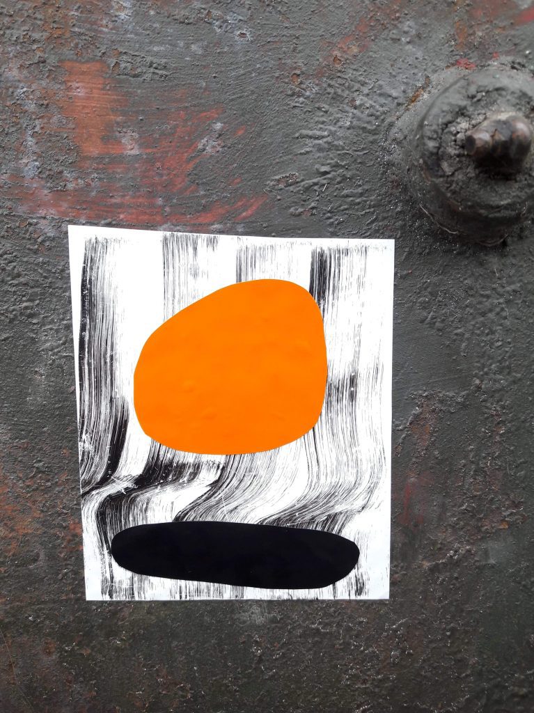
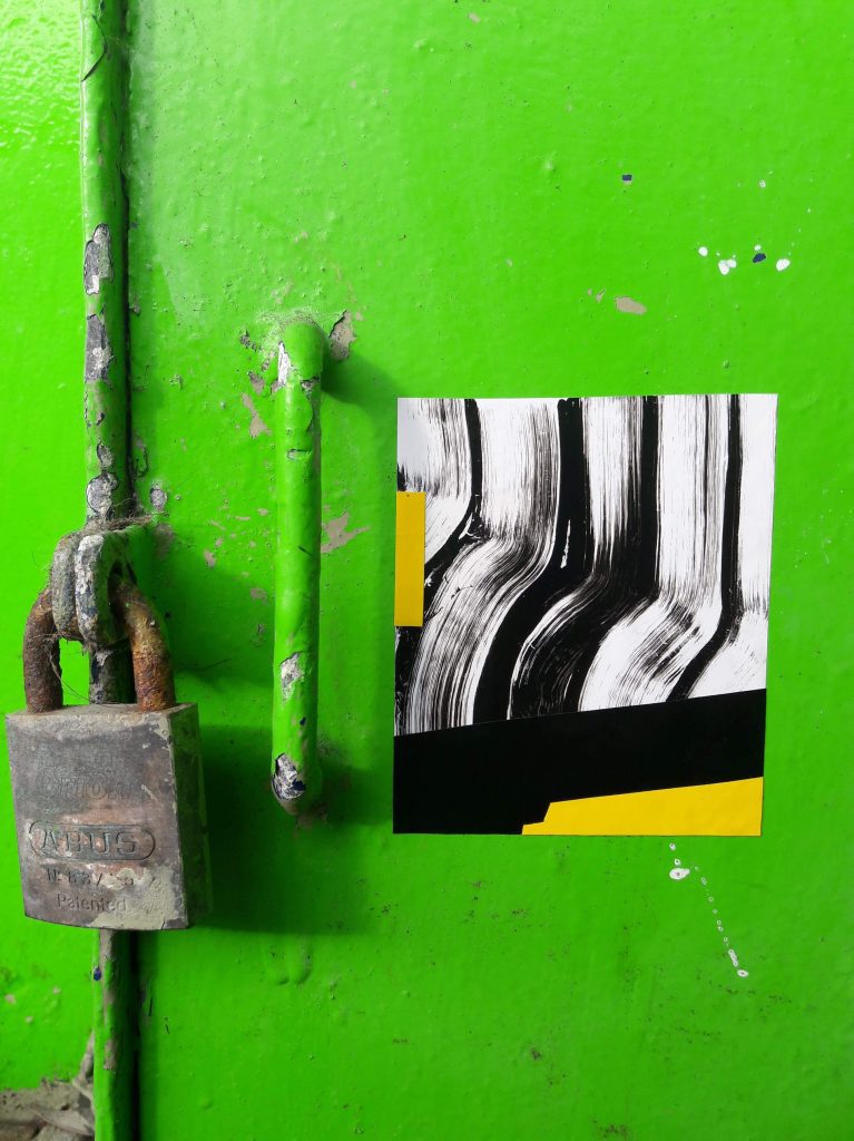
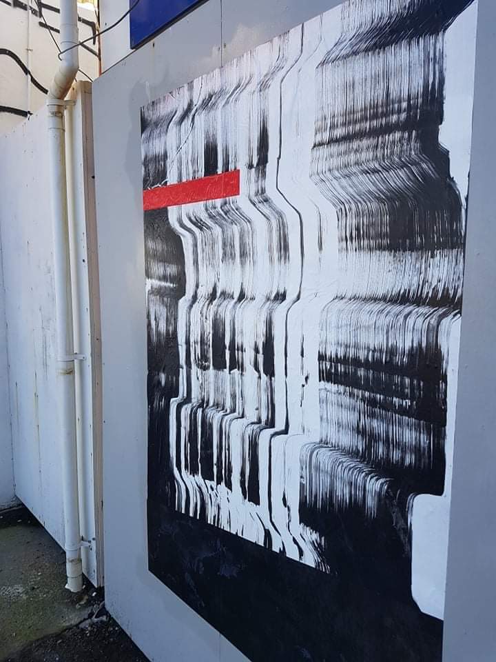
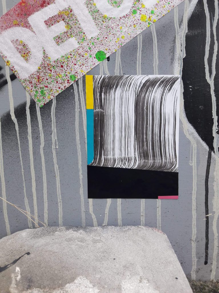
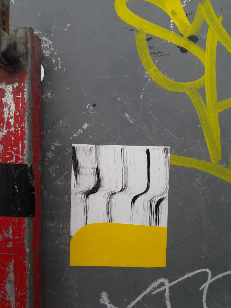
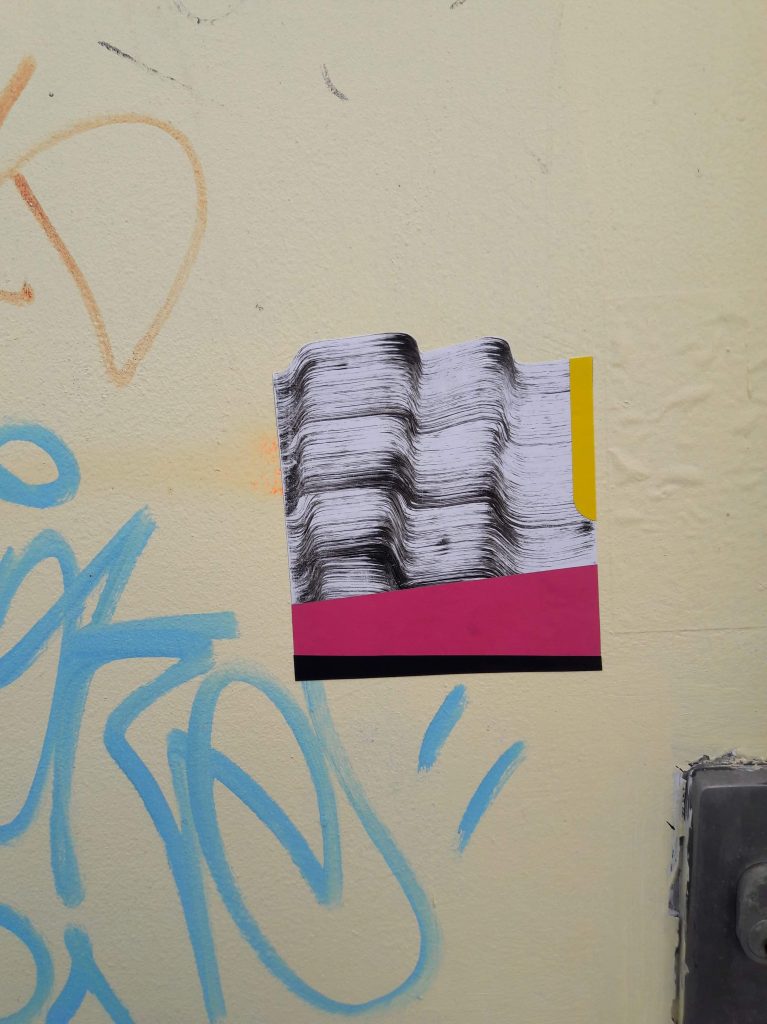
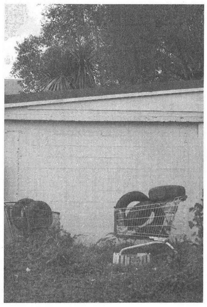
J: I just wanted something that feels real. Just like the grime, the devastation, the dirt of Ōtautahi represented through the content of the website; the logo, the general aesthetic, all juxtaposed with the clean look of the website itself; like the new emerging parts of the city neighboring with ruins and dingy car parks. 

S: While it is inspired by Ōtautahi, it is definitely global. We find solace in the not-so-pretty aspects of the world and we find a lot of artists on social media from across the globe share the same view. I think this aesthetic is about finding beauty in the raw energy of everything that’s around us, it is not necessarily ‘pretty’, it recognises the grimy, gritty elements that you can’t erase from the streets and makes them worthy of attention…  

Image by Miiekes

That kind of leads to the question of Counterfeit as a platform in the increasingly digital world. I would suggest the art Counterfeit champions needs an actual physical presence in the world too, is that a goal, to have that real world presence?

J: The goal is to be curating exhibitions and producing physical artworks and merchandise and actual tangible things. At the moment we are just trying to establish the digital side, so when people go to it, they can get a feel for what Counterfeit actually is and if it aligns with any other shit they’ve got going on, and eventually, once we build up that sort of network of artists, then we can look at putting on shows…

Were there people you knew you wanted to have involved straight away?

J: Definitely, there are so many local artists that we have close relationships with that we could reach out to, so we just hit up friends who fit that style first and then the more we collect, the more people will come in from outside that circle that we don’t know, and as long as the work fits the themes and feeling we are going for, we are happy to take it.

Did you give any thought to creating a manifesto, or a declaration, or something that summarises your goals? Even if it was a declarative statement that defines what it’s not, an anti-manifesto?

J: As someone who loves punk, owns Doc Martins and shaves their head, being in Christchurch and hearing the word manifesto, I immediately recoil! But we didn’t really write out our intentions, we do have an ‘about’ section on the website, but we don’t really know what it is yet. We came up with the phrase ‘a place for things that don’t have a place’, and I guess that’s as close as it gets.  

S: I feel like a manifesto could get quite limiting with what we want to present, so I think at this point of what we’re doing it’s not particularly necessary. I feel like the work speaks for itself…  

Do you each have designated roles within Counterfeit?

J: We definitely have designated roles, because I can’t work the Internet and it’s a digital platform! Luckily one of us has some idea of web development and how to use Instagram, so, they have that covered, and in theory that person has done most of the work so far! I just know a whole bunch of people that do stuff, and I really know what I like and don’t like, so it’s pretty much my sort of vision for it. It is kind of the perfect mix in the way it works…  

S: From my perspective, I’m not very good with social things. I’m supremely awkward, so I am responsible for the technical side of things while J is taking care of the curation and actually talking to people, which works perfectly for us…  

Image by Sofiya R

Are you open to bringing new voices in? 

J: I like the possibility of people contributing ideas, because there is a whole bunch of stuff that we are playing around with that isn’t on the website and that’s for further down the line and that would be cool to get other people’s input, but in terms of the actual operational thing, the core of it will just remain the same, a small team. If people want to jump in and help on projects and stuff like that, I’m open to that…

The website looks great, it is clean and yet raw. What should people be checking out on there?

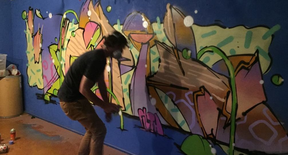
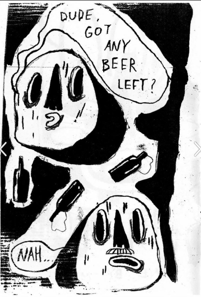
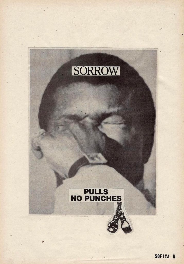
J: I really like the digital zine library. We’re just going to be forever adding to it as we get zines from people. There are other places in Ōtautahi that have zines, and we didn’t really want to step on any toes, so we like the idea of collecting zines that are out of run and that are almost forgotten about. You make zines, you give them out, you sell a few, and once the run is over everyone forgets about them, so it’s nice to collect those dead zines and have a place where they are all kept nicely. We have also introduced the X Counterfeit collab which will be an ongoing series with work made specifically for Counterfeit. Then we want to have work by people that might be something they do that’s not their normal practice, you know, someone who shoots photos might have a sketchbook that they do drawings in and we are just as interested in those as the other work. Again, it’s a place for things that don’t have a place.

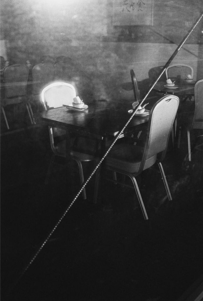
The latest X Counterfeit contribution is a photo essay by Cammy H, how did that come about?  

J: I noticed that he was posting photos that looked a bit a different to what he would normally shoot. I love Cam’s photos and with the black and white stuff that he was starting to post, S and I would look at each other and be like, this is perfect for Counterfeit, we should add these! So, I asked Cam if he would want to submit some new ones to the website. He was super keen and we showed him a preview of the website so he had a feeling of the look, and the photos we got from him were just perfect.

Image by Cammy H

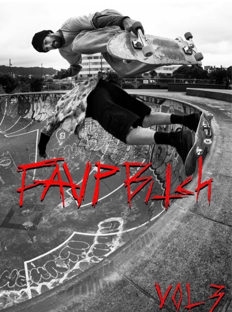
You also have a selection of zines from local skate crew FAUP. What is your relationship with them?

J: I’ve skated most of my life, so I’ve seen some of those kids come up, watched them form their crew, skate and then as they got older break off and form punk bands and stuff. But just watching them shooting their own photos and videos, making their own clothes, making zines, all for no reason, just for the fact that they love doing it, that’s the feeling I was talking about, it’s fucking real, it’s so perfect, it’s everything that I feel a lot of stuff is missing these days with the internet and shit…

FAUP Bitch, Vol. 3 by Gianni Ruffino

I guess the big thing is that you have to be willing to dive in, like in skating you have to know you will probably get hurt at some stage, but you have to do it anyway, and it correlates with creativity…

J: There’s no one making you jump down those stairs for hours. When you’re falling over for that long, for the possibility of success, I think it teaches you how to overcome challenges and deal with failures.

S: I would rather see a spectacular failure than a boring success…  

What is next for Counterfeit?

J: Zinefest, on the 17th of September, we will have a table there. We will have artist zines for sale, some older ones, some new ones and a first Counterfeit issue with a bunch of contributing artists, which is actually a real physical thing that you can look at, instead of just clicking through on the website…

And beyond Zinefest?

S: We have been speaking with quite a few artists, so we will hopefully source some work from them in the future. We plan to sell stuff as well, Counterfeit zines, Counterfeit merch…

J: Like I said earlier, we also want to stage some group exhibitions…

I imagine finding the right venues will be really important for Counterfeit shows…

S: The grimier the better!

J: I really want to have some shows at the Darkroom, that would be perfect because the exhibition could roll on into a punk show straight afterwards, making it an event. I think we just want to make it fun. There’s plenty of people doing cool shit, it just needs to be organised a bit better…

I’m a massive advocate for creating platforms for things to be seen and shared and celebrated, because in Christchurch, it’s big enough to have people doing cool stuff, but small enough to not have enough platforms…  

J: A lot of the artists and the work I like you could call lowbrow or gritty and people just do that stuff for the love of doing it. A lot might fall through the cracks or be forgotten, and I wanted to collect all that work. The thing with Counterfeit is that it might be grittier but I wanted it to be presented really well, to be respected, and I wanted the website to be super clean and to focus on the artwork and the artists, rather than Counterfeit. Exhibitions and stuff as well, it might have some shitty punk kids and beers out of a trash can, but all the work will be presented really well…

S: We just want to encourage more people to create or continue to create. If someone knows that, not only can they make something but they can actually have it seen by other people, they can make it a more significant part of their life

Image by Bethany Ponniah

And creating a platform that ensures people can feel like they can do that, that they can feel part of something, that encourages them to put something out there, is so important, because until they are visible, they go unknown and who knows who will connect with it…

S: That’s why we are open to seeing what’s out there and deciding what works for us and what doesn’t. At the end of the day our platform isn’t the only one to showcase work, it is specifically for things that we have seen a lack of representation around, so we are just happy to fill the gap.

Follow Counterfeit on Instagram and stay up to date with their newest projects…

The Paste-Up Project – with Cape of Storms

Urban collage artist Cape of Storms became the third contributor to the Paste-Up Project in early June, her bright installation completed in glorious sunshine. The concept, drawing on the artist’s experiences acclimating to life in Aotearoa through the lens of humorously juxtaposed vintage magazine and advertising imagery, provided a reflection of the advertising often found in our urban environment, almost tricking the passing audience into a sense of normality. Upon closer inspection though, the bollard was filled more playful and acerbic content, including a brick wall section packed with a wide range of images. The result was a bold production with electric colours gleaming in the sun, simultaneously covert and unmissable.

But, then the weather changed and the installation was faced with a slew of challenges. As torrential rain hit Christchurch, the paste-ups started to peel and soon, it seemed as though people had pulled the pieces off, leaving the bollard naked in places. Luckily, part of Cape of Storm’s concept was the incorporation of friends’ work to be added over time, and this unfortunate series of events provided the opportunity to refresh the bollard on a large scale.

Cape of Storm’s installation has not only provided a bold burst of colour, but a fascinating narrative that ties into the nature of both paste-up art and the process of making art in the urban environment…

____________________________________________

Kia ora! Would you like to introduce yourself?

I am Cape of Storms, a Christchurch-based collage artist, I collect obscure retro images and phrases and put them together in a fun and quirky way.

What was your initial reaction to the Paste-Up Project proposal?

I was very excited by the concept, and also daunted in equal measure at the sheer size and scale of the bollard surface area.  I typically work no larger than A3-sized pieces and often very detailed and refined. It takes hours to hunt out and combine different images together into one cohesive new image.  I hand-cut and glue everything with just a pair of scissors or a small craft knife, arrange and overlap, and then carefully glue everything together.  Some of my pieces are comprised of 30 or more smaller images and words!  So, the challenge of this project was filling in all that open space.  In the end my approach was to try to go big, but also fill the space with as much as possible to keep it interesting and provide a piece of art that had several dimensions to it.

With two artists having already contributed to the project, were you primarily interested in doing something different?

Yes, I was keen to do something unique to my style and stay true to that – I think my art style is so significantly different to both Teeth Like Screwdrivers and Bloom n Grow Gal‘s that it wasn’t too hard to be different!

What is the central theme of your installation and how does it relate to your existing work?  

The installation is a progression or continuation of a new style I have been working on for about a year now, which I am really enjoying.

I have titled the series covering the bollard Foreign Objects.   Being a foreigner living in New Zealand, I am continually getting to grips with my identity and trying to relate to my surroundings, often times feeling like a fish out of water. As a  lover of nostalgia, I found myself combining these two themes.

Throughout this series I intentionally tried to create a silly, nonsense, imaginary world that could reawaken nostalgic memories in the viewer.  Over a period of months I sourced hundreds of different found images  – from old cook books, special interest magazines, newspapers, catalogues and children’s books from bygone eras.  Things I remember seeing in my mother and grandmother’s house during my childhood growing up through the 90s.  To many younger people, these images might seem totally foreign or out of place in modern times, as they are simply just not in common use any more.  So through this use of retro “foreign” objects and arranging them together in weird, silly and fun ways, they all come together and are recognisable and familiar as a whole, something that the viewer can relate to.  I tried to select a range of bright candy colours for the background which would stand out on the grey inner-city street-scape around the bollard.  The candy-coloured palette also reinforced the nostalgic theme.  For me, this ended up being very effective at inviting the viewer in from a distance, to come up closer and look at the bollard in more detail, particularly in the heart of winter!

The brick wall section running along the bottom third of the bollard and the very top section running like a ribbon all around is a collection of my existing collage art that I have been pasting up on the streets of Christchurch over the past two years.  It was nice to include these on the bollard as well, alongside the more considered poster series that I created especially for this project.

You decided to remove the spacers on the bollard, making it one consistent 360 degree surface – which makes the experience more continuous, was that the thinking?

I didn’t like the “frames” or physical boundaries the spacing strips created, I wanted each individual poster to look like another part of the imaginary world I was creating. I also wanted to encourage the viewer to walk right around the bollard and see the image as one continuous surface.

You have included some big prints but also some collaborative spaces, what was the intention of the brick wall?

The brick wall section was intended to be a space where the wider Slap City collective group of artists would jump in and slap up various individual pieces, just as we do on our regular paste-up missions around the city.

Unfortunately due to the intense winter weather over the last month and the group not being able to meet up so frequently, we weren’t able to get in and fill that area before about 80% of the bollard surface was damaged in the torrential rain.

But the damage to the bollard has now cleared even more space, so if we are able, we will try and cover the empty spaces up again in between now and when Mark Catley inherits the bollard – I’m very excited to see what he’s got planned!!!

Printing the large posters became quite a process, working with the team from Phantom, has that changed your thinking around your work more widely? And what other challenges did the whole process throw up?

I knew I wanted to print everything with Phantom – they are the experts and their prints are of amazing quality and designed to be more durable and last out in the elements (sadly the record-breaking wet weather we’ve experienced over the last month took its toll!).  The trickiest part was maintaining resolution when scaling up from original A4 or A3 size to A0 size.  I was really worried that the images would look pixelated and poor quality.  In the end I put all my scanned images through a free online tool called The Rasterbator which I hadn’t previously used much before, but is very popular among paste-up artists, especially Teeth Like Screwdrivers, who encouraged me to get into using it. Luckily this helped tremendously in keeping the images sharp and looking half-decent.  I then asked the assistance of the very talented Tom Horton, the printer at Phantom, and he worked his magic, did some test-prints and the posters came out so much better than I could have ever imagined!

The next trickiest part was the installation itself, which I found very challenging having never done anything of that size or nature before.  My design relied upon the posters going up very neatly and level, and the curved surface was seriously difficult to work with, and certainly will not be under-estimated in the future.  I was so lucky to have the help of my partner who is a painter, as well as Vez and JZA who were able to help me paste up high (as I embarrassingly have bad vertigo when up on ladders!).  This project has again made me appreciate what a special, supportive group of people we have in the Slapcity collective, coming together to do awesome stuff, promoting our many and varied street art mediums and just generally have a cool time together.

What does the Paste-Up Project represent for you as an artist who works in the paper medium? Has it given you ideas for where you might be able to take your work next?

I was totally blown away by the opportunity to prepare a legitimate art installation all in paper-based form.  We have a lot of murals and graffiti/paint/spray-based pieces all around the city, so it was really encouraging to receive a project like this especially for paper-based art. For me personally, seeing the sheer scale of the prints, and printing on very high-quality paper has added a whole other dimension to where I think my art could go in the future, and I can see new possibilities for future projects with scaling up and going big. Finding a way to cost-effectively create large prints and in a format that is durable enough to withstand the winter elements and last a little longer out in the streets is a serious challenge for paper-based artists.

Is there anyone you want to thank?

Watch This Space for the support and patience, also for the help cleaning off and preparing the bollard surface ahead of the installation! Phantom Billstickers – Tom, Jake and the team. The Christchurch City Council’s Enliven Places fund for funding and the opportunity. Teeth Like Screwdrivers for the advice, tips and tricks. Vez and JZA for the help pasting up on the day and going high up on ladders when I wasn’t brave enough! Bongo and Neil Swiggs for the donation of some seriously good old books and magazines that I used in a few of the collages. The Slapcity crew for the support & a source of creative inspiration.

And my partner Fernando for allowing the complete take over of my time and helping with the installation!

Stay tuned for our next artist announcement for The Paste-Up Project!

Follow Cape of Storms on Instagram for more collage-y paste-y goodness!


Street Treats – Vol. 1

While Watch This Space was founded on the concept of mapping out Ōtautahi’s street art, and our online map has been primarily populated with commissioned murals, we have always understood and celebrated the importance, urgency, poignancy, rebelliousness, hilarity and, basically, goodness of guerrilla graffiti and street art. In a time where urban art faces an identity crisis, the power of bypassing permission and making or installing art in the streets, from an elegant tag to a pasted pop-culture riff, is necessary and energising. As a reflection of this belief, welcome to Street Treats, a new recurring series that tries to capture the authentic spirit of urban art by collecting our favourite works of guerrilla art and presenting them to you.

The events around the world in recent weeks have rendered an environment of energy, of action and of hope for change, sentiments that graffiti and street art have also sought historically. Striking images of graffiti-covered walls and monuments have served as iconic backdrops of a time of social revolution, but also a reminder that writing on walls, artistically or not, is a way to attack the structures of our social contracts and the injustice they often protect. The images in Street Treats – Vol 1 are not exclusively political, but they do share the rebellious motivation of bypassing consent and altering the urban environment in which they have been placed. In each case, someone has chosen to bypass authority, to subvert and surprise, to add a voice to the street, as a secretive whisper or a defiant yell. Either way, it pays to listen…

If you have some treasures to share, email them to hello@watchthisspace or message us via our social media (@watchthisspacechch) and we can include them in future Street Treats volumes…

And if your work is featured but not credited the way it should be, get in touch and let us know!

Dr Suits and the Art of Isolation…

When Aotearoa entered the level 4 lock down as we faced the threat of Covid-19, many of us took to a daily walk within our bubbles, nominally for exercise, but if we are honest, as an escape from the confines of our homes, to remind ourselves that the world around us was still there.

Luckily for me, my suburban surroundings provided plenty of points of interest, and chief among them were the constantly expanding series of stickers and paste ups produced by the prolific Dr Suits.

Dr Suits’ output over the last few years has shifted to a process-centric fixation with abstraction. As he has investigated materials and techniques, he has also grappled with the transference between street and studio. While he has produced a range of outdoor works (including commissioned murals and even a basketball court), the lock down period saw perhaps the most cohesive body of street work he has created. From small vinyl stickers to large-scale paste ups, sweeping textural waves and various geometric forms of flat colour were juxtaposed to create items of intrigue. To learn more about this flurry of creativity, we caught up with Dr Suits to talk about the inspiration and motivation for these (sub)urban additions and how extraordinary times have inspired his work…

The notable thing about this body of work was just how quickly it seemed to come to fruition and appear on the streets, was it something you had already considered, or were you specifically inspired by the lock down?

It was spontaneous really. I think a lot of my work happens like that, when I find a delicious tasting fruit, I feast on it, until there’s no fruit left.

When we entered lock down, we just raided the studio for a bunch of materials and resources with no clear plan of what we were going to do with them. We just wanted to make sure we had stuff to work with at home. The stickers were great because they were small, and I could just mess around in the lounge.

The stickers led to the much larger paste ups, a form that you have a bit of experience with…

They were something that just came out of the stickers. It was a similar process, I just wanted to do the stickers bigger. I had the materials, the paint, the paper, the glue. The beauty of paste ups is that you can work on them at home, and then it only takes ten minutes to install them, which was great for lock down. It reminded me of the post-quake period, when I first started doing paste ups, but I adapted them to my present artistic approach.

A lot of your previous paste ups were illustrative. These works are a clear reflection of your more process-driven abstract direction of the last few years…

I thought of a few ideas to do some illustrative paste ups with more on-topic commentaries, but I couldn’t find the motivation because I was too distracted with the process of making these stickers and just doing what seemed natural…

Do you connect these works in any outward sense to the Covid-19 pandemic?

I could probably think of something more specific if I wanted to, but they are a direct response to that situation because if I didn’t have that situation they wouldn’t have been created, so in some ways they are a direct response.

The paste ups and the stickers both use a collage technique, but they can be experienced very differently because of their materials and size. Were you interested in how people would respond to the different works?

It’s more driven by the process of creation. I know people are going to respond to them in their own way and that’s what I like about abstract art. People always see something that you don’t see or think something that you don’t think. Even though they use the same process, I wasn’t really thinking about it. Obviously, the paste ups don’t demand as much inspection because they’re so big that you can see them from afar, you may or may not notice that it’s collaged. I was just really enjoying the process of cutting the shapes and overlapping them and exploring different compositions. That is really similar to the way I previously would do it, but I would use Adobe Illustrator or something like that to play around with shapes and I would just pick the ones that I liked. But with the stickers, each one was a development, and I would just keep each one, it wasn’t just picking the ones that I liked and then using those as a composition to make into an artwork…

When you’re putting the paste ups on the wall, are they constructed with the final image in mind? I’m assuming they are applied on the wall in sequence…

Yeah that’s right. With the stickers, I’d start with the background, with the brushy effect using the wide-tip Molotow marker, and then I would just cut shapes out of colorful vinyl, some which I’d spray painted first, and I’d play with compositions. Then I used those stickers to inform the larger paste ups.

Were you thinking about spots for paste ups in a different way to the stickers? I assume there was less planning around the stickers, whereas the paste ups would require some forethought…

There’s an abundance of spots out in New Brighton, so it’s not hard to find a spot. And during lock down it was so quiet, no one was around, I mean I could have painted them if I wanted to. At the time, I was more interested in the collage approach and finding those small imperfections where they are slightly offset and seeing the depth between the layers, the paper sticking on top of another layer which is on top of another layer and building up. The paper ripples and it creates little shadows and as it gets wet it shrinks and it might warp a bit, the stripe might move off to the side a little…

In terms of placement, what makes a perfect wall? It feels as if your works like to have room to breathe, but also it seems that geometry is an important consideration…

Definitely, I really like a wall to have similar or reflective elements that are going to make it relatable to the work. I like to have contrast, but I also like it to have some sort of unity. That balance is what I like in my work more generally anyway. You want it to stand out, but you want it to fit in, so I try to find texture or line or some shape or something in the composition of the space that’s going to contribute to the overall composition on the wall, like a box or a down-pipe, a color or a paint change or a set of windows.

Do you feel this has taken your studio work in a new direction?

Definitely. The stickers started developing with more curves and softer lines and the collage approach to the process is something I’ll take forward.

Your work seems to evolve in quite a fluid progression, with certain elements recurring and coming into focus, does it feel that way to you as you are working?

think with abstraction, it can be very sparse in terms of the elements you’re working with, so the changes are noticeable really quickly when you do change an approach or technique or some process behind how you make an image. I can really latch on to something just by changing that one thing and that change becomes a solid basis and everything else around that can change but you are still kind of keeping a consistency within the work.

There’s an anchor…

I like to have an anchor, especially with colour or shape or composition or texture. The anchor’s a link, you could look at it two ways; it’s a safety thing, I don’t want to jump too far away from what I’ve been doing, possibly because of fear, but also it keeps it recognizable from previous work so you can see a progression, that connection between where you are going and where you’ve been.

Has this series made you think about the street/studio balance?

I’d like to do more of the paste ups. I’ve got lots of ideas for those, but I can see them influencing my paintings as well. I want to take that same process, just do a little collage sticker and then maybe do a paste up or a painting directly from that, maybe try to do both, and just push that image out in more than one way…


Follow Dr Suits on Instagram and find more of his work at Fiksate Gallery.

Nick Lowry – The faster you go, the bigger the mess… (Part Two)

In the second part of our interview with Nick Lowry, we continue with a free-flowing dive into the physicality and urgency of painting, the influence of music, the process of collage and the need for creative diversity within tight-knit communities…

Talking about some of the formal elements, your letterforms seem to have become increasingly abstracted. The dissolution of letters into blocks or blobs or half circular forms, is that the result of thinking about letterforms, or moving away from letters?

I think when I paint graffiti, I’m using my arms a lot and I’m gesticulating a lot and I think my letter structure mirrors that…

They mirror the physicality?

Yeah, like a dance. I’m really wiping the wall, or I’m doing some crazy contemporary dance in my head and I’m articulating that with my hands. I try to be as fluid as possible. I hardly spend any time on my sketch, usually it’s just my fill colour. Why would I go back over my sketch and change up my letter structure if that’s my impulse? What I’ve just sketched is how I’m feeling obviously, so I’m just backtracking over my own emotional involvement by touching it up.

TEPID piece, central Christchurch, 2019
Tepid piece, central Christchurch, 2019

It comes back to that urgency and violence, and if you are redoing it, you are losing a lot of energy, right?

Yeah.

Having an idea beforehand and trying to replicate it is a very different approach to trying to make something that reflects a specific moment and emotion.

I don’t premeditate. I’ve chucked away all my sketch books, even from when I started. I chose to throw them away. I have photos on my computer of recent pieces, but I’ve lost hard drives of stuff from up until 2016. I feel like I want to get to a point where I don’t want to take any photos of the graffiti at all.

That would really make it about the singular experience of doing something in that moment, right? It’s no longer about a catalogue or a body of work…

I think that’s why I did it. Most people would cry if they lost their books, because they really love them, but for me, they are just collecting dust and getting eaten by rats. They are a ball and chain…

There’s a freedom in letting go?

Yeah absolutely.

In so much of your work there is a dynamic quality, a sense of action and movement, from the lines whipping across the plane, to this lovely flickering quality that your more recent works have, and even white highlights, which seem to be a recurring, enduring fixation.

That’s why I paint as fast as I can go, because I don’t want to lose that. I’m scared that it’s going to float away again.

TEPID and Hambone colab, central Christchurch, 2019
Tepid and Hambone colab, central Christchurch, 2019

Is it an interest in the use of shimmering light, of reflections and movement?

That’s a good word, shimmering. That’s precisely what I’m trying to create in my pieces, movement and the feeling that each piece is its own entity. I used to try and paint with traditional colour schemes, but now I’m looking at soft gradients, not even reflections, I’m just trying to create an emotional response through the colour palette, and I think by doing that I can try and put life in these pieces, and a sense of movement and electricity.

Those soft gradients have become definitive, or at least distinctive, and they often set your work apart from others around them, kind of dissolving the harshness and angularity of some other styles. There’s something about those soft gradients and transitions that ties to those wavering outlines and organic letter shapes as well, all of which make your work stand out…

Man, that makes me really want to paint again! (Laughs) Yeah, I guess those wavering lines are the gradients I’m trying to create, these beautiful soft gradients. I’m trying to be as clean as I can with the fill, as fast as I can, but as dusty as I can, and I think the wavering lines add to that sense of motion…

"Heron" mural, Christchurch, 2018
“Heron” mural, Christchurch, 2018

It seems to me that a lot of these qualities are related to the nature of aerosol, or the possibilities found in aerosol. There is a high level of can control obviously to get those effects, but there is also a freedom and that comes about through aerosol having certain characteristics, right? Is that something that interests you?

It did… I think it did, but now I feel like, especially with my outlines and details, my gradients, I need decent paint, because you can only achieve that with certain levels of paint, and colours that hold well to the wall. Although all the blacks and whites are generally acquired from wherever, just cheap brands that I’ve scabbed. Actually, a lot of my pieces are roller fills. I’ll do the base, you know, if it’s an orange with a softer yellow or lime green gradient over that, or whatever, and generally the heavier colour is a roll fill. And I find roller filling fun because it adds to the element of really smashing and grinding something down. I look at graffiti as sculpting as well. I think it is quite sculptural, you can start with a base shape and you just kind of chisel and shape it down with detail really.

Being that you have worked across so many fields, what experiences really stand out for you?

I guess with all the art forms that I engage with, there’s at least one or two things that stand out. When it comes to graffiti, a fond memory of mine is painting a piece in the open during the day illegally on the side of a dam in Margaret River and then hearing the alarm going off as I’m painting, finishing it, scrambling off, climbing out and then watching that thing wash down! With graffiti, I like the element of getting yourself into crazy situations, not that I focus on getting up or hitting the craziest spots, but the situations that I put myself into and walking around in really obscure places you wouldn’t usually go. It’s not so much to find a place to paint, it’s more the idea of exploring. You go out with the intention of painting because you have paint with you, but painting is only twenty percent of the time, the experience and everything else is what you are taking in visually and is filling the senses, filling that void of whatever I have! I don’t know what that is, but obviously I have one and I need to fill it! I think that’s eighty per cent of the reason why I do anything. With set design, I’ve had some pretty amazing jobs recently and looking back, I think it’s probably doing kids shows, anything for children. If you can deliver something to children that is going to stay in their minds forever and inspire them, I think that is so important. I still think about shows my parents used to take me to, shows at the Mill Theatre and all that, and I can still remember every detail. I do a lot of music videos as well, and I’ve had really good responses to the stuff I’ve been producing with some really good crews. I think the satisfaction of that and seeing yourself in another format is really satisfying and doing it all to music I like as well.

Still from the Aldous Harding music video for The Barrel, from her album Designer, art directed by Nick Lowry, 2019
Still from the Aldous Harding music video for The Barrel, from her album Designer, art directed by Nick Lowry, 2018

When you are working on music videos, that relationship between the visual and the musical, does that make you reflect more on the influence of music on your visual arts practice? Music has been an enduring influence, right?

Forever, yeah…

You talked about the influence of punk and metal; can you define that influence visually?

I think it’s like when you are eating food and you kind of see with your nose. So, for me, with music, you can visualise certain energies in your mind. Music has always been this driving force for anything creative I’ve done, subliminally…

Is music always playing when you work?

Or not. Sometimes when I listen to music for days and days and days on end, just constantly, when it comes to making art, I try and tone down the amount of music or just don’t listen to it at all and just let that energy just come back out because I’ve done all the thinking and I just have to kind of let the process flow…

Which suggests reflection on the experience of listening. For some people listening to music becomes a background accompaniment, it fades into the background. It’s there and is driving action but not necessarily reflection. It sounds like for you it is actually a reflective thing as well…

Yeah, we are sponges, right? Whatever we expose ourselves to exists within us, and I think sometimes it’s nice to have that negative space and have nothingness around us and I think that’s when we can be in our most creative space.

That energy of the act of painting that we were just discussing, there’s obviously an echo with the energy of music, do you kind of see you paintings as musical in a sense, not overtly, like painting a song, but in terms of the rhythms and energies…  

Absolutely, and I think for most people it’s the same, most people that paint or have some sort of visual expression, also love music and need music around them, and I think that is probably one of the driving forces of what I do.

Having talked about the why your interest in certain forms fluctuates, what has captured your energy currently? Are there any significant developments you see on the horizon?

Yeah, I mean I’m drawing a lot more now and I haven’t painted in a while. When I was in Perth five or six years ago, I used to paint a lot, and I was also painting graffiti, but I think I’ve kind of let painting go and now I’m trying to get back into it. I feel like I’m on the brink of dropping my guard on that again. Because I do put up boundaries, like I have with graffiti right now, I’m just like, I want to do something else. I think the painting one is about to come down, I’ve slowly started just playing around with stuff, heinous stuff, it’s not good, but it’s a start! (Laughs) I’ll just keep painting over and over until I feel like I’m juicing up again, you know?

Untitled, mixed media on canvas, 2019

Are those elements of the gradients and colour schemes, the line work, are they still as strong?

Absolutely, I’m exploring the loose lines, and the very brushed fast geometry that doesn’t have to necessarily make sense but just exists, because if it did make sense, what’s the point of looking at it? It’s like watching a TV show that is not interesting, when it’s easy to watch and it has just been laid out for you.

You are not challenged…

But if you create something that doesn’t exist or shouldn’t exist or something that doesn’t even make sense, I think it’s more interesting because it’s up to the viewer to make sense of it…

What about your collage practice, do you see that as distinct to painting and more akin to your experience in film?

For me, collage is a very fast, quick way of expressing myself but also setting boundaries, you know? You are playing around with images that already exist.

Untitled, collage on board, 2019

Do you apply the same element of urgency that we were talking about with your graffiti? Are you chucking them together quite quickly?

It’s all false perspective. I like the idea of having minimum images but creating the maximum depth possible. I think emotionally they are so fucking aggravating, and I really like that. They are really harsh to look at, they don’t look right, but… It’s hard to describe. Because I do them so fast and because I’m doing them with a blade, there is a physicality and I’m really having to scratch myself and grind into it and rip and tear, and there’s that element of violence that I really enjoy, that we all have in us, and it’s very human, it’s just how you get it out.

Like graffiti in a way, right? The need to get something out, and to do so in a certain way, it is lost on some people who shut themselves off from it, but it is an outlet for a very human need…

It’s very primitive.

Which is why I still find it strange that people are so emotional in their response to and vilification of graffiti…

I kind of like the idea that it is vilified, if it was loved by everyone, what would be the point?

True, and that’s often overlooked by people who don’t get that side of it, channelling it into positive directions is good in some cases, but it also means that it is not what it was. Is there anything you want to tell people about?

I have recently provided art direction for three music videos about to come out, so people should see them. But, mostly, I think I just want people to get off Instagram and see the art for themselves, to be in front of it and smell it and touch it. I just want to try and promote that, to promote that regaining of the sense of uncontrolled-ness, and how we should all be less homogenised. Socially we should be forming a greater sense of community, but creatively we should be pulling away from each other, if that makes sense…

We can be together and unified as communities, but creatively, the more diversity the better for those communities…

Yeah, and I think this is the time to do that in Christchurch as well. We’ve had to band together and now we have to create a split, to form new dynamics within our communities and cultures so we can then really start to get the ball rolling and become a creative powerhouse as a city. Also, I think, in Christchurch, get on your bike! Like literally, get on your bicycle and roam around and check it out, because there’s a broader part of Christchurch that people don’t explore or don’t know exists, or they do, but they are too scared to get out there…

TEPID and Dove colab, central Christchurch, 2019
Tepid and Dove colab, central Christchurch, 2019

We often avoid getting outside of our comfort or routine, and that’s the beauty of walking or cycling, you can easily verge off down a side street, go down an alleyway, do things that will lead to experiences that are unexpected, but can be quite life affirming.

Definitely, and it’s a slow down as well, it slows you down to be able to accept everything that you come across. I love Christchurch, it’s sometimes hard to live here, but it does have these beautiful aspects about it that are undeniably so good!

Follow Nick on Instagram or visit his website www.nicklowry.co.nz


Nick Lowry – The faster you go, the bigger the mess… (Part One)

When I arranged to sit down with Nick Lowry (at times known as Tepid), I wasn’t sure where the conversation might lead. This wasn’t a reflection of Nick’s temperament, he is a chill guy who is instantly likeable, instead, it was based on the reality that his work is spread in so many directions that there were almost infinite possibilities. When we started to chat, it became pretty obvious that we would sprawl across various topics, shifting back and forth, an apt reflection of Nick’s process as a maker and doer. As a graffiti artist, muralist, painter, collagist, set designer, art director, sticker maker and more, it was fascinating to see how he distinguished these practices, but also had a defined understanding of his creative impulses in a singular sense. It was quickly apparent that Nick’s compulsion to make things is driven by a deep urge, one that doesn’t necessarily require explanation or understanding, but instead is a very human condition that invokes all the contradictions of our nature. By the time we came up for air, an hour had flown by and we had discussed a raft of ideas around graffiti, surfing, music, scenic art, exploring cities, and overthinking things. It is no surprise then that this has become a two-part interview, and here in part one, we start with the diversity of his work, his introduction to graffiti and his thoughts on his hometown of Christchurch…  

From graffiti, stickers and mural works, to set design and film art direction, diversity is kind of a hallmark of your work. What was the earliest creative impulse for you? Was graffiti a gateway into other creative practices, or was it more of a vehicle that harnessed your existing creative impulses?

I think it was more of a vehicle. It was probably intrigue that sparked it off. When I was twelve years old, I had a babysitter, he was probably sixteen, and he wouldn’t feed me until I smoked a joint and watched him paint freights in Belfast, which is pretty funny. So, for me it was almost this hatred of graffiti because I wasn’t getting fed unless I helped this guy out, you know? I hated it until I was about sixteen when I became mates with some guys who were painting, Fader, Astro, Raws, Venom, all those dudes. They were all mates from university. I was watching what they were doing, and I was like, this is actually a really intelligent form of art! Up until then I had always been drawing. I’d been drawing forever. I was really into, strangely enough at a young age, interior design. All through high school I was always building dioramas. So, at an early age I was exploring set design, scenic art and that sort of thing. One of my first jobs was a scenic artist in the Riccarton Players Club, at the Mill Theatre in Addington. Before that was destroyed. So, I think there is a real cross-over for me between graffiti and scenic art, in that there is a really blurry line. When I paint graffiti, I don’t paint for the ‘getting up’, I paint purely for the way colours work and for the names that I’ve chosen over the years. It’s simply a vehicle for style, like it is for a lot of graffiti writers, I guess. Like I said before, I’m just creating these little worlds and the diversity of my art just comes down to how I feel on any particular day. Some weeks I put a lot more effort into collaging or into graffiti, or into set design or muralism, or realism, or just hustling for work. I’ve never been fully immersed in anything. I don’t want to be typecast. I don’t want to be known for anything. I just do it for myself, and everything I do is simply an outlet.

There must be a consistent thread through it all though, something that unifies everything in some way, can you see the way they all interrelate?

Oh definitely…

Not only aesthetically or stylistically, but in the practice and process of each, is that something you think about?

Yeah, I guess I don’t really think that deeply into it. It’s almost like with a creative act, the more I think about it, the less I want to do it. For me being creative is a way of not thinking at all, and that’s why I probably don’t produce as much as I should. But I don’t want to have to think about producing a lot of things, because for me, that just creates pressure and I don’t like that! (Laughs)

TEPID roller tag, central Christchurch, c.2012
Tepid roller tag, central Christchurch, c.2013

That freedom is important?

The freedom of it is really important. It is what it is, and if one week I make fifty collages and for the next three weeks I don’t do anything, it’s because I’ve transferred my energy into something else. I like to surf a lot, and that is one of my most creative outlets. If I’m not making art, I like to do that. I also like to run a lot, and that is strangely another creative outlet because a lot of thought processes go on during that time. I think having physical outlets is really important.

There is a physicality in wall painting and in set design as well, so there is inherently a connection between physical activity and the act of creation in those instances. Conversely, in the case of running there is a sense of freedom, physical but also by extension mental, while surfing offers a physical creative performance…       

It’s a release of a certain type of energy. We get a taste and I think we always want to feel that energy again. I like having a diverse range of things that get me to feel differently. I don’t really think about achieving a consistent style, but sometimes, if I look around this room, if I blur my eyes a little bit, I can kind of see something. I don’t really know how to describe it. I don’t really think about what I do to the point where I can do that.

You talked about leaving things and letting them evolve subconsciously, before coming back to it when it has worked itself through…

Yeah, I just sort of nurture it in my mind and come back to it.

Do you see your work in a progressive sense? Can you look back over time and see a lineage, or are there various trajectories between different points because of that willingness to leave things? For instance, is muralism a progression from graffiti?

I think my muralism is quite immature and unrefined. it’s one of those things that is more of a hobby. Muralism is probably the hardest thing for me, because I am quite critical of what I do, and I prefer to do things for myself. With a mural, you have so much pressure to create something that’s for the viewer and I generally don’t care about the viewer! (Laughs) But at the same time I would like to produce more, and over time it is getting better and I am trying to refine the style. But I don’t visit muralism as much. Maybe I will in the future, but at the moment it isn’t a massive priority. Whereas I think set design is helping me to evolve that further because I have to work within a limited space, and I think that kind of helps set me up mentally.

Mural for Underground Coffee, Durham Street, Christchurch, 2019

You mean when you are designing a set you are working within a defined space and creating a defined world? Which to me, kind of echoes graffiti and muralism in that you are trying to create something within the space around you…

It’s too much. With muralism, there is almost too much you can do. You aren’t restricted by physics. I like being bound and restrained; you know? If I was given three colours or something and told to only use those colours, perhaps I could manage it. But I think with muralism, it is too easy to overthink it. With set design and art direction, you are given a space and an actor or dialogue, and you are confined to that, and that’s how I like to work.

Did you train in set design at all?

No, I studied graphic design, video post-production and editing.

How deeply do you think about the conceptual approach to set design? Are you constantly thinking practically, in a real-world sense, or do you explore an abstract concept beyond the visual and how an environment might be multi-layered?

Definitely, and I think that’s the beauty of it, you are creating a world through which someone is going to speak their dialogue and it doesn’t have to be literal. In fact, they want it to be as non-literal as possible, so the actor then has a space from which to bounce off, I guess.

You’ve got to achieve that balance between the nuances of each approach…

You also have to think about lighting and shadow, and the way those elements work, so there are a lot of things to consider.

This all leads me to back track a little bit. You mentioned that you didn’t come at graffiti through the traditional ways of Subway Art and Style Wars, or even hip-hop culture necessarily…

No, it was the direct influence of my peers, this supposed babysitter! (Laughs) Just being there when it was being done. My direct influences were my friends, watching things getting destroyed, skating and things like that…

TEPID piece, Christchurch, 2019
Tepid piece, Christchurch, 2019

Does that mean you had more or less of a recognition of the importance of graffiti as a sub-cultural and even historical phenomenon?

I soon learnt. Once I formed that obsession with tagging and throw ups and all the rest, I quickly picked up every book I could, watched every film I could, researched every writer throughout history and then formed obsessions with certain writers and created heroes and stuff like that. So, I soon schooled myself and became obsessed with graffiti and street art.

Were you conscious of the idea of graffiti as a political act and the themes of identity and contestation? Or was that aspect always secondary to the draw of being creative? Although creativity through destruction is political in a way…

I think the importance of graffiti and my understanding of it was about being in a moment in time and the way you deliver it, the aggression behind it and being with other writers. Not to sound like graffiti is a macho thing, but you are with the crew and you are outdoing each other. I liked the idea that there was this aggressive, ‘fuck you’ element to it. The punk influences behind graffiti for me were the main thing when I was younger…

You mentioned the punk influence earlier, which is often overshadowed by hip hop, but punk is a significant influence on graffiti and street art culture…

For me, Christchurch metal was a big influence, which I guess is like the punk ethos. I was a young metal head, but I had a broad spectrum of friends, a lot were really goth, but a lot were also really G, so there was a cross over. But we were all hanging out together. There were skaters and goths and G’s at parties, everyone was hanging out together. I didn’t want to box myself into any one circle. For me, graffiti was a thing that didn’t exist in any boxes, because my social circles didn’t fit into those boxes…

Handmade TEPID sticker, central Christchurch, 2018
Handmade Tepid sticker, central Christchurch, 2018

Christchurch is a small city, so it is more likely that those scenes will intermingle, right? Speaking of Christchurch, what impact has the city itself had on you as an artist? How big an impact do you think the quakes have had on the city’s creative communities?

Well, I spent a lot of my twenties away from Christchurch, in Perth, in Margaret River and in Broome in Western Australia, exploring the desert. I also spent a lot of time in Indonesia and exploring the Philippines. So, when the February 2011 earthquake hit, I was here for two months, and I was like, I don’t have to be here. I had travelled enough to know there was more out there and I could access that with a $400 plane ticket, so I was out…

So, those experiences travelling, have they influenced the way you think about the post-quake city? Has painting pre-quake given you a certain take on the city now?

I enjoy Christchurch’s dark underbelly and industrial vibes. I think it has this very rigid, grey stone element that I quite like, but that a lot of people despise. The city is kind of a juxtaposition of these lovely blue skies and then this grey, sterile, and weathered architecture, which I don’t know, is just kind of a strange mix. And then we are surrounded by natural beauty, if you are willing to go find it. I think it is the most schizophrenic environment to be in, you know? (Laughs) We have this white and seemingly uncultured city, but then we have these explosions of music, like you were saying before, the amount of music that comes out of Christchurch is phenomenal, explosions of art and artists and everything else. There is something in the water in Christchurch, for sure, for a population of 400,000. Maybe it is that energy of where we are geographically?

Since coming back to Christchurch in 2015, have you found new directions have opened up for you as a creative?

It has opened so many doors. I think Christchurch has changed, it’s not as gritty and grimy as it used to be. But for a creative, someone who is on their own, trying to hustle for work, it’s amazing. You can create so many opportunities for yourself, whatever you can envision in your mind, you can achieve, it just depends on how far you are willing to push yourself.

TEPID and Hambone colab, central Christchurch, 2019
Tepid and Hambone colab, central Christchurch, 2019

Does that surprise you, based on your experiences when you were younger?

I think those avenues probably existed then, but the situation didn’t allow us to have that train of thought. Whereas now when you come back and you are left with limited things to do, you really have to, in order to dig yourself out of a hole, you really have to dig, but you don’t have to dig too far to get what you want out of it. There are so many possibilities. There is not a lot that exists in Christchurch, so if you have an idea and you want to get it, you will get it.

It is almost a perfect storm because of the opportunities presented by the recovery, but also, I think, in our contemporary digital world, you can access and experience so many ideas that people are exploring all over the place and translate them to this environment if you want. The inspiration coupled with the opportunity is perhaps unlike any other time…

Definitely.

Although, I guess that can create a sense of homogeneity.

It can be a little bit homogenised sometimes.

I’m interested to talk about some of the more recent work you have been making, and particularly the features of fluorescent colours and wavering lines…

It’s kind of more painterly…

"Teeth" mural, Arcadia, central Christchurch, 2019
“Teeth” mural, Arcadia, central Christchurch, 2019

What is the inspiration for that?

Um I guess, physicality. If I’m making something, I don’t want it to look perfect, I don’t want it to look like it is clean cut or fresh. I was obsessed with painting like that in the past, but I found that as soon as I tried to paint more fluidly, I enjoyed it more. I think it’s more human to paint as rushed and as aggressively as possible. It’s like that classic car crash advertisement: ‘The faster you go the bigger the mess.’ The bigger the mess is awesome! So, much to the bane of all my mates who I paint with, I fucking rush my paintings. I always rush my graffiti, and it’s not because I want to get in and get out, it’s because I feel like I want to spew it out, I want to vomit my shit on the wall, you know? I don’t want to think about too much, because I think you can overthink things and you can overcook it. It’s not like graffiti is ‘get in, get out’, because I’m not doing anything illegal at the moment, sadly. I wish I could, but I’m just an old man! But when I do paint a piece on a wall, I just literally want to smash it…

Is it a need to replicate the energy you get when you do paint illegally? By painting with that speed, there’s an energy that echoes being somewhere you aren’t supposed to be, doing something you aren’t supposed to do, and the work will reflect that…

Definitely. I painted illegal graffiti when I was younger and I got caught enough to be like, fuck! But graffiti is graffiti and if you are not rushing it, why are you painting it? That’s the whole expression, to smash it out. It is a violent art form. As chill as you are, I think the point of graffiti for me is to make it look like it’s going to smash you in the face. I like things that look violent and have that emotional response, like you are going to get fucking sliced or whatever. But then I like to create these really funky colour schemes as well, with really soft gradients, which is my connection to nature, so maybe one day I want to die on the hills violently! I don’t know, maybe I want to get eaten by a shark? Maybe I try to create pieces that look like a violent beautiful death, or something…

Stay tuned for Part Two…

Follow Nick on Instagram or visit his website www.nicklowry.co.nz