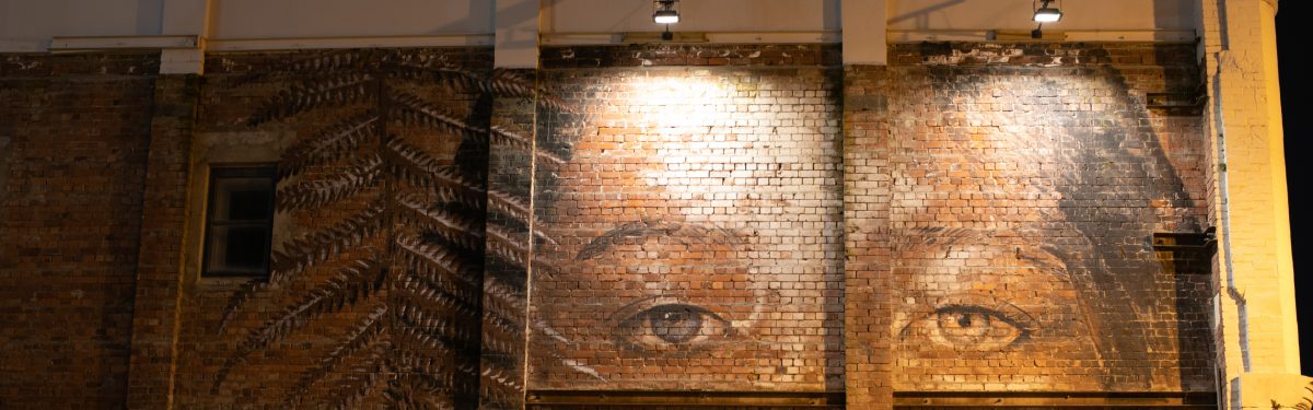
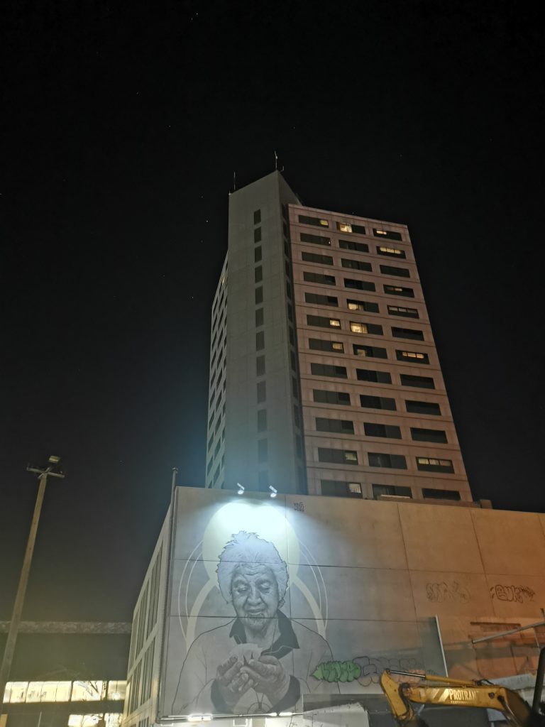
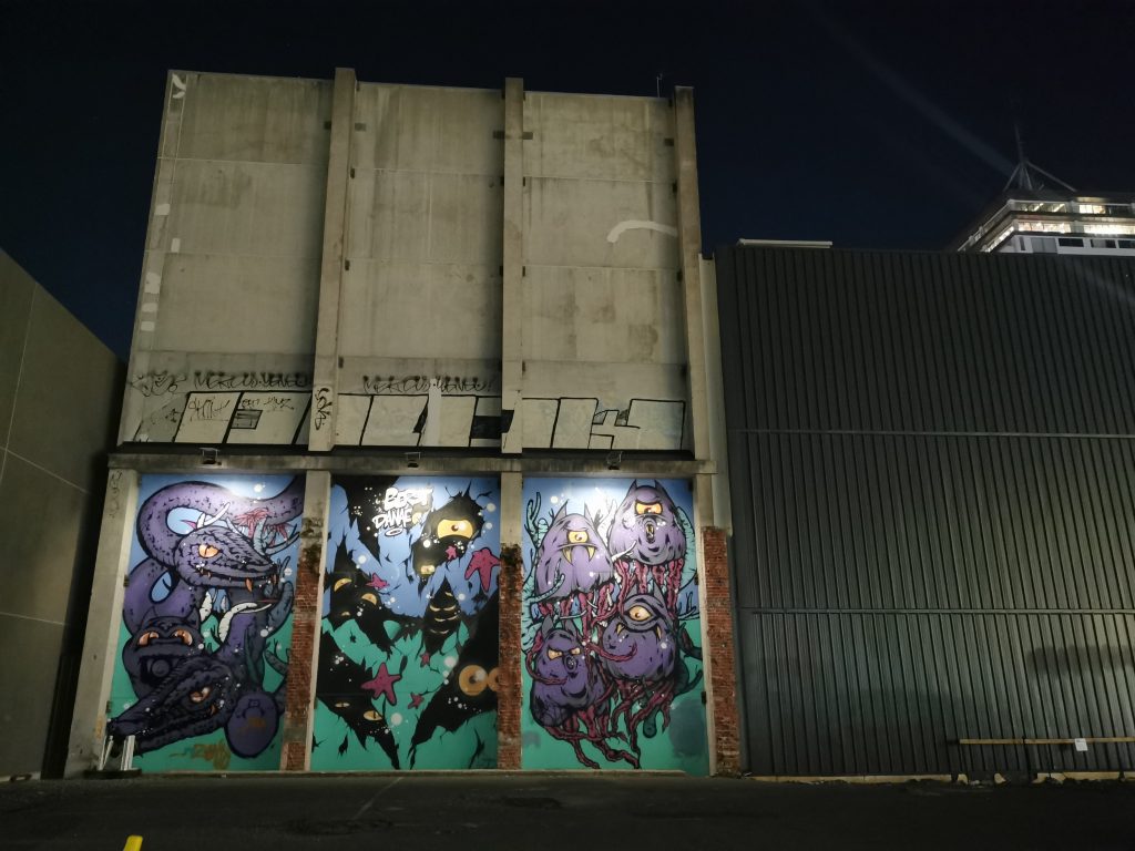
It seems like an age ago that we were introduced to Brendan Stafford and Greg Dirkzwager from local sustainable tech company Gen Green. The guys from Gen Green had the idea of lighting up some of Christchurch’s beloved street art murals using sustainable solar lighting, not only exposing the art in a (literal) new light, but also activating spaces in the city that often feel dead after dark. When they asked Watch This Space to help them realise the project, we were excited to join forces…
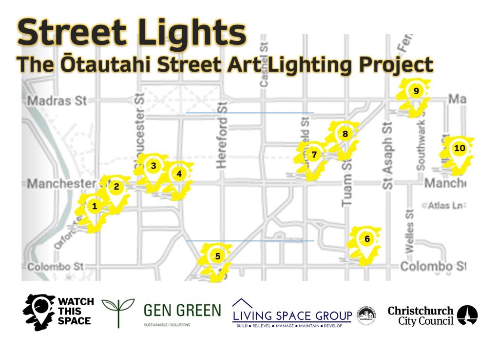
While such a plan seems straightforward enough, the reality is more challenging (even more so when you throw in a global pandemic). The first step was to select the works, looking at those pieces that would be practical and impactful, a difficult task in a city with so much urban art to choose from! We narrowed down the list to ten murals, although as time passed that list changed. The works formed a sort of trail to wander, spanning a section of the central city.
The next phase was to consider how to light the works, both from a design standpoint and more practically in terms of installation. Our imperative was always to ensure the works were not altered, the lighting instead simply highlighting or echoing the existing visual effects of the works. While the lights and charging panels are relatively small, finding solutions to avoid detracting from the works and to ensure safe and secure application was an important task. This was were Guy Archibald and George Clifford and the team at Living Space Group, a local contracting company, joined the project, contributing their skills to ensure all the requirements around installation were met.
With the lights installed, ten works of street art are now illuminated, creating an urban loop to explore the city, and just in time for the summer sun to play its part! And even if we do say so ourselves, they are looking pretty amazing!
Locate the lit up murals on the map below, and for more about each work, click onto our online map:
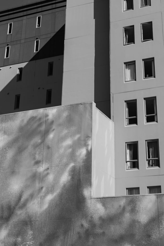
As the city continues to shift, refresh and transform, the little things matter more and more. The vacant and damaged spaces that encouraged more bold and brazen interventions are now less prominent (some of our favourite spots around the city face imminent revitalisation). The necessary contrasts of our urban surroundings are increasingly supplied by the small, unexpected things, clashing with the washed concrete structures and shiny facades that continue to stretch and grow. (Do I sound like a broken record?) Those little details that make a city lived in and alive can raise so many ideas, from the explicit to the subtle, the pointed to the more amorphous and undefined. Yet in each case, their mere presence serves to explore what it means to be part of and have a voice within a larger conglomeration. They provide a sense of the human and authentic (with just a touch of dissent, of course) and signs of contrast and contestation amidst the monolithic towers of progress (both literal and metaphoric), .
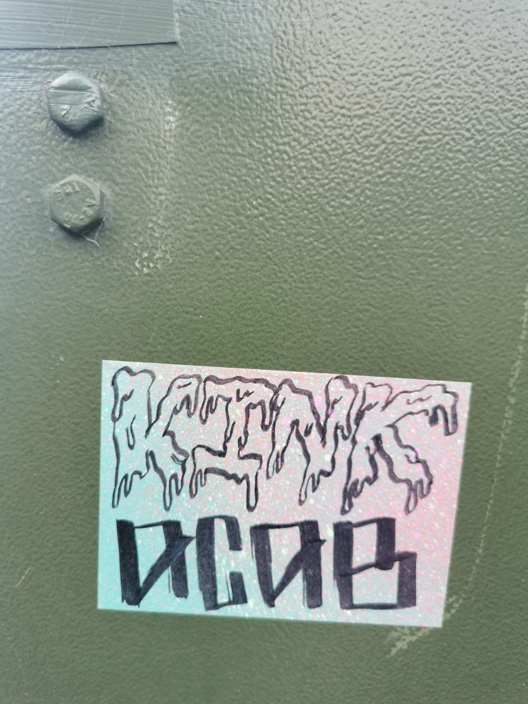
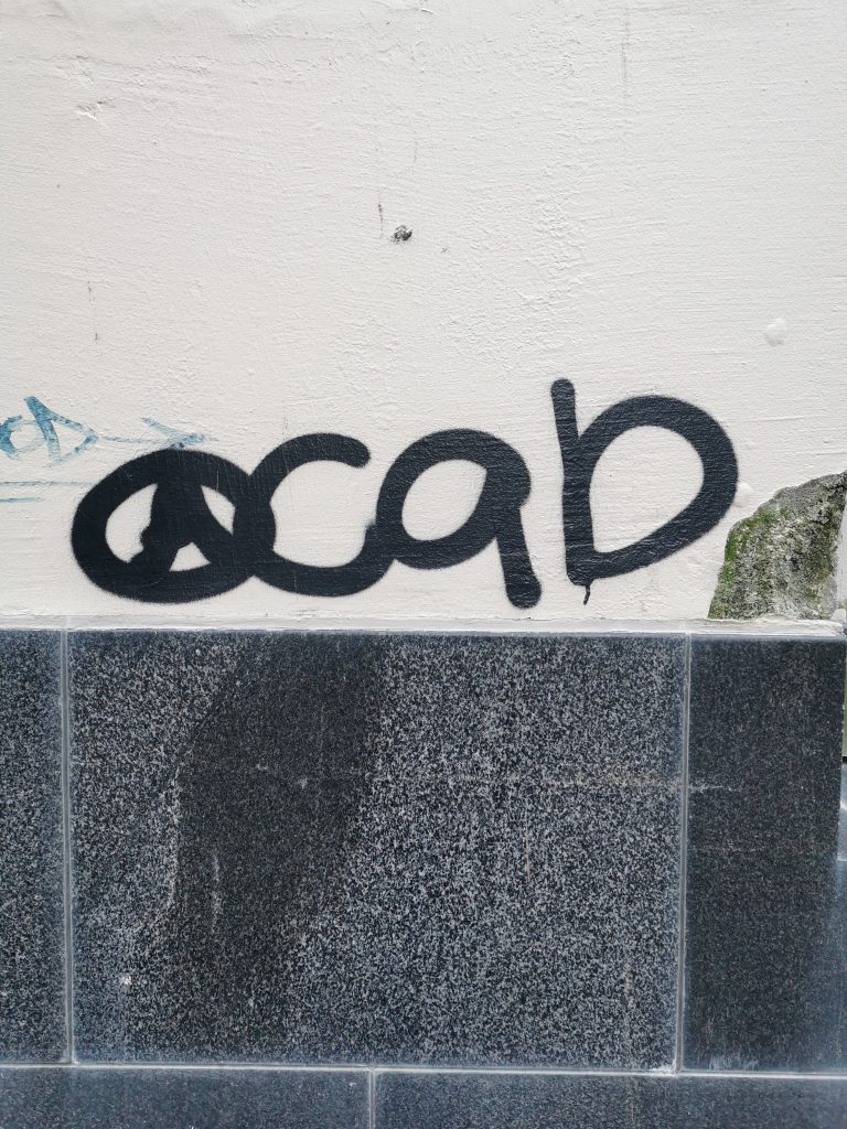
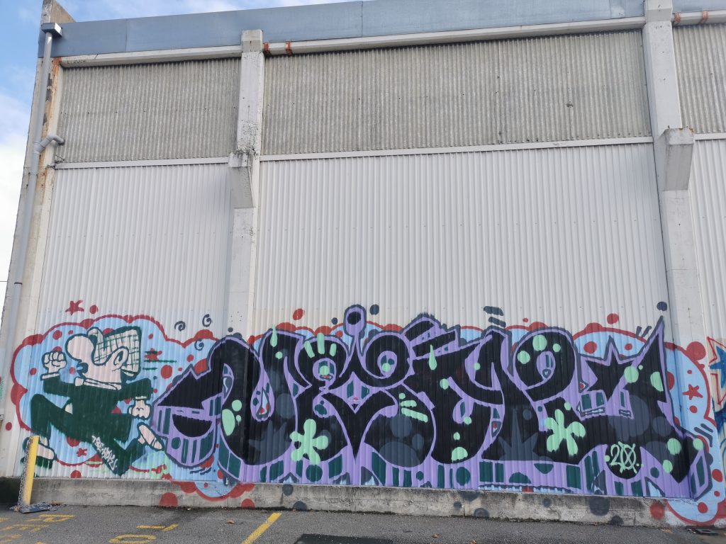
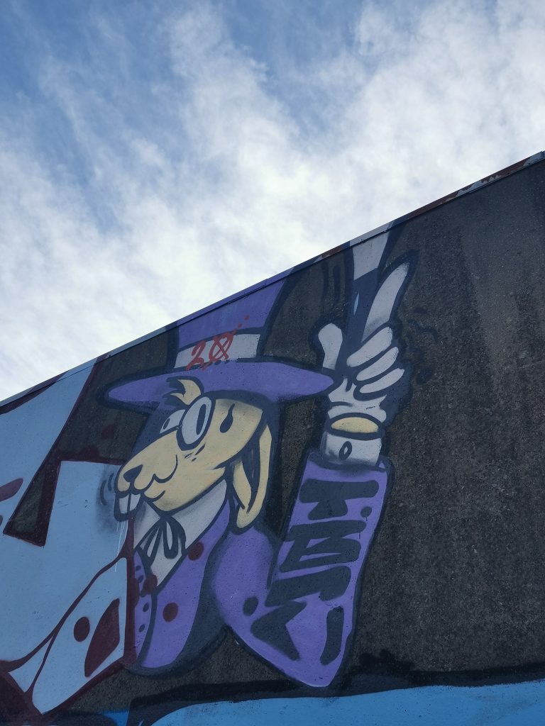
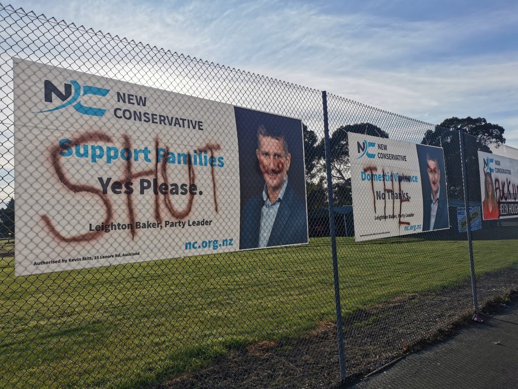
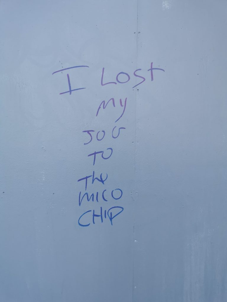
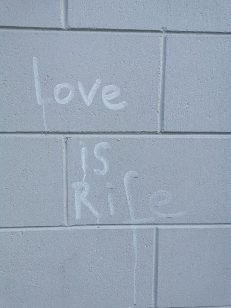
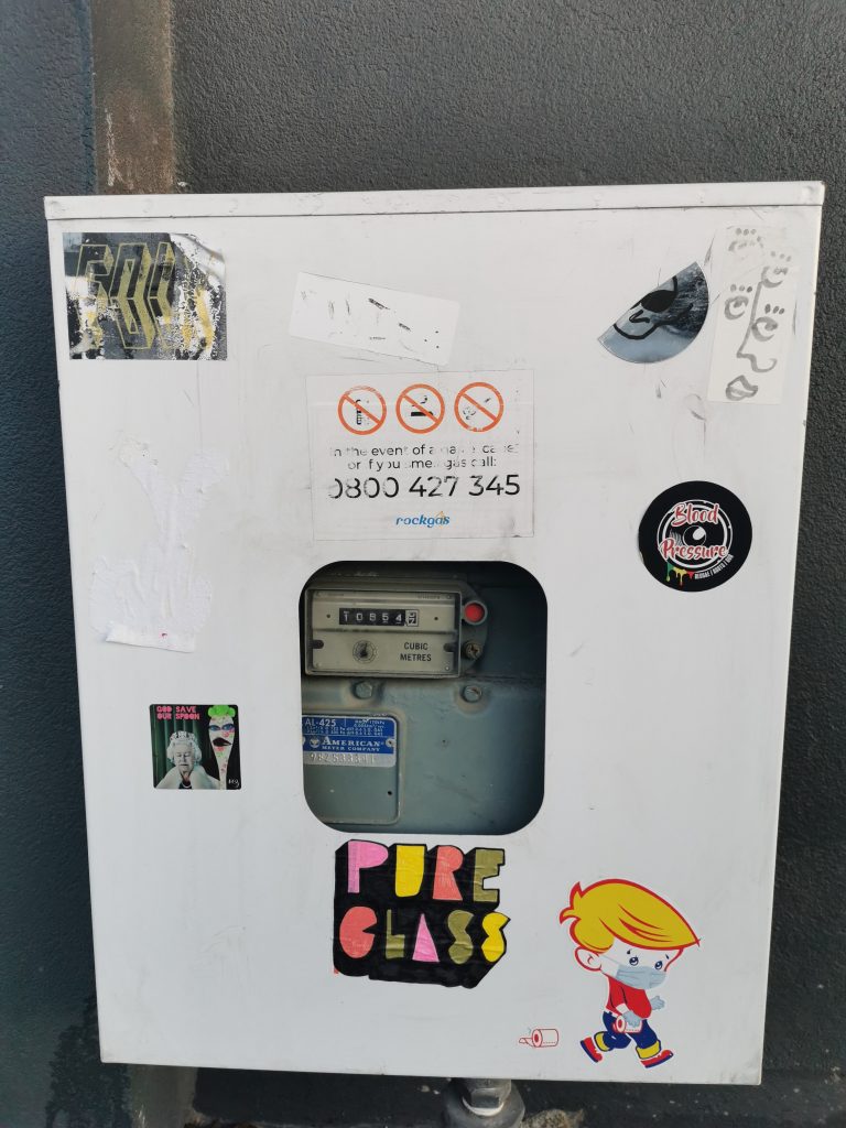
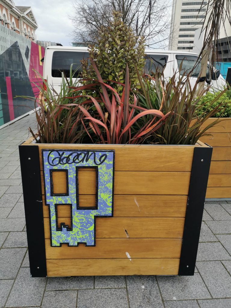
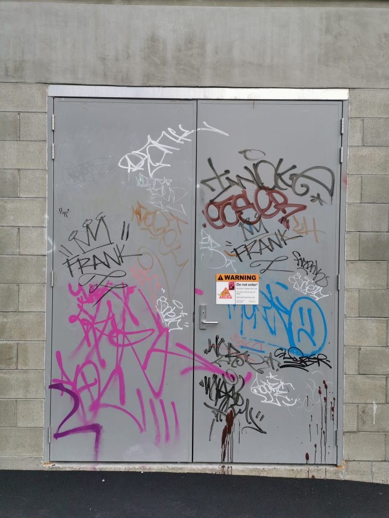
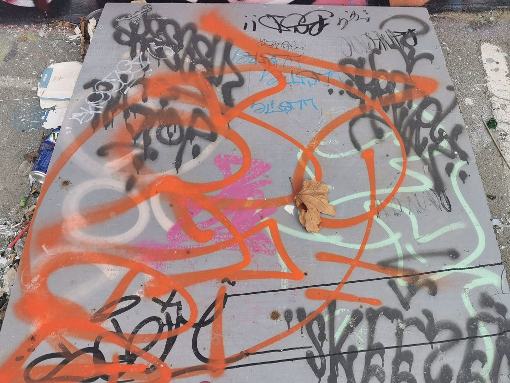
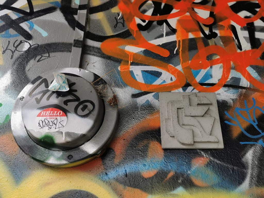
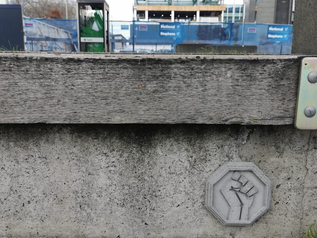
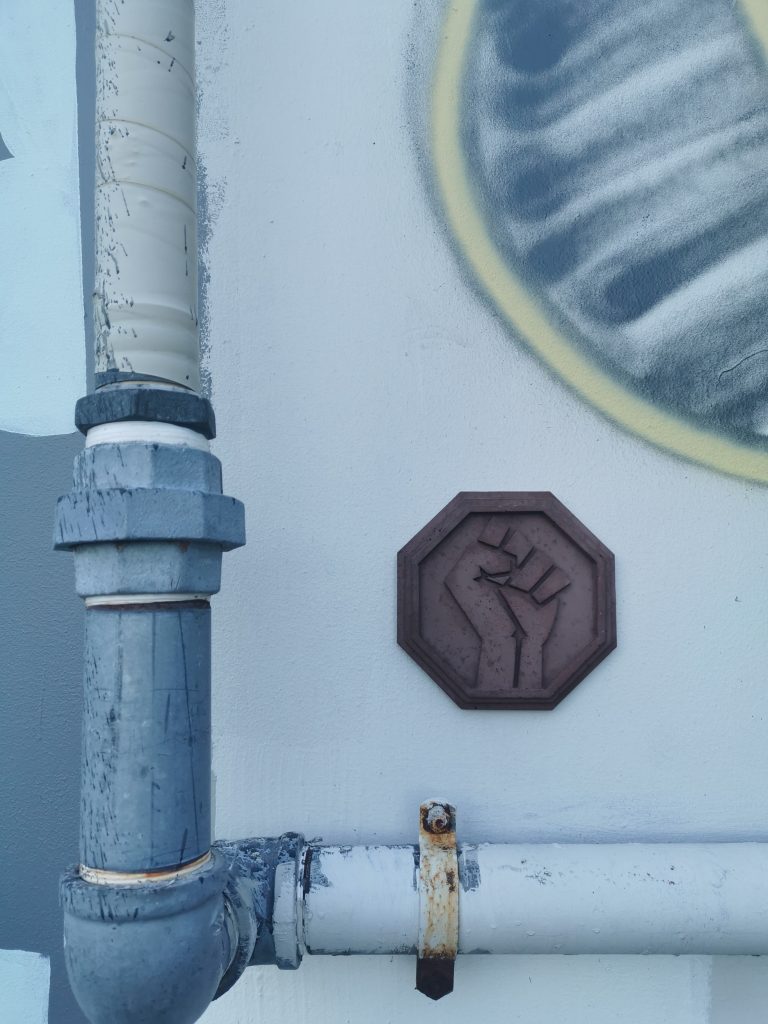
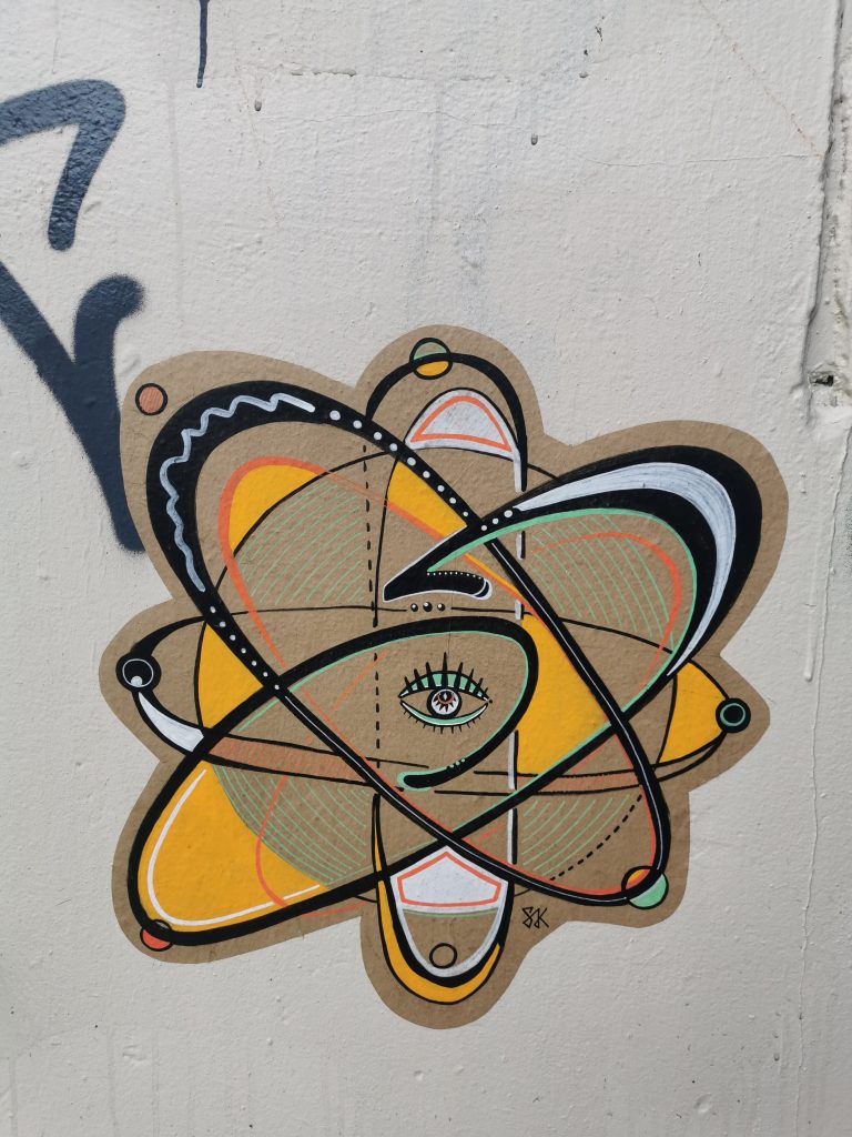
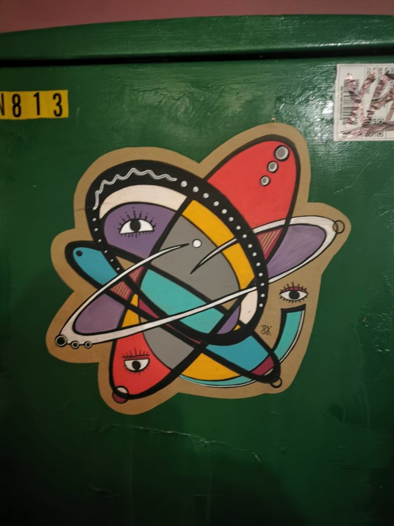
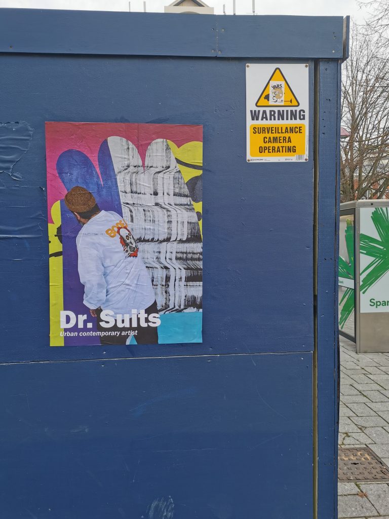
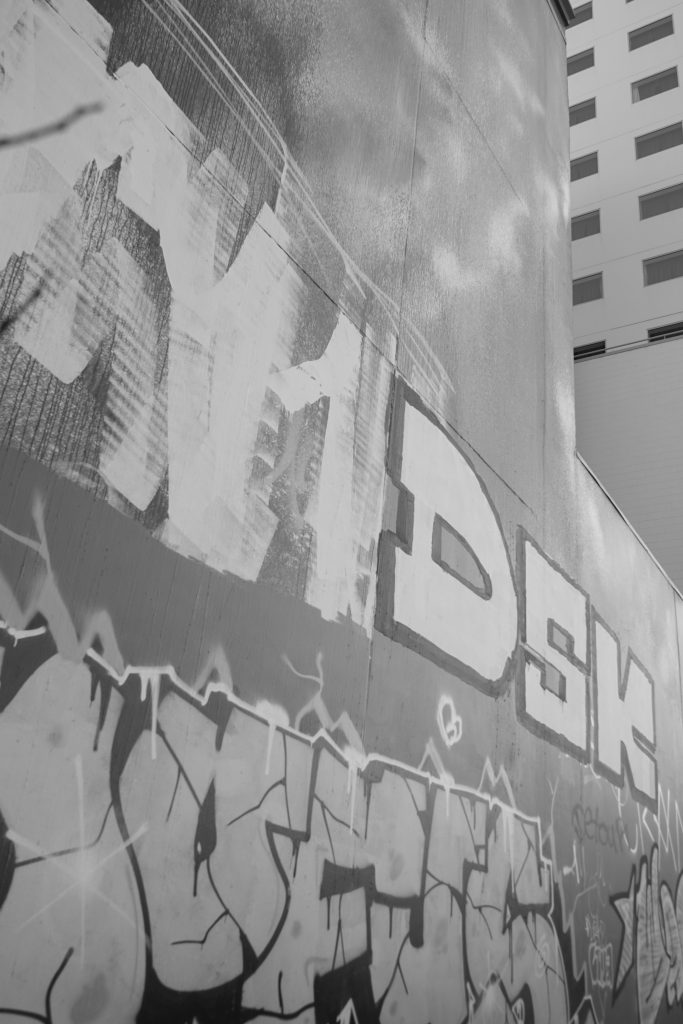
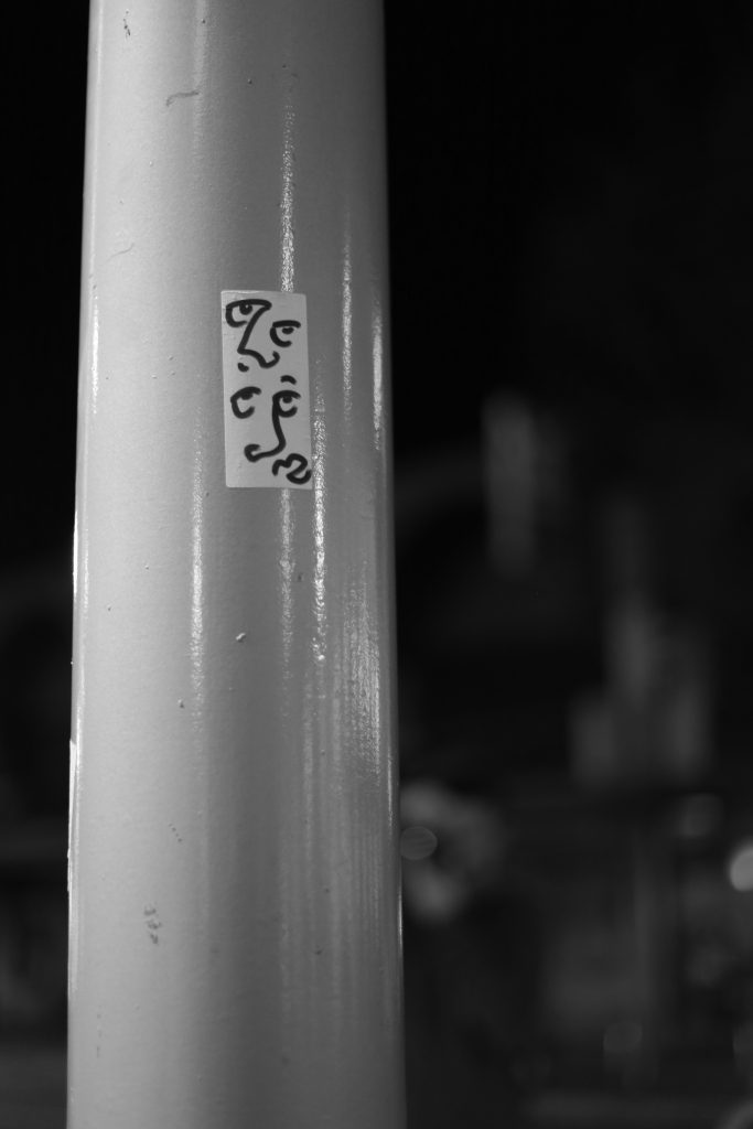
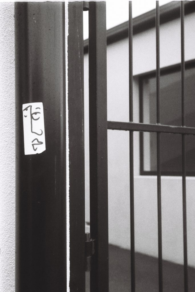
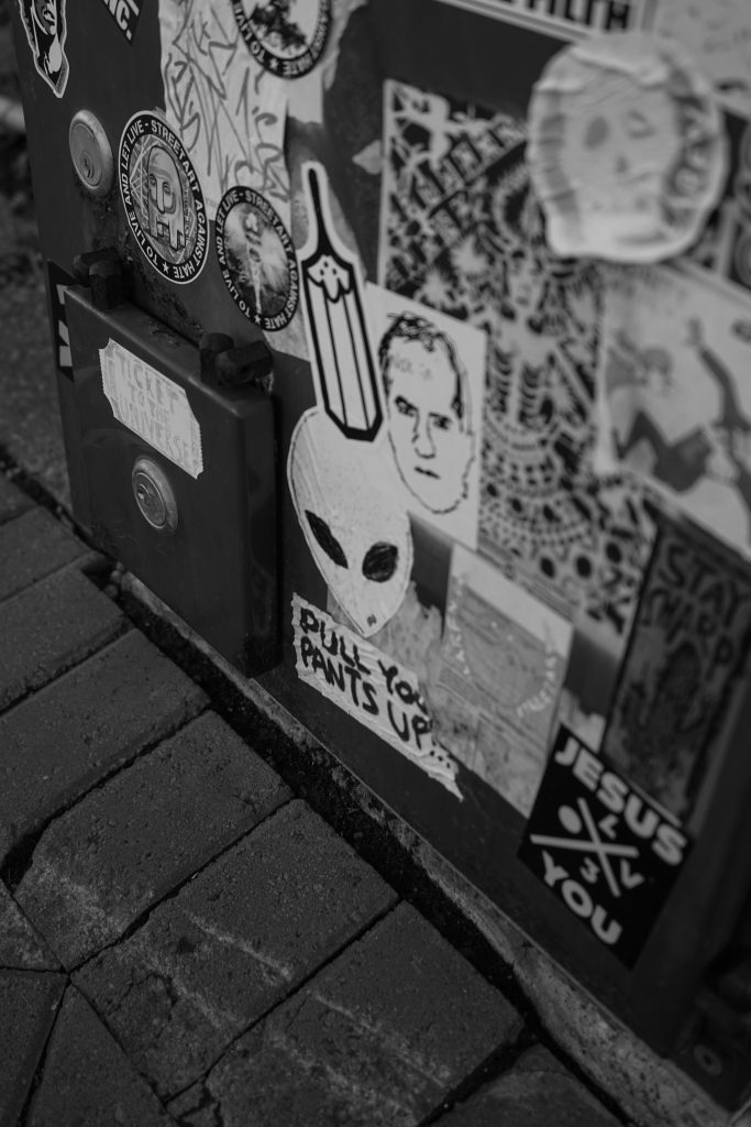
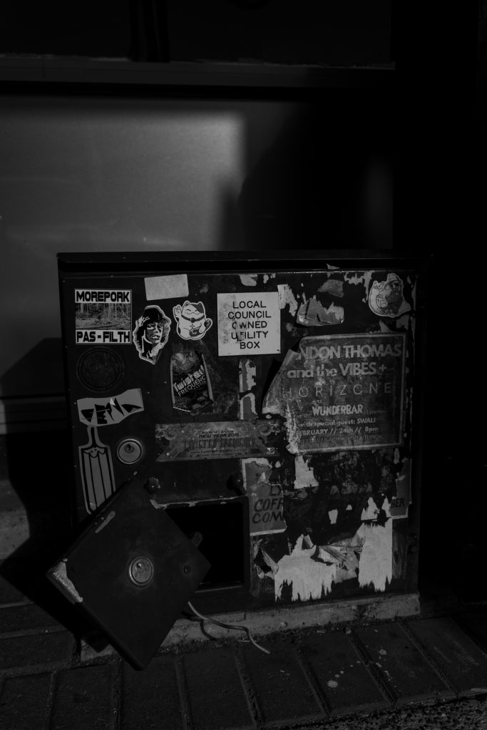
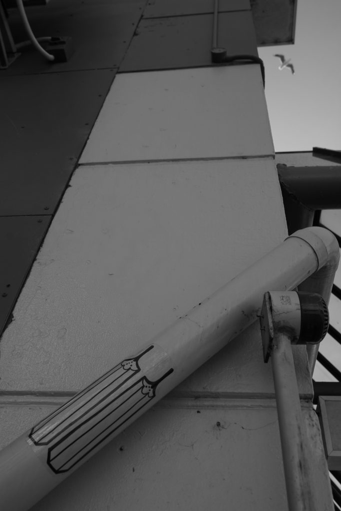
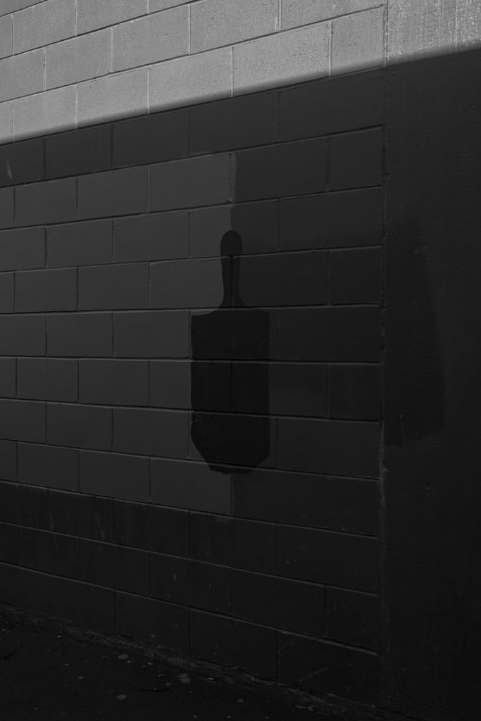
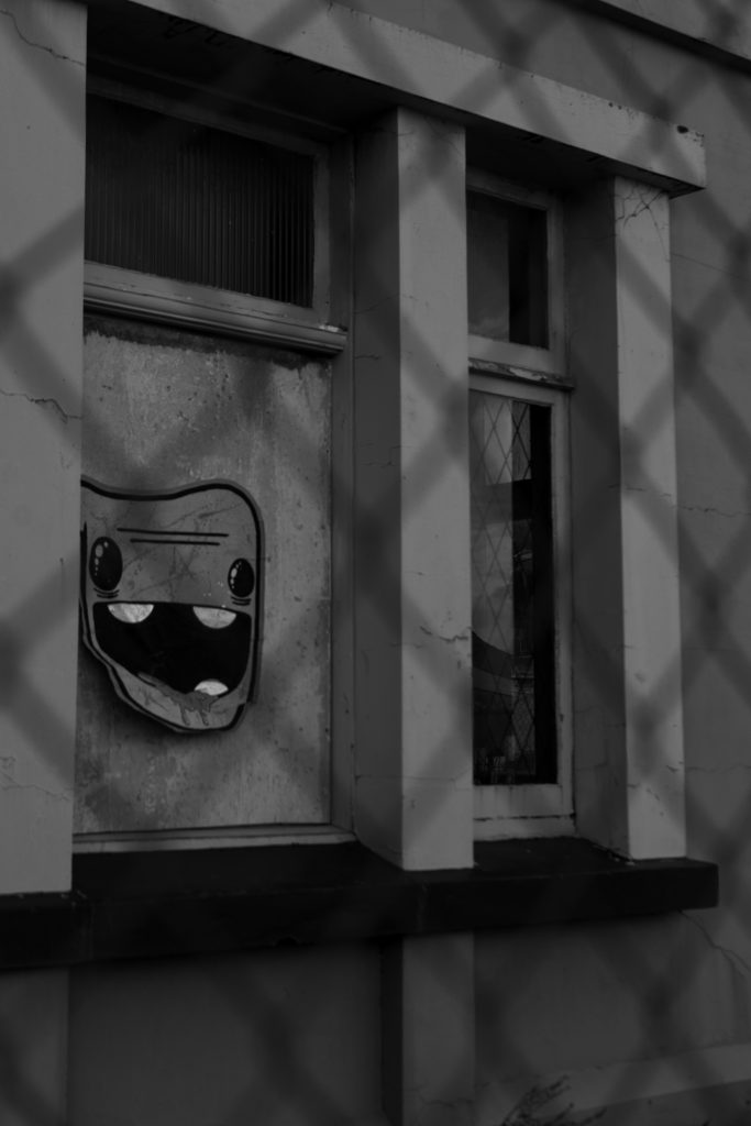
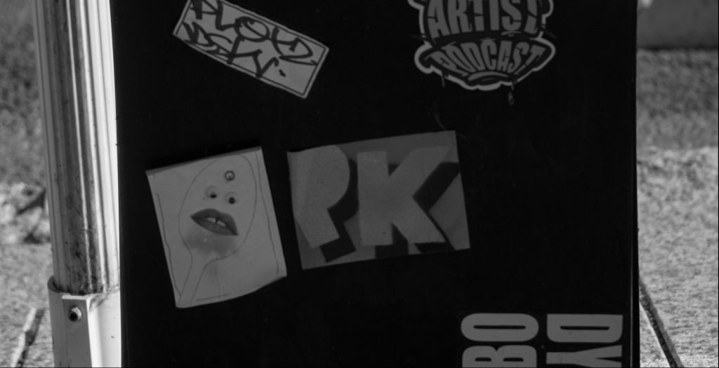
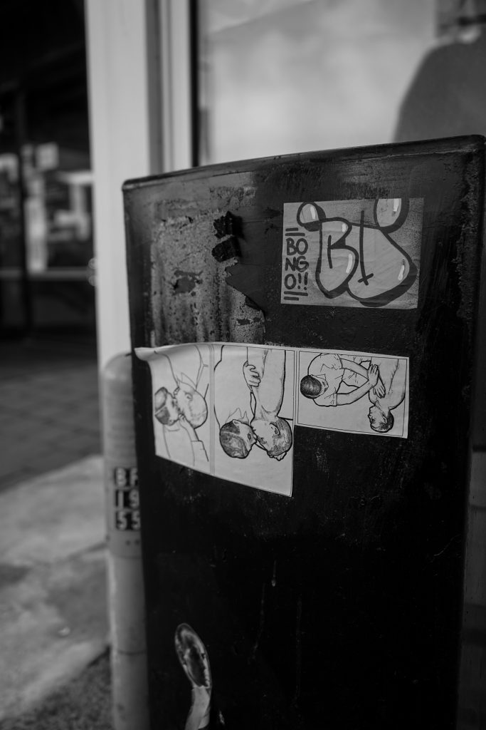
This second volume of Street Treats features a host of artists and threaded themes, from the traditional, yet entirely timely ACAB/1312 element, to graffiti’s unerring ability to speak of ugliness and beauty concurrently, or in the case of Teeth Like Screwdrivers’ ‘buff bluff’, the inherent potential in the blocks of grey paint that cover graffiti. Levi Hawken’s concrete sculptures have echoed the physical make up of the cityscape while speaking of his graffiti and skateboarding roots, and notably the Black Lives Matter movement. Vesil’s graffiti continues to be a highlight, diverse and well-placed, with an assortment of accompanying characters and accoutrements raising the spectre of playful nostalgia. Anonymous scribes contest election billboards and the future of human utility (I think…), or more hopefully, remind us that ‘love is rife’. Stickers and paste-ups continue to have a rising presence in the city, with acerbic, humorous and intriguing additions to urban walls and fixtures. In the case of FOLT’s skull cut-outs, it is as much the absence as the presence that is striking as these popular sculptural pieces are removed. Cosmik Debris’ paste-ups suggest the molecular science behind all things and the scale of being, while Dr Suits blurs the line between art and advertising, without anything to sell. This collection revels in the details of the city, details that many overlook. Yet, when you start to look closely, there are always surprises, always discussions, and always alternatives…
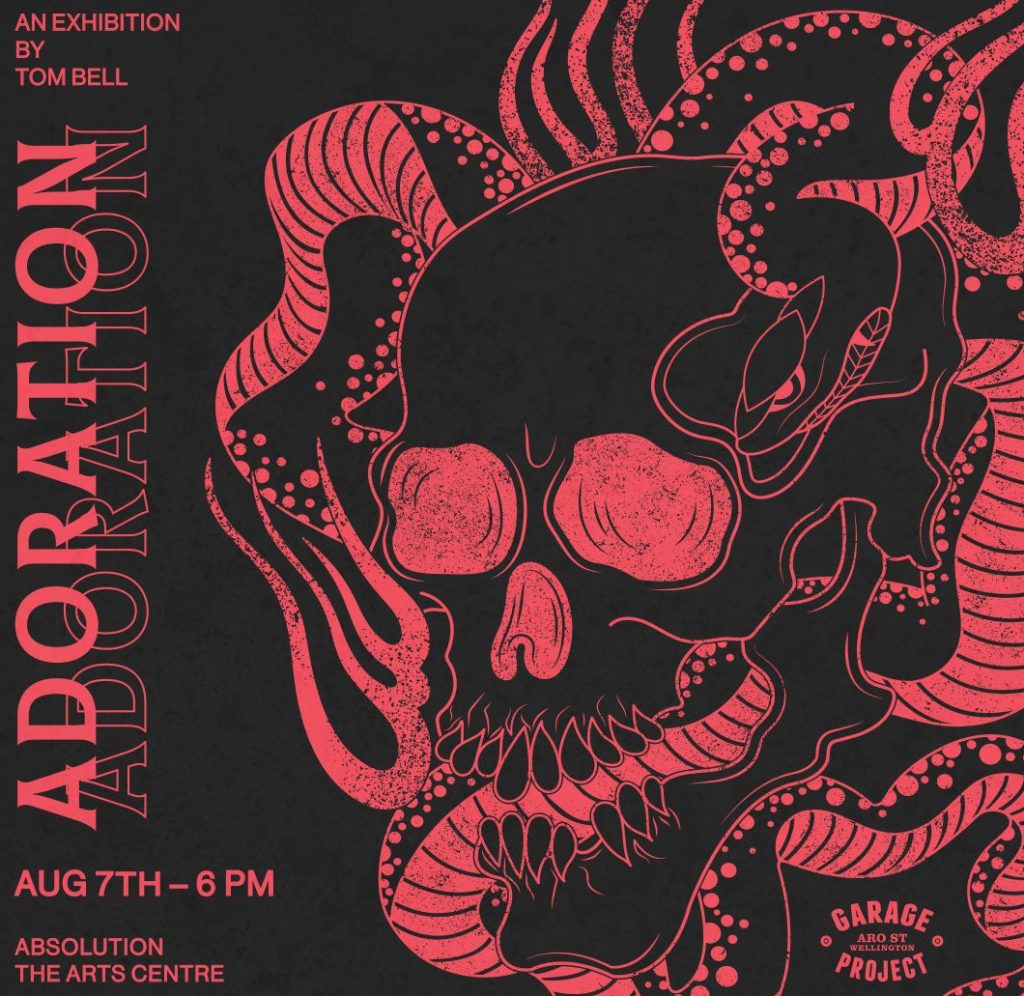
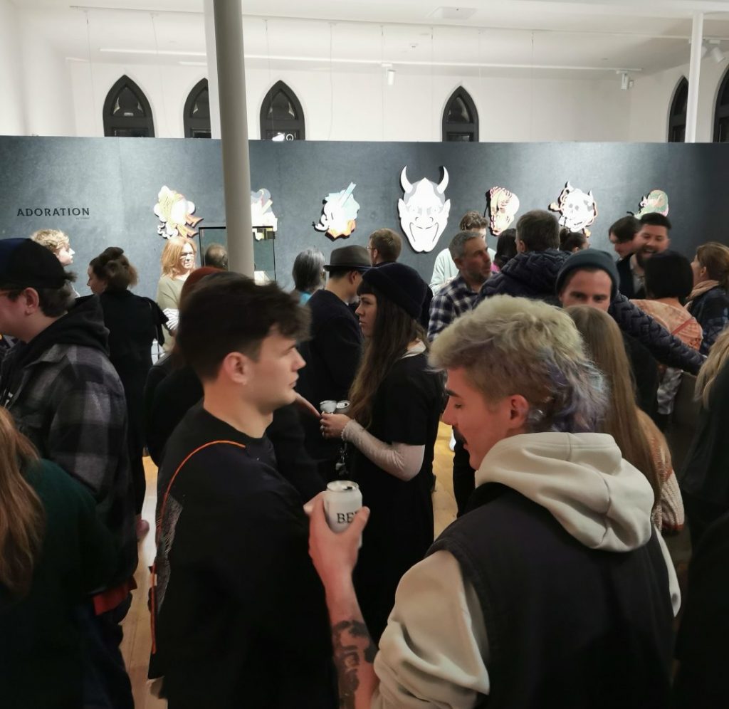
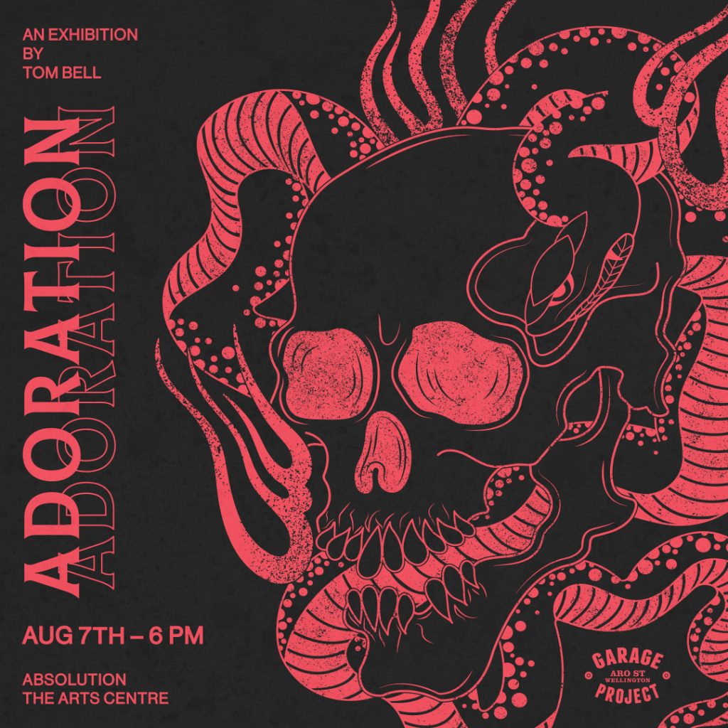
With the return of Level Two, August has been a bit of a roller-coaster, with the highs of communal gatherings matched by the returning weariness of congregations and the tiresome political bickering and conspiracy theory wackiness dominating much discourse. But that is where art is so effective, it can be both a glorious shared activity and a private independent adventure, a distraction from what is going on and a reflection of those same issues. The month started with a sense of excitement as I met with artist Tom Bell to discuss his upcoming show Adoration, which provided a great opening night. As time passed, more things turned my head. It was clear people were busy, from guerrilla interventionists, to mural artists, and it felt like the city was alive with activity. This energy has been somewhat tempered by the potential of a shut down (at the time of writing this at least), but it gives me pause to believe that even when difficult times emerge, art can always find a way to help out…
Tom Bell – Adoration @ Absolution
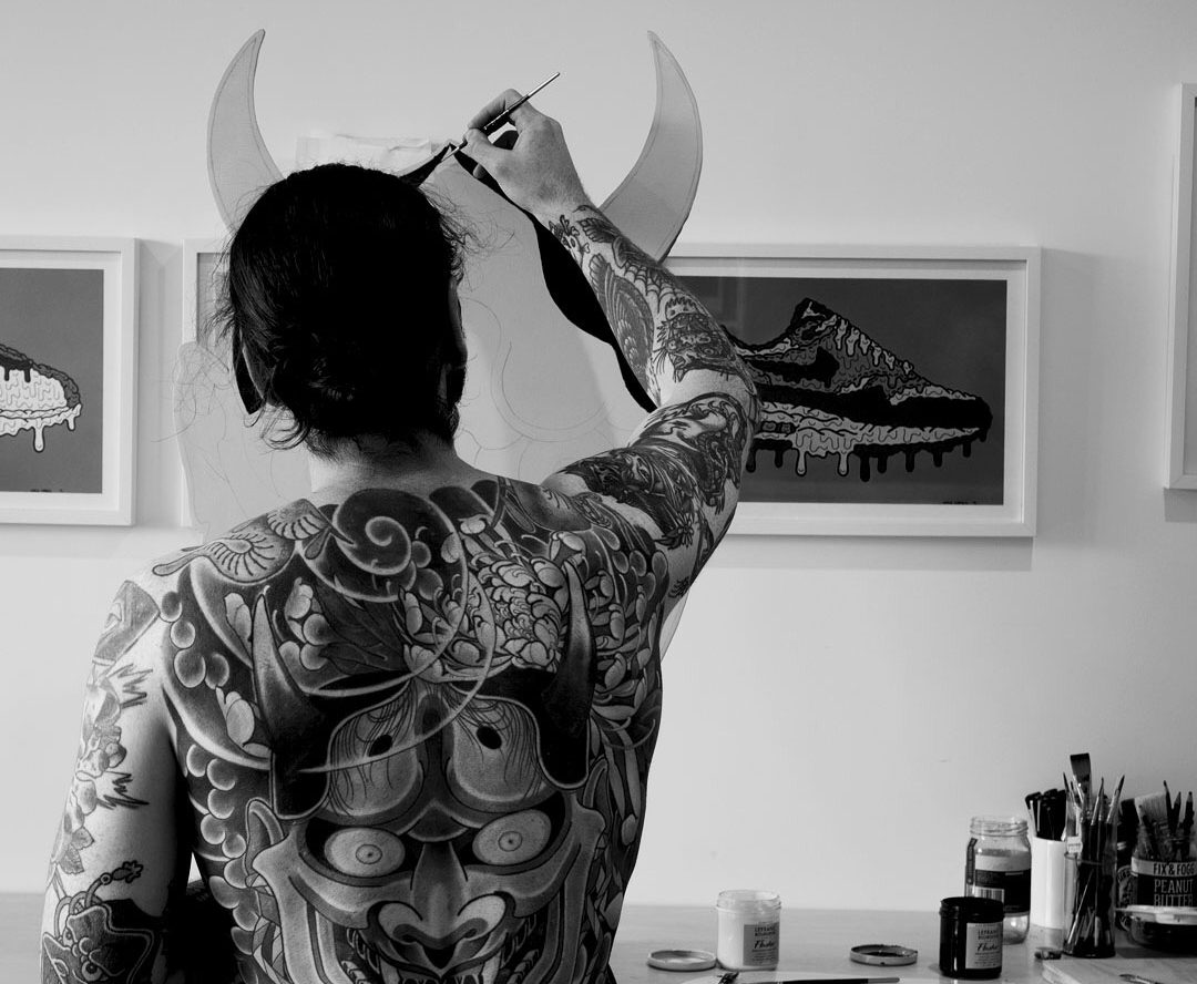
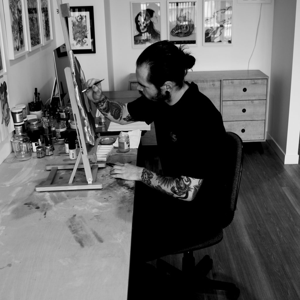
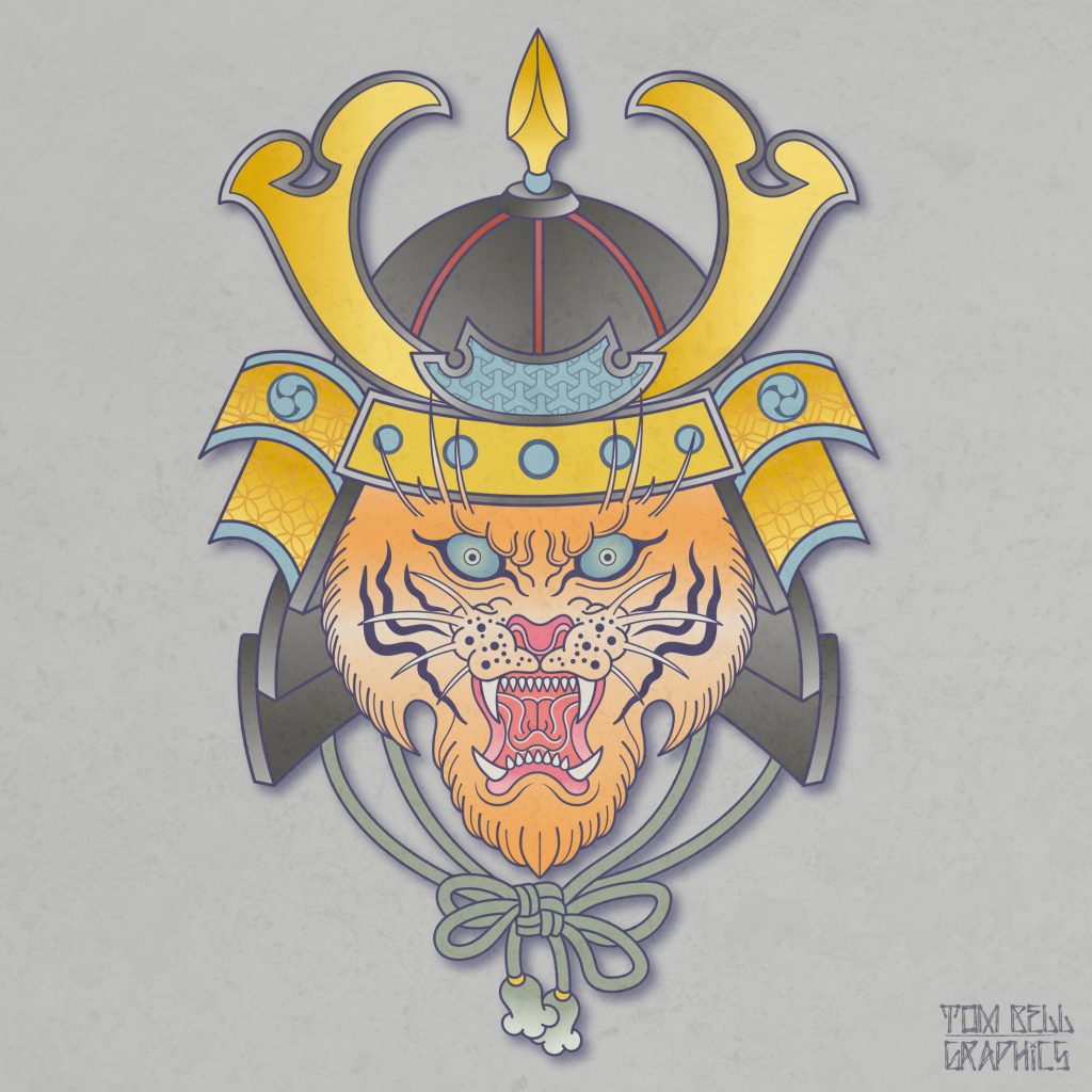
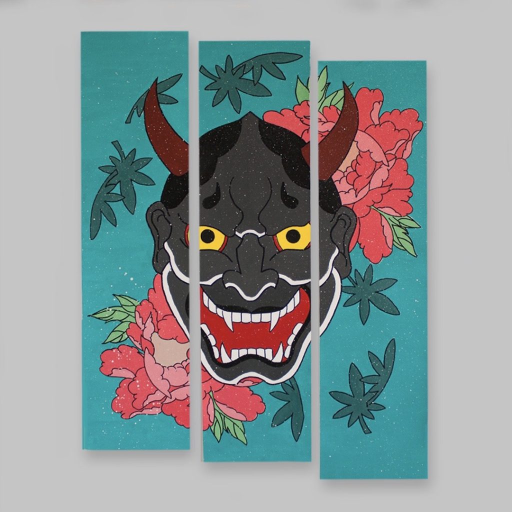
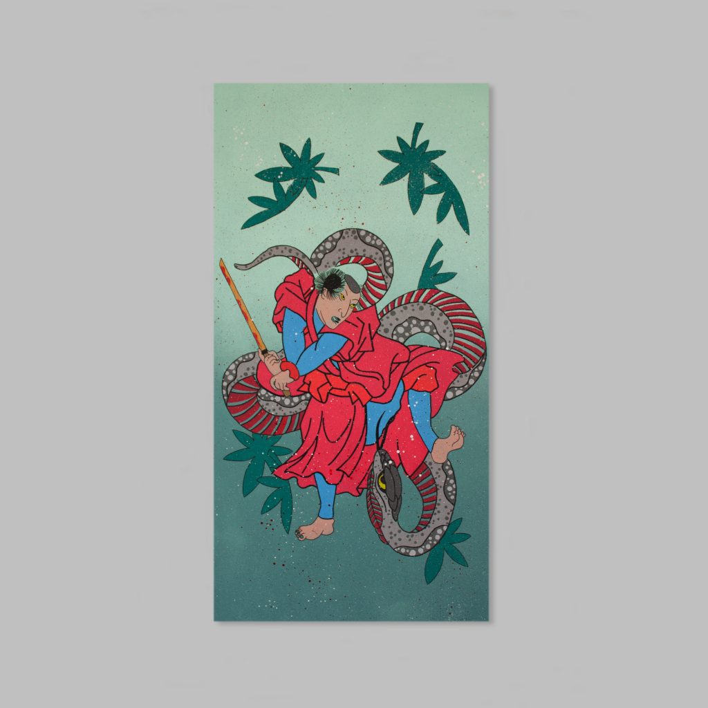
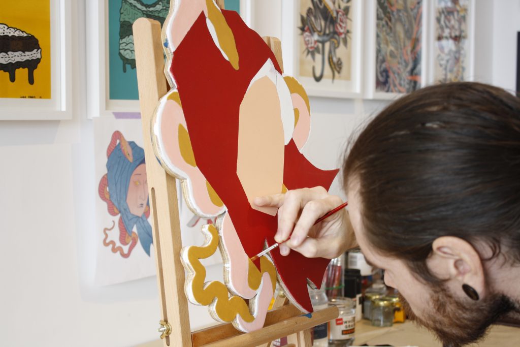
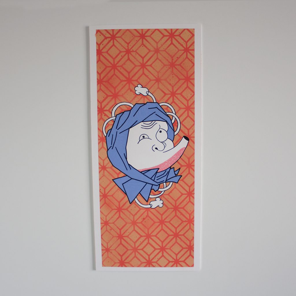
The month kicked off with a farewell as Tom Bell presented Adoration at Absolution in the Arts Centre. Tom has been based in Ōtautahi for several years, working as a graphic designer, while diving back into painting more recently as a creative outlet. His art has long been entrenched in Japanese imagery, and Adoration played homage to that ‘adored’ visual style. Intricately cut and painted plywood, with subtle layering and flashes of detail made for a striking collection. The turn out was also impressive, with Absolution jam-packed, a well-deserved result for the artist’s long path towards Adoration.
Levi Hawken’s urban installations
Auckland-based artist Levi Hawken’s concrete sculptures were introduced to the city at the Fiksate show Urban Abstract last year. Placed within the gallery setting, they were immediately recognisable as versatile aesthetic objects. But Hawken’s works are undeniably influenced by the urban environment and they gain so much from their placement within the cityscape. It was therefore an awesome surprise to see a number of his small works mysteriously applied to walls and fixtures around the city, subtly subverting expectations.
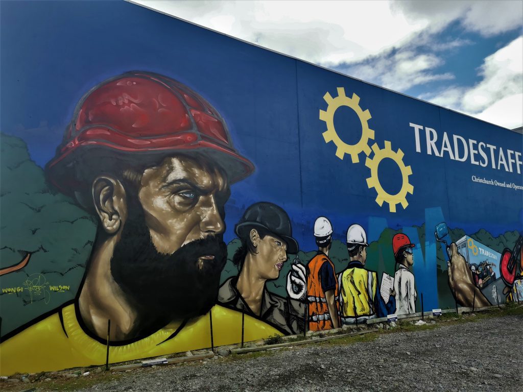
Wongi ‘Freak’ Wilson’s TradeStaff mural update
We all know Wongi Wilson’s aerosol technique is mightily impressive, and that rings even more true as time passes and he refines his approach. That reality is instantly recognisable with his recent refresh of his own TradeStaff mural on the corner of Colombo Street and St Asaph Street. The original mural, painted around 2013, had become a familiar site in the CBD, but the new work, still in progress when I first saw it, is incredibly striking, almost invoking the proletariat intensity of propaganda posters…
Catching up with old friends…
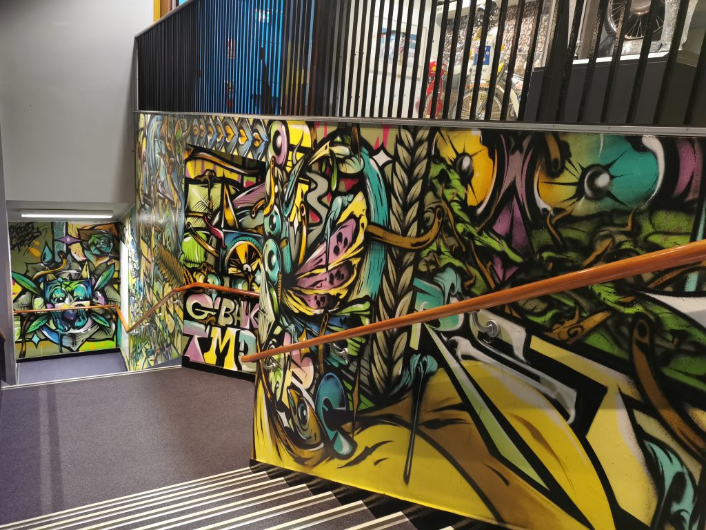
Over the month of August, we have been putting together a project that we can’t wait to share… but for now, it is enough to say it has been a heap of fun catching up with a bunch of our favourite artists and revisiting some of their most memorable works (including some more recent additions), such as Berst and his God of the Forest in Sydenham and staircase mural inside the Canterbury Museum (pictured).
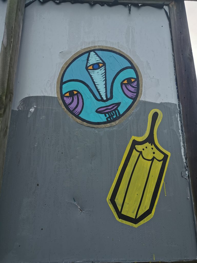
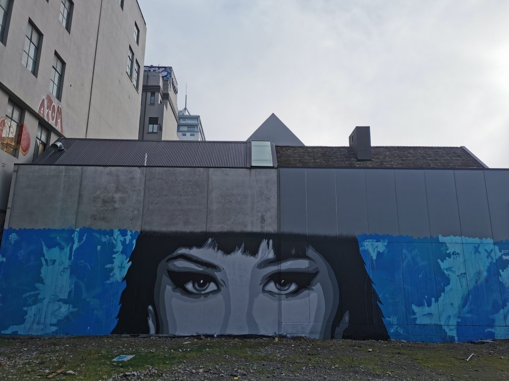
Distranged Design on Manchester Street
Distranged Design’s newest outdoor work on Manchester Street is an impactful surprise, anonymous eyes peering out from an expressionistic blue background splashed across a distressed wall. Staring at passing traffic from behind hurricane fencing it is an alluring sight and forms part of a larger collection of interventions in the vacant lot…
What were your highlights from August 2020? Let us know in the comments below…
For the latest entry in our photo essay series, we reached out to Befaaany, a Christchurch photographer whose work showcases the urban and concrete landscapes of the city. After being impressed with her striking pictures on Instagram, we knew she would be a perfect fit. Befaaany’s response was a beautiful collection of black and white images that run the gamut of urban expression, small stickers, bold graffiti, abstract paintings produced in perilous environments and the ephemera of a eradicated presence. In compiling these photographs, Befaaany is able to highlight the issue of street art’s gentrification and mainstream popularity, a process that has in many ways clouded our recognition of street art’s subversive and disruptive potential…
Local street artists are constantly finding new ways to create art in a city filled with council-funded installations from international artists. These have included challenging gentrification of graffiti directly, blurring the lines of ‘legitimate’ and ‘illegitimate’ street art, disguising their art into the city, and leaning into the temporary nature of their art form. – Befaaany
Follow Befaaany on Instagram to see more of her amazing work…
This month we asked designer and DJ Beccie B (Becca Barclay), the force behind Imposter posters, to let us know what she got up to in July. Knowing Becca, the cold clime was never going to be a hindrance, especially not with the array of activities gracing the post-lock down calendar. If anyone knows what’s up, its Beccie B, so here is her And That Was… July 2020:
We’re in August… WHAT?!
July was kind to us all! For a wintry month usually filled with rain, bed and Netflix, the post-lock down positivity and happening of events was all around us. It was so awesome to see so many people making the most of artistic opportunities and things happening around the city. What have been my highlights? Heaps! Let me tell you some more… July started with two huge events that meant so much to me…
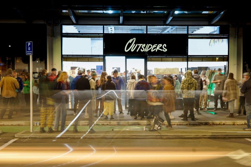
Haz Called a Tribe at Outsiders
The first was Haz Called a Tribe, the group exhibition organised by Harry King (aka A Tribe Called Haz, aka my best pal). Held at Outsiders skate shop, the show featured 15 young Christchurch-based urban artists.
Like any A Tribe Called Haz exhibition the energy was electric with a massive amount of people (of all ages) showing up to support and respect the art from our local community. I was so honoured to be involved, to help curate and to have my artwork included among this line-up of artists. Some of my personal favourites were from local legends R.Weaver, Meep, PK and Bren. Bren’s piece, affectionately named Mark, featured a dog and had me in awe as it was so different from his usual output. PK, R.Weaver and Kophie (Meep) all delivered too, with pieces in their more classic styles.
Opening night of Haz Called a Tribe at Outsiders. (Photo credit: Troy Tapara)
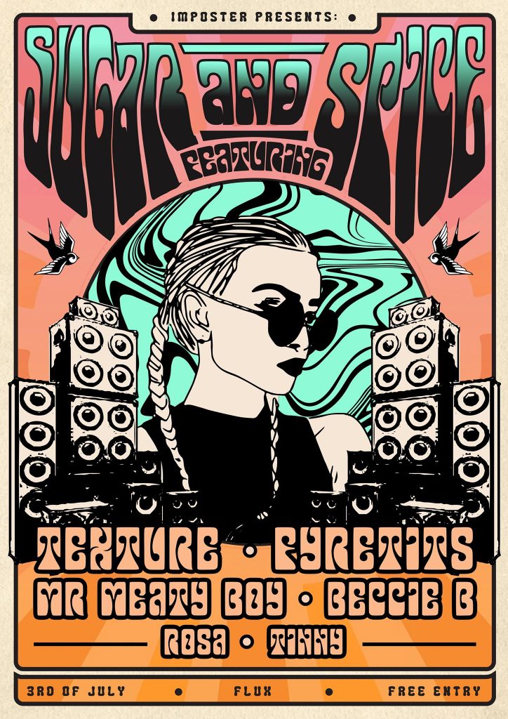
Sugar & Spice at Flux
All good exhibitions have an after-party, right? Some of you may know that for the last couple of years, under the alias Imposter, I have been creating marketing and posters for many different promoters in the Christchurch electronic music scene. A long-term goal of mine has been to hold a gig and here it was, my first-ever! Sugar and Spice was compiled of a full female line-up of local wahine DJs from all different genres. Myself, Rosa and Tinny played alongside headliners, Texture, Fyretits (Dream.r & MC Jenna Lynn) and Mr. Meaty Boy.
This event showed Flux its biggest night yet and the energy was unreal! Watch this space for Sugar & Spice Summer…
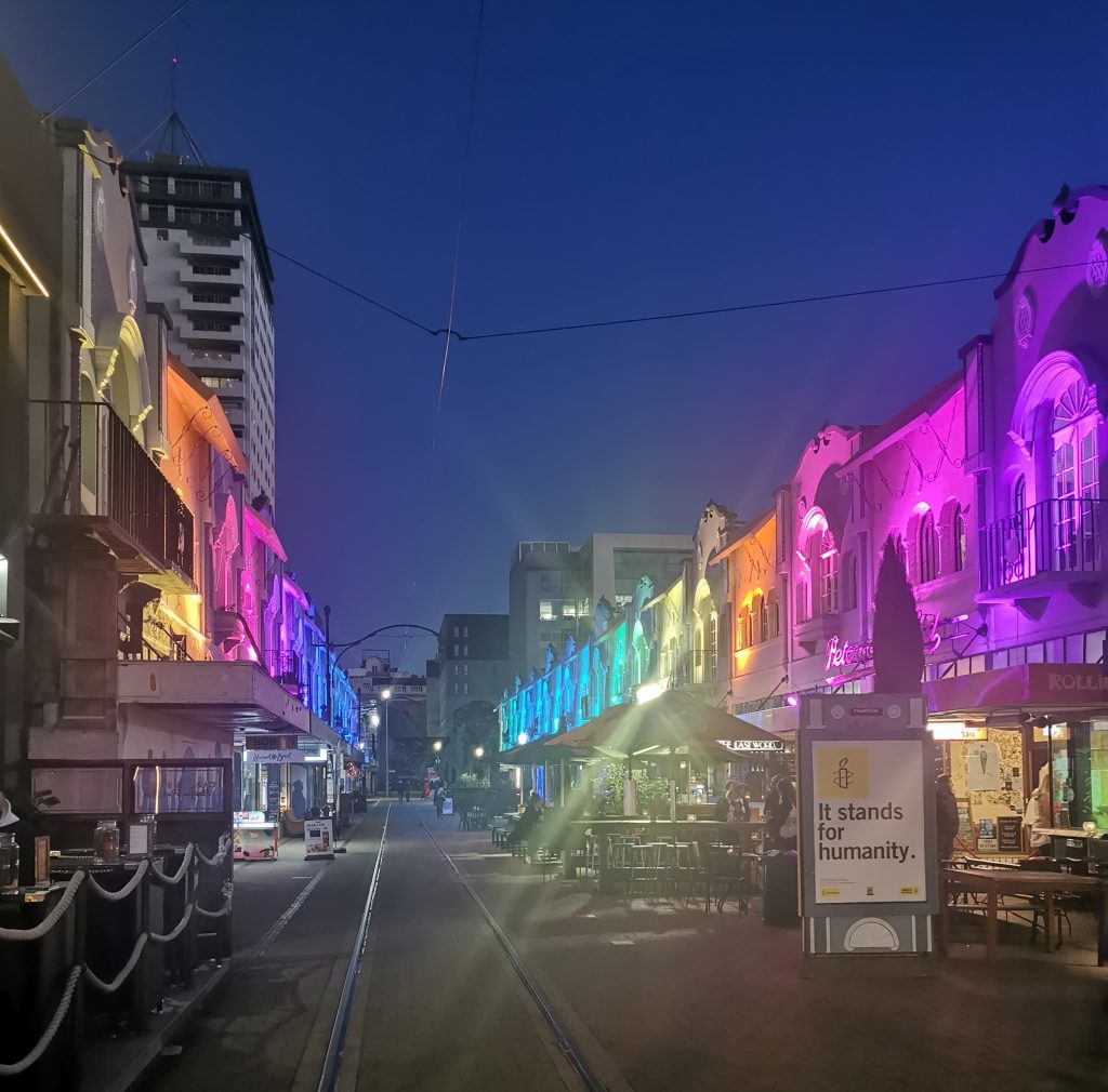
CHCH is LIT Festival
A local event that is always highlighted in my calendar is the Botanic D’lights (Yes, it is a part of Kidsfest. Yes, I am a child at heart). But due to this year’s COVID interruption, Botanic was postponed and CHCH is LIT made for a very honorable replacement. A total of 20 lighting installations were scattered throughout the CBD and New Brighton, including Tim Budgen’s Reflections, which was my highlight. A galactic-inspired piece along Oxford Terrace reflecting into the Avon River, it made for a real ‘wow’ moment.
New Regent Street looking all flash as part of CHCH is LIT.
Art Social: Art for Equality at XCHC
My dear friend Shannon Kelly hosted yet another incredible Art Social at XCHC. In light of the Black Lives Matter movement, this Art Social was a little different and hosted a group exhibition made up of 12 local artists with 50-100% of profits going toward artist’s chosen racial equality causes.
With each artist taking inspiration from black culture, this exhibition was such a beautiful collection of inspired works. A personal favourite was the trio of miniature ‘Jen Heads’ by Jenna Lynn Ingram.
And with opening night featuring Roscela from the 03 Pineapple Club, and the usual art supplies scattered throughout the XCHC, it made for such a good night filled with incredible art, delicious cocktails, and a real sense of togetherness.
An atmospheric view of the Art Social: Art for Equality exhibition at XCHC. Photo from the XCHC Facebook page.
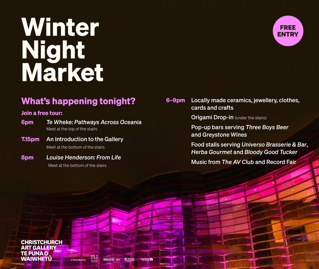
Winter Night Market at Te Puna o Waiwhetu
I must admit, I don’t go to the Christchurch Art Gallery as much as I should. And every time I do, I remember what an incredible asset it is to our artistic community.
The Winter Night Market was no exception! If you didn’t go, you truly missed out. Everyone was there. The place was packed, and the energy was incredible. The highlight for me was the exhibition Louise Henderson: From Life, which included her late career masterpiece, The Twelve Months (this exhibition is running through to October and if you find yourself bored in the CBD – please go!). That is not to mention the origami, the jewellery, the crate digging and all the familiar faces! What an evening!
Programme for the Winter Night Market. Image from The Christchurch Art Gallery Te Puna o Waiwhetu Facebook page.
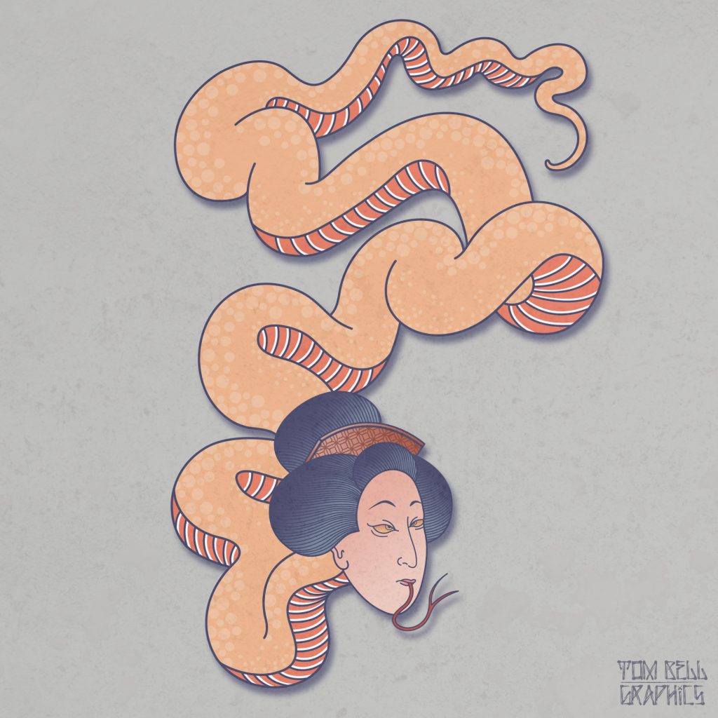
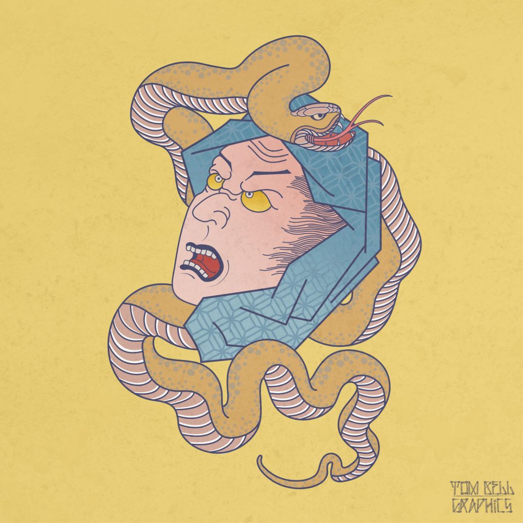
With everything that has happened in 2020 (so far), it seems like a long, long time ago that artist and designer Tom Bell told me he would be staging a solo show at Absolution this year. But while what seems like an age has passed, I have maintained a level of excitement about the exhibition Bell has come to call Adoration. The show features a body of work that combines both the artist’s established interest in the imagery and themes of Japanese art and culture, but with a new material approach, his digital rendering replaced by hand-painted cut-outs. The sense of reverence for the subject matter (the show’s title a reference to that debt) is empowered by the evidently pain-staking process of manual brush strokes. Bell’s works, whether paintings, stickers, digital prints, tiny enamel pins, t-shirt designs or illustrations, are alluring, their soft pastel colours and dynamic yet sparse compositions combining with the loaded symbolism of Japanese visual culture to feel both traditional and contemporary.
I met Tom a few years ago, he was with his ‘art fam’ as he calls them, at an exhibition opening at Fiksate. Since then his face has become a familiar one at places like Fiksate, Supreme and Smash Palace, always up for a yarn. But when we sat down to chat for this interview, I learned a lot more about him, from the Wellington-raised artist’s relationship with Christchurch, his interests in stencils and tattoos, and his journey to opening Adoration. Part of what made the discussion so engaging was Tom’s energy, he flew between thoughts, earnest and honest, clearly excited and invigorated by the upcoming show and what he had learned as an artist and a person over the last year.
I remember almost a year ago, or at least it feels like that long because of everything that has happened, you mentioned that this show is a farewell to Christchurch because you were planning to move back to Wellington…
Yeah, that’s still the plan [in August]. I’m originally from Wellington, but I have spent almost four years down here. It’s crazy because a lot of people have asked where I was hiding for those first two years! I moved down from Wellington for my graphic design job. At the time my now ex-girlfriend was from Christchurch, all her family were here, so I made the move. I really struggled making connections with people down here. Throughout my twenties I’ve struggled with social anxiety and that really put a big hindrance on me going out and going to shows and other social situations. For two and a half years the idea of going to an exhibition opening by myself, even if I knew people who would be there, would make me really anxious. I would think people are going to look at me and be like, who’s that dude? At the end of 2018 I decided I needed to face some of my weaknesses and get a control of my anxiety.
That social anxiety was a big obstacle for you obviously…
Yeah, the social anxiety was a big hindrance to me. I had people in Wellington say to me: ‘Dude, you should be getting out and trying to make connections in the art community, you’re a designer, you love your art, Christchurch has a really good scene, just start doing it…’ So, when all that happened, I just said, alright, I’m going to put myself out there. I reached out to Jessie [Rawcliffe] because we had started building a connection through Instagram, so I hit her up out of the blue and said you do a lot of collab work, would you be keen on doing one in the new year? She was like: ‘Hell yeah, that would be sick!’ We met up at Smash Palace and started talking about our creative interests. I remember her saying: ‘I paint skulls and girls, am I pigeon-holing myself?’ I said, nah, skulls and girls are ******* badass, and you can tell you really enjoy painting them. From there I was introduced to Josh [Bradshaw] and we’ve been hanging out ever since. I call them my ‘art fam’ and they have been great sounding boards for my creative journey over the last eighteen months. After attending a few exhibitions at the start of last year I started to meet everyone and it was great because it just happened organically.
I remember a conversation I had with Jessie and she asked me if I had painted before, and I said, yeah, but I was trash! She said I should get into painting and get away from the computer. So I did and I just got addicted to it, I was all in. From January to March I was painting every night after work, but I wasn’t showing anything to anyone. For me, a painting had to turn out the way I wanted, if it didn’t, it was trash in my mind, so I would put it under the bed and leave it. I think it was about April last year I finally did something I thought was pretty decent. I was comfortable enough to post it on social media and I had a lot of people reaching out to me saying they thought it was great to see me get away from the computer and to be working with another medium. I was like, well, my digital stuff is better than this, but I think people like this because it has more of a human element to it.
I think we appreciate that hand-painted quality in art, there is an evident authenticity…
I started realising that imperfections on a painting actually make it better because they show that human aspect. It doesn’t always have to be perfect, so what if you paint over lines or whatever, it gives it more character…
So that kicked off your re-acquaintance with painting?
Yeah. Last year for me was just a lot of trial and error. I was doing everything. I got back into using spray cans, because when I was studying, I started doing stencils, but it had been a while. I remember I did a life drawing class; I was terrible at figure drawing, but it was a requirement. I remember the tutor asking me if I painted stencils and I was like, yeah, how can you tell? He said he could tell from the way I drew with solid outlines. I had no concept of tone or shadow. When I was at high school I didn’t do anything creatively, I was quite sport-centric, rugby, rugby league, and my community in Wellington didn’t see art as a career path, you try to be the next All Black or rugby league star or you get a trade, that’s about it…
I see little difference between sport and art. They are both performances. Sport, at its heart, is about skill, technique, a type of aesthetic beauty, so the total partition between the two is strange, people from the arts world often hate sport, people from the sports world think of artists as weirdos…
In my early twenties, when you discover what you like and what you want to do as a career, I was into sports, but I was also really into art and creativity, and it felt like you couldn’t be associated with both. I got really hung up on that idea, because everyone from high school was like, ‘Oh dude, we hear you’re into graphic design and art and stuff, what’s all that about?’ I think now I totally resonate with friends from high school who were really good artists and they would say: ‘Our school sucks, sports get all the funding.’ I had quite a lot of friends who did art at high school, and they would always be moaning that the art resources were terrible, teachers would have to bring in a lot of their own stuff because they just didn’t have the funding for it…
There is a divergence in the way sport and art develop people, I think. In sport, people are eventually trained to follow rules and stick within structures and systems, whereas with the arts there is more willingness to break free. But as I said before, it’s not necessarily an inherent difference. If you think about sport at a more pure level, like pick-up games of basketball, or kids playing soccer in Brazilian favelas, or cricket in the streets in India, those instances are not official, it’s just the love of it and that’s where all the amazing skills and showmanship develop. It’s only once all those other aspects and structures come in, and a particular personality type is preferred, that the focus changes and that freedom is impinged. The same thing can happen in art schools as well. One of the amazing freedoms of urban art is that you are not beholden to convention. I assume your interest in stencils was at least to some degree an interest in what was happening in the streets outside of the institutional world, but there was also a clear connection to the aesthetic of graphic design…
When I first started studying, I came to Christchurch in 2010 and enrolled at the Design and Arts College to do a foundation course. The year before, I decided I wanted to do something creative, but I’d never done anything, so I looked into it and the foundation course in Fine Arts sounded pretty sweet. You did a bit of everything, photography, architecture, graphic design, life drawing, textile design. If you did well enough, you were offered a position the following year. Originally, I wanted to do photography. But when I took the digital media component of the foundation course, which really was an introduction to graphic design, the tutor said to me: ‘What do you want to do next year? I said photography, and he said I should consider graphic design because he thought I had an eye for it. So, from there, I was like alright, maybe graphic design is what I should do. At that time Exit Through the Gift Shop had just come out, and when I saw it my mind was blown! I watched it like four times over a week, and I was thinking, this is rad! These guys are doing stuff on the streets around the world, they are breaking rules, it’s controversial and it’s right in front of people. They’re not going to a gallery to see this, it’s out in the open, so I was like, it could be cool to start experimenting with stencils. I just started looking at YouTube tutorials to get the basics and then I went off on a tangent for like a year doing that. That was in 2010, and at the beginning of 2011 I met Zach Hart who was working at Ink Grave Tattoo at the time, I started getting tattooed by him and I learnt that he had a graffiti background. That grew my interest and I found out there are a lot of tattooists who have graffiti backgrounds. I’m also really into hip hop and there’s that association with graffiti also.
Since I was eight or nine, I’ve always been into tattoos. No-one in my immediate family has tattoos, but I just had a fascination with them. When I was eleven or twelve, I was at the library and I came across a book of Japanese woodblock prints from the early 1800s, and then I found a tattoo book and the images were pretty much identical. I kind of put my interest of Japanese art to the side when I was studying at university but in my mid-twenties I fell in love again with Japanese art and architecture. Since then it has just fully consumed me. My best mate is a tattoo artist in Wellington, he specializes in Irezumi [Japanese tattoos], and I have learnt a lot from him. I think the reason why I like Japanese art so much is that it’s very graphic, it’s designed to be big and in your face with bold outlines and flat colours, but there is still a sense of refinement that gives it a timelessness…
There is an important balancing act when you adopt a historical visual influence, you need to respect that lineage, but also make it fresh and not derivative. How do you approach that challenge?
It is about knowing the subject matter. For instance, a koi fish swims up stream and turns into a dragon, so if I was ever to draw a dragon or a koi, I can’t draw a tiger with it because they don’t go together. It would be easy for people to look at my work and think it’s just Japanese tattoo flash, so my contemporary take on it has been my choice of colour palette. I think my interest in Pop Art has contributed to my use of pastels, there’s a David Hockney piece, A Bigger Splash, it has flat colours, blues and caramels, and that was a big influence. It was painted in the sixties, but it still feels very fresh, so taking that and playing around with colours has allowed me to develop my own take on Japanese art while still sticking to the belief systems. I think some people try to reinvent the wheel and they forget about the fundamentals. My graphic design work is very minimal and with minimal design you’ve got no room for error, if you have one little thing that’s off, it’s going to stick out like a sore thumb, so I focus on the fundamentals with just smaller, subtle changes.
You were telling me earlier that it is only the last six months or so that you’ve become comfortable calling yourself an artist. That background in graphic design and digital work, how do they feed into your painting work, because they must be very different approaches…
When I first started painting again last year, it was tough. With design, when you don’t like something, it’s the classic ‘Command-Z’, undo, so I was very thorough in preparation. I would do a colour study and draw it on screen, colour it, print it out and then from that, paint it, doing like for like. It was very uniform. But eventually I started to just do a quick colour study on screen and then started painting, and now I’m at the point where I don’t do the colour study I just paint it.
Sometimes things look good on screen, but when I’m actually painting it, it doesn’t work. So, I think the last year has really taught me to be looser and freer when I’m working with my hands, to not be such a control freak. Normally I’m a perfectionist, especially with my graphic design work, it’s like, that’s terrible! Back to the drawing board! But when you make a mistake on a painting, when an outline has smudged, there’s a human element to it, and that’s something that I have probably learnt to appreciate. I went to a tattoo convention in New Plymouth last year and there was an artist whose paintings I love, and he was selling prints. I could see there were little imperfections in the print, and it was fine, I realized I’m just too much of a control freak. I think that freedom is why there’s been no ambition at the moment to go back to the digital side of things, because I like the fact that if you screw up a painting, you’ve got to problem solve on the spot and work with what you have…
I’ve always loved the idea associated with Margaret Kilgallen’s work, the wavering line. I think we need to attach to something human in an increasingly technologically-driven world, we become hyper aware of when something is perfect, and we recognize imperfection from another human and I think that is really important. You were talking about that idea of going back to painting being inspired by conversations with friends, that idea of community must be a really important part of where you are, is losing that when you move back to Wellington a daunting thought?
It hit me this week that I’m moving soon. I’ve got my two best mates coming down for the opening of Adoration, Mike Todd, a tattoo artist, and Jerome Taylor, who I went to high school with, who is a fashion designer. They are my creative community up there in Wellington. When I started getting tattooed by Mike, he knew I was painting on the side and he was giving me tips, like how tattoo apprentices learn, you trace a rose fifty times and by the twentieth time you should know how to draw a rose. He’s been a big part in me fundamentally learning how to paint the way I do. But in terms of what I’ve got here with Jessie and Josh and everyone else, I don’t have that. It’s a bit daunting, but I did it here, I just have to put myself out there. I’m from Wellington, so I should be able to connect a bit more if anything just because I’m local. I think having a show here will help open some doors up there. It’s funny, I already know I want to do another solo show in Wellington next year. I’ve already got ideas bubbling about what I want to do for my next show. It’s contagious, I reckon, it consumes you, but I’ve really enjoyed the process…
How did the show come together conceptually?
When I confirmed this show last year, I was still working at my old job, in a corporate structure, getting paid to do a job, and I just really felt like I was being controlled by the man. I didn’t want to sound like a temperamental artist, but I really struggled with being told to be creative within a certain framework or it wasn’t of value. So when I was coming up with themes for my show, I was thinking about basing it on entrapment and having conflicting thoughts in my head, and just lacking self-worth in a way, but then in January, I drew out my whole show in a wall plan to see if it was going to tell a story, and I realised it doesn’t have to, screw that! I’m leaving town soon, I just want to do something that I’m passionate about. It is filled with traditional Japanese influences but with a contemporary take. There are a few pieces where I have dissected objects and have incorporated other objects with them. Textures play an important part in my inspiration so I wanted to bring them in also. The show is about paying homage to Japanese art and culture, and that’s why I named the show Adoration, it’s about devotion and how I hold it dear to my heart.
We talked briefly about artists being pigeon-holed, do you ever think about that in terms of the Japanese influence in your work?
Totally, I always think to myself, am I pigeon-holing myself with my interests? The one positive to come out of lock-down was new ideas I want to paint when I move back to Wellington. It’s abstract, with no Japanese themes at all. I haven’t told anyone about it, I don’t know if I want to push this, I don’t know if I want to show anyone, I’ve done some real rough sketches and I don’t think anyone would expect it.
I assume they will likely see the light of day in Wellington, which means that while this show brings this chapter to a close, this new body of work might start the next chapter…
As much as it’s been a really good time painting the work in this show, I think this is the perfect time to start some more experimental stuff. A lot of people have asked why I don’t get into tattooing, because it makes sense with my subject matter currently. But I don’t want to keep exploring the same themes and imagery and that’s the connection people seem to make, that my Japanese- influenced work would translate to tattoo. It’s something I have warmed up to in the last six months as I’ve become more confident with the hand-rendered stuff, but tattooing is completely different from painting, it’s a whole new technique. Once I’m back in Wellington, I’m going to use the rest of this year to have a play around and try some experimental stuff, do more freehand work, which is something I have been working on for the last six months. I guess there has been a lot of personal growth down here in the last two years as well…
So, this is an important milestone…
It is an important milestone. About six months ago I realized that it makes sense to have my first show here in Christchurch, because this is where my creative journey really started. Obviously, I went back to Wellington after the 2011 earthquake and relocated to continue my studies up there, but really making things all started here, so it all makes sense. It’s like a goodbye gift, my time here is up, but this is where it all started for me. I never thought I would have a solo show, I never thought I would have my work in a public space where people would want to come see it. I think we all get a little nervous, like are people going to show up? I’ve had a lot of people reaching out to me saying they are looking forward to seeing the show. Getting messages like that has been really humbling.
That must be cool because as you have mentioned, the process of creating work and then the step of putting them out in the world can be scary. It’s a long and constantly changing road, the process and development, the failures, the changes of direction…
Yes, it’s a vulnerable position because you work on something for so long and then you think you are comfortable to show people, but once it’s in a public space, once it’s out there, then it could be well received or it might not be. It’s all part of it and I look forward to seeing how people interact with the show on Friday.
Adoration opens at Absolution in the Arts Centre on Friday, 7th August, 2020 at 6pm.
Earlier this year I received an email connecting me with Bulky Savage, a New Zealand-born artist living in Berlin, who was seeking a wall to paint while home visiting family. We traded some messages and attempted to find some options, but ultimately it appeared that nothing would quite line up. Intrigued by a Kiwi artist now based in an epicentre of urban art, I dived into his Instagram to become familiar with his work. His quirky menagerie of characters, seemingly indebted to the influence of cartoons, were immediately endearing, while literal washes of colour added vibrancy but also a suggestive symbolism. Imbued with a sense of playfulness, they were equally comfortable in the digital illustrative realm as they were on the streets.
Fortunately, B.S. was finally put in touch with the owners of Riverside Market and before returning to Germany, finally got the opportunity to produce a mural to mark his temporary homecoming. The wall painting, featuring one of his recurring hollow-eyed skull characters and a flow of colour echoing sloshing paint, is on a somewhat secluded wall in the laneway beside the bustling market. However, that seclusion doesn’t stop it from being a striking sight once you are introduced, beguiling in its seemingly open narrative, with confectionery-esque colours set to flood the ground.
While we had only exchanged brief pleasantries via email, when we finally chatted face to face (or at least via a Messenger call, as is the way in these pandemic times), it was quickly apparent that B.S. was instantly affable and an hour quickly passed. We discussed Berlin, his entrance into the street art world, his experience here in Christchurch and importantly, the state of the world and the modern economy…
While I’m sitting here in Christchurch, you are in the morning sunshine of Berlin, how did you come to live in Germany?
I grew up in Auckland. my dad is English but has been in New Zealand since the late seventies, and that’s kind of how I managed to be over here, with that [British] passport, but who knows how much that’s worth anymore…
So, at what age did you leave New Zealand, and what drew you to Berlin?
I turned 23 very shortly after I left New Zealand. I just wanted to get out. Our tiny little home in the middle of nowhere is great, but it is very hidden away, so I just wanted to see what was going on in the world. Europe was obvious and I had the passport, so that made things a bit easier. I wanted to learn another language, so I wanted to go somewhere in Continental Europe. I bumped into a bunch of German people as I was leaving New Zealand and again while I was travelling, and Berlin came up. It was always a blip on the radar, but I didn’t know anything about it except that it has always had good music. But by my second day here, I was just like, yeah, this is cool, I could do this for a bit. I did spend two months living in London when I ran out of money. I couldn’t get a job in Germany, so I went to London and worked for two months and squatted and got some cash together before settling here.
My impression of Berlin was that there is a palpable energy to the city. It was busy and there was a grit that wasn’t evident in Munich, for instance.
There is a little bit of everything here in Berlin, something for almost everybody. You either love that chaotic kind of energy like you said, or you don’t, certain people just don’t get on with it, but yeah, it totally grabbed me. I never really had a trajectory until I got to Berlin and saw the street art everywhere, and I was like, this is where I need to be!
So much of Berlin’s history can be seen and felt in the streets. The streets speak in many ways, re-presenting different eras and epochs, and that lineage almost informs the graffiti and street art in Berlin with a potency that some cities lack. While muralism is often charged with complicity in gentrification, in some ways urban art itself has been gentrified, but in Berlin it felt different.
Yeah, I guess that is always one of the conundrums of being part of this kind of art scene. It does kind of run both sides of the gambit. It is part of the problem and the solution! Berlin was definitely a bubble within it all, at least for a while… Gentrification has become more of a problem recently as the city folds a bit to the mighty Euro and murals do get absorbed into that as well. But yeah, muralism is only one layer of the street art and graffiti scene and there will always be people telling stories from the streets here.
A lot of people have said that Berlin’s a place for lost people. You get a lot of people coming here because they don’t really know what they’re doing with themselves. They spend a couple of years here and then figure it out and go and make money somewhere else. I guess I never got out, I became entangled with Berlin. But it’s become part of my art style and my lifestyle. I guess it’s also spoiled me, I’m not really sure that I could go and do what I’m doing somewhere else, in the same way anyway.
You explore a lot of different creative activities, so how would you describe what you do? Do you define yourself by any particular discipline or medium?
I like to say that I’m an artist who does street art sometimes. I bore easily, but if I’ve got different things to play with, I can always move on to something else. I really like photography, but everybody does photography, so it’s a much more difficult market to break into. I do digital stuff, and I’m trying to get back into painting with paint brushes again and things like that. But spray cans particularly are my jam. I’ve gotten good with those and its really nice to feel capable with something like that. That’s the problem with being multidisciplinary, it’s really frustrating working with things where I’m almost there, but I’m not really there. It’s nice to work with something where I can be like, bang, bang, bang, it’s done the way I wanted it. That is very satisfying.
Bulky Savage at work on a collaboration with @abwasserschwimmer for the record store Latitude in Berlin. (Photo supplied by Bulky Savage)
There is something about the material qualities of aerosol that seem a particularly good fit for an urban environment like Berlin. One of my enduring memories in Berlin was stumbling across a Blek Le Rat stencil, it had almost all been painted out apart from the feet of the character and his name, but I always remember being struck by the way that the paint sat on this brittle concrete surface. But there is a lot of discussion going on now with artists about how to balance environmental concerns with the reality of aerosol, is that something that you think about?
Sometimes. There are always concerns with all sorts of different things for me, not just environmentally, but also keeping myself sane, so I have to balance out the impacts that I have with keeping myself happy. That might seem selfish sometimes, but I live in Germany and Germany’s pretty good at taking care of that stuff. There are proper waste bins for spray cans at a lot of the walls you paint these days, which is good. I hope they get taken care of properly, you don’t really know, there’s only so far that you can go when it comes to things like recycling. I can put all my stuff in all the right boxes, but I don’t know what happens after that. I’ve heard that they don’t even recycle themselves, certain things get sent to China, stuff like that. That is completely out of my control, so I try to not worry about that as much. Its great now that they don’t have things like CFCs, I’ve had people come up and say what about the ozone layer, and actually, you know, technology, baby!
Aerosol really informs the entire process, the final image, the process of making that image, even the conception of that image, it’s a defining tool for a lot of artists, and one that is so hard to replicate…
You can’t get that effect with anything else; air brush is close, but it’s also not. I have been working on an exhibition; it was planned for the first week of lock down. I wanted to make smaller scale works, so I’m using stencils, but I had to use spray cans because I want that beautiful gradient and that granular effect that you get from aerosol. There was nothing else I could use that would work like that…
It was initially adopted by graffiti writers primarily for mobility and efficiency, but increasingly, it’s actually the aesthetic that has become the attraction. The mastery that has been achieved over generations has become what drives and defines its continued use. When did you start using spray cans?
In New Zealand there were a couple of people on the periphery of my friends that were getting into street art. Cinzah was best mates with a girlfriend of mine at the time, and I went along to a couple of his shows and he was doing some paste ups and things. I was like, this is kind of interesting. I really love his style, it’s fantastic. But I was already on my way overseas, so by the time I got to Europe, that was really my first proper introduction to spray cans. I think it was maybe two or three years after I got to Berlin that I really started playing around with spray cans, so I guess around nine years ago. They are a difficult tool to master…
You mention the influence of street art, were you attracted to the act of painting in the streets? Often that is the biggest leap, because it is a decision imbued with more significance as you get older, when you’re more aware of a lot of the mechanisms in public space…
I hadn’t considered it before, but when I got to Berlin it was so pervasive, I felt comfortable getting out and being part of it. I just went out on my own. I made some paste ups because I couldn’t use spray cans at the time, but I could draw. I was all about drawing to begin with, I still am to some degree. I’d gone into a little gallery which is not really around anymore, it was run by this guy EMESS, a stencil artist, and I talked to him about the kind of stuff I was doing, and after that I went out and made my own paste ups. I went out with a sponge, totally the wrong gear! One of those pieces was still around recently actually, it stayed up for like eight years, which is pretty impressive for a paste up. Then, finally, I started doing street art workshops and teaching people how to do stencils, and that was when I really started playing around with spray cans a lot more, just taking it from there and putting it onto the walls as well. I did the illegal stuff here and there, but I’m not sure that I would have done it anywhere else besides Berlin. It is a lot more relaxed here than it is in most places. But the illegal side of it wasn’t really a draw card for me. A lot of people, particularly in graffiti, love that side of it, going out, getting into spaces that you shouldn’t, running from cops, that kind of thing. I guess my parents raised me to be a ‘good boy’, or at least put the fear in me! I was much more into the actual creation and painting part of it. I’ve got a bunch of friends who paint trains and things, and it’s great, but I just don’t have that in me. I like taking my time. That’s why I’ve gotten into murals, spending a couple of days painting is really rewarding to me.
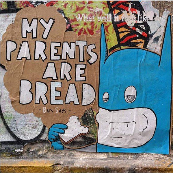
My Parents are Bread, paste up in Berlin. (Photo supplied by Bulky Savage)
Even if the illegal aspect wasn’t as attractive, were you still interested in how to situate a work in space and the encounter that you can create with an unsuspecting public audience?
When I was still doing paste ups and things, I’d like to have bits on corners of buildings so you could see it on one side and then pop around and there’s another part of it as well, leading people in certain ways. Interacting with outside spaces is a big part of the street art scene, and now, when it comes to murals, I still like that idea. I don’t want to put big messages into my art. I like to just have something that will pop and grab people’s attention, something a bit out of left field that will make them wonder what’s going on there?
Design and illustration are increasingly tied to urban art, as an interconnected pathway and through the iconographic approach of post-graffiti, the creation of an instantly recognizable and relatable icon. Has your design background influenced your work?
I studied design at Massey University in Wellington for a couple of years because I was young and foolish. I basically thought that was how you made money in art. But really, I’m more into the ‘art’ side of things. You can see that my work is very graphic, although I would say maybe more Pop Art these days. But the graphic design thing, I didn’t only do it because of the money side, I love graphic design as well, and it has definitely influenced my style.
There is an unmistakable, recurring quality to your work, notably with the hollow-eyed character, did that develop as an intentionally recurring presence, or was it something that just kind of emerged and endured?
I think I drew the first iteration of that character just before I left New Zealand. I used to work at Cosmic Corner and I did a drawing of that little character one day at work. Characters and cartoons have been a massive influence throughout my life. The Simpsons were my favourite thing growing up, and you can see the shape of Homer’s head in that character. I just kind of absorb things from everywhere. While I was traveling, I started to really develop the characters and then I came to Berlin and that’s when I was like, this is where I can take them. Over the years, I just played around with them and they took on their own personalities. There is the big fat businessman who keeps losing his head, there is the little sad guy, the introspective guy and then the crazy worm guy. They are all sort of similar, and I guess through a slow process I have imbued them with bits of my own personality.
Do they occupy their own universe or are they part of our world? The Simpsons live in Springfield, which is famously never revealed on a map, it is sort of a contained universe, but they are also part of the broader world through storylines and their pop culture status. I guess as soon as your characters are added to public space, they start to occupy our world as well, right?
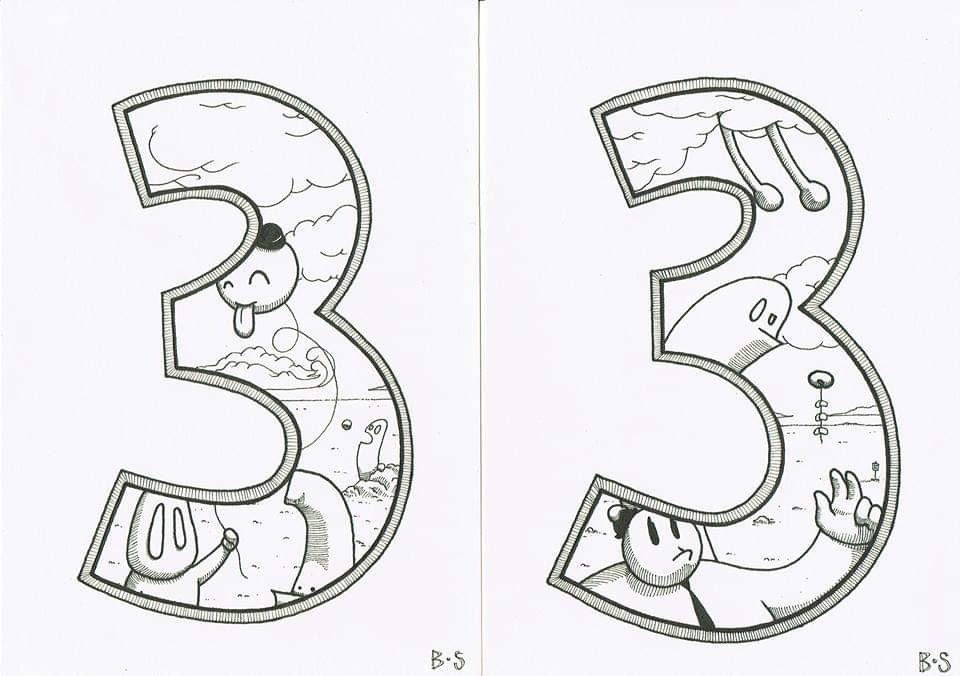
I have given them this world they inhabit, which is kind of like Springfield, I guess. It’s called Crushington and it is this relatively colourless place. There’s a Crushington in New Zealand as well, which is funny. If you look at some of my line drawings, there’s this kind of desert-like landscape, these big open spaces influenced by New Zealand, where you’ve always got that big horizon line, whether it’s the sea or the mountains. There is also a little bit of Colin McCahon in there. I love Moebius’ style as well, the desert line he uses, I stole that bit. But I like how you were saying The Simpsons are part of our world, but they’re not, because I feel the same with my characters. For the most part they are two-dimensional beings in our world, and I really want to get into sculpture over the next couple of years and bring them into a more three-dimensional form. I want to play with that idea and bring them from their world into ours, because there is this second space they inhabit where they are more like what I know. I haven’t really shared it so much, but I’m going to have an exhibition about Crushington at some point soon…
Bulky Savage, Crushington Characters for the Love of Three, illustration. (Photo supplied by Bulky Savage)
Kaws has shown with his Companions that there is so much potential to explore those three-dimensional incarnations, different materials, various scales, and even playing with the perception of high and low…
That’s one of the things that always drew me to the street art and graffiti world, if you want to do it, you do it. You can take that style, or you can take from there, take from there, take from there, and that’s why I think it’s been such an interesting movement, you have all these people coming from different backgrounds and different influences coming together and making something completely different. It’s exciting…
The waves or oozing colours are another recurring element in your work. Do you want to dive into that imagery a little bit? Metaphorically, of course…
I really started with those in 2017. I did an exhibition called Bit Sick, playing around with the B and the S of my name, and it was about how crappy 2016 was, and how sick I was of everything. I’ve always been someone who just goes with the flow and the waves were an aesthetically pleasing sort of rolling vibe, but also fit with the theme, because in that exhibition I had things about being sick of art, sick of commercialism, sick of America. Of course, 2017 came through and really shat on 2016, and things haven’t really got any better since!
By 2020 you must be more than a bit sick…
Well, you know, it all flows and rolls downhill! The exhibition that I’m working on at the moment, which was going to be out already actually, was very timely as well, it was all about not seeing the bigger picture and being focused on these little pieces, as interesting and attention grabbing as they are. Again, it is making us all feel a bit sick and now quite literally making the world sick. It’s really just about being over things as well; the state of myself, of the world, just expressing my feelings at the time. But there’s not going to be any characters in the exhibition, it’s just going to be the waves. They have become really fun to paint with spray cans as well, the shapes, the really nice blends as well, giving it a sense of solidity, so that’s become more of a focus…
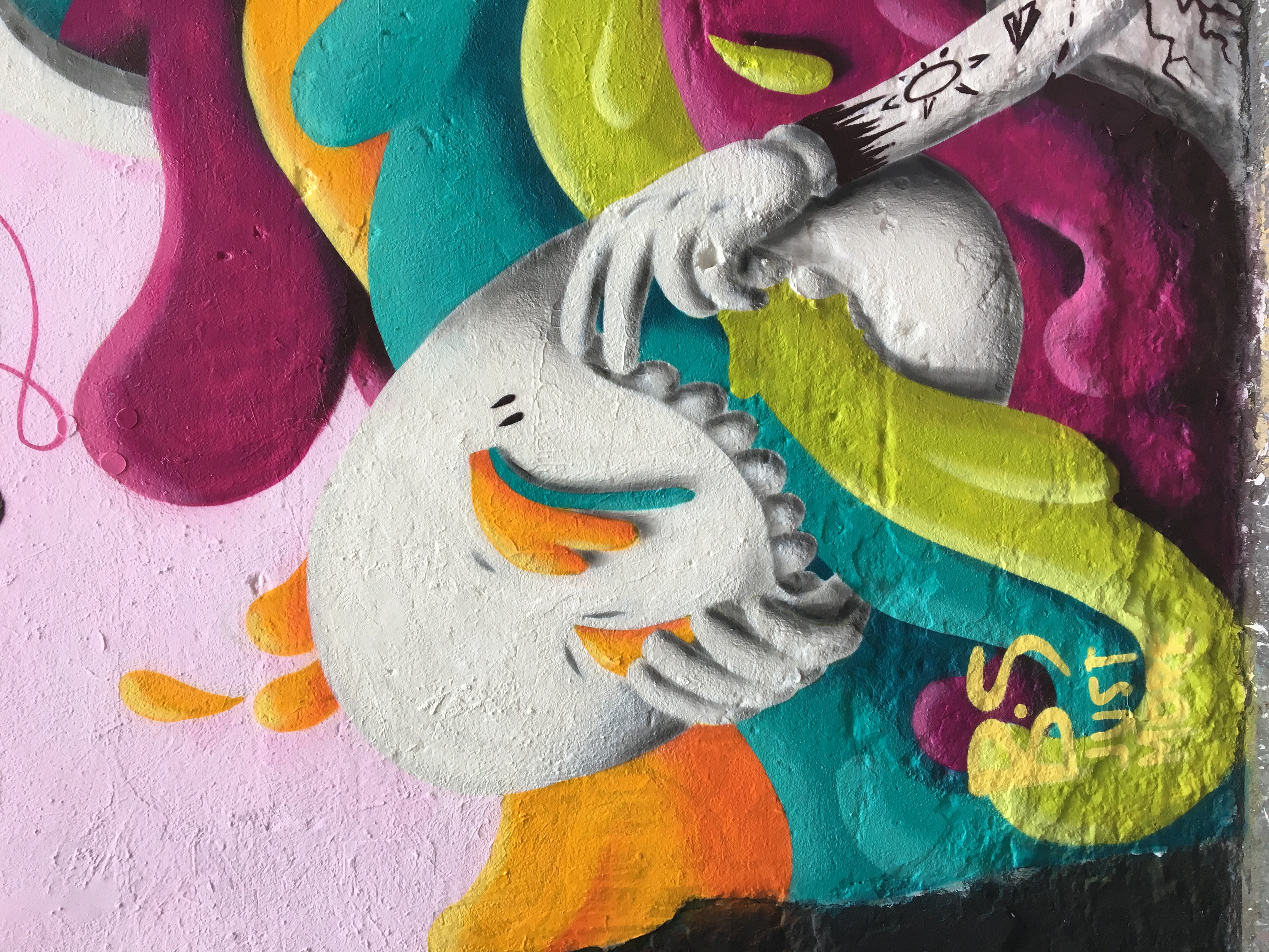
Detail of a Bulky Savage collaboration with @tenhun in Berlin. (Photo supplied by Bulky Savage)
I’m thinking of the idea of a purge, or a cleansing, and once you take away that figure, the idea of size and scale changes. If the wave becomes the sole focus, it becomes something else, right? When you see it come out of a figure, you automatically scale it relative to that figure, when you just see that wave filling an entire frame, that can be either overwhelming or it could just be a close-up of a small trickle. There’s something about that idea of the bigger picture and smaller details, and that social element becomes strangely more pertinent when you take them away from the figure. So, tell me about your experience painting here in Christchurch earlier in the year?
I’d never painted in Christchurch before, but my parents live just outside of Cheviot [a small town north of Christchurch], so when I go back, I fly into Christchurch. I would just get to see little bits of it as we drove through, or if we visited somebody there. I remember going there when the city center was still completely locked down after the earthquakes, but this was the first time I got to spend a little bit of time in Christchurch for some years, and it was cool. I saw a lot of opportunity there, personally, as much as the earthquakes were terrible, I love seeing old destroyed buildings, maybe that’s why I’m in Berlin. It’s not something that you really get to see in New Zealand, so I really liked that. I liked the show of power, but then also how the city has risen up from the ashes of it as well. The city is really interesting at the moment.
I found it incredibly interesting that Christchurch became this microcosm of a big city; you had shiny new buildings, you had broken buildings standing there empty and covered in graffiti, becoming spaces for people to explore. Different people could do different things. If your mindset was to explore those broken spaces, you could do that, if your mindset was to sit in a bar and drink a cocktail, you could do that. There was this interesting juxtaposition of old and new and broken and shiny. One thing that does is reveal a lot of the power structures that go into making a city. Christchurch has become interesting in that regard, and graffiti and street art have a role here as both dissenting voices and part of the rebuild as well. It shows why these forms of art have become such a dominant visual voice the world over, because they can adapt to different environments. How did the mural in Christchurch come about?
In a very winding way. Knowing I was coming back to New Zealand mid-last year, I started reaching out to people in September or October, mostly through Instagram. I got bounced around. I got in touch with Preston [Hegel] down at The Exchange, he was doing some cool stuff and was like, oh maybe you could talk to this person… I got bounced around between a bunch of different people before I got put in touch with the guys from Riverside Market at the last minute. I just said I’m going to be coming down in like two days and they said: Sure, we’ve got a space, you can do what you want. It just fell perfectly into place. I was slightly freaking out that I wasn’t going to be able to get a space to paint, and coming from Berlin, I was just like, what is this?! Where are my walls?! In Berlin, if you want to paint, you just go and find a wall. I have a wall that I can just go and paint anytime I want just down the road. I wasn’t necessarily looking to leave a massive mural, I just wanted to find somewhere to paint, if it could stay that would be a bonus, if not then c’est la vie. It worked out great, those guys were really nice, they were just like: What do you need? Here’s money for the paint. They paid me for it as well, which is fantastic. It was this very last-minute design, because I was like, let’s see what the wall’s going to be like and go from there…
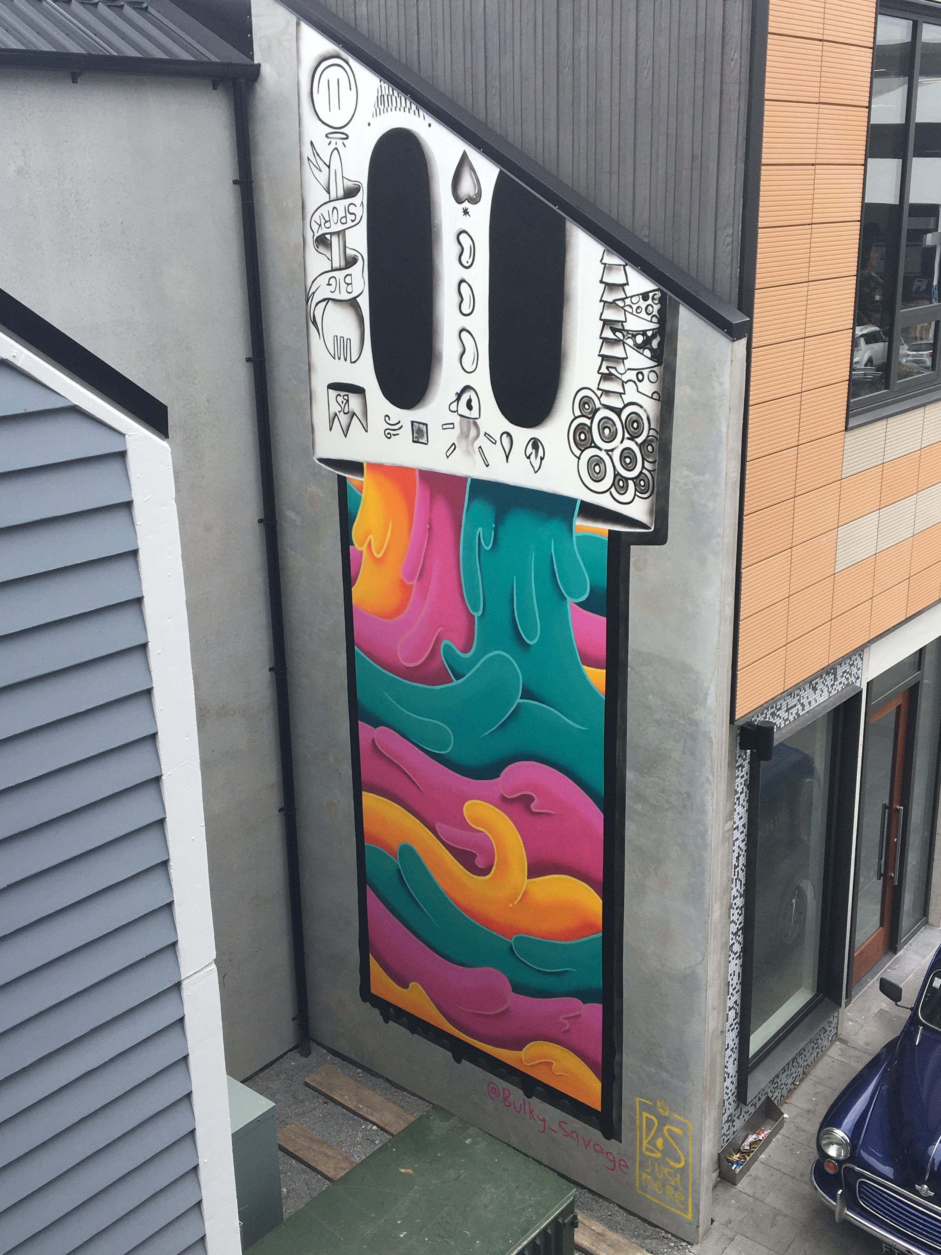
Bulky Savage’s mural at Riverside Market, central Christchurch, 2020. (Photo supplied by Bulky Savage)
The wall is quite high and relatively narrow so that obviously played into the design and I guess allowed you to use those recurring motifs in what seems like a natural fit…
Well, I had ideas floating around in my head of what I wanted to paint. I’d actually thought of having it the opposite way around, with the character at the bottom and all this stuff coming up out of it. But there was this big generator at the bottom of the wall, so I just flipped it around. Most of the time I tend to let the wall tell me what the piece is going to be, so I guess that’s good practice for when it comes to spaces like this one.
There are little references to food in the tattoos on the character, but there was no input in terms of what you had to include, that was just something that you added in?
Yeah, the guys were just like, do what you want. Which was amazing, because when you’re being paid to do something, a lot of the time they are like, it needs to be like this and fit inside this box. But I was really given freedom with it and I guess maybe that was why I thought if they’re still letting me do this then I’m going to throw in these little references to the space. I always like to let the tattoos kind of tell a story. I love tattoos, and part of the reason people get tattoos is to express little things about themselves or their experiences. I quite like incorporating them into my art in the same way, so if there’s meaning to be read from what I’m doing, which generally I try not to do, then it can be read in the tattoos…
Any artist would love that freedom to create something that is your own, but how do you think your work communicates to the crowds that go past, is there an intentional aspect that they should read, or do you encourage them to come up with their own narrative?
Yeah, story and narrative are really interesting for me. I love cartoons, I love stories. Life is stories. But I don’t want to preach, I like the idea of leaving something really open. We are human beings, we make meaning out of everything that happens, whether that’s actually what it is or not. So, instead of trying to push people towards my view or what I want to say, I prefer to leave that open and more abstract, so that people have something to play with. I often talk about Stik, the London street artist, who got famous for doing stick figures, but because they are so basic you can project your friends or your relationships or anything onto them because it’s such an open canvas. These very hyper-realistic pieces are beautifully done and technically fantastic, but there’s a bit of a distance because it’s just a picture of somebody that you don’t know. So, I like a more open experience…
Did the freedom of the mural energize you to strike out and do anything else while you were here? Is there anything hidden around Christchurch that I might not have stumbled upon yet?
No, to be honest I was a little bit out of shape and the mural was exhausting. I think I did about 19 hours in two days, and on the first night I was just completely burnt out. I was thinking about going and painting on the cans while I was there, but I just burnt myself out, I just went to bed! But I would love to come back and do some pieces in other spots, when and if that ever becomes a possibility…
Are you a Kiwi living in Berlin or a Berliner from New Zealand?
Good question! I’ll always be a Kiwi, but Berlin’s definitely become home for me. I would like to be able to split my year between the two places, because my heart is somewhat split, half of its here, half of its there, particularly with my parents being there. I love New Zealand, it’s refreshing. New Zealand people are almost the opposite of Germans in a lot of ways, very easy going, very open and welcoming, whereas you know, Germans are a lot more strict. That’s harsh, its an over generalization, obviously! But yeah, I love coming back to New Zealand, and just talking to the bus driver. It warms the heart. Christchurch in particular is looking interesting because there’s so much space, so many opportunities there at the moment, which was really good to see.
A small part of the reason for being away for as long as I have was because we had the John Key government which was in no way supportive of arts and artists, and as far as I’m aware, it’s still not super easy to be an artist in New Zealand when it comes to support from the government and things like that, but maybe that will start to change…
With lockdown precautions in so many places, it’s clear that people have been relying on art; on music, on film, on a range of forms of art, to get through isolation. And yet at the same time, no one ever positions the arts as vital, they talk about tourism or other industries, which is infuriating because if anything this situation reinforces how important the arts are to humanity. But we seem to have to go through this every time something significant happens, it was the same after the earthquakes as well. There’s still a real need to acknowledge artists’ ability to make their living doing what they do because what artists do makes life better…
Yeah definitely. I wouldn’t want to claim that my art enriches people’s lives, maybe it does and that’s fantastic. I always tend to feel a little bit selfish about my art, it’s something that I need to do, it’s very much my own expression and when someone can connect with it, that’s fantastic. Knowing that people have bought my stuff and have it hanging on their walls is nice, but again, the money side of it is not why I make art. I’d like to be able to just make art and not have to worry about the commercial aspects of it, you know? Universal Basic Income baby! People always think we need to make money and that becomes a driver and that’s when art loses a little bit of itself. I need to eat, so I have to make art that’s going to sell, but it would be nice if we learn something from this whole thing about what’s important for people, for people’s health and mental health. I run a little gallery and art shop space here as well and it’s interesting and frustrating thinking about what sells and what doesn’t and what you need to do to make money from it. I always feel still slightly grimy making my art into easily package-able things, being channeled into commercialism. Down with capitalism!
And that’s half of 2020 gone already. Although lets be honest, this year has seen a fair amount of activity, some shitty, but others important and long overdue. This month’s collection acknowledges these struggles, as well as looking to the past, the future and art as a gateway to explore and consider more than our immediate preoccupations. From Askew One’s haunting risograph print with MK Press and Fiksate, to our tribute to graffiti legend Jungle and the countless voices he inspired as a rebellious actor in the local urban landscape, here are our favourite things from the month of June…
Askew One x MK Press x Fiksate collab
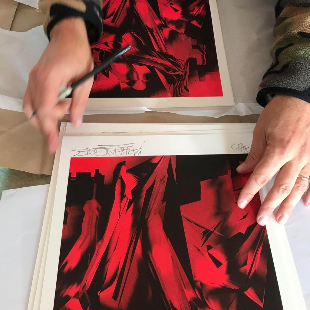
Askew One signs his MK Press x Fiksate collab risograph prints. (Photo credit: Elliot O’Donnell)
The month started on a high with the release of Askew One’s limited edition print as part of the MK Press/Fiksate artist collab risograph print series. Following Dr Suits’ initial release, Askew’s striking red and black abstraction continued the popularity of the concept, selling out in just hours. The work embraces and explores the qualities of risograph printing, while continuing his digital studies drawn from urban environments. The result is a twisting, jagged image filled with a sense of terror and dread due to the blood-like tone. Setting a benchmark for the series, you wouldn’t really expect anything less from Aotearoa’s finest, would you?
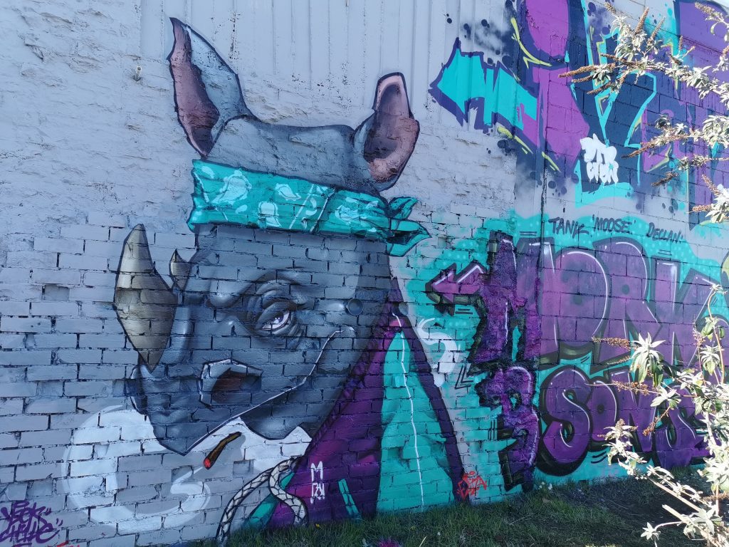
Graffiti jam for the New Brighton Outdoor Art Festival
YSEK’s rhino character from the New Brighton Outdoor Art Festival traditional graffiti wall.
The delayed and reconfigured NBOAF signed off with a traditional graffiti jam wall, with a number of local talents transforming a wall in the middle of New Brighton Mall. The green and magenta colour scheme tied the various pieces together, while individual styles and characters by YSEK and Dove ensured variety as well. The wall was intended to represent and celebrate traditional graffiti art, and as such was always going to draw criticism from some corners. The online discussion about the wall’s appearance was interesting to say the least, highlighting the ongoing and deeply held misconceptions and prejudices around graffiti, even when produced legally…
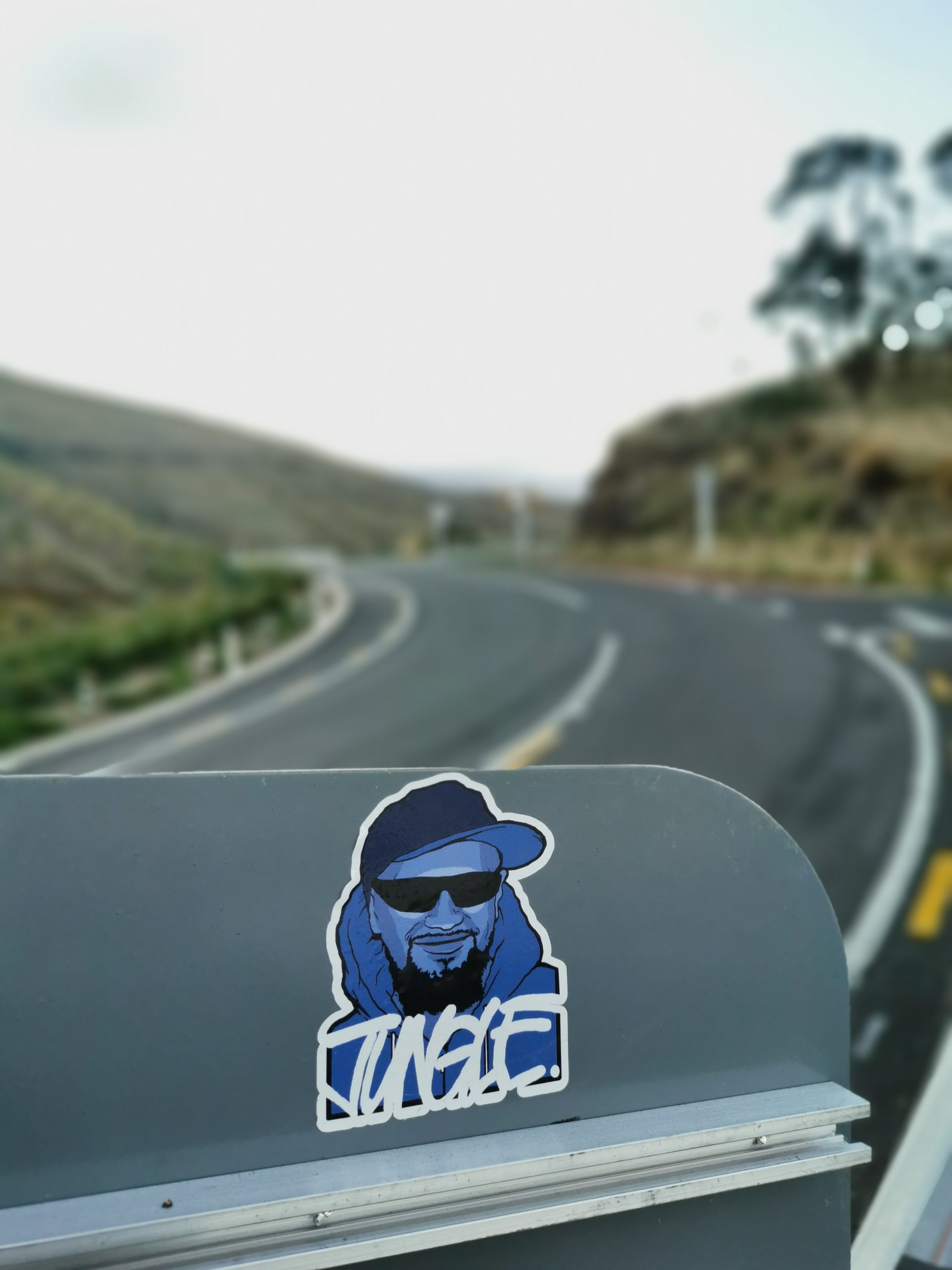
Jungle Tribute
A Jungle tribute sticker on Summit Road, February 2020.
When local graffiti legend Jungle passed away in March of 2019, Christchurch’s graffiti culture spoke by painting tributes across the city’s walls. I had discussed with Ikarus the idea of a larger written tribute that explored Jungle’s legacy, however, by the time we got to sit down with an eye on the one-year anniversary, lock down struck. In addition, what started as an interview with Ikarus, developed into a multi-generational project, stretching the process out. However, by June, the lengthy tribute was finally online. Hearing stories of Jungle’s influence, it was quickly apparent how consistent his impression was, a man who the city’s graffiti culture was indebted to, but also a character who influenced people by his charismatic personality…
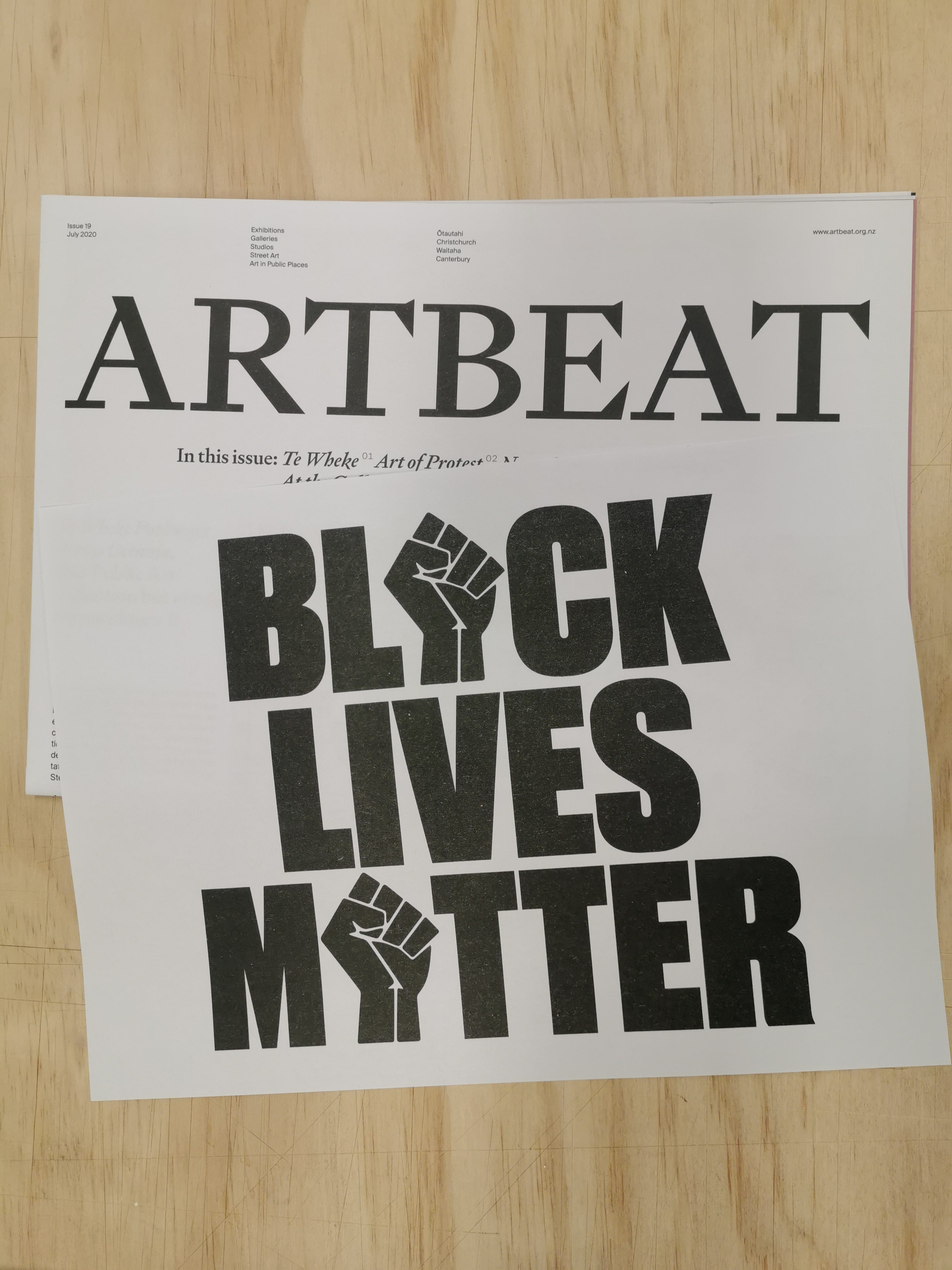
Black Lives Matter Protest Posters
June’s issue of Art Beat included an A4 risograph poster from the Posters for BLM archive. Pictured is Roydon Misseldine’s poster.
The latest issue of Art Beat, the visual arts newspaper edited by Dr Warren Feeney, featured an insert of A4 posters drawn from the shared archive Posters for BLM (@posters_for_blm). The three variations, by Stephen Powers, Sara Froese and local designer Roydon Misseldine, were risograph printed by MK Press and included inside the free paper. Importantly, the posters ensure visibility to the cause and serve as a reminder of the potential to raise a voice about oppressive systemic issues. While a small gesture, it attempts to continue this vital narrative. More posters are available for free download (for non-commercial use) from the archive, with a link in their Instagram bio.
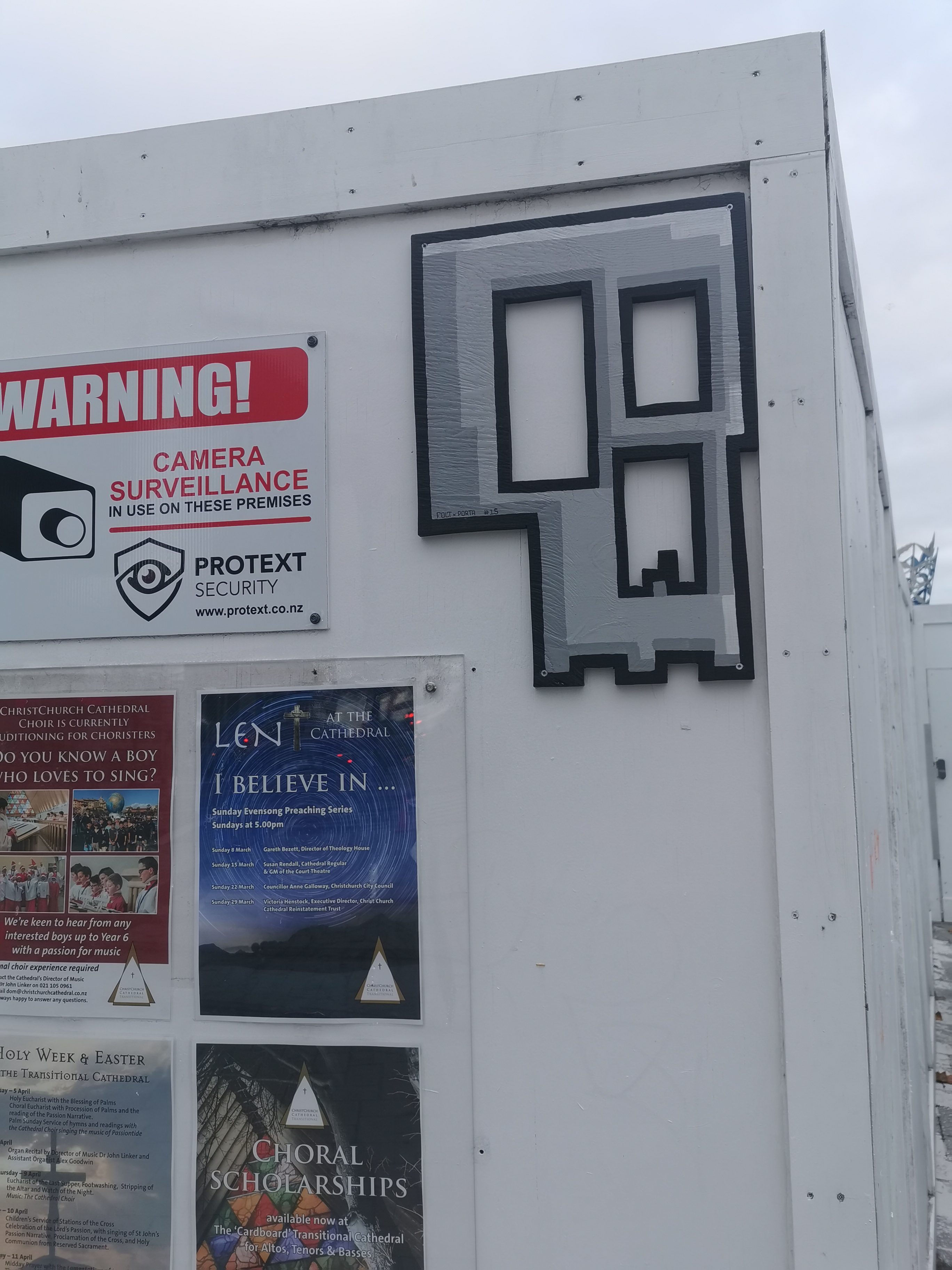
Porta x FOLT Skull Collab
The FOLT x Porta skull collab in Cathedral Square.
The collection of FOLT skull cut-outs continues to grow around the city (although many have disappeared as well, seemingly too attractive to collectors), and this subtle variation by Porta is a personal favourite. Porta’s recent investigation of pixelated video game aesthetics is utilised here, but with an understated approach, the granite colouring giving a bare concrete appearance that only reveals the highlights, shadows and blocky shapes upon closer inspection.
And that was June 2020, for me at least, let us know what you enjoyed over the month in the comments…
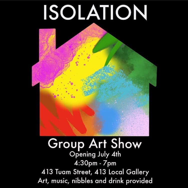
413 Local Gallery, the brainchild of artist Daken, open their second exhibition on Saturday, July 4th. Isolation is a group show featuring work produced during and in response to the Covid-19 lock down. With his own output increasing during the lock down, Daken put out an open call for artists to contribute to a group show. The result was a mixture of familiar names (Porta, Morpork, Nick Lowry, Josh Bradshaw, Jessie Rawcliffe) and a number of new faces. This range has ensured Isolation is a diverse collection of work, presenting a litany of creative endeavours.
The exhibition opens on 4:30pm on Saturday at the home of 413, AJ Creative Glass, 413 Tuam Street, Phillipstown. For more information, head to the 413 Local Gallery Facebook page.
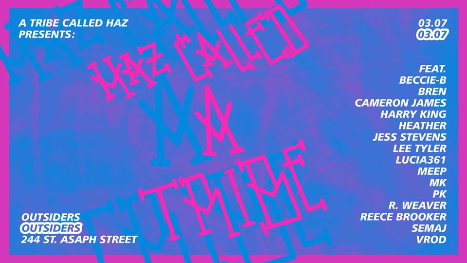
This Friday, the 3rd of July, A Tribe Called Haz has pulled together a group of talented young artists for a group show at Outsiders skate shop. Haz Called a Tribe features 17 artists, spanning a wide range of styles, with backgrounds in graffiti, design and other creative avenues ensuring the show serves as a snapshot of an emerging creative community in Ōtautahi, one born of myriad influences, including the increasingly diverse forms of street culture.
Coming out of the creative output of the Covid-19 lockdown, A Tribe Called Haz saw the work his friends were producing and knew it was time to bring everyone together for an exhibition. While not explicitly themed, he believes the collective will ultimately feel cohesive, a result of the sense of community in the group he has collected.
While a number of names are familiar, many are also newer faces, who despite a long history of making art have previously avoided such a platform. A Tribe Called Haz is also excited about the diversity of the show, ranging from traditional graffiti to abstraction, with many artists producing work that might be unexpected given their backgrounds.
Haz Called a Tribe is one-night-only pop-up exhibition at Outsiders, 244 St Asaph Street, from 6pm. DJ Liam K. Swiggs will be playing and Outsiders will be open throughout the show as well. For more information, head to to the Facebook event page…