I know what you are thinking, it’s almost December, right? And you are correct (actually knowing what month it is is a reasonable feat in 2020), this edition of And That Was… is a tad late. The truth is we had a sweet guest contributor lined up, but due to unforeseen circumstances, it just didn’t happen. We are still hopeful of working with said guest, but we will keep that under our hat for now. However, what that means is a quick sidestep, a play called on the fly, a plan B, and now, here is And That Was… October 2020, with a few favourite things from a not so special contributor…
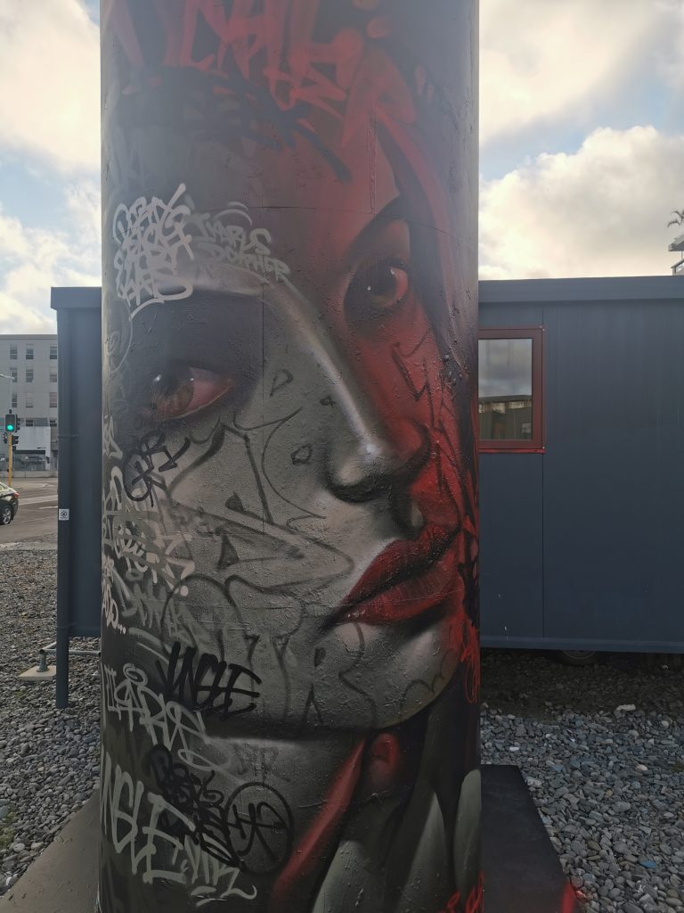
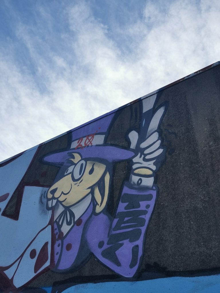
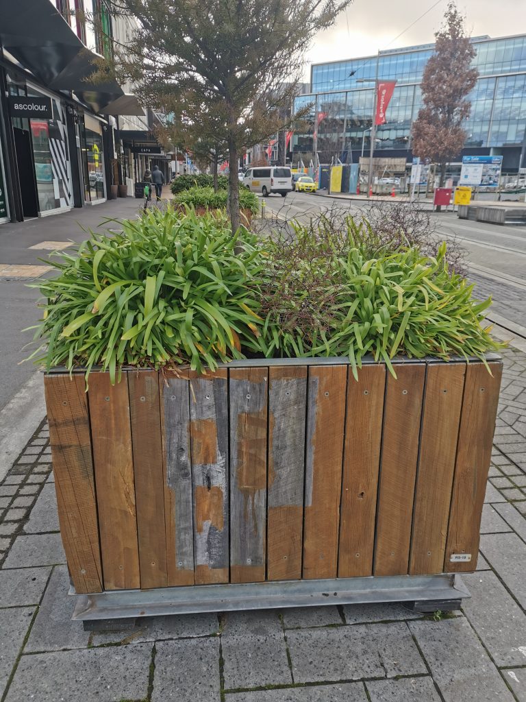
DTR Re-Paint the Giant Cans
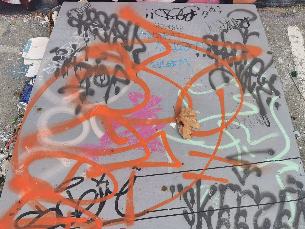
The giant spray cans at One Central have been under the guardianship of the DTR crew and they have regularly been refreshed by various crew members over their recent history. The recent refresh combined work by Dcypher, Ikarus and Wongi Wilson, including stylistic mash-ups and a stunning female portrait seemingly tattooed with graffiti tags and throw-ups, creating an effect evocative of the Mexican dia de los muertos…
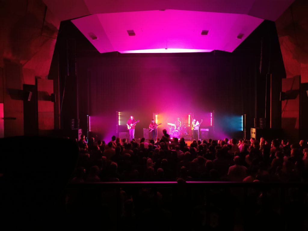
The Beths
Call me old fashioned, but I still like a live band. And in my opinion no-one is better in New Zealand music right now than The Beths. To say I was excited about their James Hay gig mid-October would be an understatement, and from the moment the stage curtain lifted, I was not disappointed, with their infectiously tight, energetic indie rock and understated charm. My night was topped off with a high-five to singer/songwriter Liz Stokes at the merch table.
Slap City Crew Get Paste-y
The last few months have seen the Slap City crew get busy across the central city, with diverse pastes appearing in busy conglomerations. The arrangement of works is always fun and revels in a sense of camaraderie. The flurry of activity from the likes of Teeth Like Screwdrivers, Vez, Cape of Storms, Bongo and more reflects the infectious energy of being part of a buzzing collective.
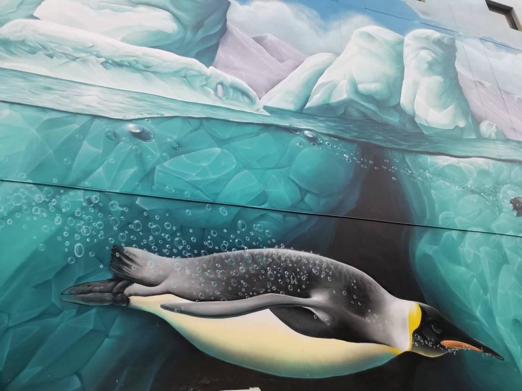
Dcypher, Yikes and OiYOU! Go Big!
Truth be told, I’m not sure if the massive Novotel mural was completed in October, my records are not entirely fool proof. But the massive scale of the Antarctic themed work (one of a pair by the artists with OiYOU! to celebrate the city’s role as a gateway to the Antartic) means it is a literal can’t miss and I’m sure at worst I am only a couple of days off. From the overwhelming size to the playful details, it is an impressive piece of work by some of Christchurch’s best, and I couldn’t leave it out.
Bols’ Retro Wrestlers
Let’s finish off this month’s list with a revelation of my inner geek… I grew up in the era of professional wrestling’s glory days. Not the violent, Limp Bizkit epoch of the Attitude Era as it’s known, but instead the over the top pageantry of American superheroes and bad guys of the eighties. It was a time when the concept of kayfabe (the idea that it is all real) was held firm and as a young kid, it was serious stuff. For that reason Bols’ nostalgic paste ups highlighting the dubious tropes and stereotypes of that era hit the mark, a reminder that not all childhood memories are as innocent as we might remember…
What are your thoughts on October’s highlights? Let us know in the comments…
Teeth Like Screwdrivers is one of those people who radiates enthusiasm. Not in the cheesy, annoying way, but simply through a desire to bring people together and to see things happen. I came across his pencil stickers before I met the man himself. They were the type of sticker I love, although simple, they pulled you in through a spark of the familiar that made you ponder, is that what I think it is? Since finally meeting the artist, I have followed Teeth Like Screwdrivers’ busy trajectory, his own prolific and expansive output, his global network of contacts and collaborators, and the formation of Slap City, a sticker and paste up club that that has brought together a diverse roster of artists. When we caught up, all of these factors became apparent both in the scope of our conversation, but also in the way Teeth Like Screwdrivers spoke, excitedly, almost breathlessly darting back and forth through topics. From his early days in Christchurch after arriving from the UK, to the formation of Slap City and his lock down sticker collab project, we covered a lot of ground, fitting for an artist who thrives on activity…
We first met at the giant spray cans, where you were part of a DTR crew workshop. I remember you just had this massive grin on your face enjoying the experience. Is a sense of community and participation a central concern for you? It seems that Slap City is very much about forming a community.
I’ve always organized stuff. When I first moved here, I started the Garden City Session [a Christchurch longboarding group], which I’m no longer doing but has now got like a thousand members. Within the first week of arriving in Christchurch, I got hold of Cheapskates and was like, right, who’s organizing something for skaters? They hit me up with Scotty who was doing Skate School and we did a couple of longboard ones and then it spiraled and spiraled and spiraled. We used to do pub crawls on skateboards. So, I was always the one organizing events, rocking up and being the hype man.
Christchurch’s Flavor Flav!
If I’m really interested in something, it is really easy to do. As a schoolteacher, if I’m doing a lesson I’m not into, it then it’s probably going to be shit, but if I’m into it, it’s going to be brilliant! So, with the sticker stuff, the same thing happened. Stickers were happening, of course they were, but I enjoy the hanging out and someone else going: ‘You could do this…’ It was the same with that DTR workshop last year. I don’t use spray cans, I’m not a graffiti artist. I’m as far from your stereotypical graffiti guy as you can get, but I wanted to see how it’s done. In my head I wanted to make my work look like a marker pen. I love markers, I’m a little bit OCD and I love the different thicknesses. So, I was like, how can I make spray paint look the same? I went and watched them and I realised you could put one line there, then you can do another line there and it cuts that first one back. That was all that was about. But I was loving it because I was surrounded by people who just knew their fucking trade, who were really good and they were just like: ‘You could do this, you could do this…’ I was like, this is brilliant! But I also realised there are lots of ways to do things. There was a really good Safe Kasper artwork on the cans a while back, he’d sprayed the bulk of it and then used a marker for the details, I was like, what the fuck? I can just paint the outline and marker the details which is essentially what I’m doing with a sticker, doing the background and then the marker over the top, so it made sense. But running shit is fun, that’s the joy for me. I like sitting at home and spending an hour just cranking out stickers, but I also like having other people around and bouncing ideas off each other.
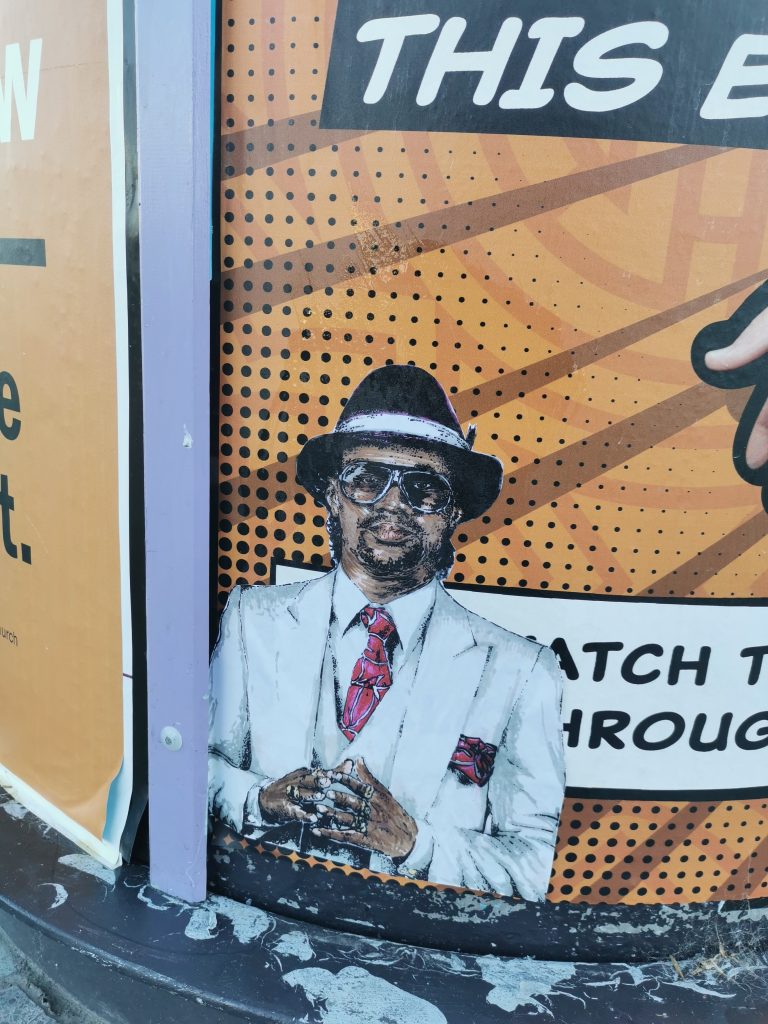
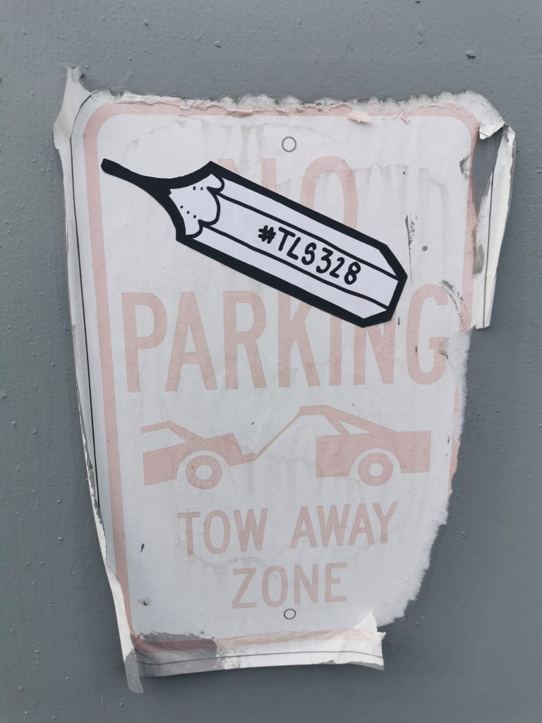
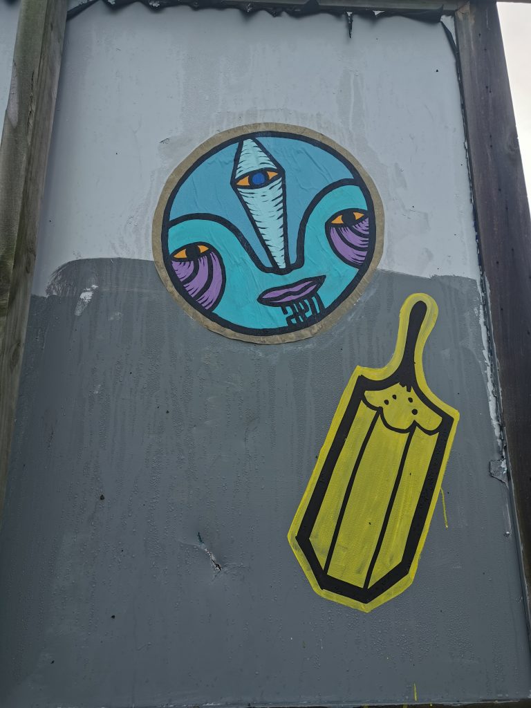
Teeth Like Screwdrivers pencils on one of the giant spray cans at the youth space on Lichfield Street
Obviously within graffiti culture there has been this history of mentorship and camaraderie in terms of crews.
Skateboarding is similar, you learn, not from the masters directly, but an older person will go: ‘Actually mate, it will be way easier if you just pop your foot off the left and put pressure on there…’ It’s the same thing. I remember I went down to the cans the other day, the DTR crew were doing a big paint jam. I’m an outsider, like I said, I’m about as far away as you can imagine from graffiti writers, but they’re like: ‘Get in bro, grab a can, give it a go…’ I was like, really? It was wonderful.
I feel like when we talk about post-graffiti or street art, it can be more isolated, because you tend to be making something in advance, it doesn’t necessarily have the same sense of community or camaraderie, but undeniably the potential’s there.
Yeah, most people want to be nice, most people are good people, you go up to them and say I really love what you’re doing, can we do something together? They are probably going to say yes, just get in there and see what happens. The worst that can happen is they say no, in which case OK, cool. Christchurch is small enough that you will bump into the same people. If you’re doing something similar, chances are you’re going to bump into me, so that connection may as well be as easy as possible. I don’t know those DTR guys from jot, but they all remembered me from a year and a half ago.
Because Christchurch is small, the competitive element isn’t necessarily as strong as it might be in bigger cities where street cultures have diverged.
Vez is a great example. I saw her stuff all over the place before I met her, and she sent me a message saying: ‘I’m moving from England to Christchurch.’ I told her that I’d started this sticker thing and that she should come along, thinking she’s had artwork everywhere in the world, she won’t want to come! But she rocked up and was just like ‘Hi!’ Now I see her work everywhere and I know who she is and what her stuff is about, and that’s what it should be really.
The fact that Slap City is held at Fiksate is another example of that sense of community in the local scene.
There are lots of examples of it in other cities where people meet at a pub or somewhere where they’ve just got a big old table and they all sit around and just pass some shit around and share. I was like, why don’t I do that here? Then we just kept doing it, then we made it every two weeks rather than once a month. But again, it fits nicely at Fiksate. We go in, it’s super chill, we set the tables up and it’s just like a second wee family. We just chat, talk about what we’ve been up to the last couple of weeks. Someone will have some new things that they want to share, or they have worked on a whole bunch of new stickers and we all kind of pass judgment on them, in a good way!
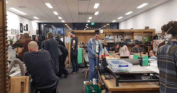
A Slap City gathering at Fiksate as part of the Road to ZineFest, September 2020
In addition to that sense of community, has Slap City allowed you to do things artistically that maybe you wouldn’t have done by yourself?
I think I’m keener to get up in the streets. I mean I’m not your typical person who goes and puts things in the street, but you know, we go out and half of us go and have a beer afterwards. It’s all about walking around. People will rock up with some paste and we just go for it. So, I guess it’s not a solo sport anymore. I mean it is, it can be. I’ve spent many evenings just putting stickers up by myself, but there’s something more fun about there being a whole bunch of you. Someone will put one up and you try to put one higher, it’s just that kind of thing. But it could be anything, it could be a bike gang, it could be a record collecting crew. It’s having that little group around you who are just as enthusiastic as you.
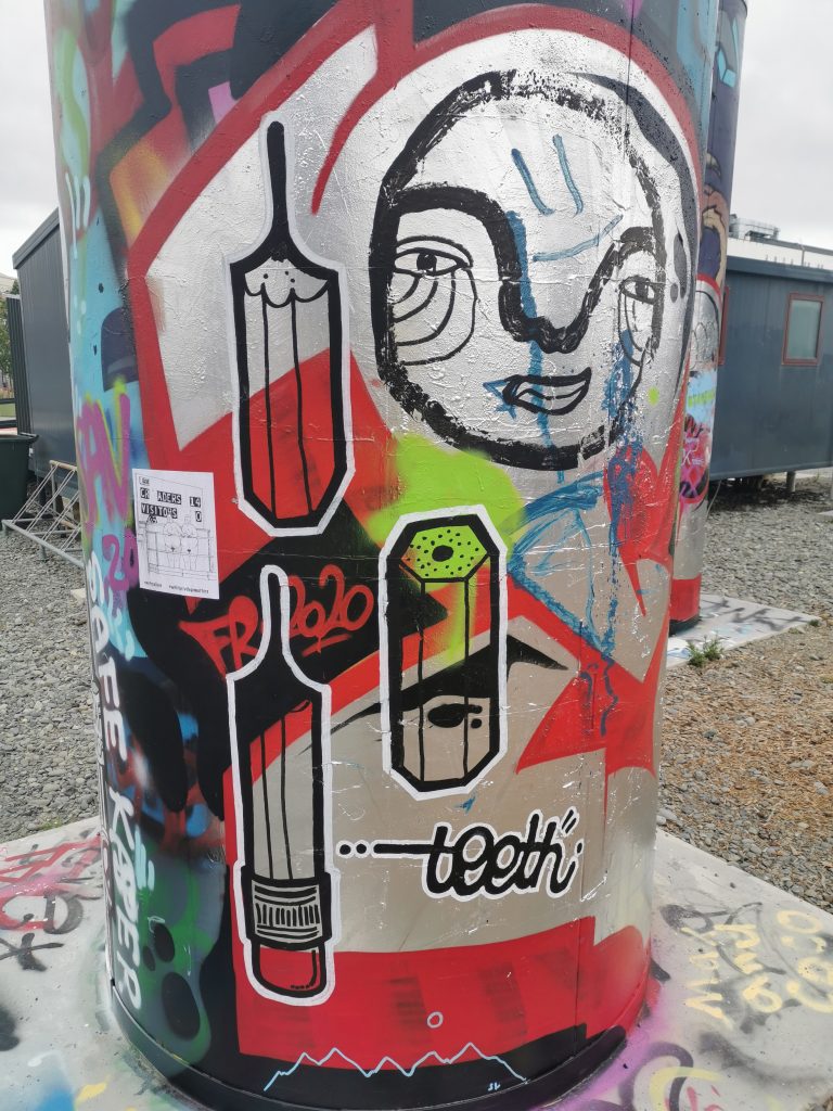
A Teeth Like Screwdrivers pencil sticker, 2019
That energy and excitement feeds everyone, and opens the gateway just enough for people to come through…
I mean we’ve got it all now. Suddenly it’s gone from me saying I can get a few people and we can do some drawing, to having this crew. People come and go but there’s probably six or seven regulars. Three of them are part of an exhibition at Fiksate [Vez, Bexie Lady and Cape of Storms are all featured in the show Perspective: Women in Urban Art], which is crazy! Bongo’s screen printing now, so he offered to do a run of a hundred stickers for this amount of money, and everyone was chucking money at him and that comes from just talking to people, getting shit done, you know? It is almost self-fulfilling. If I want to go and do some stuff on the street, then I can probably find someone keen to come along. Even if it is just wandering around and putting stupid stickers of pencils up, it doesn’t matter, that’s the fun of it. We are all very different, some crews have a particular style, especially with graffiti, but we’re drawing pictures on paper and sticking them up, it is different. One week a guy came and just did smiley faces, which was great!
People sometimes assume that there’s a right way to do street art.
Right, a particular highbrow view that you have to do this or that. I’m sure in the graffiti world there are styles and techniques that are passed on, but with stickers the joy is that they are literally just a marker pen and sticky paper. You could draw a picture of your own bum and it would count. Anyone can come along and draw funny little things on a piece of paper, and it counts. It doesn’t have to be ginormous.
Teeth Like Screwdrivers, Lyttelton, c. 2018
Touching on that idea of size, there has been a tendency in urban art towards placemaking and an increasingly big scale, and yet really placemaking is also about the small stuff.
I’m a big fan of the little things that are hidden away, the things that you don’t notice at first, but then you do and it makes them even more rad. Paste ups are fun because they let you work on a bigger scale than stickers. You can literally put up any size, but it’s still a smaller scale in terms of just drawing on a piece of paper and sticking it up on a wall. It’s generally never going to be higher than you can physically do it. I guess that’s why making stupid machines to put stickers higher up a wall amuses the shit out of me. There are a few that are up there and I’m just like, it’s so high off the ground! That’s pure amusement for me.
That idea of simply playing in the streets…
I did some pastes in Lyttelton with a mate of mine recently. So, Lyttelton has an issue with peacocks. Someone I might know really closely released a bunch of peacocks into the hills and the farmer on the top of the hill kicked off and started cooking them and eating them! So, me and said friend, we had a few beers and started pasting a whole bunch of peacocks around the port. One day I got a text message from him, he was at work and he said: ‘I think I’ve gone too big!’ He sent me a picture of a massive peacock poster coming out of a large format printer. There’s a spot above the tunnel and we pasted this huge thing up. I woke up the next morning and I’m a long way from the tunnel, my mate’s even further, but I could fucking see it! Everybody in port would be able to see it! It was like a big white postage stamp of a huge peacock head. We were just pissing ourselves because of the stupidity of it! I’m not trying to be artistic, it’s just genuinely hilarious, you paste a huge peacock so this woman who’s been killing them and eating them, every time she leaves port she sees a massive fucking peacock! We are still pasting little ones everywhere; we must have put fifty up throughout Lyttelton. They only lasted a wee while because it was shit paste, but I laughed so much.
A Peacock Liberation Front paste up, alongside work by Cape of Storms and Bexie Lady, 2020
Speaking of repetition, how did your pencils come about?
For my art A Level in the UK I made a bunch of skateboards and they had scratched up backgrounds painted to look like they had been skated on and then I added a white silhouette of different pieces of furniture. One of the silhouettes was a classic UK school chair, an orange pre-formed plastic chair with black skinny metal legs and a hole in the back. I realized I could tag it in one hit, and it was identifiable as a chair really quickly. So, for years I wrote FURNITURE, which is a lovely word to write by hand, it’s really gorgeous. I was tagging it and at the end of the E I would then move in and join the chair onto it, so that’s where I started. I realised it’s obviously a school chair, I’m a schoolteacher, it ties in, so what else could I tie in? I went to a compass, and actually I’ve got photos of doing quite big ones on the side of The Drawing Room in town, I even went on a bit of a tiki tour all over Melbourne and Sydney, just sticking stuff up. I did the compasses for a wee while and they were really simple, inspired by a particular genre of stickers at that time. Then one day I put a pencil in the compass, and I was like, oh, I really like that! So, I drew a few more pencils. They were square, so they had the rubber bit at the end with the metal, then they were triangular, pointed as if they had been sharpened by a sharpener. I got a whole bunch of small stickers, but I couldn’t draw the whole pencil on that size, so I just did the nib. But it didn’t really look like a pencil, it just looked like a triangle with the square side. But then when I scalloped it, suddenly it looked like my pencil, and then I thinned the lines. The first ones I did, there’s a few around still, they look like pencils, shaded and with straight lines, but you know, they looked too much like pencils, and it was taking me forty minutes to draw one because my inner OCD kicked in. I needed to make it quicker, so I dropped the end off, scalloped it, and put in the wee dots to make it look like it had been cut by a knife. There’s a book I’ve got called How to Sharpen a Pencil. It’s well worth finding because the boy’s a genius, he literally wrote a book about the different ways to sharpen a pencil. It has all these different pencils and who they are used for, there was this perfect one he called ‘The Architectural’ for architects. It’s really ironic but really funny. One of them was a really long-nibbed, scalloped version and I was just like, that is how I love my pencils! I just copied that and put in a few dots to show that it had been sharpened and now I just draw them non-stop. It’s just gone from there really.
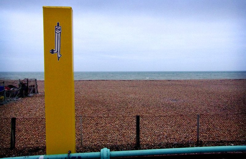
A Teeth Like Screwdrivers compass, Brighton, United Kingdom, 2007 (photo credit: Butterstotch)
Was there an element of the phenomenology that Shepard Fairey talks about, taking something that might be meaningless but repeating it enough to make it meaningful?
Fucking over and over and over again… I’m a huge fan of The Toasters, a crew from the UK who just did outlines of toasters. I remember first seeing one of them in the mid-nineties and being like, why the hell would you make a sticker with a toaster on it? But also, why not? I wasn’t really into Obey, but there were The London Police, D-Face and a whole bunch of those guys around that time that were doing thick-lined icons on white backgrounds, repeating them so they became like a signature. I’m a handwriting nerd, I love a good-looking tag that’s really been thought out. I like drawing pencils; the lines work really well for me. I love the straight lines, and there’s enough individuality that you can make each one different. You can make them short, long, you can put stupid little rubbers on the bottom if you want to, you can write words on the side, there are lots of options. But it’s still always the same identifiable thing – everyone has seen a pencil. Even with the silhouette stuff, if you’ve seen the pencil and then you see the silhouette, you can see those two are related and maybe there will be a little link in your brain, like, I’ve seen that somewhere before… That is not my idea, I got that from The Toasters, doing the outline and people thinking what the fuck is that? It’s a fucking toaster! That sense of wonderment. People are like I’ve seen your sticker things everywhere, and I’m like great! That’s the point! There isn’t a purpose behind them, there is not some subliminal message, I’m not trying to alter what you’re thinking, I’m literally just drawing a stupid pencil!
Yet even without that intent, they do change the way people think because they are becoming more aware of their surrounding environment.
I think it was Erosie in a video about The Toasters, he says: ‘This is city glitter’, you know? It’s little sparkles that might brighten someone’s day and if it just does that once, if someone says: ‘I fucking know them! I’ve seen them!’ Then great, that’s all I need to do!
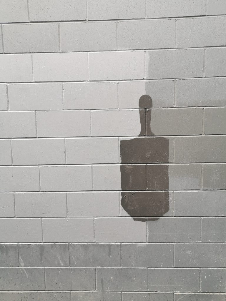
When you talk about the silhouette pencils, you are referring to your ‘bluff buff’ pieces, they remind me that the buff itself is essentially a bluff. We can look out and see the way that buff jobs just block out graffiti, they echo the shapes. I mean the most ridiculous buff jobs are the ones where you can still read the graffiti.
Yeah, they have just outlined it, you could go over it with a pen and it would fill in the gap perfectly. There are some great ones around!
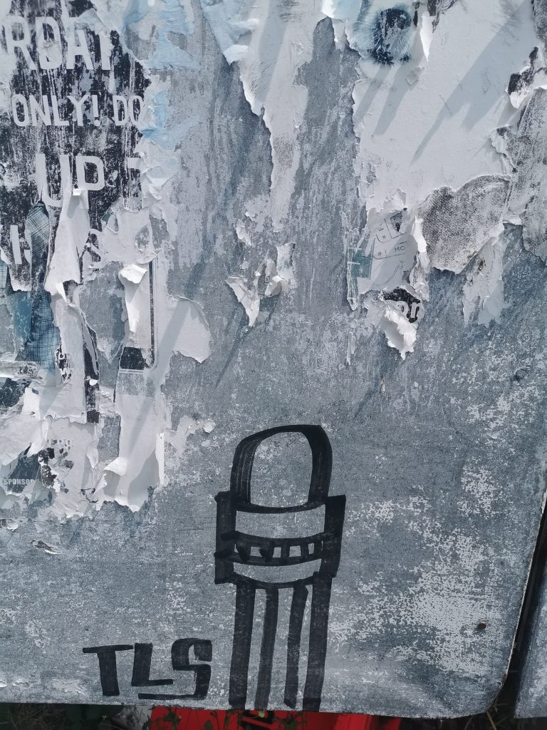
A Teeth Like Screwdrivers ‘Bluff Buff’ in central Christchurch, 2020
No one is ever going to say that the buff itself is an act of beautification.
It’s like that PEEEP Trust, they are actually stencilling their logo onto the walls they buff! At first, I thought it was an artist signing their work. It’s like the classic ‘official’ graffiti walls, with a spray can and it just gets filled. But I googled PEEEP and it’s an actual fucking thing! They are paid, or at least they raise money to do that shit.
It speaks more to masking than improvement.
It is deliberate censorship rather than enhancement.
The pencil bluffs play on that…
I don’t have roots in this. But it creates a grey area. If I’m painting on the wall and someone pulls up, I just say someone wrote the word fuck on it and I’m covering it up, and they go, ‘oh shit, that’s OK mate, see you’. No street artist is going to be using a tub of grey paint and a paintbrush, so the moment they pull up, because it’s essentially a rectangle with a bit on the bottom and a bit on the top, I can square it off and be like someone drew a dick and I’m covering it up. So, it’s making it safer for me because I’m that person.
You mentioned your love of skateboarding, was that the gateway to sticker culture and graffiti?
Skateboarding came first. I had stickers on skateboards first. There is an art form to putting a sticker on a skateboard, there is a certain way you do it. You put it in a certain place because you know that it’s going to get fucked if you put it in a different place. There is also the branding. I’m not going to put any old sticker on my stuff, it’s going to be representing me and therefore that’s important. So, I guess the placement, the branding, it has all led to where it is today. I am still like, why the fuck would you put a sticker there!? You could have moved it four inches and overlapped that one and it would have looked brilliant! That’s my inner nerdiness coming out, but there is a certain way to do it. In Lyttelton, one of Bongo’s pastes was coming off, and I wanted to put my one up, so I took his off and re-pasted it just a bit to the right and put mine so they overlapped nicely. He was like: ‘Did you move my piece a bit?’ Well, I had to because mine overlapping yours makes both of them look better, if i hadn’t it would have fucked up both of our work!
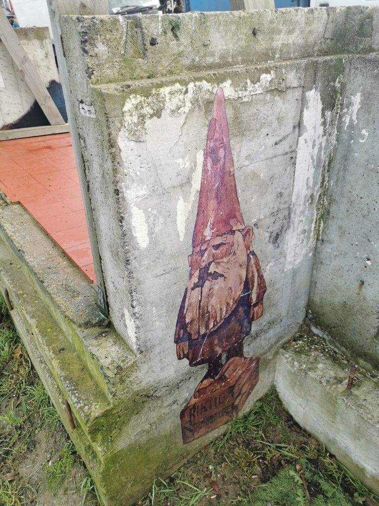
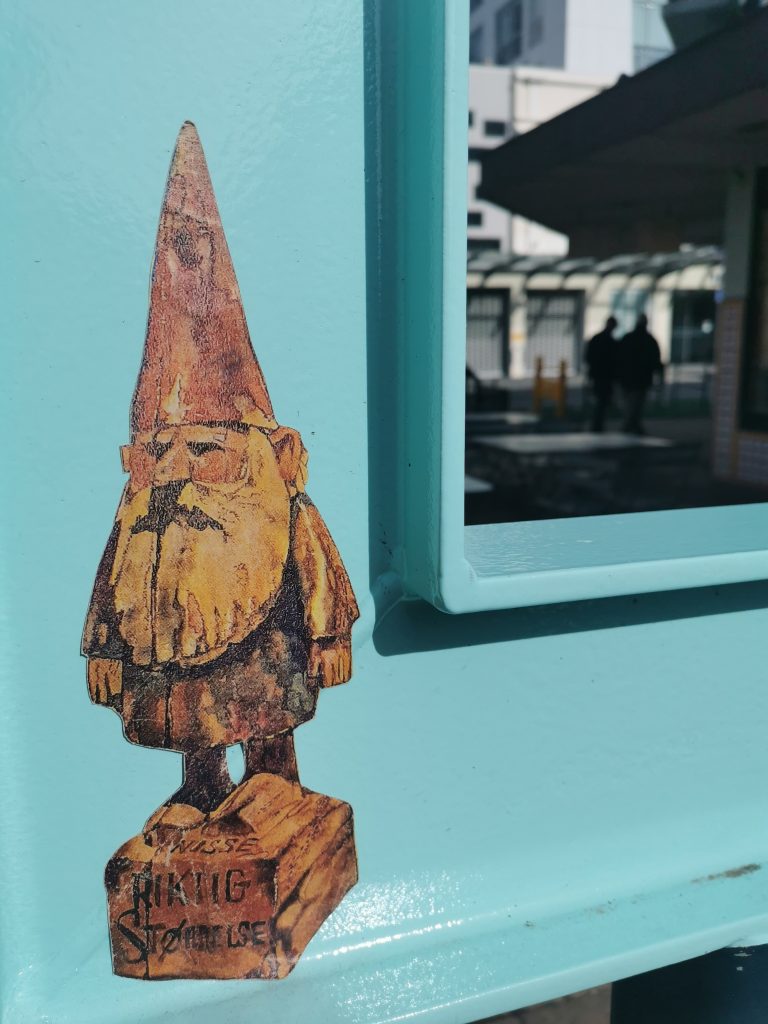
A Teeth Like Screwdrivers Gnome and Pencil beside a Bongo character, Lyttelton, 2020
That’s the thing about urban art, it doesn’t exist in a vacuum, it doesn’t exist in a white cube. The surrounding context of space gives it meaning, but also is part of the aesthetic. A mural on a wall has to work with whatever is going on there and it’s the same with a sticker. There’s a subtlety in terms of placement, and there’s also a mindfulness, right?
That’s trial and error too. The amount of times I’ve stuck a sticker up and it’s just slipped off. It’s all covered in dust and grime! But again, the buffs are a great example. You posted a picture of an alleyway somewhere, and instantly, I knew what had to happen! There’s a light grey, a dark grey, there’s an overlap, there is an obvious point for me to put a buff pencil. Again, it comes back to skateboarding. Skateboarders look at the world in a different way than most others, they will go past a spot and to anyone else it’s not a spot, but a skateboarder recognizes the fact that you could do a trick there, or you know, that curb’s looking really rad. It can be anything and the same thing applies to stickers and paste ups and graffiti, you see a spot and you’re like, ohhh, hello, that will work well…
It’s like those movie scenes where a character’s thought process is visualised and you see diagrammatic lines and mathematical equations in space.
Yeah skateboarders have that in spades! If you watch a skateboarder walking around town, you can just see the way they are trialing shit in their head. It’s just instinctive. I’m finding it’s the same with stickers, I’ve got a pile in my car and when I’m driving, I’m looking and thinking that spot would be perfect… Even colour is a part of it now, I never used colours in the past, I used white and black, now I’ve got all this colored vinyl. I’ve got this bright green, and I’m like, that will look so good on that wall, you know? It’s madness, it’s actual madness!
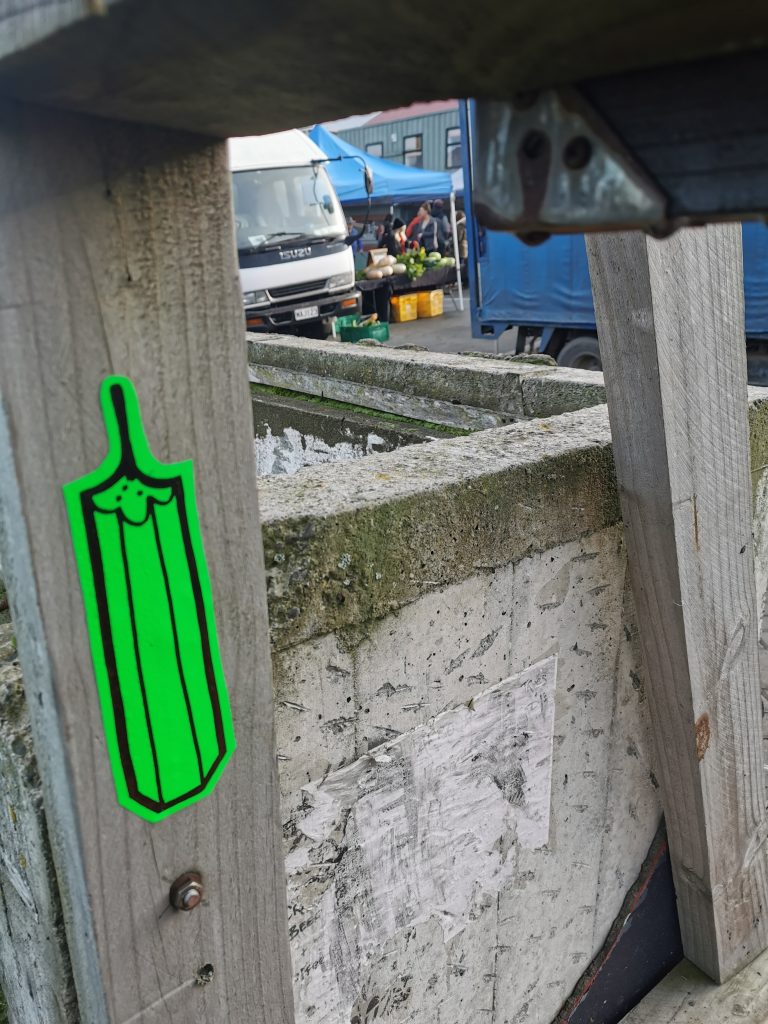
A vinyl pencil slap, Lyttelton, 2020
Urban art, graffiti, skateboarding, parkour, they are all tactical, they are always a response, and that’s the thing, they are constantly evolving. You can’t eradicate something that is not rigidly defined, things that can grow and evolve…
Certain styles of skating have come out of different cities because of the way that councils have tried to stop skaters. When rumble strips first came out in the UK, they were stated to be for blind people, so they can feel them when they are walking. But no, they are not, that’s bullshit. They were put there to stop me hitting it on a skateboard. But people were quickly figuring out how to go over them, doing tricks, and I fucking love that, it’s great.
It’s the same with graffiti, attempts to stop it are just going to change the way it occurs.
It’s just misdirection. I guess it is how cities get their style; if you’re in a city that’s heavy on trains, then a lot of train bombing is going to go down. In the UK, we didn’t have the train thing, so it was always on the buses, which is why stickers came about. You could get on the bus and just slap. If you lived in a city where there weren’t any trains coming through, you did the buses, because that was the next best thing.
And those different vessels mean different styles and techniques evolve in response.
Which is interesting for Christchurch because we are a city of concrete tilt slab buildings. I mean there are some fucking wonderful huge murals, and they are street art, it is definitely art on the street, but it’s also blocked off and lit and fucking ginormous, you know, and I feel that maybe there’s more to it all. I mean, I look at that [gestures to a nearby decorated window] and I don’t know whether someone’s done that themselves or someone’s been paid to do that, and I think that’s a really nice balance. We are so full of the big mural stuff that you can get away with putting a big paste up and no one questions it.
Small pencil stickers, Christchurch, 2020
With the breakneck change that the city’s gone through, it’s going to change the responses. So, it’s not just the eradication methods, it’s also the physical make-up. We had broken abandoned buildings that were perfect for graffiti writers to commandeer and then we had lots of exposed walls from buildings coming down which were perfect for murals, now we’re going to find more of these spaces that are more traditional spots, liminal spaces.
But weirdly they will be new! They will be sharp and fucking clean, perfect spaces, which for me, as someone who puts stickers up, I love that! The smoother the surface, the easier it is! I don’t want to deal with bricks and shit, I just want nice, clean walls. Also, the up and the down of this city, you know, there’s stuff on the floor, there’s stuff up high. We don’t have many high-rise buildings, so things stand out more. It’s got a sense of panorama.
Even from here, we can see the lay out of the city. There’s an expansiveness which is kind of inspiring in a way, because you don’t feel smothered or captured.
Or penned in. It also means that you’re not cliquing it, you know? I drive from Lyttelton to here, that’s the whole city, and it takes me fifteen minutes. So, there isn’t anywhere you can’t hit, which is fucking brilliant.
Which gives a real sense of possibility. Speaking of expansive, I really enjoyed watching your lock down collaboration project.
That came about as a lock down version of Inktober. Their first theme was like ‘green’ and then the next one was something else, and I couldn’t think of anything to do with my pencils for it. The collab thing is big in sticker culture anyway, so I just decided to write a list of twenty people I wanted do it with and I just put it out there. Then it became forty and then sixty and it just kept going. The concept is more of a mashup than a collab I guess, taking someone else’s art and doing it yourself in your way or blending your styles together.
You often use other people’s stickers to adorn things anyway, even if you’re not street slapping.
Yeah, exactly, so the mashup is just taking it to this next degree, I guess. MarxOne from up in Nelson, he is the fucking king, he has sheets and sheets and sheets of collabs with different people. As an artist, if someone does a picture of a pencil and they tag me in it, I’m not going to be like, that’s my pencil, don’t do that! That’s bollocks. But everyone has a style. I’ve tried characters and I’ve got a big fucking ginger beard character with a stupid bald head, who is basically me, and people now recognize that and that’s what it should be about and that’s the family thing again. No-one’s going to get pissed off, there’s no reason to, because someone’s literally saying: ‘I really like your shit, can I do my own version of it?’ You just go OK, send me a sticker when you’re done. I did one with Ocky Bop, one of his skulls with pencil’s for teeth. I just drew it and took a picture, and he’s like, I’m printing that shit! Now I keep getting tagged in all these pictures all over the world! It’s not complicated, I literally drew my pencils as his teeth on a sticker and now it’s gone everywhere!
Teeth Like Screwdrivers’ collab sticker with Ocky Bop, 2020
At the end of the day, that’s the beauty of sticker culture, it’s global nature. The internet has changed some of the ways we think about graffiti because now influence can be much wider, but graffiti still has an immediate localism to it. With stickers the mobility is unlimited, as you say, you’ve got pencils in cities all around the world and other people are doing it for you.
My favorite thing is that you send a pack to someone and they go: ‘Well I’m going to keep some for myself and put them in my black book because that’s cool, and I’ve got another fifteen, so I’ll put fucking five of them out in the street and I’m going to send ten to another five people…’
There’s a viral quality.
Yeah, for instance, my pencils, and my gnomes as well, they’re all over the UK and I haven’t sent a single one there. There is a guy called Spirit of Mongoose who is just printing a shit load. Which makes my job way easier. Of course, it’s not even my art, I just scanned a picture, but it’s the thought that this would happen.
A Teeth Like Screwdrivers Gnome, Lyttelton, 2019
The nomination is the act, and then as you say, someone else becomes part of it, and that comes back to family and community, this community is just much bigger than you ever realize until you start to make those connections and networks.
And it’s there all the time, it’s there and it’s getting bigger and bigger and more fun…
During the Covid-19 lock down, with our guided tours unable to run, we applied to Creative New Zealand for funding to create a virtual tour – a video series where you could learn more about some of the city’s most beloved graffiti, street art and murals from the artists who created them, all from the socially safe distance of your couch. With our friend Centuri Chan manning the camera and the editing desk, we talked to 17 New Zealand artists to get some insights into a range of works and topics, from Ikarus‘ take on graffiti writing and Paul Walters‘ stories about the massive SALT mural, to Jacob Yikes‘ discussing his signature style and Flox recalling her Ode to Hinewai work in Beckenham.
Originally conceived as a singular continuous feature, it became apparent that a segmented, episodic approach would prove more manageable, more adaptable and more consumable. As a result, the concept evolved into 16 individual vignettes, forming a cohesive series and spread across multiple platforms, including our online map entries. Featuring artists from around New Zealand (Paul X Walsh, Cracked Ink, Berst, Chimp) alongside local talent (Wongi ‘Freak’ Wilson, Dcypher, Dr Suits, Nick Lowry (Tepid), Dove, Jacob Root (Distranged Design), Josh O’Rourke, Jen Heads, Caelan Walsh), the series spans an array of styles and projects, highlighting the multifarious approaches within Ōtautahi’s urban art scene. Artists share humorous stories, intriguing insights and technical details, providing context and content to works that have become familiar sights in the city. With a level of normality returned, we like to think the Ōtautahi Christchurch Urban Art series is a perfect companion to a guided walking tour!
The Ōtautahi Christchurch Urban Art series can be viewed on our YouTube channel, via our social media platforms or on our website. With new episodes released each week, follow and subscribe to our various forums to receive notifications when new episodes go live!
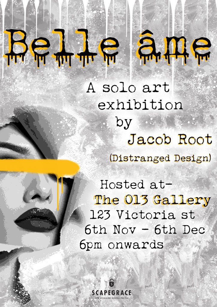
The artist also known as Distranged Design is gearing up for a brand new solo show. Opening Friday November 6th, Belle Âme will be hosted by Victoria Street’s 013 Gallery.
The title of the show translates to ‘Beautiful Soul’ and Root explains that his new works seek to illuminate “the beauty hidden within life’s most challenging moments.” He adds that the show has also been indirectly inspired by the struggle of mental health, a cause Root has championed previously with a group exhibition, and an attempt to turn “one’s negatives into positives.” The works will feature details and meanings that may not be immediately obvious, lying hidden but always present. Root is also excited by the potential for audiences to bring an outside point of view to the works and adapt meaning to their personal experiences. Continuing a recent focus, these new works will add sculptural and three-dimensional elements to his established stencilled figurative images and stylised surfaces, creating a new direction for the young artist.
Belle Âme opens 6pm, Friday November 6th at The 013 Gallery, 123 Victoria Street, and runs until December 6th.
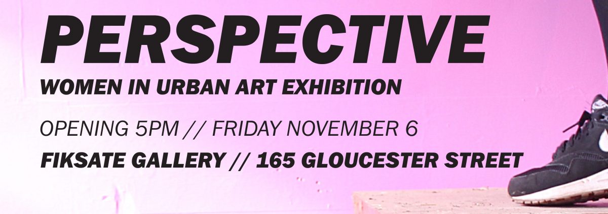
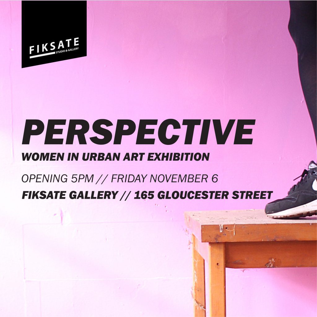
Urban art, and graffiti in particular, are viewed by many as masculine realms, physical, aggressive and competitive. But, the reality is that women have long had a vital role in the history of wall writing and street art, from subway graffiti writers like Lady Pink, to post-graffiti icons like Swoon, and leading members of the contemporary mural movement like Maya Hayuk. In Aotearoa, the female presence in urban art has also been notable, and Fiksate’s Perspective exhibition, opening on November 6th, brings together an array of artists to share their diverse experiences and reveal the myriad stories and pathways of women in urban art.
Organised by Fiksate owner Jenna Lynn Ingram (Jen_Heads), Perspective brings together established and emerging female artists from around New Zealand (and further afield), with a diverse range of practices, from typography-focussed graffiti writers to spoon-loving street artists, collagists, paste-up artists, photographers, videographers, traditional painters and mural artists. This diversity reveals the approach of Perspective, less concerned with an explicit historical narrative or thematic or stylistic similarities, the show primarily explores the scope of work of the collected artists, from Flox’s beautiful stencils to Kophie Su’a-Hulsbosch’s empowered portraits or Befaaany’s striking urban photography. In doing so, notions of the female urban artist are both celebrated and challenged.
Auckland artist Flox is one of the impressive line up included in Fiskate’s Perspective: Women in Urban Art Exhibition.
Local talent Kophie Su’a-Hulsbosch is part of the Christchurch contingent of the show.
Accompanying the exhibition will be a limited-edition risograph zine, produced by Jane Maloney of M/K Press, providing additional insights into each artist’s background and further highlighting their varied experiences, from the challenges they have faced to the different environments that have fostered their approaches and nurtured their talent. While more fluid and non-binary gender identities may render gender specific exhibitions less necessary in the future, Perspective is an important moment in Aotearoa urban art, a celebration of some amazing talent.
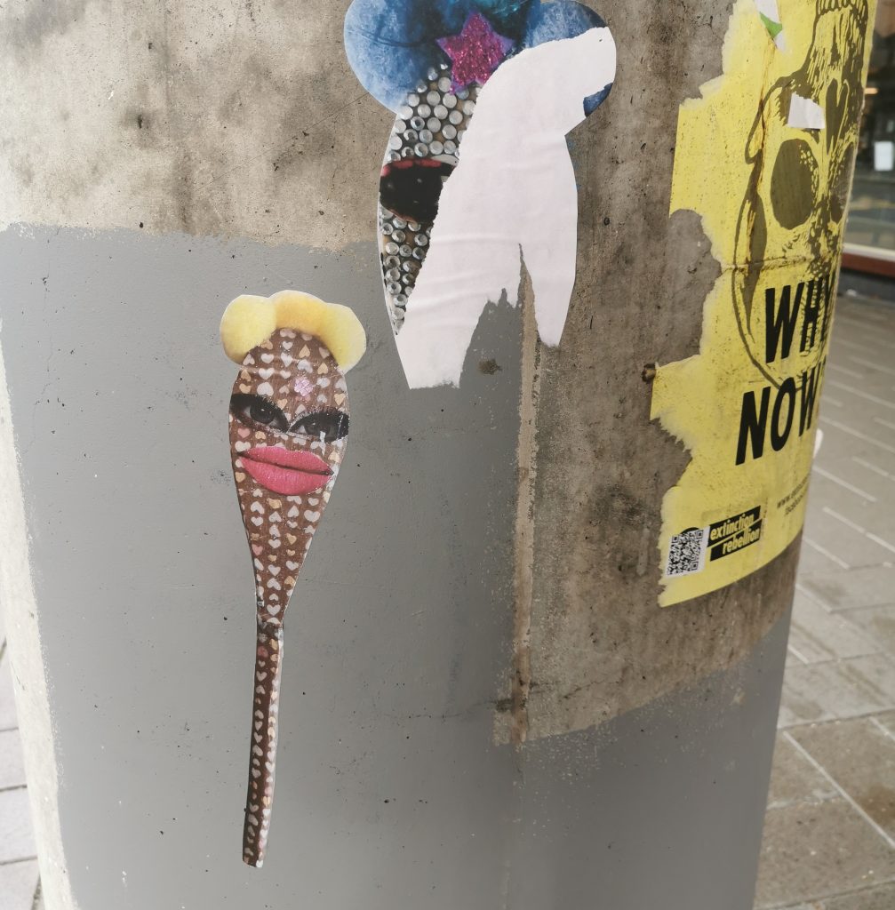
Spoon-making street artist Vez highlights the diversity of the Perspective line up.
Perspective opens 5:00pm, Friday November 6th at Fiksate Studio and Gallery, 165 Gloucester Street.
For the September recap we reached out to our pal Teeth Like Screwdrivers, sticker aficionado, purveyor of pencils and host of Slap City, a fortnightly creative collab session held at Fiksate Studio and Gallery. As a figure who has brought people together to share, make and collaborate on creative projects, it was no surprise his highlights from last month reflected the communal, from photographic projects to conscious exhibitions and, of course, the Slap City events on the road to Ōtautahi Zinefest. Take it away Teeth Like Screwdrivers…
Is it the new normal now to talk about how weird each passing month is? It is? Ok, I’ll continue, with our normal. Welcome to September 2020.
September seemed to ramp up with ‘happenings’ in Ōtautahi. Maybe it was watching what was going on up north and knowing how lucky we are down here, maybe the feeling that summer is just around the corner, but there certainly seems to be a buzz around the city and the stuff I’m interested in…
Slap City on the Road to ZineFest
The Road to Zinefest event at Fiksate Gallery brought together Slap City, Otautahi Zinefest, Ride on Super Sound, M/K Press and the Physics Room… (Photo courtesy of Otautahi Zinefest)
A regular event for me has been hosting (I turn up!) a fortnightly sticker and paste-up workshop at Fiksate Gallery. For the month of September the workshops took on a new, busier, more awesome direction when we were joined by Ōtautahi Zinefest, Ride on Super Sound, M.K Press and The Physics Room. Suitably called ‘Road to Zine Fest’ the evenings saw people trying their hand at zines, Riso printing, sticker collabs and the ever popular badge-maker. Then of course there was Zinefest itself on the 26th, which was a huge success and really great to see it happening at Tūranga smack in the middle of the city.
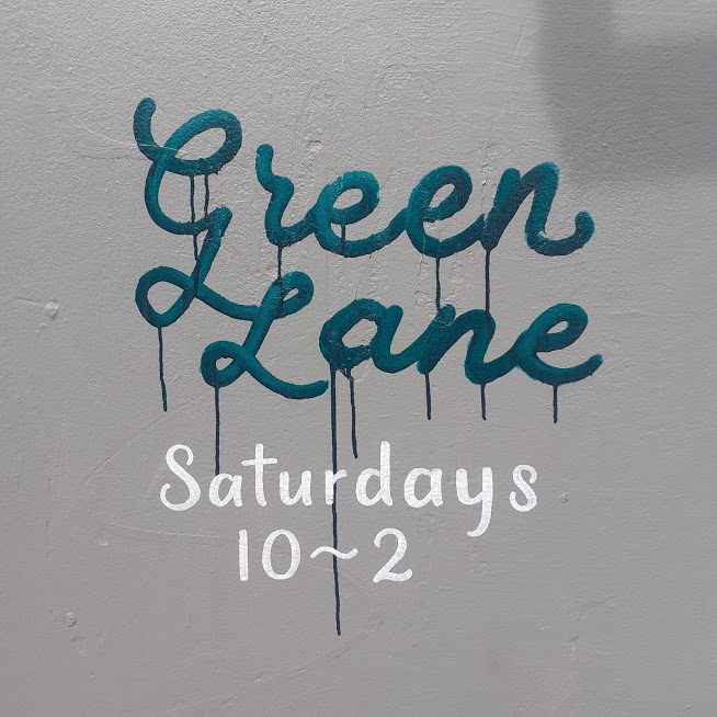
Green Lane Market
(Photo supplied by Teeth Like Screwdrivers)
Markets of all sorts seem to be kicking off across the city, especially markets based around sustainability, recycling and re-purposing. Green Lane has been host to some great events in the past couple of months (King of the Forest was insane) but every Saturday it opens its doors as a market. The last few weekends have been really busy and it is great to see spaces like Green Lane pop up and cater to something other than the mall shops and international brands.
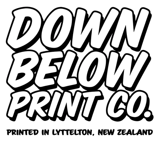
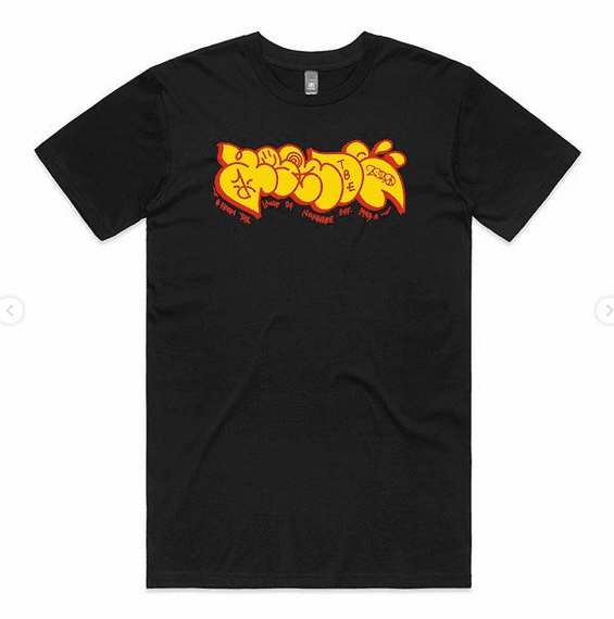
Down Below Print Co.
The limited edition Down Below Print Co. X Agroe collab t-shirt. (Photo from Down Below Print Co.)
Living in Lyttelton I am pretty biased towards anything portside. Down Below Print Co. is a Lyttleton-based screen printer with strong ties to the Dunedin scene. Every month they are releasing a collab t-shirt with a different graf artist for a limited time and run. For the month of September it is Agroe, and it is a good one!
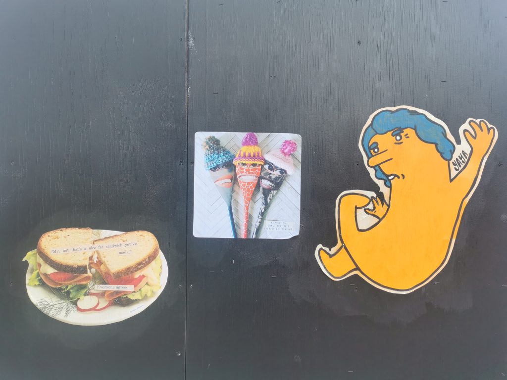
Slapped City…
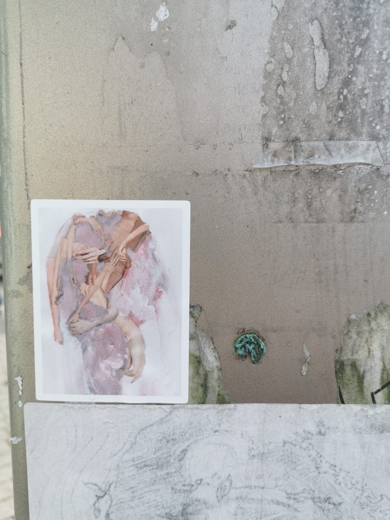
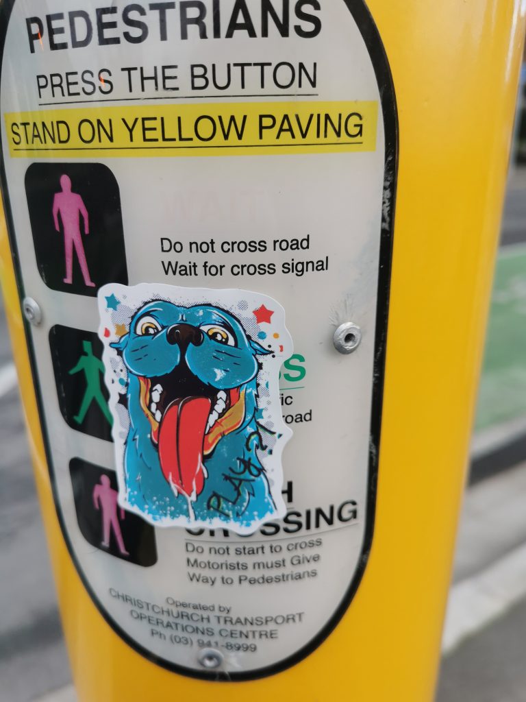
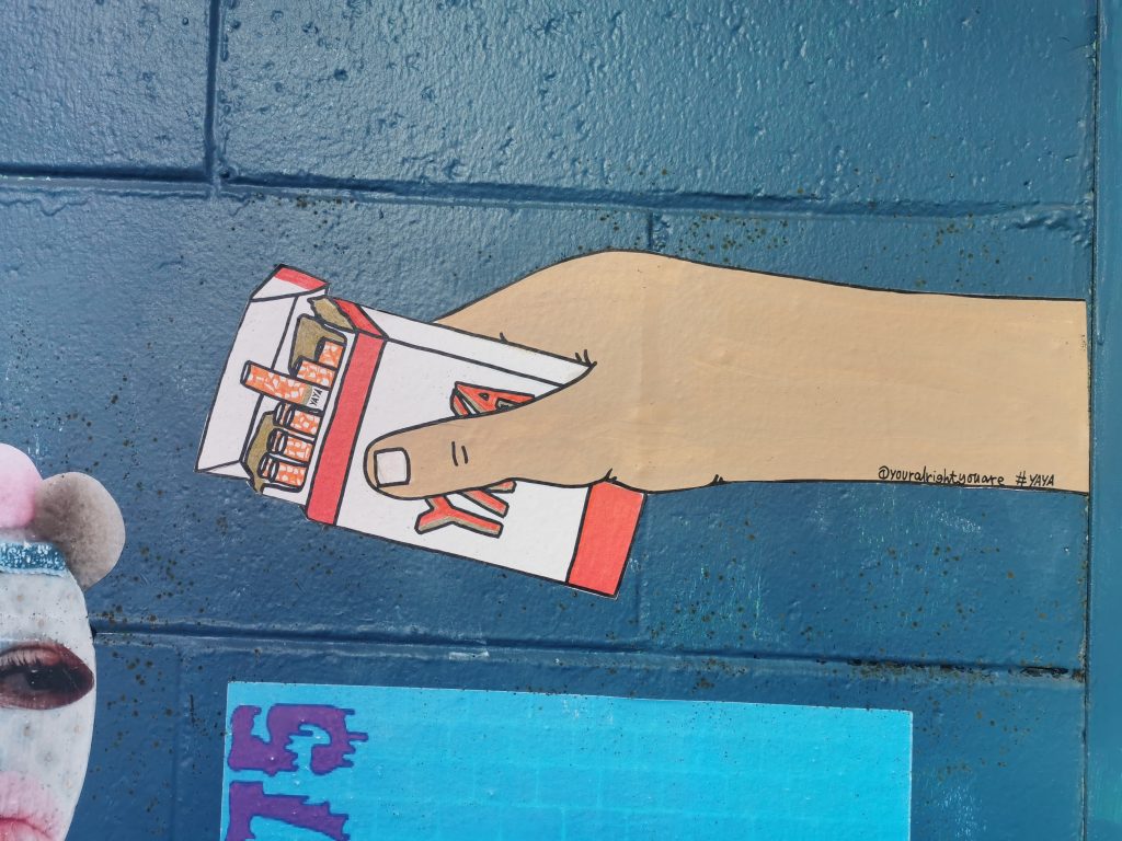
Central city paste ups by Cape of Storms, Vez and Your Alright You Are.
Maybe it is that whole post lock down thing and a need to get out and about but the city seems to have been overrun with stickers and increasingly paste-ups. It has been great to see Christchurch is catching up with Dunedin with heaps of international artists getting pasted up. My particular favourites have been seeing YAYA, Vez’s spoons and more recently Cape of Storm’s tongue-in-cheek art works popping up across the city.
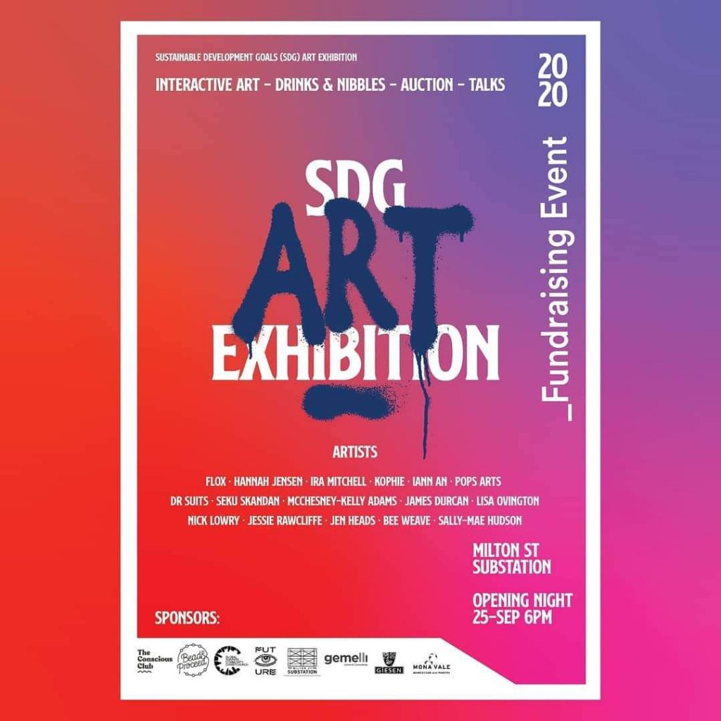
SDG Art Exhibition at the Milton Street Substation
Jessie Rawcliffe’s Ophelia from the SDG Art Exhibition at the Milton Street Substation.
Having been involved in the very first Conscious Club event I am always stoked to see what they get up to. Not only have they recently opened their headquarters in the Boxed Quarter but the last few days of the month saw the opening of SDG Art Exhibition at the Milton St. Substation. The exhibition showcased the work of 17 different artists, each work representing one of the 17 United Nation Sustainable Development Goals. Highlights of the show for me were the works by Jessie Rawcliffe and Lisa Ovington.
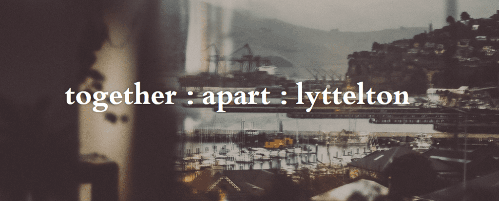
Justyn Rebecca’s Together: Apart: Lyttelton
(Photo from Together: Apart: Lyttelton website)
Right at the end of the month there was a rad show at Te Ana Marina in Lyttelton. Together: Apart: Lyttelton is a huge installation of photos taken by Justyn Rebecca of people from Lyttelton during our Lockdown. All the photos were taken through windows, for social distancing reasons, and had to be within walking distance of Justyn’s house. Marlon [Williams] played some songs, people hung out on the grass with picnics and there were kids running about, skating and on scooters.
Welcome back to normal, Christchurch.
Follow Teeth Like Screwdrivers on Insta, and become part of the Slap City family on alternating Wednesdays at Fiksate Studio and Gallery…
On the 25th September, The World Economic Forum Global Shapers Christchurch Hub proudly opens an exhibition to bring awareness to the UN Sustainable Development Goals (SDGs) and raise funds for the charities that align to those goals. Bringing together an impressive slew of artists, including a significant number with urban art pedigree, the exhibition marks the beginning of the ‘decade of action’, the ten year span culminating in the 2030 deadline for achieving the goals and in doing so, create a world that can serve future generations more fairly. The exhibition reflects the belief that creativity can play an essential role in bringing awareness to and creating discourses around these causes.
The exhibition, staged at the Milton Street Substation, is made up of a diverse line-up of talent, including artists from Christchurch and around New Zealand: Pops Art, Nick Lowry, Iann An, Séku Skandan, McChesney-Kelly Adams, Ira Mitchell, Hannah Jensen, Kophie Su’a Hulsbosch, Bee Weave (Selina Faimalo), Dr Suits, James Durcan, Flox, Jesse Rawcliffe, Sally Mae Hudson, Lisa Isbister and Jen Heads. Each of the seventeen artists will present work reflecting on one of the seventeen SDGs, providing a response to the relevant issues in their own distinct styles.
The Global Shapers Christchurch Hub is composed of a small number of exceptional young professionals. Members come from diverse backgrounds, united by a passion to influence positive change through meaningful projects and to harness the collective power of active citizenship. Hub members Bridget Williams, founder of Bead & Proceed, and The Conscious Club’s Selina Faimalo and Kophie Su’a Hulsbosch have taken on curatorial duties for the SDG exhibition, drawing on their backgrounds in creative realms, social enterprise and the shared desire to empower, educate and inspire towards a sustainable future. We asked Bridget, Selina and Kophie a few questions to get the run down on the exhibition…
People may not know much about the SDGs – what are some of these goals?
The seventeen SDGs include important goals such as achieving zero hunger, eradicating poverty, supporting good health and wellbeing, climate action and ensuring access to quality education, to name a few.
How did you decide art was the lens through which to bring awareness to this cause?
The SDGs are all interconnected, and in order to leave no one behind, it is important that we achieve them all by 2030 which is only ten years away, so raising awareness that these goals even exist is one step closer to achieving them. Art and creativity send such a strong message that really resonates with many. It doesn’t just send a message, but also creates a powerful statement.
How did the curatorial group select the artists?
Kophie has an arts background and she selected people in her network that she thought would represent the SDGs well. The result is a great mix of artists and people.
Were you looking for artists who were already interested in social and sustainability issues, or was it a case of allocating the concepts to artists?
We looked for artists that could represent these issues, but it was an opportunity for them to learn more about the SDGs and become more acquainted with these issues. We got each artist to choose the three SDGs that resonated most with them, and from there we sorted through them and allocated them each a specific goal.
There is a strong presence of artists with ties to graffiti and street art, despite all the change surrounding those cultures, do you feel that they still display a social consciousness both outwardly and inherently?
As Kophie was the curator she definitely has a bias to selecting urban artists but tried to select a diverse range of artists in other fields. She believes graffiti and street art is one of most free, political and subversive forms of art, so I would say the consciousness of this art form is definitely strong enough. Also, it provides more representation to underground artists, when traditionally the SDGs would mostly be associated with a more highbrow aesthetic.
Tell me more about the venue, what has it presented in terms of the possible lay out of the show?
The venue is an industrial converted substation, a large old brick building, two stories high, with three distinct areas. On the ground floor, where the exhibition will be held, is a large rustic brick room, with a foyer out the front. Upstairs there is an overlooking floor with retro wooden floors and a balcony facing the courtyard outside. It is going to make for a really unique venue.
What other projects does the Global Shapers Hub have lined up?
The Hub is looking at other long term projects such as a Climate Dollar for Christchurch and collaborating with other organisations to help address the negative effects of Covid-19 (regarding the future of sustainable work experience) and, importantly, supporting other hub members who are working on impact projects.
THE SDG Art Exhibition opens September 25th at 6pm, with drinks, nibbles, talks, interactive art and an auction. Funds go towards supporting charities aligned with the SDG outcomes. For more information to the event page on Facebook.
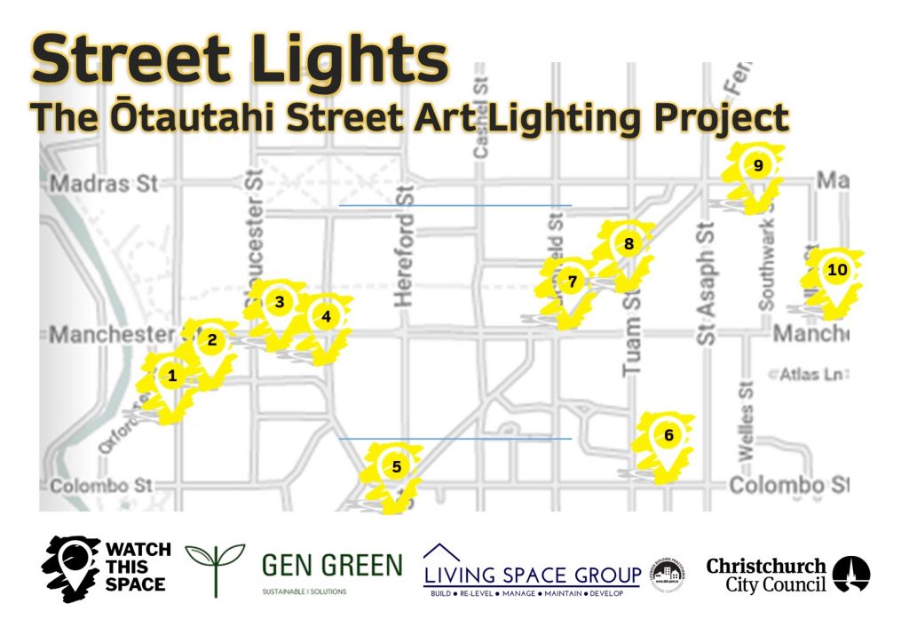
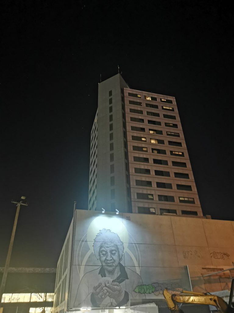
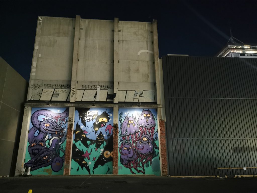
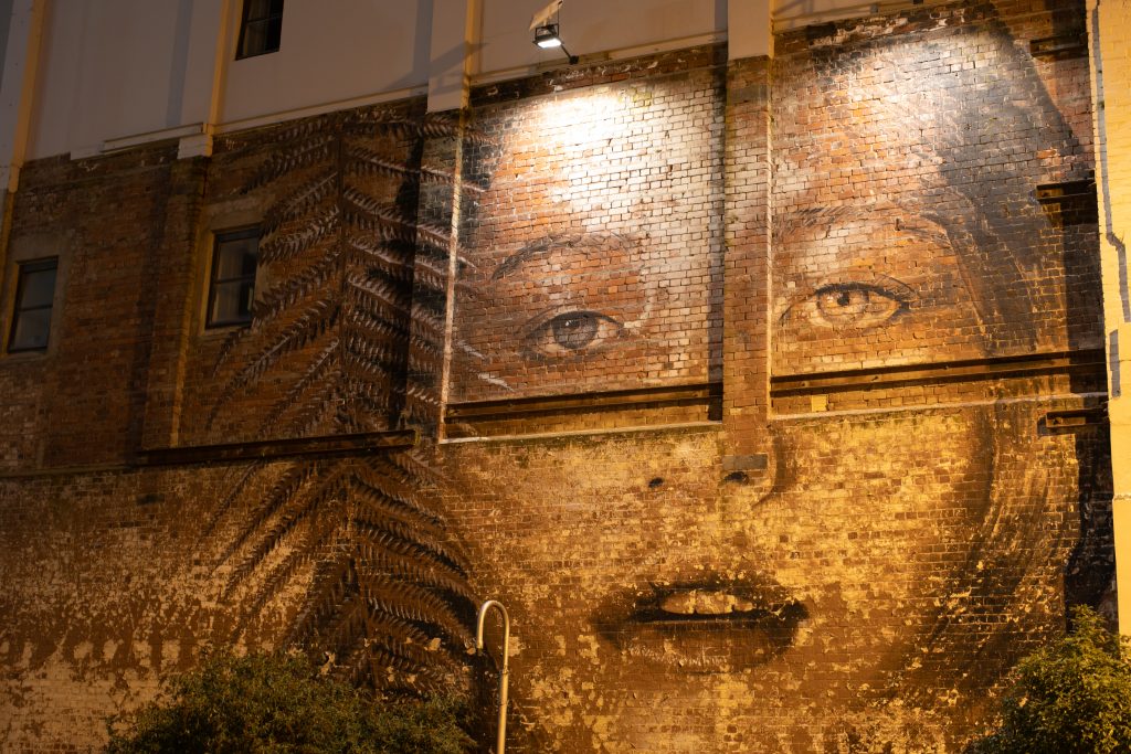
It seems like an age ago that we were introduced to Brendan Stafford and Greg Dirkzwager from local sustainable tech company Gen Green. The guys from Gen Green had the idea of lighting up some of Christchurch’s beloved street art murals using sustainable solar lighting, not only exposing the art in a (literal) new light, but also activating spaces in the city that often feel dead after dark. When they asked Watch This Space to help them realise the project, we were excited to join forces…
While such a plan seems straightforward enough, the reality is more challenging (even more so when you throw in a global pandemic). The first step was to select the works, looking at those pieces that would be practical and impactful, a difficult task in a city with so much urban art to choose from! We narrowed down the list to ten murals, although as time passed that list changed. The works formed a sort of trail to wander, spanning a section of the central city.
The next phase was to consider how to light the works, both from a design standpoint and more practically in terms of installation. Our imperative was always to ensure the works were not altered, the lighting instead simply highlighting or echoing the existing visual effects of the works. While the lights and charging panels are relatively small, finding solutions to avoid detracting from the works and to ensure safe and secure application was an important task. This was were Guy Archibald and George Clifford and the team at Living Space Group, a local contracting company, joined the project, contributing their skills to ensure all the requirements around installation were met.
With the lights installed, ten works of street art are now illuminated, creating an urban loop to explore the city, and just in time for the summer sun to play its part! And even if we do say so ourselves, they are looking pretty amazing!
Locate the lit up murals on the map below, and for more about each work, click onto our online map:
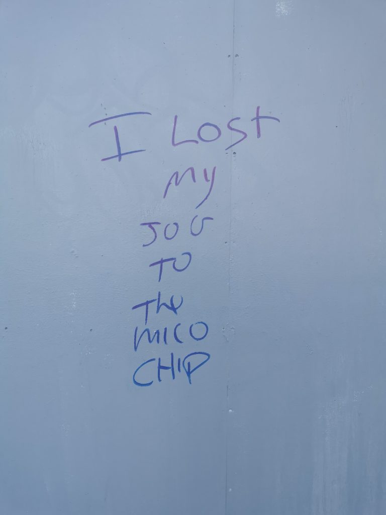
As the city continues to shift, refresh and transform, the little things matter more and more. The vacant and damaged spaces that encouraged more bold and brazen interventions are now less prominent (some of our favourite spots around the city face imminent revitalisation). The necessary contrasts of our urban surroundings are increasingly supplied by the small, unexpected things, clashing with the washed concrete structures and shiny facades that continue to stretch and grow. (Do I sound like a broken record?) Those little details that make a city lived in and alive can raise so many ideas, from the explicit to the subtle, the pointed to the more amorphous and undefined. Yet in each case, their mere presence serves to explore what it means to be part of and have a voice within a larger conglomeration. They provide a sense of the human and authentic (with just a touch of dissent, of course) and signs of contrast and contestation amidst the monolithic towers of progress (both literal and metaphoric), .
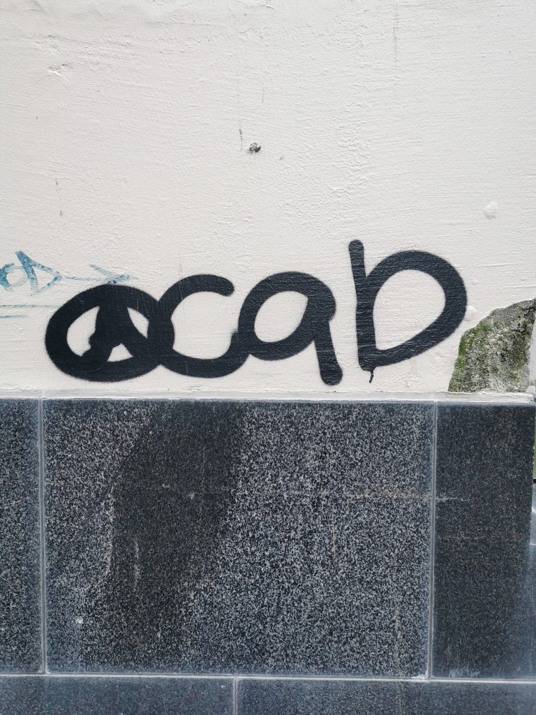
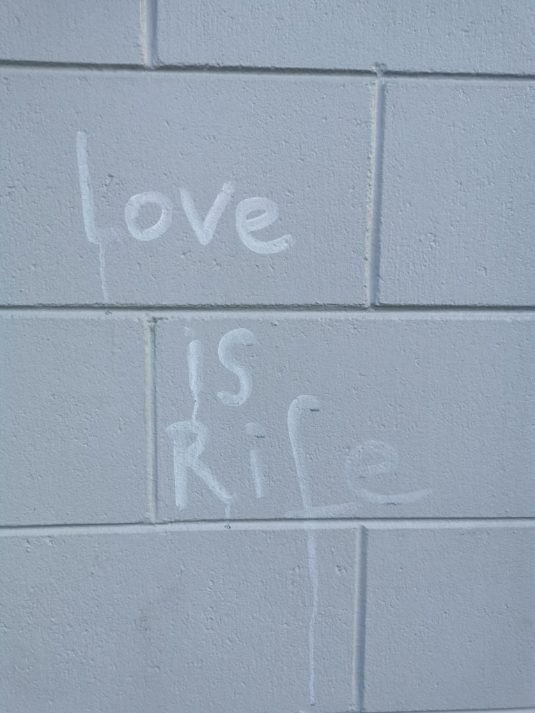
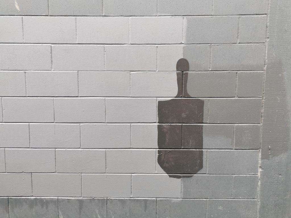
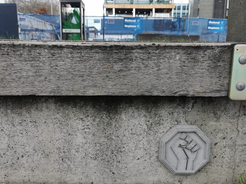
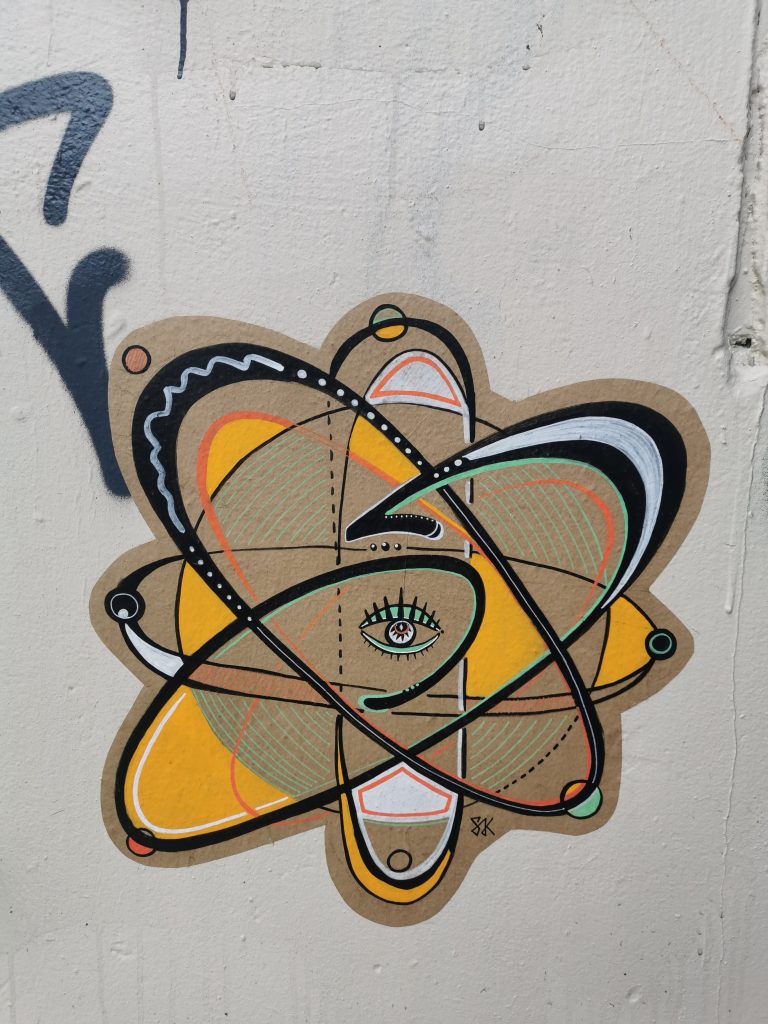
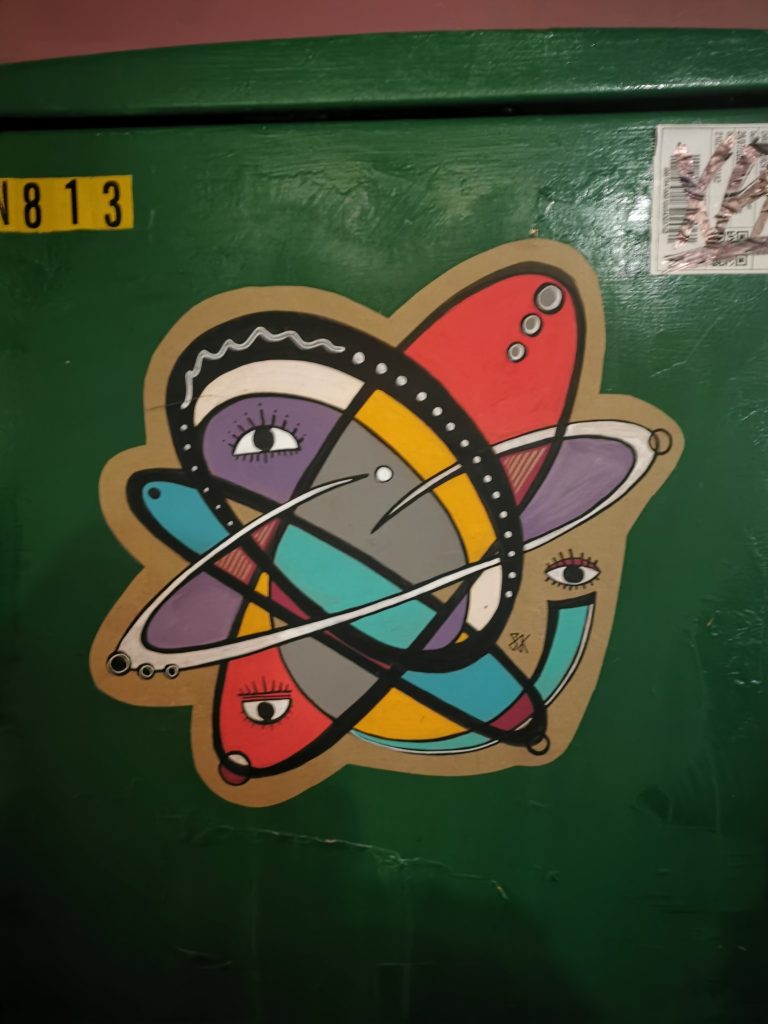
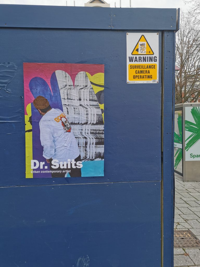
This second volume of Street Treats features a host of artists and threaded themes, from the traditional, yet entirely timely ACAB/1312 element, to graffiti’s unerring ability to speak of ugliness and beauty concurrently, or in the case of Teeth Like Screwdrivers’ ‘buff bluff’, the inherent potential in the blocks of grey paint that cover graffiti. Levi Hawken’s concrete sculptures have echoed the physical make up of the cityscape while speaking of his graffiti and skateboarding roots, and notably the Black Lives Matter movement. Vesil’s graffiti continues to be a highlight, diverse and well-placed, with an assortment of accompanying characters and accoutrements raising the spectre of playful nostalgia. Anonymous scribes contest election billboards and the future of human utility (I think…), or more hopefully, remind us that ‘love is rife’. Stickers and paste-ups continue to have a rising presence in the city, with acerbic, humorous and intriguing additions to urban walls and fixtures. In the case of FOLT’s skull cut-outs, it is as much the absence as the presence that is striking as these popular sculptural pieces are removed. Cosmik Debris’ paste-ups suggest the molecular science behind all things and the scale of being, while Dr Suits blurs the line between art and advertising, without anything to sell. This collection revels in the details of the city, details that many overlook. Yet, when you start to look closely, there are always surprises, always discussions, and always alternatives…
With the return of Level Two, August has been a bit of a roller-coaster, with the highs of communal gatherings matched by the returning weariness of congregations and the tiresome political bickering and conspiracy theory wackiness dominating much discourse. But that is where art is so effective, it can be both a glorious shared activity and a private independent adventure, a distraction from what is going on and a reflection of those same issues. The month started with a sense of excitement as I met with artist Tom Bell to discuss his upcoming show Adoration, which provided a great opening night. As time passed, more things turned my head. It was clear people were busy, from guerrilla interventionists, to mural artists, and it felt like the city was alive with activity. This energy has been somewhat tempered by the potential of a shut down (at the time of writing this at least), but it gives me pause to believe that even when difficult times emerge, art can always find a way to help out…
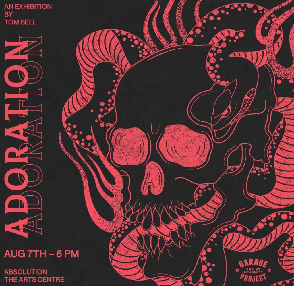
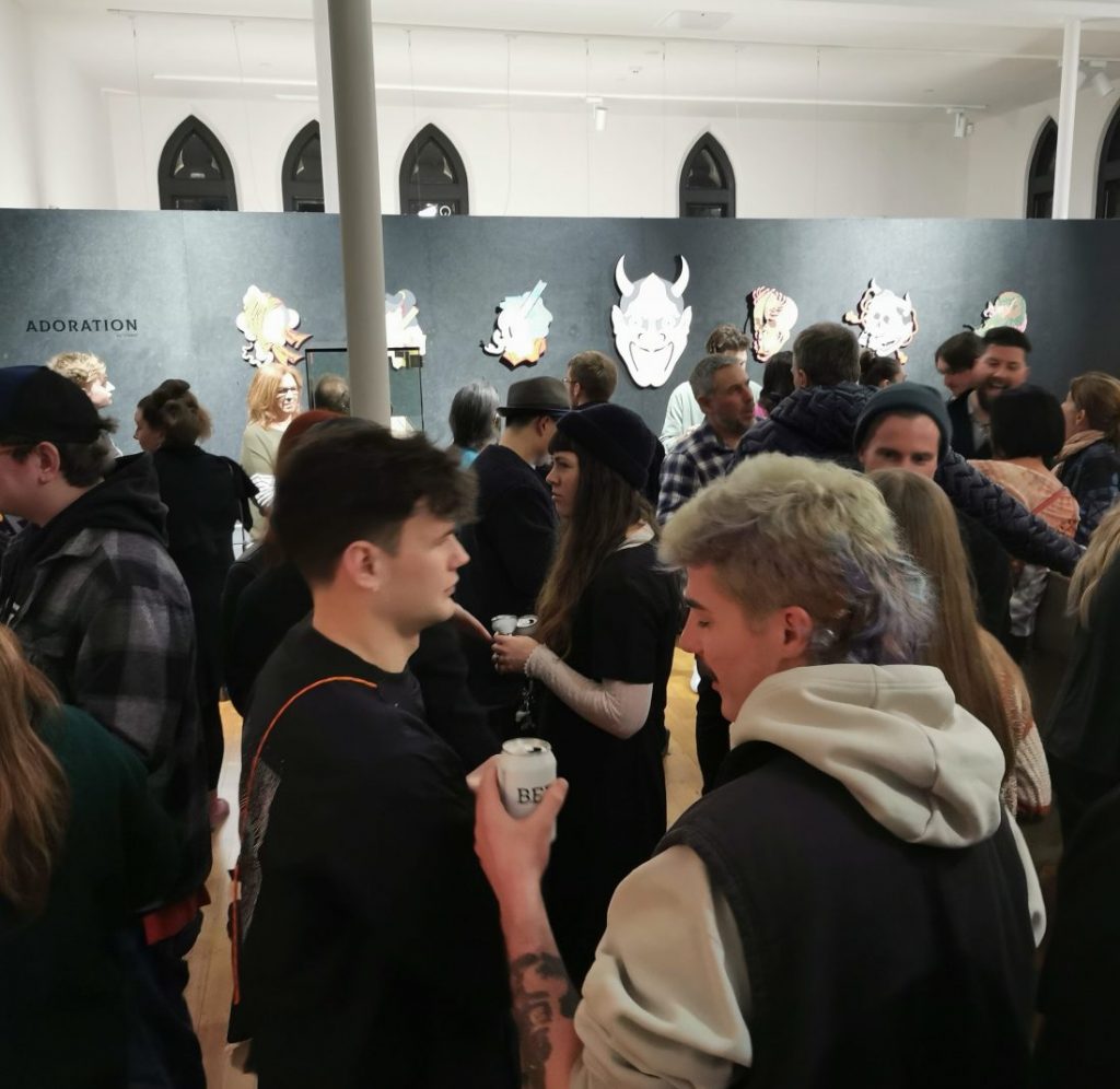
Tom Bell – Adoration @ Absolution
The month kicked off with a farewell as Tom Bell presented Adoration at Absolution in the Arts Centre. Tom has been based in Ōtautahi for several years, working as a graphic designer, while diving back into painting more recently as a creative outlet. His art has long been entrenched in Japanese imagery, and Adoration played homage to that ‘adored’ visual style. Intricately cut and painted plywood, with subtle layering and flashes of detail made for a striking collection. The turn out was also impressive, with Absolution jam-packed, a well-deserved result for the artist’s long path towards Adoration.
Levi Hawken’s urban installations
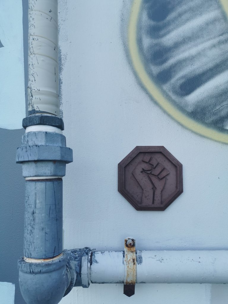
Auckland-based artist Levi Hawken’s concrete sculptures were introduced to the city at the Fiksate show Urban Abstract last year. Placed within the gallery setting, they were immediately recognisable as versatile aesthetic objects. But Hawken’s works are undeniably influenced by the urban environment and they gain so much from their placement within the cityscape. It was therefore an awesome surprise to see a number of his small works mysteriously applied to walls and fixtures around the city, subtly subverting expectations.
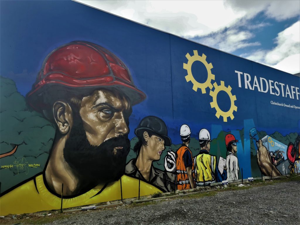
Wongi ‘Freak’ Wilson’s TradeStaff mural update
We all know Wongi Wilson’s aerosol technique is mightily impressive, and that rings even more true as time passes and he refines his approach. That reality is instantly recognisable with his recent refresh of his own TradeStaff mural on the corner of Colombo Street and St Asaph Street. The original mural, painted around 2013, had become a familiar site in the CBD, but the new work, still in progress when I first saw it, is incredibly striking, almost invoking the proletariat intensity of propaganda posters…
Catching up with old friends…
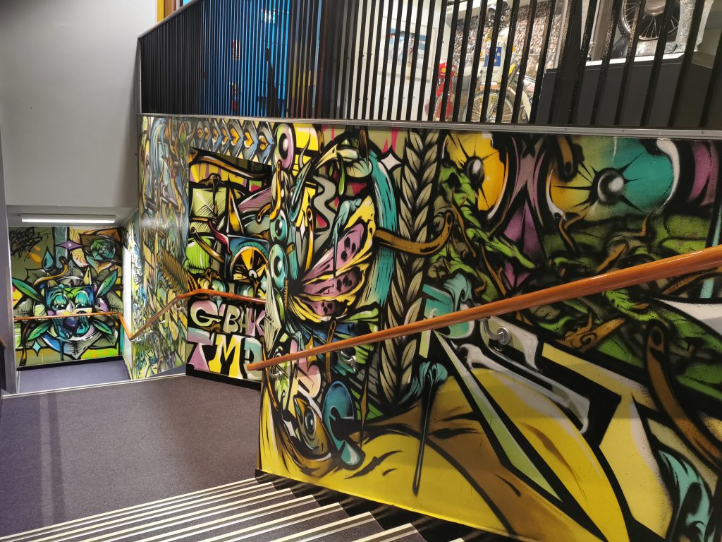
Over the month of August, we have been putting together a project that we can’t wait to share… but for now, it is enough to say it has been a heap of fun catching up with a bunch of our favourite artists and revisiting some of their most memorable works (including some more recent additions), such as Berst and his God of the Forest in Sydenham and staircase mural inside the Canterbury Museum (pictured).
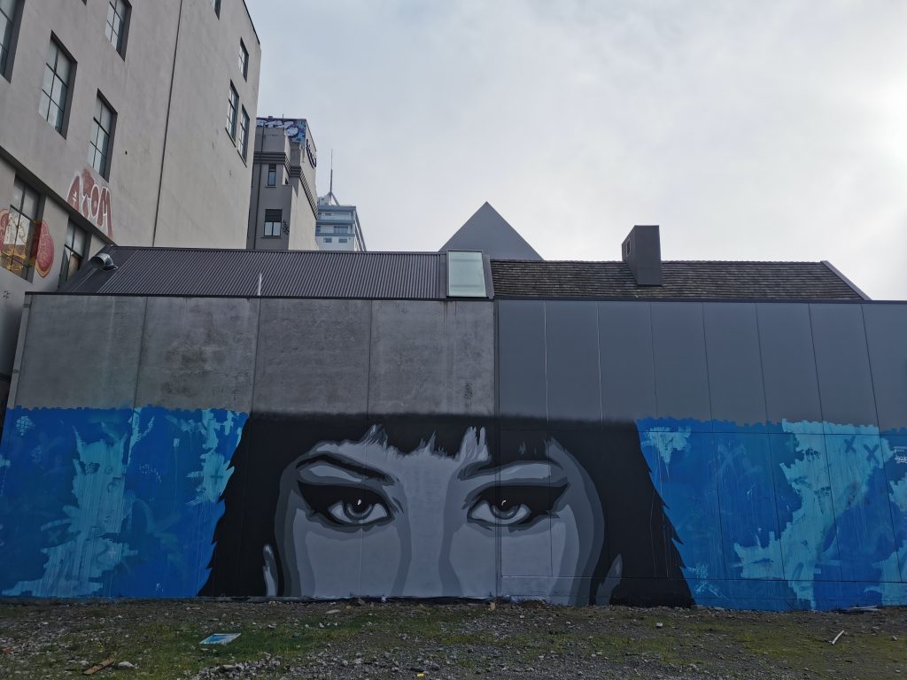
Distranged Design on Manchester Street
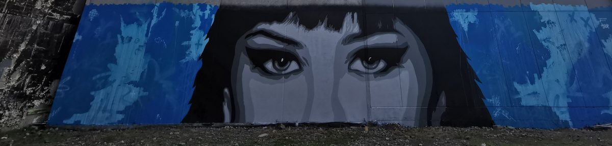
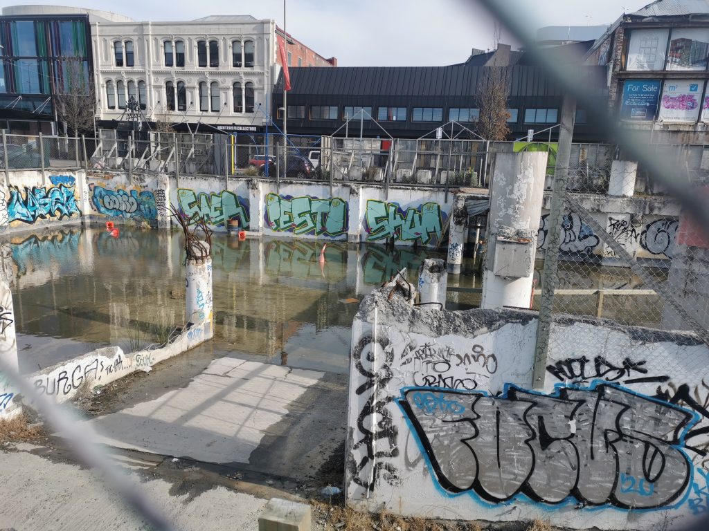
Distranged Design’s newest outdoor work on Manchester Street is an impactful surprise, anonymous eyes peering out from an expressionistic blue background splashed across a distressed wall. Staring at passing traffic from behind hurricane fencing it is an alluring sight and forms part of a larger collection of interventions in the vacant lot…
What were your highlights from August 2020? Let us know in the comments below…