
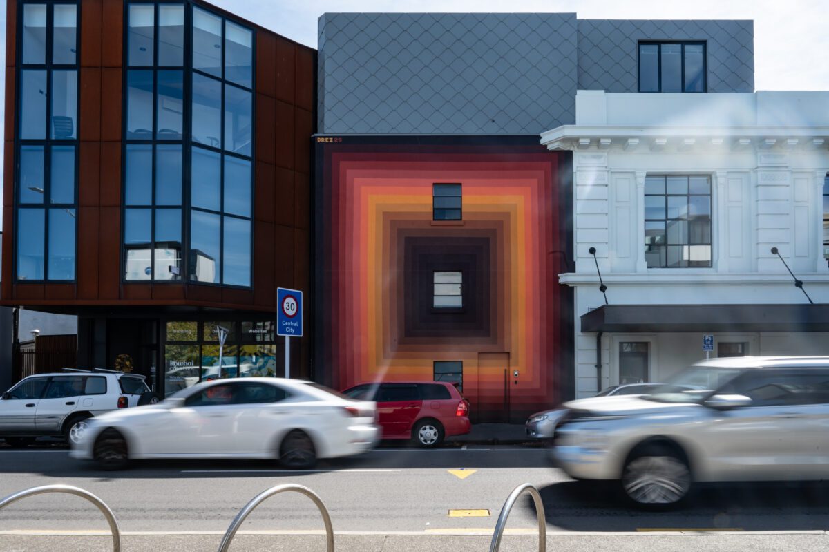
Good things take time – that’s what they say, anyway. It’s hard to believe that it was mid-March when we sat down with Melbourne artist Drez to reflect on his whirlwind visit to Ōtautahi for the Flare Street Art Festival, where does the time go? With a lot going on, it has taken us a while to finally publish our conversation (conducted in a car in Phillipstown just before Drez departed for the airport!), but we know it is worth the wait! After getting to know Drez as he painted his striking mural on St Asaph Street, it was a privilege to take the chance to dive a bit deeper into his practice, his influences and the comparative cultural and historic landscapes of Aotearoa and Australia. A thoughtful and reflective presence, Drez reveals the importance that he places on his work’s ability to engage its audience through colour and form, eliciting a direct connection between art and experience…
Continue reading “Chromatic Oscillations – An Interview with Drez”Tag: Public Art
Lighting an Icon for Puanga Matariki – Flare Ōtautahi Street Art Festival, Offline Collective and Christ Church Cathedral Present Hurihanga
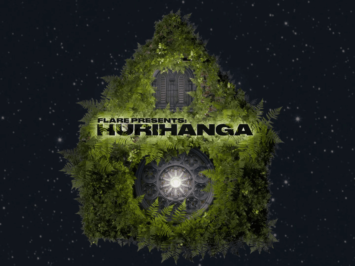
As part of Ōtautahi’s Matariki celebrations, the city’s most iconic heritage building has been illuminated by a powerful projection created by the Offline Collective’s Sam Emerson (Ngāi Tahu) in collaboration with collective members Michael Duggan and Charlie Pitts. Presented by Flare Ōtautahi Street Art Festival, the Christ Church Cathedral Reinstatement Project and Offline Collective, Hurihanga transforms the Cathedral’s exterior into a canvas of light, honouring stories of renewal, remembrance, and whakapapa through breathtaking visuals and mātauranga Māori.
Continue reading “Lighting an Icon for Puanga Matariki – Flare Ōtautahi Street Art Festival, Offline Collective and Christ Church Cathedral Present Hurihanga”Piece of Mind – Dcypher, Graffiti Muralism and Changing Perceptions…
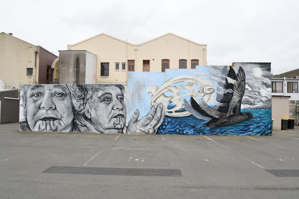
When the opportunity to refresh his mural on the corner of Welles Street and Colombo Street arose in late 2024, Dcypher had a few ideas in mind. The original mural, commissioned by the New Zealand Transport Agency, had become somewhat rundown, it’s large sections of flat colour filled with a variety of uninvited additions. The chance to repaint the wall, without having to respond to a cycle safety brief, allowed the artist to explore themes and styles closer to his heart.
Continue reading “Piece of Mind – Dcypher, Graffiti Muralism and Changing Perceptions…”Spotlight 3.0 – with Iva Anjani

The latest Spotlight work to illuminate the Gloucester Street side of Te Pae Christchurch Convention Centre is a warm, inviting scene created by local artist Iva Anjani. Further exploring the possibilities of the projected animation format, Anjani’s peaceful domestic scene was created by hand, stitching together up-cycled materials to compile the image. A painstaking process, the work is imbued with care and exudes a sense of serenity, a reminder of those places where we can find sanctuary. With the scene brought to subtle life through the wizardry of Immersive Reality’s Nick Keyse, Anjani’s work provides a soft contrast to the urban surrounding, a window of calm to contemplate. As Anjani’s first public artwork, we took the opportunity to talk to the artist about her experiences and reflections as her vision came to life…
Continue reading “Spotlight 3.0 – with Iva Anjani”The Paste-Up Project – with Mark Catley
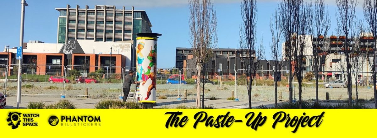
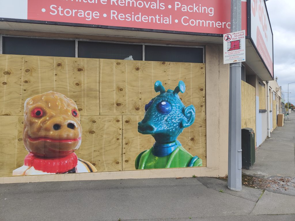
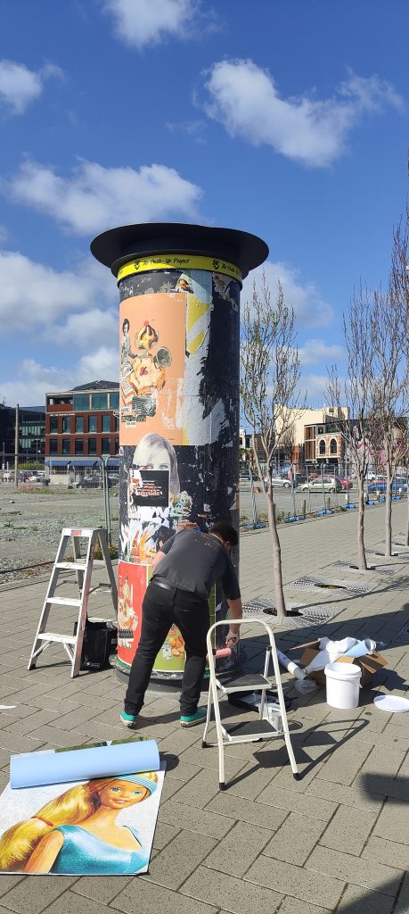
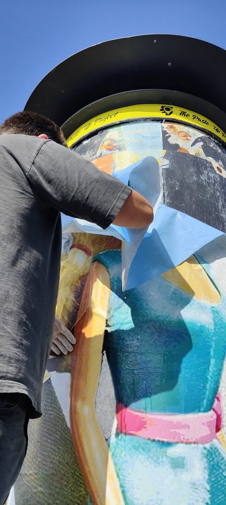
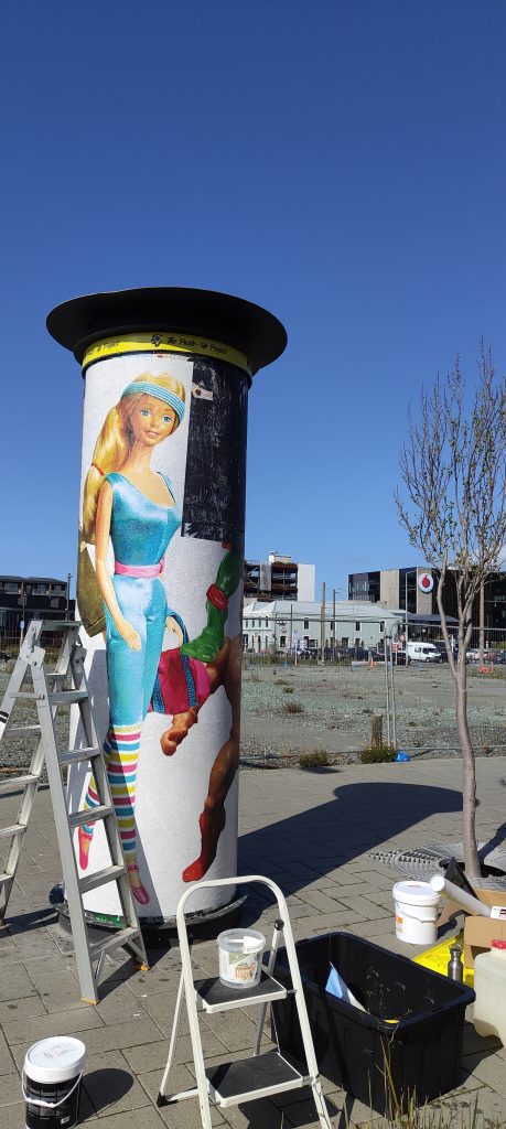
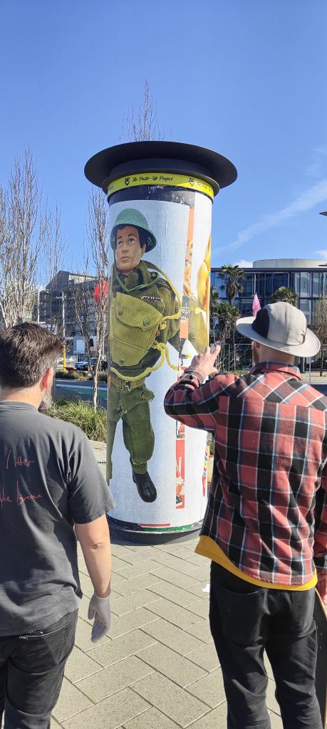
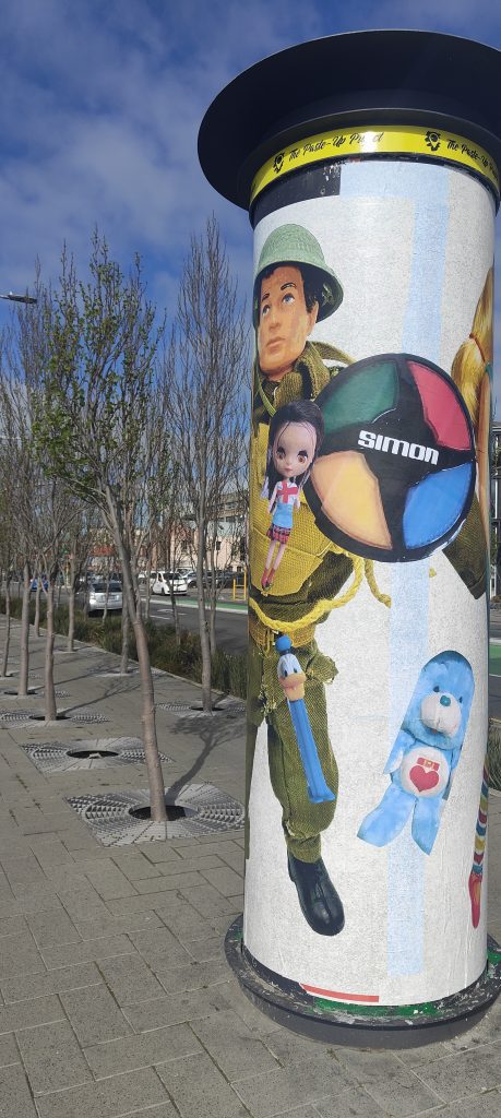
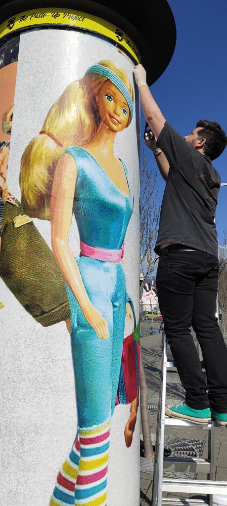
The fourth and final artist in the Paste-Up Project is Mark Catley – one of the city’s longest tenured paste-up artists. Mark’s nostalgic vintage toy paste ups have been a familiar site across Christchurch for many years and as such he was a natural contributor to this project. For his installation, Mark continued his toy parade, this time with huge images of Barbie, G.I. Joe, He-Man and more circling the bollard like a line-up awaiting identification. Catley’s work evokes nostalgia, warm recollections of childhood favourites, but it also illuminates the darker side, from the ridiculous body shapes and reinforced gender stereotypes to the problematic materials used in production. We chatted with Mark and dived into his experiences pasting art around the city and the Paste-Up Project specifically, and, of course, a specific Star Wars character…
It seems like you have been pasting art up around Ōtautahi for a long time, do you remember when you started?
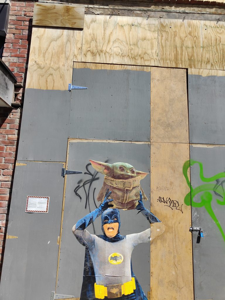
Well, according to my Instagram page, it was 2015. I only worked that out based on when the photos were taken of the big Batman and Robin faces opposite Victoria Square, it’s some fancy restaurant now…
The Permit Room…
Yeah, that’s it!
So, what was the inspiration?
Well, a lot of people were doing it at the time. After the earthquakes, things had changed, and I just thought I’d give it a go. I honestly don’t even remember now. I would’ve had a friend print them out for me. I was doing my insurance work at the time, and I would get emails about toy figures and I would open them up and put them on my computer monitor and I just started taking photos of the faces of Batman and Robin and then I went home and made them bigger and I just pasted them up. At first, I didn’t actually know anyone doing it personally, so I just had to Google how to do it myself. I remember going to one of those Instructables websites about how to make wheat-paste glue. I just used the first recipe I found and I pretty much stick with it even now…
Did it always make sense as the medium to use to put your art out in the streets?
Well yeah, I mean, I’d never tried using spray cans or anything like that and I figured this was the quickest way to get it up there. Then by chance, the first time I put them up, I think it would have been the Batman head, I remember walking back to my car and turning around to have a look, thinking that’s pretty cool, and there’s some guy yelling out to me: “Hey you!” I was like, oh shit! I mean, it wasn’t that late, it would have been daylight savings, so it had only just got dark, and this guy shouted out to me. I turned around and I just replied “Yeah?” And he asked me: “Did you just do that over there?” I said “Yeah”, and he said it was pretty cool, but he wanted my details, and I just gave them to him. I told him my name, I gave him my cell phone number, and then nothing happened. It wasn’t until six months or a year later that The Press ran a story about this mysterious street artist and it turned out the first guy was a reporter and after the first story was posted on Stuff, that reporter spoke to another reporter and they knew who I was straight away. So, someone from The Press phoned me and said: “Oh, so was this you?” And stupidly I just said, “Yeah it was”, being the good boy I am. I remember hanging up and thinking, shit! So, I rang them back and said: “Hey, why don’t you just not put that it’s me and have a bit of fun with this?” But he was like, “Nah, it’s too late.” So my dream of being a mysterious artist was washed away…
You were never able to become the Banksy figure of mystery…
Exactly, I never really had enough time to give myself a cool name or anything.
I don’t think I’m creative enough to come up with a good name…
I’ve got a good name now, a podcast gave it to me: BosskCat, because Bossk is my favourite Star Wars character and my last name is Catley, so BosskCat. They even made a picture of TopCat, but with Bossk’s head stuck on it. That was some guys in England who thought of it…
You have become known for your annual May the 4th Star Wars bonanza, has that become something that you look forward to each year?
I really like to do it. It’s just a bit of fun and I imagine even if no one else cared, I would just put them up for myself for fun. It must have been a few years ago now, but I remember it was hosing down on the night of May the third, it was stupid weather, you know, there was no way anyway should have gone out putting up paste ups, although some of those pieces have lasted for years. Anyway, one of them was over in Lyttelton, on the old fire station, it was a Princess Leia paste up, but there were about 10 or 12 Russian sailors all hiding under that spot, with bottles of vodka and a plastic bag of cooked fish. They were just drinking and pulling out bits of fish meat to eat. The smell was revolting. I was annoyed because that was the spot, you know, I’d worked out a few days earlier that was the spot, and because it was raining I thought no one would be there. Anyway, I half tried to explain what I was doing but they had no idea what I was saying, they just laughed, so I just quickly did it and got out of there, looking back it was pretty funny…
Interestingly enough, other people started to add to that piece, right? Was that cool to see?
Yeah, they put like little pockets and a big mouth on there, that was cool…
It gave the piece its own life after you walked away, and that’s a good lead-in actually to the Paste-Up Project, because although you haven’t got any Star Wars figures, obviously the vintage toys are a central element, so explain the concept that you’ve installed…
I really wanted to do something interactive and get the public involved. I was treating it along the lines that it’s going to be pretty hard just to keep it updated, let alone with people playing with it, so I just thought I will have some larger figures up there from generic toys from my memories; I really wanted to have a massive Barbie from the 80s, a Sport Barbie in an 80s leotard, showing how crazy the body shape was. I also wanted a He-Man up there too, because I’ve been talking a lot with my friends about how it is so weird that He-Man is such a macho figure, but he’s always in his underwear. It’s the same with fantasy novels like Conan, it’s always fighting monsters in loin clothes, it’s very weird to me. Anyway, I added Raphael, a Teenage Mutant Ninja Turtle, and a G.I. Joe from the 60s. Back in the 60s, all the boys were taught to go to war and fight and kill, this very macho thing, and all the women were taught just to stay home and look after their man and the family, that was the lifestyle, so I wanted to question that. Then I just asked the public to send me photos of the toys that they had as kids. I’ve still got quite a few to put up as well…
The thing with toys is that they have such a powerful sense of nostalgia for us and yet they are often highly problematic and that was one of the things you said that you were wanting to illuminate. But it’s not just the questions of gender identity and body image, there’s also actually the literal toxicity of older toys…
Yeah, it’s crazy when you look into all the plastics that they used, especially back in 50s and 60s, right up to the 80s and 90s and probably still now a little bit with the mass-produced toys especially, all the knock-off toys. They’re getting better now, but its the hidden stuff like all the glues, the paints. I think Fisher Price is one of the first companies to actually come forward and say publicly that you can still collect these vintage toys, but by all means do not let your children use them. It’s quite interesting because a lot of people just really don’t want to hear that. A friend told me that this local Salvation Army store posted that they had all these great toys from the 80s and someone replied saying, hey, this company’s actually come out and said that these are to collect, not for kids to play with, which is a hard thing to hear. Right now I’m holding a 1980s plastic figure, I love all this stuff, but I will wash my hands after playing with something like this, and I don’t really like letting my daughter play with some of these toys. It’s not because they are collectible, they are toys that are meant to be played with, it’s more that we try to get her toys that aren’t toxic. It’s hard, because I still buy vinyl, but ideally, they should be using recycled plastics to make records. It’s just bewildering, it’s crazy…
You have actually worked quite consistently at a reasonably large scale, some of the previous Paste Up Project artists haven’t worked at such a size. Was this project less daunting because of your previous experience?
Yeah, it was good. Really the only issue was the curve of the bollard and learning about the materials, like soaking the adhesive paper for half an hour. But it went up so easily, I couldn’t believe how fast it was. It was really good how it adhered, so it went well, and I enjoyed working at that scale…
That sense of scale seems quite important for your work because that nostalgic element takes on more emphasis when it is larger. As you get older, things seem smaller, so to make them bigger again plays on our memories of them, it brings back that sense of magic. When you see something after a long time and you’ve gotten older and bigger, it never seems as impressive, so recreating them at this massive scale, it brings back that wonder. It gives them a sense of agency as well; it makes them seem like they can talk back. The large size seems to be a good fit with the concepts that are being teased out in your work…
Yeah, I mean it does make a lot of sense. I mean, I like Ghostcat’s tiny builds, his small stuff, with surprises that you have to look out for, the detail’s just amazing. But then I love things that are just stupidly large, oversized and just really like: Bang! There’s Barbie, standing on Manchester Street. I love the fact that everyone just knows what they are straight away, yet it’s still a surprise.
It automatically attaches people to something familiar, right?
They go in for a closer look and they go, oh it’s He Man! I remember that as a kid! It starts all the conversations about what their childhood was like. Hopefully it makes people smile…
You talked about a few people commenting as they were passing, have people been responding to the work?
Most of it has been positive. I’m always personally surprised that more people don’t stop and have a chat. I’m the sort of person that if I saw someone doing that, then I’m always like, wow, that’s cool, and I’ll go ahead and try and find out what someone’s doing. But you know, most people just live in their own worlds, looking at their phones. Big groups of drunk people are the worst to be honest, that’s why I try not to do it on a Friday or Saturday night. There’s nothing worse than a whole bunch of drunk people, going “what are you doing?” With this work, when people asked, I could tell them that it’s an official project, and they like to hear that as opposed to just putting something up, but then it’s a bollard, you are not just going to put things up on it are you?
That’s the other thing with your installation, the connection with the bollard. Because they are toys, it automatically raises the idea of advertising, so it starts to become an interesting interplay because it’s not advertising and it’s actually doing the opposite because it’s raising some of the issues of consumption. The way you have composed the work, that large-scale parade going around the bollard, was that in some ways to stop it looking too much like advertising posters?
Yeah, it was. At one point what I wanted to do was like a line-up, like The Usual Suspects mug shot. But then I realised that the heights were all different, and it wouldn’t have worked. I mean, I’ve sort of done that, but not really. I just wanted to make something that you walked around, a big continuous piece to look at, and then to add to it over the weeks. I’ve been there a few times and added stuff to it…
I have one last question and this one is probably pretty hard to answer, you’ve mentioned that you’re a toy collector, what’s the one toy you would buy if price was no object?
I’m a Bossk collector, so there is the famous toxic-limbed Bossk from Spain. There are about 50 of them in the world, some say 29. I’m really into the Spanish Star Wars stuff. Basically, they’ve made like 600 million little tiny figures, mainly in China or Taiwan, places like that, but then Spain got a contract, and started producing some Star Wars figures, but the company that produced them, the quality of plastic they used wasn’t as good and so for some reason the Bossk figure’s plastic has degraded and has turned his limbs, his arms and legs, a green colour. They call it the toxic green Bossk and this figure is sought after all over the world, it goes for stupid money. It’s not like the Boba Fett Rocket Launcher, but…
That’s the famous one, right?
Yeah, but it really annoys me, and I’m getting my geeky hat on here, there are fewer figures of the toxic Bossk, but because it’s Boba Fett, it’s given more cred. But Boba Fett is just a dude in a space helmet, he is literally just a guy in a space suit! He’s a cool figure too, but the Bossk is the one! I know that if I ever got it, it wouldn’t be that amazing, I would have it in my hands and it would be, ahh, its OK, but that’s the one I would buy.
Did you want to give any shout outs?
Thanks to yourself and Phantom, JZA, Cape of Storms, and teethlikescrewdrivers, he’s always handy with his advice and he is so enthusiastic. I love the fact that he is all over everything…
That sense of community is driven by a lot of people, but he is right at the heart of it…
If I was younger, I would hang out with them all the time. But I do kind of like working by myself. I have so much work, but it just takes time. It always looks so cool and it’s great when there are new fresh walls. I often think what would my mum think? But she would probably drive right past and that’s alright.
Thank you to Phantom Billstickers and the Christchurch City Council for their support of The Paste-Up Project!
Dr Suits goes to Akaroa…
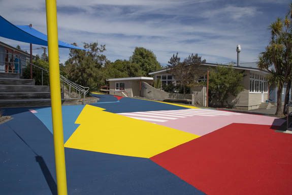
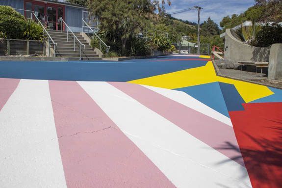
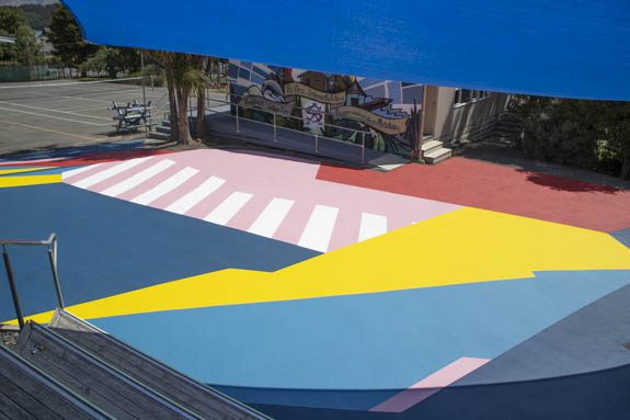
Back in November, we caught up with our good friend Dr Suits to chat about his experience at Taupo’s Graffiato festival, Aotearoa’s longest running street art festival, what he didn’t let us know at that time was he was in talks about a massive mural on the grounds of Akaroa Area School. Akaroa, the picturesque waterside township south east of Christchurch on Banks Peninsula, is not an expected location for such a project – but word of Dr Suits’ ability to produce bold, striking mural works had obviously spread. In January 2022, Dr Suits and Porta loaded up and headed to Akaroa to spend a week transforming the junior school with colour and the result, Polymorph, is stunning. When he got back we sat down to talk about the project and the technical process…
____________________________________________
How on earth did you find yourself painting such a massive ground mural in Akaroa?
It’s funny, the last thing I talked to you about was Graffiato (the street art festival in Taupo). As soon as I got off the plane in Rotorua after leaving Taupo, I checked my emails, and I had a message from Ross, the principal of Akaroa Area School asking if I would be interested in painting the junior area of their school. He didn’t really give away too much in terms of what he wanted, but it was quite exciting, especially having just painted at Graffiato…
You must have felt like you were on a roll! How did you get on their radar?
One of the teachers showed Ross an article about Crossings, the red zone work we painted last year, and he must have thought, that looks good, this artist can paint a ground! I have a ground that needs some paint, so it’s perfect…
Did Crossings inspire the concept or were they already sold on the idea of painting the ground?
They wanted to paint the junior ground and after a conversation with them, they had some really clear ideas about what they wanted. When they asked me to quote the area, I was like, far out, how have this school got the money for this? To go through the design process with a school, I’d imagine it would be quite a long process…
I imagine there are a lot of stakeholders that must be consulted…
Yes. Their ideas were directed at traditional games and instructing children to play in a certain way and interact with the space in a very traditional way, like we probably would have interacted with spaces when we were kids…
You mean like hopscotch, that sort of thing?
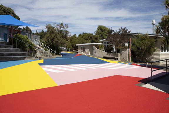
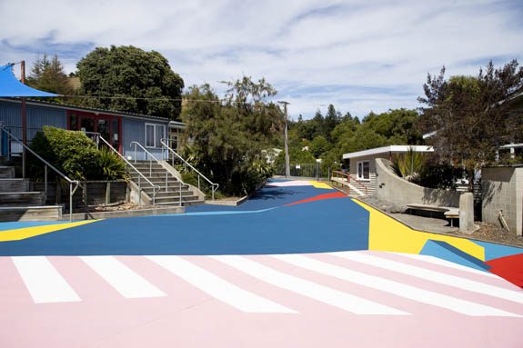
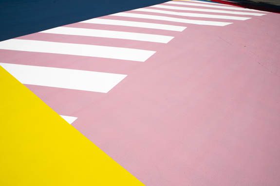
Yeah, like Four Square, roads to follow, those types of things. I knew I wasn’t going to have a lot of creative freedom, so I just quoted the job. Anyway, Ross got back to me and said we can’t afford that, which I was expecting, so I called him back and I said, what is your priority? Is it to have those traditional elements, or is it to get a whole lot of color on the ground? He said if we can get that area covered, that’s the priority. So, I got talking to him about how we could make that happen, just using a more mathematical approach to working out surface areas and ordering smartly, basically designing according to how much material would be used…
So, you figured out a formula to achieve that?
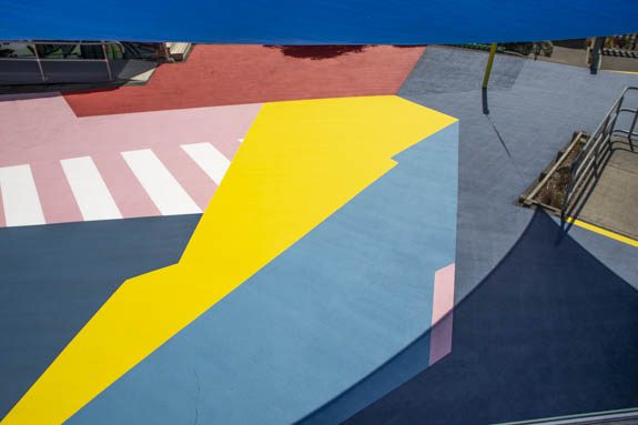
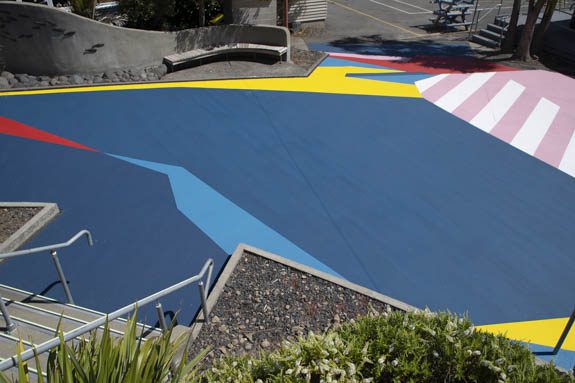
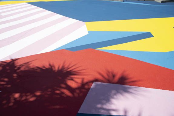
It was quite challenging. I hadn’t really approached the design process in that way before, I usually approach it more artistically. I’ve done it in fashion design, where you’re really conscious about material and how to maximize the design based on materials, so I kind of used that thinking. Basically, I tried to keep the design quite simple and geometric, because curves would slow me down, details would slow me down. I did a few concepts and gave them to my friend Roberto who put them into CAD, and he worked out their surface area, and then I calculated how much product I would need, and I tweaked it from there. I also had to consider the surface of the ground, because if it’s rougher, it’s going take more product, yellows and pinks will need more layers. So, I reduced the yellows and pinks and added more blues, because they cover the ground really well. It was all about efficiency, really.
You’re known for your color palette, particularly in your outdoor mural works and those pinks and yellows are pretty prominent. Was that a challenge to minimise those colors?
Yeah, it wasn’t a challenge as such, but I had to have some in there!
Did you use the paint product that you used for the basketball court in New Brighton?
A similar product.
Which is different to the standard paint that you used in the red zone. So, how did you go about sourcing the paint?
There were a few contenders, but it came down to durability and workability. I’d seen another company that used the same product, and I could see what it looked like in a similar context. I also had conversations with the sales rep. There are a few products within their range that are similar; some are acrylic, some are water-based, which is great, there were others that were chemical-based, which I wanted to avoid. I wanted to avoid playing around with solvents, which are unpleasant to work with and to clean up…
Particularly when you are doing such a massive job as well, that would have required a whole heap more gear just to get the job done…
Yeah. The paint company rep was great, he was really helpful. He probably got sick of me asking questions!
So, this product will be your go to from now on?
Absolutely, I got my head around how to use the product, putting the hardener in, laying it out. I had to get scales, a paint mixer and a few more things. The scales were a bit more expensive than I bargained for, but they came in extremely handy. I mean I couldn’t have done the job without either of those tools. There are different options for the application, the rep even recommended spraying it…
With a pressurized sprayer? Were you tempted?
Spraying would be OK if you had a sprayer, but you’ve got to take into consideration masking, the wind, clean up and waste, and I wanted to reduce waste. Basically, once this product is mixed together, you have to use it within 40 minutes.
Was it a case of the old ‘measure twice, cut once’, or was there still a little bit of figuring out as you went?
I used a grid system, which meant I could get pretty accurate with the layout and composition, which kept me to plan, but when we were putting down the first coats, if there was half a bucket of product left, I’d improvise and chuck it in somewhere to break it up a bit…
How close was the original design to the finished piece?
I’d say 85 per cent. There are a few add-ons here and there…
That’s always good for the creative process, right?
When I was designing it, I was working on such a small scale and when I actually got into the space, it was so much bigger than the piece of paper or the screen that I was working on. It definitely changes the perception of it. I think one of the coolest parts about the project was being immersed in that color as you’re working on it, really experiencing how colors change when you put them next to each other.
What was the area in square metres?
360 square meters.
Did you look at any comparable mural works in Christchurch? Do you know of any other similarly scaled works?
I didn’t even think about that. I was just focused on the task at hand. But, just to give you an idea of what that looks like, the longest straight line on it was 28 meters.
Wow! On that first day when you started painting or even just gridding it out, did you have to stop and ask yourself: am I going to be able to do this?
No, I’d done all that after I took the job on and designed it and been paid the deposit, that’s when I was like, shit! Am I actually going to be able to do this? It wasn’t until I went out there and had a good look around that I was like, OK, it’s not as big as I’ve built it up in my head.
Did it help as well that you had your trusty compadre, Porta, there with you?
Oh yeah! I’ve said it before and I’ll say it again, Porta’s the man!
There were certain restrictions based on the colour palette, and you had to encourage them to move away from including those ‘instructed play’ elements, but was the final design based on any particular concept or idea other than dynamic shapes and space for play?
That’s it, just dynamic shapes and spaces. I used my trusty collage technique. I cut out some shapes and piece them together, and just subconsciously come up with something.
Have you been able to get feedback yet?
I sent Ross a message on the first day back at school to ask about the big reveal on the first morning of school, his reply was: ‘Awesome!! Thumbs up’. So, I figured, it must have been a big day…
Was it disappointing that you didn’t get to see that first response of the kids yourself?
Yeah, I was a little bit, but as we were working on it, people would walk past daily and even when we had one or two blocks of color down, people were pretty excited. It really started coming together towards the end, I knew as soon as we got the yellow down it would really start to come to life, and then when we put the final blue down at the end, that just tied it all together.
You also added a little touch where you painted a pole bright yellow?
That pole’s funny because I’ve always wanted to do a sculpture exactly like that, with a just off axis yellow line…
You finally got to do it! I was going to say that one of the great aspects of projects like this, and we talked about this with your court in New Brighton, is the way they encourage movement of bodies through and across these spaces (which allows people to engage with and respond to abstract art, even unwittingly). It would be really cool to have a drone video that shows the students moving across the mural.
Ross got some drone footage, with his kids walking on it, not playing unfortunately, but it will be really cool to see. With the COVID situation, schools have been really encouraged to get kids outside, and this work will really help with that…
An unforeseen practicality! Doing something in a place the size of Akaroa, I guess the work would reach the whole township. You said some people came past and saw it, did you get a sense that people were hearing about it and the word was spreading?
I think so. I did have that realization that we could have quite an impactful reach. Basically, if you are a family in that town with kids, they go to that school, and if you grew up in that town, you went to that school. So, hopefully people will be really excited about what we added to the school. The school is a really amazing environment, it’s nestled next to a hillside, there are a lot of native trees and birds, it was really beautiful to just hang out there painting…
Now that you’ve done something to this scale, it sets the precedent. How do you go about finding some new places to paint?
The school got funding from the Ministry of Education for the project and a couple of other projects around the campus, so my next task is to put it all together in a nice little package and reach out to more schools, find out what the funding was and how to go about getting it. Then just push them to apply for the funding to get something like this…
You will be taking more notice of school grounds now I imagine!
There were a lot of restrictions around this project, which made it good for the first one of this scale. Those restrictions really helped make it achievable and set boundaries, so I couldn’t really go too crazy with the design and get in over my head, which could have easily happened. I was learning a new product, I was out of town, if I ran out of something it wasn’t like I could just nip down to buy something. The product had to be ordered in from Auckland. So, if I get another job, closer to home, I’ll be able to push it a bit further and explore the color palette…
Follow Dr Suits on Instagram to what he has in store next!
All images supplied by Dr Suits
Invers – A Photo Essay by Rowee the Kiwi

I first met Rowee the Kiwi when he joined a street art tour I was hosting. His camera was clicking from the first minute to the last, and not just capturing the murals and more prominent works we were exploring, he would often shoot off down an alleyway or into a vacant lot to capture something much smaller in scale. It was clear Rowee was what you might call a ‘street art hunter’, an urban explorer who understood the way artists can transform a cityscape. And he has seen a lot, his travels have ensured his collection of flicks includes some amazing works by renowned and anonymous artists, many that have since dissolved, leaving his records as a legacy. Having returned from living in Australia, he settled back in Invercargill, a city he has roots in, and this shift has coincided with the emergence of urban art in that part of world, notably through the effort and work of DEOW (both his mural work and his organisation of South Sea Spray, an urban art festival that attracts impressive rosters to the picturesque south).
In Invers, Rowee the Kiwi explores Invercargill through his photographs of DEOW’s work and centrally, the massive mural Mia… So let’s take a trip down south…
Mick Jagger famously said “Invercargill is the arsehole of the world”, but then… he’d never been to Bluff. Having lived here during the 70s and 80s, I certainly didn’t have much to complain about. Which is why it was such an easy decision the retire back here.
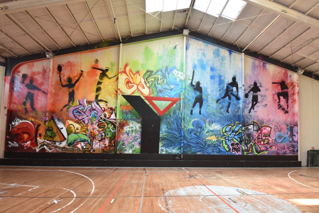
I first learnt of Danny Owen, aka DEOW, through my grandson Zac, who was doing work with him, mostly on rooftops and factory walls. This one is in the YMCA building on Tay Street, created with Ikarus from the DTR crew and members of the SLK crew, Devos, Omen and Dias.
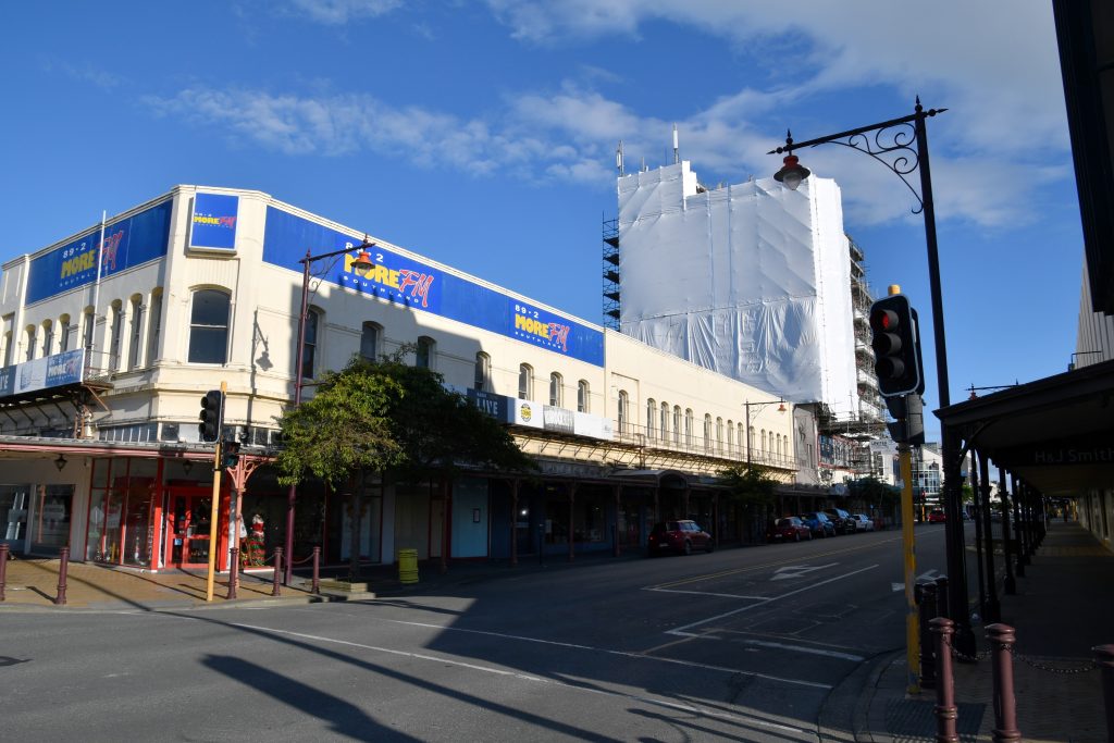
After many years of apparent neglect Invercargill’s inner city is showing signs of a renaissance. Most of a whole city block is being redeveloped. Plans seem somewhat fluid but already important works by DEOW have already gone.
The Kelvin Hotel underwent a face lift in recent years and a lot of people were interested in what was hidden under the wrap…
The unveiling…
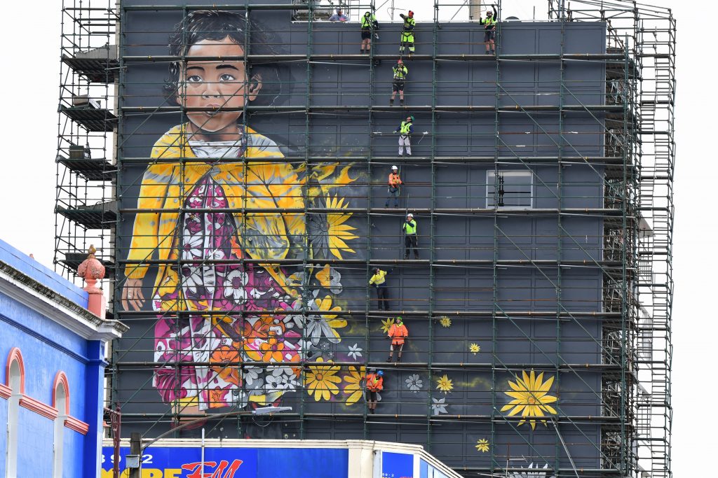
At the time this was the biggest work of art in the Southern Hemisphere. Now surpassed by Adnate’s public housing block work in Melbourne and more recently by the Adnate Hotel in Perth.
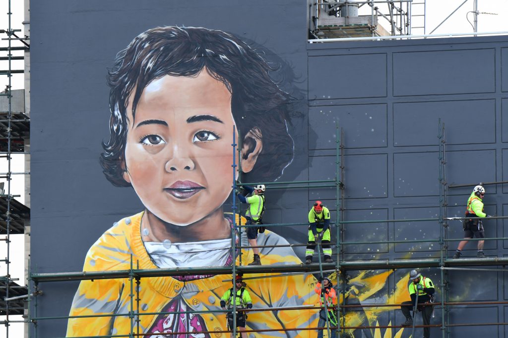
The face of Mia revealed…
Demolition around Mia…
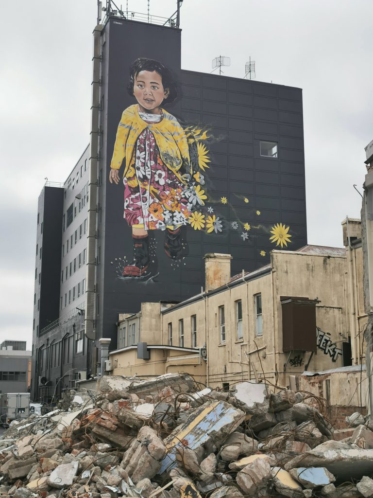
DEOW and Mia…
The fear is that most of Mia will be covered by a proposed accommodation block that may be built on the now vacant block beside it.
One piece that has fallen to the developers’ bulldozer is DEOW’s magnificent Tua’s Story of the Ghost Bird…
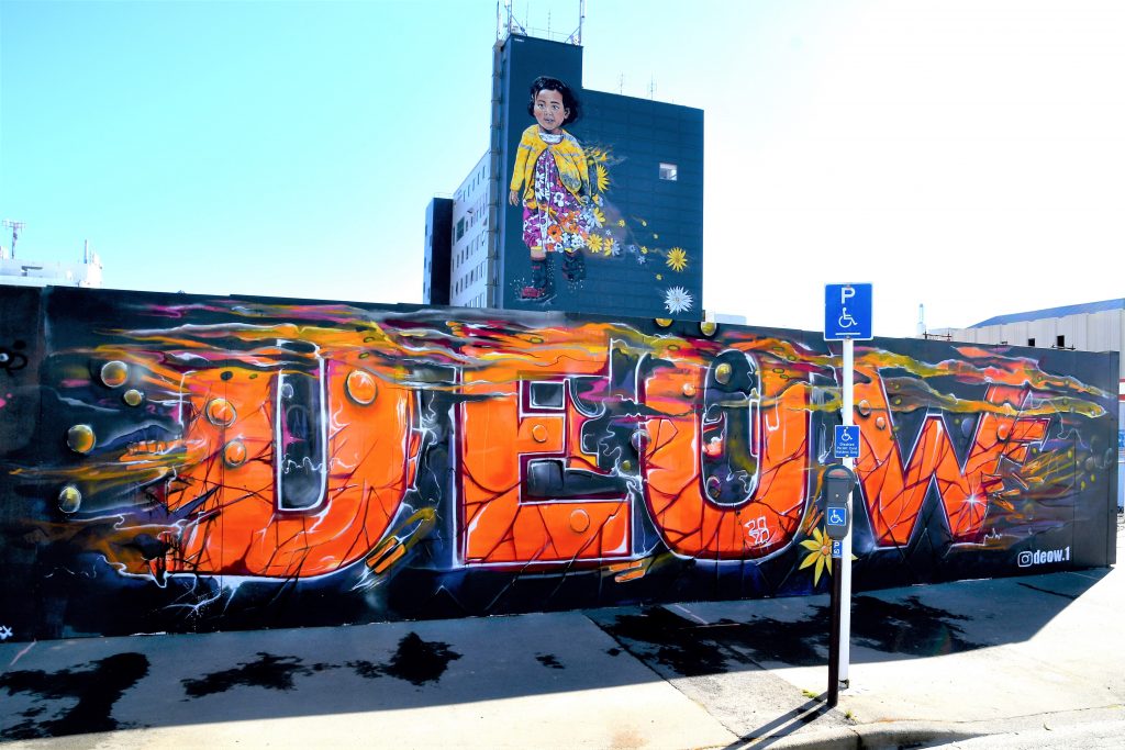
One that lives on is, to quote DEOW himself: “The ghost bird” – Ngāi Tahu / Rakiura’s Tītī.
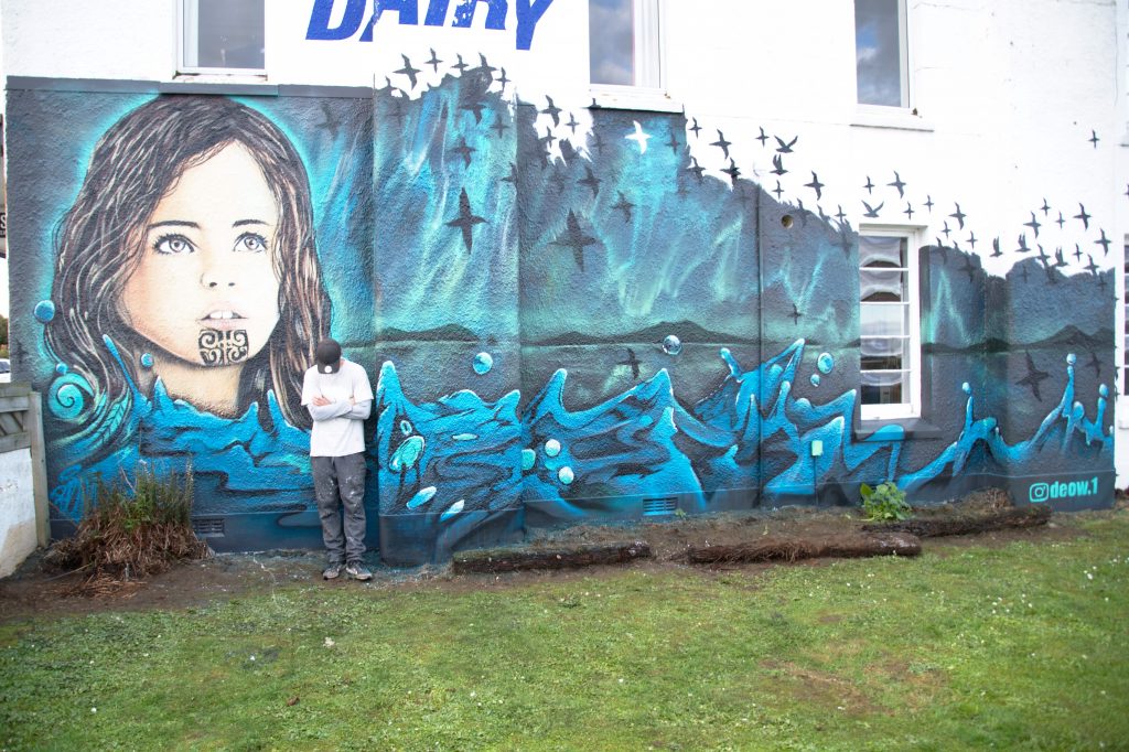
It is said when the ghost bird takes flight on the new moon, all tītī scamper from their islands and start their epic journey north. The girl symbolises the next generation, the next one to tell the legend. The Southern Lights reflect over the South Coast and the Foveaux Straight, as the birds glide past the skyline of Bluff – Omaui – Centre Island – Riverton – The Longwoods – Takatimu, all seen from the city of ‘Water & Light’.
To see more of Rowee the Kiwi’s urban art photographs, follow him on Instagram…