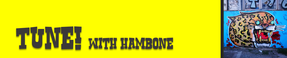
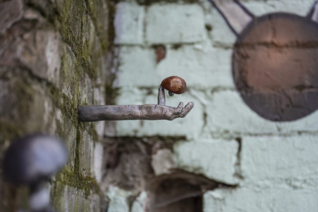
Hambone is up on the decks this week, with a tasty selection of tunes that inspire his tattoo flash inspired creations. We love the punky energy that buzzes in Hambone’s work; twisted, snarling, funny and loud, and while some of the songs here might fit a similar description, there are also eclectic choices that might surprise. From the Aotearoa heaviness of Beastwars and sludginess of Head Like A Hole, to the iconic electro energy of The Prodigy, hip hop cuts with Ice Cube and Yelawolf and even Haddaway’s iconic What Is Love?… Dive into the Bone Man’s diverse choices and draw some skulls, it’s only fitting….
April is that strange period when Daylight Savings ends and yet there is still a late afternoon glow that makes you realise that we are not yet fully ensconced in Winter. There is an optimism found in that glow, one that masks the panic that often sets in when you click that we are a third of the way through the year. I guess April feels like a lovely, calm swansong. And importantly, the longer nights, before it gets too cold, allow for a bit more creative activity, whether outside or in the studio (depending on your personal preferences) – the grandeur of Summer and large-scale murals replaced with a smaller sense of possibility. What did we love in April? Read on and find out…
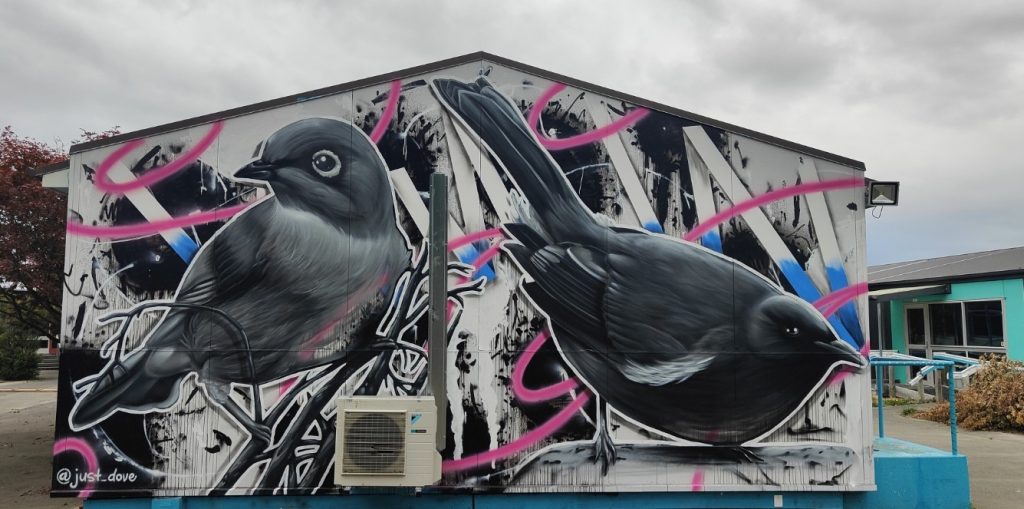
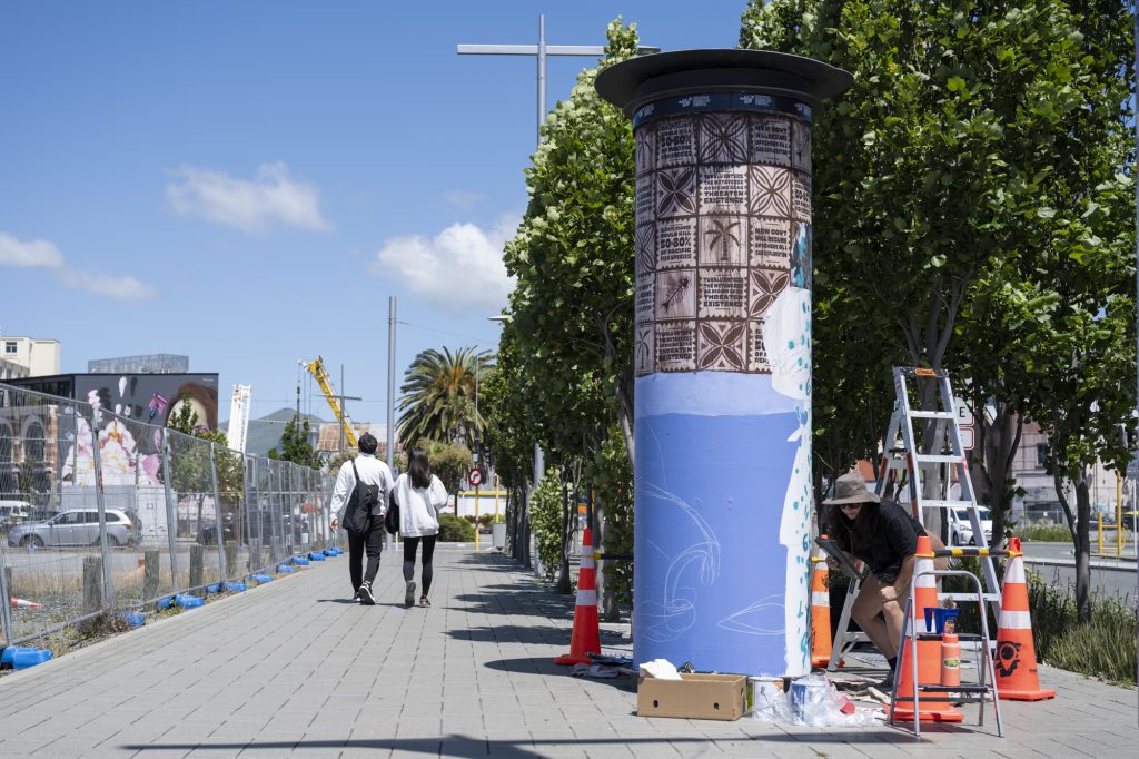
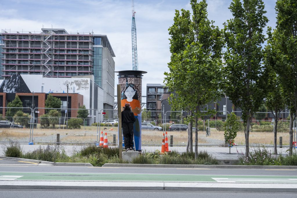
Dove @ The Climate Action Campus
There is some real action taking place at the Avonside site of the Climate Action Campus, with the A-Maze-Ink art trail allowing artists the opportunity to brighten the walls with artwork that illuminates the campus kaupapa. One of our favourites is Dove‘s striking painting of a tauhou and korimako against a busy background – an example of the artist’s smooth style, the work is at once calming and energetic.
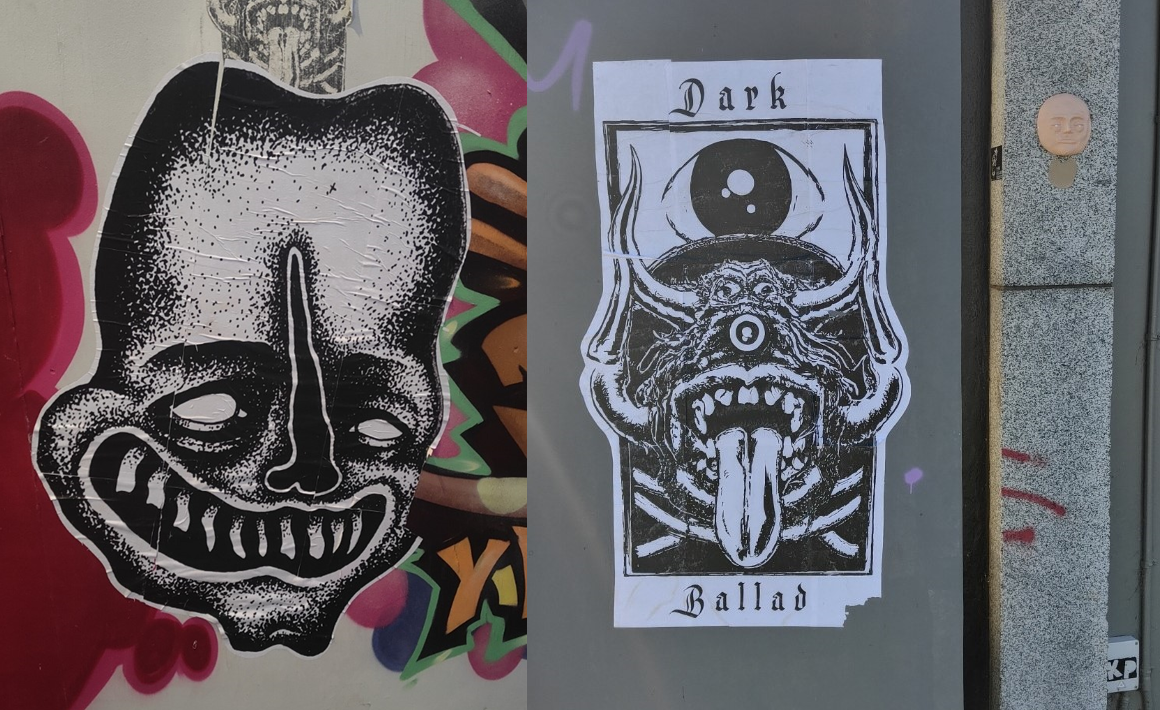
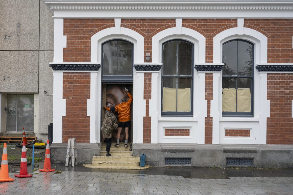
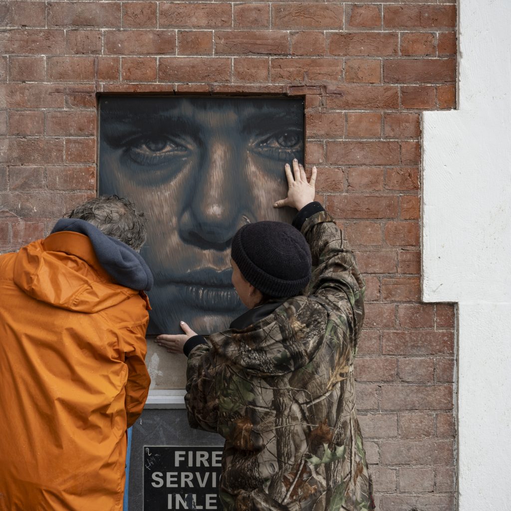
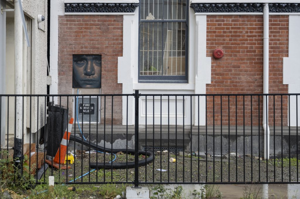
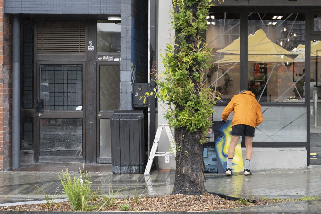
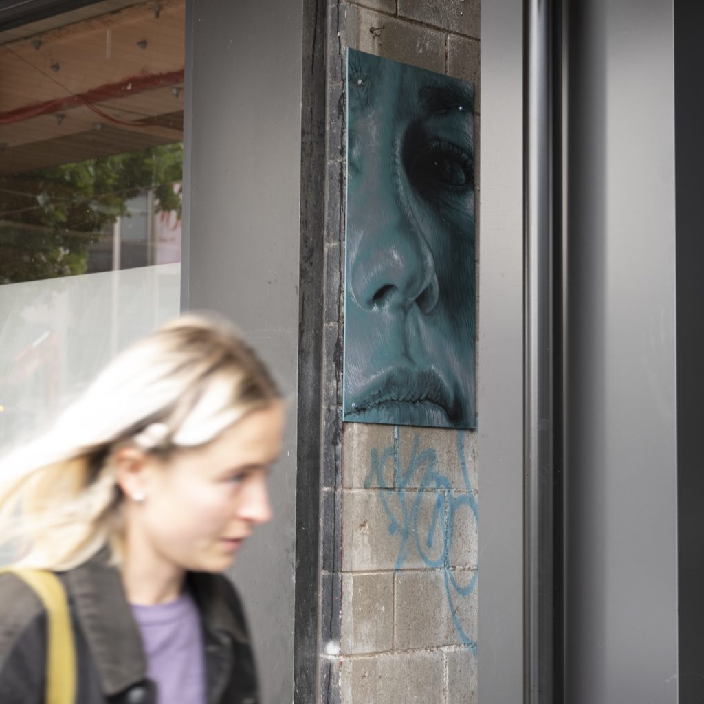
Freshly Wet Paste-Ups
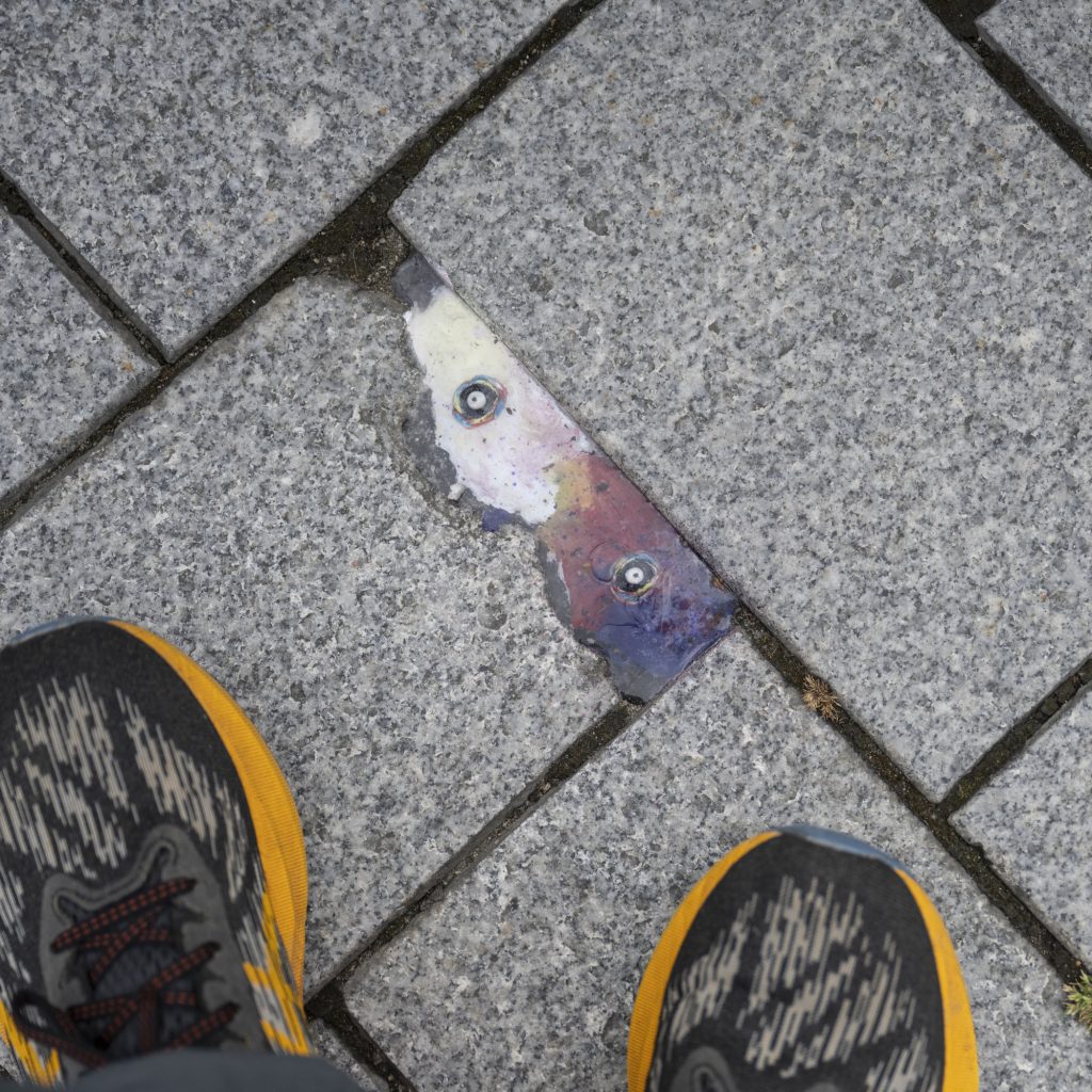
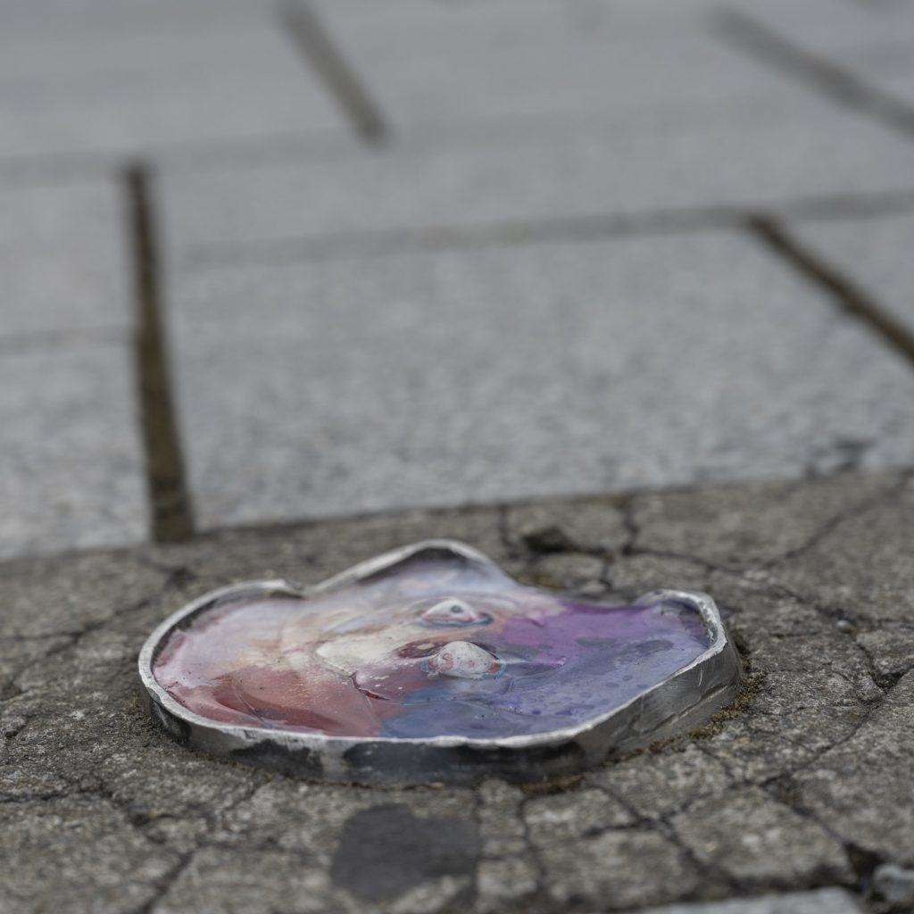
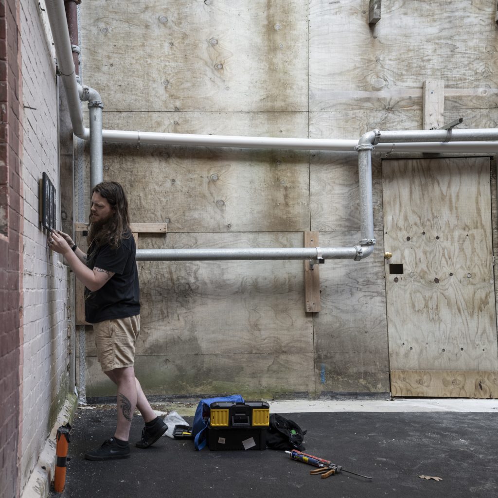
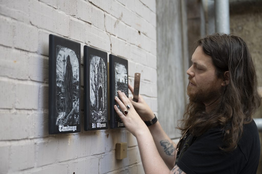
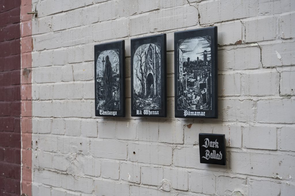
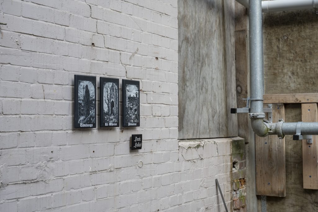
We love seeing a flurry of activity on the streets, so the recent installation of a series of large paste-up works across the city by Dark Ballad and Klaudia Bartos gave us a real shot in the arm. From the nightmarish darkness of Dark Ballad’s wood-block works to the twisted visages of Klaudia’s characters, the stark black and white works are just delightful… ly disarming.
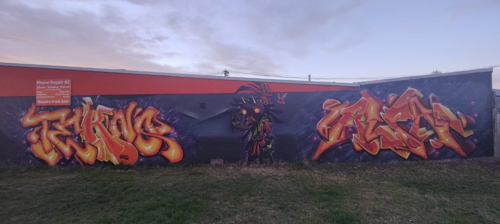
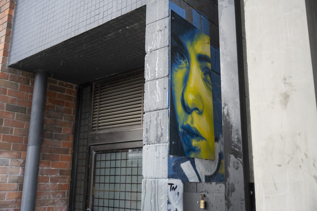
Alfa and Teknq in New Brighton
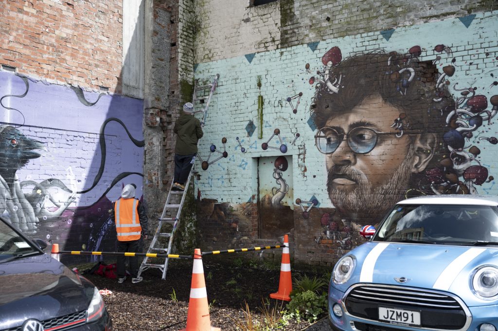
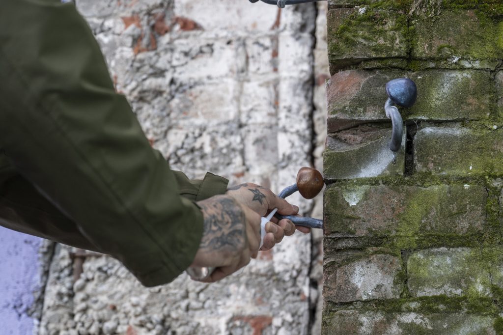
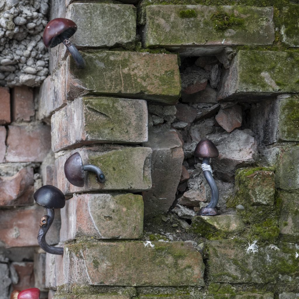
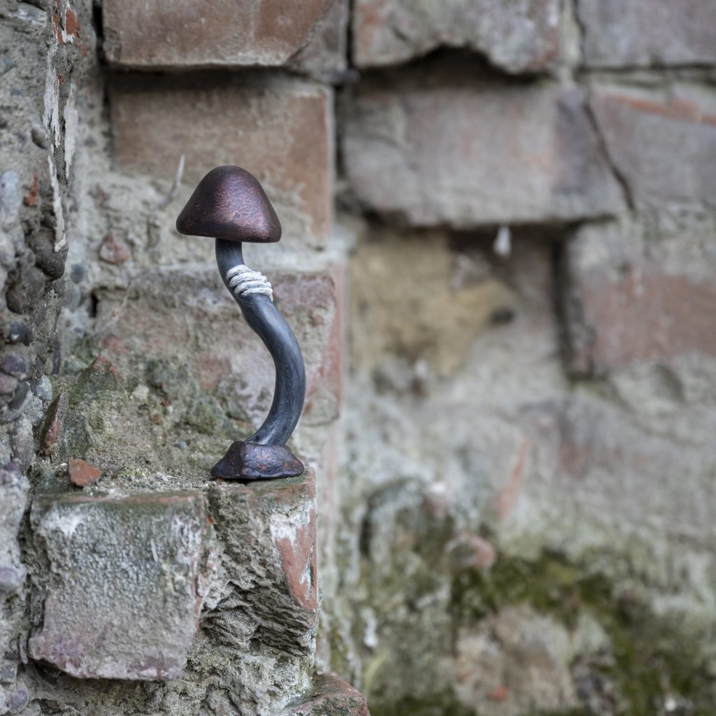
Clearly visible as I drive home, I have loved watching this collab between TEKNQ and ALFA come together – even if it has proven a distraction from attentive driving. The fiery colour palette of the pieces, accompanied by the Skull Kid character from the Legend of Zelda – Majora’s Mask game, add an ominous quality but also perfectly play off the existing wall and building’s qualities.
Vice Australia X Meep
We can’t reveal too much as the video is still in post-production, but we had a blast hanging out with local superstar Kophie a.k.a Meep and the crew from Vice Australia as they explored Ōtautahi Christchurch’s varied offerings – spanning our city’s eats, treats and streets! Stay tuned for the end product…
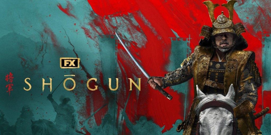
Shōgun
As the weather becomes perfect for spending time indoors, it is a good chance to share what we have been watching – and nothing has been as good as Shōgun on Disney+! Based on the 1975 novel by James Clavell, the series explores the political machinations of 17th Century Japan. Centred on Yoshii Toranaga, John Blackthorne, Lady Mariko and the charismatic Yabushige, the show revels in the delicious details and the subterfuge of “men talking in rooms” (thanks House of R podcast). After one episode, we were hooked and a binge followed – dive in!
These were our picks, what caught your eye in April? Let us know in the comments…
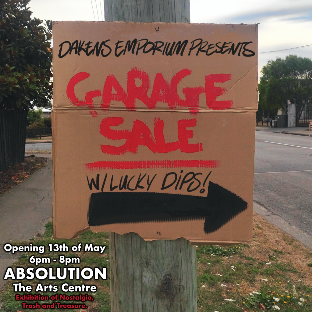
Kiwis love a good garage sale. Maybe it is the curiosity. Maybe it is the potential nostalgia. Maybe it is the chance to rifle through someone’s discarded belongings in the hope of finding a unique treasure. Maybe we just love the thought of a bargain that cuts out the middle man.
Ōtautahi creative Daken, known for his bootleg toys and funky, humorous illustrative style, is drawing on the power of garage sales to inspire his forthcoming show Garage Sale with Lucky Dips, opening May 13th at Absolution. Daken describes the show as an exhibition of nostalgia, Kiwiana, trash and treasures, all presented through the lens of a good old fashioned garage sale. We caught up with Daken ahead of the show to find out what we can expect and how the idea came to fruition…
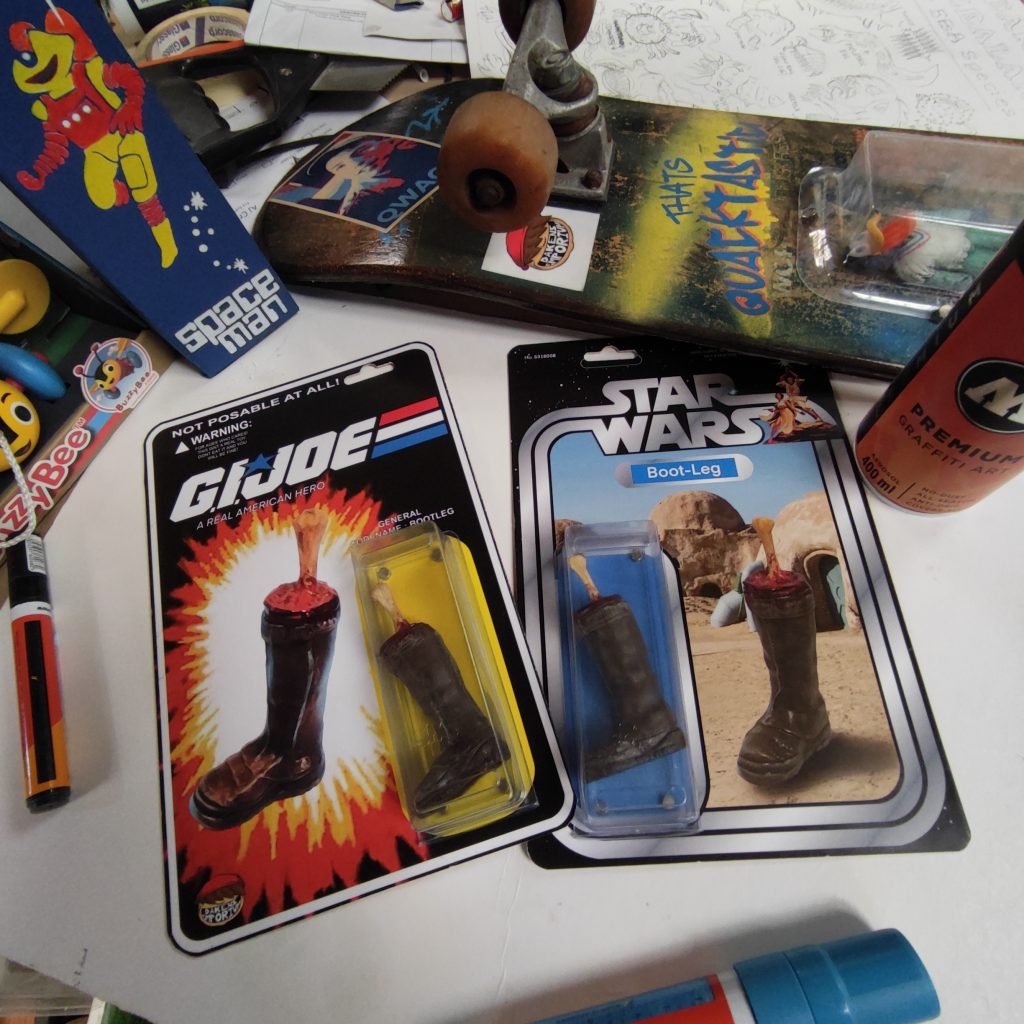
I know you are always busy making, creating and generally tinkering, but when was your last solo show? I had my first solo show way back in 2021, on my birthday actually, which was pretty exciting. That show was almost exclusively a bootleg toy show (with the exception of a couple paintings). I had only been in the toy-making scene for a year at that stage so I wanted to really push what I was doing in that space. I feel like Garage Sale is more integrated with everything else I do, coming together for a more varied experience.
How did the idea for Garage Sale come to you? I know you have an Instagram profile that focusses on handmade garage sale signs… Absolution asked if I woukld like to have a show there (shout out to Rochelle!). I always have show concepts and ideas popping up in my head. The Garage Sale idea had been fermenting for a wee while, and given the opportunity at Absolution, it felt right. I do indeed run an Instagram profile that posts pictures of garage sale signs, I started it back in 2019. Garage sales have always had a special place in my heart. Having a background in graffiti, the idea of guerrilla marketing through a kind of typographic graffiti folk art really interested me. No one sign is the same, they are always made with random materials, and the focus is to just get the message across: ‘Come here, on this date, to look through my old crap and give me cash for it.’ I felt at the time that I needed to document them because, like graffiti, they are such a temporary thing. The Instagram page (@garagesails) was a big seed that helped lead to this show.
What can we expect to find at Garage Sale with Lucky Dips? A Lot of trash, treasure and nostalgia, haha! The show started with the idea of garage sales but slowly evolved into sub genres of nostalgia and identity through the lens of Kiwiana. So, you can expect to see all of these ideas drawn on paper, painted on items, displayed on thrifted clothes, made into toys from other recycled and broken toys and much more…
It sounds like Garage Sale will reflect your diverse practice… I like to think of myself as a jack-of all-trades, master-of-none when it comes to my work. Jumping between materials, mediums and ideas has always been my thing. I use the name Daken’s Emporium because I can’t seem to stick to one thing. The idea of emporiums and garage sales seems to fit the way my work in general is very eclectic in nature. I get an odd feeling, dare I say a sense of magic, when there is a culmination of things that come together to make a bigger narrative. I love how everything has its own history, has a story of when it was made and how it came to be in some place with other things that can be so different, somehow all winding up in the same place… Did I just describe the human experience?! One of the biggest challenges that kicks at the anxieties in the back of my head is it all not working. I look at my contemporaries and other artists and wish that I could pick something and stick with it. But the truth is, trying new things is always fun and exciting for me. So defining my own personal style and voice within so many avenues of work, while challenging, is in the end, who I am.
Do you have final message for people who might want to come and see Garage Sale? For those that intend on coming to the show, have a fun time! I hope I have managed to capture at least a small fraction of that magic I talked about, even for a short period before it’s all separated and taken down, just like a garage sale sign. Also, come say what’s up! I would love to chat about the work, hear your thoughts, and discuss who you think would win in a fight between Swamp Thing and Superman! Oh, and don’t forget to pick up a lucky dip!
Daken’s Garage Sale with Lucky Dips opens on Monday 13th May, 6pm – 8pm, at Absolution Tattoo and Piercing, The Arts Centre – Te Matatiki Toi Ora
March is often a final flurry of activity before the weather slowly changes, sunlight lessens and opportunities for public projects get a little bit harder and people start to prefer the warnth and shelter of studios and indoor spaces. Despite this, we found a lot to like out there in Ōtautahi over the month of March and now it is our pleasure to share our finds! From small pleasures to collaborative productions and even an exhibition or two, here are some our favourite things…
A Tribute to Hamish Kilgour
I Go Side On at the Pūmanawa Gallery at The Arts Centre Te Matatiki Toi Ora provided a beautiful and poignant tribute to the life and art of Hamish Kilgour – one of Aotearoa’s most beloved musical figures (he founded The Clean alongside his brother David). The show, created by Paul Kean and Alec Bathgate, collected a range of works, including paintings, drawings, doodles and ephemera, all accompanied by recollections of encounters with Kilgour. The urgent creative drive and earnest personal narratives combined for a touching experience.
Riccarton Jam
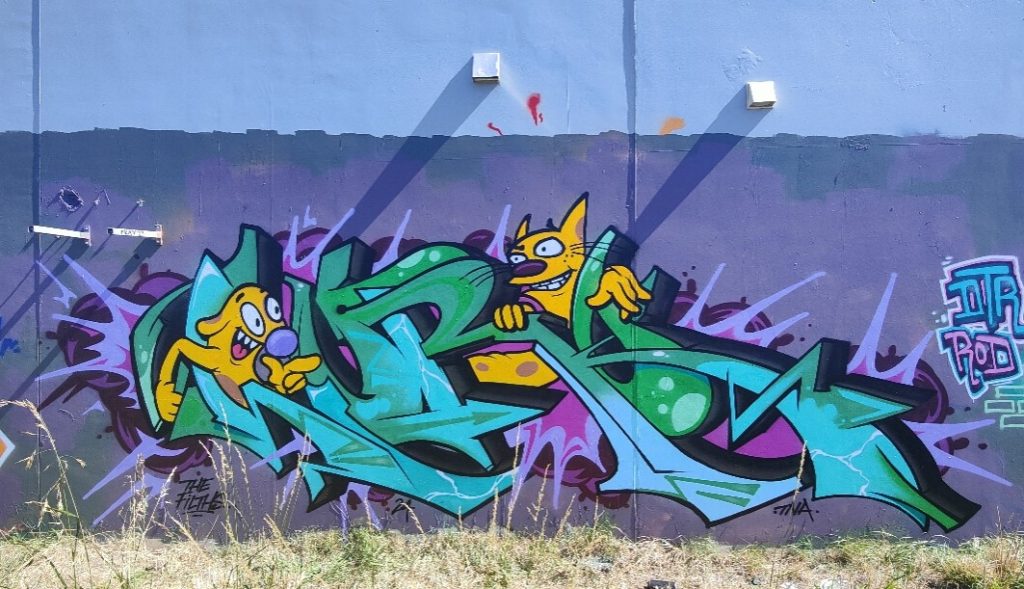
The popular trackside spot on Riccarton Road received a freshen up with a jam by some of the city’s most respected graffiti artists past and present, including Ikarus, Lurq, Morks, Dcypher, Pest5, Post, Drows and Foul. With a few flashes of nostalgia (CatDog anyone?) and a heap of history, the wall is a testament to Christchurch graffiti…
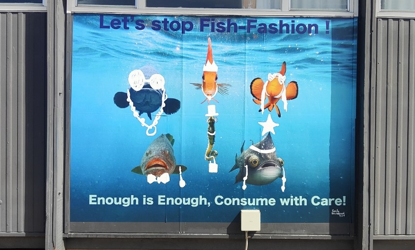
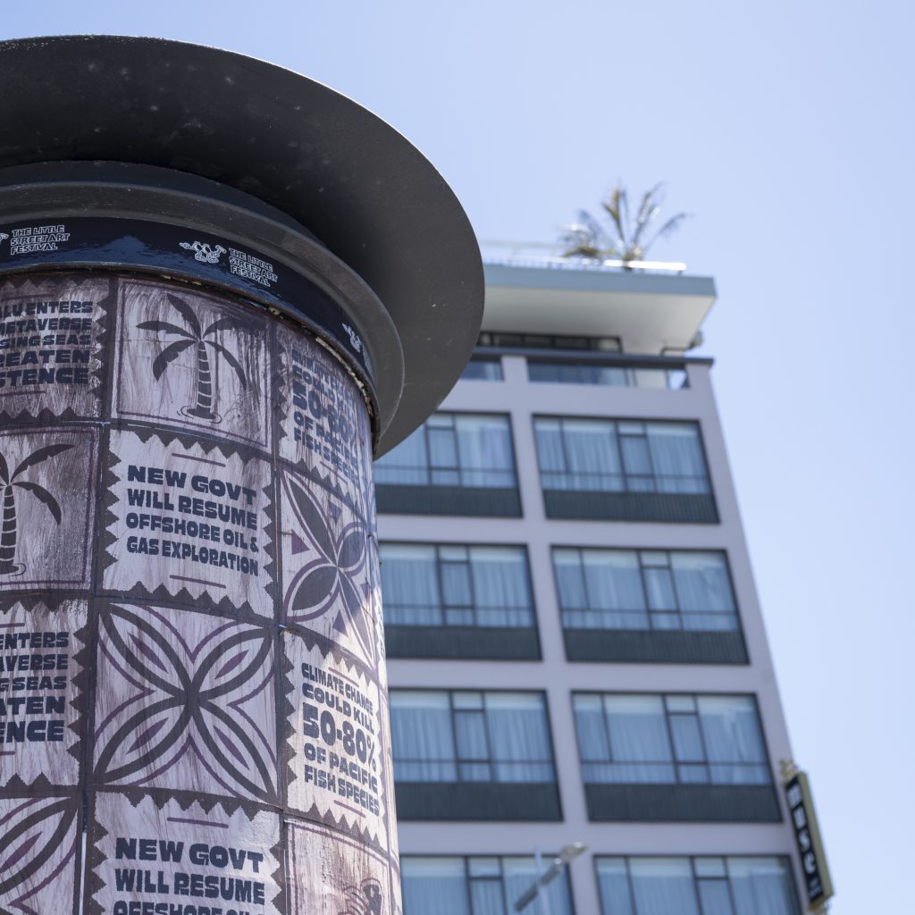
Youth Art at the Climate Campus
The Climate Action Campus, located on the old Avonside Girls High School site, is quickly amassing a heap of striking art on its walls – from the Amaze-Ink project initiated by the Christchurch City Council’s Graffiti Projects Team, to a small collection of works by students – all with a focus on climate action. We have been lucky enough to help with the latter, and with support from Phantom Billstickers, we loved seeing the work “Stop Fish Fashion”, by Emily Brickwood, come to life!
STOKED – The Duke Festival of Surfing Art Exhibition
New Brighton’s annual Duke Festival of Surfing hosted STOKED – its companion art exhibition in March and some of our favourite artists were in on the action – including teethlikescrewdrivers, Dove, Nick Lowry, Dark Ballad and Bloom. With a variety of styles and good vibes, it was well worth the visit!
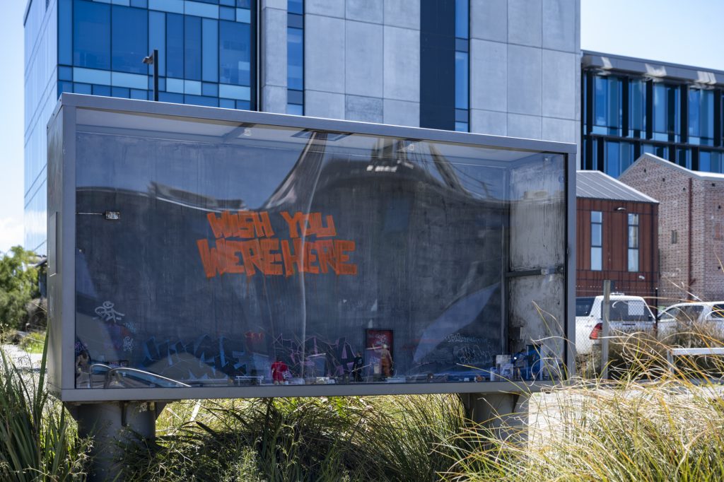
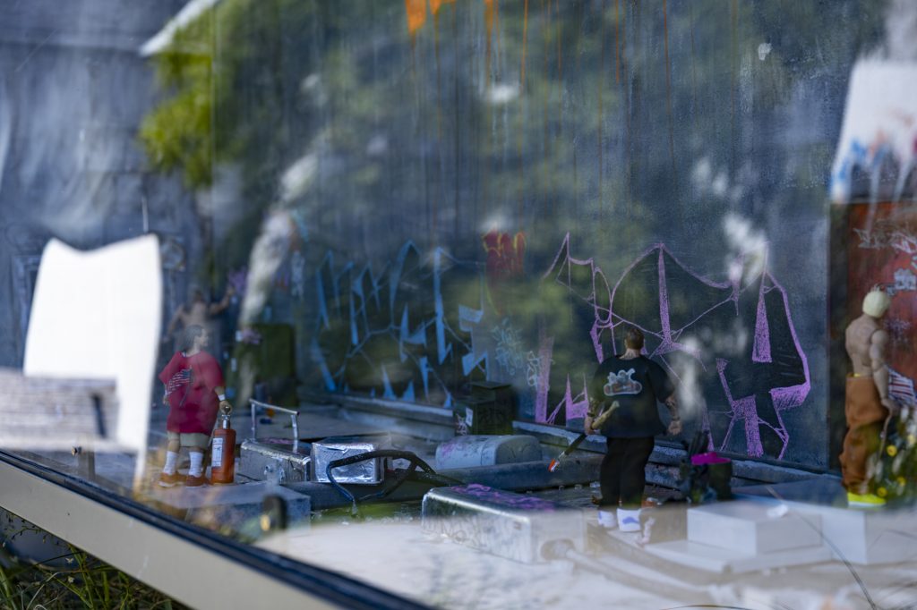
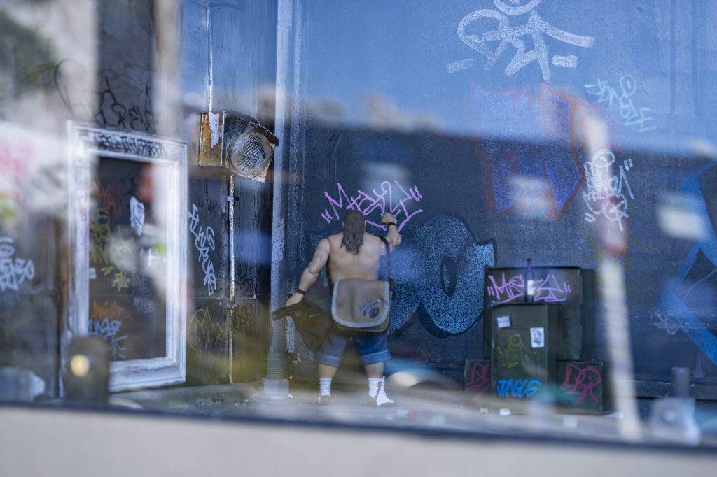
A Little Fix Up…
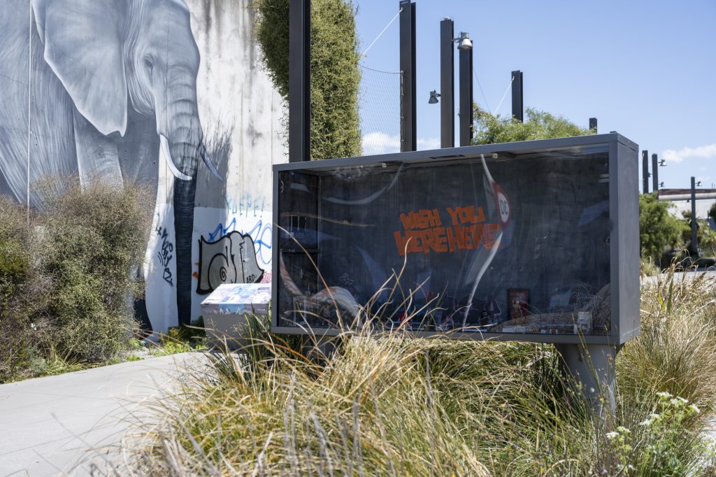
Ikarus’ Wish You Were Here, the lightbox installation for The Little Street Art Festival was given a spruce up in late March, thanks to a generous festival supporter, who kindly donated the replacement perspex frontage. Ultimately, these works are temporary, but it is always so touching that people want to help give them just a bit of a longer life – thank you!
These were our picks – what would you add? Let us know in the comments! And if you want to let us know about events or projects that we can spotlight on our blog – email us at [email protected]!
After several years of developing, planning and piecing together the logistics, Watch This Space was proud to finally bring the Little Street Art Festival to life in Otautahi Christchurch in late 2023!
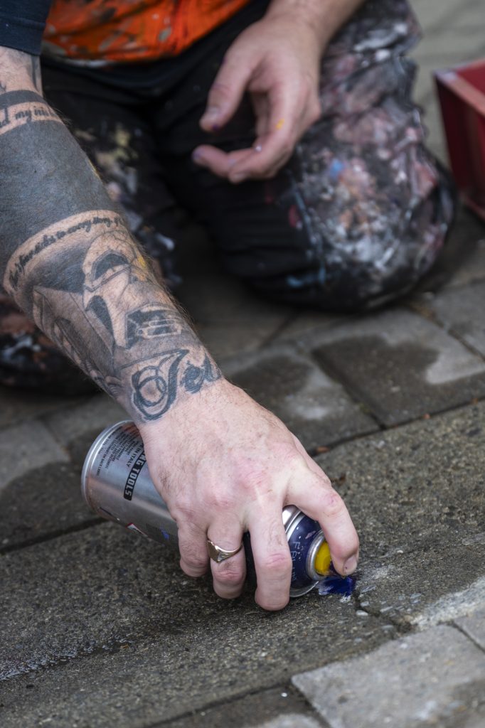
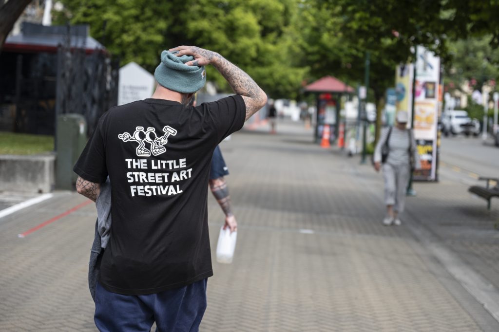
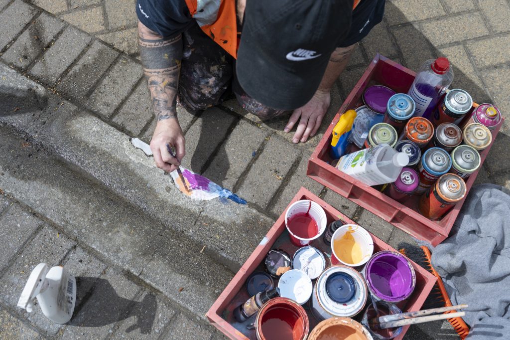
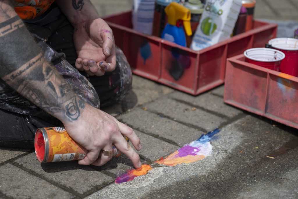
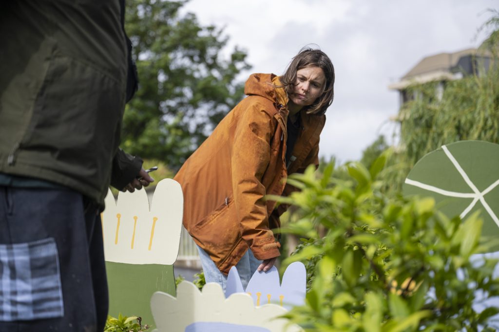
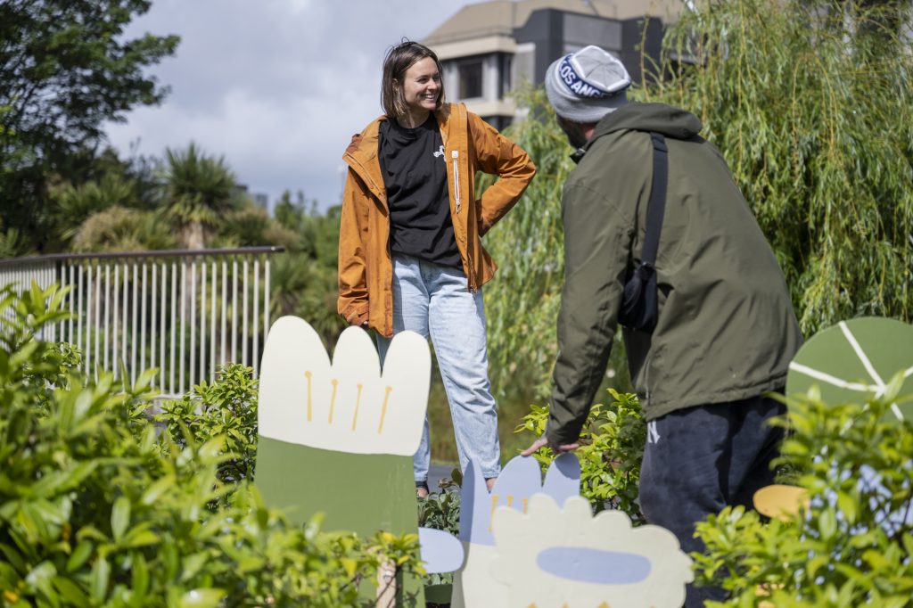
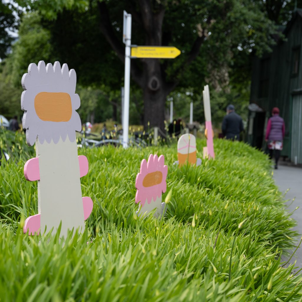
The festival was conceived as a platform for alternative approaches to street art, especially smaller scale and materially diverse practices. As such, serves as a point of difference from established mural festivals and provides artists who either don’t fit the profile of large-scale muralism or want to push to new directions with their work. For the inaugural festival, we gathered nine local creatives, a mixture of established names and newer artists and helped them take their work to the streets – Jacob Yikes, Ghostcat, Ikarus, Jessie Rawcliffe, Bloom, Dark Ballad, teethlikescrewdrivers, Nathan Ingram and Kophie a.k.a Meep, all contributing whimsical, meaningful and striking pieces. The installations ranged from paintings to sculptural pieces, interactive and participatory approaches and ephemeral interventions. With over 50 individuals pieces scattered throughout the city, the festival encouraged exploration and new ways of looking. In addition to the featured artworks, the festival also presented a programme of free events, including walking tours, an artist panel discussion, treasure hunts, workshops and activations (including Tink’s installation at festival sponsor Westfield Riccarton). We were blown away with the response to the festival and we can’t wait to bring the Little Street Art Festival back soon! For more information, check out our website: https://www.littlestreetartfestival.co.nz/ – but for now – check out some of our favourite pictures captured by festival photographer Centuri Chan…
A massive thank you our sponsors: Westfield Riccarton, Antony & Mates, Phantom Billstickers, Christchurch City Council, Toi Otautahi, Creative Communities and all our Boosted donors!
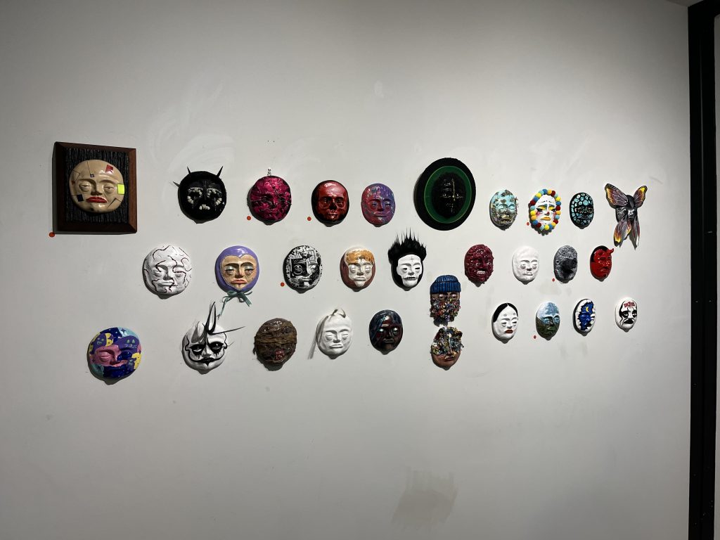
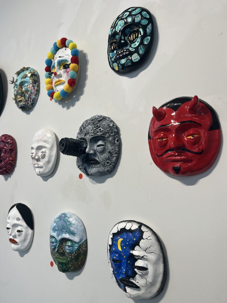
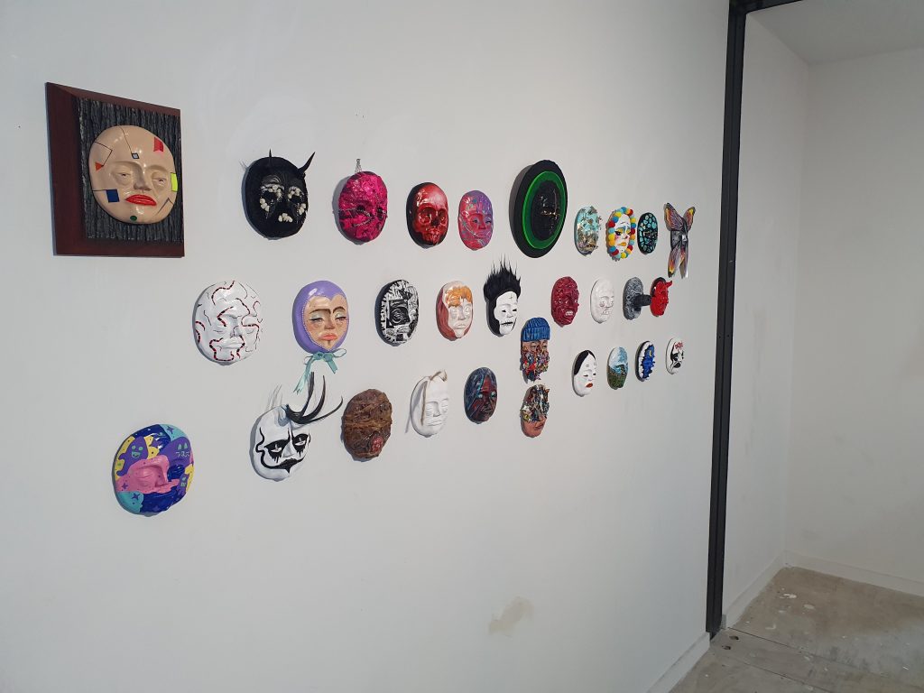
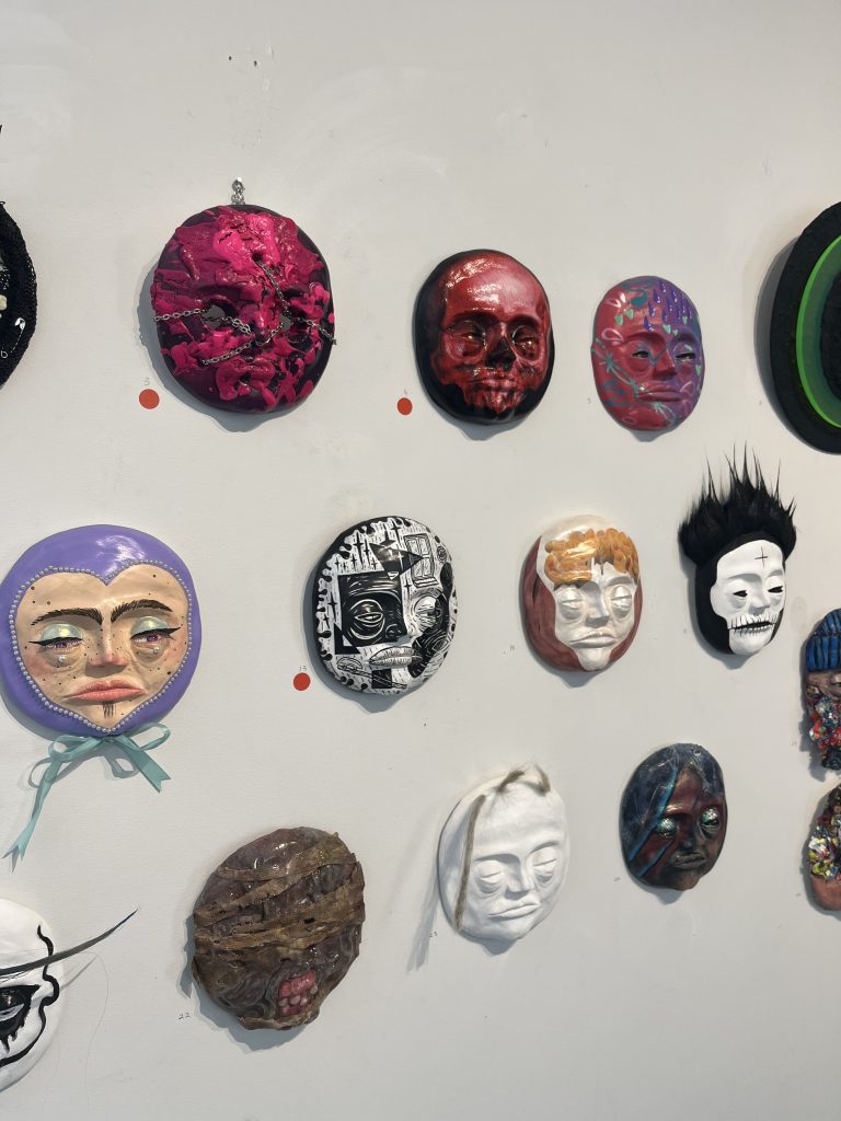
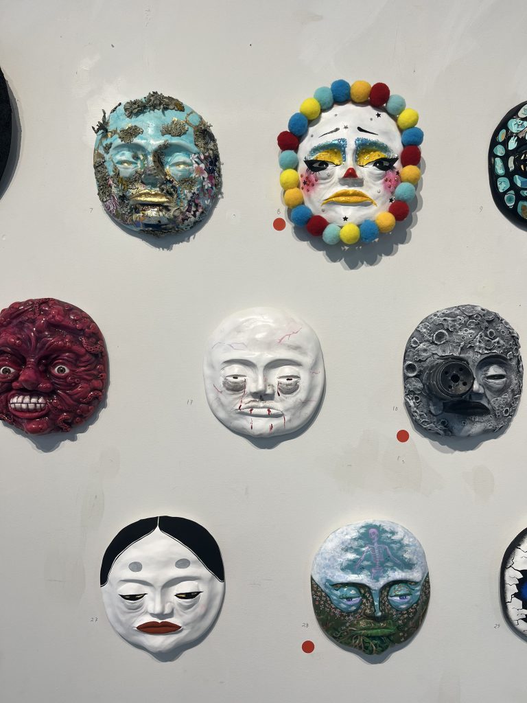
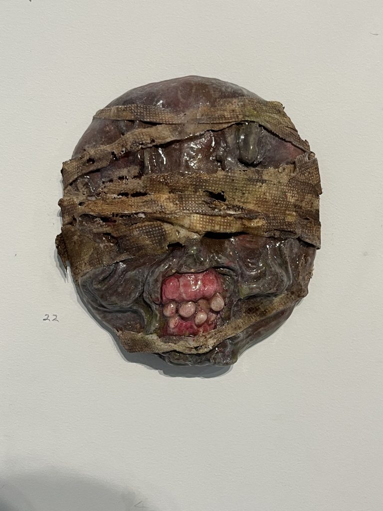
Friday November 4th saw the opening of a unique exhibition as Klaudia Bartos brought together an array of Otautahi creatives to give fresh takes on her clay faces that have populated the city over the last year.
Bartos’ small faces provided the canvas for more than 25 local artists, each adding their signature (or surprising) flair to the intriguing characters. Staged at the Masked Artist Gallery in the BOXed Quarter, the cluster of creations a survey of characters and suggested mind states, from references to classic cinema and pop culture, to blossoming elements of the natural world and more abstract configurations. A celebration of community and individualism!
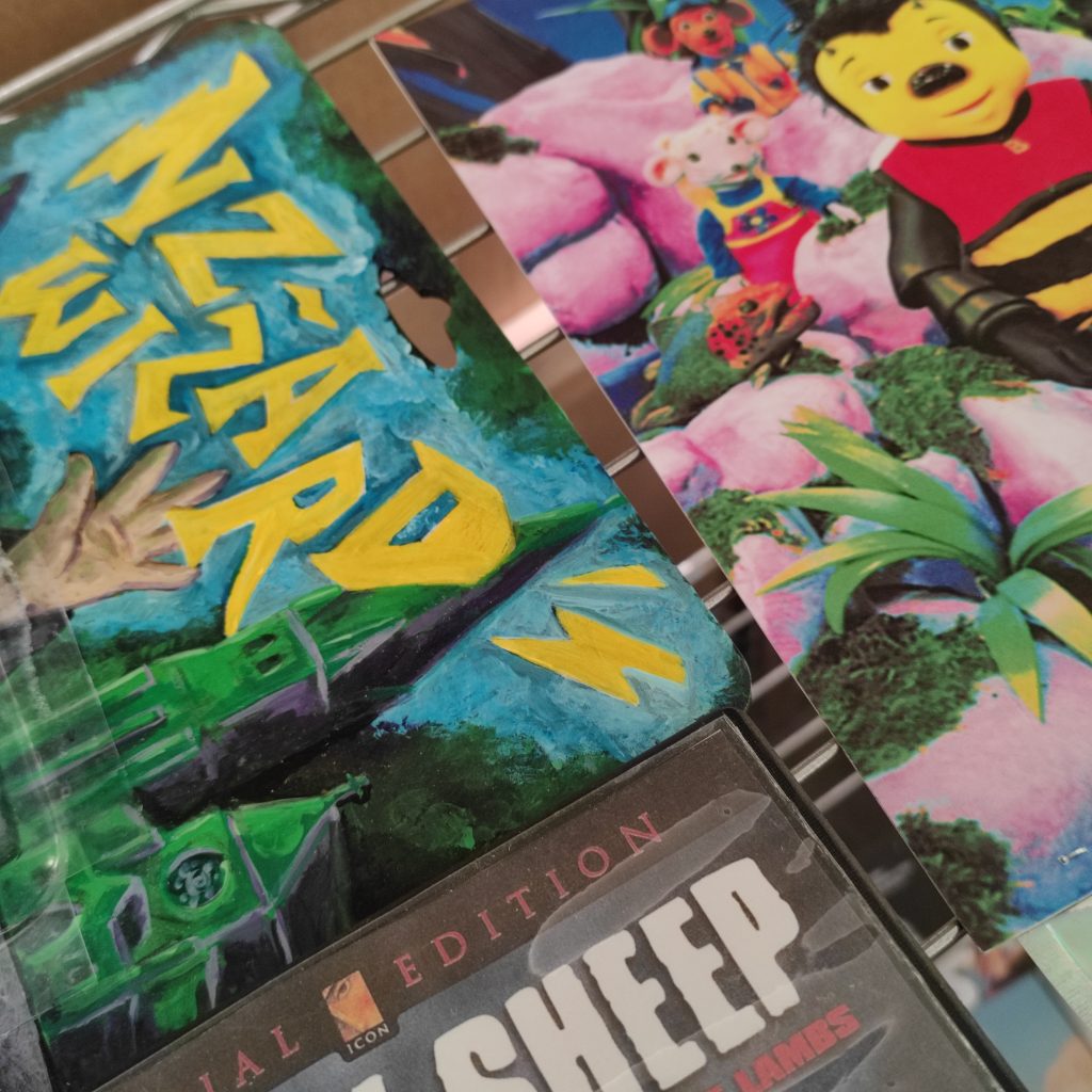
Clones features work by Glen Cutin, Melike Gungor, PK, Jessie Rawcliffe, Peaz, Nick Lowry, Melanie McKerchar, Devon Jones, Sarah Lund, Apex the Artist, Bet, Louann Sidon, RATS, Olivia Isabel Smith, Dark Ballad, Smeagol, Hode, Jay Skelton, Hambone, Jimirah, Reubin Caldwell, Neil Swiggs, Hannah Martin, Masked Artist, Amy Couling, Wynn Smith, and Catherine Brougham.
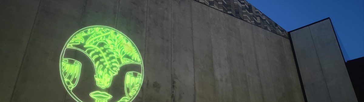
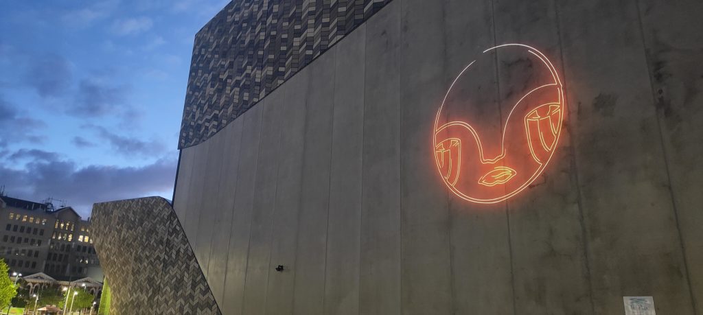
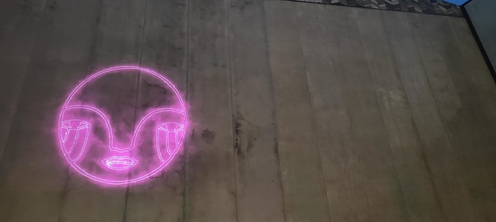
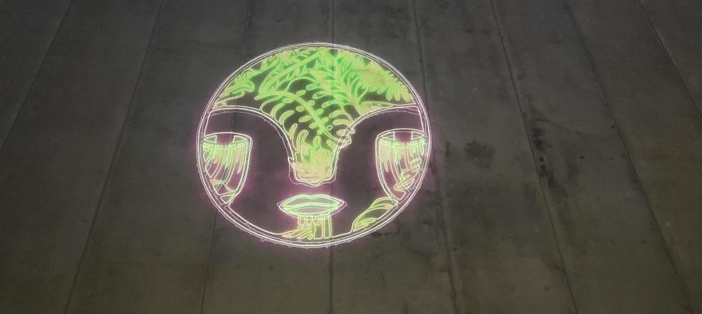
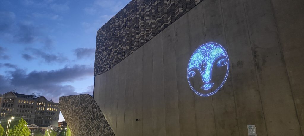
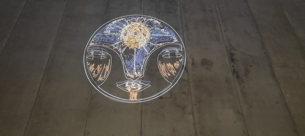
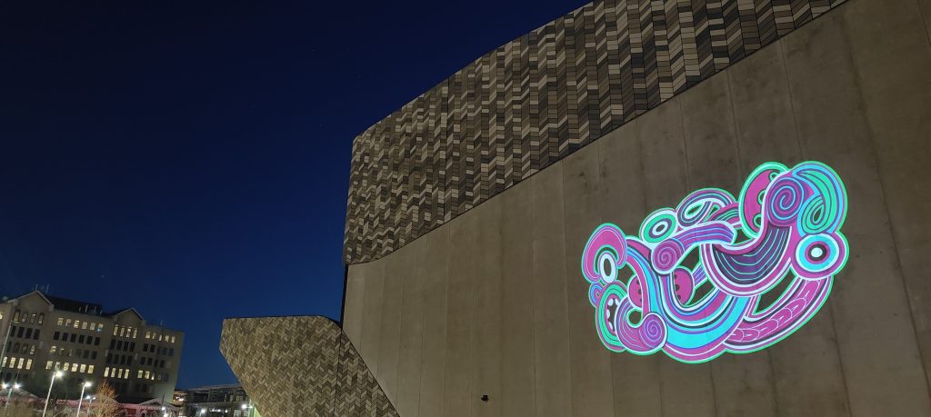
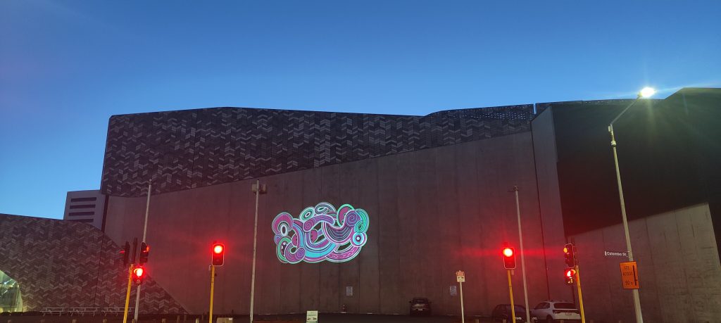
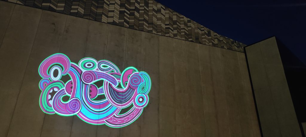
The latest projection in our Spotlight series is a truly mesmerising addition – a rotation of fiery, glowing and ruminative icons by local artist Jen_Heads, brought to energetic life by Sam Emerson from Offline Collective. Jenna Ingram’s Jen_Heads have become a recurring form in her work, appearing on canvas, paper, and walls, now given life through the Spotlight collaboration.
The dazzling Jen_Heads animation embodies the profound connection between humanity and the natural world. The work is a fresh imagining of Ingram’s titular urban icon, a form of endless possibility. The animation evolves through four stages, as the artist explains: “the initial two heads symbolize the essence of human nature with the heads pulsing like a heartbeat, seamlessly transitioning into our harmonious integration with the natural world, as depicted in the flora and fauna heads.” The shift from energetic flames of purple to serene green provides a sense of relieving calm, reward for a more attuned relationship with the organic environment. Ingram continues: “the concluding pair of heads signifies the spiritual dimension of our existence, reflecting our deep-rooted ties to ancient wisdom and ancestral heritage. This artistic representation underscores the fundamental unity that binds us all together.” Standing in front of the evolving animation, one is struck by the sense of humanity and elemental connections.
Ōtautahi artist Jenna Lynn Ingram, also known as Jen_Heads, holds a Bachelor of Fine Arts from the University of Canterbury, where her interest in the urban landscape as a site of influence blossomed. In the wake of the Christchurch Earthquakes, her work shifted to the streets, a transition that led her to form Aotearoa’s leading urban art gallery Fiksate Gallery. Ingram’s work has been exhibited and collected throughout Aotearoa and she has been featured in festivals and exhibitions such as Spectrum (2014) and SHIFT: Urban Art Takeover (2023).
Offline Collective is a visual creative agency based in Ōtautahi, Aotearoa. Offline is engaged in a range of creative endeavours, constantly exploring new possibilities through the lens of technology. Offline Collective’s work ranges from live touring visuals and art installations, to graphic and motion design, combining diverse creative fields to unlock new ideas.
Spotlight – Urban Art Projections is a collaboration between Watch This Space and ChristchurchNZ, providing a fresh approach to urban creativity for talented local artists. Connecting visual artists with digital creatives, Spotlight explores the potential of projection works, illuminating the exterior of Te Pae Christchurch Convention Centre.
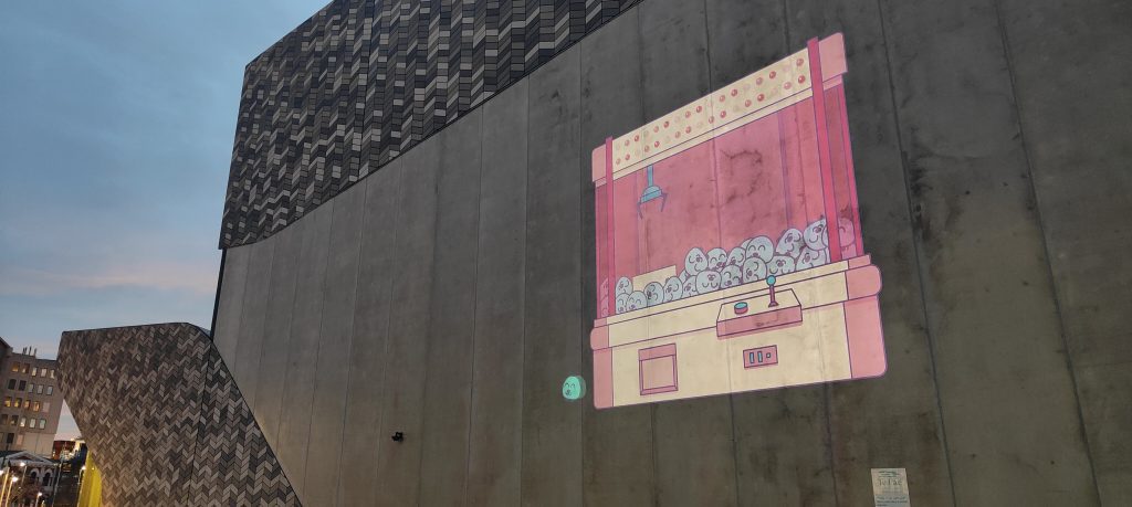
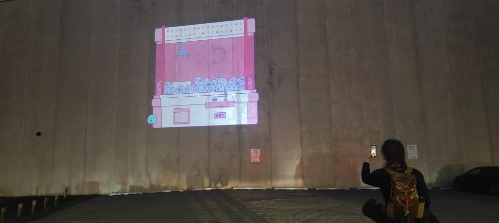
The fourth installation of this female-centric Spotlight series, Ōtautahi artist and designer Jimirah Baliza’s Get a Grip, is a playful invitation to passers-by; an invitation to pause and immerse ourselves in a scene that transcends our immediate experience. The animated depiction of a retro arcade claw machine embodies the unpredictable nature of life, reminding us that it is often filled with both anticipation and uncertainty, ups and downs, near misses and satisfying successes. Anyone who has played such a game knows the hope, the excitement, the calculation, the frustration, and ultimately either the disappointment or the elation of the challenge. Drawing on this universal connection, Baliza presents a whimsical moment of candy floss pink and baby blue nostalgia, transporting us back to a time of innocence and wonder, where the act of winning a prize was a heart-pounding adventure.
Get a Grip plays through the experience of the game on a loop of attempts, at first failing, the prize slipping from the metal claw, but eventually succeeding, creating a crescendo of joy following the spilled first attempts. The smile as the ‘prize’ toddles off from the machine. The prizes themselves, cheerful animal characters, serve as smiling participants in the challenge. They become echoes of community, networks of support with the ability to uplift each other. We are encouraged to keep on, to go again, to get our rewards and to revel in that success.
Jimirah Baliza is an Ōtautahi Christchurch-based independent graphic designer, illustrator and artist. Raised in Manila, Baliza is a creative problem solver at heart, with a passion for working with entrepreneurs, local businesses, community groups and organisations, enhancing their visual communications and their ability to engage, empower and educate across print, screen and space. Get a Grip was once again supported by local legend Nicholas Keyse. Pushing the limits of graphics technology while incorporating traditional techniques,Keyse founded Immersive Reality Ltd after working extensively in the print and digital design industry. Showcasing his work in exhibitions, Keyse held a solo exhibition at the Centre of Contemporary Arts’ Lux Gallery in Christchurch in 2019. Co-founder and curator of record label Subtle Recordings, he is also well-known for his prolific production of music posters with which he hopes to continue to inspire future creatives.
Spotlight – Urban Art Projections is proudly presented by Watch This Space in collaboration with ChristchurchNZ. This iteration of Spotlight proudly shines a light on the diverse work of four talented female Ōtautahi artists – exploring new possibilities for urban creativity and adding a surprising twist to the city after dark! The Spotlight 2.0 project was completed with support from the Hine te Hiringa – Empower Women Utilising FIFA Women’s World Cup 2023 Fund to help celebrate and empower women.
I’ve never really trusted August as a month. I know, it sounds silly, but its a tricky month. It is at the end of Winter and is cold and wet (more other than not), which means a constant struggle with not being able to wear t-shirts more consistently. And it’s place in the calendar means you can only reflect on how much of the year has passed you by. It isn’t helped by the imposter syndrome – you know, being a renamed month in the Gregorian calendar and all… I guess I’m just skeptical. Luckily, there have been some cool happenings, discoveries and teases this August to supersede this lingering distrust and warm my apparently cold heart just enough to be ready for the arrival of Spring and the goodness I’m sure we will find in the coming weeks and months… So, here’s what we loved last month…
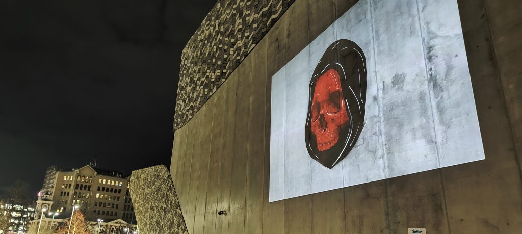
Jessie Rawcliffe’s Spotlight Projection
Not the last mention of the Spotlight project in this list, but Jessie Rawcliffe‘s haunting animated image was a perfect start to the new iteration of the projection series. The rotating image (each frame individually rendered by the artist) alternated between a strong female portrait and a hooded red skull – an evocative contrast that illuminated Rawcliffe’s exquisite illustrative talent.
Ghostcat’s Leave No Trace Trail
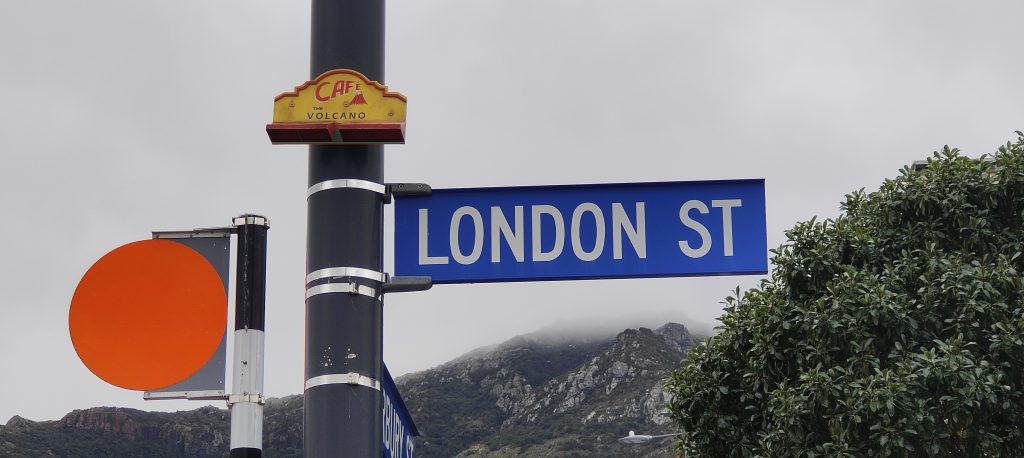
Ghostcat‘s Ghosts on Every Cornerproject will encompass a range of elements: an exhibition, a book, and a public art trail. The first installation of the latter went up in August, a tribute to a true Lyttelton icon. On the corner of London Street, the small red and yellow frontage of the famous Volcano Cafe is strapped to a lamppost, just metres from the home of now fallen building. A loving memorial, this is just the first of a series of works that will pay homage to the places and spaces that made Ōtautahi Christchurch, well, Ōtautahi Christchurch…
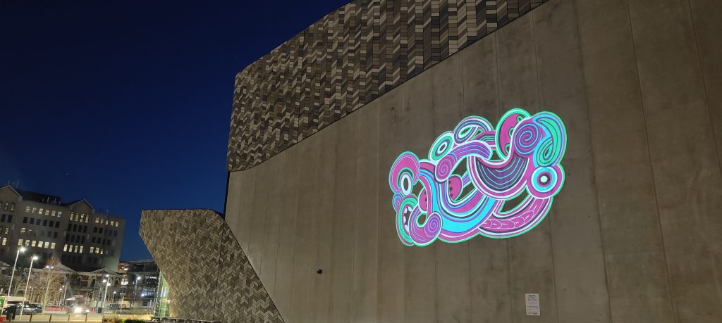
River Jayden’s Te Tihi o Kahukura for the Spotlight Series
The second work from the Spotlight series to appear in August was River Jayden‘s stunning Te Tihi o Kahukura – a contemporary piece of toi Māori, brightly coloured and alive with subtle movement. The animation appeared like water, shimmering on the wall of Te Pae and, just like its namesake Kahukura, bringing light, colour and beauty to its surroundings.
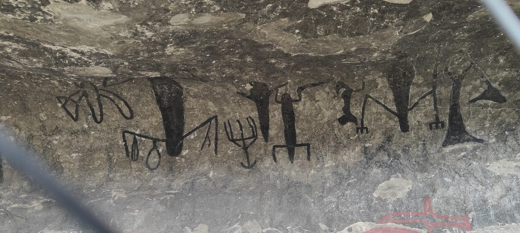
Rock Art in the Hurunui
We were lucky enough to visit a site of Māori rock art in the Hurunui District in August. A fascinating collection of iconography (apparently painted over in emulsifying paint in the early twentieth-century), it shows the long lineage of decorating our physical spaces in acts of communication, of expression and of existence. Found on private land, the rock art is not readily accessible, but is an important piece of history.
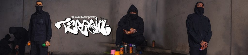
TMD x CCC
Talk about an iconic collaboration – in August we found out about this project bringing together legendary New Zealand clothing brand Canterbury Clothing Company (CCC) and urban art heavyweights, Tāmaki Makaurau crew TMD. The tough Terrain range is perfect for the urban adventurer and the upcoming collab is sure to be fire! (Image from https://www.canterburynz.com.au/terrain-i454)
That’s the list of our favourite things from August 2023 – what were some of your highlights? Let us know!
The second work of our Spotlight 2.0 series is now live and illuminating the exterior of Te Pae – Christchurch Convention Centre with vibrant light and alluring movement. Artist River Jayden‘s stunning Te Tihi o Kahukura showcases the beauty of toi Māori, while adding a bright contemporary twist. Jayden explains that ‘Te Tihi o Kahukura’ translates to ‘The Citadel of Kahukura’ or the pinnacle of the rainbow. In te reo Māori, Kahukura is one of the names given for a rainbow, and it is said, specifically the arch of a rainbow. Te Tihi o Kahukura is also the first name of Castle Rock, the famous outcrop on Summit Road. Kahukura, a spirit guardian, is an important figure in the Kāi Tahu (Ngāi Tahu) creation story. To Kāi Tahu, Kahukura is an atua (god) and the decorator of the whenua (land), bringing light, colour and beauty to all surroundings. Jayden’s work acknowledges Kāi Tahu as mana whenua, while emphasizing the importance of Kāi Tahu oral traditions and Mātauranga Māori (Māori knowledge). Drawing on traditional design elements and employing strong line work, the bold use of colour, essentially neon-like, adds a contemporary flair. Nicholas Keyse’s slow, understated animation, including a blinking eye and fluid movement, imbues Jayden’s work with a calm, yet fascinating quality, drawing the viewer in. Te Tihi o Kahukura is visible from distance, a beacon calling forth and reflecting our region’s history, beauty and future.
River Jayden (Ngāti Tahu – Ngāti Whaoa, Ngāti Tuwharetoa & Ngāti Maaniapoto) is a painter and graphic designer who uses traditional Māori toi (art) and design within a contemporary context. Te Tihi o Kahukura was developed with support from digital artist Nicholas Keyse, founder of Immersive Reality Ltd.
Spotlight 2.0 shines a light on four talented female Ōtautahi artists, giving their work a new platform, projecting animated pieces on the exterior of Te Pae. With a diverse range of artists, displaying unique visual and thematic interests, Spotlight 2.0 illuminates our powerful creative communities and raises new possibilities in the cityscape. Spotlight 2.0 is supported by ChristchurchNZ and the Hine te Hiringa – Empower Women Utilising FIFA Women’s World Cup 2023 Fund to help celebrate and empower women.