Watch This Space was proud to host the 2025 artist panel discussion for the Flare Ōtautahi Street Art Festival. Joined onstage by Haser, Fluro, Berst, Jessie Rawcliffe and Ling, the conversation ranged from cultural influences and connection to place, to graffiti’s lineage, the differences between Melbourne and Ōtautahi and when Ling will finally paint a portrait of Berst! Hosted at Dux Central, the event capped a massive week for the artists and organisers of the Flare Festival. Luckily, in case you missed it, we recorded the event and you can watch it below!
Thanks to Corban Tupou for hosting the live stream and Local Elements for working the sound! We are already looking forward to 2026!
The latest Spotlight work to illuminate the Gloucester Street side of Te Pae Christchurch Convention Centre is a warm, inviting scene created by local artist Iva Anjani. Further exploring the possibilities of the projected animation format, Anjani’s peaceful domestic scene was created by hand, stitching together up-cycled materials to compile the image. A painstaking process, the work is imbued with care and exudes a sense of serenity, a reminder of those places where we can find sanctuary. With the scene brought to subtle life through the wizardry of Immersive Reality’s Nick Keyse, Anjani’s work provides a soft contrast to the urban surrounding, a window of calm to contemplate. As Anjani’s first public artwork, we took the opportunity to talk to the artist about her experiences and reflections as her vision came to life…
The Flare Ōtautahi Street Art Festival kicks off on Thursday, 27th February – and it is bringing 10 days of epic street art goodness! With a massive offering of things to do and see, let’s get everything you need to know in one place!
Los Angeles is an iconic city, but it never quite feels like it lives up to any sense of beautiful grandeur, the architecture is more post-modern than historic, the sun bleaches so many of its surfaces that there is always a sense that it has been washed out, and the sprawl makes it hard to contextualise your location. But despite this, there is an undeniable quality to the various haunts, whether it is the air of Hollywood Boulevard, the familiar locations from film and television, or the eccentricities of Venice Beach. The wide streets and the open expanse above give it feeling not dissimilar from post-quake Ōtautahi, although on a completely different scale. So when we were recently in the city, there was an unsettling melange of familiarity, strangeness, expectation and reality. But, for all that, there were lots of artistic treats to discover, from large murals to smaller interventions, with some big names thrown in the mix. It is impossible to cover all of such a sprawling city, and even the places we did explore are often hard to fully navigate, but here are some favourites we did find. Dive on in and check out some of our highlights from the City of Angels…
Oops, we did it again – you get another two-for-one this time as our busy schedule kept us a little behind the eight-ball when it comes to our favourite things! It might be a little concerning, what with a bumper summer incoming and a heap of cool projects on the horizon – but fear not, we make a promise to be very, very good. We hope. But enough with the apologies, let us celebrate what has been a prolific period with some highlights! Here are the things we loved over the last couple of months…
So, we have an apology to make – July kind of slipped by and we didn’t get our monthly list of favourites completed on time (can you see the shame on our face? We look like a dog who got into the rubbish). But don’t fear, that means this month you get a two-for-one! We even made it a little bit bigger, so it is kind of an end of winter blockbuster. Grab some popcorn, slurp your soda and check out the things we loved from the last 8 weeks!
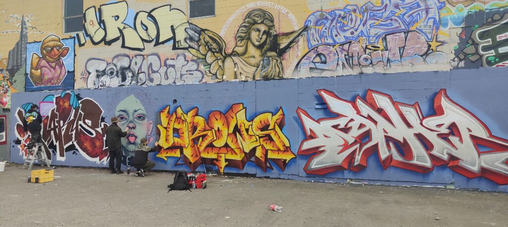
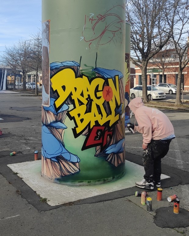
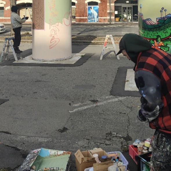
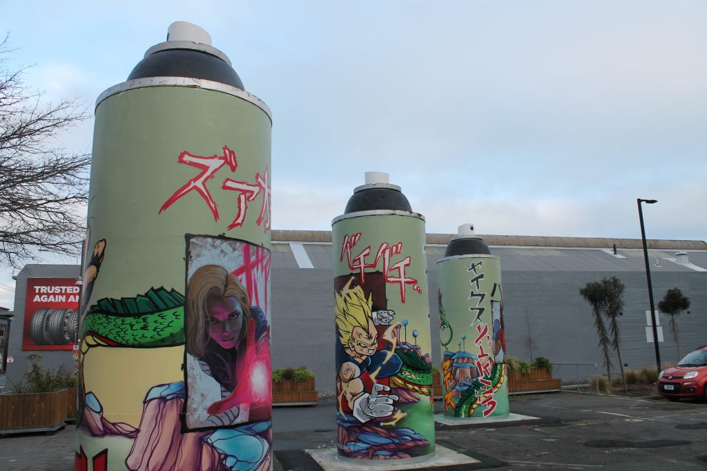
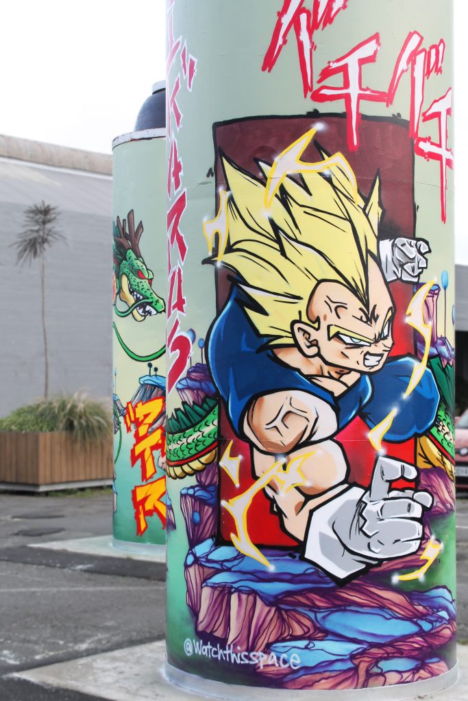
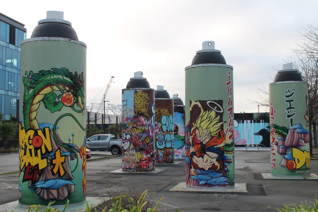
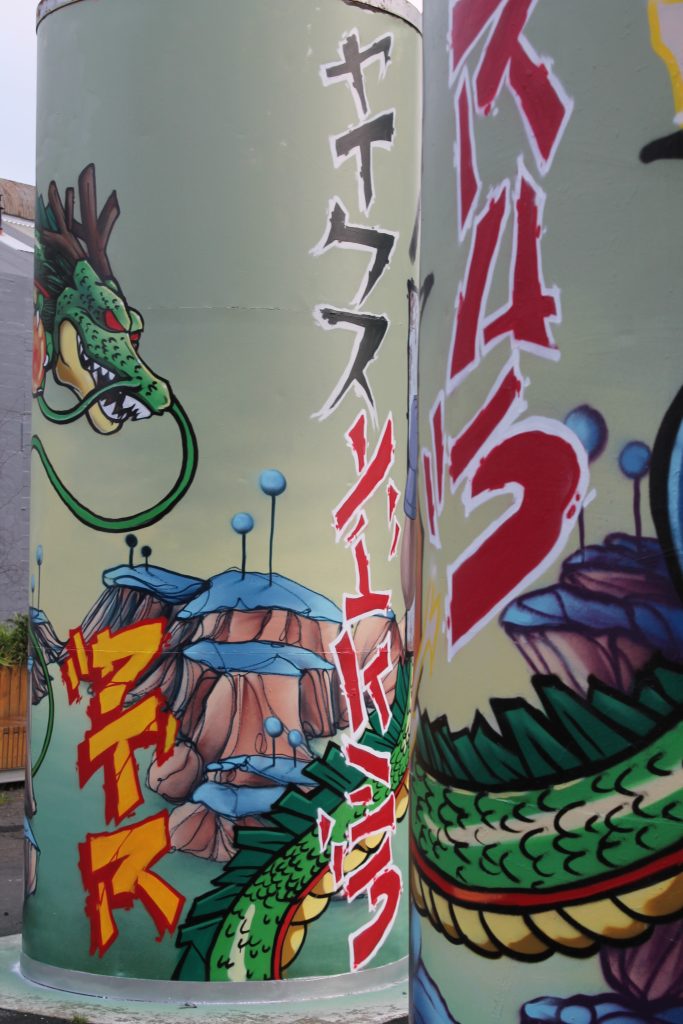
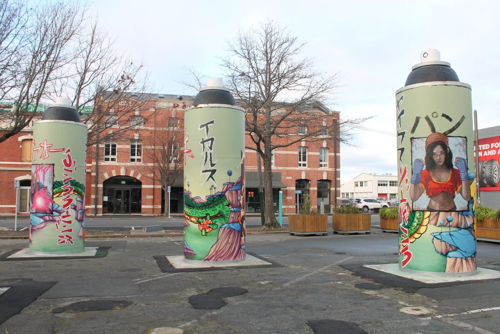
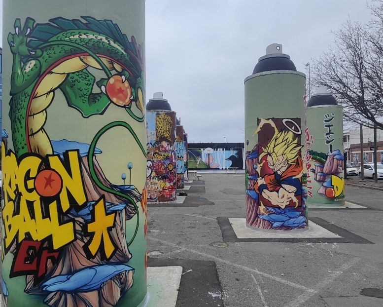
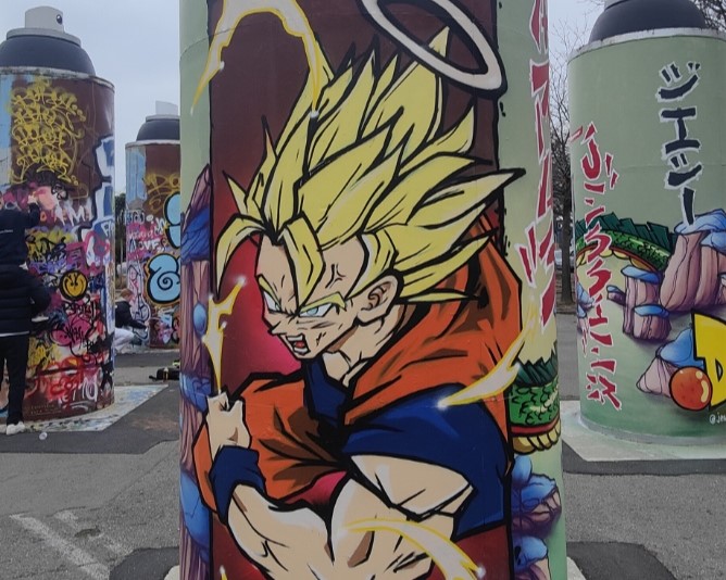
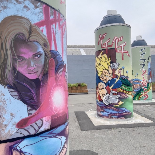
The Giant Cans Get a Refresh
The Giant Cans on St Asaph Street are designed to be split between free wall spaces (the three cans to the east) and more permanent works (the three cans to the south-west). To keep things fresh, the three ‘permanent’ cans are re-painted routinely and the latest transformation was a unique collaboration between Jacob Yikes, Ikarus and Jessie Rawcliffe – a sprawling tribute to Dragonball creator Akira Toriyama. Mixing familiar landscapes and characters with the artists’ signature styles, it has to be said that the work is “over 9000!”…
Ghstie Goes Nostalgic…
We have loved finding Ghstie’s three-eyed tributes to the cartoons of our past – whether Slimer from Ghostbusters or Casey Kelp from the Snorks, we are suckers for a trip down memory lane…
FSA Catch the Train
With their signature flair in full monochrome effect, the FSA’s crew’s tribute to subway trains and graffiti is both a bold addition to the Manchester Street bus stops and a wink to the subversive culture…
Rest in Peace…
Just like Ghstie’s slaps, Dark Ballad’s reflective stickers bring some nostalgic heat with the stencilled image of wrestling legend The Undertaker, fitting for an artist with a love of life’s darker side!
Drows’ Connection
We were proud to support the production of Drows’ striking Connection on Colombo Street – an activation of a long vacant site by the Christchurch City Council. Alongside the landscaping of the area, Drows’ colourful hoarding work speaks of his, and by extension the viewers’, connection to place – from the maunga to the awa and beyond, Connection is at once personal and universal…
A Summery New Brighton Jam…
It is always good to stumble upon a surprise, and when we noticed some activity across the carpark on a quick trip to New Brighton, we had to investigate… We quickly found members of the DTR crew, Dcypher, Ikarus and Drows, along with Jessie Rawcliffe refreshing a popular wall, a good reminder of Summer’s impending arrival and the increased activity that is sure to come with the longer days…
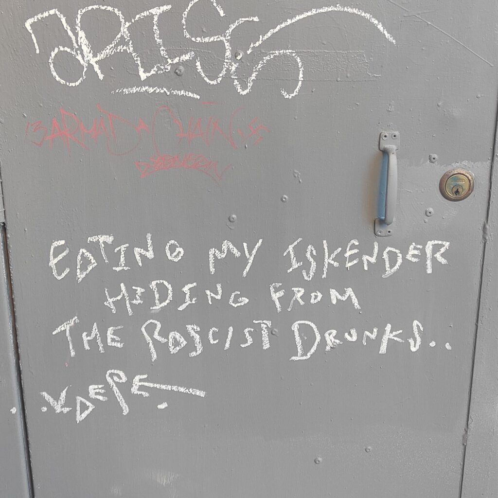
Just Eating my Iskender…
We love a little story and wandering down Hereford Lane, we couldn’t help but be struck by the poetic tone of Kaepe’s waxy statement. We love our city, but that doesn’t mean it is perfect, and sometimes, it is the margins that remind us…
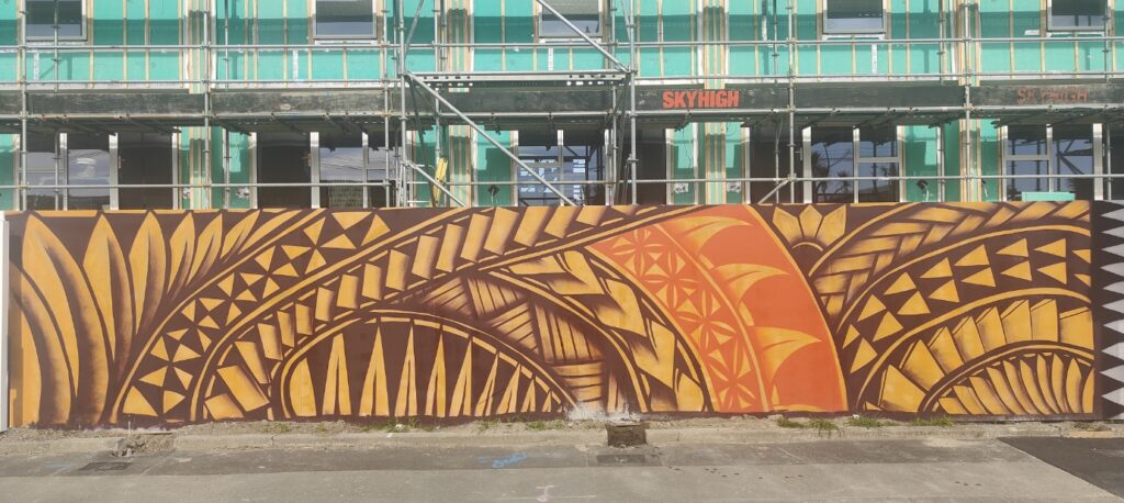
Monti in New Brighton…
We love Monti Masiu’s paintings, celebrations of his Tongan heritage in striking compositions that are both traditional and contemporary. His work on a temporary hoarding in New Brighton is awash in warm brown, ochre and orange tones, brightening up an otherwise stolid setting…
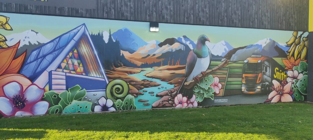
Jacob Yikes at Smiths City
Jacob Yikes is one of Ōtautahi’s most iconic urban artists, with his instantly recognisable style and aesthetic, so it was fitting that he adorn the iconic Smiths City premises on Colombo Street, a local company that has been in the location since 1918, familiar to generations of Cantabrians. We love the vibrant tones and serene scene…
teethlikescrewdrivers’ Doodle Session
We were stoked to launch our new Doodle Session video series – where we chat to artists while they draw – exploring their process and their creative mindsets. First up is teethlikescrewdrivers, who ran through a range of his fixations, from chairs and pencils to words and self-portraits – a lovely, chaotic, creative ramble! Stay tuned for episode two – it will be live by the time you read this!
They were our highlights for July and August – let us know what you think!
Our new Doodle Session series is a deep dive into the creative process of some of our favourite artists. We sit down and let the creative energy flow as they draw, doodle and mark a page, all while we ask a few questions and explore what makes them tick, the role drawing plays, and how it all comes together.
Episode one of our Doodle Sessions features none other than teethlikescrewdrivers – whose energy is evident in the way he annotates our conversation with drawings, from school chairs to pencils, self-portraits to phrases – check it out and get inspired!
Keep an eye out for future episodes on our YouTube channel!
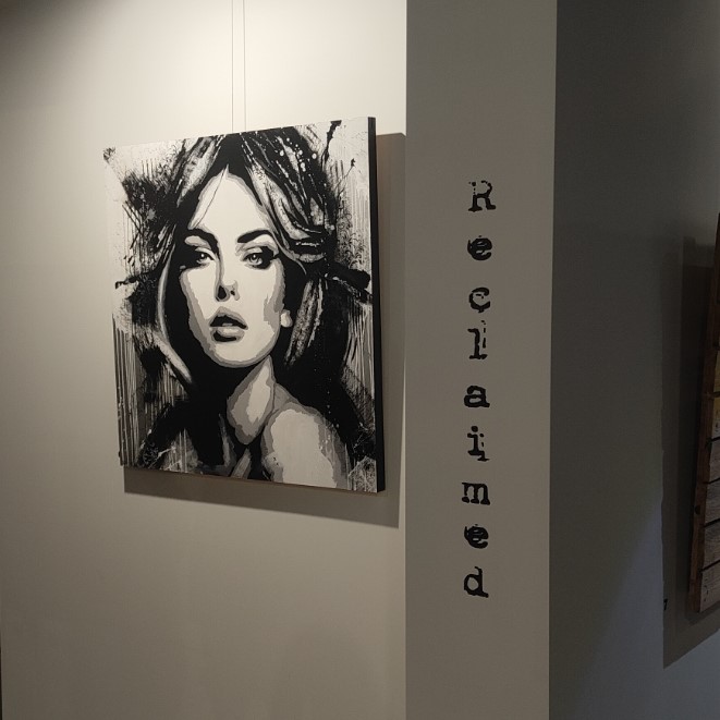
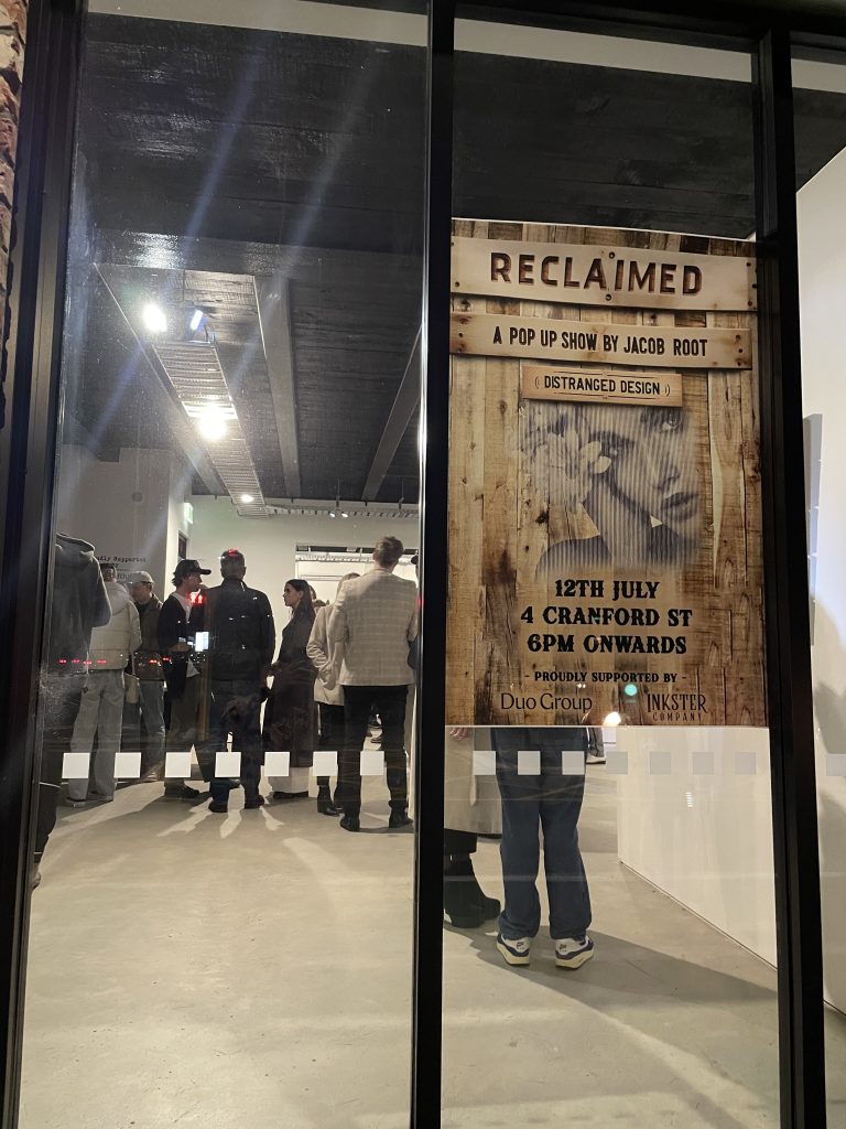
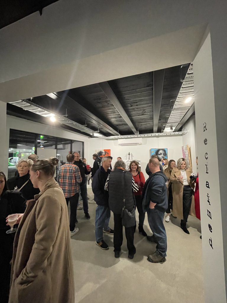
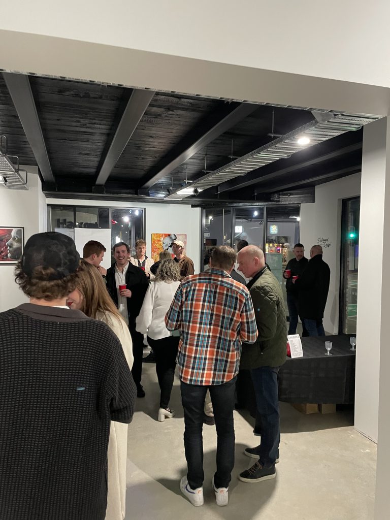
Jacob Root, a.k.a Distranged Design has a way of getting on with things – whether it is flying across the world to immerse himself in the creative scene in Los Angeles, or staging exhibitions of his work here in Ōtautahi Christchurch, he tends to find ways to make things happen. For his latest solo show, Reclaimed, he set about making a body of work that both explored new ways of making (from paint application to the use of up-cycled materials), and found a space through a mural contact – eventually coming to life in a weekend pop-up show.
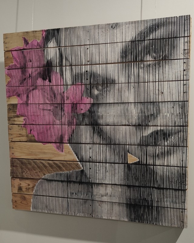
The well-attended opening night, despite the drizzly Friday evening, showed that Distranged Design has built a solid following of fans eager to see his latest work. The showroom setting afforded a spacious and uncluttered layout for his large works, many painted on recycled palettes and found objects. The styles employed also highlighted a changing approach, clearly influenced by the artist’s increasingly large mural works. The stencil background is still apparent, including the Snik-inspired Moire-styled technique, but a new painterly approach, deploying more freely constructed layers, is arising, an approach the artist admits is, in part, to give relief from the work-heavy cutting process.
Despite his youth, Distranged Design has been a presence in Ōtautahi’s scene for several years, and Reclaimed shows an artist beginning to explore new paths…
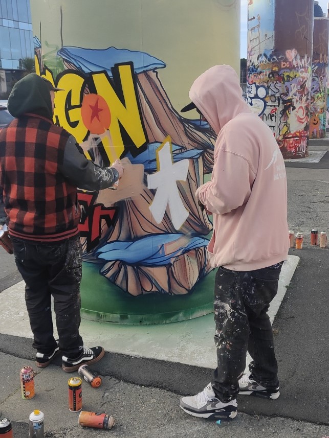
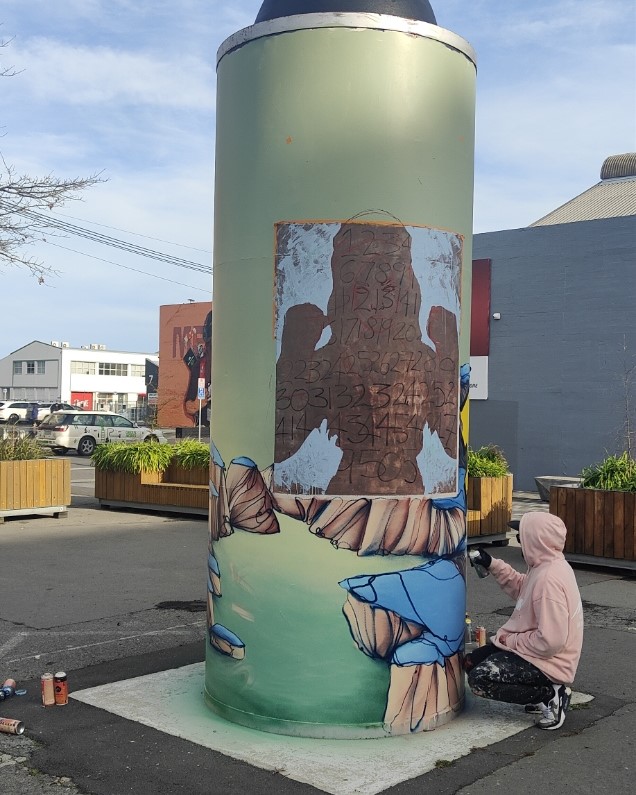
When you bring together three heavy hitting talents, the results should always be something special – and the latest refresh of the ‘permanent’ Giant Cans is testament to that truth! When we approached Ikarus, Jacob Yikes and Jessie Rawcliffe to paint the steel cylinders, we challenged them to take a different approach – rather than painting one can each, we asked the three artists to create a collaboration across the three cans. The result is stunning!
The three artists united behind a love of anime and specifically Dragon Ball – the iconic Japanese Manga – a fitting subject given the series’ creator Akira Toriyama had passed away in March 2024. The artists them considered ways to incorporate their signature styles within the familiar aesthetic of Toriyama’s world and beloved characters – exploring the potential and challenges of the circular shapes and multiple viewpoints – the result is a stunning, whirring work that is vibrant and intriguing.
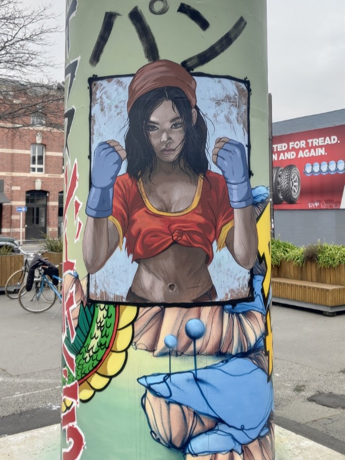
Yikes’ otherworldly style is evident in the green, almost alien, landscape in which characters sit, framed as if contained within comic book panels. The giant dragon Shenron wraps around the three cans, entwining the setting within his mystical presence, clutching the magical, titular Dragon Balls. Rawcliffe’s realism is deployed to depict stylised versions of Pan and Android 18, giving new life to familiar characters. Ikarus’ graffiti traditions are evident in the bolts of text that add a sense of onomatopoeia to the scene, an energetic presence. Traditional representations of Goku and Vegeta, perhaps two of the most famous characters in the saga, and the cat-like Puar, add to the scene.
The various aspects combine into a cohesive production, but also present the need to move about, to explore different vantage points and lines of sight. Time to see it for yourself!
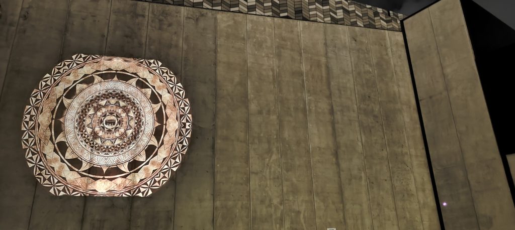
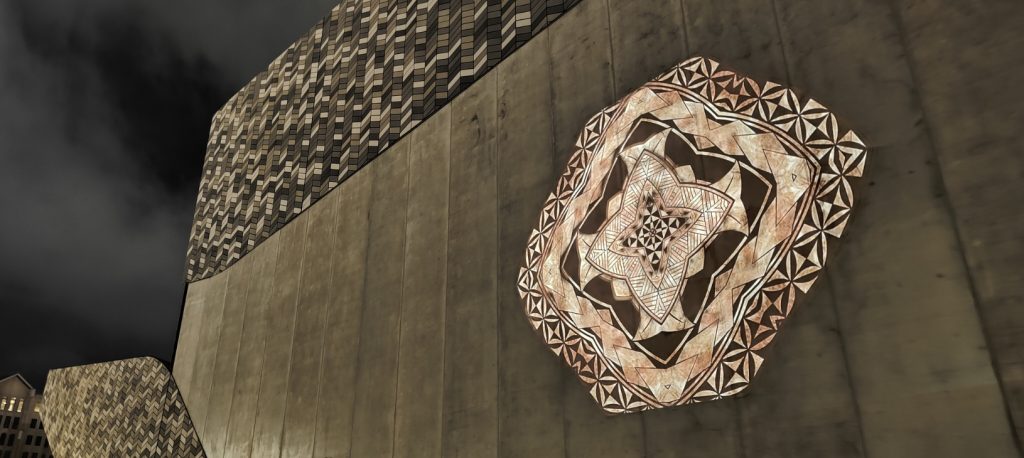
We are excited to ;launch the third iteration of our Spotlight series – introduced a new roster of artists to illuminate the city after dark with their striking artworks!
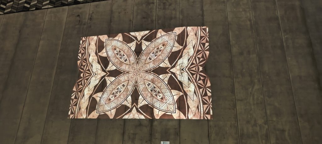
The first work to come to life for Spotlight 3.0 is Monti Masiu’s ‘api – a circular image that reflects the artist’s exploration of his Tongan heritage, inspired by the traditional forms and iconography of ngātu (bark cloth) and tatatau (tattoo), and centred around the symbolic importance of the kava bowl, representative of community. The image builds outward through numerous layers of sepia-toned circles and imagery, the work is at once honoring of tradition and something new.
That newness is made apparent in the collaborative aspect, Nicholas Keyse from Immersive Reality bringing the static image to animated life, producing a kaleidoscopic effect that suggests new forms and possibilities as it slowly reveals Masiu’s image. The revolving image is mesmirising as it plays out, slowly filling an increasingly large section of wall before receding again and eventually disappearing before playing through again, the loop reflective of the stories passed through generations, linking us to ancestors and our future.
This is a work that needs to be seen in person, so head down to the Colombo Street exterior of Te Pae – Christchurch Convention Centre after dark and take it all in…
Stay tuned for the next Spotlight work in the coming weeks!
Spotlight 3.0 is made possible with funding from the Christchurch City Council’s Place partnership Fund, with additional support from Rau Paenga Ltd, Phoenix PDP and Ōtautahi NZ.