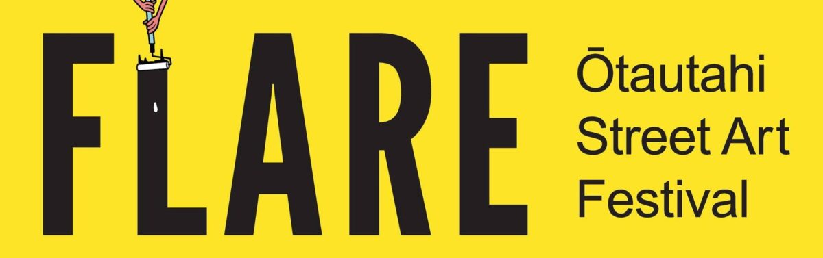
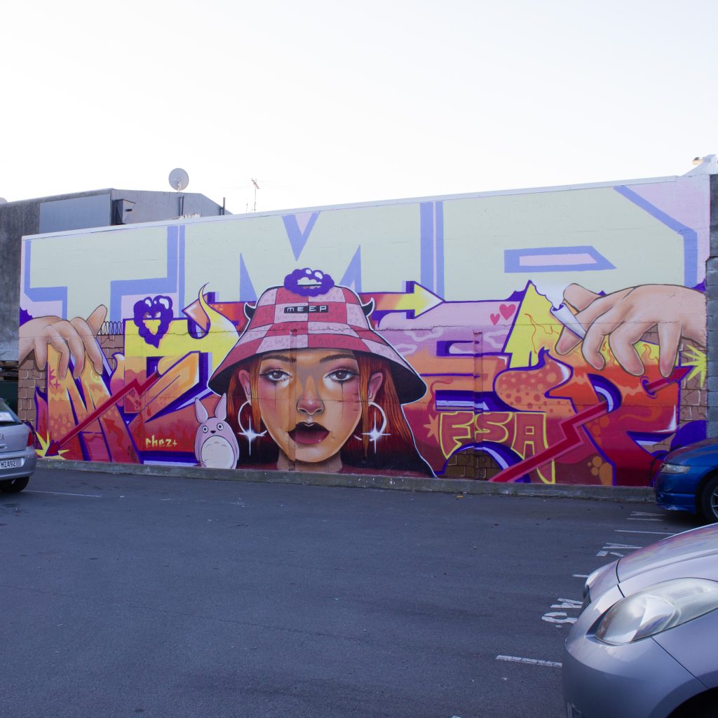
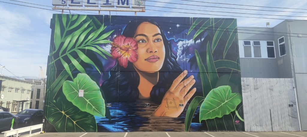
After a three year hiatus, the Flare Ōtautahi Street Art Festival is back for 2025! Featuring seven headline artists creating large-scale murals across the city, more than 50 additional artists contributing to a range of creative activations, street art tours, an artist panel, workshops, a market and an exhibition – this is going to be huge! Oh, and did we mention the creation of Aotearoa’s tallest mural by Jacob Yikes?!?
To mark this return, we caught up with some of the central organising crew – project manager Selina Faimalo, artists Dcypher and Kophie a.k.a Meep, along with our own Reuben Woods to chat about the challenges, the excitement and legacy of Flare!
Los Angeles is an iconic city, but it never quite feels like it lives up to any sense of beautiful grandeur, the architecture is more post-modern than historic, the sun bleaches so many of its surfaces that there is always a sense that it has been washed out, and the sprawl makes it hard to contextualise your location. But despite this, there is an undeniable quality to the various haunts, whether it is the air of Hollywood Boulevard, the familiar locations from film and television, or the eccentricities of Venice Beach. The wide streets and the open expanse above give it feeling not dissimilar from post-quake Ōtautahi, although on a completely different scale. So when we were recently in the city, there was an unsettling melange of familiarity, strangeness, expectation and reality. But, for all that, there were lots of artistic treats to discover, from large murals to smaller interventions, with some big names thrown in the mix. It is impossible to cover all of such a sprawling city, and even the places we did explore are often hard to fully navigate, but here are some favourites we did find. Dive on in and check out some of our highlights from the City of Angels…
Oops, we did it again – you get another two-for-one this time as our busy schedule kept us a little behind the eight-ball when it comes to our favourite things! It might be a little concerning, what with a bumper summer incoming and a heap of cool projects on the horizon – but fear not, we make a promise to be very, very good. We hope. But enough with the apologies, let us celebrate what has been a prolific period with some highlights! Here are the things we loved over the last couple of months…
So, we have an apology to make – July kind of slipped by and we didn’t get our monthly list of favourites completed on time (can you see the shame on our face? We look like a dog who got into the rubbish). But don’t fear, that means this month you get a two-for-one! We even made it a little bit bigger, so it is kind of an end of winter blockbuster. Grab some popcorn, slurp your soda and check out the things we loved from the last 8 weeks!
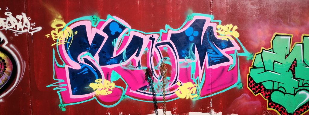
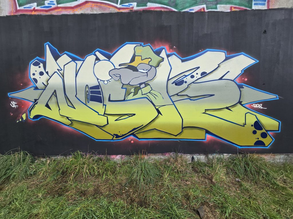
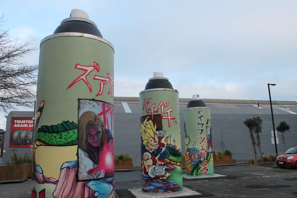
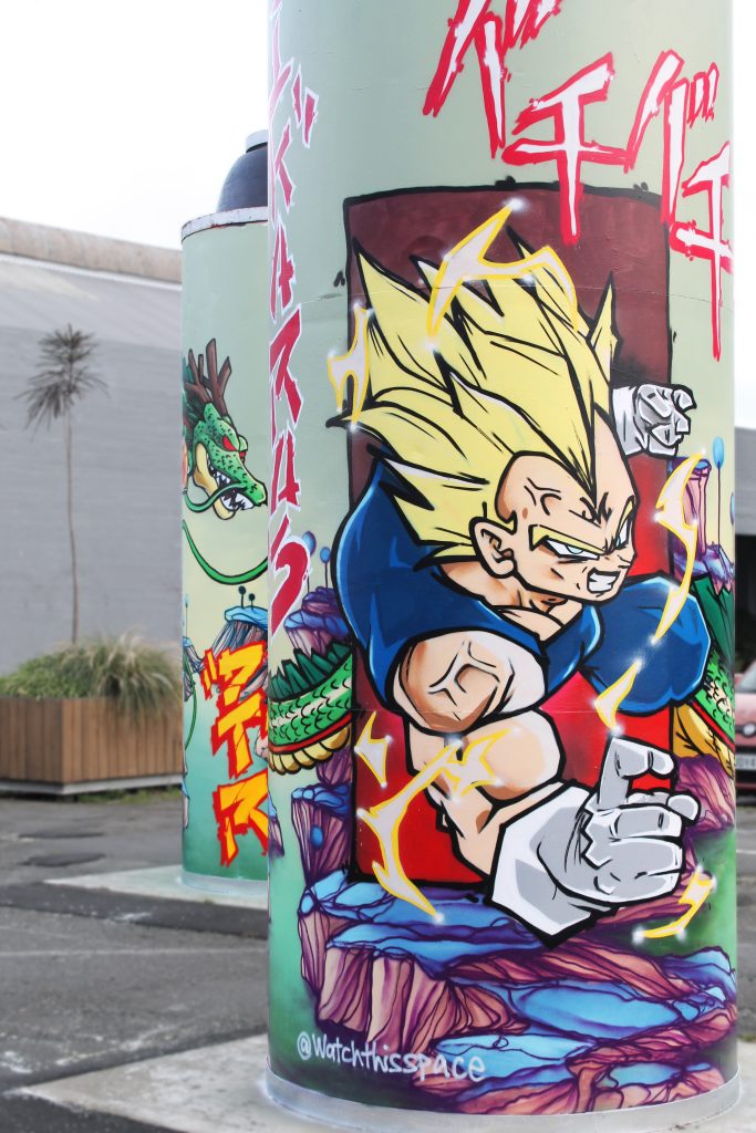
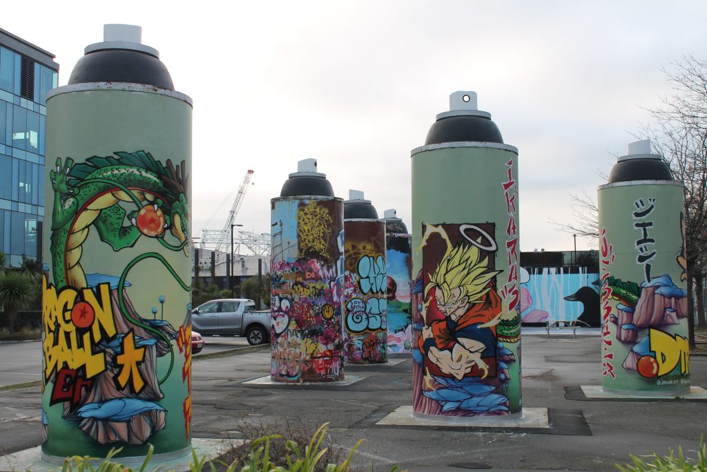
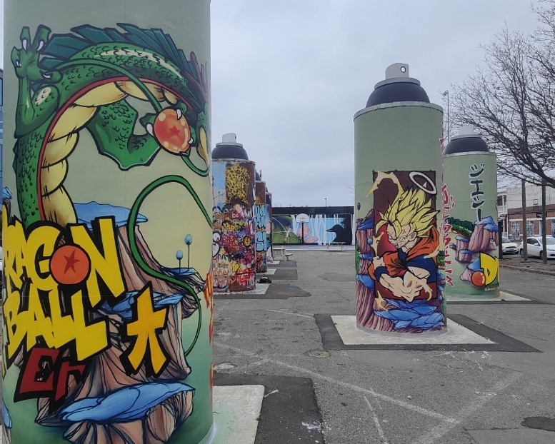
The Giant Cans Get a Refresh
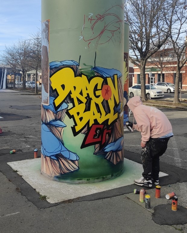
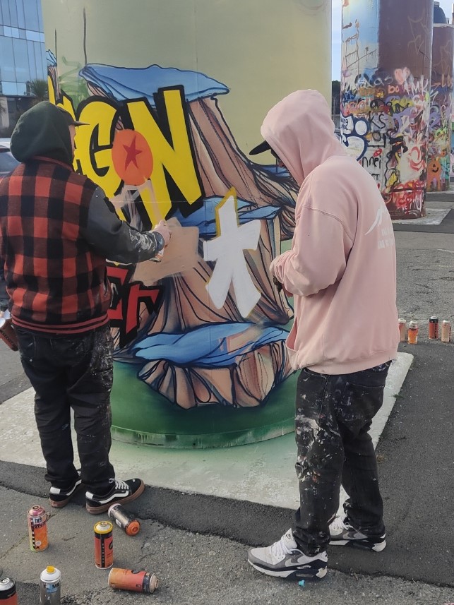
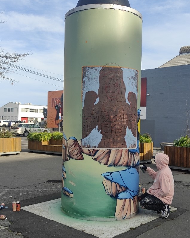
The Giant Cans on St Asaph Street are designed to be split between free wall spaces (the three cans to the east) and more permanent works (the three cans to the south-west). To keep things fresh, the three ‘permanent’ cans are re-painted routinely and the latest transformation was a unique collaboration between Jacob Yikes, Ikarus and Jessie Rawcliffe – a sprawling tribute to Dragonball creator Akira Toriyama. Mixing familiar landscapes and characters with the artists’ signature styles, it has to be said that the work is “over 9000!”…
Ghstie Goes Nostalgic…
We have loved finding Ghstie’s three-eyed tributes to the cartoons of our past – whether Slimer from Ghostbusters or Casey Kelp from the Snorks, we are suckers for a trip down memory lane…
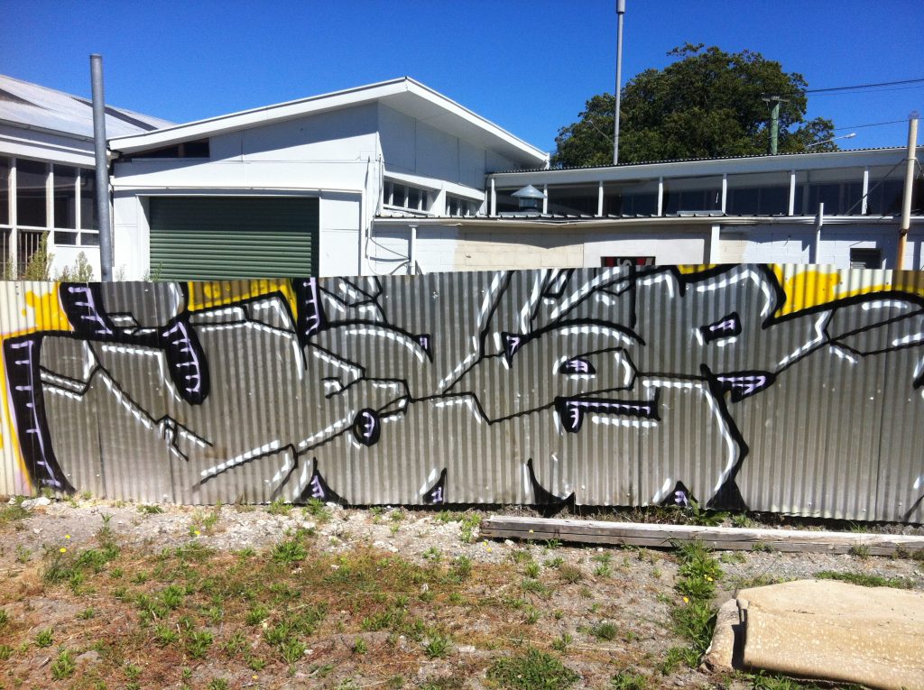
FSA Catch the Train
With their signature flair in full monochrome effect, the FSA’s crew’s tribute to subway trains and graffiti is both a bold addition to the Manchester Street bus stops and a wink to the subversive culture…
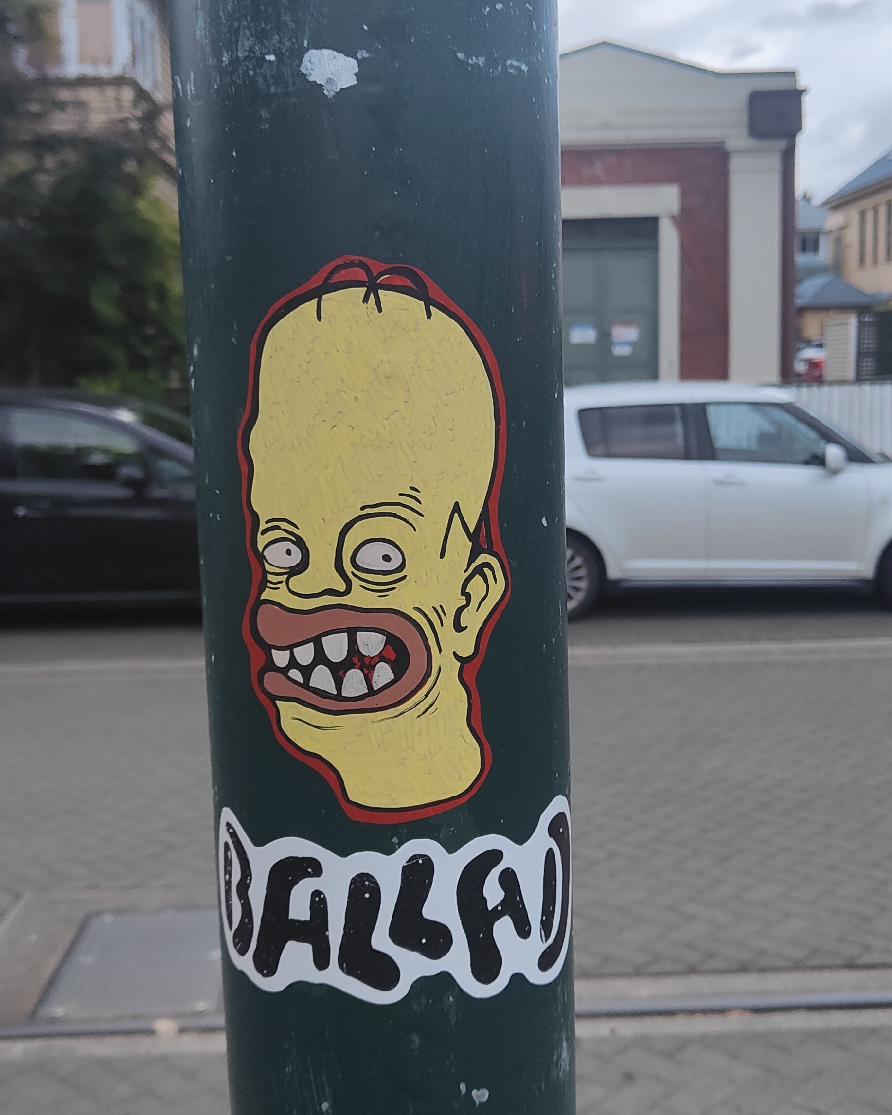
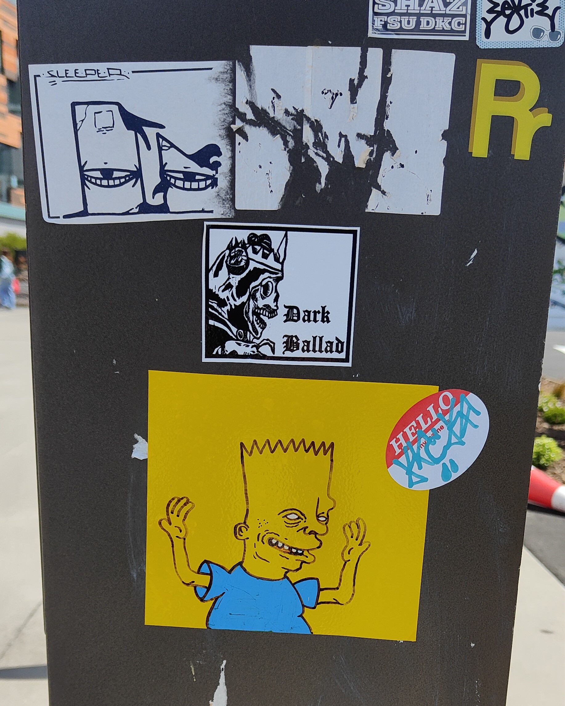
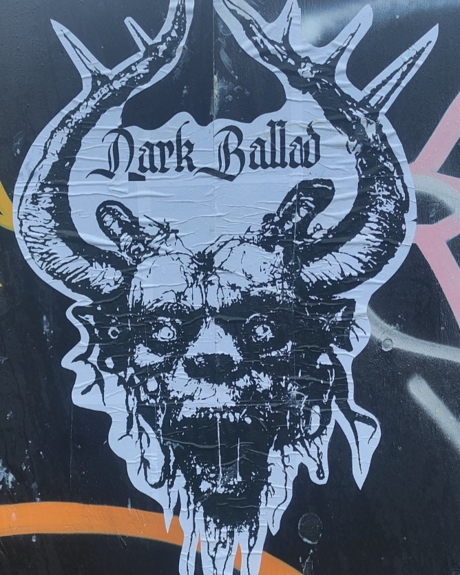
Rest in Peace…
Just like Ghstie’s slaps, Dark Ballad’s reflective stickers bring some nostalgic heat with the stencilled image of wrestling legend The Undertaker, fitting for an artist with a love of life’s darker side!
Drows’ Connection
We were proud to support the production of Drows’ striking Connection on Colombo Street – an activation of a long vacant site by the Christchurch City Council. Alongside the landscaping of the area, Drows’ colourful hoarding work speaks of his, and by extension the viewers’, connection to place – from the maunga to the awa and beyond, Connection is at once personal and universal…
A Summery New Brighton Jam…
It is always good to stumble upon a surprise, and when we noticed some activity across the carpark on a quick trip to New Brighton, we had to investigate… We quickly found members of the DTR crew, Dcypher, Ikarus and Drows, along with Jessie Rawcliffe refreshing a popular wall, a good reminder of Summer’s impending arrival and the increased activity that is sure to come with the longer days…
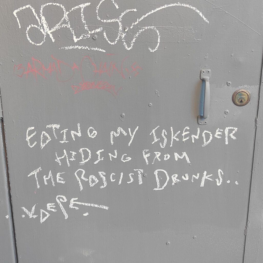
Just Eating my Iskender…
We love a little story and wandering down Hereford Lane, we couldn’t help but be struck by the poetic tone of Kaepe’s waxy statement. We love our city, but that doesn’t mean it is perfect, and sometimes, it is the margins that remind us…
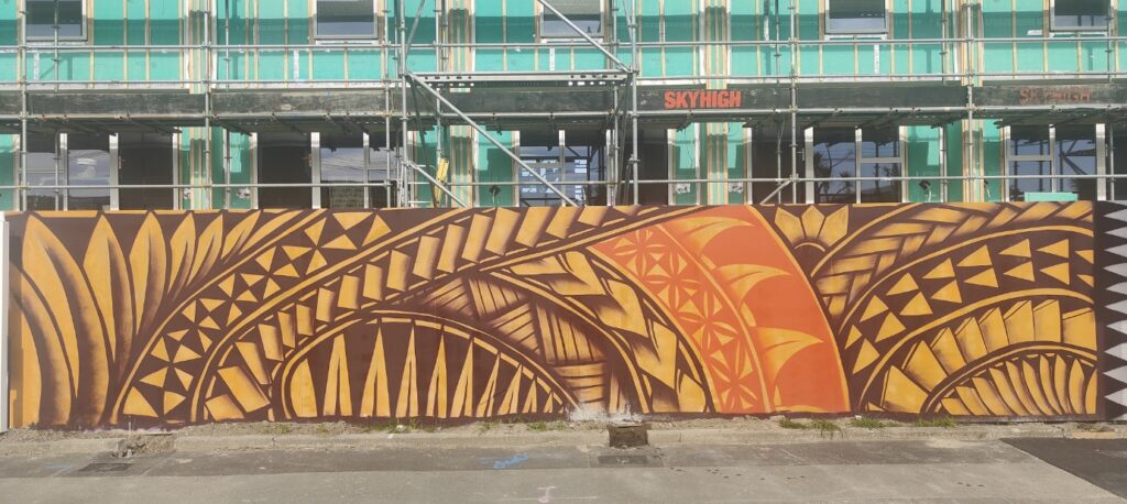
Monti in New Brighton…
We love Monti Masiu’s paintings, celebrations of his Tongan heritage in striking compositions that are both traditional and contemporary. His work on a temporary hoarding in New Brighton is awash in warm brown, ochre and orange tones, brightening up an otherwise stolid setting…
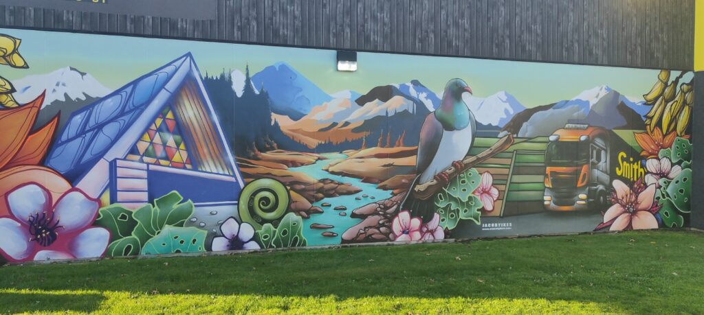
Jacob Yikes at Smiths City
Jacob Yikes is one of Ōtautahi’s most iconic urban artists, with his instantly recognisable style and aesthetic, so it was fitting that he adorn the iconic Smiths City premises on Colombo Street, a local company that has been in the location since 1918, familiar to generations of Cantabrians. We love the vibrant tones and serene scene…
teethlikescrewdrivers’ Doodle Session
We were stoked to launch our new Doodle Session video series – where we chat to artists while they draw – exploring their process and their creative mindsets. First up is teethlikescrewdrivers, who ran through a range of his fixations, from chairs and pencils to words and self-portraits – a lovely, chaotic, creative ramble! Stay tuned for episode two – it will be live by the time you read this!
They were our highlights for July and August – let us know what you think!
Our new Doodle Session series is a deep dive into the creative process of some of our favourite artists. We sit down and let the creative energy flow as they draw, doodle and mark a page, all while we ask a few questions and explore what makes them tick, the role drawing plays, and how it all comes together.
Episode one of our Doodle Sessions features none other than teethlikescrewdrivers – whose energy is evident in the way he annotates our conversation with drawings, from school chairs to pencils, self-portraits to phrases – check it out and get inspired!
Keep an eye out for future episodes on our YouTube channel!
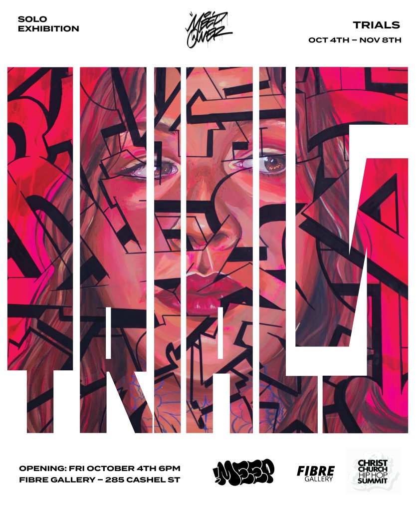
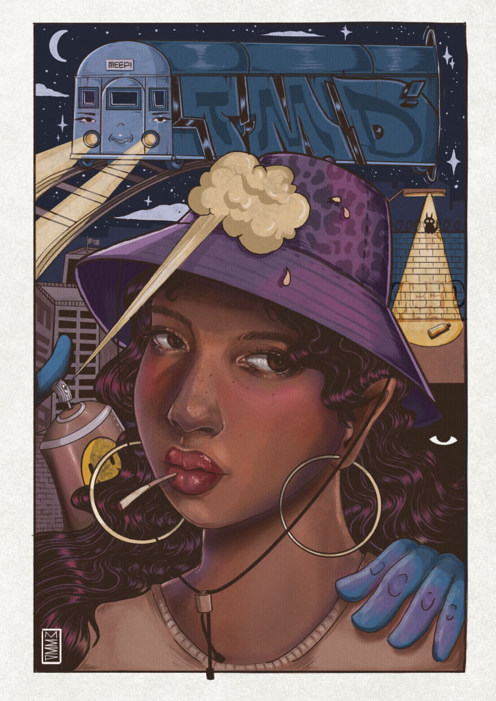
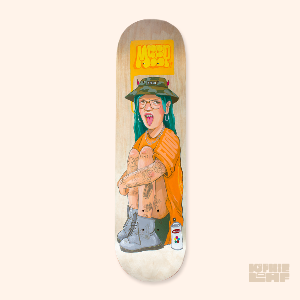
Kophie a.k.a Meep One is such a prominent part of the Ōtautahi and wider Aotearoa scene that it is hard to believe she has not staged a solo exhibition of work – until now! Trials is the artist’s first foray into a solo gallery exhibition, fittingly staged during the 2024 Christchurch Hip Hop and hosted by Fibre Gallery, key connections for Meep, whose work is rooted in the influence of graffiti and hip hop culture and her proud bi-cultural Dutch and Samoan heritage. While gaining widespread attention for her public mural work, Meep is well-versed in studio work, from painting to design and even fashion and jewellery. Trials will focus on her imaginative creative output without the restrictions of public commission conditions. A fiercely principled individual, Meep’s art is always imbued with meanings and discourses drawn from her experiences and observations, even when it appears more surreal than topical. We sat down with Kophie to chat about Trials, the process of bringing it all together, hip hop culture, subversive influences, and a number of other topics…
Your upcoming exhibition, Trials, will be staged at Fibre Gallery in October – I was surprised that this will be your first solo exhibition, for someone with your body of work and profile, it’s been a long time coming…
Yeah, I’ve always wanted to do it, I just haven’t really had the guts! It’s been terrifying because I really don’t like being the centre of attention or anything like that. But art is an important part of my life, and it has been ever since I was born really, so I’m happy to finally do it. I’ve wanted to do a show with a big research project behind it for ages, but it’s just too much and it’s hard to get funding for that scale, so for this show I’m focussed on painting stuff that I want to paint in the moment, experimenting and just showing it really…
There is so much work that goes into organising a show, the logistics of funding it and organising a venue, the promotion and all those things, but an exhibition also needs to have something to say, and it takes time to develop a body of work out of formative ideas. The fact that this has taken a while to manifest, does that mean you feel more confident in terms of what you’re saying?
Yeah, and I feel like once I get my first show out of the way, then I won’t feel so stressed about doing it again. In the past I have put too much pressure on myself to make it perfect, but I have just let that go and just made art.
Trials is taking place as part of the 2024 Christchurch Hip Hop Summit. The influence of hip hop has always been a strong element of your work, how much did street culture, graffiti and hip hop inspire this exhibition?
One of my first introductions to graffiti was seeing the wall at Waltham Park from the first Hip Hop Summit in Christchurch, and the guys from the Summit team have always been supportive of me. I was supposed to do one for last year’s Summit, but I wasn’t able to secure funding, so they’re kind of making me do it this year! Hip hop and graffiti are a massive part of my inspiration, and so is street culture in general, like skateboarding. I wasn’t good at skateboarding, but I was around the culture. Growing up in Wanaka, it’s very outdoorsy, so things like snowboarding were also an influence. Then we moved to Christchurch and seeing all the graffiti when I was a teenager was a big part of my growing up. Once I was transfixed with graffiti and art, apart from non-stop drawing, I would always either bunk or walk after school to the South Library and pour over all the graffiti, art and skateboarding books they had there at the time. When I was at school, I would just sit in class and basically draw on myself all day. A lot of the stuff in Trials is inspired by that feeling I had when I was younger and seeing graffiti for the first time and how the world was back then without social media. I think there is a nostalgia for that time, most days I just want to throw it all out the window and just play in the street like I did when I was a kid. It just seems like the world now is completely different…
I assume the show’s title refers to the trials and tribulations that you’ve been through, but it also suggests the concept of criminality that is associated with graffiti, the challenge of transitioning graffiti into a career in the arts, and perhaps the trials of modern-day life, especially the impact of technology and social media. Was the title intentionally so wide-reaching in its suggestions?
Yeah definitely, when I was trying to think of a name, I wanted something that had multiple meanings. The name evokes the trials I have been through to get to where I am now. I guess I had a hard upbringing, but despite dropping out of school, I was able to get an education and then to do what I do now, I’m very grateful of how far I’ve come and how I’ve gotten through all that. Trials also reflects the fact that I wanted to do a lot of experimentation in this body of work. I’ve had so many ideas for so long and I just haven’t had time or the ability to take time from work and focus on painting. It takes a lot of time and money, which is proving to be difficult even right now. I start at 9am and then finish at 9pm and I’m still working on the same painting…
Obviously, there are a lot of very personal aspects embedded in the show, but something I admire in your work is that when you are painting real people, including your self-portraits, you imbue your subjects with a symbolic quality, a feeling of being an archetype rather than an explicitly specific person…
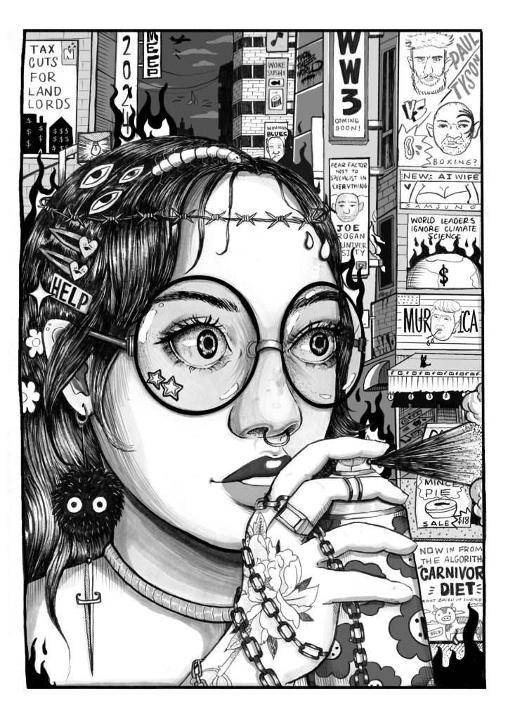
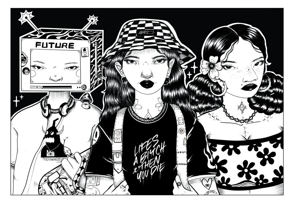
I like to create the whole character. I don’t like doing realism, it’s not something that I really enjoy. It’s just a skill rather than being able to use creativity and imagination. So, for this show there is a lot more of my cartoony stuff, abstracted and surrealist stuff, subversive stuff. There are a lot of hidden messages. I find straight ahead realism quite boring because you are just painting what’s there. I want to create characters from scratch and give them back stories that reflect how I was feeling in that moment or something that inspired me. I doodle all the time, so I’ve taken a lot of stuff that I have drawn and remember how I was feeling and then I try to turn them into better works…
What does the process look like? How do you go about taking an initial drawing that captures an idea and turning it into a more polished painting?
Working on an iPad makes it a lot easier because I just take a photo of a random sketch and refine it. It’s easier to play with colours and stuff before I paint it. But other times, I just start drawing on a piece of wood or canvas and then I just paint it. So, some of them have a refined sketch, some of them don’t. I’m mostly playing with oil and acrylics on ply, which is my favourite surface. I’m largely using recycled ply that I’ve cut into shapes, it’s reminiscent of some of my paste-ups in the past, big cut out figures, but they’re on ply and nicely painted. There are probably only going to be two real portraits, one inspired by me, because it’s hard to get a reference photo of someone else and I don’t want to use AI, and one of Callum [Kophie’s partner, who is currently finishing a music production degree in Australia] because I miss him! But in both cases, they’re not just portraits, they’re abstracted and stylised, with stories behind them.
You mentioned the presence of subversive elements in your work. How important is working in the studio for the expression of subversion when you are increasingly creating commissioned public works where creative freedom is lessened? Does that become part of that nostalgic element that you’re looking for as well?
Yeah, one hundred per cent. I feel like a lot of my big murals are be watered down a lot because of the client relationship, so this show does take me back to my roots. I’ve always been outspoken and political. I care about issues, so that’s always been a central part of my work. In my first year of study, we had to draw a portrait of a friend. He told me he worked in the meat works, so I drew him like Hannibal Lecter as a joke, and I made this big melting-globe-world-monster thing, and a fish made of scrap materials symbolizing a radioactive fish after the Fukushima disaster, which had just occurred. I guess it comes from the influence of satire, political art, like Obey, and the likes of Adbusters. Skate graphics as well, they have a history of being subversive and they definitely influenced me. That stuff’s always been cool to me. I played a lot of video games growing up and they always had funny subversive stuff, like in Tony Hawk’s Pro Skater, there was a Sasquatch character…
I like that with games now, where you see custom builds and skins, so you’ll have these relatively normal worlds, and then, all of a sudden, they’re populated by giant bananas. The more ridiculous something is, the more it reveals the underlying absurdity of what we perceive as normal…
I like the balance of silly but serious at the same time, it makes you think. All my works are very topical in one way or another, some are just more obvious than others. I feel like a big thing in my work is the impending doom of climate change and how we are all heading towards a fiery death, but no one seems to care. It’s just like head in the sand stuff…
It’s that whole This Is Fine meme, the dog sitting in a flaming room…
That’s exactly the aesthetic, that whole ‘I’m fine’ thing…
We have discussed some of the themes and subject, but is this body of work a progression in terms of visual style?
I feel like it’s me being true to my original style. If you look at my old workbooks, I drew the same sort of stuff but just way worse, so it is an evolution of that. I haven’t really been able to paint big versions of my sketches. I do a little bit in my graffiti when I have enough paint, but not as much as I would like.
It feels like a balancing act of how to express yourself in different spaces…
I guess it comes back to the duality of doing illegal stuff while also trying to go to meetings and be professional. I always feel so fake in a way. But I look at businesspeople who are doing horrendous shit and they don’t bat an eyelid. I’m a genuine person that sticks to their guns, so I just feel really weird about living a double life. I don’t know how to act half the time…
How do you think the idea of a more genuine expression relates to the broader context of hip hop? At its heart, hip hop is very much a DIY culture, but it also has been through so many incarnations; you had the earlier stages of hip hop, street parties and making something from little or nothing, then you had the ‘get cash’ and bling kind of attitude of the nineties onwards, that hustle ethos, and now hip hop has evolved into something different again as it is more commercial today. What hip hop ethos do you identify with most strongly?
I guess hip hop has become very commercialised nowadays and I never want to be a commercial sort of artist. I just want to be someone who makes art about things that are happening in the present moment. I like a lot of underground music.With the Full Steam Ahead crew, we wanted to try and incorporate all the hip hop elements. Even though we mainly do graffiti and rap at the moment, we do have B-Boys in the crew. I love the origins of hip hop. Street wear, clothing and fashion is also a big part of my inspiration. When I was a kid, a lot of the time I would just draw the different outfits that I dreamed of having because I had to wear second hand clothes. It wasn’t cool to wear second hand clothes then! I would draw all sorts of cool outfits. I’d draw girls and then cut them out and make them different outfits like paper dolls. I thought I was going to be a fashion designer! Drawing my characters with cool clothes and accessories is a central part of my art, I guess. The t-shirt as an important platform for messages is another idea I really like. When I was painting recently, I was thinking about all the clothes I had when I was a teenager and stuff, I had this cool t-shirt that said like ‘Big Brother is Watching’ from the 2000s, why did I get rid of it! I want to paint it now, just thinking about that!
That captures the DIY element of hip hop for me, it was created by young people who didn’t have access to things so they made use of what they could, whether it was street corners or subway trains…
That’s definitely a central part of my work and my whole life really. I’ve always made stuff that I didn’t have. I’d make clothes for my dolls from scratch or like second hand fabrics. I just did it out of necessity really. Even now, like I built a fence at home when we needed one. I make do with what I have, I upcycle things, I learn to make and fix what I can. I have always been a DIY type. I’d cut out posters from free magazines when I was a kid, take the posters and cut them up and collage them and poster my room with them. I don’t know, it’s always been like that. I made the hat I’m wearing because I was playing the video game Harry Potter Legacy, and I liked the hat one of the characters was wearing. I was like, I need it, so I made it. My art has always been from second hand stuff or acquired items. Right now, I’m using recycled ply because I had it. It comes down to my ethos of not buying new things for the good of sustainability. Everything nowadays is so crappily made anyway.
The clothing your subjects wear is important, whether a t-shirt with a message or your works that explore Pasifika identity and traditional clothing, these are a reflection of your background and the way fashion has always been so important to hip hop, punk, any kind of street culture…
Yeah, I made the weirdest outfits when I was a teenager. I had a big emo phase and a Boy George phase, like an eighties phase, a gangster phase, haha. I think fashion plays a big part in personal expression, so it is important in my artwork. Especially drawing things that I couldn’t get or creating my own fashion designs…
I want to see some photos of Boy George era Kophie! You mentioned your crew Full Steam Ahead, but of course you are now also a member of TMD [The Most Dedicated]. How big an impact has that had on your work, knowing you are part of a globally celebrated creative collective? Does that bring pressure, or does it just reinforce your self-belief?
I mean, I think about it every single day because it blows my mind that I’m in TMD! I’m so inspired by everyone in the crew. When I was younger, I would use my friend’s computer, because I didn’t have one at home, just to look at pictures of TMD productions and stuff, so it blows my mind really. It did give me the push in confidence to have my own exhibition, because I wanted to in the past, but I was worried that no one would really come or turn up, but I have gotten to the point now that I don’t really care anymore. I am also not making art to for the intention of anyone buying or anything like that, I’m making it because it’s stuff that I’ve always wanted to make and it’s a reflection of myself. Although it is all for sale!
That’s really important I think, because it is quite rare. For a lot of people an exhibition is a way to sell work, to make money, so to have an exhibition where you can be more honest in terms of what you want to say and you can make work that’s important to you, it must make the whole process more satisfying on a personal level…
Yeah, as I mentioned, I wanted to do a whole research aspect and have detailed stories behind each work, but I didn’t have the time and funds to do all that. But it feels more freeing to just do what I feel like doing in the moment and do whatever is topical or influenced by whatever podcast I’m listening to, or if I’m angry or sad or happy, then make something based around that. I feel like it takes the pressure off, and I feel like it gives it more authenticity…
Do you have a defined idea of how the whole show will look?
Sort of, but not really. I’m not sure if they will all really match or anything, it’s just like my brain spilling onto a painting. But I have four paintings so far, and it’s quite a big space so I’ll see what happens. It was quite a short turn around, they asked me a couple of months ago, so I guess I’ve had four months to get it all ready, which sounds like a long time, but it’s not really, especially when you’re trying to do a hundred other things. Paintings take so much longer than anything else. But yeah, I’ll see what I can do!
Who do you want to thank?
Red and Tommy from the Hip Hop Summit and YCD [Youth & Cultural Development], Nina from Fibre Gallery for making me do it, Selina and the FSA and TMD crews, and of course, Callum!
What do people need to know about Trials?
The show will open on the 4th of October at Fibre Gallery on Cashel Street, where my mural Navigation is on the side of the building. I think it opens at 6pm. We have DJ INFARED playing. I might bring some Speights…
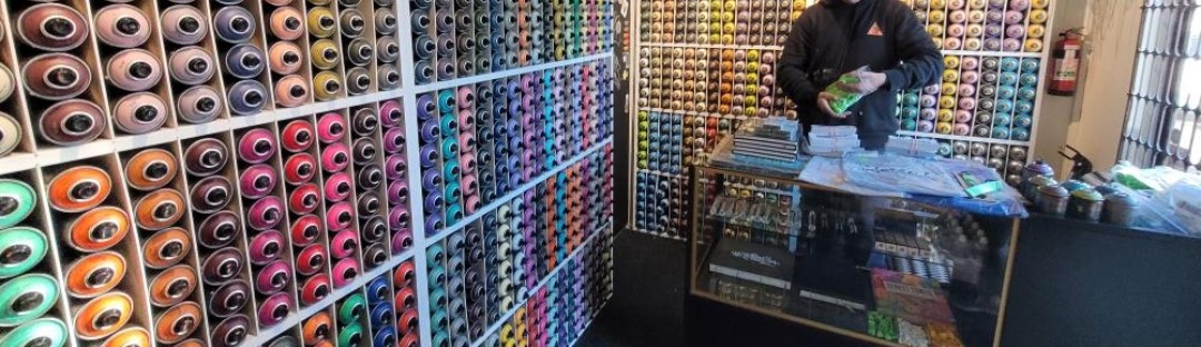
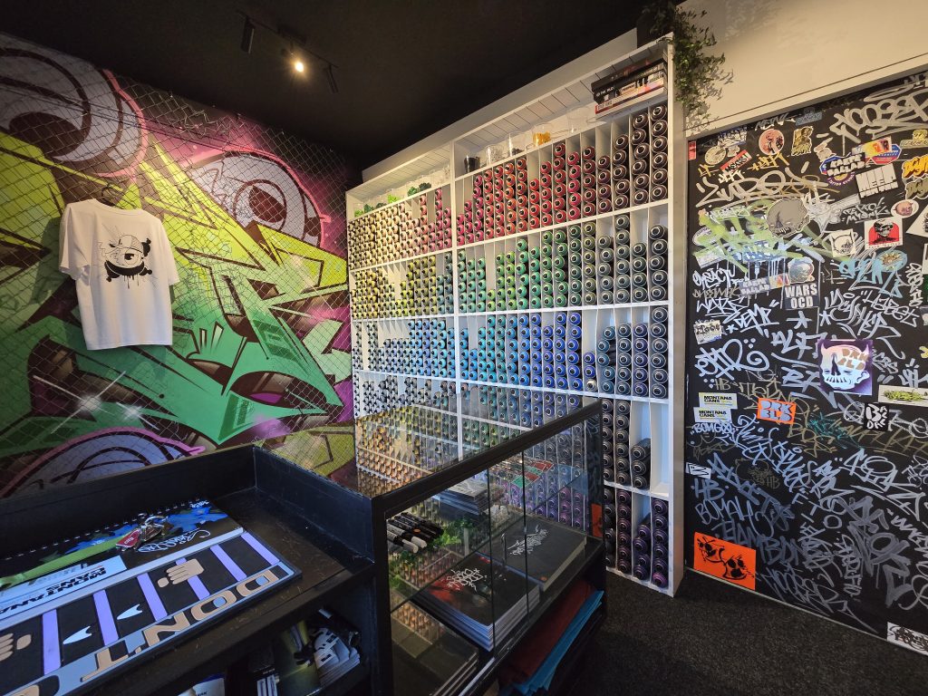
As the city’s newest spot to stock up on paint, Rinley’s Writer Supplies has quickly been established as the go-to for the local graffiti community. That comes as no surprise when it is the brainchild of a veteran painter who knows the local scene and what people want, ensuring Rinley’s is truly a store for writers. We visited Rinley’s small-but-well-stocked Sydenham location and caught up with owner Noose to chat about his graffiti experiences, how Rinley’s came into existence and the realities of selling (and stocking) spray paint…
One thing I’ve learned from meeting a lot of graffiti writers is to never to expect what someone is going to be like…
Hard out! I’ve had that here. I don’t know if you know the dude who paints mushrooms, but I met him recently and he was like, I don’t associate with anyone who paints, don’t say who I am or what I look like or whatever! I was so surprised. I was asking him about whether he paints the mushrooms where you would actually find them, and he was like, yeah, kind of, it was a little bit of a road map, which I thought was quite cool. He was a really interesting dude.
There are painters who have been deep in the culture for years and then there’s those who get into it almost independently, who subvert the traditions a little…
I think the scene has changed dramatically as well. I was definitely an asshole, but that doesn’t get you anywhere, it just stagnates your actual growth as an artist when you’re like, that guy went over me, I’m just going to go hard out and make sure I go over them. It means you don’t paint anything good, you’re like, what’s the point, you’re going to get gone over anyway…
Was your introduction to graffiti through hip-hop culture or through another influence?
Skateboarding bro, just being down at the skate park. That was when the older generation were painting walls down there all the time. I was down there every day bunking school and I’d see them painting all the time and I’d try and talk to them. The reception was very gangster and like, what do you write, Toy? It was quite aggressive. So, I was like, OK, that’s how you have to be, you have to have beef to be someone. There was also the whole YouTube explosion around the same time. I started in 2007 and that was when movies like State Your Name and a bunch of big New York graf videos had just came out and had the attitude of, if you buy your paint you’re a toy, and graffiti is a full contact sport. So, I was like, you have to be able to fight and do all these other stupid little things, which is so dumb looking back on it now.
Various artists, 2021
I don’t know if you’d agree, but my feeling is that there are definitely benefits to a less rigid view, a willingness to change and go with the changes…
People like that get better so much quicker because they’re nice people to paint with, because they have opportunities to paint with people who are better than them and they want to paint with them. But if you’re an asshole, everyone will be like, I don’t really want to paint with that guy, he’s going to cause drama, and it’s going to affect the thing that I’ve got going on…
Starting in 2007, you have obviously had experience from both the pre-quake and the post-quake scenes, how do you see the difference?
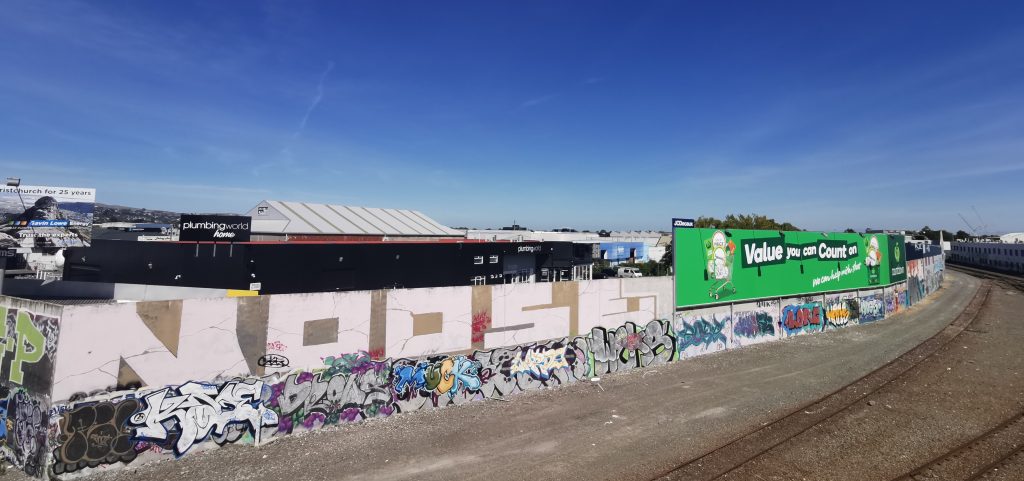
Pre-quake, if you didn’t have a good tag and you didn’t have a good throw-up, you weren’t allowed to piece. It wasn’t going to happen. Your stuff wouldn’t last, you had to build your name to that point. You also couldn’t paint freights at the time, because of the fear of FILTH and other crews like FAT, they very much held down that scene. There were real repercussions for messing with the thing that they had going on. But post-quake a lot of those dudes left, so this younger generation had a bit of a free for all, there weren’t these scary dudes holding a tight grip on the scene. Obviously, the amount of abandons (empty buildings) as well meant it was just a free for all, it was crazy.
The city was fucked, so people were happy that there was something going on. For years there were three pubs in the city you could go to late at night, there was the Town Ball, that tent one, maybe Dux Live in Addington, so it was pretty grim… Any kind of colour that you added to that was seen as good, you could just paint like there were no laws.
Do you think that environment led to an ongoing change in terms of the perception of graffiti or do you think that bias is still there? Ōtautahi has this reputation for our murals – graffiti has fed into that so much and yet it doesn’t necessarily get the same shine, do you think that’s improved from what it was?
I feel like the level of graffiti that was painted pre-quake went down post-quake. Pre-quake you had the likes of Dcypher, Lurq, USK, Sender, the Wall of Fame by the Colombo Street over-bridge. Then there was the big buff that happened with the train tracks and a lot of that was lost, so it just turned into a tagging and throw-up spot and people stopped piecing and doing productions for quite some time. It wasn’t really until some of those festivals happened post-quake that it was, like, oh shit, we’re getting good recognition for the bombing that everyone’s doing, but we can’t compete at all with the piecing…
Dcypher, mid-2000s
That echoes what happened in Auckland with the Rugby World Cup buff in 2011 and years of history were wiped away and that vacuum was filled with a focus on bombing and tagging rather than piecing…
It opened up a spot. It was like alright, those sick pieces and burners and stuff are all gone, now it’s our time to take that spot, let’s just do something quick and fast, like a big stomper or something to claim that spot to use it later to do something. As opposed to being like, shit, let’s do something as good as that or attempt something as good as that…
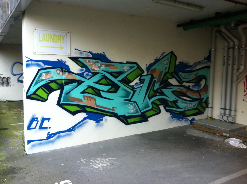
What names stand out for you in that post-quake era?
Definitely BC crew, JFK crew, Ikarus obviously, Yikes. I feel like When Dcypher came back it was on for DTR. Freak and all those guys were still doing amazing stuff, but you know, its Dcypher, he gets things going…
B.C., circa 2012
You talk about JFK, who were super active post-quake – you are a member of that crew, right?
Yep, I am. When JFK was formed, you had to be painting quite heavily to be in it, but there was also a lot of thought about where you were situated in the city; I got put in because I was in Addington, Deok was put in because he was in Hornby… It just made going all city very easy, so that’s why it covered the city quite quickly, there was a bunch of dudes in New Brighton, a bunch of dudes in the east, there was a bunch of dudes out west…
JFK, circa 2013
Who else stands out?
Post-quake, 100% Skum from JFK, he was just insane. He was the PK before PK. I remember Skum, Germ, Jot, all those dudes, were going hardcore. Slepa, I think he was kind of going hard pre-quake and kind of died off just after the quake, but yeah, all those dudes were going crazy…
SKUM, 2016JOTER, circa 2014
Fast forward a decade or so and we are here today sitting inside your store Rinley’s Writing Supplies, how did Rinley’s come about?
I got caught two years ago and basically, I couldn’t paint Noose anymore, they knew who I was. I had just had a kid. I was going through the whole court thing, where I was put on a year’s good behaviour. At the same time, I was also getting some legal work, and I was saving all the money from that because I wanted to try to do a project, like try to get legal walls for people and to find people new places to paint, do that whole thing. I was getting more jobs doing Chorus cabinets and saving all that money. So, I had bunch of money sitting there and I was like, I can probably open a shop with what I’ve got. I had already thought of the name Rinley’s, I was going to make markers and paint. The name at first was Rinley’s Black and Chrome, it was just going to be black mops, chrome mops. But that sort of changed over time. I messaged a bunch of paint suppliers, shopped around and was in chats with Montana and they were just so on the ball with replying to emails. They were so good to deal with, I was like, this is like a no-brainer, I’ll just take the risk and do it. I sent them a whole bunch of money and three months later all this paint showed up…
Going back to that idea of racking paint to be a real writer, how have your personal experiences shaped Rinley’s and how you have gone about setting the store up?
I wasn’t a racker. When I started the cages came about that made it harder. I was just on the cusp where you could rack from The Warehouse when I was starting. I was just buying paint, and I was buying shit loads of it. I was spending basically my whole wage on paint at one point…
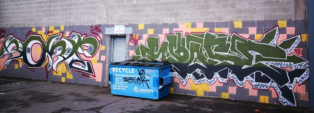
BORE and NOOSE, 2016
Where were you buying paint?
I was using Embassy hard out, but when Ironlak went, it was a matter of necessity to shop around, so I ended up using Gordon Harris for years. Before I started Rinley’s, I was using Tom’s Emporium.
Tom’s has stocked Montana, you talked about how Montana as a company were really good to deal with, but it also has a strong reputation for quality…
Yeah, Embassy had Montana years and years ago, when I first started, and I loved it. The smell is nostalgic, and its good paint. But honestly, the main reason I chose Montana is how good they are to deal with. Their paint is as good as any other paint you can get, but the level of service and communication when you’re sending large amounts of money overseas is second to none compared to some of the other places. They see a small place like this, and they see the potential. They don’t see it like just some small fry who only want a small amount of paint compared to someone else.
You’ve started Rinley’s at a manageable scale in terms of the shop itself, but you’ve got a big range of cans in a small space!
I think what was happening with a lot of the paint shops was that they were looking at four different, say, burgundies, and they looked at the middle tone and they go fuck, it is close enough to the other ones, let’s just get that and we will step down to the next shade, whereas artists still want those off shades. For someone like Yikes or Dcypher, who do crazy technical pieces, those slight changes in shade mean a lot. For me just painting pieces and stuff, it doesn’t mean as much to me, I can go from a burgundy to a bright red pretty easily, but it’s just like a necessity really, like there’s just nothing better than having a full range that you can just look at. The other thing was when you go into a lot of paint shops or even skate shops to buy paint, they’re all behind a cage. It’s almost like you’re burdening the staff to get the cage open, you feel like you are being watched and you can’t be trusted. That’s why I’ve got this set up, where the door is shut at all times, but I’ll let you in, you pick your own shit, you can compare colours, you don’t have any other awkward encounters. I just make this shopping experience better, because painters aren’t all deviants, a lot are quite successful in their jobs, they don’t deserve to be watched like a hawk to buy paint…
Rinley’s Writer Supplies
Which is all an off shoot of essentially criminalising spray paint…
Which was the stupidest law anyway! People can buy all these pens, there’s no law on the pens. You can go fill up a weed sprayer full of paint, you could go get a fire extinguisher right now from Bunnings, fill it with paint and have the most destructive tool you could possibly have, but for some reason spray paint was targeted. I’ve read the legislation around the time that it was written (early 2000s), I think the perception was that graffiti writers are all lower-class kids, so let’s make it hard for like 15/16-year-olds, not actually knowing that many of them were fully grown men. Which is stupid because they would have seen that in the court papers…
With the rise of urban contemporary art, people are using spray paint as a part of a much broader creative practice as well, but the product is stigmatised by putting it behind cages and making it an awkward experience for people to have to go and get something unlocked and then be watched…
Well, the other crazy thing with the law was that if you are walking around the street at 12 o’clock in the daytime with a bag full of spray paint and you got pulled up by the cops, you’ve got a legitimate alibi as to why you have that spray paint, you do that at 12 o’clock at night and you’re a tagger. Who is to say that you’re not a night worker? I’ll open late for people, like if you want to buy paint late at night, holla out, we’ll sort a time out and you can come and grab it. A lot of the dudes that do come in, they work late, they don’t get the chance to come into paint shops during the week. Not all of them are out painting graf, some are just using it for canvases or whatever they want to use it for…
It’s interesting, I know of a few people who have gone into studying criminal law or things like that, because of experiences associated with painting graffiti. Were you already aware of some of those things from being a writer, or is that stuff that you kind of dived into because you knew that opening the store would potentially bring up some of those issues?
I kind of knew a bunch about the laws just from being caught before, but then I obviously had to look into it from a business point of view; am I liable for selling someone spray paint and then they go out and do a throw up and chuck a Rinley’s tag alongside it? Am I going to get in the shit for that? Which is why you need things like public liability insurance and stuff like that. I mean, if that was to happen, they could take you to court and it could get thrown out, but you’ve just wasted thousands of dollars on lawyer’s fees just to try and argue point which should be pretty straight forward…
Do you have excess stock in storage?
Everything is out at the moment. We will have stuff in storage from this next order, especially in the Montana Gold range, because this (the current stock) is only half the Gold range. We’re doubling the next order in the Gold range. It was just a wee bit of a concern because Gold hadn’t been here for so long, I was worried that people would be like, it’s a dollar fifty more than Montana Black cans, The people that have used it have all said the same thing: the cans go longer, the coverage is better, they’re easier to use because they are low pressure… Even Dcypher said all the stuff he did for Project Legit using Gold has held up insanely well, and that’s like 15 years ago now. So, for people that are wanting to use aerosol for large-scale murals, that’s the shit to use.
Rinley’s Writer Supplies
What’s your time frame for re-stocking? Have you figured out the best way to keep well stocked?
Because it’s coming from overseas, it’s like three and a half months. I am lucky, my partner is a fucking genius when it comes to running a business how its supposed to be run, she’s a superstar at that kind of thing, so yeah, she’s got that side covered. We’ve just placed another order, a massive order as well, to try and time with summer.
You ultimately have a very specific audience, so I assume it’s less about growth as it is about building customer loyalty and a solid reputation…
I’ve had probably a message every other day asking do you ship? do you ship? But at the moment, I’m not interested in shipping because I’m concerned that if I do start shipping, locals come in and they are like, oh shit, man you’ve sold out really quick and it’s like, yeah, I’ve sent a 500 can order to Nelson or whatever. I want to cover local first… and put Christchurch on the map internationally as best as I can…
NOOSE, 2024
You’ve got more than just paint as well – tell me about some of the other products you stock…
I pretty much only import stuff that I like! We’ve got a range of markers. The reason I got the silver Uni Paint PX-30s is just because they are the best silver marker you can get. The Sakura Magic’s are just a good black marker and then the Sakura Solid Paint Sticks are cool because they are a little bit different. We have various mops from Krink to Fadebomb and eggshell stickers too.
I see you also have some books, some collectibles and some art for sale as well…
When I had opened, I didn’t have a lot of things up other than the spray paint, the caps and the markers, so a few friends were like, I’ve got some shit that I want to sell, can I put it in your shop? And I was like yeah definitely! It was pretty empty up there, so a mate’s put up his Transformers VHS tapes he wants to sell, he had a custom shoe he wanted to sell, Skum from JFK has like a whole bunch of random buses and canvases that were done in like 2015 or 2016, so we’re selling those, and then the books. I got Fresh Press from the guys up north, and then just like a few other books that I had collected over the years that I’ve read probably 10 times and won’t read again…
You’ve got Flip the Script by Christian P. Acker, I love that book…
Yeah, it’s a bloody good book. The Mike Giant book is really interesting as well. I look at that quite a lot now, just because it reminds me a lot of old Christchurch graffiti. I’m not sure whether or not it was the Art Crimes page from years ago that he was uploading to, and people were taking influence from, but it’s kind of crazy how similar his style and even some of the colour combos and walls that he did remind me of old Christchurch pieces, like how the letters hit the ground… I also listen to his podcasts and stuff and from the sounds of it, he was sharing photo stacks around the world with people quite regularly, so whether or not those stacks ended up here, it was an interesting time back then, the internet was around but it wasn’t used the way it is now…
Having been part of the graffiti scene for so long, does opening Rinley’s feel like a new phase in your graffiti story?
I started in 2007 and I really didn’t want to be coming into my 20th year painting not having done anything, so I wanted to do something at least. I fucked myself getting caught, so I couldn’t do anything impressive graf wise, I wasn’t going to risk getting caught again, having young kids and a missus that was fucking stressing out, so Rinley’s was the answer…
Having been caught, what are your thoughts on how the city approaches graffiti?
Every time they like have some new programme that will stop tagging, they never work! The only thing that does work is giving people space to paint legally. I think the Council now, especially with people like Mel Hillier at the Graffiti Projects team, she understands that, and she can see now that there is a group of people that do just want to paint good shit. They might not necessarily want to go onto painting three-storey high buildings with crazy murals, but they just want to paint nice pieces, they want to chill, to be able to have beers or whatever just down at the wall and just make a day of it…
BORE and NOOSE, 2015
You know, the city has all these places where people can be physically active. There’s never a problem about basketball courts or pump tracks or skate parks, why is it such a big leap to have a place where someone can paint a wall?
As someone who’s fucking shit at sport, shit at skateboarding, I did it for years and got nowhere with it, the one thing that you are kind of alright at, painting pieces, you’re shunned for!
When you frame it as a chill thing, where you can spend a day with a group of mates painting, having some beers, having a good time, where’s the threat in that?
Everyone that comes past and sees you painting, I’ve never had a bad interaction when we’ve been painting pieces. As soon as the sun goes down though, that’s where the perception changes, even if you are doing the exact same thing after dark, people go, tagger! Which is crazy, just paint in the day and you’re right!
NOOSE, JFK, 2024
Problem solved! Thanks man – lastly, when can people shop at Rinley’s?
Nine to five, Monday to Thursday, nine to six, Friday, and then nine until twelve, Saturday and Sunday. But from October I’m probably going to be doing appointment only across the board as we are having a baby. But I’ll be low on paint by that time anyway, so I don’t think it will be a massive problem…
And people can find out more on the socials?
Yep! Follow us on @rinleys on Instagram and Threads!
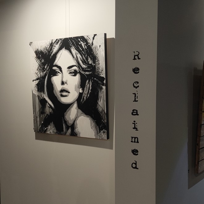
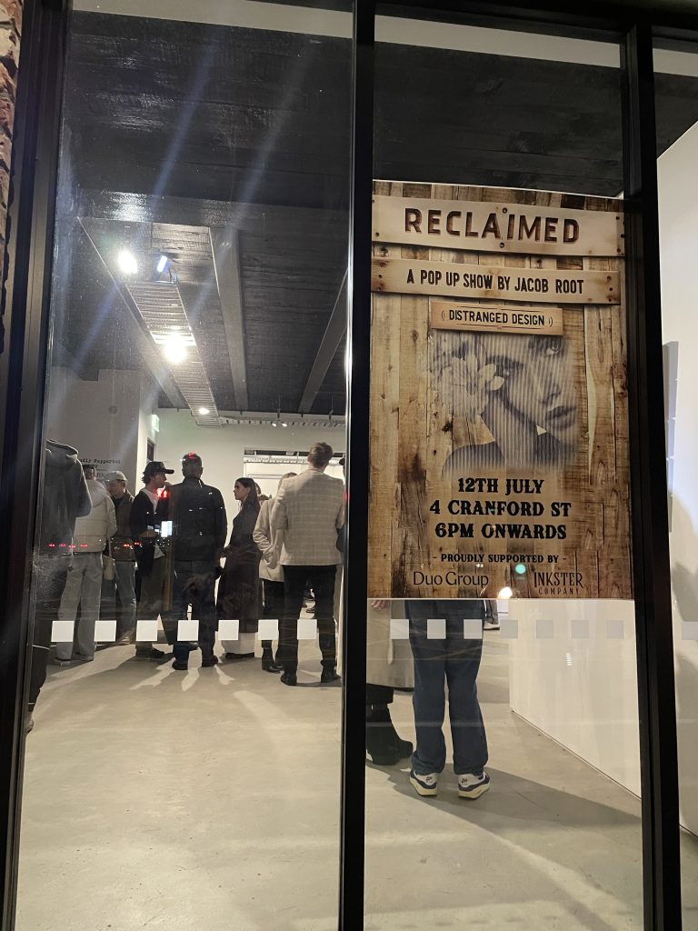
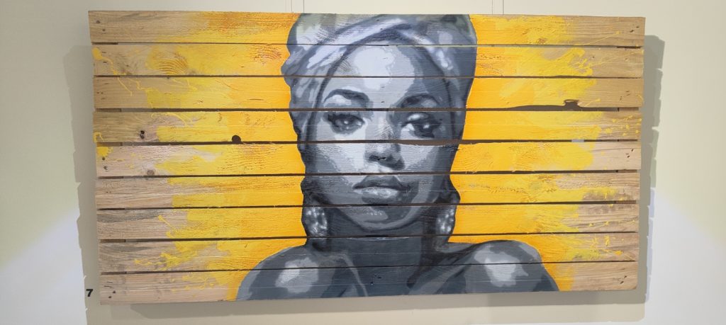
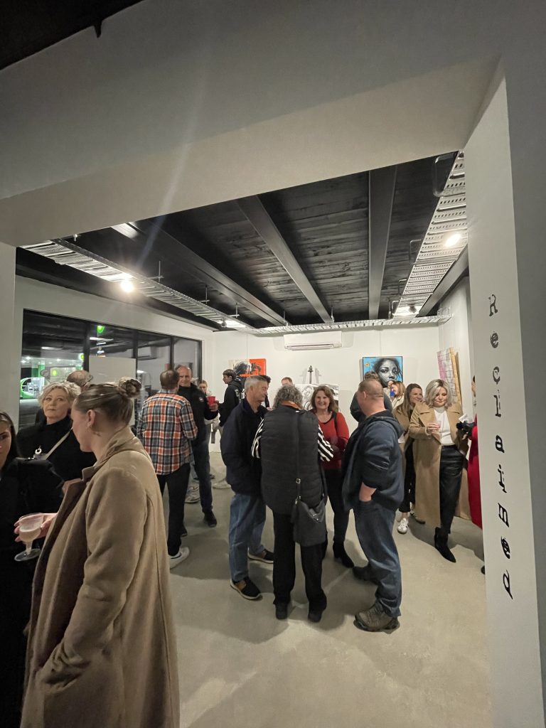
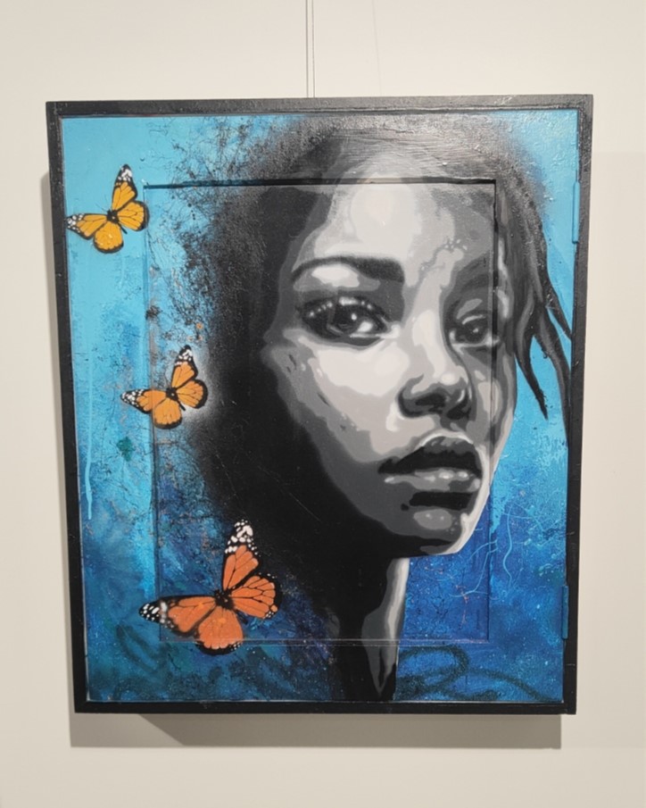
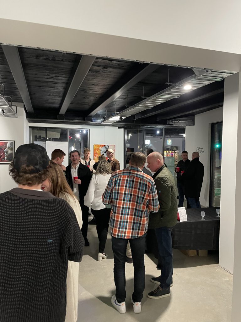
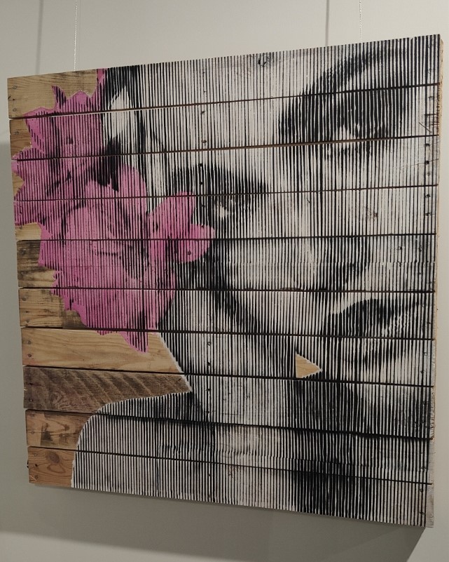
Jacob Root, a.k.a Distranged Design has a way of getting on with things – whether it is flying across the world to immerse himself in the creative scene in Los Angeles, or staging exhibitions of his work here in Ōtautahi Christchurch, he tends to find ways to make things happen. For his latest solo show, Reclaimed, he set about making a body of work that both explored new ways of making (from paint application to the use of up-cycled materials), and found a space through a mural contact – eventually coming to life in a weekend pop-up show.
The well-attended opening night, despite the drizzly Friday evening, showed that Distranged Design has built a solid following of fans eager to see his latest work. The showroom setting afforded a spacious and uncluttered layout for his large works, many painted on recycled palettes and found objects. The styles employed also highlighted a changing approach, clearly influenced by the artist’s increasingly large mural works. The stencil background is still apparent, including the Snik-inspired Moire-styled technique, but a new painterly approach, deploying more freely constructed layers, is arising, an approach the artist admits is, in part, to give relief from the work-heavy cutting process.
Despite his youth, Distranged Design has been a presence in Ōtautahi’s scene for several years, and Reclaimed shows an artist beginning to explore new paths…
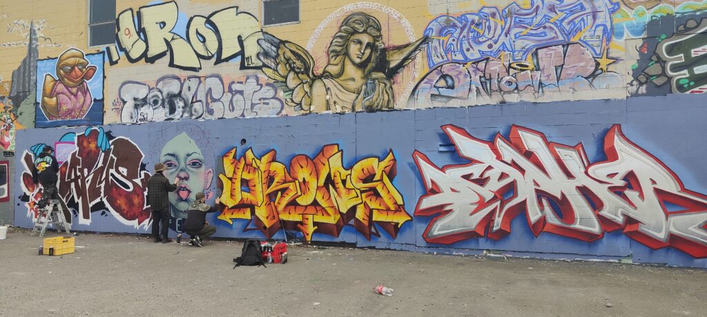
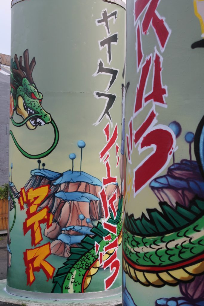
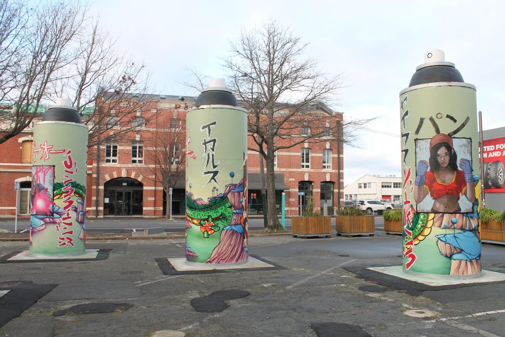
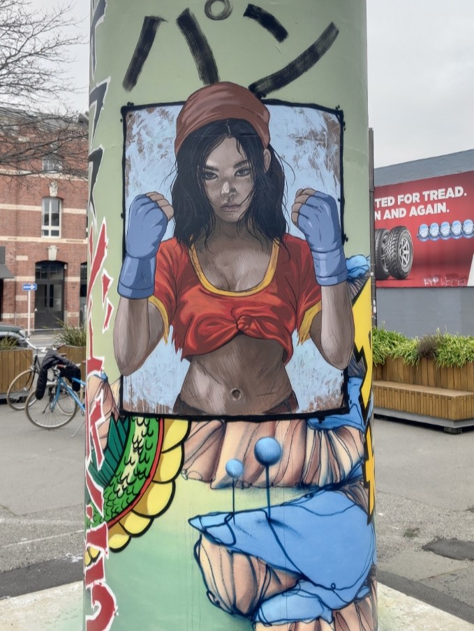
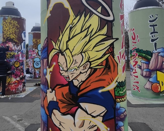
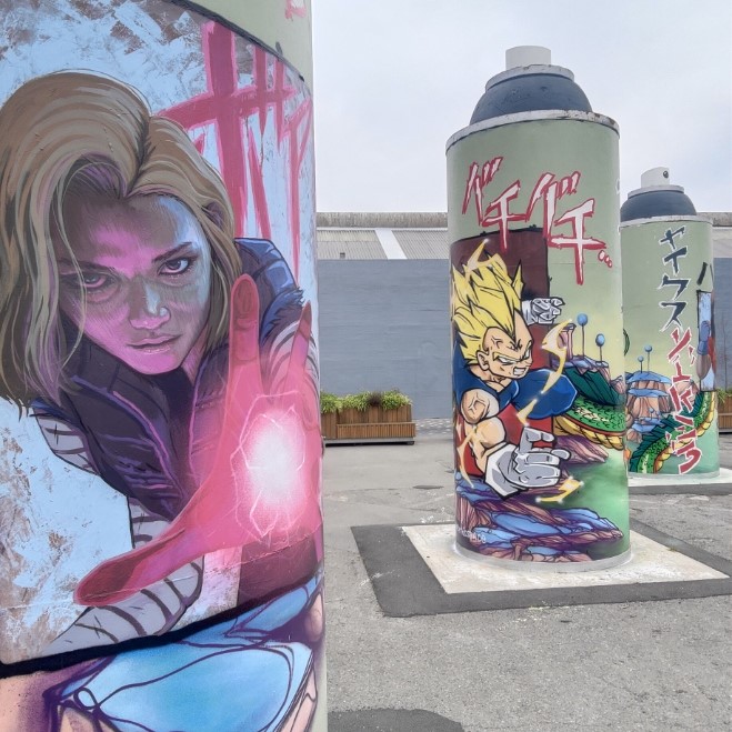
When you bring together three heavy hitting talents, the results should always be something special – and the latest refresh of the ‘permanent’ Giant Cans is testament to that truth! When we approached Ikarus, Jacob Yikes and Jessie Rawcliffe to paint the steel cylinders, we challenged them to take a different approach – rather than painting one can each, we asked the three artists to create a collaboration across the three cans. The result is stunning!
The three artists united behind a love of anime and specifically Dragon Ball – the iconic Japanese Manga – a fitting subject given the series’ creator Akira Toriyama had passed away in March 2024. The artists them considered ways to incorporate their signature styles within the familiar aesthetic of Toriyama’s world and beloved characters – exploring the potential and challenges of the circular shapes and multiple viewpoints – the result is a stunning, whirring work that is vibrant and intriguing.
Yikes’ otherworldly style is evident in the green, almost alien, landscape in which characters sit, framed as if contained within comic book panels. The giant dragon Shenron wraps around the three cans, entwining the setting within his mystical presence, clutching the magical, titular Dragon Balls. Rawcliffe’s realism is deployed to depict stylised versions of Pan and Android 18, giving new life to familiar characters. Ikarus’ graffiti traditions are evident in the bolts of text that add a sense of onomatopoeia to the scene, an energetic presence. Traditional representations of Goku and Vegeta, perhaps two of the most famous characters in the saga, and the cat-like Puar, add to the scene.
The various aspects combine into a cohesive production, but also present the need to move about, to explore different vantage points and lines of sight. Time to see it for yourself!
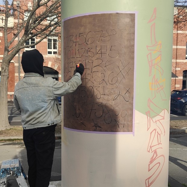
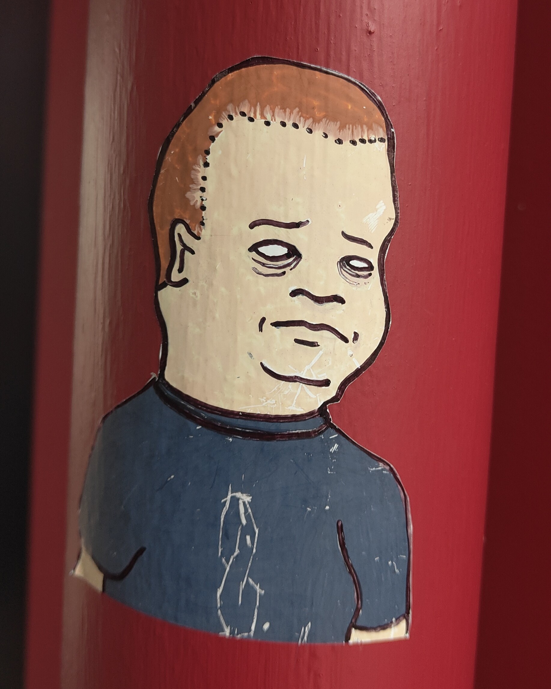
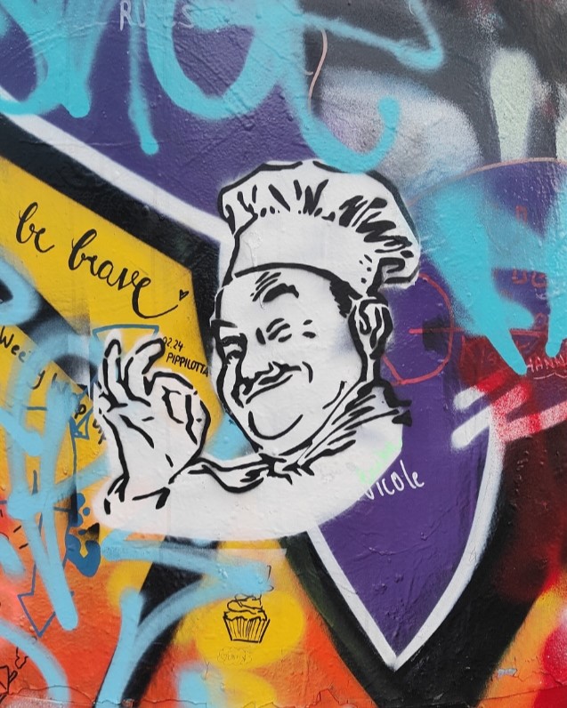
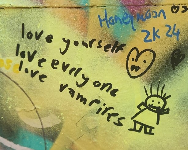
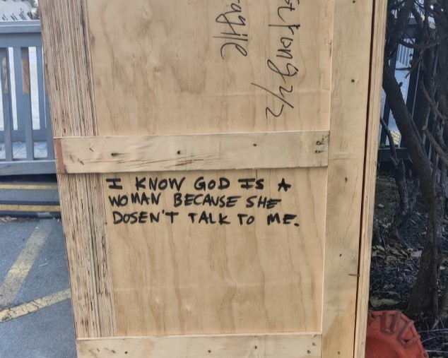
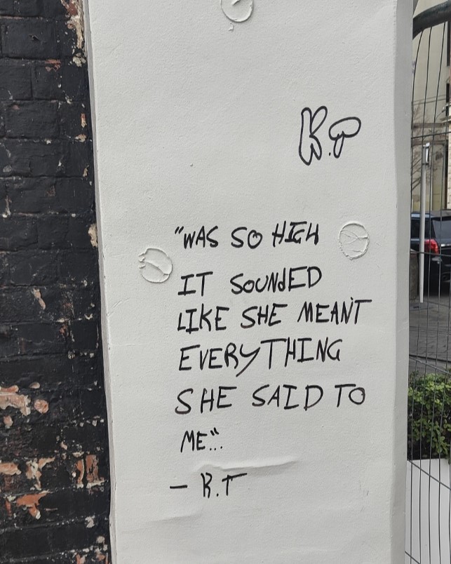
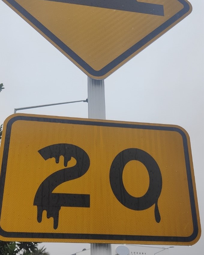
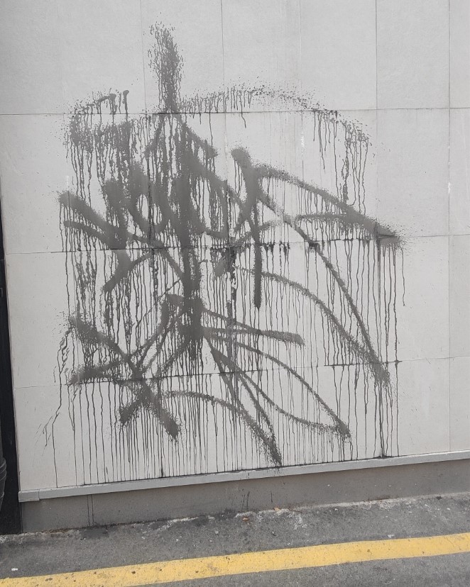
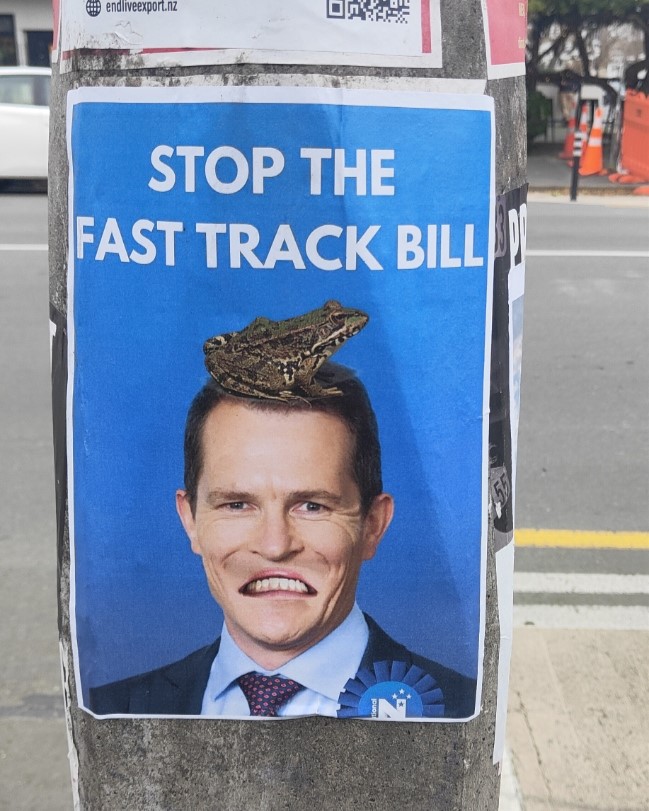
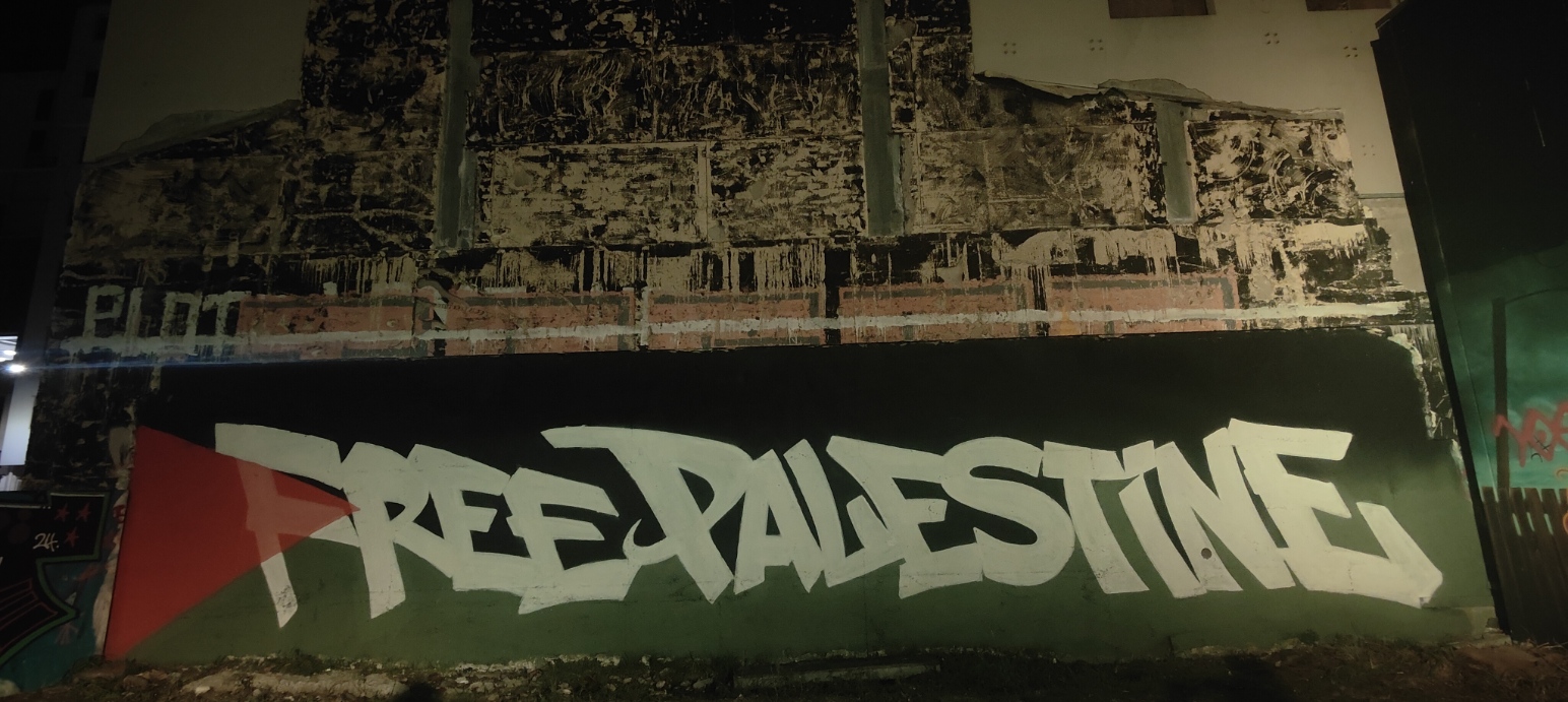
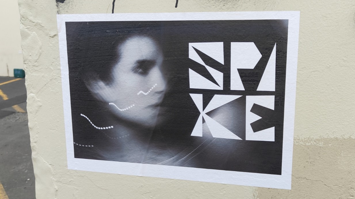
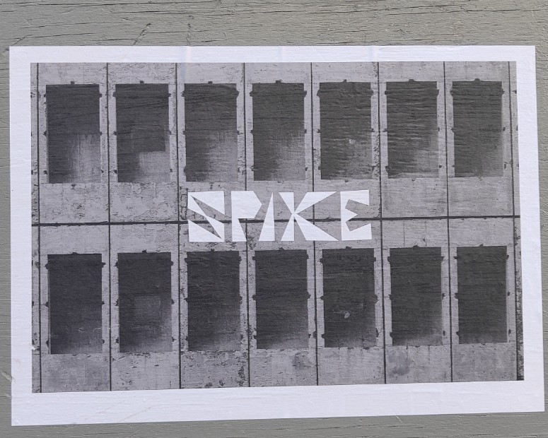
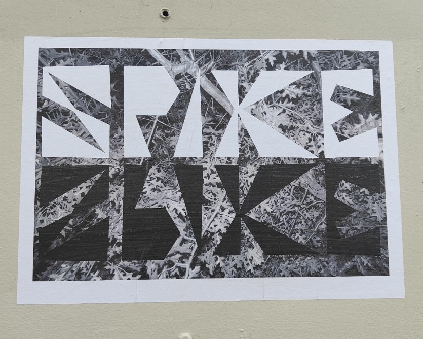
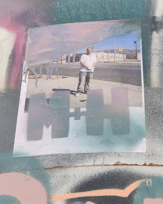
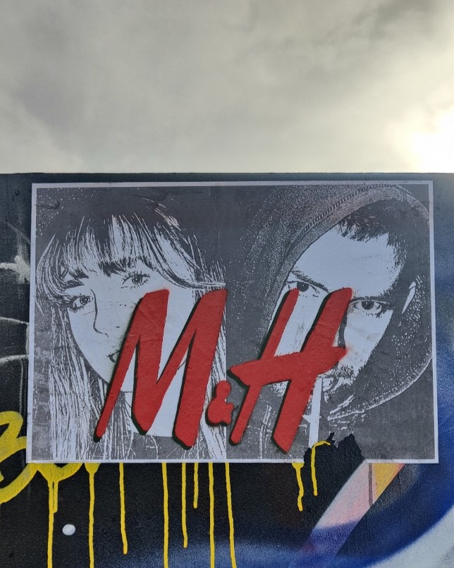
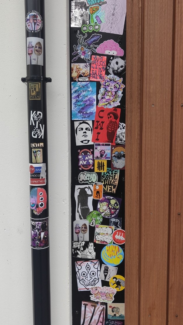
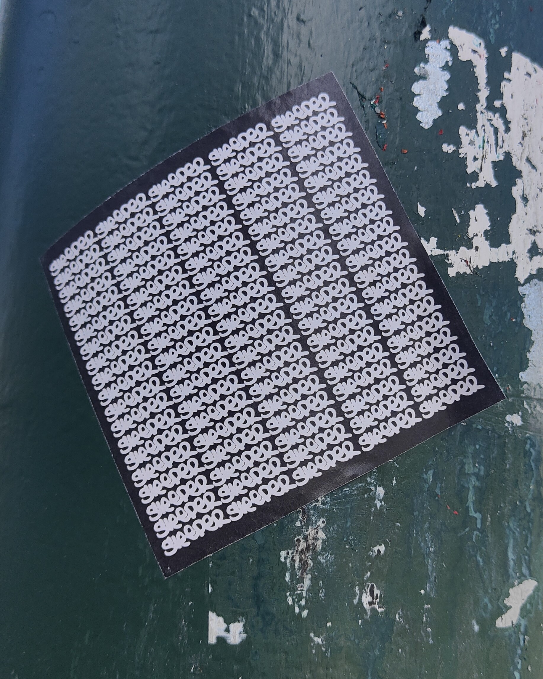
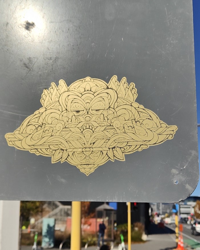
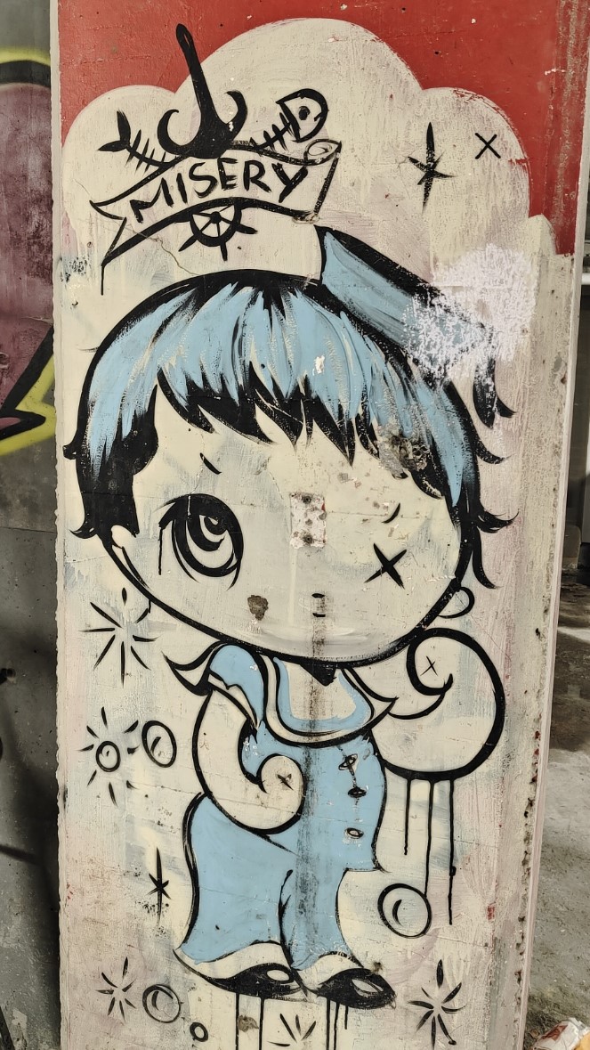
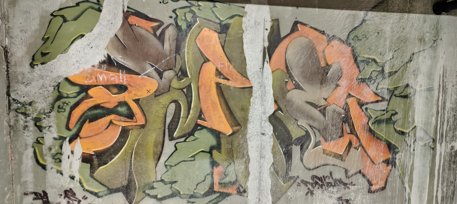
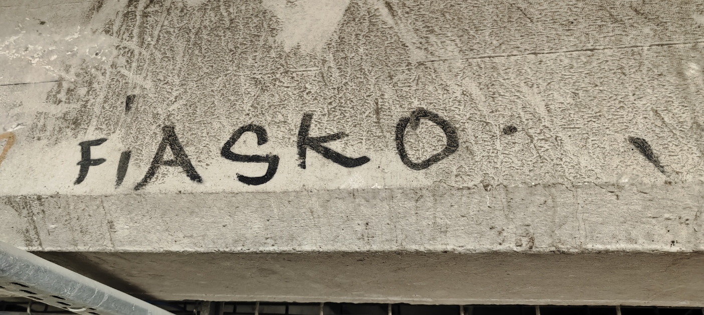
Street Treats is back with some tasty finds from Ōtautahi’s urban landscape. A reminder that we need to celebrate the little things that make us laugh, smile, think, curse, cry and everything in between. After all, what is a city but a site for each of us to exist and express ourselves? Each piece showcased here is the result of an action, a decision to leave something for others to encounter, a realisation that we can impact the experience of our fellow citizens. Sure, this sounds overly dramatic for a collection of peeling stickers and scrawled massages. But think a little deeper about what they each represent and what they contrast with, it makes the city an infinitely more interesting place. From twisted familiar icons to mysterious new names, a number of throwbacks, some political protest and humorous notations, this collection is a reminder of the myriad voices that make up our city…
This volume features: Klaudia Bartos, Dark Ballad, Sleeper, Bols, K.T., Dcypher, SPIKE, M+H, Ghstie, Misery, Fiasko, Jessie Rawcliffe and more…