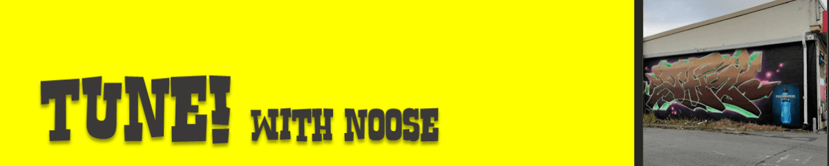
As the city’s newest spot to stock up on paint, Rinley’s Writer Supplies has quickly been established as the go-to for the local graffiti community. That comes as no surprise when it is the brainchild of a veteran painter who knows the local scene and what people want, ensuring Rinley’s is truly a store for writers. We visited Rinley’s small-but-well-stocked Sydenham location and caught up with owner Noose to chat about his graffiti experiences, how Rinley’s came into existence and the realities of selling (and stocking) spray paint…
One thing I’ve learned from meeting a lot of graffiti writers is to never to expect what someone is going to be like…
Hard out! I’ve had that here. I don’t know if you know the dude who paints mushrooms, but I met him recently and he was like, I don’t associate with anyone who paints, don’t say who I am or what I look like or whatever! I was so surprised. I was asking him about whether he paints the mushrooms where you would actually find them, and he was like, yeah, kind of, it was a little bit of a road map, which I thought was quite cool. He was a really interesting dude.
There are painters who have been deep in the culture for years and then there’s those who get into it almost independently, who subvert the traditions a little…
I think the scene has changed dramatically as well. I was definitely an asshole, but that doesn’t get you anywhere, it just stagnates your actual growth as an artist when you’re like, that guy went over me, I’m just going to go hard out and make sure I go over them. It means you don’t paint anything good, you’re like, what’s the point, you’re going to get gone over anyway…
Was your introduction to graffiti through hip-hop culture or through another influence?
Skateboarding bro, just being down at the skate park. That was when the older generation were painting walls down there all the time. I was down there every day bunking school and I’d see them painting all the time and I’d try and talk to them. The reception was very gangster and like, what do you write, Toy? It was quite aggressive. So, I was like, OK, that’s how you have to be, you have to have beef to be someone. There was also the whole YouTube explosion around the same time. I started in 2007 and that was when movies like State Your Name and a bunch of big New York graf videos had just came out and had the attitude of, if you buy your paint you’re a toy, and graffiti is a full contact sport. So, I was like, you have to be able to fight and do all these other stupid little things, which is so dumb looking back on it now.
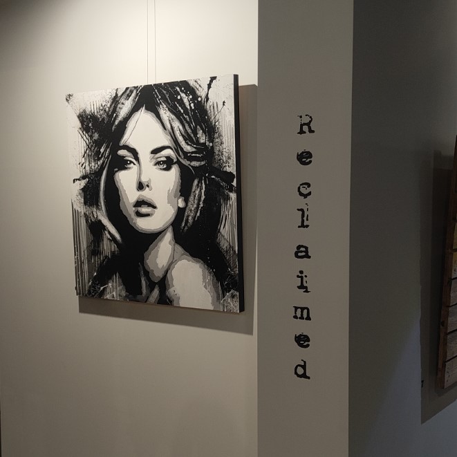
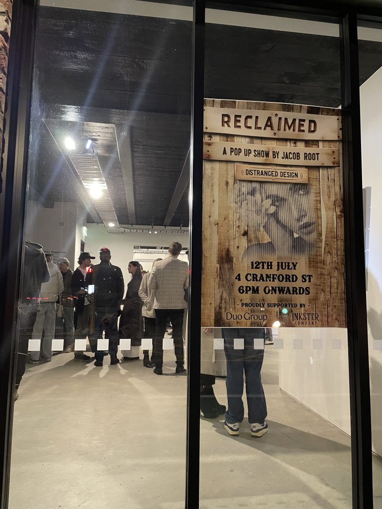
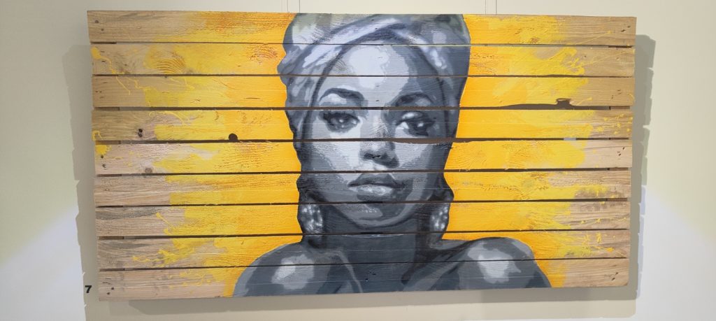
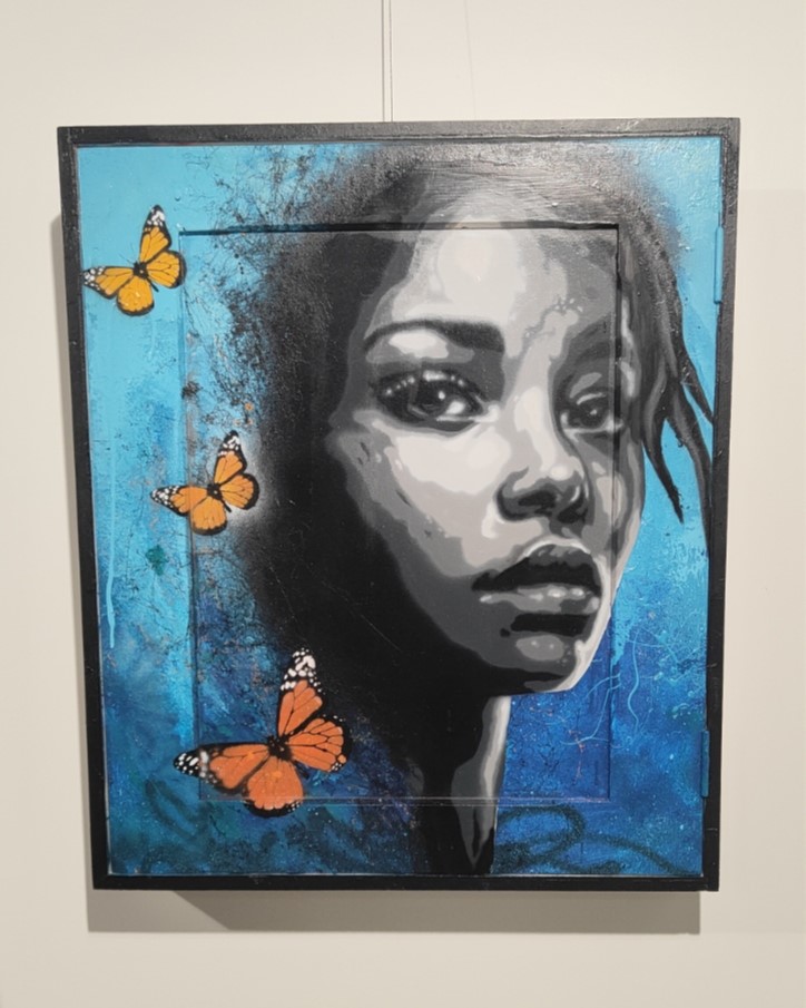
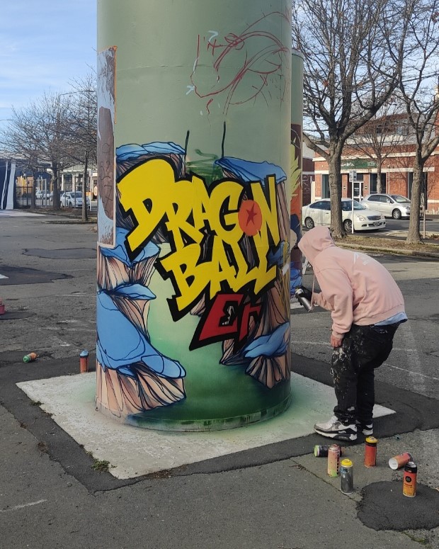
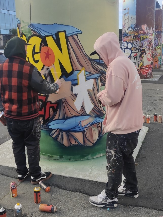
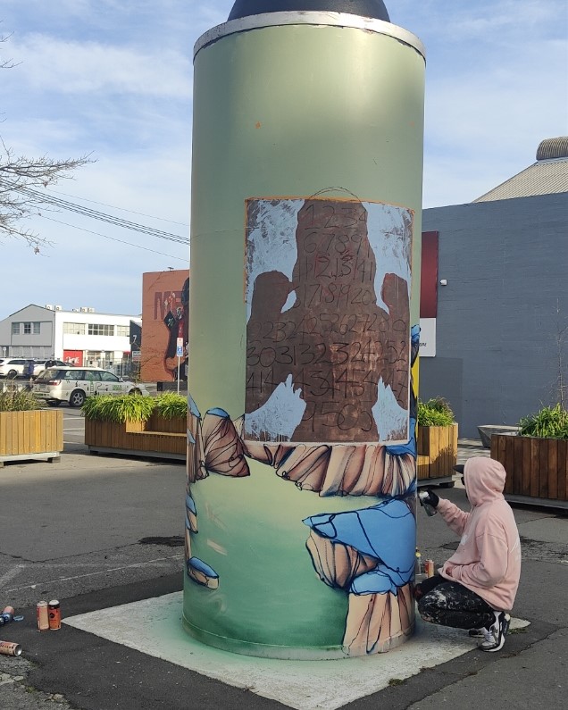
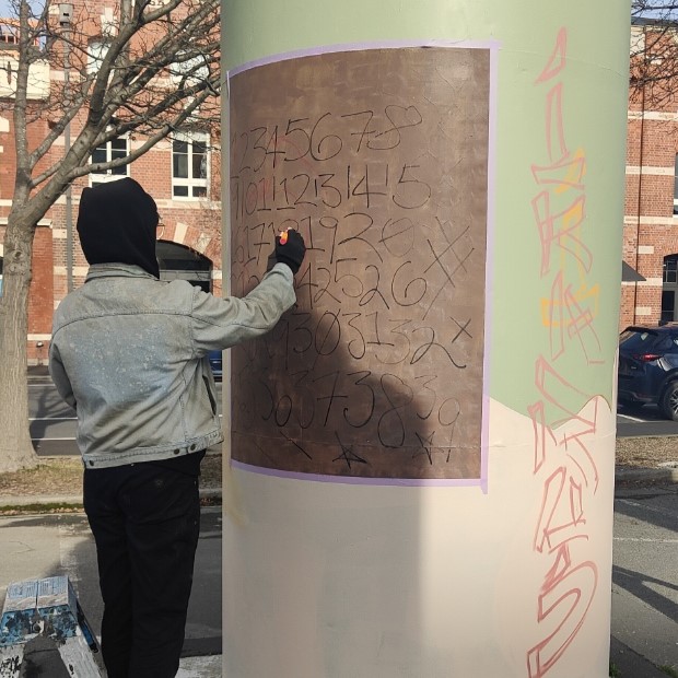
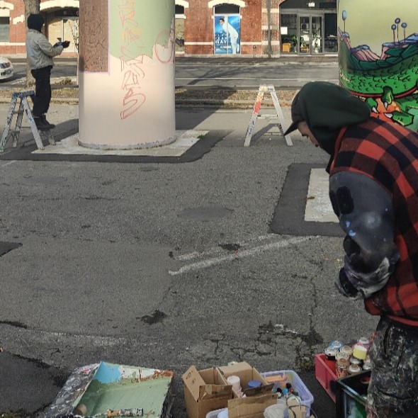
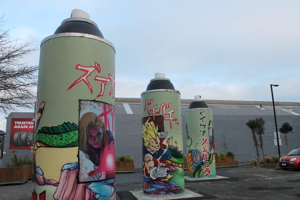
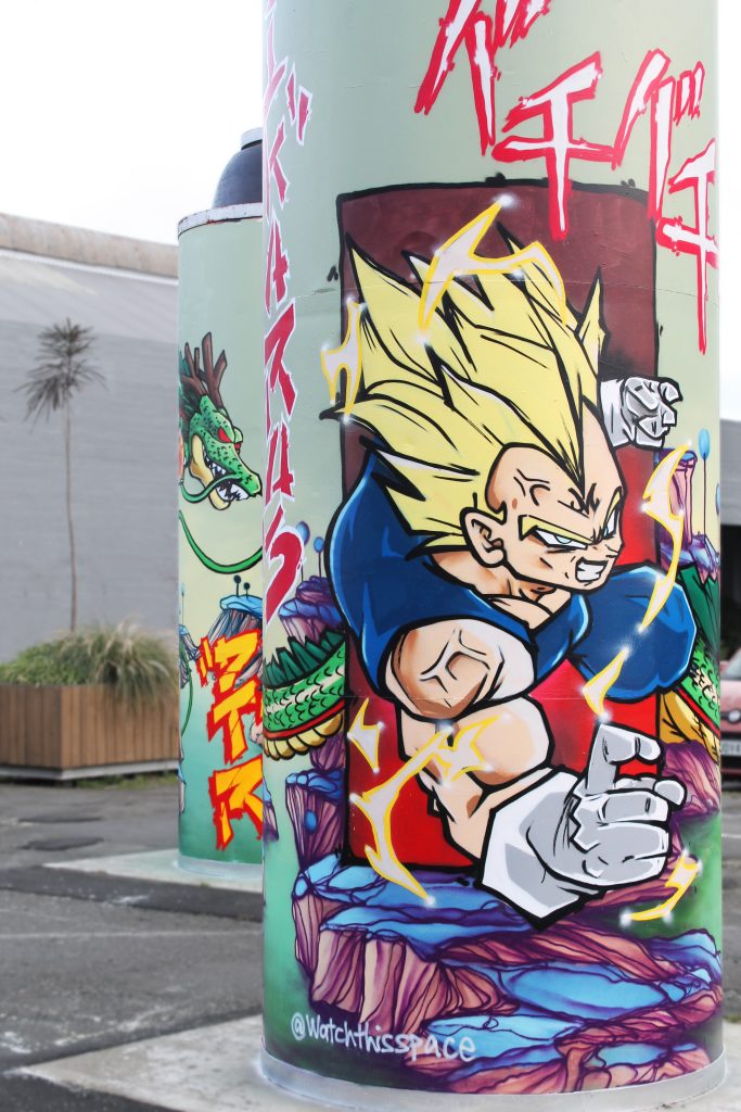
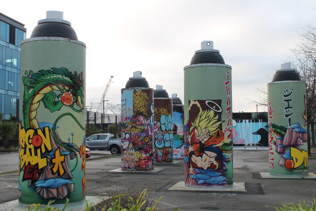
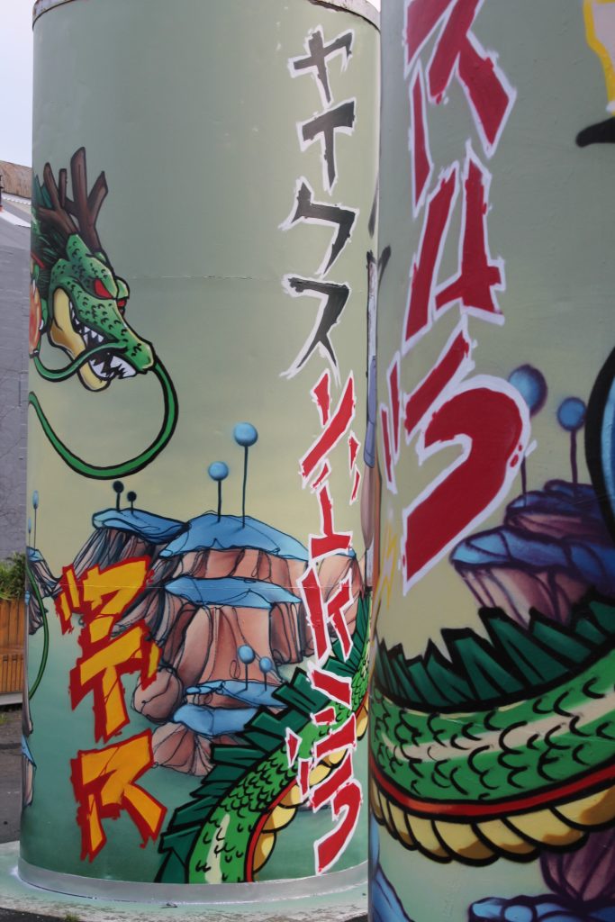
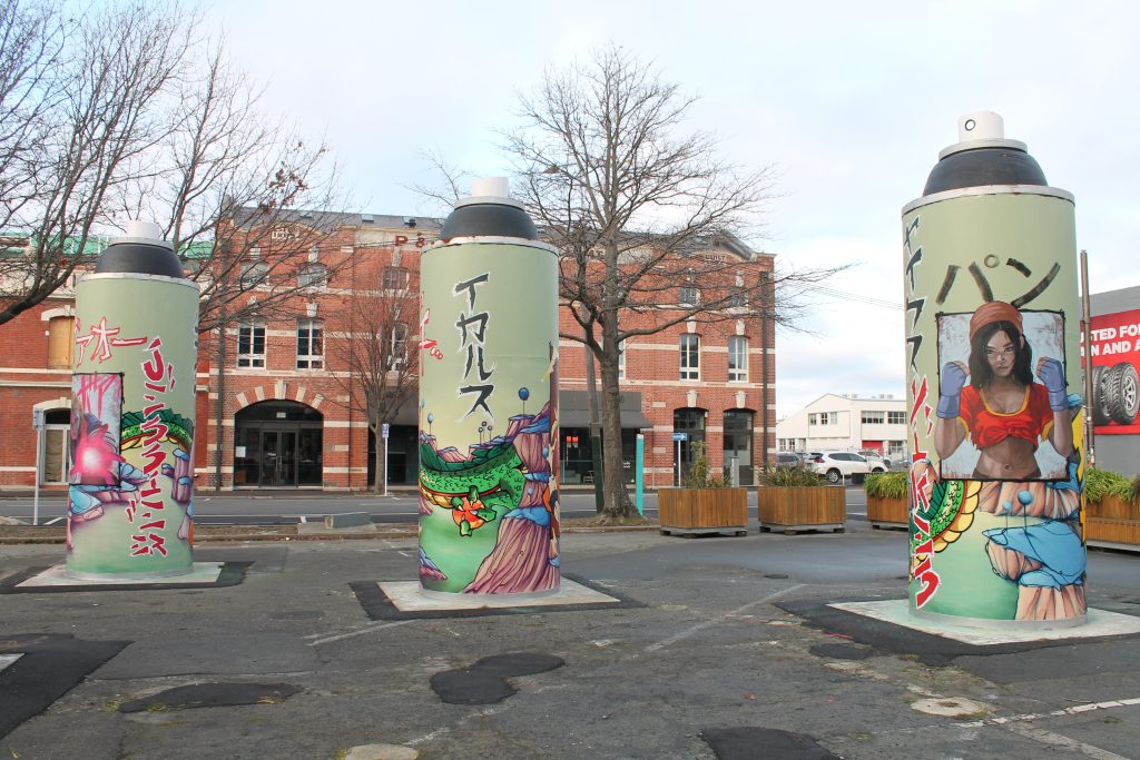
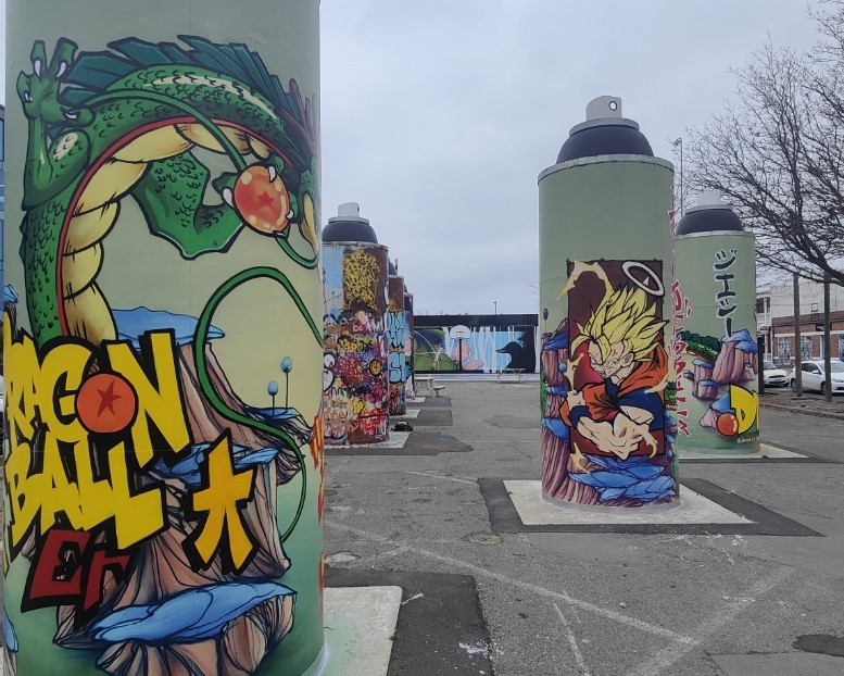
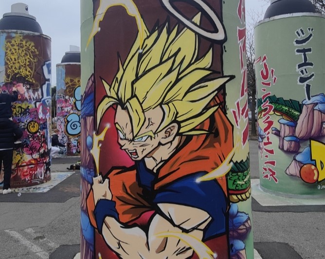
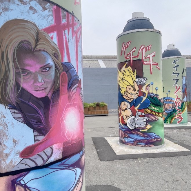
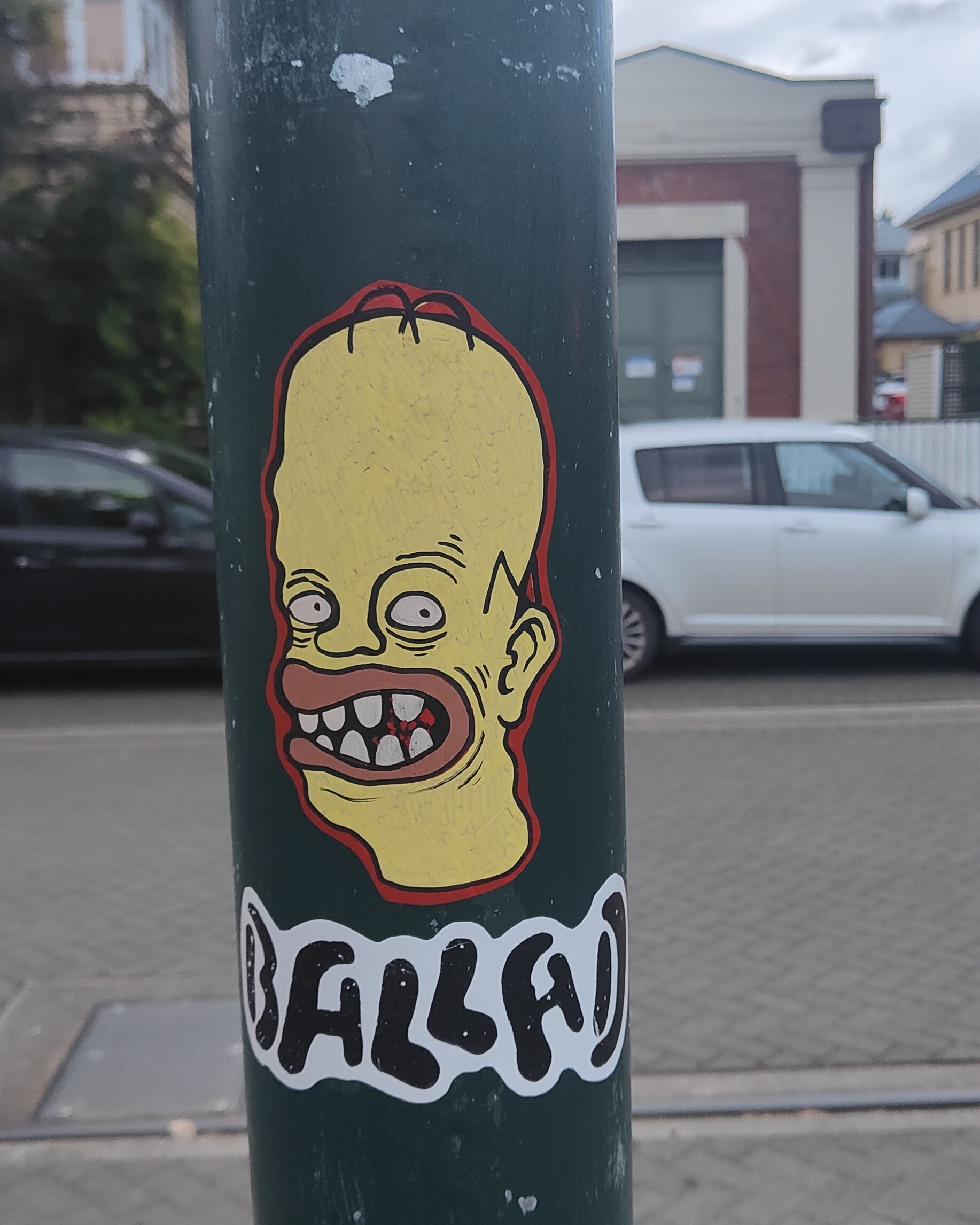
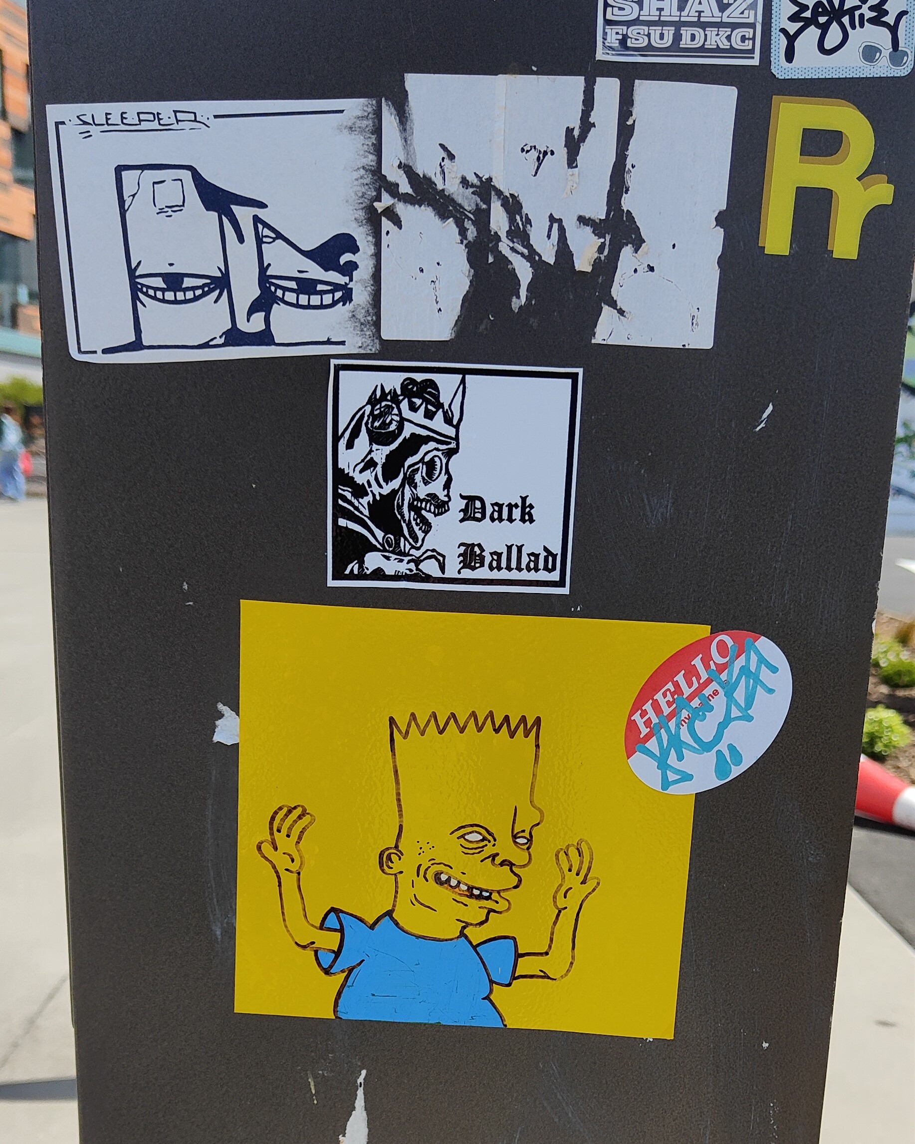
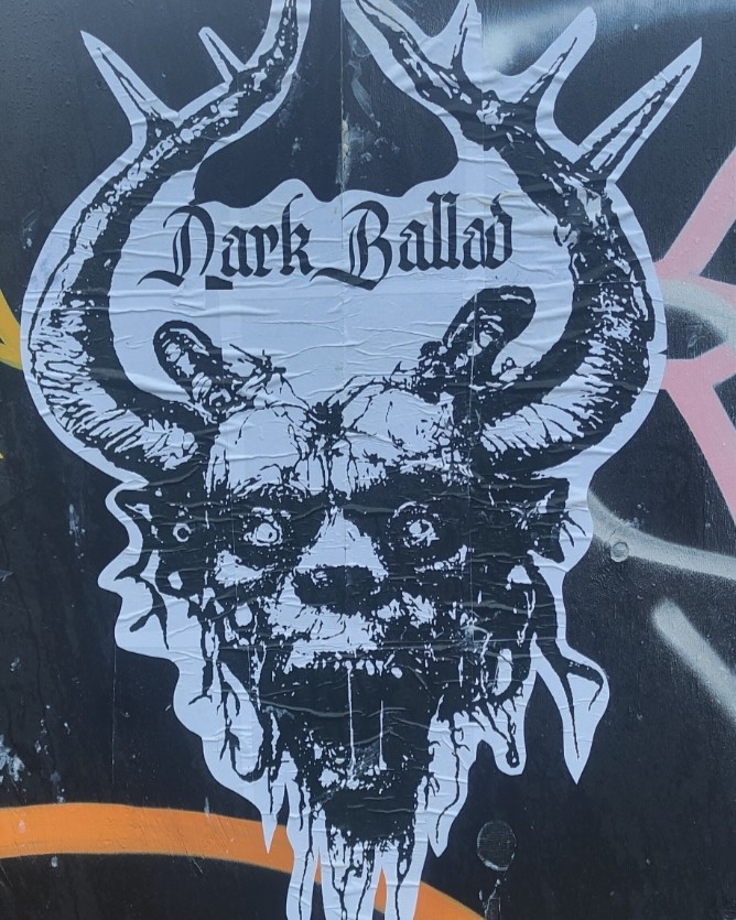
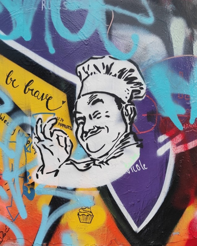
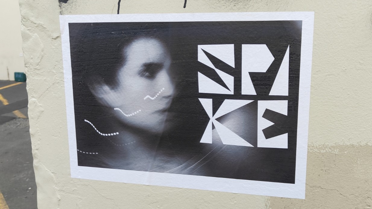
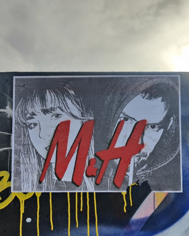
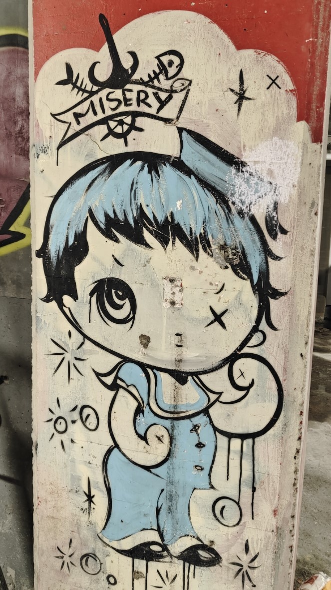
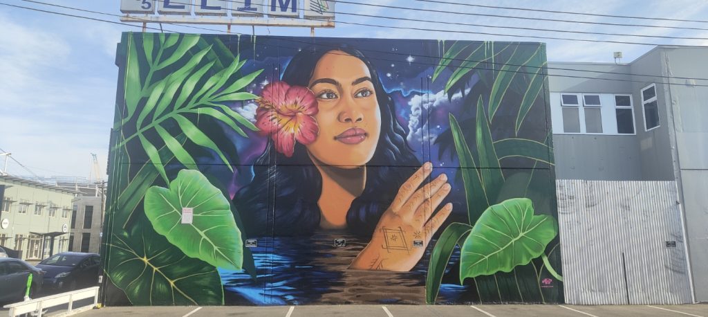
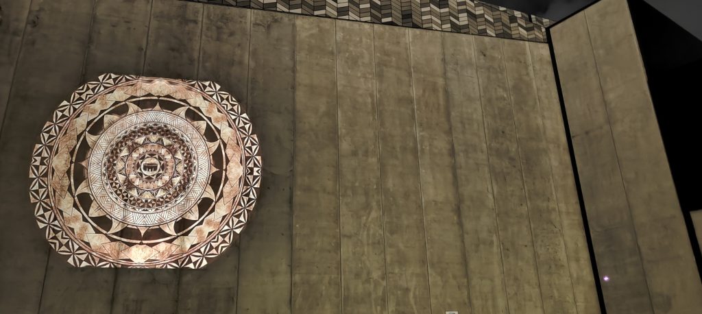
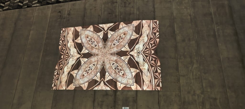
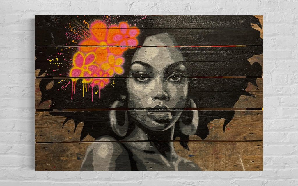
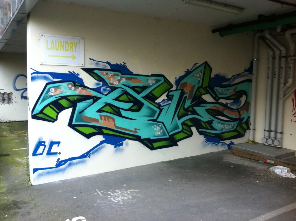
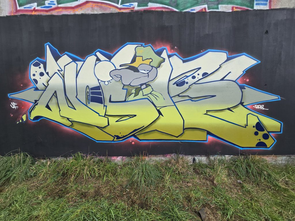
Various artists, 2021
I don’t know if you’d agree, but my feeling is that there are definitely benefits to a less rigid view, a willingness to change and go with the changes…
People like that get better so much quicker because they’re nice people to paint with, because they have opportunities to paint with people who are better than them and they want to paint with them. But if you’re an asshole, everyone will be like, I don’t really want to paint with that guy, he’s going to cause drama, and it’s going to affect the thing that I’ve got going on…
Starting in 2007, you have obviously had experience from both the pre-quake and the post-quake scenes, how do you see the difference?
Pre-quake, if you didn’t have a good tag and you didn’t have a good throw-up, you weren’t allowed to piece. It wasn’t going to happen. Your stuff wouldn’t last, you had to build your name to that point. You also couldn’t paint freights at the time, because of the fear of FILTH and other crews like FAT, they very much held down that scene. There were real repercussions for messing with the thing that they had going on. But post-quake a lot of those dudes left, so this younger generation had a bit of a free for all, there weren’t these scary dudes holding a tight grip on the scene. Obviously, the amount of abandons (empty buildings) as well meant it was just a free for all, it was crazy.
The city was fucked, so people were happy that there was something going on. For years there were three pubs in the city you could go to late at night, there was the Town Ball, that tent one, maybe Dux Live in Addington, so it was pretty grim… Any kind of colour that you added to that was seen as good, you could just paint like there were no laws.
Do you think that environment led to an ongoing change in terms of the perception of graffiti or do you think that bias is still there? Ōtautahi has this reputation for our murals – graffiti has fed into that so much and yet it doesn’t necessarily get the same shine, do you think that’s improved from what it was?
I feel like the level of graffiti that was painted pre-quake went down post-quake. Pre-quake you had the likes of Dcypher, Lurq, USK, Sender, the Wall of Fame by the Colombo Street over-bridge. Then there was the big buff that happened with the train tracks and a lot of that was lost, so it just turned into a tagging and throw-up spot and people stopped piecing and doing productions for quite some time. It wasn’t really until some of those festivals happened post-quake that it was, like, oh shit, we’re getting good recognition for the bombing that everyone’s doing, but we can’t compete at all with the piecing…

That echoes what happened in Auckland with the Rugby World Cup buff in 2011 and years of history were wiped away and that vacuum was filled with a focus on bombing and tagging rather than piecing…
It opened up a spot. It was like alright, those sick pieces and burners and stuff are all gone, now it’s our time to take that spot, let’s just do something quick and fast, like a big stomper or something to claim that spot to use it later to do something. As opposed to being like, shit, let’s do something as good as that or attempt something as good as that…
What names stand out for you in that post-quake era?
Definitely BC crew, JFK crew, Ikarus obviously, Yikes. I feel like When Dcypher came back it was on for DTR. Freak and all those guys were still doing amazing stuff, but you know, its Dcypher, he gets things going…
You talk about JFK, who were super active post-quake – you are a member of that crew, right?
Yep, I am. When JFK was formed, you had to be painting quite heavily to be in it, but there was also a lot of thought about where you were situated in the city; I got put in because I was in Addington, Deok was put in because he was in Hornby… It just made going all city very easy, so that’s why it covered the city quite quickly, there was a bunch of dudes in New Brighton, a bunch of dudes in the east, there was a bunch of dudes out west…

Who else stands out?
Post-quake, 100% Skum from JFK, he was just insane. He was the PK before PK. I remember Skum, Germ, Jot, all those dudes, were going hardcore. Slepa, I think he was kind of going hard pre-quake and kind of died off just after the quake, but yeah, all those dudes were going crazy…
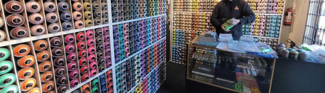
Fast forward a decade or so and we are here today sitting inside your store Rinley’s Writing Supplies, how did Rinley’s come about?
I got caught two years ago and basically, I couldn’t paint Noose anymore, they knew who I was. I had just had a kid. I was going through the whole court thing, where I was put on a year’s good behaviour. At the same time, I was also getting some legal work, and I was saving all the money from that because I wanted to try to do a project, like try to get legal walls for people and to find people new places to paint, do that whole thing. I was getting more jobs doing Chorus cabinets and saving all that money. So, I had bunch of money sitting there and I was like, I can probably open a shop with what I’ve got. I had already thought of the name Rinley’s, I was going to make markers and paint. The name at first was Rinley’s Black and Chrome, it was just going to be black mops, chrome mops. But that sort of changed over time. I messaged a bunch of paint suppliers, shopped around and was in chats with Montana and they were just so on the ball with replying to emails. They were so good to deal with, I was like, this is like a no-brainer, I’ll just take the risk and do it. I sent them a whole bunch of money and three months later all this paint showed up…
Going back to that idea of racking paint to be a real writer, how have your personal experiences shaped Rinley’s and how you have gone about setting the store up?
I wasn’t a racker. When I started the cages came about that made it harder. I was just on the cusp where you could rack from The Warehouse when I was starting. I was just buying paint, and I was buying shit loads of it. I was spending basically my whole wage on paint at one point…
Where were you buying paint?
I was using Embassy hard out, but when Ironlak went, it was a matter of necessity to shop around, so I ended up using Gordon Harris for years. Before I started Rinley’s, I was using Tom’s Emporium.
Tom’s has stocked Montana, you talked about how Montana as a company were really good to deal with, but it also has a strong reputation for quality…
Yeah, Embassy had Montana years and years ago, when I first started, and I loved it. The smell is nostalgic, and its good paint. But honestly, the main reason I chose Montana is how good they are to deal with. Their paint is as good as any other paint you can get, but the level of service and communication when you’re sending large amounts of money overseas is second to none compared to some of the other places. They see a small place like this, and they see the potential. They don’t see it like just some small fry who only want a small amount of paint compared to someone else.
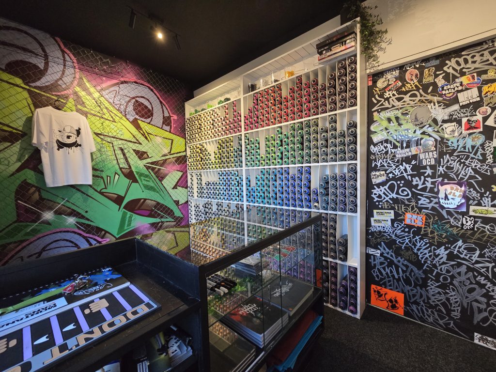
You’ve started Rinley’s at a manageable scale in terms of the shop itself, but you’ve got a big range of cans in a small space!
I think what was happening with a lot of the paint shops was that they were looking at four different, say, burgundies, and they looked at the middle tone and they go fuck, it is close enough to the other ones, let’s just get that and we will step down to the next shade, whereas artists still want those off shades. For someone like Yikes or Dcypher, who do crazy technical pieces, those slight changes in shade mean a lot. For me just painting pieces and stuff, it doesn’t mean as much to me, I can go from a burgundy to a bright red pretty easily, but it’s just like a necessity really, like there’s just nothing better than having a full range that you can just look at. The other thing was when you go into a lot of paint shops or even skate shops to buy paint, they’re all behind a cage. It’s almost like you’re burdening the staff to get the cage open, you feel like you are being watched and you can’t be trusted. That’s why I’ve got this set up, where the door is shut at all times, but I’ll let you in, you pick your own shit, you can compare colours, you don’t have any other awkward encounters. I just make this shopping experience better, because painters aren’t all deviants, a lot are quite successful in their jobs, they don’t deserve to be watched like a hawk to buy paint…
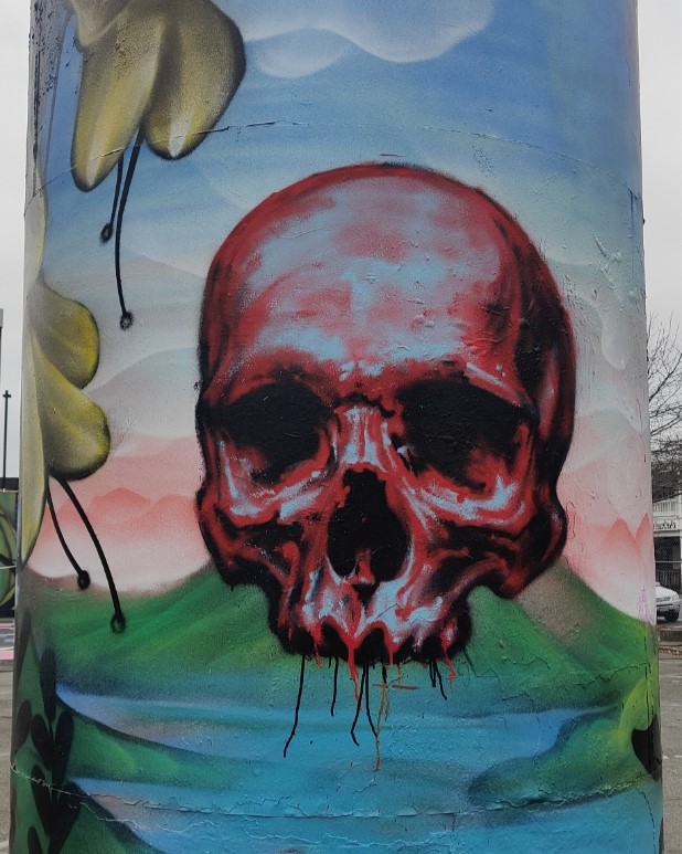
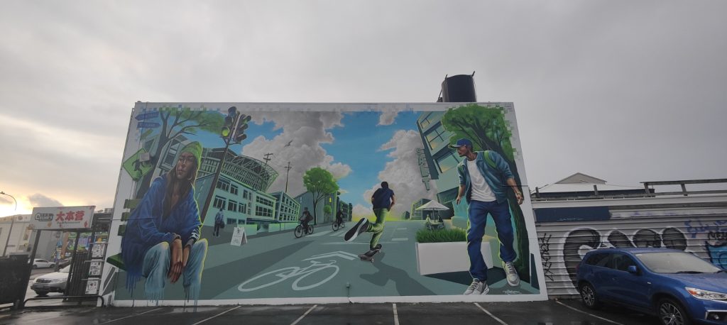
Rinley’s Writer Supplies
Which is all an off shoot of essentially criminalising spray paint…
Which was the stupidest law anyway! People can buy all these pens, there’s no law on the pens. You can go fill up a weed sprayer full of paint, you could go get a fire extinguisher right now from Bunnings, fill it with paint and have the most destructive tool you could possibly have, but for some reason spray paint was targeted. I’ve read the legislation around the time that it was written (early 2000s), I think the perception was that graffiti writers are all lower-class kids, so let’s make it hard for like 15/16-year-olds, not actually knowing that many of them were fully grown men. Which is stupid because they would have seen that in the court papers…
With the rise of urban contemporary art, people are using spray paint as a part of a much broader creative practice as well, but the product is stigmatised by putting it behind cages and making it an awkward experience for people to have to go and get something unlocked and then be watched…
Well, the other crazy thing with the law was that if you are walking around the street at 12 o’clock in the daytime with a bag full of spray paint and you got pulled up by the cops, you’ve got a legitimate alibi as to why you have that spray paint, you do that at 12 o’clock at night and you’re a tagger. Who is to say that you’re not a night worker? I’ll open late for people, like if you want to buy paint late at night, holla out, we’ll sort a time out and you can come and grab it. A lot of the dudes that do come in, they work late, they don’t get the chance to come into paint shops during the week. Not all of them are out painting graf, some are just using it for canvases or whatever they want to use it for…
It’s interesting, I know of a few people who have gone into studying criminal law or things like that, because of experiences associated with painting graffiti. Were you already aware of some of those things from being a writer, or is that stuff that you kind of dived into because you knew that opening the store would potentially bring up some of those issues?
I kind of knew a bunch about the laws just from being caught before, but then I obviously had to look into it from a business point of view; am I liable for selling someone spray paint and then they go out and do a throw up and chuck a Rinley’s tag alongside it? Am I going to get in the shit for that? Which is why you need things like public liability insurance and stuff like that. I mean, if that was to happen, they could take you to court and it could get thrown out, but you’ve just wasted thousands of dollars on lawyer’s fees just to try and argue point which should be pretty straight forward…
Do you have excess stock in storage?
Everything is out at the moment. We will have stuff in storage from this next order, especially in the Montana Gold range, because this (the current stock) is only half the Gold range. We’re doubling the next order in the Gold range. It was just a wee bit of a concern because Gold hadn’t been here for so long, I was worried that people would be like, it’s a dollar fifty more than Montana Black cans, The people that have used it have all said the same thing: the cans go longer, the coverage is better, they’re easier to use because they are low pressure… Even Dcypher said all the stuff he did for Project Legit using Gold has held up insanely well, and that’s like 15 years ago now. So, for people that are wanting to use aerosol for large-scale murals, that’s the shit to use.

Rinley’s Writer Supplies
What’s your time frame for re-stocking? Have you figured out the best way to keep well stocked?
Because it’s coming from overseas, it’s like three and a half months. I am lucky, my partner is a fucking genius when it comes to running a business how its supposed to be run, she’s a superstar at that kind of thing, so yeah, she’s got that side covered. We’ve just placed another order, a massive order as well, to try and time with summer.
You ultimately have a very specific audience, so I assume it’s less about growth as it is about building customer loyalty and a solid reputation…
I’ve had probably a message every other day asking do you ship? do you ship? But at the moment, I’m not interested in shipping because I’m concerned that if I do start shipping, locals come in and they are like, oh shit, man you’ve sold out really quick and it’s like, yeah, I’ve sent a 500 can order to Nelson or whatever. I want to cover local first… and put Christchurch on the map internationally as best as I can…
You’ve got more than just paint as well – tell me about some of the other products you stock…
I pretty much only import stuff that I like! We’ve got a range of markers. The reason I got the silver Uni Paint PX-30s is just because they are the best silver marker you can get. The Sakura Magic’s are just a good black marker and then the Sakura Solid Paint Sticks are cool because they are a little bit different. We have various mops from Krink to Fadebomb and eggshell stickers too.
I see you also have some books, some collectibles and some art for sale as well…
When I had opened, I didn’t have a lot of things up other than the spray paint, the caps and the markers, so a few friends were like, I’ve got some shit that I want to sell, can I put it in your shop? And I was like yeah definitely! It was pretty empty up there, so a mate’s put up his Transformers VHS tapes he wants to sell, he had a custom shoe he wanted to sell, Skum from JFK has like a whole bunch of random buses and canvases that were done in like 2015 or 2016, so we’re selling those, and then the books. I got Fresh Press from the guys up north, and then just like a few other books that I had collected over the years that I’ve read probably 10 times and won’t read again…
You’ve got Flip the Script by Christian P. Acker, I love that book…
Yeah, it’s a bloody good book. The Mike Giant book is really interesting as well. I look at that quite a lot now, just because it reminds me a lot of old Christchurch graffiti. I’m not sure whether or not it was the Art Crimes page from years ago that he was uploading to, and people were taking influence from, but it’s kind of crazy how similar his style and even some of the colour combos and walls that he did remind me of old Christchurch pieces, like how the letters hit the ground… I also listen to his podcasts and stuff and from the sounds of it, he was sharing photo stacks around the world with people quite regularly, so whether or not those stacks ended up here, it was an interesting time back then, the internet was around but it wasn’t used the way it is now…
Having been part of the graffiti scene for so long, does opening Rinley’s feel like a new phase in your graffiti story?
I started in 2007 and I really didn’t want to be coming into my 20th year painting not having done anything, so I wanted to do something at least. I fucked myself getting caught, so I couldn’t do anything impressive graf wise, I wasn’t going to risk getting caught again, having young kids and a missus that was fucking stressing out, so Rinley’s was the answer…
Having been caught, what are your thoughts on how the city approaches graffiti?
Every time they like have some new programme that will stop tagging, they never work! The only thing that does work is giving people space to paint legally. I think the Council now, especially with people like Mel Hillier at the Graffiti Projects team, she understands that, and she can see now that there is a group of people that do just want to paint good shit. They might not necessarily want to go onto painting three-storey high buildings with crazy murals, but they just want to paint nice pieces, they want to chill, to be able to have beers or whatever just down at the wall and just make a day of it…
You know, the city has all these places where people can be physically active. There’s never a problem about basketball courts or pump tracks or skate parks, why is it such a big leap to have a place where someone can paint a wall?
As someone who’s fucking shit at sport, shit at skateboarding, I did it for years and got nowhere with it, the one thing that you are kind of alright at, painting pieces, you’re shunned for!
When you frame it as a chill thing, where you can spend a day with a group of mates painting, having some beers, having a good time, where’s the threat in that?
Everyone that comes past and sees you painting, I’ve never had a bad interaction when we’ve been painting pieces. As soon as the sun goes down though, that’s where the perception changes, even if you are doing the exact same thing after dark, people go, tagger! Which is crazy, just paint in the day and you’re right!

Problem solved! Thanks man – lastly, when can people shop at Rinley’s?
Nine to five, Monday to Thursday, nine to six, Friday, and then nine until twelve, Saturday and Sunday. But from October I’m probably going to be doing appointment only across the board as we are having a baby. But I’ll be low on paint by that time anyway, so I don’t think it will be a massive problem…
And people can find out more on the socials?
Yep! Follow us on @rinleys on Instagram and Threads!