For over 20 years, Ronald McDonald House Christchurch, located on Cashel Street, has provided a ‘home-away-from-home’ for families travelling to Ōtautahi for medical treatment. A welcoming space for whānau to find respite from hospital rooms, Ronald McDonald House provides warm hospitality in tough times, a truly vital service that removes further stress for families already dealing with so much.
Continue reading “A Home Away From Home – Jay ‘Daken’ Skelton at Ronald McDonald House”Category: New Works Coming Up
Flare Ōtautahi Street Art Festival 2025 – A Photo Essay Recap…
It is hard to believe that three months have flown by since the 2025 Flare Ōtautahi Street Art Festival coloured our city’s walls with a flurry of activity and energy! A triumphant return for the mural festival, the 2025 iteration drew huge crowds, enthusiastic media coverage and, of course, a collection of impressive artworks that further cement Ōtautahi Christchurch as the urban art destination of Aotearoa. From colourful abstractions, striking portraits, and bold typography to sky-high surrealism, complex graffiti and poignant cultural narratives, Flare covered a range of bases stylistically and thematically. With more than 19 large-scale works and a series of activations, Flare 2025 was indicative of a city completely enamoured with turning our streets into canvasses and embracing possibility!
We thought that with the cold months now well and truly here, it would be an ideal time to bring some fire and warm some souls with a reminder of Flare’s goodness – so join us for a little stroll through memory lane with a visual recap of Flare Ōtautahi Street Art Festival 2025!
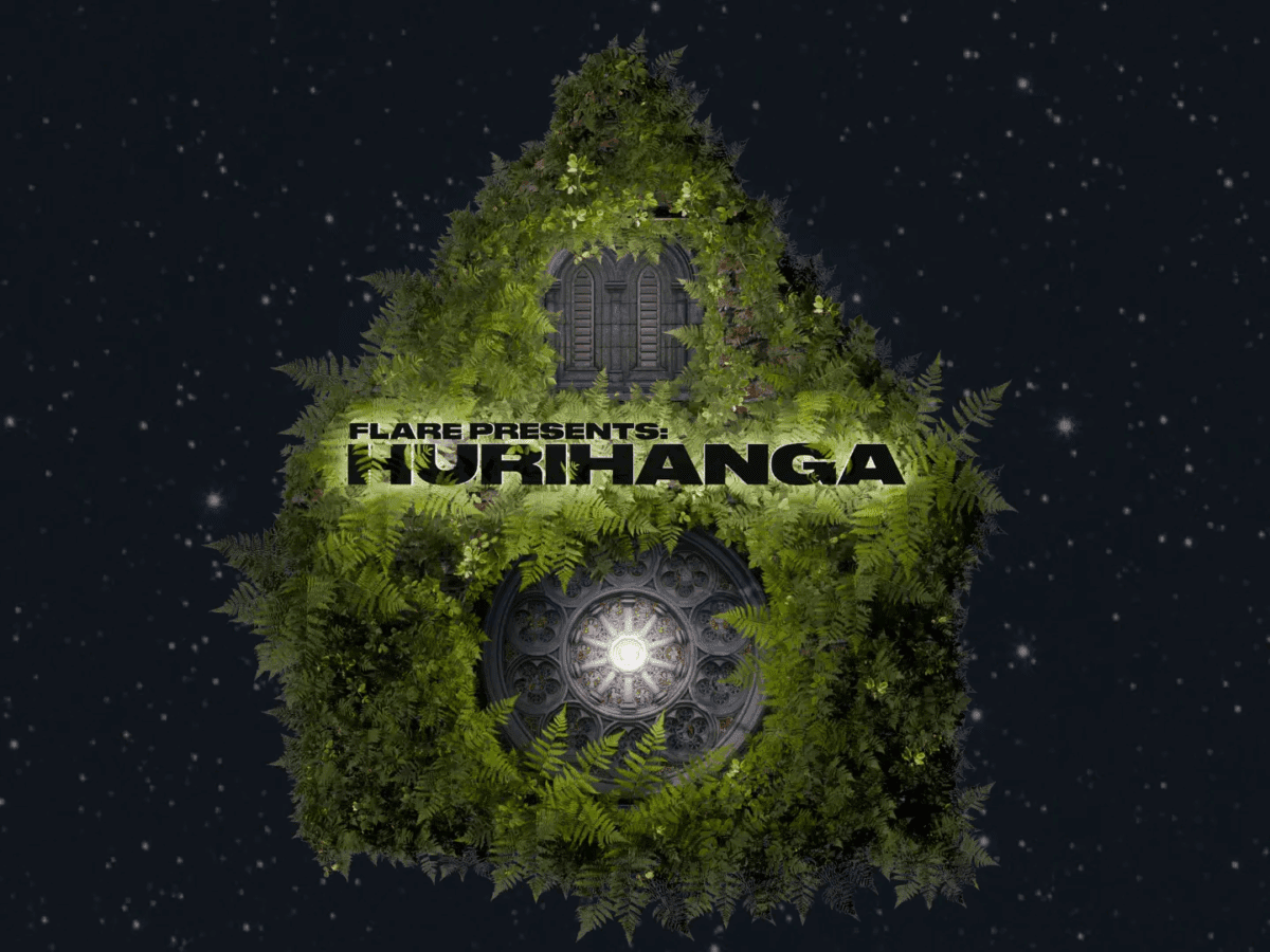
Continue reading “Flare Ōtautahi Street Art Festival 2025 – A Photo Essay Recap…”Lighting an Icon for Puanga Matariki – Flare Ōtautahi Street Art Festival, Offline Collective and Christ Church Cathedral Present Hurihanga
As part of Ōtautahi’s Matariki celebrations, the city’s most iconic heritage building has been illuminated by a powerful projection created by the Offline Collective’s Sam Emerson (Ngāi Tahu) in collaboration with collective members Michael Duggan and Charlie Pitts. Presented by Flare Ōtautahi Street Art Festival, the Christ Church Cathedral Reinstatement Project and Offline Collective, Hurihanga transforms the Cathedral’s exterior into a canvas of light, honouring stories of renewal, remembrance, and whakapapa through breathtaking visuals and mātauranga Māori.
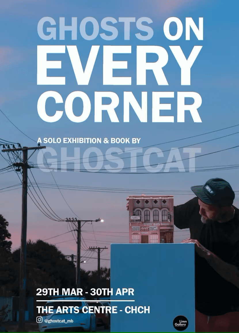
Continue reading “Lighting an Icon for Puanga Matariki – Flare Ōtautahi Street Art Festival, Offline Collective and Christ Church Cathedral Present Hurihanga”Ghost Stories: Ghostcat’s Ghosts on Every Corner Project and the Memories of a City
I might be a bit biased (Disclaimer: I was the author of the Ghosts on Every Corner book and have been involved in the project since it’s initial genesis), but it is hard to go past Ghosts on Every Corner as one of the most impactful art projects to emerge from Ōtautahi in 2025. Numbers generally don’t lie – tentative counts suggests more than 10,000 people visited the Pūmanawa Gallery space at the Arts Centre in the five week run that Ghostcat’s scratch-built recreations were on display, a huge figure for an independent project. Additionally, the book documenting and expanding the project, featuring striking photography by the super talented Dave Richards, has proven popular, selling more than 700 copies on pre-order before being placed on the bookshelves of retail outlets. It would be fair to say that Ghosts on Every Corner struck a chord.
Continue reading “Ghost Stories: Ghostcat’s Ghosts on Every Corner Project and the Memories of a City”FILTH Crew – Trains, Plains, and a Lasting Legacy…
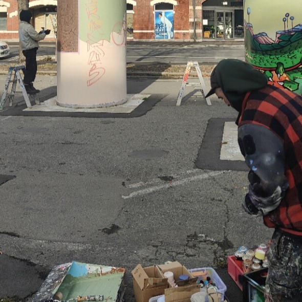
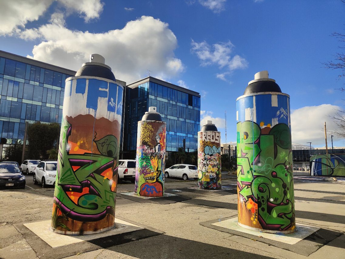
The legendary FILTH Crew are the latest artists to transform the ‘permanent’ Giant Cans on St Asaph Street! In late May, Morks, Lurq and Tepid added some fresh funk with their collaborative production that references so many of the things that have shaped this long-running, one-of-a-kind creative collective. While the cylindrical cans present a unique proposition and challenge, the FILTH Crew have long made use of unusual surfaces and environments – from city walls, to trains, to the surroundings of Te Wai Pounamu’s rivers and plains. In their work for the Giant Cans, these influences are made clear, as we found out from Morks:
“Our concept for the cans was to match all three cans. We wanted to represent the South Island, using the Southern Alps and Canterbury Plains. We chose the colour blue for the ‘FILTHS’ signature font up at the top of the cans, to represent the Southern Alps, which appear inside the letters. Our pieces’ colour schemes were based on and influenced by pounamu, being endemic to the South Island. We brought in elements of the West Coast, Fiordland, Western Southland and the Nelson Districts as well. We added the harakeke overlapping the pieces to bring all the elements of South onto the cans.” The effect is lively, meaningful and evocative of the surrounding environment just beyond the city’s doorstep. The production feels proudly familiar.
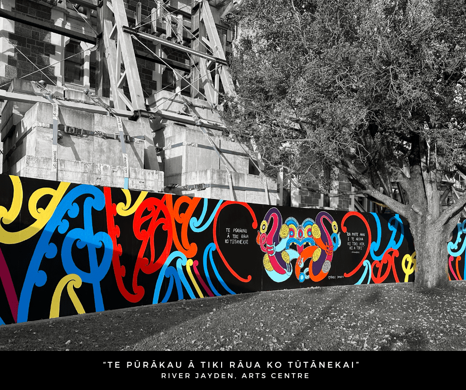
Continue reading “FILTH Crew – Trains, Plains, and a Lasting Legacy…”River Jayden’s Te Pūrakau ā Tiki rāua ko Tūtānekai – Celebrating Identity and Reclaiming Space…
Created across several weeks in late March and early April, as a celebration of Pride Month, Te Pūrakau ā Tiki rāua ko Tūtānekai – The Story of Tiki and Tūtānekai was designed and conceived by artist River Jayden (Ngāti Tahu – Ngāti Whaoa, Ngāti Maniapoto), and executed by Jayden with support from a small group of local takatāpui rangatahi.
Continue reading “River Jayden’s Te Pūrakau ā Tiki rāua ko Tūtānekai – Celebrating Identity and Reclaiming Space…”Piece of Mind – Dcypher, Graffiti Muralism and Changing Perceptions…
When the opportunity to refresh his mural on the corner of Welles Street and Colombo Street arose in late 2024, Dcypher had a few ideas in mind. The original mural, commissioned by the New Zealand Transport Agency, had become somewhat rundown, it’s large sections of flat colour filled with a variety of uninvited additions. The chance to repaint the wall, without having to respond to a cycle safety brief, allowed the artist to explore themes and styles closer to his heart.
Continue reading “Piece of Mind – Dcypher, Graffiti Muralism and Changing Perceptions…”Jacob Yikes Goes Big for Flare!
We love @larraman’s time lapse of Jacob Yikes’ massive mural on the Distinction for Flare Ōtautahi Street Art Festival – an insight into the work that goes into such a huge undertaking! Thanks to ChristchurchNZ and @larraman for this incredible footage – and to Flare and Yikes for the vision! Tallest mural in Aotearoa? Completed it mate!
Stay tuned for more Flare Ōtautahi Street Art Festival recaps!
Spotlight Version 3.0 – with Iva Anjani
The latest Spotlight work to illuminate the Gloucester Street side of Te Pae Christchurch Convention Centre is a warm, inviting scene created by local artist Iva Anjani. Further exploring the possibilities of the projected animation format, Anjani’s peaceful domestic scene was created by hand, stitching together up-cycled materials to compile the image. A painstaking process, the work is imbued with care and exudes a sense of serenity, a reminder of those places where we can find sanctuary. With the scene brought to subtle life through the wizardry of Immersive Reality’s Nick Keyse, Anjani’s work provides a soft contrast to the urban surrounding, a window of calm to contemplate. As Anjani’s first public artwork, we took the opportunity to talk to the artist about her experiences and reflections as her vision came to life…
Continue reading “Spotlight Version 3.0 – with Iva Anjani”The Giant Cans Refresh
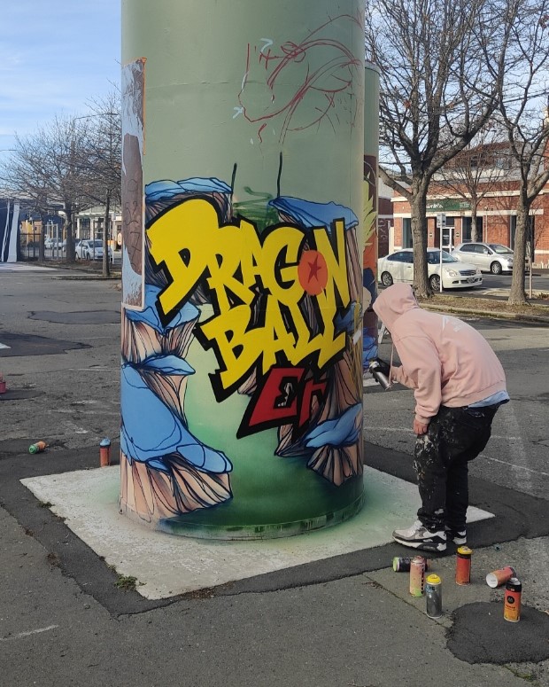
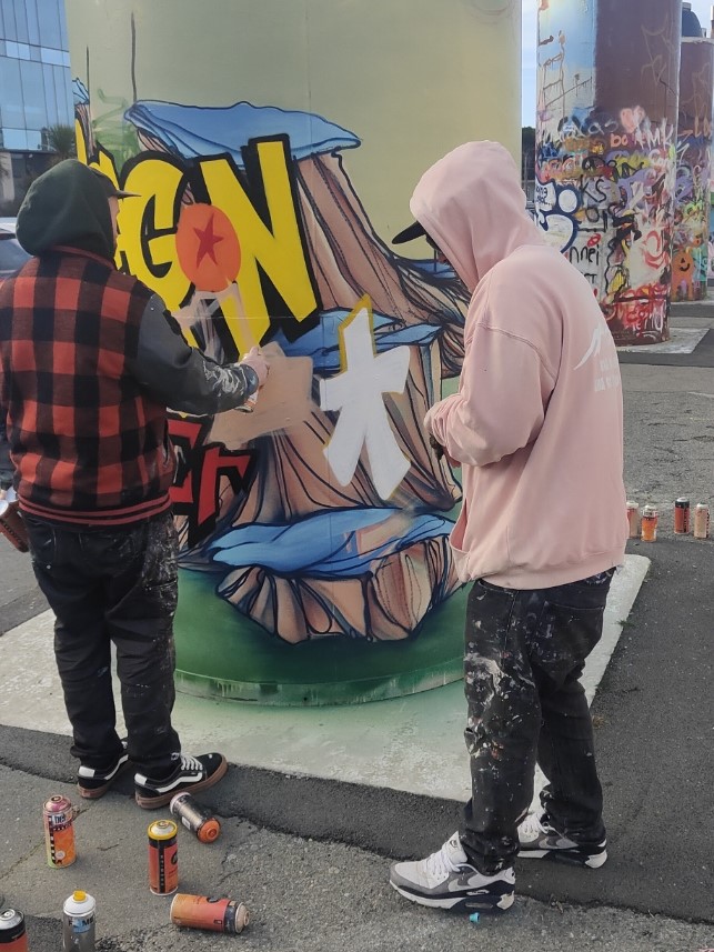
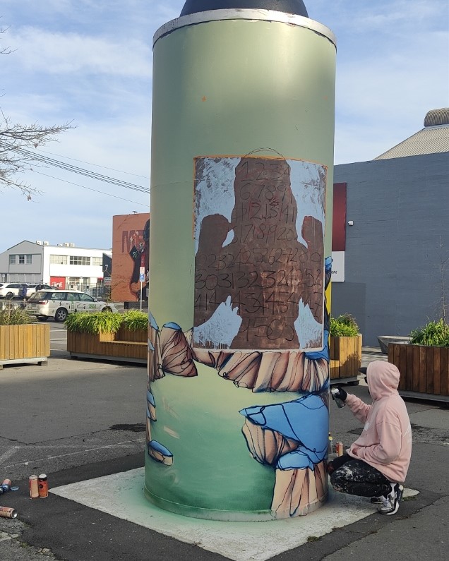
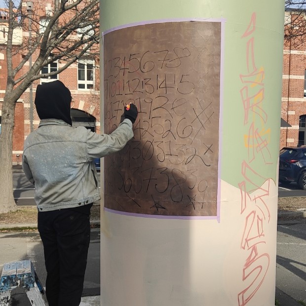
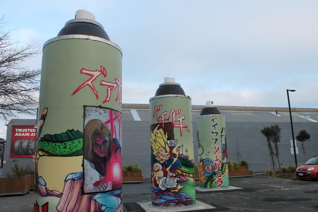
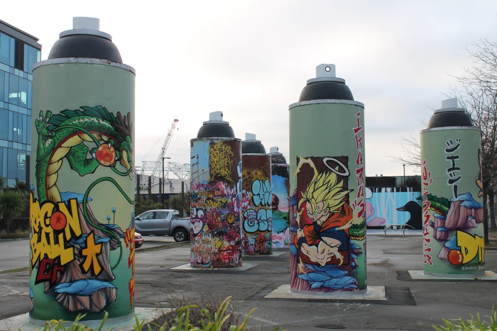
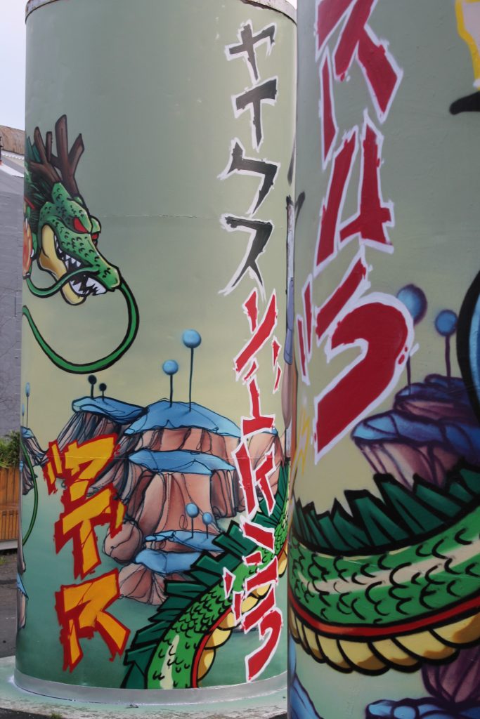
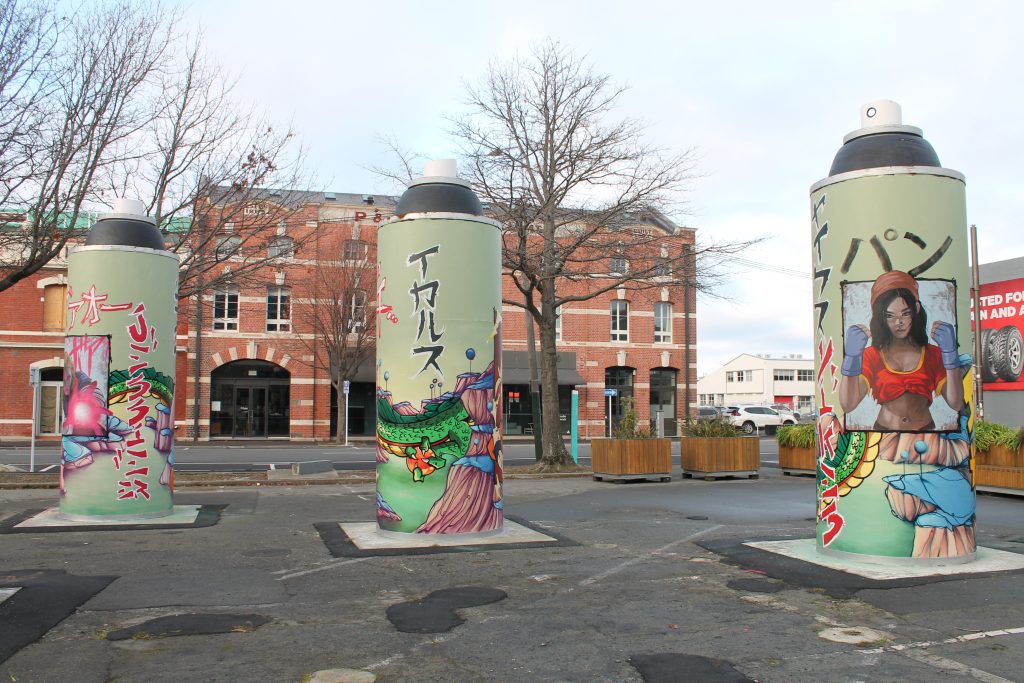
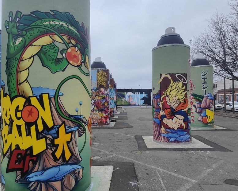
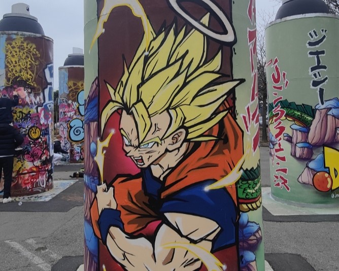
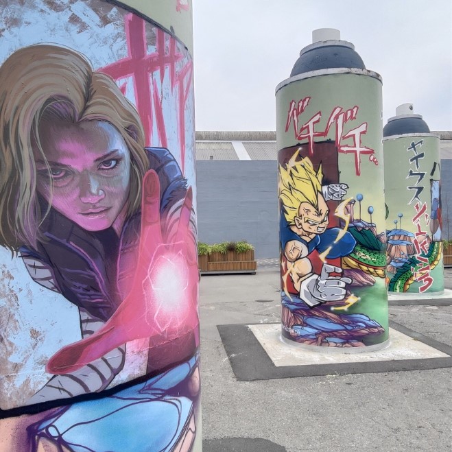
When you bring together three heavy hitting talents, the results should always be something special – and the latest refresh of the ‘permanent’ Giant Cans is testament to that truth! When we approached Ikarus, Jacob Yikes and Jessie Rawcliffe to paint the steel cylinders, we challenged them to take a different approach – rather than painting one can each, we asked the three artists to create a collaboration across the three cans. The result is stunning!
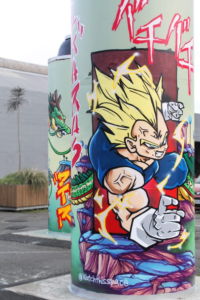
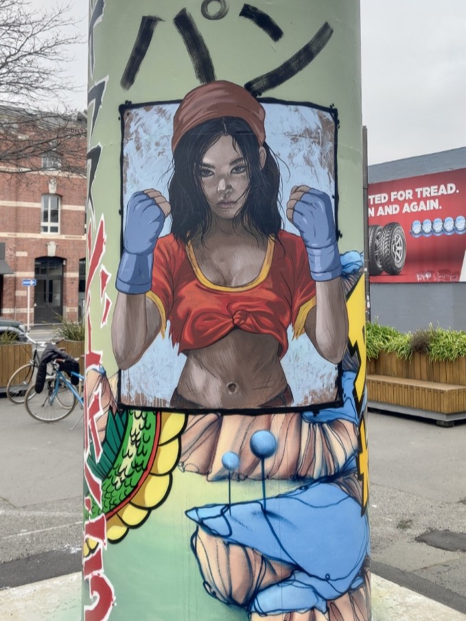
The three artists united behind a love of anime and specifically Dragon Ball – the iconic Japanese Manga – a fitting subject given the series’ creator Akira Toriyama had passed away in March 2024. The artists them considered ways to incorporate their signature styles within the familiar aesthetic of Toriyama’s world and beloved characters – exploring the potential and challenges of the circular shapes and multiple viewpoints – the result is a stunning, whirring work that is vibrant and intriguing.
Yikes’ otherworldly style is evident in the green, almost alien, landscape in which characters sit, framed as if contained within comic book panels. The giant dragon Shenron wraps around the three cans, entwining the setting within his mystical presence, clutching the magical, titular Dragon Balls. Rawcliffe’s realism is deployed to depict stylised versions of Pan and Android 18, giving new life to familiar characters. Ikarus’ graffiti traditions are evident in the bolts of text that add a sense of onomatopoeia to the scene, an energetic presence. Traditional representations of Goku and Vegeta, perhaps two of the most famous characters in the saga, and the cat-like Puar, add to the scene.
The various aspects combine into a cohesive production, but also present the need to move about, to explore different vantage points and lines of sight. Time to see it for yourself!
Photos by Watch This Space and Jessie Rawcliffe
