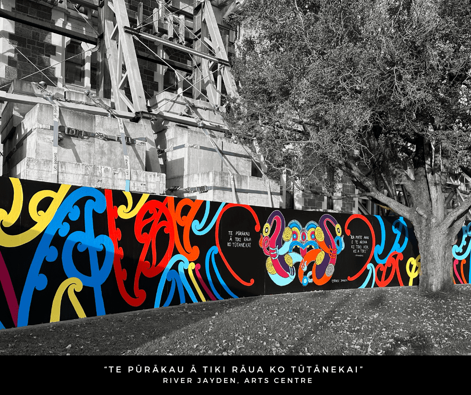
Created across several weeks in late March and early April, as a celebration of Pride Month, Te Pūrakau ā Tiki rāua ko Tūtānekai – The Story of Tiki and Tūtānekai was designed and conceived by artist River Jayden (Ngāti Tahu – Ngāti Whaoa, Ngāti Maniapoto), and executed by Jayden with support from a small group of local takatāpui rangatahi.
Continue reading “River Jayden’s Te Pūrakau ā Tiki rāua ko Tūtānekai – Celebrating Identity and Reclaiming Space…”Category: New Works Coming Up
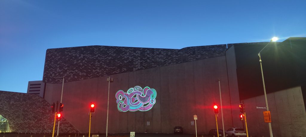
Piece of Mind – Dcypher, Graffiti Muralism and Changing Perceptions…
When the opportunity to refresh his mural on the corner of Welles Street and Colombo Street arose in late 2024, Dcypher had a few ideas in mind. The original mural, commissioned by the New Zealand Transport Agency, had become somewhat rundown, it’s large sections of flat colour filled with a variety of uninvited additions. The chance to repaint the wall, without having to respond to a cycle safety brief, allowed the artist to explore themes and styles closer to his heart.
Continue reading “Piece of Mind – Dcypher, Graffiti Muralism and Changing Perceptions…”Jacob Yikes Goes Big for Flare!
We love @larraman’s time lapse of Jacob Yikes’ massive mural on the Distinction for Flare Ōtautahi Street Art Festival – an insight into the work that goes into such a huge undertaking! Thanks to ChristchurchNZ and @larraman for this incredible footage – and to Flare and Yikes for the vision! Tallest mural in Aotearoa? Completed it mate!
Stay tuned for more Flare Ōtautahi Street Art Festival recaps!
Spotlight 3.0 – with Iva Anjani

The latest Spotlight work to illuminate the Gloucester Street side of Te Pae Christchurch Convention Centre is a warm, inviting scene created by local artist Iva Anjani. Further exploring the possibilities of the projected animation format, Anjani’s peaceful domestic scene was created by hand, stitching together up-cycled materials to compile the image. A painstaking process, the work is imbued with care and exudes a sense of serenity, a reminder of those places where we can find sanctuary. With the scene brought to subtle life through the wizardry of Immersive Reality’s Nick Keyse, Anjani’s work provides a soft contrast to the urban surrounding, a window of calm to contemplate. As Anjani’s first public artwork, we took the opportunity to talk to the artist about her experiences and reflections as her vision came to life…
Continue reading “Spotlight 3.0 – with Iva Anjani”The Giant Cans Refresh
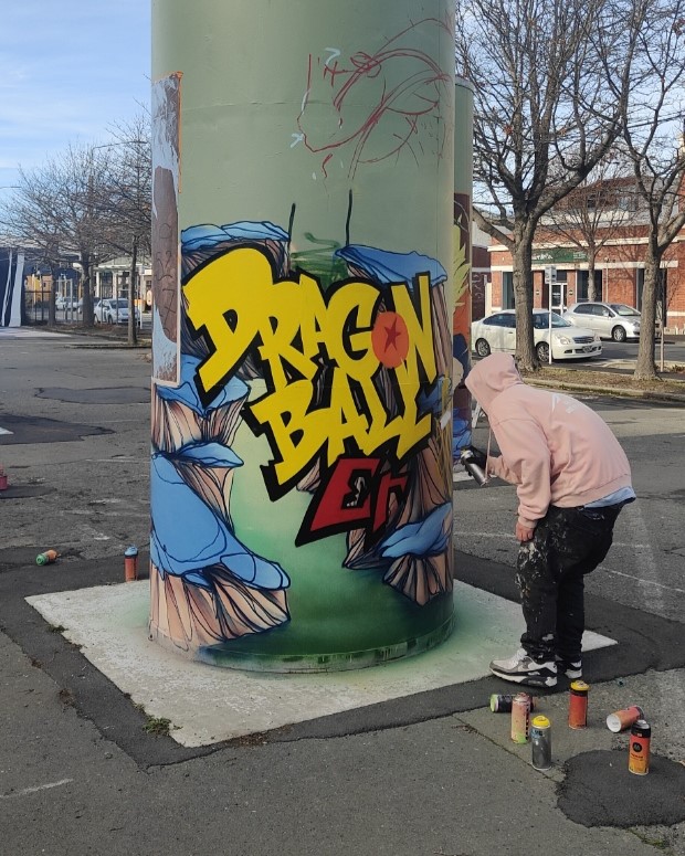
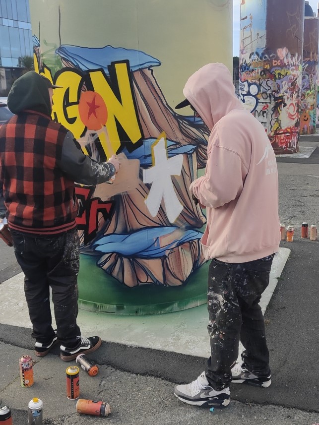
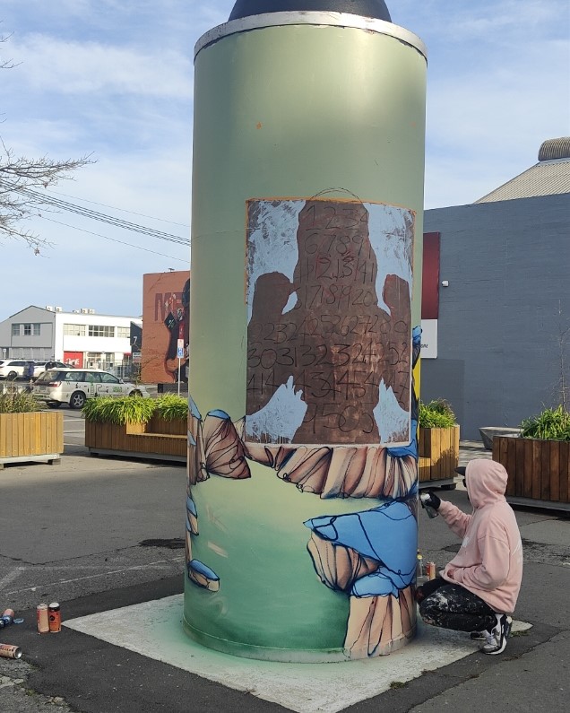
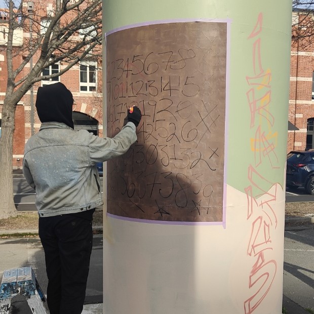
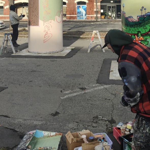
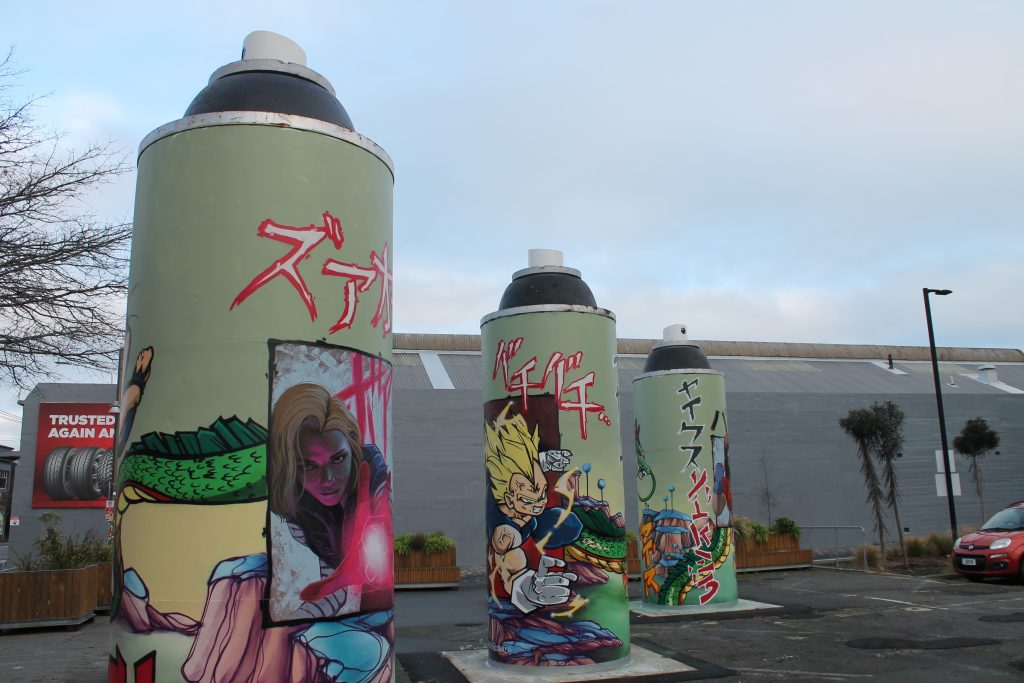
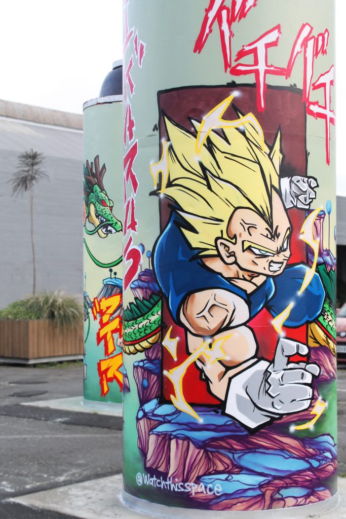
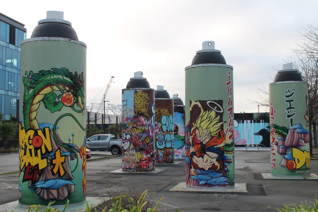
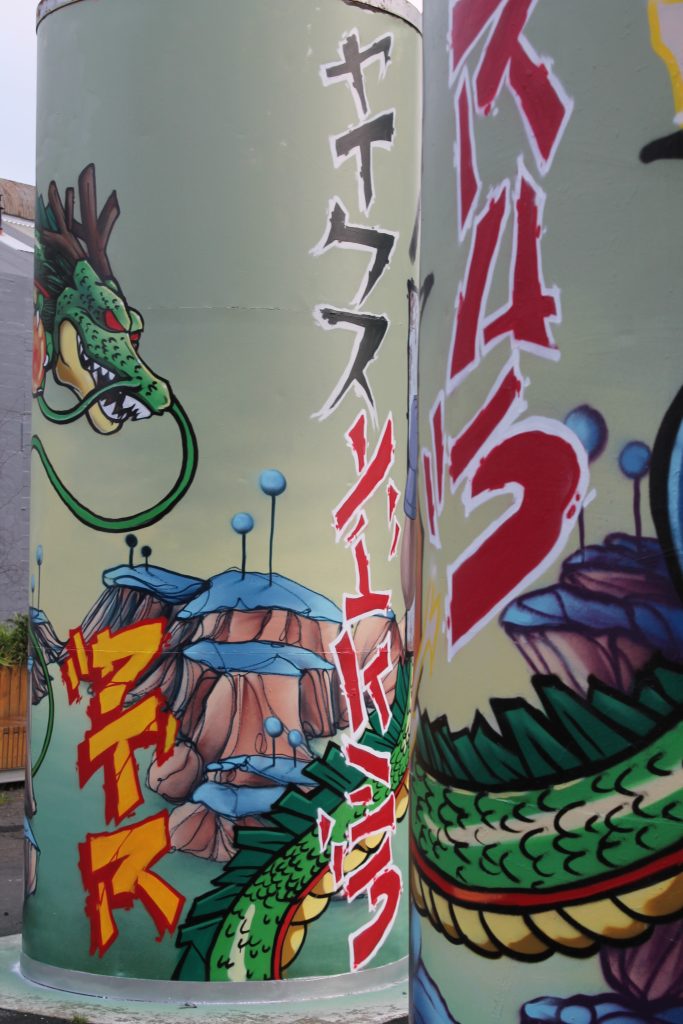
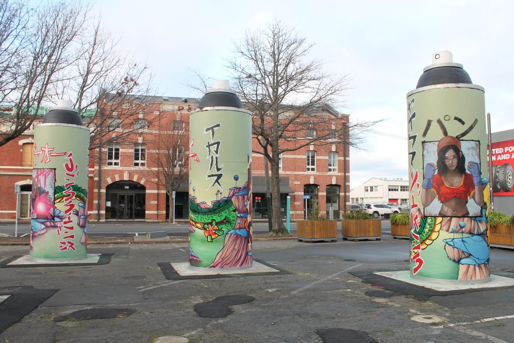
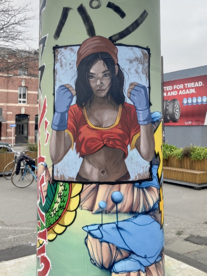
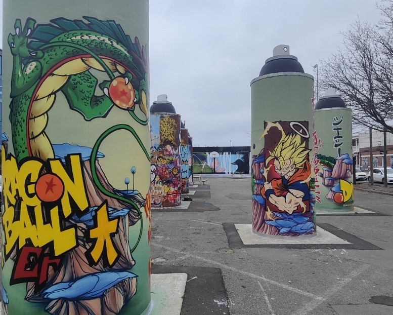
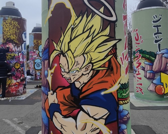
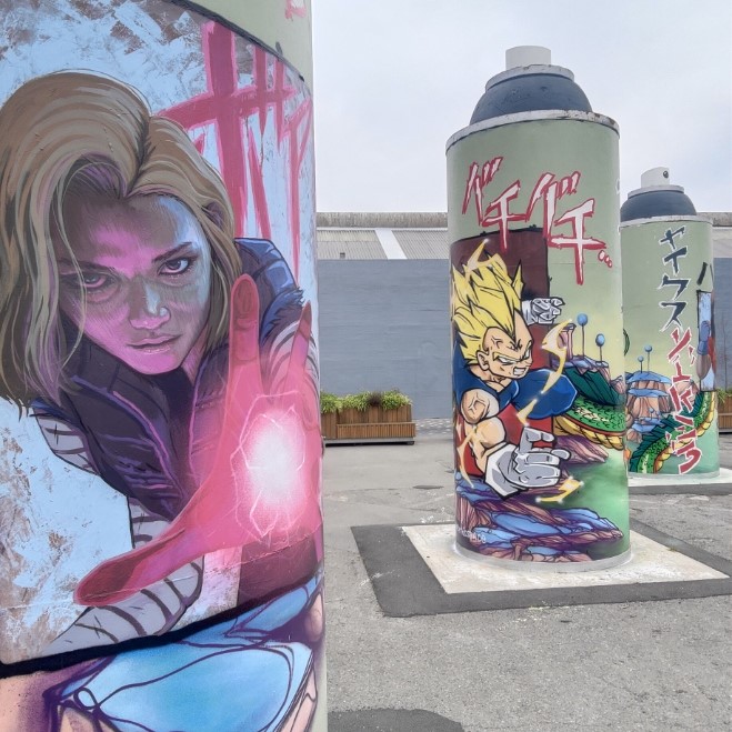
When you bring together three heavy hitting talents, the results should always be something special – and the latest refresh of the ‘permanent’ Giant Cans is testament to that truth! When we approached Ikarus, Jacob Yikes and Jessie Rawcliffe to paint the steel cylinders, we challenged them to take a different approach – rather than painting one can each, we asked the three artists to create a collaboration across the three cans. The result is stunning!
The three artists united behind a love of anime and specifically Dragon Ball – the iconic Japanese Manga – a fitting subject given the series’ creator Akira Toriyama had passed away in March 2024. The artists them considered ways to incorporate their signature styles within the familiar aesthetic of Toriyama’s world and beloved characters – exploring the potential and challenges of the circular shapes and multiple viewpoints – the result is a stunning, whirring work that is vibrant and intriguing.
Yikes’ otherworldly style is evident in the green, almost alien, landscape in which characters sit, framed as if contained within comic book panels. The giant dragon Shenron wraps around the three cans, entwining the setting within his mystical presence, clutching the magical, titular Dragon Balls. Rawcliffe’s realism is deployed to depict stylised versions of Pan and Android 18, giving new life to familiar characters. Ikarus’ graffiti traditions are evident in the bolts of text that add a sense of onomatopoeia to the scene, an energetic presence. Traditional representations of Goku and Vegeta, perhaps two of the most famous characters in the saga, and the cat-like Puar, add to the scene.
The various aspects combine into a cohesive production, but also present the need to move about, to explore different vantage points and lines of sight. Time to see it for yourself!
Photos by Watch This Space and Jessie Rawcliffe
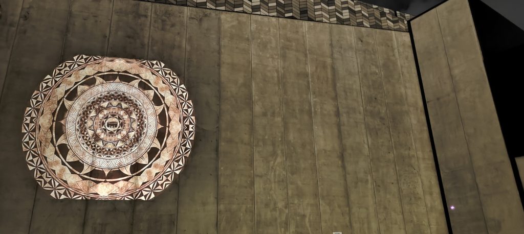
Spotlight 3.0 – Monti Masiu’s ‘api
We are excited to ;launch the third iteration of our Spotlight series – introduced a new roster of artists to illuminate the city after dark with their striking artworks!
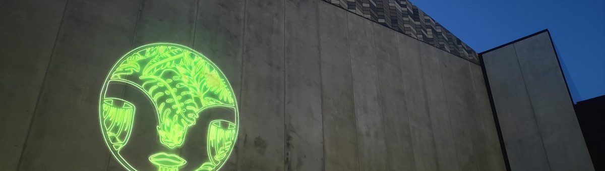
The first work to come to life for Spotlight 3.0 is Monti Masiu’s ‘api – a circular image that reflects the artist’s exploration of his Tongan heritage, inspired by the traditional forms and iconography of ngātu (bark cloth) and tatatau (tattoo), and centred around the symbolic importance of the kava bowl, representative of community. The image builds outward through numerous layers of sepia-toned circles and imagery, the work is at once honoring of tradition and something new.
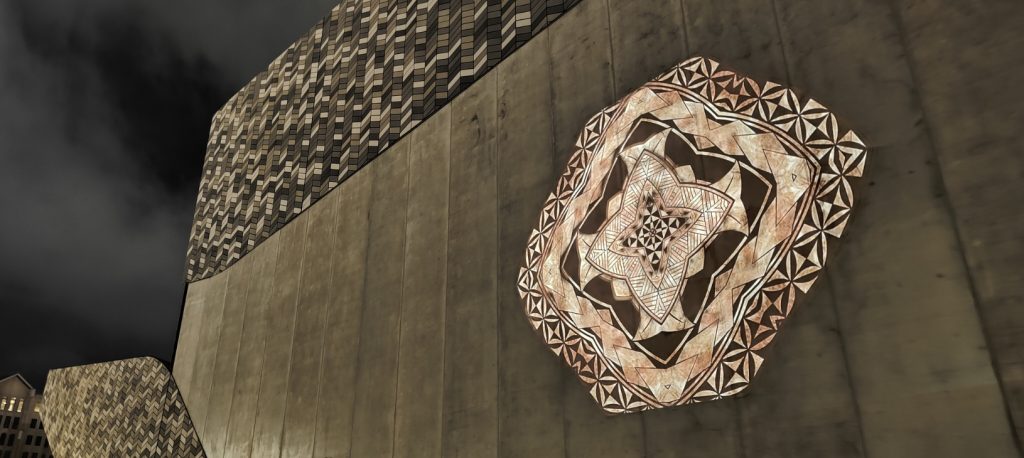
That newness is made apparent in the collaborative aspect, Nicholas Keyse from Immersive Reality bringing the static image to animated life, producing a kaleidoscopic effect that suggests new forms and possibilities as it slowly reveals Masiu’s image. The revolving image is mesmirising as it plays out, slowly filling an increasingly large section of wall before receding again and eventually disappearing before playing through again, the loop reflective of the stories passed through generations, linking us to ancestors and our future.
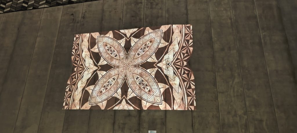
This is a work that needs to be seen in person, so head down to the Colombo Street exterior of Te Pae – Christchurch Convention Centre after dark and take it all in…
Stay tuned for the next Spotlight work in the coming weeks!
Spotlight 3.0 is made possible with funding from the Christchurch City Council’s Place partnership Fund, with additional support from Rau Paenga Ltd, Phoenix PDP and Ōtautahi NZ.
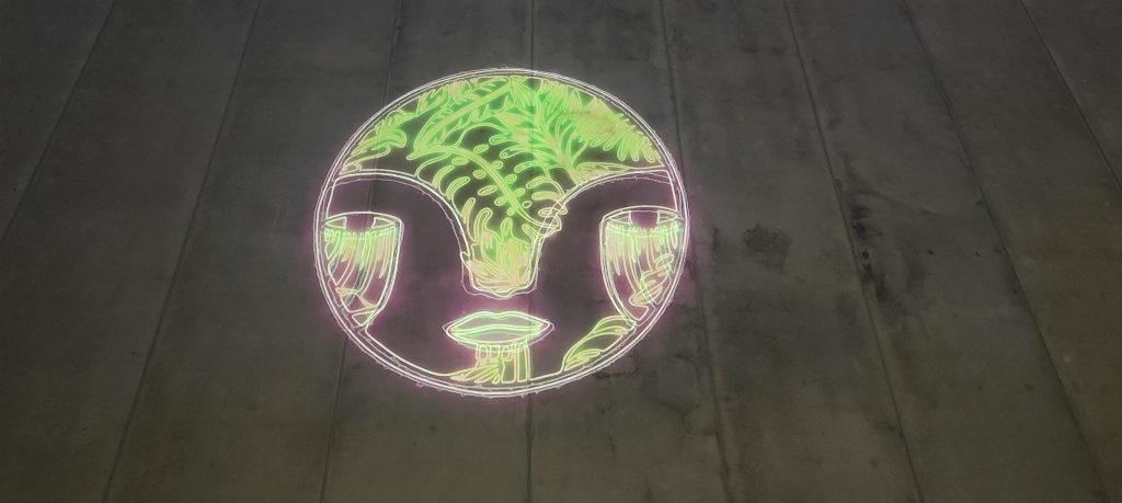
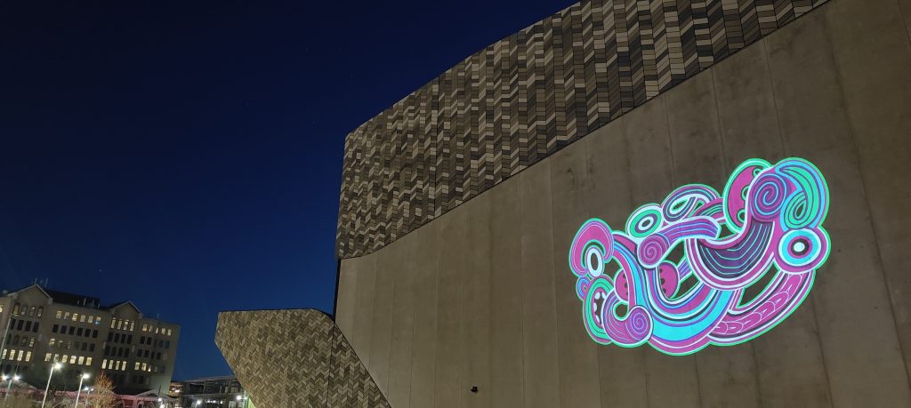
Spotlight – Jen_Heads sparkles…
The latest projection in our Spotlight series is a truly mesmerising addition – a rotation of fiery, glowing and ruminative icons by local artist Jen_Heads, brought to energetic life by Sam Emerson from Offline Collective. Jenna Ingram’s Jen_Heads have become a recurring form in her work, appearing on canvas, paper, and walls, now given life through the Spotlight collaboration.
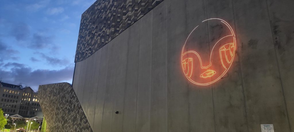
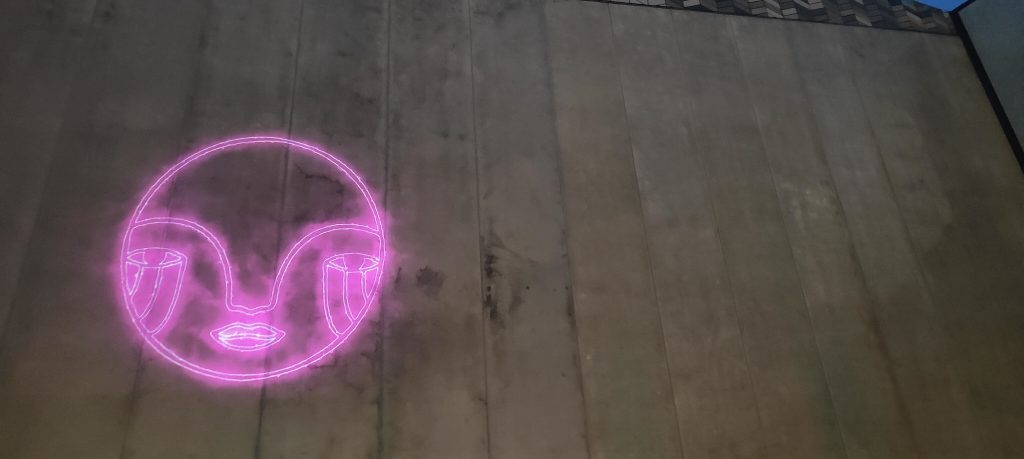
The dazzling Jen_Heads animation embodies the profound connection between humanity and the natural
world. The work is a fresh imagining of Ingram’s titular urban icon, a form of endless possibility. The animation evolves through four stages, as the artist explains: “the initial two heads symbolize the essence of human nature with the heads pulsing like a heartbeat, seamlessly transitioning into our harmonious integration with the natural world, as depicted in the flora and fauna heads.” The shift from energetic flames of purple to serene green provides a sense of relieving calm, reward for a more attuned
relationship with the organic environment. Ingram continues: “the concluding pair of heads
signifies the spiritual dimension of our existence, reflecting our deep-rooted ties to ancient
wisdom and ancestral heritage. This artistic representation underscores the fundamental unity
that binds us all together.” Standing in front of the evolving animation, one is struck by the sense of humanity and elemental connections.
Ōtautahi artist Jenna Lynn Ingram, also known as Jen_Heads, holds a Bachelor of Fine Arts from
the University of Canterbury, where her interest in the urban landscape as a site of influence
blossomed. In the wake of the Christchurch Earthquakes, her work shifted to the streets, a
transition that led her to form Aotearoa’s leading urban art gallery Fiksate Gallery. Ingram’s work
has been exhibited and collected throughout Aotearoa and she has been featured in festivals
and exhibitions such as Spectrum (2014) and SHIFT: Urban Art Takeover (2023).
Offline Collective is a visual creative agency based in Ōtautahi, Aotearoa.
Offline is engaged in a range of creative endeavours, constantly exploring new possibilities
through the lens of technology. Offline Collective’s work ranges from live touring visuals and art
installations, to graphic and motion design, combining diverse creative fields to unlock new
ideas.
Spotlight – Urban Art Projections is a collaboration between Watch This Space and ChristchurchNZ, providing a fresh approach to urban creativity for talented local artists. Connecting visual artists with digital creatives, Spotlight explores the potential of projection works, illuminating the exterior of Te Pae Christchurch Convention Centre.
Spotlight 2.0 – Jimirah Baliza’s Get a Grip
The fourth installation of this female-centric Spotlight series, Ōtautahi artist and designer Jimirah Baliza’s Get a Grip, is a playful invitation to passers-by; an invitation to pause and immerse ourselves in a scene that transcends our immediate experience. The animated depiction of a retro arcade claw machine embodies the unpredictable nature of life, reminding us that it is often filled with both anticipation and uncertainty, ups and downs, near misses and satisfying successes. Anyone who has played such a game knows the hope, the excitement, the calculation, the frustration, and ultimately either the disappointment or the elation of the challenge. Drawing on this universal connection, Baliza presents a whimsical moment of candy floss pink and baby blue nostalgia, transporting us back to a time of innocence and wonder, where the act of winning a prize was a heart-pounding adventure.
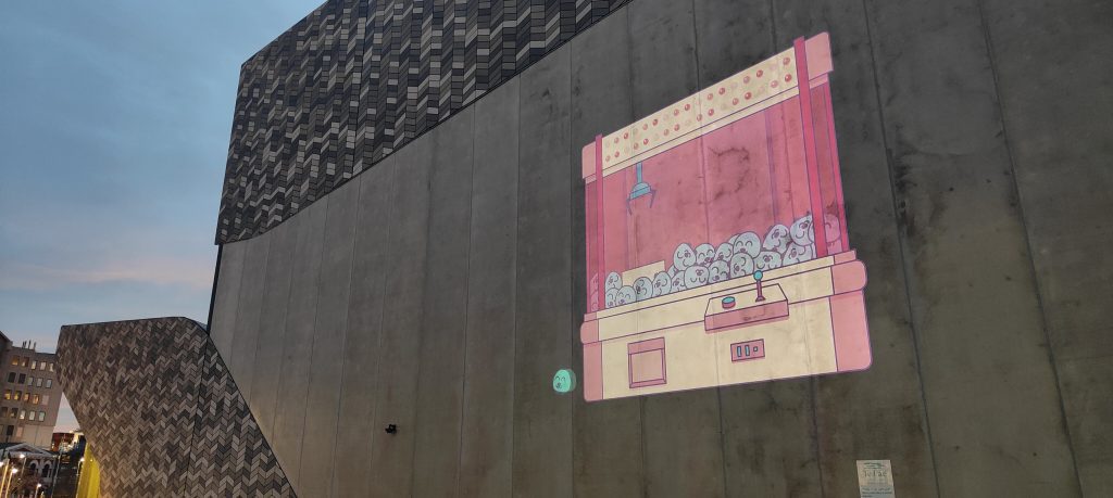
Get a Grip plays through the experience of the game on a loop of attempts, at first failing, the prize slipping from the metal claw, but eventually succeeding, creating a crescendo of joy following the spilled first attempts. The smile as the ‘prize’ toddles off from the machine. The prizes themselves, cheerful animal characters, serve as smiling participants in the challenge. They become echoes of community, networks of support with the ability to uplift each other. We are encouraged to keep on, to go again, to get our rewards and to revel in that success.
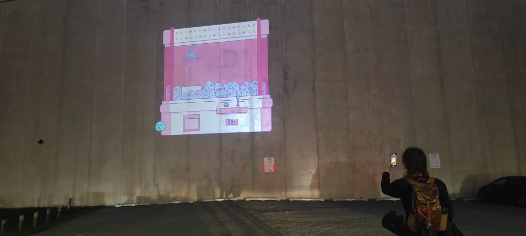
Jimirah Baliza is an Ōtautahi Christchurch-based independent graphic designer, illustrator and artist. Raised in Manila, Baliza is a creative problem solver at heart, with a passion for working with entrepreneurs, local businesses, community groups and organisations, enhancing their visual communications and their ability to engage, empower and educate across print, screen and space. Get a Grip was once again supported by local legend Nicholas Keyse. Pushing the limits of graphics technology while incorporating traditional techniques, Keyse founded Immersive Reality Ltd after working extensively in the print and digital design industry. Showcasing his work in exhibitions, Keyse held a solo exhibition at the Centre of Contemporary Arts’ Lux Gallery in Christchurch in 2019. Co-founder and curator of record label Subtle Recordings, he is also well-known for his prolific production of music posters with which he hopes to continue to inspire future creatives.
Spotlight – Urban Art Projections is proudly presented by Watch This Space in collaboration with ChristchurchNZ. This iteration of Spotlight proudly shines a light on the diverse work of four talented female Ōtautahi artists – exploring new possibilities for urban creativity and adding a surprising twist to the city after dark! The Spotlight 2.0 project was completed with support from the Hine te Hiringa – Empower Women Utilising FIFA Women’s World Cup 2023 Fund to help celebrate and empower women.
Spotlight 2.0 – Bloom’s Wall of Blooms
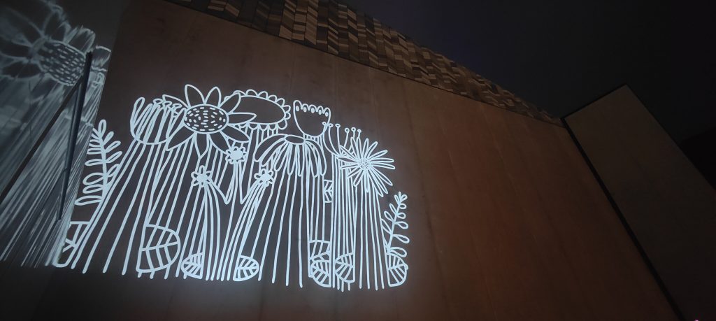
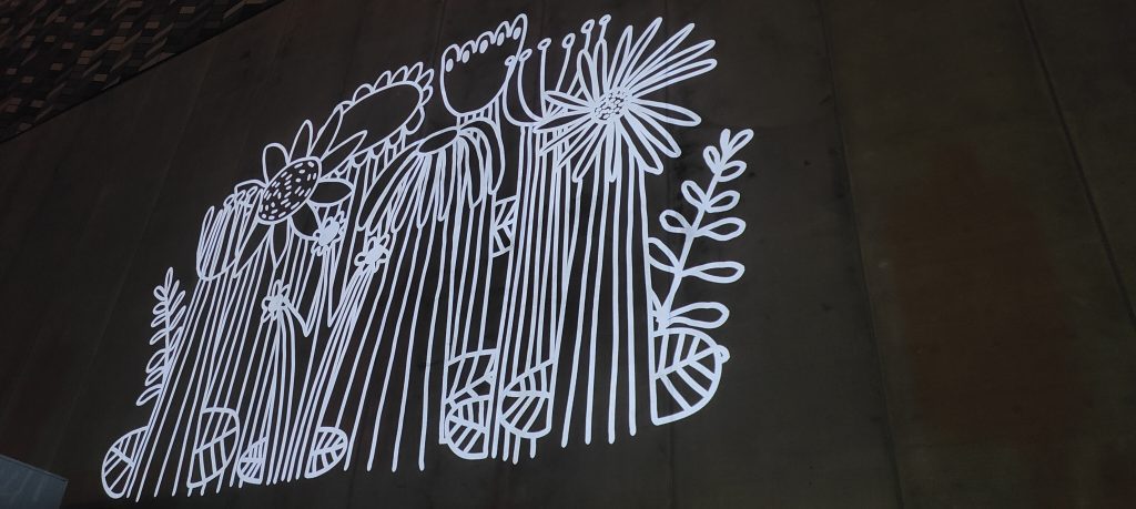
The third work presented as part of the Spotlight project went live on the last day of August – urban gardener Bloom‘s Wall of Blooms another beautiful addition to the series. Multi-disciplinary artist, designer, curator and all-round powerhouse Bloom’s urban flowers have appeared in a variety of sizes, forms and locations across the city for several years now, from small drawings, paste-ups and painted wooden blocks, to the Paste-Up Project bollard and the recent production of a large mural at QB Studios on St Asaph Street. Wall of Blooms adds another incarnation of the artist’s work to Ōtautahi’s streets, the animated digital illustration a truly mesmerising apparition on the side of Te Pae – Christchurch Convention Centre.
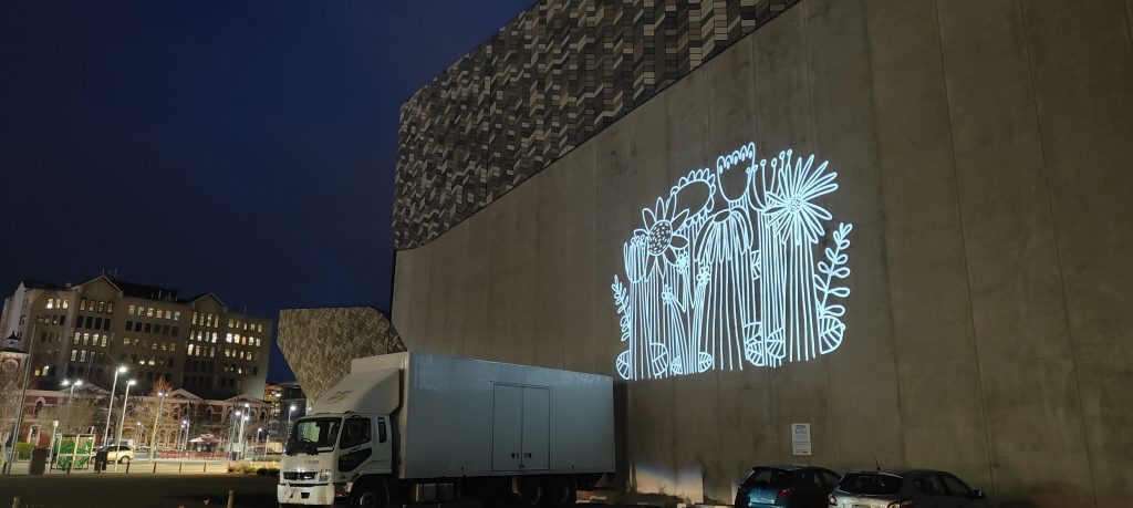
The white line illustration, once again animated by digital artist Nicholas Keyse from Immersive Reality, comes to life on the wall, growing and blooming in front of the viewer, before gently swaying and evenutally receding, playing out a full life cycle. Inspired by the urban gardeners of Ōtautahi and the beauty of nature, Wall of Blooms reflects our ever-changing cityscape and the determination of nature
amidst the concrete, instilling a sense of wonder and appreciation for life’s precious
moments. The subtle movement suggests liveliness and the endurance of nature, thriving in an environment constructed to deny its existence. These blooms, huge in scale, are testament to persistence. The grouping also suggests ideas of community and our own ability to thrive through our networks of support.
Wall of Blooms invites us to pause and to observe the flowers’ growth, fostering a connection
with nature and celebrating the simple yet stunning elements of life that surround us every day. A
poignant reminder of the resilience and beauty found in unexpected places, Wall of Blooms
prompts us to cherish the present while encouraging collective efforts to support nature’s
growth and, by extension, our own ability to flourish, to find strength and joy within ourselves. Simple things really are the most powerful.
Spotlight – Urban Art Projections is proudly presented by Watch This Space and ChristchurchNZ.
Spotlight 2.0 specifically shines a light on the diverse work of four talented female Ōtautahi artists – exploring new possibilities for urban creativity and adding a surprising twist to the city after dark! The Spotlight project was completed with support from the Hine te Hiringa – Empower Women Utilising FIFA Women’s World Cup 2023 Fund to help celebrate and empower women.
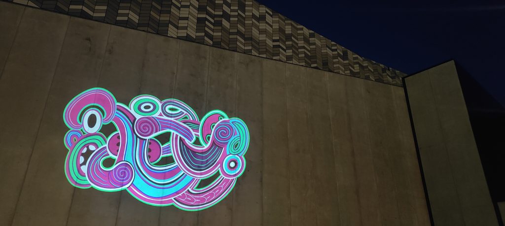
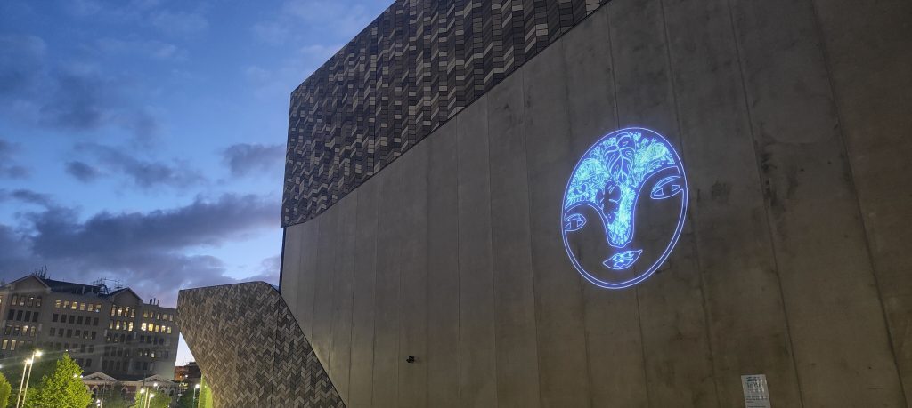
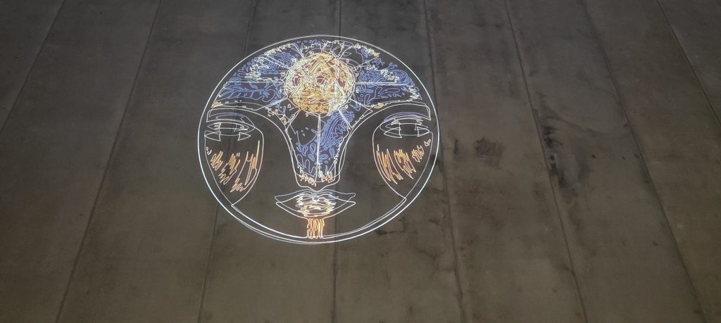
Spotlight 2.0 – River Jayden’s Te Tihi o Kahukura

The second work of our Spotlight 2.0 series is now live and illuminating the exterior of Te Pae – Christchurch Convention Centre with vibrant light and alluring movement. Artist River Jayden‘s stunning Te Tihi o Kahukura showcases the beauty of toi Māori, while adding a bright contemporary twist. Jayden explains that ‘Te Tihi o Kahukura’ translates to ‘The Citadel of Kahukura’ or the pinnacle of the rainbow. In te reo Māori, Kahukura is one of the names given for a rainbow, and it is said, specifically the arch of a rainbow. Te Tihi o Kahukura is also the first name of Castle Rock, the famous outcrop on
Summit Road. Kahukura, a spirit guardian, is an important figure in the Kāi Tahu (Ngāi Tahu) creation
story. To Kāi Tahu, Kahukura is an atua (god) and the decorator of the whenua (land), bringing
light, colour and beauty to all surroundings. Jayden’s work acknowledges Kāi Tahu as mana
whenua, while emphasizing the importance of Kāi Tahu oral traditions and Mātauranga Māori
(Māori knowledge). Drawing on traditional design elements and employing strong line work, the bold use of colour, essentially neon-like, adds a contemporary flair. Nicholas Keyse’s slow, understated animation, including a blinking eye and fluid movement, imbues Jayden’s work with a calm, yet fascinating quality, drawing the viewer in. Te Tihi o Kahukura is visible from distance, a beacon calling forth and reflecting our region’s history, beauty and future.
River Jayden (Ngāti Tahu – Ngāti Whaoa, Ngāti Tuwharetoa & Ngāti Maaniapoto) is a painter
and graphic designer who uses traditional Māori toi (art) and design within a contemporary
context. Te Tihi o Kahukura was developed with support from digital artist Nicholas Keyse, founder of Immersive Reality Ltd.
Spotlight 2.0 shines a light on four talented female Ōtautahi artists, giving their work a new platform, projecting animated pieces on the exterior of Te Pae. With a diverse range of artists, displaying unique visual and thematic interests, Spotlight 2.0 illuminates our powerful creative communities and raises new possibilities in the cityscape. Spotlight 2.0 is supported by ChristchurchNZ and the Hine te Hiringa – Empower Women Utilising FIFA Women’s World Cup 2023 Fund to help celebrate and empower
women.