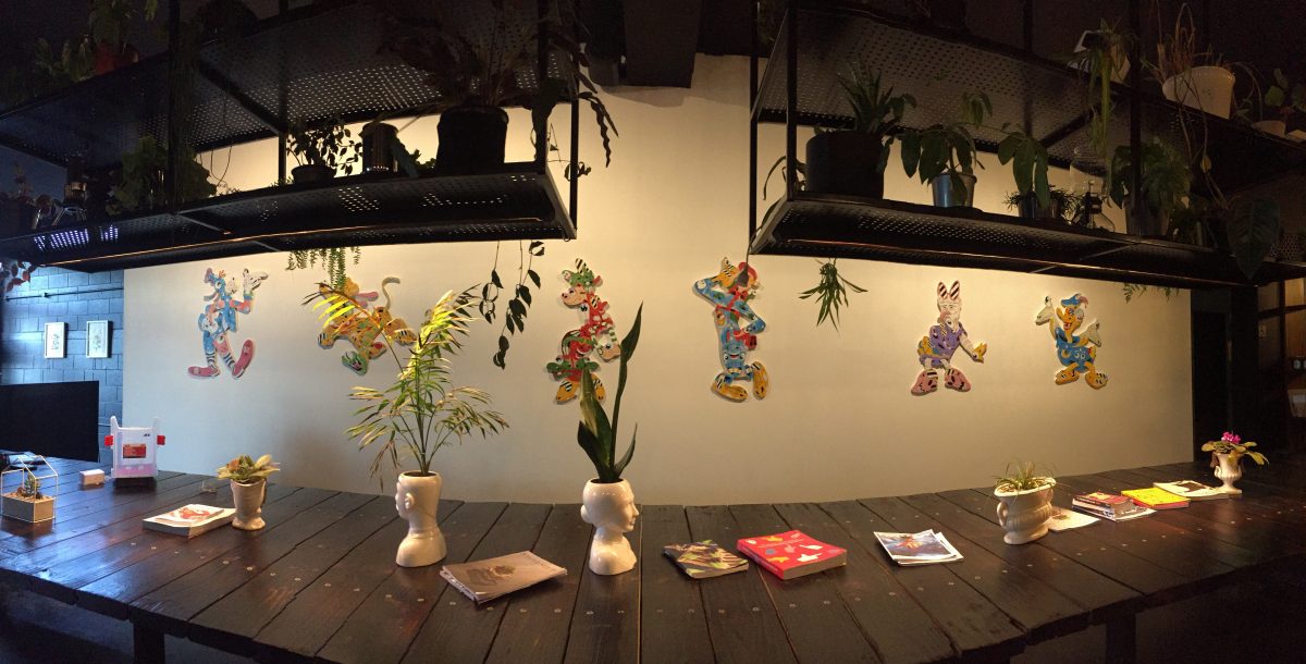
We welcome Ōhinehou Lyttelton based artist Jonny Waters as our latest contributor to TUNE! Jonny is one of the founding figures behind Ōtepoti Hip Hop Hustle – a celebration of the culture’s various realms, and can sometimes (maybe) be found spinning tracks at a certain port village spot, so it is no surprise music is a vital ingredient in his creative profile. But it isn’t just hip hop – like his visual art practice, Jonny’s musical influences extend beyond beats, into the energy of punk, the atmosphere of indie, and a selection of classics. Read on to discover his album selections as our artist-created playlist continues to grow…
Continue reading “TUNE! with Jonny Waters”Tag: Jonny Waters
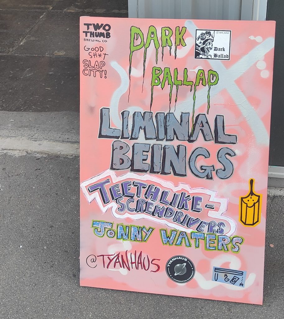
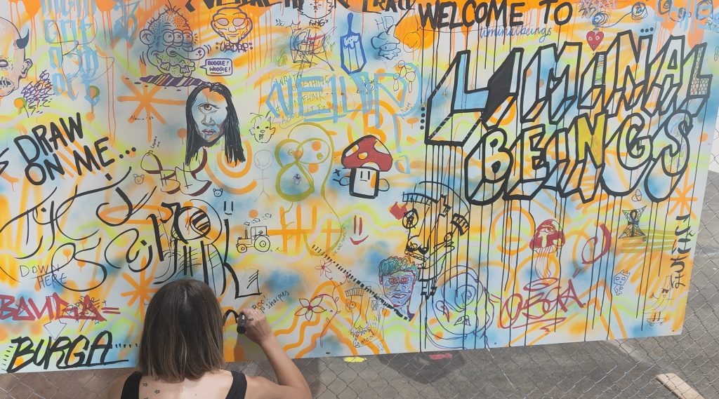
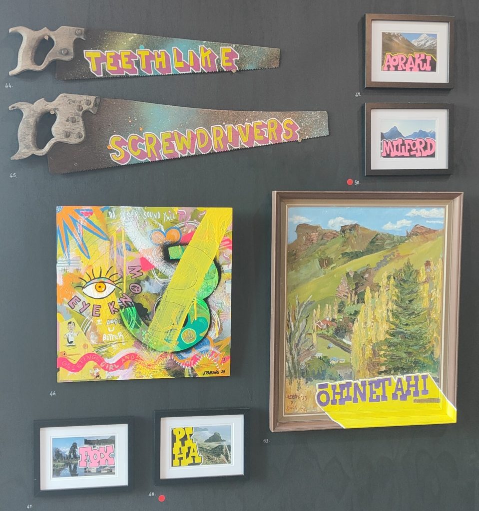
Showtime! Liminal Beings @ TyanHAUS, Friday 18 February 2023
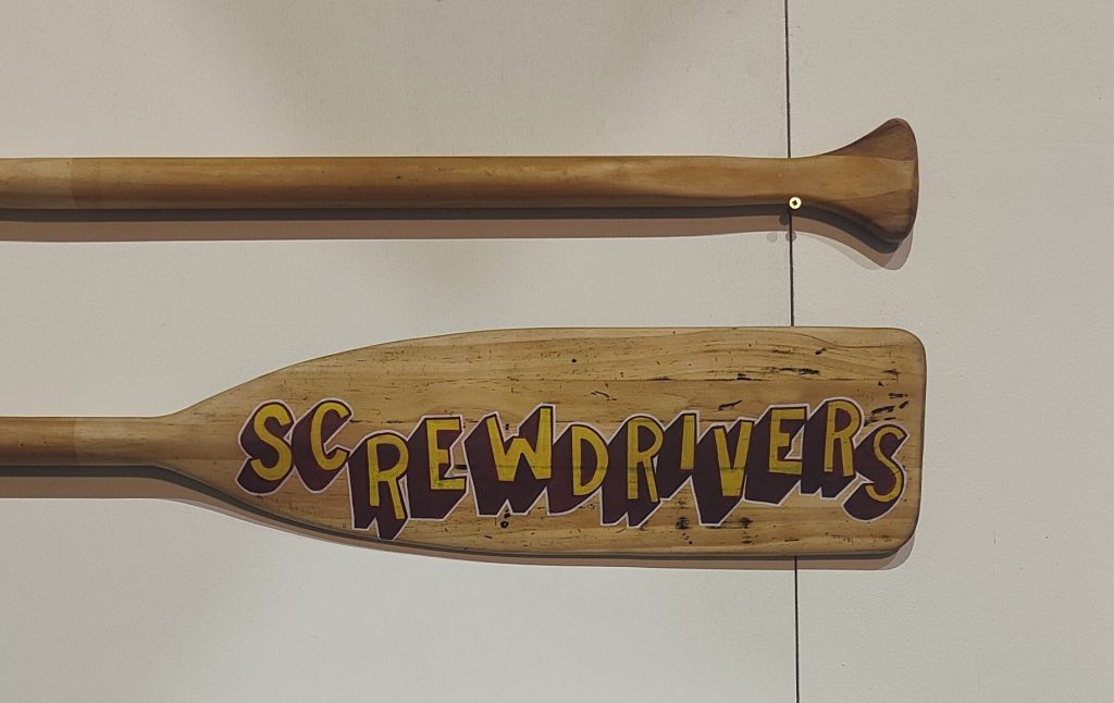
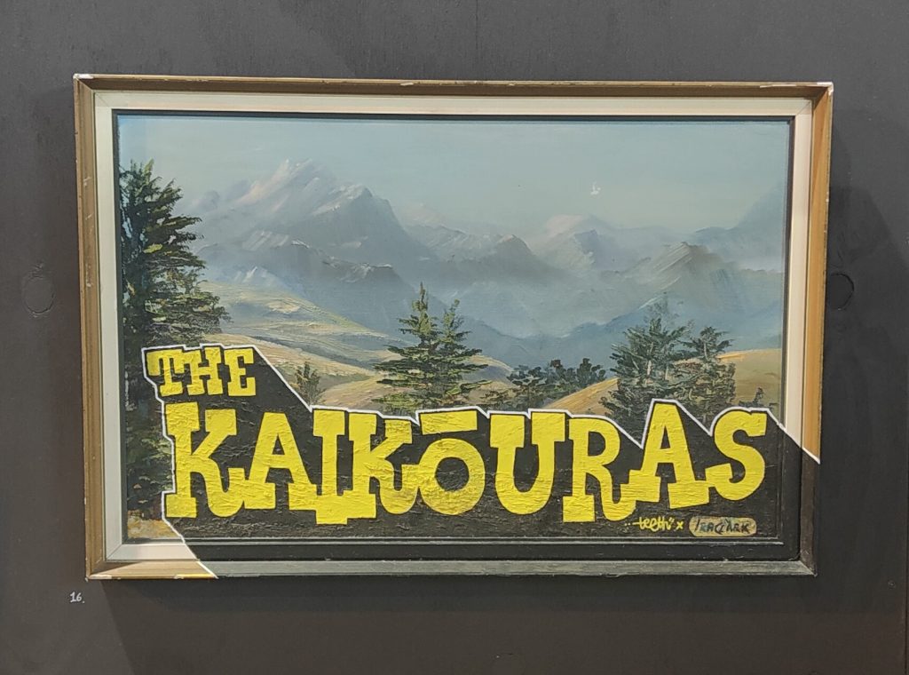
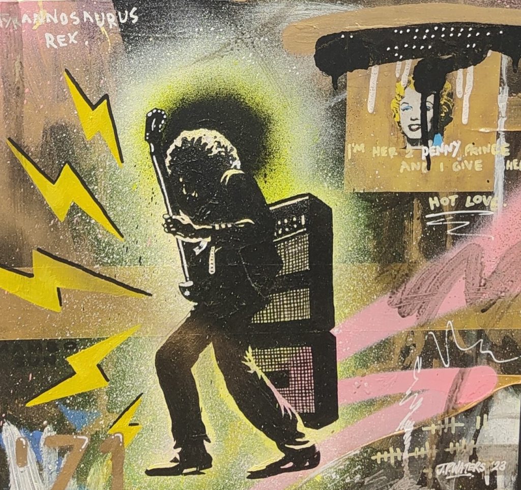
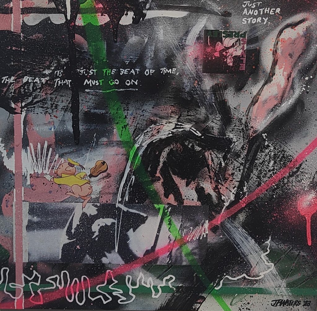
Friday, 18th February saw the opening of the collaborative exhibition Liminal Beings – a collection of work by Jonny Waters, Dark Ballad (Joe Clark) and teethlikescrewdrivers at TyanHAUS. While the mix may not seem like an obvious one, the infusion of pop and urban culture – from Dark Ballad’s skateboard decks referencing iconic cinema (the carpet of the Overlook Hotel a particular favourite), to Waters’ remixed album cover paintings and, of course, teethlikescrewdrivers’ treasure trove of repurposed objects, from old maps to place mats, cricket bats and more, provided a sense of chaotic unity. The placement of each artists’ work interspersed rather than delineated into separate sections added to the overall effect. With aspects of typography, punky, gestural expressionism, and clean, graphic design work, Liminal Beings had something for everyone. We headed along to check it out…
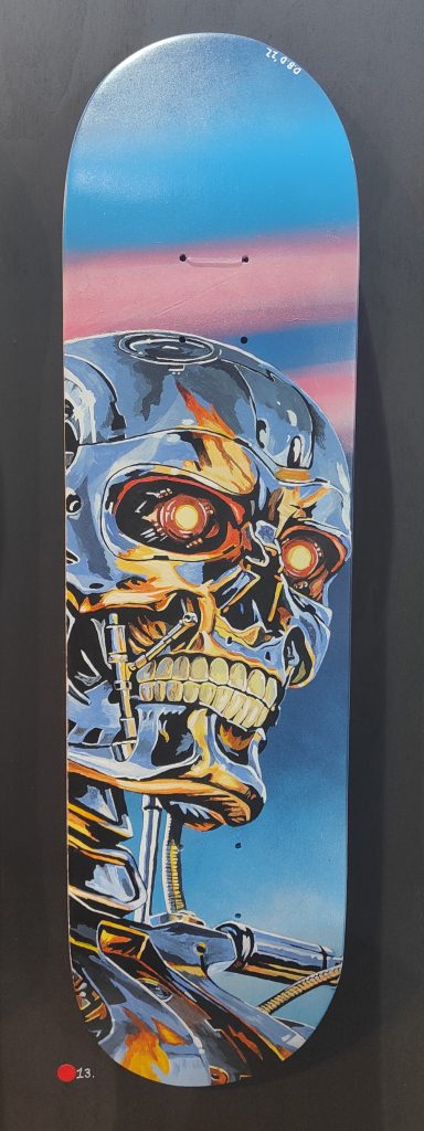
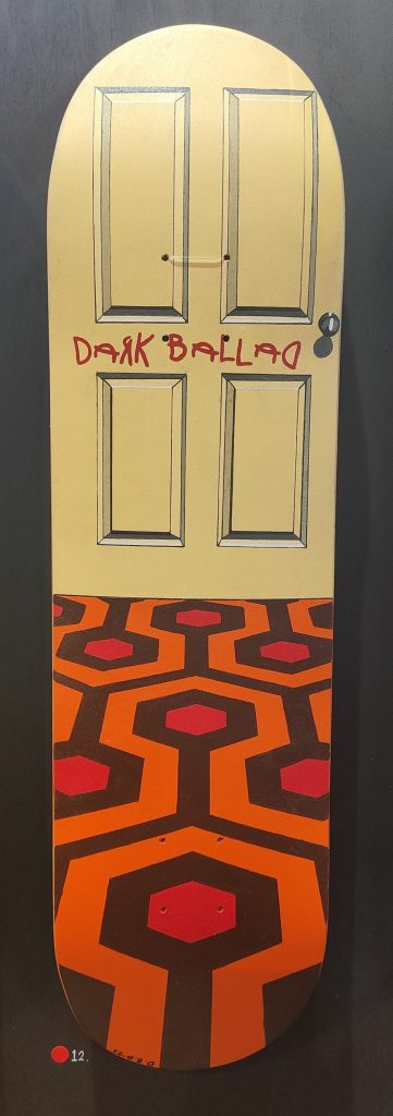
If you have a show coming up, please let us know – email [email protected] or contact us on social media @watchthisspacechch and we can share your creative goodness!
Jonny Waters – Dizney Dreamz
When I sat down with Dunedin-based artist Jonny Waters the morning before his new show Dizney Dreamz opened at The Anchorage, it was the first time we had met in person. Yet, even outside of the collection of social media messages and e-mails we had exchanged in both arranging an interview and as part of other exhibitions Jonny had been a part of, such as CAP’D at Fiksate in 2017, I had been encountering Jonny’s work for such a long time, I kind of felt like I knew him already.
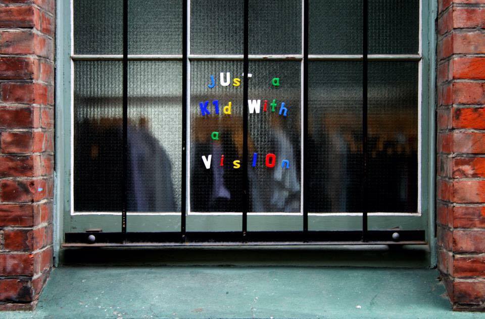
From Christchurch to Wellington and more recently Dunedin, in addition to the digital realm, his stickers, fridge magnet installations, paste-ups and more recently graffiti and character paintings, as well as his studio works, have always been distinctive and memorable, showing an exploratory, inquisitive and playful nature (a fact exacerbated by the various monikers he has employed). This sprawling body of work is reflective of his own journeys, and, for me at least, has provided touchstones of different time periods (like a Christchurch chalkboard message from 2010 that was recontextualised, and protected, by hurricane fencing in the wake of the earthquakes, indeed it is still there today) and places (I still remember literally stumbling upon a small sticker in the fringe of the Wellington CDB a few years back and immediately making a connection between similar versions I had photographed back in Christchurch).
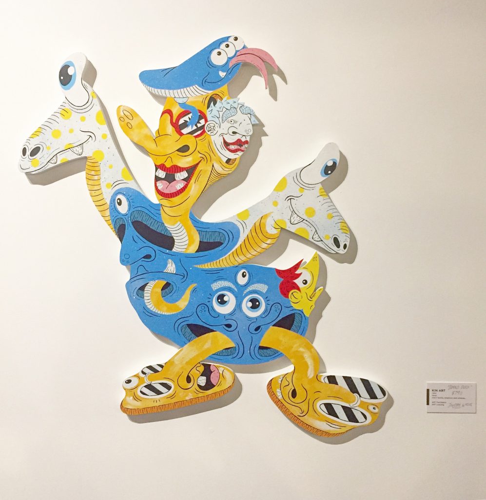
We caught up with Jonny on his return to Christchurch (where he lived and studied for several years) for his new show, which features a new batch of quirky cut-out characters, playful riffs on his love of nineties cartoons, their recognisable silhouettes framing transformations that rip apart nostalgic expectations. We spoke about these works and their relationship with his previous work, his experiences in different cities, and mixing his roles as both an educator and an urban artist.
Jonny, your show Dizney Dreamz opens tonight (January 25th) at The Anchorage…
Correct.
You are currently based in Dunedin, how did an exhibition in Christchurch come together?
It’s been in the pipeline for probably four or five months. I was looking for a space in Christchurch, where I wanted to have a show. I’ve had lots of shows in Dunedin, but I really wanted to push for a show in Christchurch because it’s close to home. I grew up in Ashburton and left when I finished high school to study here for three years, and those three years were super fun and I learnt a hell of a lot and made some amazing connections and friends. So, I wanted to come back here and have a show to, I think, spread my wings a little bit, but also to get back to my roots a little bit more, you know? To be back on the old Canterbury soil…
You are working with Kin Art for this show, how did you make that connection?
Yeah, I’m working with Justin from Kin Art. I’m pretty sure Justin hit me up on Instagram, and he said: ‘Hey, I’m actually in Dunedin in a couple of days, do you want to meet for a coffee?’ So, we met, had a yarn and then he came to the studio, and checked out the works. At that stage, Mickey and Minnie (two of the works in Dizney Dreamz) were half or three quarters done, and he really liked the look of those. I showed him the other cut-outs. Obviously, they were unpainted, but he was really keen to talk about having a show. Then a few months later I came up to The Anchorage, checked out the space and the size was perfect.
It is an interesting space. It is a café, but it offers a decent environment to show work, it’s not like those cafés where there is not really any suitable or even defined space for work…
It’s got a clean aesthetic. It’s functional for people to walk around without being in the way of anyone else. It works really nicely as an exhibition space and a café space. It has nice walls as well. I like that it’s got different sections, so you can show this work over here, that work over there on that wall, and kind of split things up a little bit…
I want to come back and talk about Dizney Dreamz in more detail, but I’m also interested to talk about your background. You mentioned that you grew up in Ashburton and came to Christchurch and studied at CPIT, or what now is ARA, but since then you have lived in a few different places, and I have to admit I have stumbled across your work, under various identities, in a number of cities. Has art, and in particular, urban art, always been a way for you to get to know a new environment?
I think so, definitely. A lot of people may not agree with this or may have a different opinion, but it is actually a lot easier to meet other writers or street artists and link up with them and become part of their community and their environment than it is to try and connect with people in the art world, generally speaking. I don’t know whether that’s the traditional elitism or that feeling of exclusivity, but I have definitely found that. A lot of people have this weird stereotype of: ‘Oh, big bad graf guys, isn’t it scary to reach out to them?’ But ninety-five percent of the graffiti and street art people that I have met have all been the most lovely and nice natured people, so that’s been a really good foundation to discuss art and graf and to find spots to paint. But a lot of the time, the people that I’ve met through graffiti in the different cities that I’ve lived in have been in touch with the art world as well, not the fine art, high art world, but the low brow, funky, weird, illustrative, urban contemporary thing… It all depends. The artists that create urban work in every city shape the feeling and vibe of the environment. A classic example is the BMD guys when they were going full gas in Wellington. They created an environment that felt more friendly, creative, playful and relaxed.
You are now based in Dunedin, you have lived here in Christchurch, briefly in Sydney, and in Wellington, does that ring true for all of those places? How does each city compare in terms of their own distinct vibes and scenes? Obviously, this can depend on timing and who you connect with, but how have you found different cities?
I think each city has a really different flavour, but I think that depends on who you hang around with as well; the people that influence your view about where you are going, whether you push it one way or go in another direction. Unfortunately, I haven’t painted here that many times. I’ve painted a few times with Gerald and Hurls, just my regular mates in the crew, but my graffiti and street art foundations are here through mostly stickers and random wall installations. There are also more guys in Christchurch who are just into bombing, which is awesome, I respect that one hundred percent, but I just can’t afford to live that type of graffiti lifestyle. It’s always been a more fun outlet for me, the legality of it comes secondary. But Dunedin is so chill. It’s like, we’ll go for a paint, we’ll buy a box of beers, it’s more about hanging out, it just so happens that we’re painting as well. In Dunedin we have also got so many spots that you can do that, it’s like a grey area. Yes, it’s illegal, but the cops aren’t going to arrest you, they are kind of safe spots in a way. I don’t think they mind because it keeps it somewhat ‘contained’. Wellington is similar as well. There are a lot of spots you can go paint and not worry about people stressing out. I’ve painted a lot up in the gun emplacement barracks up near Brooklyn, and people are always up there walking their dogs or having a few beers at a picnic, and they are cool, they are interested in what you are painting, they are not like: ‘What are you doing?’ I prefer a chill vibe and would rather not get paranoid about shit.
Does that also allow you to be a bit more adventurous in what you do?
What I enjoy doing is mixing it up and being deliberately quirky. If every tag I have done is slightly different in some way I think there’s something funny about that and creates a style in itself. Same thing with pieces. I literally paint how I’m feeling on that given day. I might have painted something I have actually sketched out beforehand maybe 2 or 3 times max? It’s fun to say: “Well what could I have a crack at today to mix it up”. Sometimes it looks good, sometimes it looks shit! (Laughs)
Did your experience within educational institutions impact your feeling of a city as well? Because you also studied in Wellington, right?
I did, I was at Teacher’s College in Wellington at Victoria University.
And here in Christchurch you were studying visual arts?
I did a Design degree. At ARA you’ve got three streams, and I think it is still the case: Multimedia, Visual Communications and Visual Arts. I did Visual Communications, so basically a Graphic Design degree…
Was that environment important for you, not so much from an educational perspective, but a social one? Did you find yourself surrounded by a certain crowd, or in a certain creative community, that changed the way you think about art?
Changed the way I thought, or fostered it?
Either. Was it there that you started to think about the streets as a site in which to work, or was that already happening?
It was interesting, because I grew up in Ashburton, where you are not surrounded by any urban art whatsoever. The only time I ever got to see any urban art was on the internet or when I came up to Christchurch as a kid, and that cemented quite a strong idea of what I thought about Christchurch’s identity. I loved it, and I’d try to talk to my dad about it, and he’d be like: ‘That’s just bullshit!’ So, I was like, ‘Oh, cool, so it’s bad as well! It’s rebellious!’ Aside from that, it had a real impact on me and that’s why I started doing stuff outside of my normal artwork under different names. But the guys who I went to ARA with, they had a bit of an influence as well. We all started going out doing stickers and stuff like that, but we each had our own interests. In the classroom or studio, we all developed our own niche and our own approach. I guess we figured out the ways we each operated best and what mediums we preferred and that sort of thing, and that was completely supported by our tutors. I specialised in things like 3D studies, design things but pushing them into an art world. I also liked illustration, and I really enjoyed life drawing. I was putting an artistic twist on graphic design, whereas other guys were getting way more into typography, web design and stuff like that. I was always swaying towards art…
Did that reflect a desire to be using your hand, rather than technology?
I hated the computer. I got sick of it. I just wanted to draw all the time, so I was like, I will just scan it in and chip away at these works, I’ll literally just use Live Paint, Illustrator, whatever, and be like: ‘Cool, that looks awesome!’ I did this final year project, Monster Mash, a big alphabet poster, all the letters were really weird and quirky and humorous, a little bit distasteful, not P.C. It was purely illustration, the only graphic design that was involved was how they were laid out and the type face chosen for different titles and stuff. That is sort of where I headed in the end, and I wouldn’t change anything about that. Honestly, some graphic design I find tedious. I don’t like computers so much… Did I mention I don’t like computers so much?
That ‘Do-It-Yourself’ quality has long been a part of urban art culture; did you make that connection?
Definitely, I think it has always been pretty obvious. The crossover, the look of the different characters that I draw, is really obvious. I didn’t think so back then, but it is. I mean there is always going to be a crossover, and some artists do it really well, they have a really natural crossover in their aesthetic for the urban stuff they do and the art practice work, but for me I think it is unavoidable. (Laughs)
It is also interesting that you started with more of a post-graffiti, character-heavy style, and then moved into letterforms later…
Yeah everything at the start was character-based.
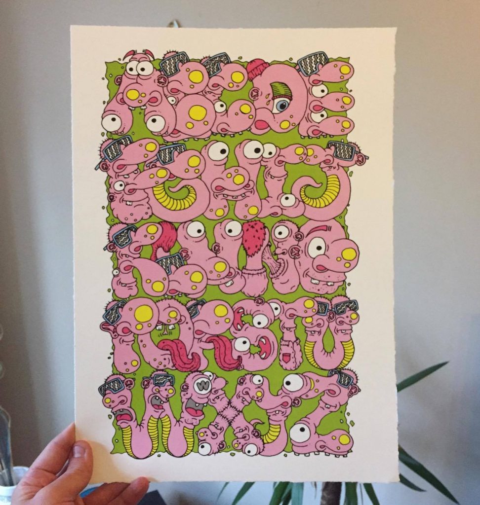
Often your lettering has embraced characters not just as accompaniments, but as part of the letterforms themselves…
I’ve always loved that, creating, making characters out of type. That Monster Mash poster, that sort of thing. It’s almost like problem solving: how am I going to create this letter that is still a letter but is also really funky and cool, weird and quirky, you know?
That is at the heart of graffiti, right? How do I take a letter and recreate it where legibility is no longer the primary goal?
I guess I’m not necessarily taking the traditional approach, but yeah. I’ve had a lot of traditional dudes, who follow that path, say to me: ‘That’s really cool, you’ve got your own twist on it.’ Then, I’ve got other people who would be like: ‘What the fuck are you up to? You’re like dissing the culture of graffiti!’ I think these days there so many people doing amazing weird shit that you have to be open to change.
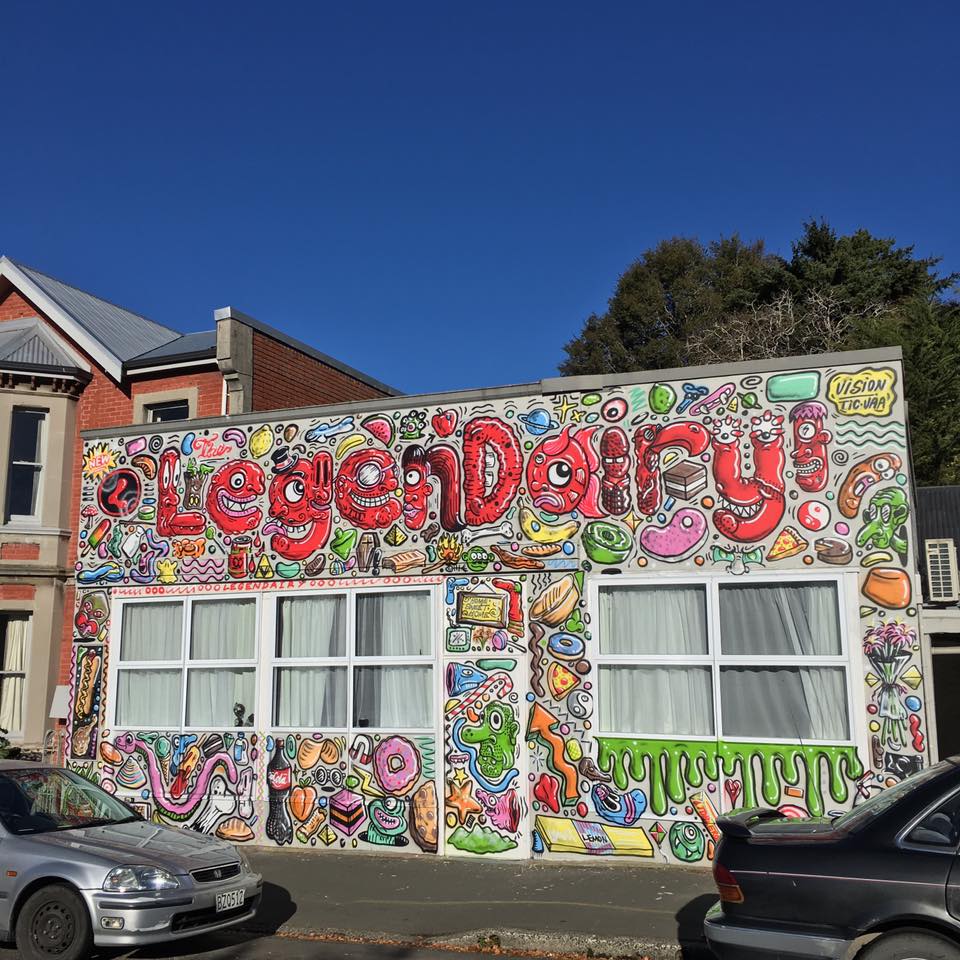
But people have been pushing letterforms so far for a while now, so you aren’t alone. There are the likes Augustine Kofie and Remi Rough, who have taken their work towards the abstract, but it’s developed from letters…
Exactly, it’s the same with what Askew is doing, a lot of his abstract patterns all developed from letters…
As a teacher, how do you balance celebrating the rebelliousness that was a vital recognition when you first discovered urban art with the responsibility of teaching?
The two worlds? That façade? You’ve got to be a careful with what you say, how you frame things…
I’d love to be able to say to every kid, this is important because it is illegal, or it developed from illegal roots…
Because the artist did illegal stuff for ten years, that’s why this is important! (Laughs)
So, how do you approach that with students, or in the workshops you run?
When I was at Kings High School (in Dunedin), for three years I ran a street art camp. All year ten students had to choose a camp each year, there was no art camp, nothing cultured, it was all sporting or academic, science camp and stuff like that. So, I was like, stuff that, I’m going to create an art camp! Every year we came up here to Christchurch, we did a graffiti workshop with Ikarus, and then we always had a look around at the street art. That was when all the big walls were still up, you had Lister, Owen Dippie, all these amazing walls to check out. We would do a trip out to New Brighton as well. The boys really loved that trip, it was great. It was letting them in and showing them who you are, but only so much, you know? It wasn’t like I was taking them out and showing them how to do a tag, it was framed in a street art context. It just so happened that I chose graffiti to be framed within that…
But that’s the challenge now, right? Urban art is so complex now. There are so many approaches…
It’s such a melting pot…
But those rebellious roots need to be acknowledged…
Sure, especially with the way the street art movement is sort of being defined as ‘more important’ now…
It’s easy to take kids to see amazing big murals, and the artists are amazing, but it’s important for kids to not think that that is what street art is exclusively…
Exactly, and that is what I tried to ensure, actually doing a graffiti workshop and learning about letterforms, about painting a piece, not a character, not a ‘street art’ painting, they were actually learning about a graffiti piece. Shout out to Ikarus for all those workshops as well, because he was amazing with all the kids. Even in the classroom, the kids know that you are in that world, that you are part of that world, but they don’t know much more than that. I was always really careful about any specifics, and generally I was pretty quiet. I wouldn’t say like: ‘Oh, I painted this sick piece in the weekend, you should go and check it out’, you know? I was very much, this is me as an artist, this is the work I do as an artist, and I sort of left that stuff out of the spotlight when it came to anything professional or school related…
I guess the most important thing to do would be to let them make their own decision around the socio-political motivations for making art that isn’t permissioned. If a young person is able to decide that they believe in something enough to do it in a certain way, that’s empowering for them.
Exactly, and the thing is, if a student was getting into graffiti, I would never deter that. I would actually support it, and probably, if I trusted them enough, and they trusted me, I would give them some advice, a heads up, and you know look out for them a little bit. But there is a very, very, fine line. You’ve got to stay professional.
Just because of urban art’s longevity, we are now seeing more and more people in ‘upstanding’ positions who have grown up writing graffiti, or making street art, and not just as artists, but in other realms as well.
There are lots of people moving within these different worlds, like Berst is in education as well.
And it isn’t just that direct crossover, but there are more people who recognise graffiti and street art’s validity and importance as visual cultures.
As forms of expression…
Coming back to Dizney Dreamz, we’ve touched on that illustrative and character-based approach, which is very evident in these works; these sort of grotesque, surreal, re-imagined cut-out Disney characters. A lot of the influences and ideas we have been talking about come out in these works, there is a trace of your work over time in these works…
I think so, but in a cohesive way. Obviously, it helps that they are all Disney characters, but they have all got a similar aesthetic in the way they function as pieces as well. There are different linkages, the pieces flow with each other, I think that there are certainly a lot of those influences coming together, but it’s also about how they interact with each other in this specific show. There’s a little bit more thinking involved. When I’m doing all the sketches for these pieces, figuring out how I want to design them, there’s always so many different options or varieties with how things can go. There will always be one piece where I’m not happy with that, or that’s not right…
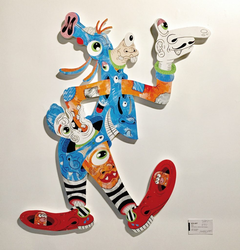
That relationship between each other is even more important when the added context and information of the street is removed as well. There is more emphasis on how they work as distinct objects of display.
Exactly.
Rather than each character being framed within a block or a canvas, they have an autonomy or sense of independence through the cut-out shape, and that allows that flow through each one to another with those whips and angles and lines. The eye is led around each piece and on to the others as well…
They are just really interesting to view. That space they create, negative or positive, is really interesting. I’ve always wanted to choose characters like Mickey and all his mates, because they are really interesting silhouettes. They are so recognisable, so I’m able to communicate almost instantly. Most people are aware of Mickey and these Disney characters, so you’ve got that initial connection sorted, and from there you can go further and get closer and get a feel for what the work is about…
Yet, because the silhouettes are so recognisable, you are then surprised and intrigued because that recognition is blown apart by the detail…
Exactly, it might annoy some people because it ruins their image of Mickey Mouse, or whatever character, but the whole idea is about nostalgia. The early nineties or mid-nineties, for me, was super cartoon-based, it’s got a real strong place in our subconscious and I think that’s what nostalgia does, it’s like a collection of dreams, and hence Dizney Dreamz. I think the work in this show is trying to change the way we feel about our own nostalgia. So, if anyone sees a silhouette of Mickey Mouse, they know straight away its Mickey Mouse. Then, whether you like it or not, you get a feeling like: ‘Oh when did I last see Mickey Mouse?’ It’s all tracing back, but it’s recreating an experience when you see these works, it’s like reinterpreting nostalgia. I’ve had this fascination for a little while and it started with a show at Kiki Beware in Dunedin, it was really off the cuff, and I wanted to do some paintings on cut-outs. I don’t even know why I thought of it, but these silhouettes were so cool. That show was smaller, there was Bugs Bunny, a smaller version of Mickey, Sonic the Hedgehog, Speedy Cerviche from Samurai Pizza Cats, Chucky from Rugrats. They were awesome, and a lot of the feedback I got was that these were something new, that people had never seen shit like that before. So, I was kind of inspired after that, I guess. Then I eventually got to planning my first solo gallery show, Tooney Lunes, taking Looney Tunes characters, fifteen of them, and turning them into warped, fucked up characters. It sold really well, it had big numbers going through, and I was feeling pretty positive and good about it. Then this show follows on, and the whole crux of the idea about it is trying to manipulate your feelings of nostalgia towards characters or things that you may be attached to…
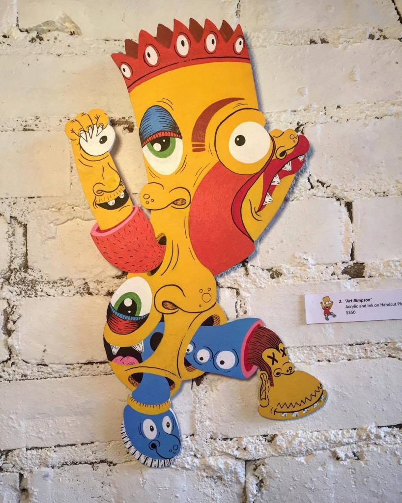
That sense of the grotesque, which has been a feature of your work for a long time, aids that approach…
Yeah, I never thought of them as grotesque, more playful. But now that you mention it…
Yeah, there are limbs coming out of unexpected places, that then disappear into each other, there are wrinkles and bumps…
They are all smiling and everything, but it’s like, are you happy though? Are you really happy? (Laughs)
Are you attracted to that imagery because of the fun you can have in creating it? It allows you to do almost anything you want, because you aren’t seeking perfection or beauty…
I think again, it’s like a problem-solving thing, like I said with the letters; you’ve got this silhouette, you’ve got the frame work, what are you going to do to make it look interesting? It doesn’t necessarily have to look pleasing to the eye. It’s good if it does, but it doesn’t have it at all. In regard to inspiration, I’m really inspired by Kaws, I’m really into his work, and I think there’s probably some similarities in taking familiar characters and changing them, morphing them and layering them. Another huge inspiration is Rob McLeod from Wellington. He works with cut-outs as well, my work would probably be more Pop, with brighter colours, whereas his works have gotten more subdued and darker. Some of his stuff has got pretty grotesque and quite dark, so he’s a huge influence. But my favourite artists are Jean-Michel Basquiat, and Francis Bacon, even if it isn’t as obvious in these works…
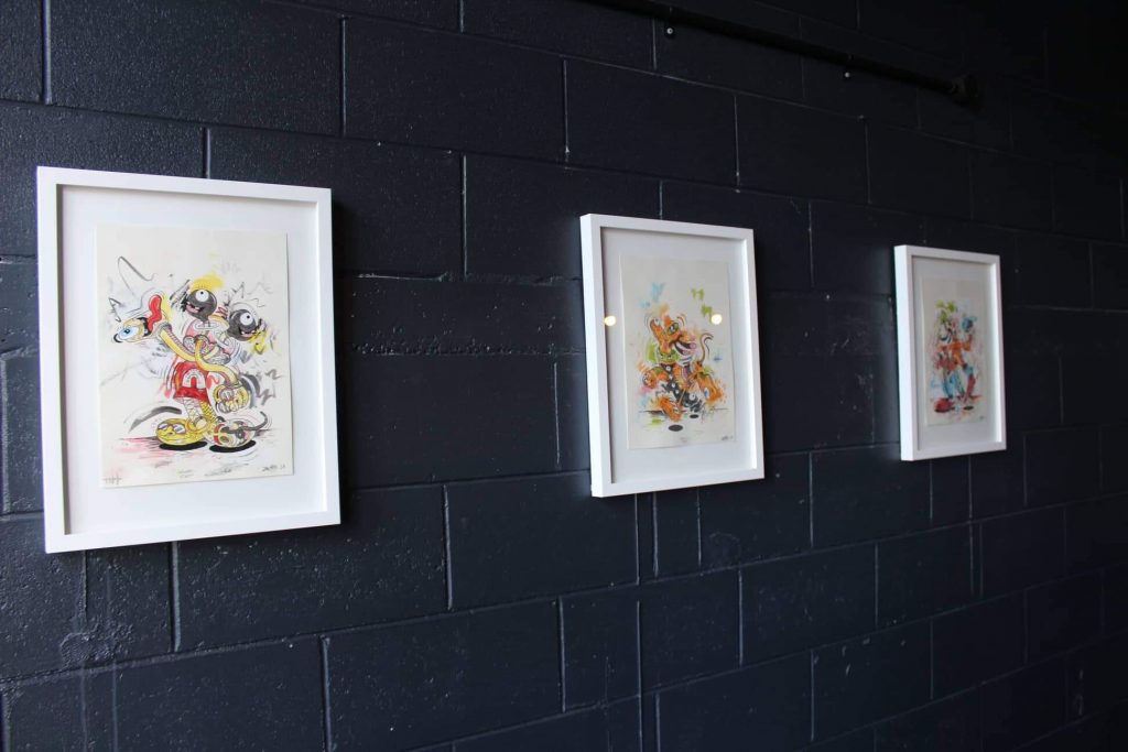
With someone like Basquiat, there is an urgency in the mark making, but there is also an often a violence that comes through, an unease…
Even when you’ve got those happy colours, this doesn’t feel right, you know? (Laughs) That’s how I feel when I look at Francis Bacon’s work as well, you’re a little bit unsettled…
Which is what you are trying to do through the lens of nostalgia, right? Speaking of Kaws, considering you are working with cut-out shapes, longer term, have you thought of expanding into three-dimensional sculptural pieces?
Wow, I don’t know. I’d certainly be open to the idea of things like that, but I just love painting. I love painting in two-dimensions. These works are still two-dimensional surfaces obviously, and I don’t think I will ever lose that attachment to painting, but I’m not really into the traditional canvas thing, at the moment anyway. I might go back to it, but I want to keep exploring other ways of creating paintings that are two-dimensional, but different in some way.
I suppose it comes back to the fact that you were more interested in drawing and painting even when you were studying graphic design. These cut-out works have that certainty, that sharp line work, but there is always a sense they are created by hand…
There is no mechanical quality.
Yeah, there is no mechanical production, which can become hard to replicate in that sculptural process. When you start dealing with fabrication and manufacture, that process impacts that freedom.
Exactly. But I don’t know, I probably need like a month to reflect and think about where things might go. I want to have a few more shows this year, wherever it might be, whether it is in Dunedin, or in Sydney, when I go over there for a cousin’s wedding, I might try and tee something up there. I feel like maybe the cut-outs may have done their dash, but with these ones, the whole idea was to be bigger in scale and because of that I could play around in media. There’s spray paint in there, there’s a thicker use of paint, there is a little bit more of an abstract quality to the layering. I think that’s almost pushing it as far as this sort of aesthetic can go, because the previous ones were really flat and clean, and in some ways, it looked really nice. But I really like the layering and detail that has come with these works. I don’t know how much further I could push that…
Are you more likely to develop those ideas in the studio, or on walls? How much influence do those different approaches feed into each other?
I think they are always cross-contaminating. It’s what you are confident with; I wouldn’t use spray paint in these works if I didn’t feel comfortable with that medium, because it’s high risk. You don’t want to fuck up a work when you want to have a decent show. So, it’s a confidence thing. It’s what you are safe with, which sounds bad, because people say art should take risks, but I think there is already that risk-taking in other elements. When I’d finish cutting in and doing the different layers of these works, I thought about doing some splatters and stuff like that, like a big line through it. I thought about seeing how it goes. I did a few tests of that idea a few times, and it looked cool, but it actually detracted from the design too much. It took too much away, it drew the focus away too much to the action of doing that, so I was like, nah I’ll keep it subtle…
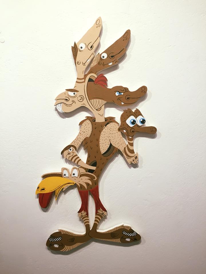
Are you still trying to create a character that has a sense of being able to function as a working body? The silhouette gives that suggestion, and while the details subvert any expectations, you still read them as functioning, albeit mis-formed, creatures…
Yeah, I still want them to function as a whole.
Any shout outs?
Shout outs to The Anchorage for hosting obviously, big thanks to Justin and Kin Art, thanks to Watch This Space for the interview. Big ups to Christchurch in general, I’m loving being back here and having a show!
Dizney Dreamz is at The Anchorage until February 23, 2019…
Follow Jonny on social media:
Instagram: @jonathanwatersart


