
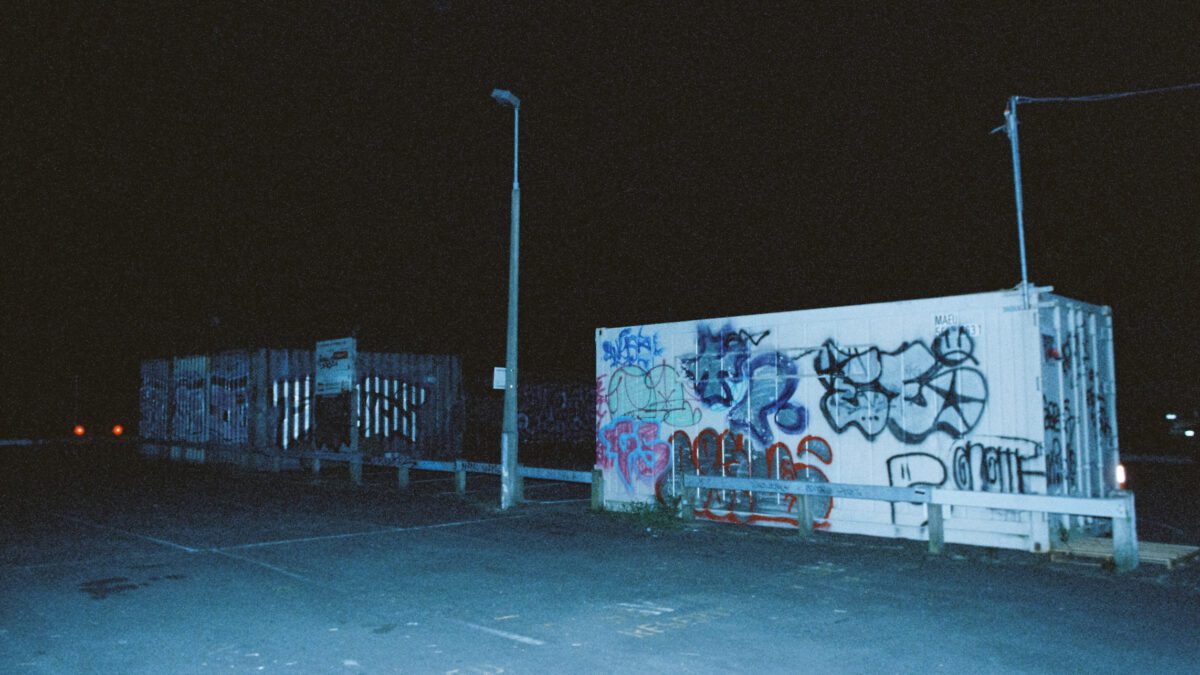
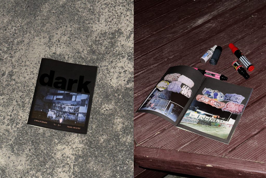
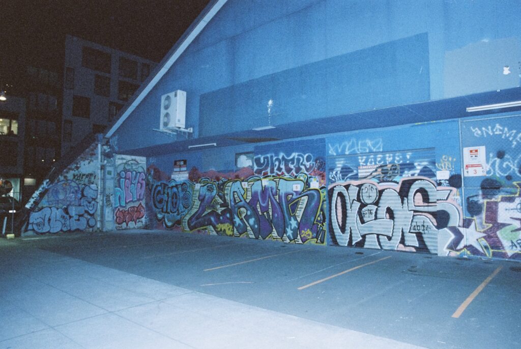
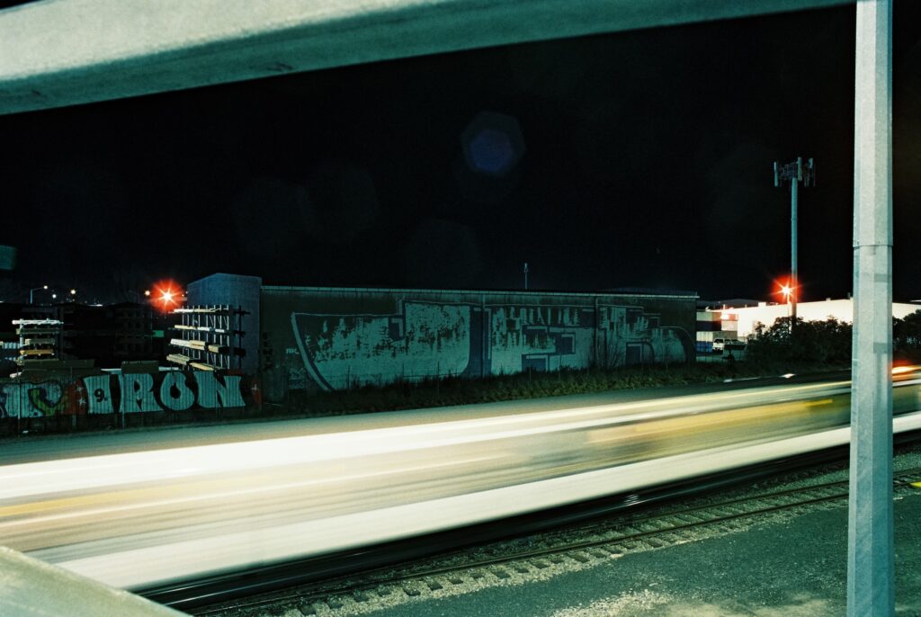
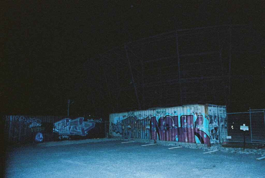
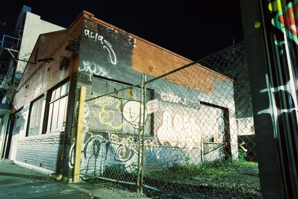
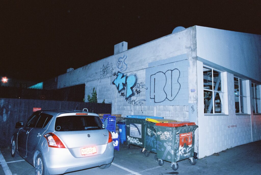
With Ōtautahi ZineFest 2025 taking place at the end of August, it is a perfect time to shine a spotlight on a fresh zine that has recently captured our attention — Mitchell Bolstridge’s Dark – Graffiti of Ōtautahi, No. 1. That turn of phrase is fitting, as Dark itself is a zine that illuminates dark spaces around the city and the expressions found within them — the tags, throwies, pieces, and other additions that signify the allure of our city’s liminal zones. A beautiful production, with grainy film stock images, Dark is an exploration of the city, illuminating overlooked areas while also reflecting on the changing landscape and attitudes towards graffiti across the city. We caught up with Dark creator Mitchell Bolstridge for a chat about the inspiration for the zine, the process of capturing the images and what might come next…
Zine history, obviously, is pretty wide-ranging, there are so many different approaches coming from the form’s independent streak. But there is a strong connection between graffiti and zine culture. Because graffiti is a rebellious pastime, documenting it has often fallen outside of the mainstream, and zines have been a really kind of popular form of documentation and sharing of the culture. Was that something that you were aware of when you started to make Dark?
Mitchell Bolstridge: No, I had no real understanding really of what zines were. My friends back in Wellington had just made some of their own from their own photography and I was like, that’s such an amazing way of expressing ideas in a cohesive piece. That was where the inspiration came from. I wanted to get across the feeling of being by yourself at night in the city, and these familiar places that feel unfamiliar to the majority of people.
Spaces that graffiti artists love, right? Tell me a little bit about your creative background. Do you see yourself primarily as a photographer or a designer? How would you explain your broader practice?
Mitchell Bolstridge: I don’t really see myself under one hat, I would just say I’m a visual artist in general. I’ve got a background in video and photo, and then going into more digital spaces of graphic design and things. But I also like to make art. I paint miniatures. I have a variety of linocuts that I like doing. It’s not one set framework — I think it’s just all visual communication in general.
Was combining a lot of those different passions at the heart of Dark?
Mitchell Bolstridge: Yeah, for sure! It’s not that I went with one approach and stuck with it. At times I was a photographer and at times I was a designer. At times I was an editor. I previously had a written narrative running through the zine, but I got rid of it because it didn’t serve the purpose of engaging in the material. Even though I thought that what I wrote was quite good, there’s a part of me that knows that it was pointless. There are also photos that I absolutely love, which didn’t suit the context, so they weren’t used.
Have you thought about reusing that content? Or are you quite happy to push aside the things that don’t quite fit and then move on?
Mitchell Bolstridge: More than anything I feel saddened that I don’t get to share that content in the same way, to the same validity. It feels like I’m picking favorites or making choices like that, but there is no real loss with them not being there. It’s like you can destroy things and create them too.
That’s a good point. Ultimately every part has to serve the end product, right? Originally you planned a two-part zine, where one side was Dark and one side was Light. Tell us about that concept and how you decided to focus on Dark and the out-of-the-way, grimy spaces that are captured in the final zine.
Mitchell Bolstridge: Originally it was that graffiti was dark and the historic churches of Christchurch were light. They were going to be diametrically opposed: dark pages and night photography on cinema film and lighter compositions with white backgrounds on more approachable regular film stocks. But it just didn’t align well enough in terms of my own perception of it. I can understand the cultural perspective of it being about people in time, but I don’t know if that would have necessarily translated to a lot of people and seeing that community or culture based around specific places and accomplishing things. That was where the narrative was, but I just don’t think it worked in the end. I have those photos, but they just didn’t necessarily gel with the audience in the same way. It’s sort of like if I went and shot them, and made a hardback book of all of those churches and wrote their history, that would make more sense. Whereas a zine for graff feels more fitting. It’s fast and loose.
Dark has a specific focus, but it feels less about graffiti culture and actually more about the social position of graffiti. What audience were you envisaging? Were you making this as something that you wanted the graffiti community to embrace, or were you wanting to try and open the doors to a wider audience?
Mitchell Bolstridge: I didn’t really pick a target audience, I just wanted to represent how I viewed it. And in the same sense, it was really a photography exposé. One of the things that I discovered after I’d done it was that it hasn’t necessarily resonated with the graffiti community as much as I thought it might. I don’t know if that’s just a direct correlation of not necessarily considering the art form in the same way. But I think it’s also that times in Christchurch are changing in a dramatic way. I got a box drop letter from an MP that was saying how vandalism in the area has massively increased, and it’s really interesting to see that re-framing from what it was years ago, when it was more of an embraced culture. Post-quake, it was kind of embraced by the community, people could see the interaction with place, and that there were people behind it that also loved this place. They didn’t see the destruction in a negative light in the way it might be seen now. The city is rebuilding and a lot of those broken spaces are gone, so the attachment to graffiti being a fix for these places is sort of losing its spark.
Graffiti has kind of come back around to a contestation, a disruption, whereas the post-quake environment was a setting where graffiti felt like a contribution. But the more shiny new objects that pop up, the more the spaces that you’ve documented in Dark stand out and people react against them.
Mitchell Bolstridge: I also think that in general, Christchurch has some of the best writers for such a small population of people. One of the things I’ve noticed, which I find really funny, is that toy tags seem to stay around a lot longer, while really insane pieces can sometimes get buffed within a week. It’s almost like it’s not necessarily about consent or how good the work is. It can sometimes just be about how offended someone is that they have taken the action of doing it.
I want to circle back, because you mentioned the zine as a photographic exposé. That’s one of the things that really struck me, there’s a grainy quality that is both the result of shooting at night time and shooting in certain film, right? Tell me a little bit about the processes, what was your approach photographically to get the look and vibe that you wanted?
Mitchell Bolstridge: I only shot on three film stocks, all cinema film. I wanted to mix very quiet and well thought out photos with flash photography on a point-and-shoot because they’re both appropriate. I feel like in general photographers get in their head about something always being a particular way and photography being this particular thing to be constantly striving to hit a mark on, when realistically it’s just to show a particular thing. You’re expressing your thoughts in still imagery. So sometimes it was light painting on a 15-20 second exposure, sometimes it was just a flash on a point-and-shoot. But it was nice to have the camera to just fit in my pocket and do that. As much as it was going to a particular spot that I knew would have good graff, I could take point-and-shoot photos of the tags and throws along the way. It wasn’t necessarily just about picking a spot that had good pieces, I wanted to include spots that had good tags and throws as well, because it’s all part of that same pathway.
Every single mark is someone’s expression. How carefully were you selecting the locations? Were you planning, or documenting as much as possible and then selecting the images that worked best?
Mitchell Bolstridge: There were a few key shots that I was looking for, like the centrefold — I knew that shot was gonna be good. But the majority of the time it was pretty open. One of the nights I just went for a walk with my black and white film and knew I was gonna finish the roll. I was going to find as many spots as I possibly could until it was done. It was only four rolls of film, and one of the rolls actually sat in my camera for over a year, so I didn’t know if it was going to turn out or not because cinema film is remarkably strange!
You’ve used torn, collaged overlay effects to show close ups or more focused aspects. How did that decision come about?
Mitchell Bolstridge: I really liked a particular tag or throw-up in some of the photos, but the photos themselves weren’t good enough to put by themselves. So that effect was a way of alleviating that and still putting the stuff that I liked in there. Sometimes it was just a fun play on the composition. It’s all to do with line and interaction. I structured the whole thing in a way that was building to the center and then sort of leaving again.
We talked about discarding things that didn’t work, and about the Light and Dark idea. Do you see this zine as the first of a larger series?
Mitchell Bolstridge: I mean, I definitely could produce more. It was really fun to do it and I learned quite a lot throughout it in terms of the composition, like choosing a page layout that was American style over traditional A-sized really helped the photography and landscape modes. I did name it ‘Number One’ – which was more based on community perception. Whether or not it would be good enough, I wasn’t really sure though. I don’t really know what’s happening in terms of the city and the spaces because I get the feeling that more and more of the really good work is going to be in inaccessible places. Dark is not really necessarily about the graffiti culture, which is kind of interesting. There are some photos that I took that felt like they fit the feeling, but didn’t really fit people’s perception of graffiti. I could definitely make something more in the next iteration of the feeling of graffiti. Like, I didn’t document the empty cans, or the weird passageways, or fences. It wasn’t so much about the experience of being a graffiti writer. It’s more a documentation of the spaces that have been commandeered by graffiti, which helps create a more open audience.
You don’t have to come from one world or the other to enjoy it. You can approach it as someone who is just interested in the way that our city looks, the way our city is evolving. Finally, where can people grab a copy of Dark: Graffiti Of Ōtautahi?
You can buy a copy directly from me, just message me on Instagram, or there are some copies at Rinley’s as well.