
Part One of our interview with Ikarus covered a lot of ground, but in a sense, we only scratched the surface. In Part Two, Ikarus continues to reflect on lessons learnt and his encounters with a public confused and often angered by graffiti, before diving into how his own work and style has developed in response to his roots and his worldview. He also discusses his formative influences, and how events like Rise and Spectrum afforded him the unexpected chance to work alongside a number of well-travelled artists. Picking up where we left off, let’s jump back inside the head of one of Christchurch’s graffiti legends…
There are some members of the public who are confused by graffiti, and yet I think that means they neglect some of the formal and performative elements, like for me it’s always interesting watching a someone’s hand-style, there’s an aspect of movement, a physical quality to how that hand-style is formed, a reflection of how the hand moves. But when people don’t see it happening, it’s easy to not acknowledge those things…
Absolutely, a good example is when I was working at Project Legit (an organisation that mentored young graffiti artists, providing opportunities for legal walls alongside workshops and more), one of the big conversations you’ll have with an average citizen who doesn’t understand the culture is: “I love the stuff you do…”, even when its name based and character stuff, when they see it happen, “…but I hate tagging”. I’d say to them, I get it, you might have had your property tagged, you don’t like the way it looks visually when you’re driving around the city, because you don’t understand it, that it is someone’s name, it’s all over this place, and you don’t know that particular style, and whatever. But I will always defend tagging, I will always defend the vandalism side of graffiti because as you say, it’s where it all comes from, none of the rest of it could exist without it. So, I would explain all that and I would say, you know this is just an evolution of that and this is how it had to be in in the early days and this is how a lot of young people had to start out. Then they would say, “well, there’s no skill in doing a tag”. Then I would beg to differ and then I would show them, a lot of times I would give them a challenge: “I have this can, I’ll put a cap on it, and I’ll give you a hundred dollars right now if you can do a straight line that maintains its width, its consistency, it doesn’t go fuzzy at the end, doesn’t drip. If you can do a 50cm line that maintains all those qualities, I’ll give you a hundred dollars right now”. Not one of these people ever did it and I would sort of demonstrate a tag with various elements, like flares, down from the same point at each letter, and it has a flow and rhythm to it, and they would see it and I would say, see you couldn’t do a straight line but I could do this, does that take some amount of skill? And they would have to admit that it does. A lot of it comes down to the fact that they don’t think there’s any forethought, or any culture behind it, they just think it’s mindless vandalism. I did once have a lady, I was working on some stencils with a special needs student, and we’d made an Auckland Warriors stencil for him and I was showing him the process of selecting the image and cutting the different layers, and this lady said to me that she thought you just bought a can with a picture on it and literally waved it around in front of a wall and the picture came out. I started laughing because I thought she was joking, and she wasn’t joking! A lot of the time we’ll be painting, and it will only be the bare bones sketched up of various areas and people will come past and say that its really good, and you’re like: well, come back tomorrow and you will really like it! But a lot of it is that they don’t understand the process, very rarely, and especially over the last half a decade, do you see someone who sees the process and speaks to us, they really don’t go away with a negative thought about it you know, because they see that there is something behind it and that people are actually thinking about what they are doing. I mean, it’s sort of a lot easier for us because we are in the public painting a lot of big colourful works, but it wasn’t always like that, we were doing this back when nobody understood it, and you the police were definitely coming, someone was definitely pulling over and mouthing off at you because you were a bad example you know, the resistance that we used to face was crazy compared to what it is now, for sure…
Even what you were saying before, that people don’t realize the technique that goes into it, like the ten thousand hour idea applies to graffiti: the amount of times a hand-style is performed by someone reflects a real commitment, it is perfected over hundreds or thousands of times…
Absolutely, with graffiti, especially the people into the vandalism side of it, there’s the element of just writing your name over and over again, there’s a certain level of OCD obsessive compulsiveness. I can remember being 17 and a friend of mine had a really nice ‘S’ and I remember sitting for hours and hours and hours and dozens and dozens and dozens of pieces of paper trying to get it, so there’s a certain level of obsessive compulsiveness that comes with it, it’s just something to focus on…
I think of that scene in Style Wars with Skeme’s Mum…
“You do doodle on the paper”! Yeah, yeah, it is like that…
From a personal perspective, in terms of your letterforms, because your style has developed and been refined now over so many years and you can see how perfected your they are, what realisations have come from your personal progression stylistically?
I know what you’re saying, you’re politely saying that I do the same piece all the time! (laughs)
Not at all!
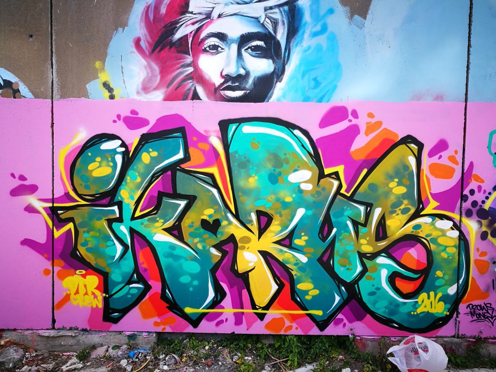
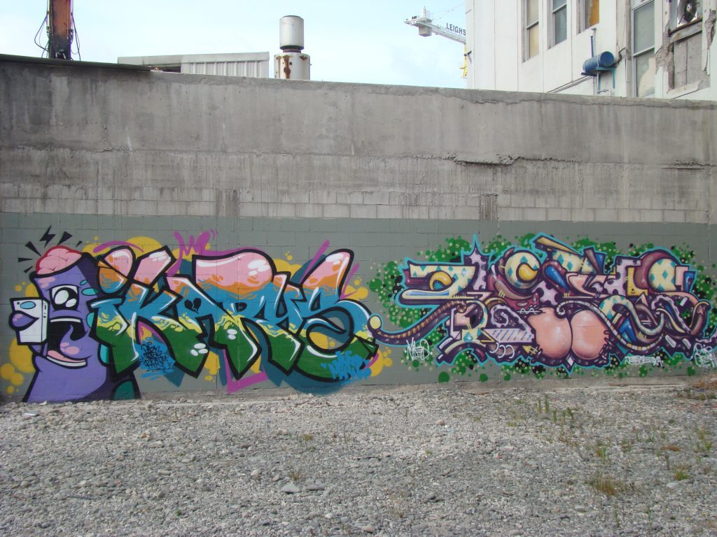
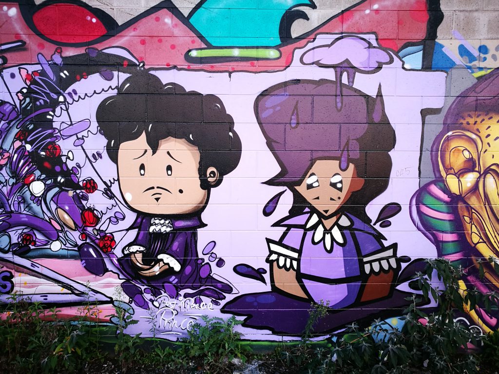
(Laughs) I do hear that a lot though. People ask me why I don’t change my letters, but if you look back over the course of everything I’ve done, it changes. But from day one, I’d never wanted to do anything more than tag. When I was young, I wanted to be a vandal, and I was really anti- graffiti art, let alone what I would of thought about street art back then. I didn’t even like big colourful graffiti murals, I called it borderline graffiti, and I was like argh that stuff, anyone can do that stuff! And I mean that’s still true to this day, anyone can take that much time and produce an amazing piece of work if you have the permission and unlimited hours and you have access to paint, you know it’s still a true thing. It’s one of the things I love the most about vandalism, that it’s pure, you get nothing from it, no one will give you anything. No one will reward you for vandalism, it’s not gonna provide you with anything positive, which is kind of the beautiful thing about it. For people that are really dedicated to it, it is pure, there is no ulterior motive, you do it for whatever reason you do it for and that’s all you can get from it, you know. But as far as my own letter forms, from day one, once I decided, okay I’m getting caught a lot, I’ve been to court, faced various fines and community service and PD and that sort of stuff, I wasn’t willing to give up graffiti, but I also wasn’t willing to keep getting caught just doing tagging and low-level bum shit. So, I was like okay, I’m going to do nice, simple letters, because you can put as many arrows and bells and whistles and fancy fat cap flares and little hooks on the end as you like, but if your basic letterform is garbage, then it’s garbage, it isn’t anything, you know, it’s just a whole lot of colours and squiggles. So, my whole intention early on was only to be able to do a simple letterform and then paint so much that nobody could count me out. I wanted to know that if a kid grew up in Christchurch, was into graffiti and they didn’t know who I was, I wanted it to be their fault, not mine! Some people want to do wildstyle letters, they want to camouflage it, they only want it to be readable by graffiti writers, but I was like no, if I’m gonna waste my time and look at getting myself jail time and getting more fines or PD, what I paint is going to be super simple. I was like, if you drive past it at 60 kilometres an hour or 100 kilometres an hour on a motorway and there is a line-up of five people, your gonna see my name, you’ll read my name first. So, that was always really important to me. Over the years there were times I tried to do like dissected connections and different kinks to letters, and various things but I just found that the thing I went back to that made me happiest was the simplest stuff. You’ll talk to graffiti writers that paint three-day productions, giant, three-metre-high, twenty-metre-long walls, but they get the exact same enjoyment out of doing a ten or twenty-minute chrome piece on a rooftop or in an abandoned building or on the side of a train track. The enjoyment level is different for different things. All I really wanted was to be a tagger, and then when I started painting I wanted my pieces to be big tags, really simple to read, and I think that’s a huge part of it, the simplicity to read and the big bold letters. Especially as my eyes get worse. I’ve got really bad eyesight, so I want my letters to be simpler, my outlines to be thicker, my characters to be bigger, just so I can see them when I stand back.
I would suggest that it’s led to a refined style that is instantly recognisable. I never get sick of seeing them. There’s something to savour about that repetition as well, it’s not redundant, that sense of constant refinement is so evident…
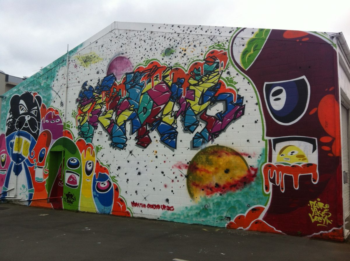
Yeah, it is down to things like logos, and I’ve read stuff with different artists over the years and they want their stuff to be like that, instantly recognisable, and that’s what I want. as I say, you’re going 100 kilometres an hour past it, and there’s an instant recognition, people that don’t write graffiti can still read it. A lot of the time people will come to the walls we’re painting and they will say I don’t know what that says, I don’t know what that says, but they say I-carus? I-karus? They can’t pronounce it, but they can read it and they say oh I know that, I’ve seen it, and that’s what I want from it. The same way you see the golden arches of the McDonalds’ logo. You know what it is. So I want it where you just drive past it super-fast and you see that letterform and you see the style of my characters, it’s super simple but you know instantly, oh I know that! Even if it’s not Ikarus that I’m writing, or the exact characters that I always paint, I still want it to be recognisable. It’s a general thing, I mean I’m not special, it’s something that most graffiti artists write for, to have their style be distinctly recognised. Same as Yikes, you know instantly recognisable. You go past his stuff and you are going to know it. His style on the other hand is so unique, and I wouldn’t necessarily say my stuff is unique because it’s really based on traditional letterforms, it’s really just a big colourful tag when you look at it.
You mention your characters, it feels like you’ve developed their own distinct presence over the last however long. It feels like the various characters have a really distinct sense of personality. Is that something you’ve been trying to develop? Or has it just occurred through repetition?
It’s a little bit of both. There’s been some conscious thought on that level. There’s been some characters I’ve done and in my head, I’ve had my own little storylines about certain characters and who they are. Some characters I do it’ll be a visualisation of something that I was thinking about at the time. Again, they’re all fairly similar. They will be the same character but with a different accessory or some sort of thing that is relevant to whatever I was thinking at the time, or if I was thinking about someone. I hide little things in there for my girlfriend, stuff like that…
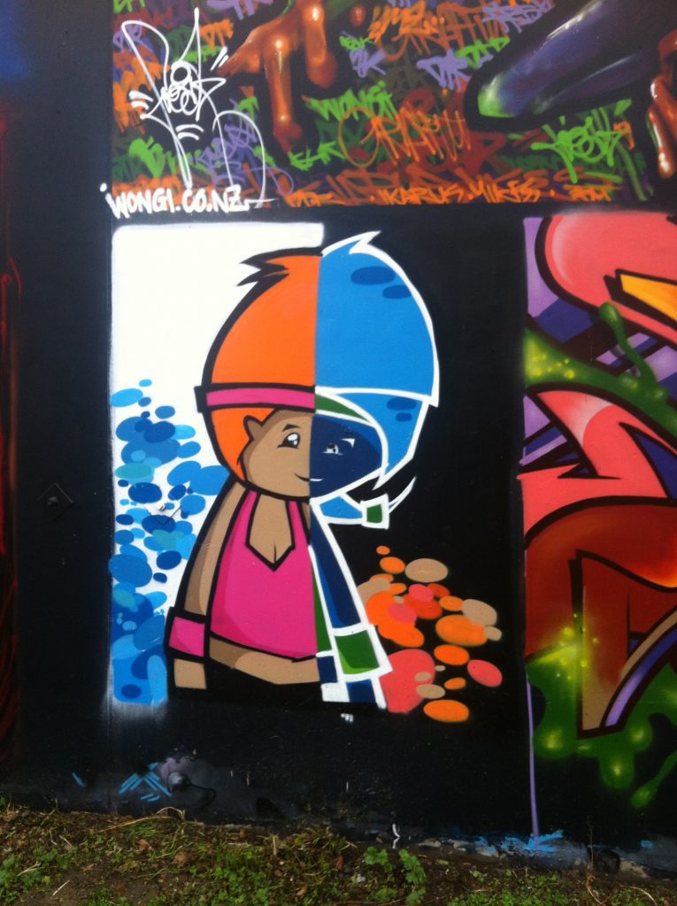
They often seem like representations of your worldview in some way, there is a nice sense of cynicism in some ways (laughs), which I think is important because the letterforms have become an indication of you in some way, just through number and repetition, and now the characters are an outward representation of your experiences as well. They add a personal element, they’re not decorative, they are a psychological element too…
Definitely, everyone tells me my characters are just mad depressed looking! They should be cute but they all look suicidal. It’s accurate, I mean there’s a series of emo girls that I think of as the ‘Suicide Girls’. There’s various characters for various things, like the cool kid characters. There was a period where I was painting my little alien dudes with the brain exposed and that was because of whatever fucking traumatic relationship stuff I was going through at the time. But then I generally just keep using them all. Like there’s a series of boxes and cartoon things, around the back of the YMCA, if you know it, it is speaking about something…
There’s a narrative
Yeah, they have their own narrative, I just don’t really explain it to anyone (laughs). It’s just something I will have been thinking about and dramatizing it
And that’s it right? It’s the ability to exorcise things but you don’t have to explain it because anyone can come along and build that narrative up themselves…
Yeah exactly, that’s just art in general. I think it was Seth [Globepainter], his painting of the boy on the cloud with a ladder, at Spectrum, I looked at it and thought, with my general frame of mind, oh, look at that sad little kid sitting on a cloud. Then I saw some other people come in and say that boy’s up on a cloud and he’s so happy! It’s a crazy thing, people see different things. Some people see bright colours, and see a message behind it, some people don’t see anything…
Speaking of Spectrum and the Oi YOU! shows, over the last five or six years, who stands out that you have met or worked with that you might not have expected to get to know?
I mean pretty much everyone was fucking awesome, but standouts, from the first show, Rise, Thom Buchanan was a rad dude. He painted an amazing work, an amazing cityscape, and painted for like a million hours and layers over two weeks. I hadn’t seen his work before and he was just a rad dude who did some super rad work. Obviously, Sofles is fucking mind-blowing. Everything he did for every show was just crazy and he’s a super rad regular dude. He’s not even one of these crazy super human vegans that doesn’t drink or anything, he gets down and then does his thing, and then bombs and travels the world. He’s super crazy, he blows my mind! And Tilt! Just painting with Tilt was super cool, because early on Tilt was actually a pretty big influence on the way I do my letters. The dude does throw-ups most of the time. It’s one of those things, like from NZ, Addict, ADT, is another dude that inspires me a lot, simple letters, iconic, logo-istic, if that’s a word (laughs), but that instant identification. Early on Tilt was just going to countries and doing his throw-up and putting the country’s flag inside his throw-up, and I was like, this is fucking amazing and this means you don’t have to do fifty-colour, amazing, super technical, wildstyle bullshit and you can still get known. When I was younger, and I didn’t really do the artistic side of it, I was looking for my own style, and when I was looking through graffiti magazines and watching graffiti DVDs or I saw graffiti, it was always super technical stuff, layered up with amazing lighting effects and shadows and detail, whether it be pieces, characters or backgrounds, and that stuff would blow my mind, but it wasn’t anything I ever wanted to do. So, when I saw something super simple, like the London Police, with the big round faces, the Adidas, it was iconic, it was instantly recognisable. With stuff like that, or Tilt’s throw-ups, I would think to myself: I could have done that, I actually could have done that! Not that those guys can’t draw, but it was instantly recognisable stuff like that led me to think, oh there’s a lane I can get into. I don’t have the patience or determination to do wildstyle! My friend Reakt loved to sit down for five hours with a pencil and an eraser and work out his letters and connections and the layers, and I’m there just tearing through black books page by page doing throw ups and tags. I couldn’t do it, but once I saw that really iconic, logo-like stuff, I was like, okay, there’s a lane, there’s an area I can get into. The same as I just want to do simple letterforms, I can do simple characters. The first characters I did were just big round faces, you know still fairly similar, but I used to call them the ‘Bubblegum Fuck Faces’, and they were just big round colourful fucking cartoony looking faces and that was it, and then it sort of evolved from there and moved on over the years.
I know we could go on, but you’ve got some painting to do, and I know this is probably just the first time I hit you up for thoughts and opinions! So thanks for sitting down with us…
No problems.