The Paste-Up Project – with Mark Catley

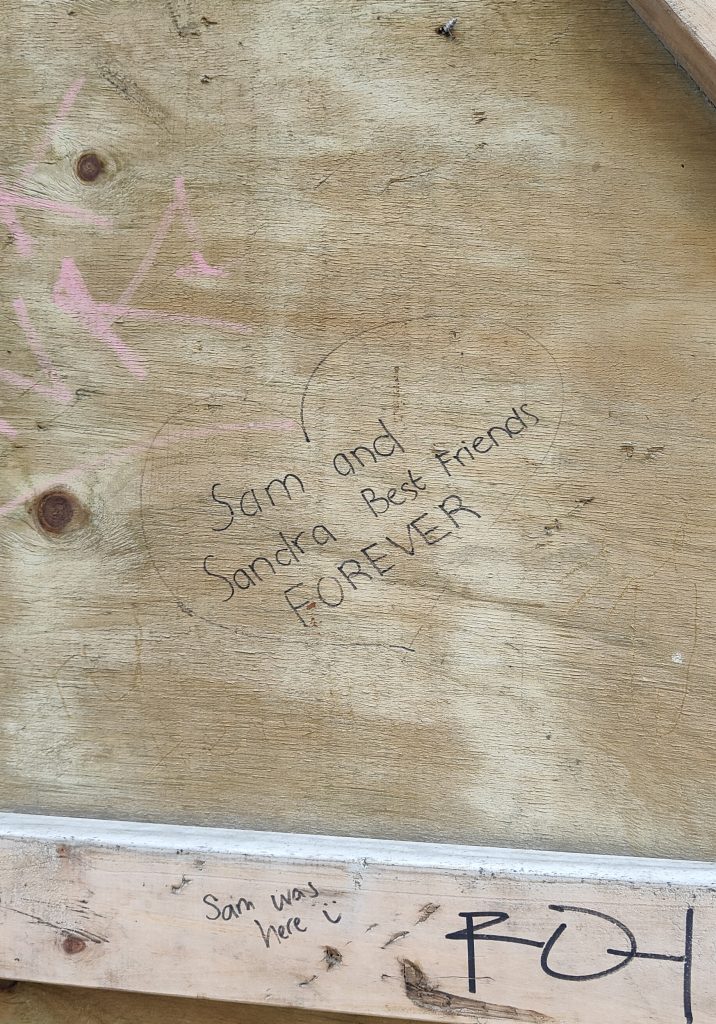
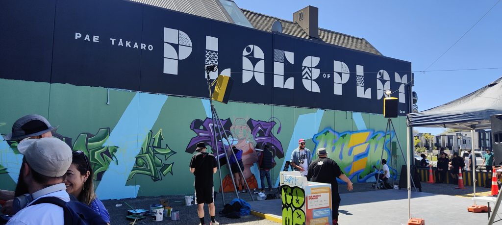
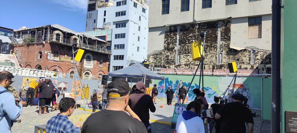
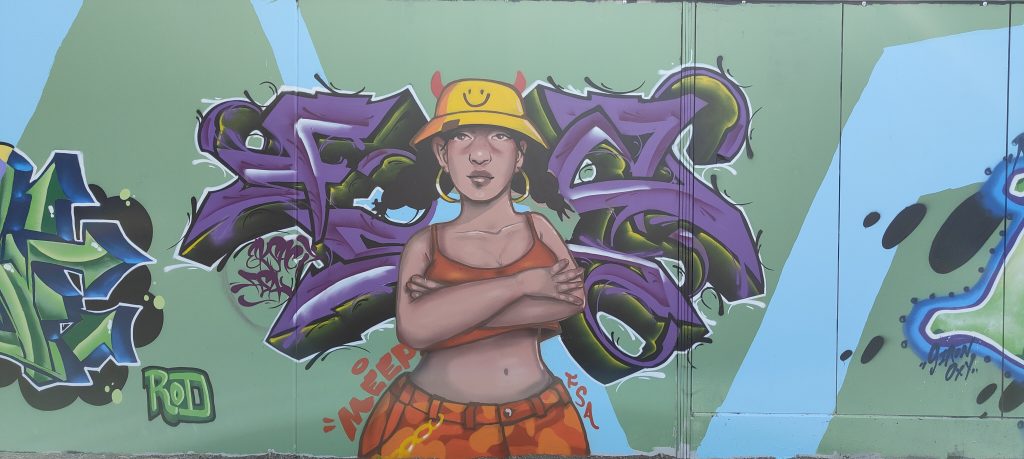
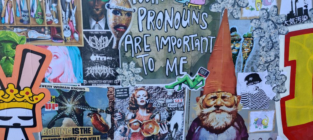
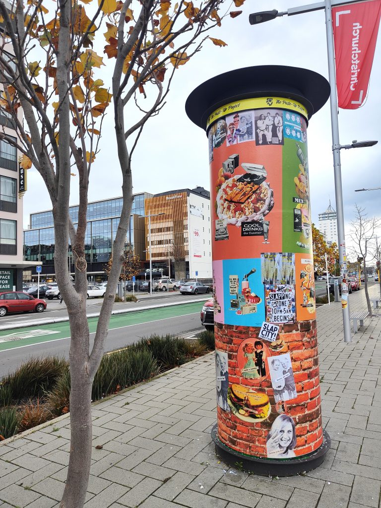
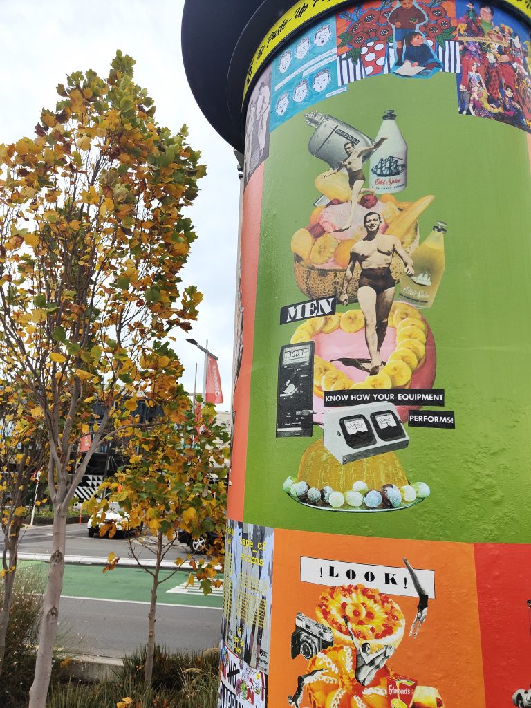
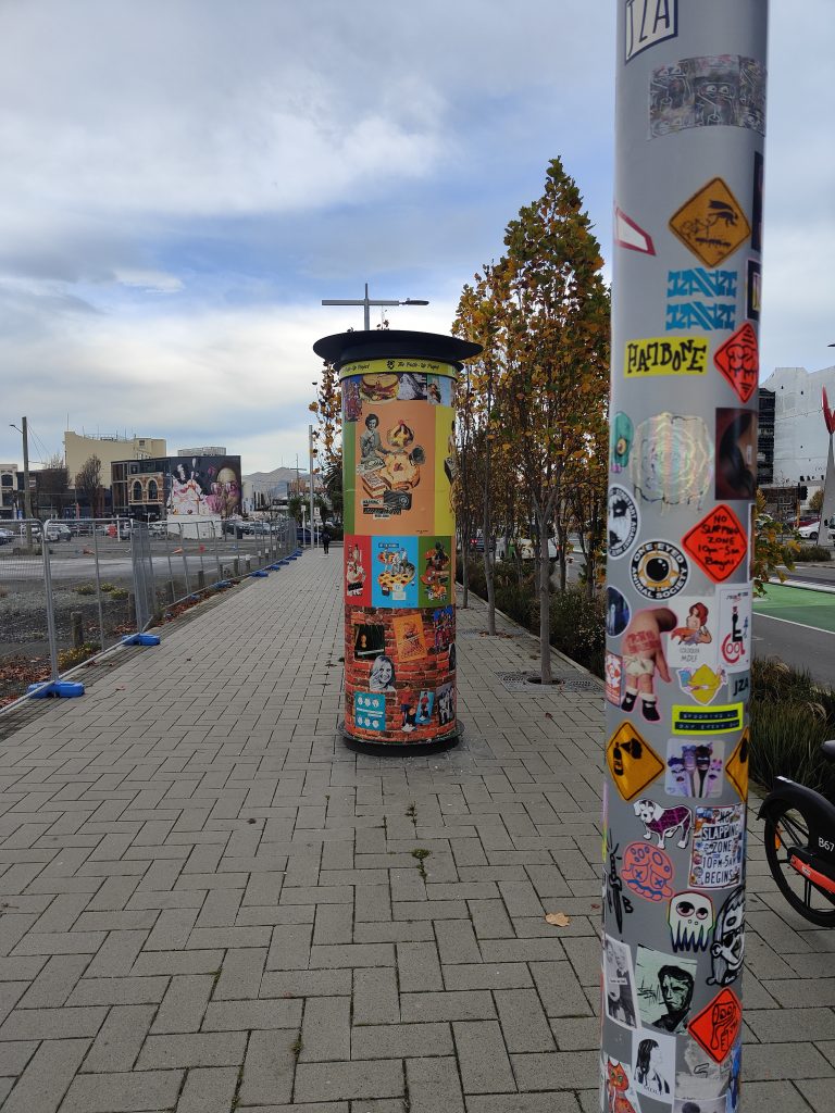
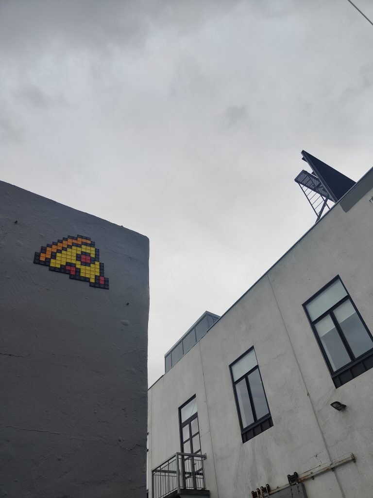
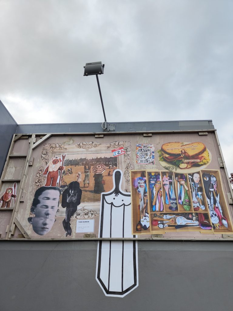
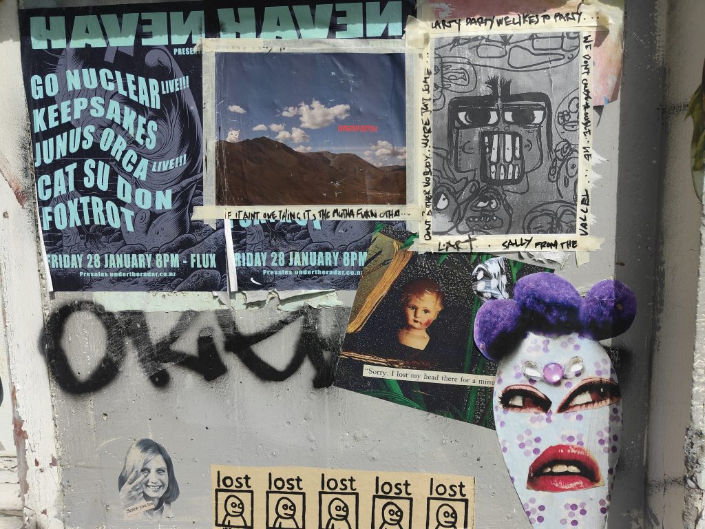
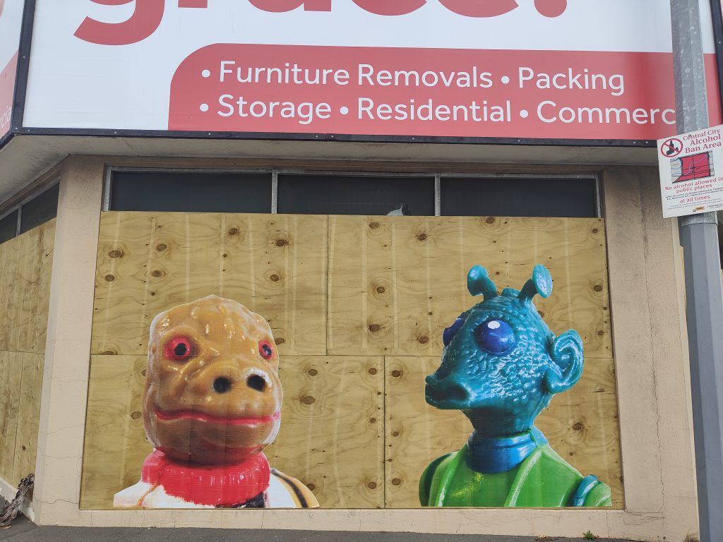
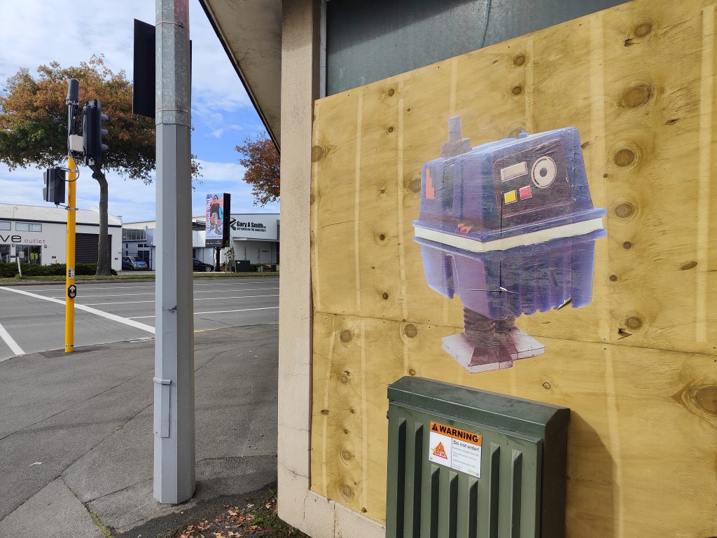
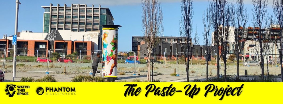
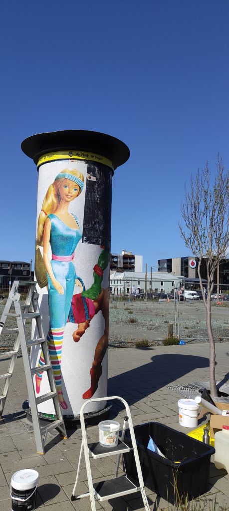
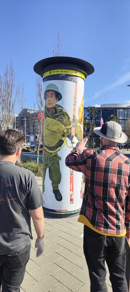
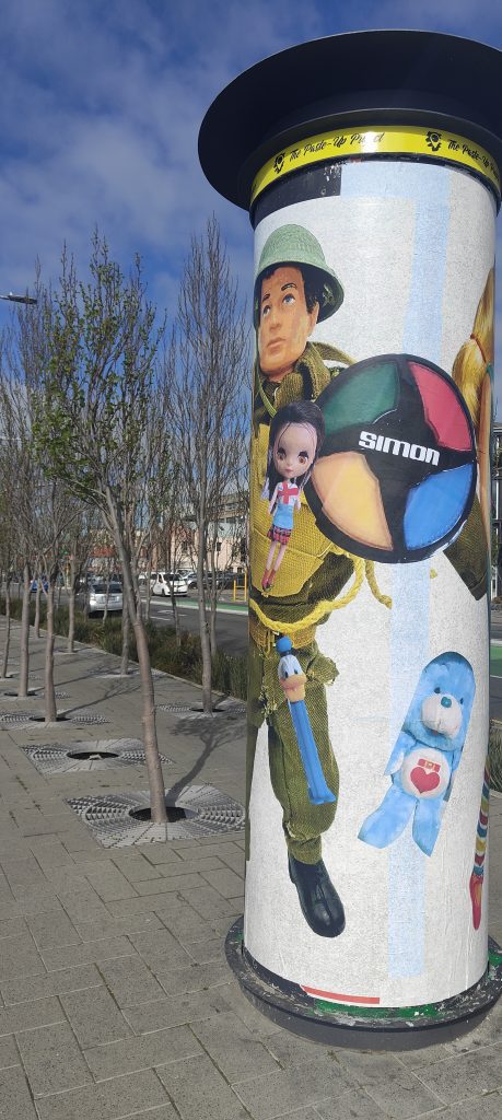
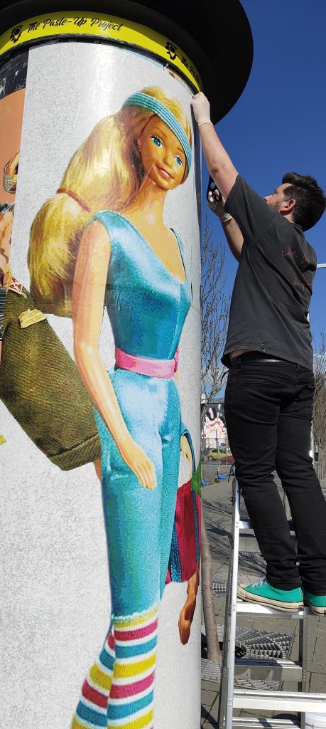
The fourth and final artist in the Paste-Up Project is Mark Catley – one of the city’s longest tenured paste-up artists. Mark’s nostalgic vintage toy paste ups have been a familiar site across Christchurch for many years and as such he was a natural contributor to this project. For his installation, Mark continued his toy parade, this time with huge images of Barbie, G.I. Joe, He-Man and more circling the bollard like a line-up awaiting identification. Catley’s work evokes nostalgia, warm recollections of childhood favourites, but it also illuminates the darker side, from the ridiculous body shapes and reinforced gender stereotypes to the problematic materials used in production. We chatted with Mark and dived into his experiences pasting art around the city and the Paste-Up Project specifically, and, of course, a specific Star Wars character…

It seems like you have been pasting art up around Ōtautahi for a long time, do you remember when you started?

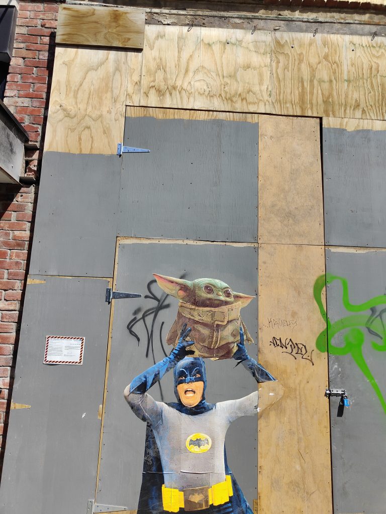
Well, according to my Instagram page, it was 2015. I only worked that out based on when the photos were taken of the big Batman and Robin faces opposite Victoria Square, it’s some fancy restaurant now…

The Permit Room…

Yeah, that’s it!

So, what was the inspiration?

Well, a lot of people were doing it at the time. After the earthquakes, things had changed, and I just thought I’d give it a go. I honestly don’t even remember now. I would’ve had a friend print them out for me. I was doing my insurance work at the time, and I would get emails about toy figures and I would open them up and put them on my computer monitor and I just started taking photos of the faces of Batman and Robin and then I went home and made them bigger and I just pasted them up. At first, I didn’t actually know anyone doing it personally, so I just had to Google how to do it myself. I remember going to one of those Instructables websites about how to make wheat-paste glue. I just used the first recipe I found and I pretty much stick with it even now…  

Did it always make sense as the medium to use to put your art out in the streets?

Well yeah, I mean, I’d never tried using spray cans or anything like that and I figured this was the quickest way to get it up there. Then by chance, the first time I put them up, I think it would have been the Batman head, I remember walking back to my car and turning around to have a look, thinking that’s pretty cool, and there’s some guy yelling out to me: “Hey you!” I was like, oh shit! I mean, it wasn’t that late, it would have been daylight savings, so it had only just got dark, and this guy shouted out to me. I turned around and I just replied “Yeah?” And he asked me: “Did you just do that over there?” I said “Yeah”, and he said it was pretty cool, but he wanted my details, and I just gave them to him. I told him my name, I gave him my cell phone number, and then nothing happened. It wasn’t until six months or a year later that The Press ran a story about this mysterious street artist and it turned out the first guy was a reporter and after the first story was posted on Stuff, that reporter spoke to another reporter and they knew who I was straight away. So, someone from The Press phoned me and said: “Oh, so was this you?” And stupidly I just said, “Yeah it was”, being the good boy I am. I remember hanging up and thinking, shit! So, I rang them back and said: “Hey, why don’t you just not put that it’s me and have a bit of fun with this?” But he was like, “Nah, it’s too late.” So my dream of being a mysterious artist was washed away…

You were never able to become the Banksy figure of mystery…

Exactly, I never really had enough time to give myself a cool name or anything.

I don’t think I’m creative enough to come up with a good name…

I’ve got a good name now, a podcast gave it to me: BosskCat, because Bossk is my favourite Star Wars character and my last name is Catley, so BosskCat. They even made a picture of TopCat, but with Bossk’s head stuck on it. That was some guys in England who thought of it…

You have become known for your annual May the 4th Star Wars bonanza, has that become something that you look forward to each year?

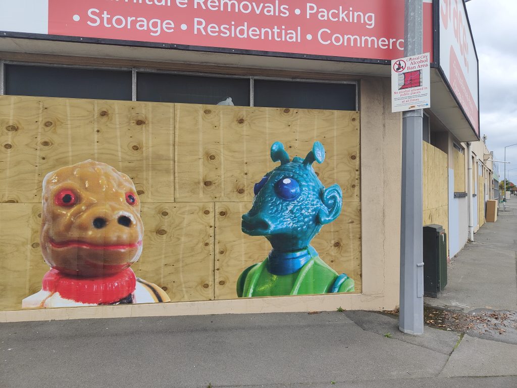
I really like to do it. It’s just a bit of fun and I imagine even if no one else cared, I would just put them up for myself for fun. It must have been a few years ago now, but I remember it was hosing down on the night of May the third, it was stupid weather, you know, there was no way anyway should have gone out putting up paste ups, although some of those pieces have lasted for years. Anyway, one of them was over in Lyttelton, on the old fire station, it was a Princess Leia paste up, but there were about 10 or 12 Russian sailors all hiding under that spot, with bottles of vodka and a plastic bag of cooked fish. They were just drinking and pulling out bits of fish meat to eat. The smell was revolting. I was annoyed because that was the spot, you know, I’d worked out a few days earlier that was the spot, and because it was raining I thought no one would be there. Anyway, I half tried to explain what I was doing but they had no idea what I was saying, they just laughed, so I just quickly did it and got out of there, looking back it was pretty funny…

Interestingly enough, other people started to add to that piece, right? Was that cool to see?

Yeah, they put like little pockets and a big mouth on there, that was cool…

It gave the piece its own life after you walked away, and that’s a good lead-in actually to the Paste-Up Project, because although you haven’t got any Star Wars figures, obviously the vintage toys are a central element, so explain the concept that you’ve installed…

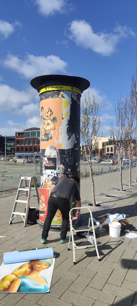
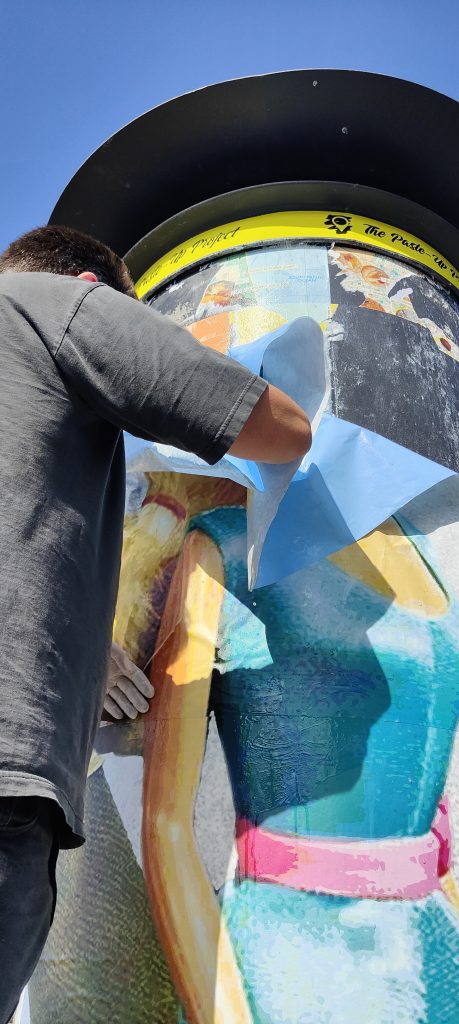
I really wanted to do something interactive and get the public involved. I was treating it along the lines that it’s going to be pretty hard just to keep it updated, let alone with people playing with it, so I just thought I will have some larger figures up there from generic toys from my memories; I really wanted to have a massive Barbie from the 80s, a Sport Barbie in an 80s leotard, showing how crazy the body shape was. I also wanted a He-Man up there too, because I’ve been talking a lot with my friends about how it is so weird that He-Man is such a macho figure, but he’s always in his underwear. It’s the same with fantasy novels like Conan, it’s always fighting monsters in loin clothes, it’s very weird to me. Anyway, I added Raphael, a Teenage Mutant Ninja Turtle, and a G.I. Joe from the 60s. Back in the 60s, all the boys were taught to go to war and fight and kill, this very macho thing, and all the women were taught just to stay home and look after their man and the family, that was the lifestyle, so I wanted to question that. Then I just asked the public to send me photos of the toys that they had as kids. I’ve still got quite a few to put up as well…

The thing with toys is that they have such a powerful sense of nostalgia for us and yet they are often highly problematic and that was one of the things you said that you were wanting to illuminate. But it’s not just the questions of gender identity and body image, there’s also actually the literal toxicity of older toys…

Yeah, it’s crazy when you look into all the plastics that they used, especially back in 50s and 60s, right up to the 80s and 90s and probably still now a little bit with the mass-produced toys especially, all the knock-off toys. They’re getting better now, but its the hidden stuff like all the glues, the paints. I think Fisher Price is one of the first companies to actually come forward and say publicly that you can still collect these vintage toys, but by all means do not let your children use them. It’s quite interesting because a lot of people just really don’t want to hear that. A friend told me that this local Salvation Army store posted that they had all these great toys from the 80s and someone replied saying, hey, this company’s actually come out and said that these are to collect, not for kids to play with, which is a hard thing to hear. Right now I’m holding a 1980s plastic figure, I love all this stuff, but I will wash my hands after playing with something like this, and I don’t really like letting my daughter play with some of these toys. It’s not because they are collectible, they are toys that are meant to be played with, it’s more that we try to get her toys that aren’t toxic. It’s hard, because I still buy vinyl, but ideally, they should be using recycled plastics to make records. It’s just bewildering, it’s crazy…

You have actually worked quite consistently at a reasonably large scale, some of the previous Paste Up Project artists haven’t worked at such a size. Was this project less daunting because of your previous experience?

Yeah, it was good. Really the only issue was the curve of the bollard and learning about the materials, like soaking the adhesive paper for half an hour. But it went up so easily, I couldn’t believe how fast it was. It was really good how it adhered, so it went well, and I enjoyed working at that scale…

That sense of scale seems quite important for your work because that nostalgic element takes on more emphasis when it is larger. As you get older, things seem smaller, so to make them bigger again plays on our memories of them, it brings back that sense of magic. When you see something after a long time and you’ve gotten older and bigger, it never seems as impressive, so recreating them at this massive scale, it brings back that wonder. It gives them a sense of agency as well; it makes them seem like they can talk back. The large size seems to be a good fit with the concepts that are being teased out in your work…

Yeah, I mean it does make a lot of sense. I mean, I like Ghostcat’s tiny builds, his small stuff, with surprises that you have to look out for, the detail’s just amazing. But then I love things that are just stupidly large, oversized and just really like: Bang! There’s Barbie, standing on Manchester Street. I love the fact that everyone just knows what they are straight away, yet it’s still a surprise. 

It automatically attaches people to something familiar, right?

They go in for a closer look and they go, oh it’s He Man! I remember that as a kid! It starts all the conversations about what their childhood was like. Hopefully it makes people smile…

You talked about a few people commenting as they were passing, have people been responding to the work?

Most of it has been positive. I’m always personally surprised that more people don’t stop and have a chat. I’m the sort of person that if I saw someone doing that, then I’m always like, wow, that’s cool, and I’ll go ahead and try and find out what someone’s doing. But you know, most people just live in their own worlds, looking at their phones. Big groups of drunk people are the worst to be honest, that’s why I try not to do it on a Friday or Saturday night. There’s nothing worse than a whole bunch of drunk people, going “what are you doing?” With this work, when people asked, I could tell them that it’s an official project, and they like to hear that as opposed to just putting something up, but then it’s a bollard, you are not just going to put things up on it are you?

That’s the other thing with your installation, the connection with the bollard. Because they are toys, it automatically raises the idea of advertising, so it starts to become an interesting interplay because it’s not advertising and it’s actually doing the opposite because it’s raising some of the issues of consumption. The way you have composed the work, that large-scale parade going around the bollard, was that in some ways to stop it looking too much like advertising posters?

Yeah, it was. At one point what I wanted to do was like a line-up, like The Usual Suspects mug shot. But then I realised that the heights were all different, and it wouldn’t have worked. I mean, I’ve sort of done that, but not really. I just wanted to make something that you walked around, a big continuous piece to look at, and then to add to it over the weeks. I’ve been there a few times and added stuff to it…

I have one last question and this one is probably pretty hard to answer, you’ve mentioned that you’re a toy collector, what’s the one toy you would buy if price was no object?

I’m a Bossk collector, so there is the famous toxic-limbed Bossk from Spain. There are about 50 of them in the world, some say 29. I’m really into the Spanish Star Wars stuff. Basically, they’ve made like 600 million little tiny figures, mainly in China or Taiwan, places like that, but then Spain got a contract, and started producing some Star Wars figures, but the company that produced them, the quality of plastic they used wasn’t as good and so for some reason the Bossk figure’s plastic has degraded and has turned his limbs, his arms and legs, a green colour. They call it the toxic green Bossk and this figure is sought after all over the world, it goes for stupid money. It’s not like the Boba Fett Rocket Launcher, but…

That’s the famous one, right?

Yeah, but it really annoys me, and I’m getting my geeky hat on here, there are fewer figures of the toxic Bossk, but because it’s Boba Fett, it’s given more cred. But Boba Fett is just a dude in a space helmet, he is literally just a guy in a space suit! He’s a cool figure too, but the Bossk is the one! I know that if I ever got it, it wouldn’t be that amazing, I would have it in my hands and it would be, ahh, its OK, but that’s the one I would buy. 

Did you want to give any shout outs?

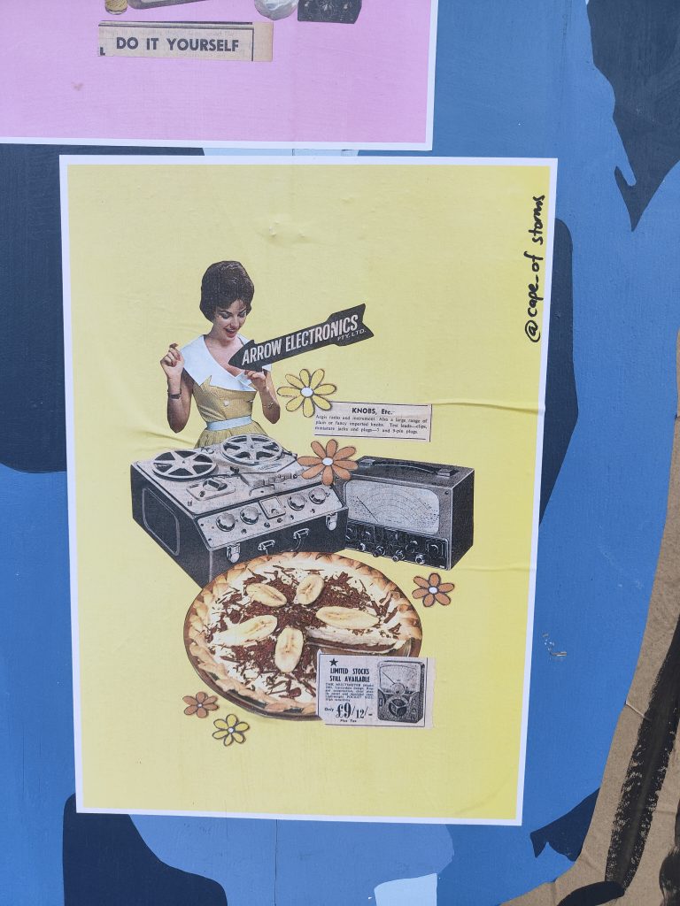
Thanks to yourself and Phantom, JZA, Cape of Storms, and teethlikescrewdrivers, he’s always handy with his advice and he is so enthusiastic. I love the fact that he is all over everything…

That sense of community is driven by a lot of people, but he is right at the heart of it…

If I was younger, I would hang out with them all the time. But I do kind of like working by myself. I have so much work, but it just takes time. It always looks so cool and it’s great when there are new fresh walls. I often think what would my mum think? But she would probably drive right past and that’s alright.

Thank you to Phantom Billstickers and the Christchurch City Council for their support of The Paste-Up Project!

And That Was… October 2022

October is a month that keeps you guessing. The weather is still likely to throw a few curve balls, and people tend to not know if they are still in a mid-year blitz or are creeping towards the end of the year wind-down. It feels like this unpredictable manner extends to the art in the streets, with surprises popping up in the form of both small additions and large projects. October 2022 kicked off with the Christchurch Hip Hop Summit, saw a refresh for the Berlin Wall, and provided a range of little surprises in between. So, let’s have a look at what we loved in October…

The Dance-O-Mat gets a facelift…

Gap Filler’s iconic Dance-O-Mat had already made itself known in it’s new home on Manchester Street, but in October, it got a brighter spruce-up when the Christchurch Hip Hop Summit Graffiti Jam painted the walls of the site with traditional pieces and characters by Tepid, YSEK, Meep, Drows, Xact and APEK. Additionally, the temporary wall was unveiled as a paste-up site, with the wood covered by the Slap City collective.

DTR X FILTH Crews Collab

In addition to the Dance-O-Mat Graffiti Jam, the Cathedral Square section of Spark Lane also got some new art courtesy of a collaborative production between the FILTH crew and DTR. Coordinated by Ikarus as an additional element of the Hip Hop Summit, the jam featured some Christchurch graffiti royalty in a Simpsons/Masters of the Universe mash-up themed production. With the site now opened and more visible, the painting is a timely addition and reminder of the talented local scene.


Now What Belongs Together, Will Grow Together, Bols on the Berlin Wall

Local stencil artist Bols refreshed the west-facing side of the Berlin Wall in Rauora Park. The text-based painting, based on a quote from German politician Willy Brandt, continues the artist’s investigation of words as image. The layered text in reds, orange, yellow and white, echo not only the German flag, but also the flames of protest, a reminder of what it takes to break down walls.

Complementary Summoning Spot

Right next to the Berlin Wall, we also found one of our favourite pieces of street art, if it can be called as such – perhaps it is more aptly described as an activation – of the dead! Cinder’s Complementary Summoning Spot, seeingly installed by Archfiend, is an urban ouija board, adding a spiritual twist to the streets, and daring passers-by to scratch that supernatural itch!

Sam and Sandra…

To sign off on October, we take a very different direction, a much more wholesome example of urban inscription. Is there anything more heart-warming than a declaration of friendship inscribed for posterity? Sam and Sandra are BFF’s and they have committed that to the world, in fact, the world would be that much better if we all displayed that kind of earnestness…

They were our favourite things from October, what were yours? Let us know in the comments!

The Christchurch Hip Hop Summit 2022 – The DTR Graffiti Showcase

The Christchurch Hip Hop Summit kicked off for 2022 with a day of painting and tunes as the oldest of the four elements took centre stage. Organised and curated by Ikarus of the DTR Crew, the Summit’s Graffiti Jam featured two productions; one by a collection of local artists at the re-activated Dance-O-Mat site on Manchester Street and the other, a collaboration between the DTR and FILTH crews, along Spark Laneway between Hereford Street and Cathedral Square. While the two jams had starkly different atmospheres; DJs played music as crowds gathered at the Dance-O-Mat, the DTR and FILTH jam more low-key, they both celebrated the traditions of graffiti and resulted in impressive productions.

Making a Place of Play

Gapfiller’s Dance-O-Mat, a relocatable urban dance floor, is one of the city’s most enduring post-quake place-making icons – a status cemented when the now King and Queen Consort, Charles and Camilla, cut some shapes on the floor when they visited the city in 2012. When the Dance-O-Mat needed a new home, GapFiller found the vacant space next to Paddy McNaughton’s Irish Pub on Manchester Street. The process of installing the dance floor was undertaken and soon, the washing machine discotheque was sending rhythms out across the city and limbs were moving (some more elegantly than others).

The Dance-O-Mat’s new setting was a typical Ōtautahi lot, vacant but for rocky shingle, weeds and bright graffiti painted on the surrounding walls. Now with support from GapFiller, Resene Paints, the Christchurch Hip Hop Summit and a range of artists, the paint covered walls have been given a facelift to match the Dance-O-Mat’s activation. The first addition was a simple black and white declaration of the site as a Gapfiller ‘Place of Play’ – part of the urban play initiative. The mural, completed by Nick Lowry and Bols, simply deploys the graphic Place of Play logo, designed by Ariki Creative, running along the upper section of the Northern wall, boldly declaring the site as a destination. The painting spanning 18 metres in length and starting more than three metres up the wall, was completed in just two days, and set the tone for further activations.

If the Place of Play mural served a practical purpose, the next wave of creative work was brighter and exemplified the Place of Play intentions. On the first weekend of October, the 2022 Christchurch Hip Hop Summit kicked off with graffiti jams – including at the Dance-O-Mat site, where a selection of local graffiti artists refreshed the walls with characters and pieces. The activity, bolstered by DJs playing music, drew sizeable crowds (and dancers), making the most of the (almost) summery weather. Across from the graffiti artists, members of Slap City decorated the dedicated paste-up wall (which already featured a bold ‘Dance-O-Mat’ painting in red and yellow by teethlikescrewdrivers) with paper-based additions big, small and everywhere in between.

The flurry of activity was a perfect introduction for a site that now celebrates various creative outlets, a new must-see destination in the heart of Ōtautahi. The Dance-O-Mat is back and it looks fantastic!

One More, More The Show

More The Show returns this week with One More, More the Show – once again celebrating local wahine artists and raising funds for The Period Place. One More, More the Show will fill the walls of Clubhouse Creative on Southwark Street with art by a wide range of Ōtautahi creatives, painters, illustrators, makers and more. As organiser Lydia Thomas explains, More the Show came from the lack of wahine art at local art shows: “I haven’t been in Ōtautahi long, but I can already see and know of extremely talented females and I wanted to create someone just for them.” The More shows are short and sweet with a playful energy, intended to function like a gig or a festival (music will be supplied by talented local female DJs), a limited window to experience the event. This time, Thomas has a selection of almost 30 artists, featuring returning creatives like Robbi Carvalho, Kyla K and Harriet Murray, but also new contributors, including Emma Turner and Lily Wenmoth. Whereas previous shows have allowed artists to present multiple works, this show is more focused, with each artist contributing just one work, giving each a more unique value. The show will also donate a minimum of 10% of every sale to The Period Place, whose mission is ensure every person with a period in Aotearoa can have access to period education and products. As Thomas declares: “People should come to see the show because the talent of wahine artists in Ōtautahi is out of the gate – we are so lucky be able to head out and enjoy it, to drink wine, eat cake and celebrate!”

One More, More the Show opens Thursday 6th October, 5:30pm – 7:30pm at ClubHouse Creative, Southwark Street. Drinks and food will be supplied by from Buzz Club, Good Sh*t Soda, Young & Co Wines and Full Time Tart.

TUNE! with PK

One of the best things about the TUNE! project is seeing the diverse range of influences different artists reveal. The spectrum of musical collections is a great reminder that nothing is monolithic. It is easy to assume graffiti writers and street artists are all simple stereotypes (hooded vandals or hipster artists), the reality is, of course, not so monochromatic. For this edition of TUNE!, we talk to enigmatic local graffiti writer, photographer and urban explorer PK, who drops an eclectic mix of tunes, from Grace Jones and The Brian Jonestown Massacre to Dam Native and The Birthday Party, a perfect example of spiraling influences…

PK: Music is my second biggest obsession (the first isn’t hard to guess!). I think music is definitely the cooler of the two. I don’t often listen to stuff while I’m painting or going about my day now, but I have fun memories of boosting around on all night missions as a teenager listening to my punk cassettes and BBC One In The Jungle mixes. I wanted this list to have a bit of everything I enjoy but it got to like 50 songs so I cut it down to a lucky 13 that I think represents most of what I’ve been listening to recently…

Burning Witch – Stillborn

Lydia Lunch – Friday Afternoon

Joanne Robertson – Hi Watt

The Brian Jonestown Massacre – E to G

Flipper – Shed No Tears

Townes Van Zandt – White Freight Liner Blues

Alexander ‘Skip’ Spence – Grey/Afro

Scraps – Baby Baby

Grace Jones – Me! I Disconnect From You

Strawberry Switchblade – Trees and Flowers

The Birthday Party – Sonny’s Burning

Dam Native – Battle Styles

Marilao – F*@k Me Moon [Morph]

TUNE! is an ever-growing playlist of the music that inspires our favourite creatives – stay tuned for our next edition!

And That Was… August 2022

I am actually skeptical August even happened. I have the most fleeting recollections of some days that purported to be in August, but I have no certainty, such was the speed with which it passed. On the bright side of this hurtling stream of months is, of course, the impending arrival of weather conducive to art making outdoors – longer days, warmer nights and a bigger audience… But before we get to all that, let’s use all of our available resources to paint a picture of what happened in the mysterious month of August…

Jay Hutchinson @ Fiksate

We have been fans of Ōtepoti artist jay Hutchinson’s work for a while, so it was brilliant to come face to face with his hand-embroidered refuse in our favourite gallery. From a discarded Subway napkin to a greasy KFC chip box (both presented on chunks of asphalt), the jarring juxtaposition of delicate beauty and overlooked mundanity striking and alluring.

Seaside Session

It’s always great to to see familiar spaces get a spruce up and in mid-August, a popular New Brighton spot was the site of a communal re-paint, featuring a range of contributions, including Burga, Peaz, Tepid, Nemo and teethlikescrewdrivers. This evolving space is always good for a gander, full of intentional and accidental collaborations…

IRONS X Yikes (Kind Of…)

Yikes’ startled character, seemingly locked between brick pillars on Manchester Street has been a favourite for years, but a recent addition by IRONS highlighted the way pieces can become a harmonious pairing. IRONS’ painting above Yikes’ work feels entirely organic due to the green background echoing the older piece, a perfect understanding of how to seamlessly fit in…

Ikarus X YSEK

If the Yikes and IRONS juxtaposition was more a response from the latter, Ikarus and YSEK’s Sydenham collaboration was much more planned, a combination of each artists’ iconic style – the unmistakable letter forms of Ikarus and YSEK’s signature animal characters, in this case a blue-skinned lizard, all tied together with a sewer background and unified colour scheme. Chef’s kiss.

Black Panther 2 Trailer

OK, so technically it was released in July, but let’s just say I only saw it in August. The trailer for Black Panther 2 is pretty epic, adding new elements to the story and hinting at the handling of the tragic loss of Chadwick Boseman. Technically it isn’t urban art related, but as someone suggested, the mural of T’Challa spotted in the trailer looks like a Retna and El Mac collaboration, which is good enough for me!

What were your highlights in August? Let us know!

Tune! with Peaz

The next entry in our ever-growing playlist of music that inspires our favourite creatives comes from graffiti artist Peaz. With a mix of hip-hop, low-fi, pysch and blues, these cuts are a perfect blend and reflection of the artist’s tastes and a world view that is about the present and the importance of expression and experiences…

Peaz: I love all kinds of music, especially depending on which part of my life journey is being experienced. Everything from early psychedelic rock to the newer styles, doom, hip hop, blues, jazz and metal. Much like graffiti, I especially value artists with a message, who have a story to tell. There is a lot to be said for music and art that makes us look a little deeper and think a little differently. Most of the artists listed here constantly remind me of what’s really important in life and existing, much like being active as a writer. It’s about looking at the bigger picture and being here, now; living in every moment and expressing oneself as authentically as possible. It’s almost impossible to sweat the small stuff when creating and experiencing, so I suppose that’s what makes music more meaningful to me.

Horrorshow – Waiting for the 5.04


All Day – Wasting Time

Mac Miller – Ascension

@peace – Nothing

Avantdale Bowling Club – Home

All Them Witches – Effervescent

Dead Meadow – The Light

The Doors – Been Down So Long

Kid Cudi – Solo Dolo

David Dallas – Til Tomorrow

Follow Peaz on Instagram

The Paste-Up Project – with Cape of Storms

Urban collage artist Cape of Storms became the third contributor to the Paste-Up Project in early June, her bright installation completed in glorious sunshine. The concept, drawing on the artist’s experiences acclimating to life in Aotearoa through the lens of humorously juxtaposed vintage magazine and advertising imagery, provided a reflection of the advertising often found in our urban environment, almost tricking the passing audience into a sense of normality. Upon closer inspection though, the bollard was filled more playful and acerbic content, including a brick wall section packed with a wide range of images. The result was a bold production with electric colours gleaming in the sun, simultaneously covert and unmissable.

But, then the weather changed and the installation was faced with a slew of challenges. As torrential rain hit Christchurch, the paste-ups started to peel and soon, it seemed as though people had pulled the pieces off, leaving the bollard naked in places. Luckily, part of Cape of Storm’s concept was the incorporation of friends’ work to be added over time, and this unfortunate series of events provided the opportunity to refresh the bollard on a large scale.

Cape of Storm’s installation has not only provided a bold burst of colour, but a fascinating narrative that ties into the nature of both paste-up art and the process of making art in the urban environment…

____________________________________________

Kia ora! Would you like to introduce yourself?

I am Cape of Storms, a Christchurch-based collage artist, I collect obscure retro images and phrases and put them together in a fun and quirky way.

What was your initial reaction to the Paste-Up Project proposal?

I was very excited by the concept, and also daunted in equal measure at the sheer size and scale of the bollard surface area.  I typically work no larger than A3-sized pieces and often very detailed and refined. It takes hours to hunt out and combine different images together into one cohesive new image.  I hand-cut and glue everything with just a pair of scissors or a small craft knife, arrange and overlap, and then carefully glue everything together.  Some of my pieces are comprised of 30 or more smaller images and words!  So, the challenge of this project was filling in all that open space.  In the end my approach was to try to go big, but also fill the space with as much as possible to keep it interesting and provide a piece of art that had several dimensions to it.

With two artists having already contributed to the project, were you primarily interested in doing something different?

Yes, I was keen to do something unique to my style and stay true to that – I think my art style is so significantly different to both Teeth Like Screwdrivers and Bloom n Grow Gal‘s that it wasn’t too hard to be different!

What is the central theme of your installation and how does it relate to your existing work?  

The installation is a progression or continuation of a new style I have been working on for about a year now, which I am really enjoying.

I have titled the series covering the bollard Foreign Objects.   Being a foreigner living in New Zealand, I am continually getting to grips with my identity and trying to relate to my surroundings, often times feeling like a fish out of water. As a  lover of nostalgia, I found myself combining these two themes.

Throughout this series I intentionally tried to create a silly, nonsense, imaginary world that could reawaken nostalgic memories in the viewer.  Over a period of months I sourced hundreds of different found images  – from old cook books, special interest magazines, newspapers, catalogues and children’s books from bygone eras.  Things I remember seeing in my mother and grandmother’s house during my childhood growing up through the 90s.  To many younger people, these images might seem totally foreign or out of place in modern times, as they are simply just not in common use any more.  So through this use of retro “foreign” objects and arranging them together in weird, silly and fun ways, they all come together and are recognisable and familiar as a whole, something that the viewer can relate to.  I tried to select a range of bright candy colours for the background which would stand out on the grey inner-city street-scape around the bollard.  The candy-coloured palette also reinforced the nostalgic theme.  For me, this ended up being very effective at inviting the viewer in from a distance, to come up closer and look at the bollard in more detail, particularly in the heart of winter!

The brick wall section running along the bottom third of the bollard and the very top section running like a ribbon all around is a collection of my existing collage art that I have been pasting up on the streets of Christchurch over the past two years.  It was nice to include these on the bollard as well, alongside the more considered poster series that I created especially for this project.

You decided to remove the spacers on the bollard, making it one consistent 360 degree surface – which makes the experience more continuous, was that the thinking?

I didn’t like the “frames” or physical boundaries the spacing strips created, I wanted each individual poster to look like another part of the imaginary world I was creating. I also wanted to encourage the viewer to walk right around the bollard and see the image as one continuous surface.

You have included some big prints but also some collaborative spaces, what was the intention of the brick wall?

The brick wall section was intended to be a space where the wider Slap City collective group of artists would jump in and slap up various individual pieces, just as we do on our regular paste-up missions around the city.

Unfortunately due to the intense winter weather over the last month and the group not being able to meet up so frequently, we weren’t able to get in and fill that area before about 80% of the bollard surface was damaged in the torrential rain.

But the damage to the bollard has now cleared even more space, so if we are able, we will try and cover the empty spaces up again in between now and when Mark Catley inherits the bollard – I’m very excited to see what he’s got planned!!!

Printing the large posters became quite a process, working with the team from Phantom, has that changed your thinking around your work more widely? And what other challenges did the whole process throw up?

I knew I wanted to print everything with Phantom – they are the experts and their prints are of amazing quality and designed to be more durable and last out in the elements (sadly the record-breaking wet weather we’ve experienced over the last month took its toll!).  The trickiest part was maintaining resolution when scaling up from original A4 or A3 size to A0 size.  I was really worried that the images would look pixelated and poor quality.  In the end I put all my scanned images through a free online tool called The Rasterbator which I hadn’t previously used much before, but is very popular among paste-up artists, especially Teeth Like Screwdrivers, who encouraged me to get into using it. Luckily this helped tremendously in keeping the images sharp and looking half-decent.  I then asked the assistance of the very talented Tom Horton, the printer at Phantom, and he worked his magic, did some test-prints and the posters came out so much better than I could have ever imagined!

The next trickiest part was the installation itself, which I found very challenging having never done anything of that size or nature before.  My design relied upon the posters going up very neatly and level, and the curved surface was seriously difficult to work with, and certainly will not be under-estimated in the future.  I was so lucky to have the help of my partner who is a painter, as well as Vez and JZA who were able to help me paste up high (as I embarrassingly have bad vertigo when up on ladders!).  This project has again made me appreciate what a special, supportive group of people we have in the Slapcity collective, coming together to do awesome stuff, promoting our many and varied street art mediums and just generally have a cool time together.

What does the Paste-Up Project represent for you as an artist who works in the paper medium? Has it given you ideas for where you might be able to take your work next?

I was totally blown away by the opportunity to prepare a legitimate art installation all in paper-based form.  We have a lot of murals and graffiti/paint/spray-based pieces all around the city, so it was really encouraging to receive a project like this especially for paper-based art. For me personally, seeing the sheer scale of the prints, and printing on very high-quality paper has added a whole other dimension to where I think my art could go in the future, and I can see new possibilities for future projects with scaling up and going big. Finding a way to cost-effectively create large prints and in a format that is durable enough to withstand the winter elements and last a little longer out in the streets is a serious challenge for paper-based artists.

Is there anyone you want to thank?

Watch This Space for the support and patience, also for the help cleaning off and preparing the bollard surface ahead of the installation! Phantom Billstickers – Tom, Jake and the team. The Christchurch City Council’s Enliven Places fund for funding and the opportunity. Teeth Like Screwdrivers for the advice, tips and tricks. Vez and JZA for the help pasting up on the day and going high up on ladders when I wasn’t brave enough! Bongo and Neil Swiggs for the donation of some seriously good old books and magazines that I used in a few of the collages. The Slapcity crew for the support & a source of creative inspiration.

And my partner Fernando for allowing the complete take over of my time and helping with the installation!

Stay tuned for our next artist announcement for The Paste-Up Project!

Follow Cape of Storms on Instagram for more collage-y paste-y goodness!


Street Treats, Vol. 7

For the latest installment of Street Treats, we are serving up a selection of pieces, pastes, pixels, petals and beyond. From a reminder of an old pal’s legacy, to epic collaborations and tiny treats, the streets have provided a range of goodies. That is, of course, the joy of the urban environment as a setting for creative (and naughty) interventions, there is no curation. The result echoes the physical presence of our cities, where thousands, indeed millions of people interweave as they go about their own concerns, trials and aspirations. Any city is a collection of individual voices and the art of the streets reflects this diversity, each piece the compulsive expression of an individual that can be read in infinite ways by the passing audience. In a world where online communication has become increasingly toxic and antagonistic, the art in the streets provides something different, still capable of asserting beliefs and ideologies, but devoid of the escalating tensions or echo chambers of comment sections. Indeed, as one image attests, often the response to uninvited additions is not so much beautification as silencing, ensuring a monochromatic environment. So enjoy this platter of pictures and relax, our cities and our communities are not monolithic, and the streets provide the platform for that multiplicity…