Our new Doodle Session series is a deep dive into the creative process of some of our favourite artists. We sit down and let the creative energy flow as they draw, doodle and mark a page, all while we ask a few questions and explore what makes them tick, the role drawing plays, and how it all comes together.
Episode one of our Doodle Sessions features none other than teethlikescrewdrivers – whose energy is evident in the way he annotates our conversation with drawings, from school chairs to pencils, self-portraits to phrases – check it out and get inspired!
Keep an eye out for future episodes on our YouTube channel!
Kophie a.k.a Meep One is such a prominent part of the Ōtautahi and wider Aotearoa scene that it is hard to believe she has not staged a solo exhibition of work – until now! Trials is the artist’s first foray into a solo gallery exhibition, fittingly staged during the 2024 Christchurch Hip Hop and hosted by Fibre Gallery, key connections for Meep, whose work is rooted in the influence of graffiti and hip hop culture and her proud bi-cultural Dutch and Samoan heritage. While gaining widespread attention for her public mural work, Meep is well-versed in studio work, from painting to design and even fashion and jewellery. Trials will focus on her imaginative creative output without the restrictions of public commission conditions. A fiercely principled individual, Meep’s art is always imbued with meanings and discourses drawn from her experiences and observations, even when it appears more surreal than topical. We sat down with Kophie to chat about Trials, the process of bringing it all together, hip hop culture, subversive influences, and a number of other topics…
Your upcoming exhibition, Trials, will be staged at Fibre Gallery in October – I was surprised that this will be your first solo exhibition, for someone with your body of work and profile, it’s been a long time coming…
Yeah, I’ve always wanted to do it, I just haven’t really had the guts! It’s been terrifying because I really don’t like being the centre of attention or anything like that. But art is an important part of my life, and it has been ever since I was born really, so I’m happy to finally do it. I’ve wanted to do a show with a big research project behind it for ages, but it’s just too much and it’s hard to get funding for that scale, so for this show I’m focussed on painting stuff that I want to paint in the moment, experimenting and just showing it really…
There is so much work that goes into organising a show, the logistics of funding it and organising a venue, the promotion and all those things, but an exhibition also needs to have something to say, and it takes time to develop a body of work out of formative ideas. The fact that this has taken a while to manifest, does that mean you feel more confident in terms of what you’re saying?
Yeah, and I feel like once I get my first show out of the way, then I won’t feel so stressed about doing it again. In the past I have put too much pressure on myself to make it perfect, but I have just let that go and just made art.
Trials is taking place as part of the 2024 Christchurch Hip Hop Summit. The influence of hip hop has always been a strong element of your work, how much did street culture, graffiti and hip hop inspire this exhibition?
One of my first introductions to graffiti was seeing the wall at Waltham Park from the first Hip Hop Summit in Christchurch, and the guys from the Summit team have always been supportive of me. I was supposed to do one for last year’s Summit, but I wasn’t able to secure funding, so they’re kind of making me do it this year! Hip hop and graffiti are a massive part of my inspiration, and so is street culture in general, like skateboarding. I wasn’t good at skateboarding, but I was around the culture. Growing up in Wanaka, it’s very outdoorsy, so things like snowboarding were also an influence. Then we moved to Christchurch and seeing all the graffiti when I was a teenager was a big part of my growing up. Once I was transfixed with graffiti and art, apart from non-stop drawing, I would always either bunk or walk after school to the South Library and pour over all the graffiti, art and skateboarding books they had there at the time. When I was at school, I would just sit in class and basically draw on myself all day. A lot of the stuff in Trials is inspired by that feeling I had when I was younger and seeing graffiti for the first time and how the world was back then without social media. I think there is a nostalgia for that time, most days I just want to throw it all out the window and just play in the street like I did when I was a kid. It just seems like the world now is completely different…
I assume the show’s title refers to the trials and tribulations that you’ve been through, but it also suggests the concept of criminality that is associated with graffiti, the challenge of transitioning graffiti into a career in the arts, and perhaps the trials of modern-day life, especially the impact of technology and social media. Was the title intentionally so wide-reaching in its suggestions?
Yeah definitely, when I was trying to think of a name, I wanted something that had multiple meanings. The name evokes the trials I have been through to get to where I am now. I guess I had a hard upbringing, but despite dropping out of school, I was able to get an education and then to do what I do now, I’m very grateful of how far I’ve come and how I’ve gotten through all that. Trials also reflects the fact that I wanted to do a lot of experimentation in this body of work. I’ve had so many ideas for so long and I just haven’t had time or the ability to take time from work and focus on painting. It takes a lot of time and money, which is proving to be difficult even right now. I start at 9am and then finish at 9pm and I’m still working on the same painting…
Obviously, there are a lot of very personal aspects embedded in the show, but something I admire in your work is that when you are painting real people, including your self-portraits, you imbue your subjects with a symbolic quality, a feeling of being an archetype rather than an explicitly specific person…
I like to create the whole character. I don’t like doing realism, it’s not something that I really enjoy. It’s just a skill rather than being able to use creativity and imagination. So, for this show there is a lot more of my cartoony stuff, abstracted and surrealist stuff, subversive stuff. There are a lot of hidden messages. I find straight ahead realism quite boring because you are just painting what’s there. I want to create characters from scratch and give them back stories that reflect how I was feeling in that moment or something that inspired me. I doodle all the time, so I’ve taken a lot of stuff that I have drawn and remember how I was feeling and then I try to turn them into better works…
What does the process look like? How do you go about taking an initial drawing that captures an idea and turning it into a more polished painting?
Working on an iPad makes it a lot easier because I just take a photo of a random sketch and refine it. It’s easier to play with colours and stuff before I paint it. But other times, I just start drawing on a piece of wood or canvas and then I just paint it. So, some of them have a refined sketch, some of them don’t. I’m mostly playing with oil and acrylics on ply, which is my favourite surface. I’m largely using recycled ply that I’ve cut into shapes, it’s reminiscent of some of my paste-ups in the past, big cut out figures, but they’re on ply and nicely painted. There are probably only going to be two real portraits, one inspired by me, because it’s hard to get a reference photo of someone else and I don’t want to use AI, and one of Callum [Kophie’s partner, who is currently finishing a music production degree in Australia] because I miss him! But in both cases, they’re not just portraits, they’re abstracted and stylised, with stories behind them.
You mentioned the presence of subversive elements in your work. How important is working in the studio for the expression of subversion when you are increasingly creating commissioned public works where creative freedom is lessened? Does that become part of that nostalgic element that you’re looking for as well?
Yeah, one hundred per cent. I feel like a lot of my big murals are be watered down a lot because of the client relationship, so this show does take me back to my roots. I’ve always been outspoken and political. I care about issues, so that’s always been a central part of my work. In my first year of study, we had to draw a portrait of a friend. He told me he worked in the meat works, so I drew him like Hannibal Lecter as a joke, and I made this big melting-globe-world-monster thing, and a fish made of scrap materials symbolizing a radioactive fish after the Fukushima disaster, which had just occurred. I guess it comes from the influence of satire, political art, like Obey, and the likes of Adbusters. Skate graphics as well, they have a history of being subversive and they definitely influenced me. That stuff’s always been cool to me. I played a lot of video games growing up and they always had funny subversive stuff, like in Tony Hawk’s Pro Skater, there was a Sasquatch character…
I like that with games now, where you see custom builds and skins, so you’ll have these relatively normal worlds, and then, all of a sudden, they’re populated by giant bananas. The more ridiculous something is, the more it reveals the underlying absurdity of what we perceive as normal…
I like the balance of silly but serious at the same time, it makes you think. All my works are very topical in one way or another, some are just more obvious than others. I feel like a big thing in my work is the impending doom of climate change and how we are all heading towards a fiery death, but no one seems to care. It’s just like head in the sand stuff…
It’s that whole This Is Fine meme, the dog sitting in a flaming room…
That’s exactly the aesthetic, that whole ‘I’m fine’ thing…
We have discussed some of the themes and subject, but is this body of work a progression in terms of visual style?
I feel like it’s me being true to my original style. If you look at my old workbooks, I drew the same sort of stuff but just way worse, so it is an evolution of that. I haven’t really been able to paint big versions of my sketches. I do a little bit in my graffiti when I have enough paint, but not as much as I would like.
It feels like a balancing act of how to express yourself in different spaces…
I guess it comes back to the duality of doing illegal stuff while also trying to go to meetings and be professional. I always feel so fake in a way. But I look at businesspeople who are doing horrendous shit and they don’t bat an eyelid. I’m a genuine person that sticks to their guns, so I just feel really weird about living a double life. I don’t know how to act half the time…
How do you think the idea of a more genuine expression relates to the broader context of hip hop? At its heart, hip hop is very much a DIY culture, but it also has been through so many incarnations; you had the earlier stages of hip hop, street parties and making something from little or nothing, then you had the ‘get cash’ and bling kind of attitude of the nineties onwards, that hustle ethos, and now hip hop has evolved into something different again as it is more commercial today. What hip hop ethos do you identify with most strongly?
I guess hip hop has become very commercialised nowadays and I never want to be a commercial sort of artist. I just want to be someone who makes art about things that are happening in the present moment. I like a lot of underground music.With the Full Steam Ahead crew, we wanted to try and incorporate all the hip hop elements. Even though we mainly do graffiti and rap at the moment, we do have B-Boys in the crew. I love the origins of hip hop. Street wear, clothing and fashion is also a big part of my inspiration. When I was a kid, a lot of the time I would just draw the different outfits that I dreamed of having because I had to wear second hand clothes. It wasn’t cool to wear second hand clothes then! I would draw all sorts of cool outfits. I’d draw girls and then cut them out and make them different outfits like paper dolls. I thought I was going to be a fashion designer! Drawing my characters with cool clothes and accessories is a central part of my art, I guess. The t-shirt as an important platform for messages is another idea I really like. When I was painting recently, I was thinking about all the clothes I had when I was a teenager and stuff, I had this cool t-shirt that said like ‘Big Brother is Watching’ from the 2000s, why did I get rid of it! I want to paint it now, just thinking about that!
That captures the DIY element of hip hop for me, it was created by young people who didn’t have access to things so they made use of what they could, whether it was street corners or subway trains…
That’s definitely a central part of my work and my whole life really. I’ve always made stuff that I didn’t have. I’d make clothes for my dolls from scratch or like second hand fabrics. I just did it out of necessity really. Even now, like I built a fence at home when we needed one. I make do with what I have, I upcycle things, I learn to make and fix what I can. I have always been a DIY type. I’d cut out posters from free magazines when I was a kid, take the posters and cut them up and collage them and poster my room with them. I don’t know, it’s always been like that. I made the hat I’m wearing because I was playing the video game Harry Potter Legacy, and I liked the hat one of the characters was wearing. I was like, I need it, so I made it. My art has always been from second hand stuff or acquired items. Right now, I’m using recycled ply because I had it. It comes down to my ethos of not buying new things for the good of sustainability. Everything nowadays is so crappily made anyway.
The clothing your subjects wear is important, whether a t-shirt with a message or your works that explore Pasifika identity and traditional clothing, these are a reflection of your background and the way fashion has always been so important to hip hop, punk, any kind of street culture…
Yeah, I made the weirdest outfits when I was a teenager. I had a big emo phase and a Boy George phase, like an eighties phase, a gangster phase, haha. I think fashion plays a big part in personal expression, so it is important in my artwork. Especially drawing things that I couldn’t get or creating my own fashion designs…
I want to see some photos of Boy George era Kophie! You mentioned your crew Full Steam Ahead, but of course you are now also a member of TMD [The Most Dedicated]. How big an impact has that had on your work, knowing you are part of a globally celebrated creative collective? Does that bring pressure, or does it just reinforce your self-belief?
I mean, I think about it every single day because it blows my mind that I’m in TMD! I’m so inspired by everyone in the crew. When I was younger, I would use my friend’s computer, because I didn’t have one at home, just to look at pictures of TMD productions and stuff, so it blows my mind really. It did give me the push in confidence to have my own exhibition, because I wanted to in the past, but I was worried that no one would really come or turn up, but I have gotten to the point now that I don’t really care anymore. I am also not making art to for the intention of anyone buying or anything like that, I’m making it because it’s stuff that I’ve always wanted to make and it’s a reflection of myself. Although it is all for sale!
That’s really important I think, because it is quite rare. For a lot of people an exhibition is a way to sell work, to make money, so to have an exhibition where you can be more honest in terms of what you want to say and you can make work that’s important to you, it must make the whole process more satisfying on a personal level…
Yeah, as I mentioned, I wanted to do a whole research aspect and have detailed stories behind each work, but I didn’t have the time and funds to do all that. But it feels more freeing to just do what I feel like doing in the moment and do whatever is topical or influenced by whatever podcast I’m listening to, or if I’m angry or sad or happy, then make something based around that. I feel like it takes the pressure off, and I feel like it gives it more authenticity…
Do you have a defined idea of how the whole show will look?
Sort of, but not really. I’m not sure if they will all really match or anything, it’s just like my brain spilling onto a painting. But I have four paintings so far, and it’s quite a big space so I’ll see what happens. It was quite a short turn around, they asked me a couple of months ago, so I guess I’ve had four months to get it all ready, which sounds like a long time, but it’s not really, especially when you’re trying to do a hundred other things. Paintings take so much longer than anything else. But yeah, I’ll see what I can do!
Who do you want to thank?
Red and Tommy from the Hip Hop Summit and YCD [Youth & Cultural Development], Nina from Fibre Gallery for making me do it, Selina and the FSA and TMD crews, and of course, Callum!
What do people need to know about Trials?
The show will open on the 4th of October at Fibre Gallery on Cashel Street, where my mural Navigation is on the side of the building. I think it opens at 6pm. We have DJ INFARED playing. I might bring some Speights…
As the city’s newest spot to stock up on paint, Rinley’s Writer Supplies has quickly been established as the go-to for the local graffiti community. That comes as no surprise when it is the brainchild of a veteran painter who knows the local scene and what people want, ensuring Rinley’s is truly a store for writers. We visited Rinley’s small-but-well-stocked Sydenham location and caught up with owner Noose to chat about his graffiti experiences, how Rinley’s came into existence and the realities of selling (and stocking) spray paint…
One thing I’ve learned from meeting a lot of graffiti writers is to never to expect what someone is going to be like…
Hard out! I’ve had that here. I don’t know if you know the dude who paints mushrooms, but I met him recently and he was like, I don’t associate with anyone who paints, don’t say who I am or what I look like or whatever! I was so surprised. I was asking him about whether he paints the mushrooms where you would actually find them, and he was like, yeah, kind of, it was a little bit of a road map, which I thought was quite cool. He was a really interesting dude.
There are painters who have been deep in the culture for years and then there’s those who get into it almost independently, who subvert the traditions a little…
I think the scene has changed dramatically as well. I was definitely an asshole, but that doesn’t get you anywhere, it just stagnates your actual growth as an artist when you’re like, that guy went over me, I’m just going to go hard out and make sure I go over them. It means you don’t paint anything good, you’re like, what’s the point, you’re going to get gone over anyway…
Was your introduction to graffiti through hip-hop culture or through another influence?
Skateboarding bro, just being down at the skate park. That was when the older generation were painting walls down there all the time. I was down there every day bunking school and I’d see them painting all the time and I’d try and talk to them. The reception was very gangster and like, what do you write, Toy? It was quite aggressive. So, I was like, OK, that’s how you have to be, you have to have beef to be someone. There was also the whole YouTube explosion around the same time. I started in 2007 and that was when movies like State Your Name and a bunch of big New York graf videos had just came out and had the attitude of, if you buy your paint you’re a toy, and graffiti is a full contact sport. So, I was like, you have to be able to fight and do all these other stupid little things, which is so dumb looking back on it now.
Various artists, 2021
I don’t know if you’d agree, but my feeling is that there are definitely benefits to a less rigid view, a willingness to change and go with the changes…
People like that get better so much quicker because they’re nice people to paint with, because they have opportunities to paint with people who are better than them and they want to paint with them. But if you’re an asshole, everyone will be like, I don’t really want to paint with that guy, he’s going to cause drama, and it’s going to affect the thing that I’ve got going on…
Starting in 2007, you have obviously had experience from both the pre-quake and the post-quake scenes, how do you see the difference?
Pre-quake, if you didn’t have a good tag and you didn’t have a good throw-up, you weren’t allowed to piece. It wasn’t going to happen. Your stuff wouldn’t last, you had to build your name to that point. You also couldn’t paint freights at the time, because of the fear of FILTH and other crews like FAT, they very much held down that scene. There were real repercussions for messing with the thing that they had going on. But post-quake a lot of those dudes left, so this younger generation had a bit of a free for all, there weren’t these scary dudes holding a tight grip on the scene. Obviously, the amount of abandons (empty buildings) as well meant it was just a free for all, it was crazy.
The city was fucked, so people were happy that there was something going on. For years there were three pubs in the city you could go to late at night, there was the Town Ball, that tent one, maybe Dux Live in Addington, so it was pretty grim… Any kind of colour that you added to that was seen as good, you could just paint like there were no laws.
Do you think that environment led to an ongoing change in terms of the perception of graffiti or do you think that bias is still there? Ōtautahi has this reputation for our murals – graffiti has fed into that so much and yet it doesn’t necessarily get the same shine, do you think that’s improved from what it was?
I feel like the level of graffiti that was painted pre-quake went down post-quake. Pre-quake you had the likes of Dcypher, Lurq, USK, Sender, the Wall of Fame by the Colombo Street over-bridge. Then there was the big buff that happened with the train tracks and a lot of that was lost, so it just turned into a tagging and throw-up spot and people stopped piecing and doing productions for quite some time. It wasn’t really until some of those festivals happened post-quake that it was, like, oh shit, we’re getting good recognition for the bombing that everyone’s doing, but we can’t compete at all with the piecing…
That echoes what happened in Auckland with the Rugby World Cup buff in 2011 and years of history were wiped away and that vacuum was filled with a focus on bombing and tagging rather than piecing…
It opened up a spot. It was like alright, those sick pieces and burners and stuff are all gone, now it’s our time to take that spot, let’s just do something quick and fast, like a big stomper or something to claim that spot to use it later to do something. As opposed to being like, shit, let’s do something as good as that or attempt something as good as that…
What names stand out for you in that post-quake era?
Definitely BC crew, JFK crew, Ikarus obviously, Yikes. I feel like When Dcypher came back it was on for DTR. Freak and all those guys were still doing amazing stuff, but you know, its Dcypher, he gets things going…
You talk about JFK, who were super active post-quake – you are a member of that crew, right?
Yep, I am. When JFK was formed, you had to be painting quite heavily to be in it, but there was also a lot of thought about where you were situated in the city; I got put in because I was in Addington, Deok was put in because he was in Hornby… It just made going all city very easy, so that’s why it covered the city quite quickly, there was a bunch of dudes in New Brighton, a bunch of dudes in the east, there was a bunch of dudes out west…
Who else stands out?
Post-quake, 100% Skum from JFK, he was just insane. He was the PK before PK. I remember Skum, Germ, Jot, all those dudes, were going hardcore. Slepa, I think he was kind of going hard pre-quake and kind of died off just after the quake, but yeah, all those dudes were going crazy…
Fast forward a decade or so and we are here today sitting inside your store Rinley’s Writing Supplies, how did Rinley’s come about?
I got caught two years ago and basically, I couldn’t paint Noose anymore, they knew who I was. I had just had a kid. I was going through the whole court thing, where I was put on a year’s good behaviour. At the same time, I was also getting some legal work, and I was saving all the money from that because I wanted to try to do a project, like try to get legal walls for people and to find people new places to paint, do that whole thing. I was getting more jobs doing Chorus cabinets and saving all that money. So, I had bunch of money sitting there and I was like, I can probably open a shop with what I’ve got. I had already thought of the name Rinley’s, I was going to make markers and paint. The name at first was Rinley’s Black and Chrome, it was just going to be black mops, chrome mops. But that sort of changed over time. I messaged a bunch of paint suppliers, shopped around and was in chats with Montana and they were just so on the ball with replying to emails. They were so good to deal with, I was like, this is like a no-brainer, I’ll just take the risk and do it. I sent them a whole bunch of money and three months later all this paint showed up…
Going back to that idea of racking paint to be a real writer, how have your personal experiences shaped Rinley’s and how you have gone about setting the store up?
I wasn’t a racker. When I started the cages came about that made it harder. I was just on the cusp where you could rack from The Warehouse when I was starting. I was just buying paint, and I was buying shit loads of it. I was spending basically my whole wage on paint at one point…
Where were you buying paint?
I was using Embassy hard out, but when Ironlak went, it was a matter of necessity to shop around, so I ended up using Gordon Harris for years. Before I started Rinley’s, I was using Tom’s Emporium.
Tom’s has stocked Montana, you talked about how Montana as a company were really good to deal with, but it also has a strong reputation for quality…
Yeah, Embassy had Montana years and years ago, when I first started, and I loved it. The smell is nostalgic, and its good paint. But honestly, the main reason I chose Montana is how good they are to deal with. Their paint is as good as any other paint you can get, but the level of service and communication when you’re sending large amounts of money overseas is second to none compared to some of the other places. They see a small place like this, and they see the potential. They don’t see it like just some small fry who only want a small amount of paint compared to someone else.
You’ve started Rinley’s at a manageable scale in terms of the shop itself, but you’ve got a big range of cans in a small space!
I think what was happening with a lot of the paint shops was that they were looking at four different, say, burgundies, and they looked at the middle tone and they go fuck, it is close enough to the other ones, let’s just get that and we will step down to the next shade, whereas artists still want those off shades. For someone like Yikes or Dcypher, who do crazy technical pieces, those slight changes in shade mean a lot. For me just painting pieces and stuff, it doesn’t mean as much to me, I can go from a burgundy to a bright red pretty easily, but it’s just like a necessity really, like there’s just nothing better than having a full range that you can just look at. The other thing was when you go into a lot of paint shops or even skate shops to buy paint, they’re all behind a cage. It’s almost like you’re burdening the staff to get the cage open, you feel like you are being watched and you can’t be trusted. That’s why I’ve got this set up, where the door is shut at all times, but I’ll let you in, you pick your own shit, you can compare colours, you don’t have any other awkward encounters. I just make this shopping experience better, because painters aren’t all deviants, a lot are quite successful in their jobs, they don’t deserve to be watched like a hawk to buy paint…
Rinley’s Writer Supplies
Which is all an off shoot of essentially criminalising spray paint…
Which was the stupidest law anyway! People can buy all these pens, there’s no law on the pens. You can go fill up a weed sprayer full of paint, you could go get a fire extinguisher right now from Bunnings, fill it with paint and have the most destructive tool you could possibly have, but for some reason spray paint was targeted. I’ve read the legislation around the time that it was written (early 2000s), I think the perception was that graffiti writers are all lower-class kids, so let’s make it hard for like 15/16-year-olds, not actually knowing that many of them were fully grown men. Which is stupid because they would have seen that in the court papers…
With the rise of urban contemporary art, people are using spray paint as a part of a much broader creative practice as well, but the product is stigmatised by putting it behind cages and making it an awkward experience for people to have to go and get something unlocked and then be watched…
Well, the other crazy thing with the law was that if you are walking around the street at 12 o’clock in the daytime with a bag full of spray paint and you got pulled up by the cops, you’ve got a legitimate alibi as to why you have that spray paint, you do that at 12 o’clock at night and you’re a tagger. Who is to say that you’re not a night worker? I’ll open late for people, like if you want to buy paint late at night, holla out, we’ll sort a time out and you can come and grab it. A lot of the dudes that do come in, they work late, they don’t get the chance to come into paint shops during the week. Not all of them are out painting graf, some are just using it for canvases or whatever they want to use it for…
It’s interesting, I know of a few people who have gone into studying criminal law or things like that, because of experiences associated with painting graffiti. Were you already aware of some of those things from being a writer, or is that stuff that you kind of dived into because you knew that opening the store would potentially bring up some of those issues?
I kind of knew a bunch about the laws just from being caught before, but then I obviously had to look into it from a business point of view; am I liable for selling someone spray paint and then they go out and do a throw up and chuck a Rinley’s tag alongside it? Am I going to get in the shit for that? Which is why you need things like public liability insurance and stuff like that. I mean, if that was to happen, they could take you to court and it could get thrown out, but you’ve just wasted thousands of dollars on lawyer’s fees just to try and argue point which should be pretty straight forward…
Do you have excess stock in storage?
Everything is out at the moment. We will have stuff in storage from this next order, especially in the Montana Gold range, because this (the current stock) is only half the Gold range. We’re doubling the next order in the Gold range. It was just a wee bit of a concern because Gold hadn’t been here for so long, I was worried that people would be like, it’s a dollar fifty more than Montana Black cans, The people that have used it have all said the same thing: the cans go longer, the coverage is better, they’re easier to use because they are low pressure… Even Dcypher said all the stuff he did for Project Legit using Gold has held up insanely well, and that’s like 15 years ago now. So, for people that are wanting to use aerosol for large-scale murals, that’s the shit to use.
Rinley’s Writer Supplies
What’s your time frame for re-stocking? Have you figured out the best way to keep well stocked?
Because it’s coming from overseas, it’s like three and a half months. I am lucky, my partner is a fucking genius when it comes to running a business how its supposed to be run, she’s a superstar at that kind of thing, so yeah, she’s got that side covered. We’ve just placed another order, a massive order as well, to try and time with summer.
You ultimately have a very specific audience, so I assume it’s less about growth as it is about building customer loyalty and a solid reputation…
I’ve had probably a message every other day asking do you ship? do you ship? But at the moment, I’m not interested in shipping because I’m concerned that if I do start shipping, locals come in and they are like, oh shit, man you’ve sold out really quick and it’s like, yeah, I’ve sent a 500 can order to Nelson or whatever. I want to cover local first… and put Christchurch on the map internationally as best as I can…
You’ve got more than just paint as well – tell me about some of the other products you stock…
I pretty much only import stuff that I like! We’ve got a range of markers. The reason I got the silver Uni Paint PX-30s is just because they are the best silver marker you can get. The Sakura Magic’s are just a good black marker and then the Sakura Solid Paint Sticks are cool because they are a little bit different. We have various mops from Krink to Fadebomb and eggshell stickers too.
I see you also have some books, some collectibles and some art for sale as well…
When I had opened, I didn’t have a lot of things up other than the spray paint, the caps and the markers, so a few friends were like, I’ve got some shit that I want to sell, can I put it in your shop? And I was like yeah definitely! It was pretty empty up there, so a mate’s put up his Transformers VHS tapes he wants to sell, he had a custom shoe he wanted to sell, Skum from JFK has like a whole bunch of random buses and canvases that were done in like 2015 or 2016, so we’re selling those, and then the books. I got Fresh Press from the guys up north, and then just like a few other books that I had collected over the years that I’ve read probably 10 times and won’t read again…
You’ve got Flip the Script by Christian P. Acker, I love that book…
Yeah, it’s a bloody good book. The Mike Giant book is really interesting as well. I look at that quite a lot now, just because it reminds me a lot of old Christchurch graffiti. I’m not sure whether or not it was the Art Crimes page from years ago that he was uploading to, and people were taking influence from, but it’s kind of crazy how similar his style and even some of the colour combos and walls that he did remind me of old Christchurch pieces, like how the letters hit the ground… I also listen to his podcasts and stuff and from the sounds of it, he was sharing photo stacks around the world with people quite regularly, so whether or not those stacks ended up here, it was an interesting time back then, the internet was around but it wasn’t used the way it is now…
Having been part of the graffiti scene for so long, does opening Rinley’s feel like a new phase in your graffiti story?
I started in 2007 and I really didn’t want to be coming into my 20th year painting not having done anything, so I wanted to do something at least. I fucked myself getting caught, so I couldn’t do anything impressive graf wise, I wasn’t going to risk getting caught again, having young kids and a missus that was fucking stressing out, so Rinley’s was the answer…
Having been caught, what are your thoughts on how the city approaches graffiti?
Every time they like have some new programme that will stop tagging, they never work! The only thing that does work is giving people space to paint legally. I think the Council now, especially with people like Mel Hillier at the Graffiti Projects team, she understands that, and she can see now that there is a group of people that do just want to paint good shit. They might not necessarily want to go onto painting three-storey high buildings with crazy murals, but they just want to paint nice pieces, they want to chill, to be able to have beers or whatever just down at the wall and just make a day of it…
You know, the city has all these places where people can be physically active. There’s never a problem about basketball courts or pump tracks or skate parks, why is it such a big leap to have a place where someone can paint a wall?
As someone who’s fucking shit at sport, shit at skateboarding, I did it for years and got nowhere with it, the one thing that you are kind of alright at, painting pieces, you’re shunned for!
When you frame it as a chill thing, where you can spend a day with a group of mates painting, having some beers, having a good time, where’s the threat in that?
Everyone that comes past and sees you painting, I’ve never had a bad interaction when we’ve been painting pieces. As soon as the sun goes down though, that’s where the perception changes, even if you are doing the exact same thing after dark, people go, tagger! Which is crazy, just paint in the day and you’re right!
Problem solved! Thanks man – lastly, when can people shop at Rinley’s?
Nine to five, Monday to Thursday, nine to six, Friday, and then nine until twelve, Saturday and Sunday. But from October I’m probably going to be doing appointment only across the board as we are having a baby. But I’ll be low on paint by that time anyway, so I don’t think it will be a massive problem…
And people can find out more on the socials?
Yep! Follow us on @rinleys on Instagram and Threads!
Jacob Root, a.k.a Distranged Design is proud to present Reclaimed – a pop-up exhibition of new works on old surfaces at a temporary space at 4 Cranford Street, opening 6pm Friday, July 12.
Reclaimed will present works painted on up-cycled materials, including pallets, window frames, and used timber, providing a fitting textural surface for his exploration of aerosol – the artist moving beyond traditional stencil approaches and into freehand spraying, thick brush stroke portraits and experimental stencil techniques. We asked Jacob a couple of questions about the show…
Stencilling can be interesting as a technique, you kind of need to find new approaches as you refine the process – what new influences have you developed for Reclaimed and how did they come about?
I think the main influence of trying new techniques was travel, but also the amount of murals I’ve done over the last couple of years where I didn’t have the opportunity or time to cut stencils, so I had to get better at freehand spraying. After it started clicking I just really enjoyed it more, as it’s more hands on painting rather than cutting stencils for hours on end. Also the fact my hand and arm cramps and aches for hours after cutting stencils, it didn’t seem like a long term plan as my only way of creating artworks.
Material surfaces are really important for stencilling and by extension aerosol, too, how much work has to go into making the ‘canvasses’ for Reclaimed?
So far a lot has gone into messing around and rebuilding items, which I’m really loving. Driving around scavenging items that I can beautify by rebuilding, sanding, then painting on them has been incredibly satisfying, and the edginess and grit of the canvases I’ve found compliments my style. I’ve got a lot more to do in the next couple of weeks leading up to the show though!
What is the location for Reclaimed and how did that opportunity come about?
The location is 4 Cranford Street, it’s a new build by Duogroup. Duogroup are the building owners of the wall that Rightbrain and I painted our Sir Ed Hillary mural on, so I decided to get in contact with them and they were kind enough to jump at the idea and let me use their space.
Reclaimed is made possible by the support of Duogroup and the Inkster Company.
Make sure to catch Reclaimed – opening 6pm, Friday, July 12 and open until Sunday, July 14.
Kiwis love a good garage sale. Maybe it is the curiosity. Maybe it is the potential nostalgia. Maybe it is the chance to rifle through someone’s discarded belongings in the hope of finding a unique treasure. Maybe we just love the thought of a bargain that cuts out the middle man.
Ōtautahi creative Daken, known for his bootleg toys and funky, humorous illustrative style, is drawing on the power of garage sales to inspire his forthcoming show Garage Sale with Lucky Dips, opening May 13th at Absolution. Daken describes the show as an exhibition of nostalgia, Kiwiana, trash and treasures, all presented through the lens of a good old fashioned garage sale. We caught up with Daken ahead of the show to find out what we can expect and how the idea came to fruition…
I know you are always busy making, creating and generally tinkering, but when was your last solo show? I had my first solo show way back in 2021, on my birthday actually, which was pretty exciting. That show was almost exclusively a bootleg toy show (with the exception of a couple paintings). I had only been in the toy-making scene for a year at that stage so I wanted to really push what I was doing in that space. I feel like Garage Sale is more integrated with everything else I do, coming together for a more varied experience.
How did the idea for Garage Sale come to you? I know you have an Instagram profile that focusses on handmade garage sale signs… Absolution asked if I woukld like to have a show there (shout out to Rochelle!). I always have show concepts and ideas popping up in my head. The Garage Sale idea had been fermenting for a wee while, and given the opportunity at Absolution, it felt right. I do indeed run an Instagram profile that posts pictures of garage sale signs, I started it back in 2019. Garage sales have always had a special place in my heart. Having a background in graffiti, the idea of guerrilla marketing through a kind of typographic graffiti folk art really interested me. No one sign is the same, they are always made with random materials, and the focus is to just get the message across: ‘Come here, on this date, to look through my old crap and give me cash for it.’ I felt at the time that I needed to document them because, like graffiti, they are such a temporary thing. The Instagram page (@garagesails) was a big seed that helped lead to this show.
What can we expect to find at Garage Sale with Lucky Dips? A Lot of trash, treasure and nostalgia, haha! The show started with the idea of garage sales but slowly evolved into sub genres of nostalgia and identity through the lens of Kiwiana. So, you can expect to see all of these ideas drawn on paper, painted on items, displayed on thrifted clothes, made into toys from other recycled and broken toys and much more…
It sounds like Garage Sale will reflect your diverse practice… I like to think of myself as a jack-of all-trades, master-of-none when it comes to my work. Jumping between materials, mediums and ideas has always been my thing. I use the name Daken’s Emporium because I can’t seem to stick to one thing. The idea of emporiums and garage sales seems to fit the way my work in general is very eclectic in nature. I get an odd feeling, dare I say a sense of magic, when there is a culmination of things that come together to make a bigger narrative. I love how everything has its own history, has a story of when it was made and how it came to be in some place with other things that can be so different, somehow all winding up in the same place… Did I just describe the human experience?! One of the biggest challenges that kicks at the anxieties in the back of my head is it all not working. I look at my contemporaries and other artists and wish that I could pick something and stick with it. But the truth is, trying new things is always fun and exciting for me. So defining my own personal style and voice within so many avenues of work, while challenging, is in the end, who I am.
Do you have final message for people who might want to come and see Garage Sale? For those that intend on coming to the show, have a fun time! I hope I have managed to capture at least a small fraction of that magic I talked about, even for a short period before it’s all separated and taken down, just like a garage sale sign. Also, come say what’s up! I would love to chat about the work, hear your thoughts, and discuss who you think would win in a fight between Swamp Thing and Superman! Oh, and don’t forget to pick up a lucky dip!
Daken’s Garage Sale with Lucky Dips opens on Monday 13th May, 6pm – 8pm, at Absolution Tattoo and Piercing, The Arts Centre – Te Matatiki Toi Ora
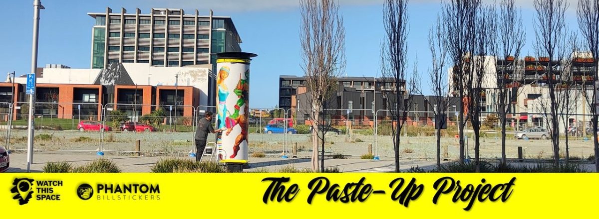
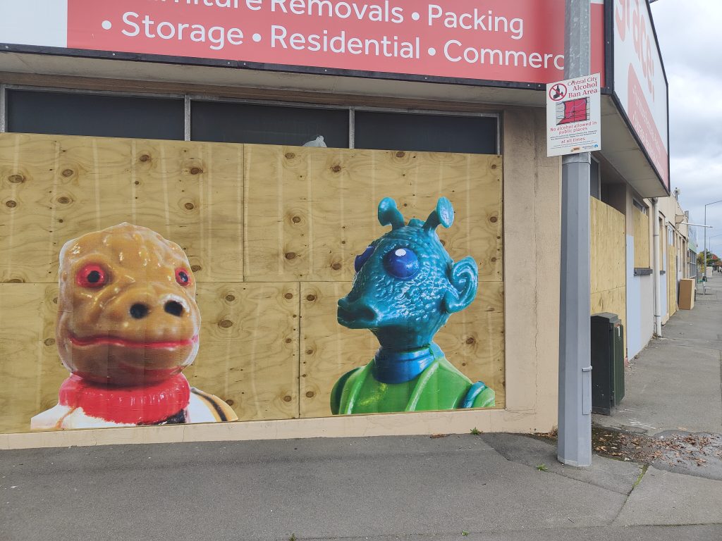
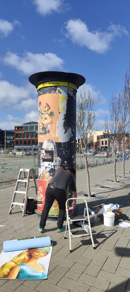
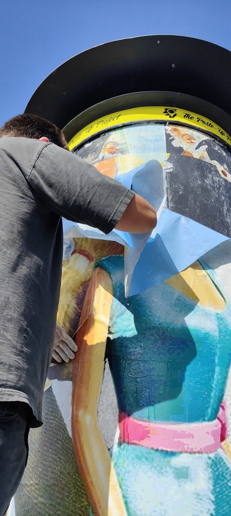
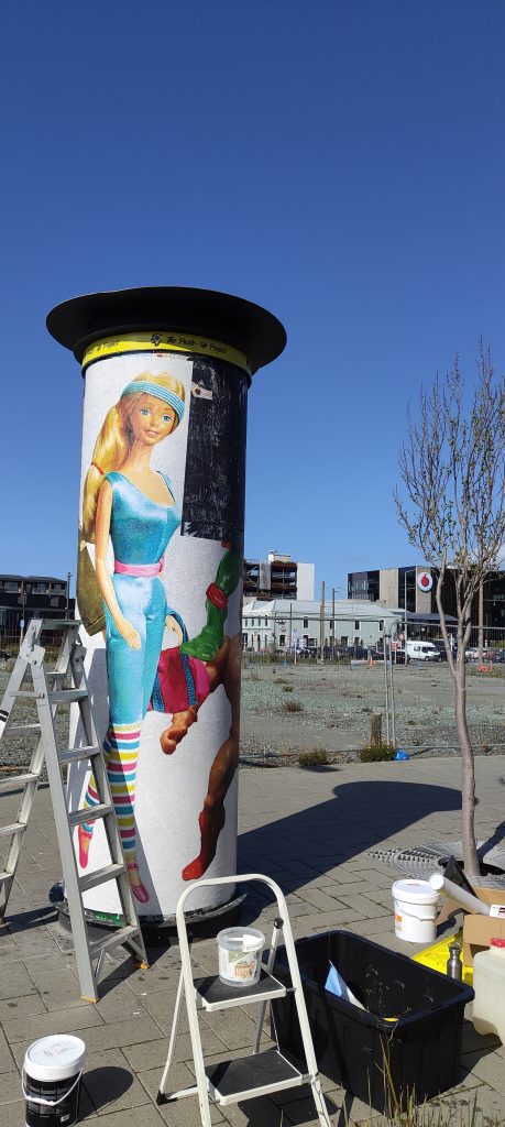
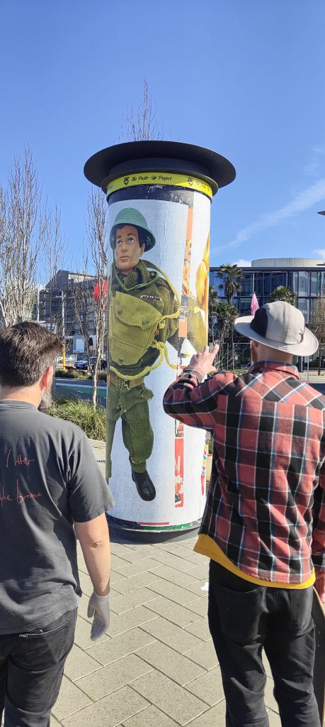
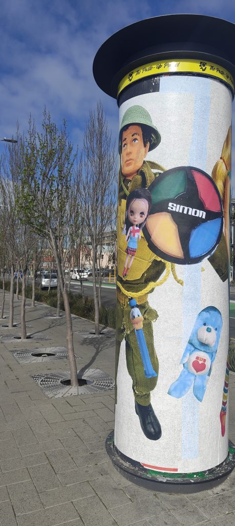
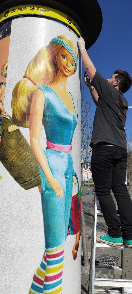
The fourth and final artist in the Paste-Up Project is Mark Catley – one of the city’s longest tenured paste-up artists. Mark’s nostalgic vintage toy paste ups have been a familiar site across Christchurch for many years and as such he was a natural contributor to this project. For his installation, Mark continued his toy parade, this time with huge images of Barbie, G.I. Joe, He-Man and more circling the bollard like a line-up awaiting identification. Catley’s work evokes nostalgia, warm recollections of childhood favourites, but it also illuminates the darker side, from the ridiculous body shapes and reinforced gender stereotypes to the problematic materials used in production. We chatted with Mark and dived into his experiences pasting art around the city and the Paste-Up Project specifically, and, of course, a specific Star Wars character…
It seems like you have been pasting art up around Ōtautahi for a long time, do you remember when you started?
Well, according to my Instagram page, it was 2015. I only worked that out based on when the photos were taken of the big Batman and Robin faces opposite Victoria Square, it’s some fancy restaurant now…
The Permit Room…
Yeah, that’s it!
So, what was the inspiration?
Well, a lot of people were doing it at the time. After the earthquakes, things had changed, and I just thought I’d give it a go. I honestly don’t even remember now. I would’ve had a friend print them out for me. I was doing my insurance work at the time, and I would get emails about toy figures and I would open them up and put them on my computer monitor and I just started taking photos of the faces of Batman and Robin and then I went home and made them bigger and I just pasted them up. At first, I didn’t actually know anyone doing it personally, so I just had to Google how to do it myself. I remember going to one of those Instructables websites about how to make wheat-paste glue. I just used the first recipe I found and I pretty much stick with it even now…
Did it always make sense as the medium to use to put your art out in the streets?
Well yeah, I mean, I’d never tried using spray cans or anything like that and I figured this was the quickest way to get it up there. Then by chance, the first time I put them up, I think it would have been the Batman head, I remember walking back to my car and turning around to have a look, thinking that’s pretty cool, and there’s some guy yelling out to me: “Hey you!” I was like, oh shit! I mean, it wasn’t that late, it would have been daylight savings, so it had only just got dark, and this guy shouted out to me. I turned around and I just replied “Yeah?” And he asked me: “Did you just do that over there?” I said “Yeah”, and he said it was pretty cool, but he wanted my details, and I just gave them to him. I told him my name, I gave him my cell phone number, and then nothing happened. It wasn’t until six months or a year later that The Press ran a story about this mysterious street artist and it turned out the first guy was a reporter and after the first story was posted on Stuff, that reporter spoke to another reporter and they knew who I was straight away. So, someone from The Press phoned me and said: “Oh, so was this you?” And stupidly I just said, “Yeah it was”, being the good boy I am. I remember hanging up and thinking, shit! So, I rang them back and said: “Hey, why don’t you just not put that it’s me and have a bit of fun with this?” But he was like, “Nah, it’s too late.” So my dream of being a mysterious artist was washed away…
You were never able to become the Banksy figure of mystery…
Exactly, I never really had enough time to give myself a cool name or anything.
I don’t think I’m creative enough to come up with a good name…
I’ve got a good name now, a podcast gave it to me: BosskCat, because Bossk is my favourite Star Wars character and my last name is Catley, so BosskCat. They even made a picture of TopCat, but with Bossk’s head stuck on it. That was some guys in England who thought of it…
You have become known for your annual May the 4th Star Wars bonanza, has that become something that you look forward to each year?
I really like to do it. It’s just a bit of fun and I imagine even if no one else cared, I would just put them up for myself for fun. It must have been a few years ago now, but I remember it was hosing down on the night of May the third, it was stupid weather, you know, there was no way anyway should have gone out putting up paste ups, although some of those pieces have lasted for years. Anyway, one of them was over in Lyttelton, on the old fire station, it was a Princess Leia paste up, but there were about 10 or 12 Russian sailors all hiding under that spot, with bottles of vodka and a plastic bag of cooked fish. They were just drinking and pulling out bits of fish meat to eat. The smell was revolting. I was annoyed because that was the spot, you know, I’d worked out a few days earlier that was the spot, and because it was raining I thought no one would be there. Anyway, I half tried to explain what I was doing but they had no idea what I was saying, they just laughed, so I just quickly did it and got out of there, looking back it was pretty funny…
Interestingly enough, other people started to add to that piece, right? Was that cool to see?
Yeah, they put like little pockets and a big mouth on there, that was cool…
It gave the piece its own life after you walked away, and that’s a good lead-in actually to the Paste-Up Project, because although you haven’t got any Star Wars figures, obviously the vintage toys are a central element, so explain the concept that you’ve installed…
I really wanted to do something interactive and get the public involved. I was treating it along the lines that it’s going to be pretty hard just to keep it updated, let alone with people playing with it, so I just thought I will have some larger figures up there from generic toys from my memories; I really wanted to have a massive Barbie from the 80s, a Sport Barbie in an 80s leotard, showing how crazy the body shape was. I also wanted a He-Man up there too, because I’ve been talking a lot with my friends about how it is so weird that He-Man is such a macho figure, but he’s always in his underwear. It’s the same with fantasy novels like Conan, it’s always fighting monsters in loin clothes, it’s very weird to me. Anyway, I added Raphael, a Teenage Mutant Ninja Turtle, and a G.I. Joe from the 60s. Back in the 60s, all the boys were taught to go to war and fight and kill, this very macho thing, and all the women were taught just to stay home and look after their man and the family, that was the lifestyle, so I wanted to question that. Then I just asked the public to send me photos of the toys that they had as kids. I’ve still got quite a few to put up as well…
The thing with toys is that they have such a powerful sense of nostalgia for us and yet they are often highly problematic and that was one of the things you said that you were wanting to illuminate. But it’s not just the questions of gender identity and body image, there’s also actually the literal toxicity of older toys…
Yeah, it’s crazy when you look into all the plastics that they used, especially back in 50s and 60s, right up to the 80s and 90s and probably still now a little bit with the mass-produced toys especially, all the knock-off toys. They’re getting better now, but its the hidden stuff like all the glues, the paints. I think Fisher Price is one of the first companies to actually come forward and say publicly that you can still collect these vintage toys, but by all means do not let your children use them. It’s quite interesting because a lot of people just really don’t want to hear that. A friend told me that this local Salvation Army store posted that they had all these great toys from the 80s and someone replied saying, hey, this company’s actually come out and said that these are to collect, not for kids to play with, which is a hard thing to hear. Right now I’m holding a 1980s plastic figure, I love all this stuff, but I will wash my hands after playing with something like this, and I don’t really like letting my daughter play with some of these toys. It’s not because they are collectible, they are toys that are meant to be played with, it’s more that we try to get her toys that aren’t toxic. It’s hard, because I still buy vinyl, but ideally, they should be using recycled plastics to make records. It’s just bewildering, it’s crazy…
You have actually worked quite consistently at a reasonably large scale, some of the previous Paste Up Project artists haven’t worked at such a size. Was this project less daunting because of your previous experience?
Yeah, it was good. Really the only issue was the curve of the bollard and learning about the materials, like soaking the adhesive paper for half an hour. But it went up so easily, I couldn’t believe how fast it was. It was really good how it adhered, so it went well, and I enjoyed working at that scale…
That sense of scale seems quite important for your work because that nostalgic element takes on more emphasis when it is larger. As you get older, things seem smaller, so to make them bigger again plays on our memories of them, it brings back that sense of magic. When you see something after a long time and you’ve gotten older and bigger, it never seems as impressive, so recreating them at this massive scale, it brings back that wonder. It gives them a sense of agency as well; it makes them seem like they can talk back. The large size seems to be a good fit with the concepts that are being teased out in your work…
Yeah, I mean it does make a lot of sense. I mean, I like Ghostcat’s tiny builds, his small stuff, with surprises that you have to look out for, the detail’s just amazing. But then I love things that are just stupidly large, oversized and just really like: Bang! There’s Barbie, standing on Manchester Street. I love the fact that everyone just knows what they are straight away, yet it’s still a surprise.
It automatically attaches people to something familiar, right?
They go in for a closer look and they go, oh it’s He Man! I remember that as a kid! It starts all the conversations about what their childhood was like. Hopefully it makes people smile…
You talked about a few people commenting as they were passing, have people been responding to the work?
Most of it has been positive. I’m always personally surprised that more people don’t stop and have a chat. I’m the sort of person that if I saw someone doing that, then I’m always like, wow, that’s cool, and I’ll go ahead and try and find out what someone’s doing. But you know, most people just live in their own worlds, looking at their phones. Big groups of drunk people are the worst to be honest, that’s why I try not to do it on a Friday or Saturday night. There’s nothing worse than a whole bunch of drunk people, going “what are you doing?” With this work, when people asked, I could tell them that it’s an official project, and they like to hear that as opposed to just putting something up, but then it’s a bollard, you are not just going to put things up on it are you?
That’s the other thing with your installation, the connection with the bollard. Because they are toys, it automatically raises the idea of advertising, so it starts to become an interesting interplay because it’s not advertising and it’s actually doing the opposite because it’s raising some of the issues of consumption. The way you have composed the work, that large-scale parade going around the bollard, was that in some ways to stop it looking too much like advertising posters?
Yeah, it was. At one point what I wanted to do was like a line-up, like The Usual Suspects mug shot. But then I realised that the heights were all different, and it wouldn’t have worked. I mean, I’ve sort of done that, but not really. I just wanted to make something that you walked around, a big continuous piece to look at, and then to add to it over the weeks. I’ve been there a few times and added stuff to it…
I have one last question and this one is probably pretty hard to answer, you’ve mentioned that you’re a toy collector, what’s the one toy you would buy if price was no object?
I’m a Bossk collector, so there is the famous toxic-limbed Bossk from Spain. There are about 50 of them in the world, some say 29. I’m really into the Spanish Star Wars stuff. Basically, they’ve made like 600 million little tiny figures, mainly in China or Taiwan, places like that, but then Spain got a contract, and started producing some Star Wars figures, but the company that produced them, the quality of plastic they used wasn’t as good and so for some reason the Bossk figure’s plastic has degraded and has turned his limbs, his arms and legs, a green colour. They call it the toxic green Bossk and this figure is sought after all over the world, it goes for stupid money. It’s not like the Boba Fett Rocket Launcher, but…
That’s the famous one, right?
Yeah, but it really annoys me, and I’m getting my geeky hat on here, there are fewer figures of the toxic Bossk, but because it’s Boba Fett, it’s given more cred. But Boba Fett is just a dude in a space helmet, he is literally just a guy in a space suit! He’s a cool figure too, but the Bossk is the one! I know that if I ever got it, it wouldn’t be that amazing, I would have it in my hands and it would be, ahh, its OK, but that’s the one I would buy.
Did you want to give any shout outs?
Thanks to yourself and Phantom, JZA, Cape of Storms, and teethlikescrewdrivers, he’s always handy with his advice and he is so enthusiastic. I love the fact that he is all over everything…
That sense of community is driven by a lot of people, but he is right at the heart of it…
If I was younger, I would hang out with them all the time. But I do kind of like working by myself. I have so much work, but it just takes time. It always looks so cool and it’s great when there are new fresh walls. I often think what would my mum think? But she would probably drive right past and that’s alright.
Thank you to Phantom Billstickers and the Christchurch City Council for their support of The Paste-Up Project!
I remember seeing Tom Kerr’s tattoo flash drawings illustrating lines from Bruce Springsteen’s iconic 1982 album Nebraska on Instagram around two years ago. As a long time fan of the musician, I was an immediate intrigued. The album, famously recorded in Springsteen’s bedroom on a four track recorder, stands as one of the New Jersey native’s most celebrated works, devoid of the stadium rock scale and instead focussed on Springsteen’s intimate Americana story telling. I reached out to Tom at the time and he told me of his plan to draw imagery for every song, I was excited to see what would come from the project. It may have taken some time, but finally the suite is ready for exhibition as a complete body of work. As you can imagine, I was excited to sit down with Tom and we sermonised about Springsteen, Nebraska and the process of making these works…
I have always found, depending on prevailing tastes, that it can sometimes be hard to admit that you are a Springsteen fan, you never know response you are going to get! For some people, it’s still the flannel shirt and Born in the USA, but there is, of course, this whole other side to Springsteen. How did you kind of come across his music?
My dad is a huge fan, so growing up, Springsteen classics were always playing, especially Born in the USA and Born to Run and stuff, but I think getting older and being a young adult, I just resented Springsteen and thought for so long it was just dad music. Then my really good friend Dan, who probably has the best taste in punk music I know, was like, have you listened to Nebraska? I was like, nah, I don’t really rate any of Springsteen’s music, it’s all dad rock or whatever. I think he said something like, forget everything you know about Springsteen before you listen to this album, it’s not a big band, there are no saxophone solos or type of shit. I was really into lo-fi music, recorded songs, and I got more and more into that and through that I went back to Springsteen’s wider catalogue and listened to Born to Run and that’s when I fell in love with all the classics. You get to an age when you realise the music your parents loved is good. As a kid, you push so hard to be like, I don’t want to like the music my parents liked, I’ve got better taste than they do. But then you grow up and realize that Elton John and Springsteen and Cat Stevens, and all those dudes are flawless musicians…
The idea of Springsteen being ‘dad rock’ was so strongly entrenched from his mega star status in the 80s, but I was always more into his early, kind of romantic street poet aesthetic, the storytelling, the Magic Rat and stuff like that, and then Darkness on the Edge of Town, The River and eventually Nebraska continue that storytelling vein in a darker tone. Born to Run is about escaping, but those later albums are about being trapped, or what happens when you don’t get out, and I think as you get older, there’s something about that idea…
With Nebraska, the songs are so well done, you listen to Johnny 99 or Highway Patrolman and they go for three minutes and you know everyone in the song, you know about their dreams, their aspirations. The song ends and you are like, how have you painted such a picture with like three chords and just like talking about these guys? He tells us how characters went to war, how the farm didn’t work, about having a brother who is a loose cannon and shit, I couldn’t tell someone that much information in just three minutes…
They are short, yet they are almost cinematic in scope and vision. The other interesting thing is Springsteen’s influence on the New Jersey punk scene, right? The Dropkick Murphys, The Gaslight Anthem, he’s had this interesting standing where the broader public have this perception, but the people in the know have a different understanding…
I think it comes from digging a little deeper. Born in the USA was his commercial success, it was in the 80s and there was so much marketing when they made that album, they made him shave and go to the gym to look like a working-class farm boy or whatever. But in reality, if you look at photos from Greetings from Asbury Park, he’s wearing a beanie, he has long hair and is wearing bell bottoms and shit, and he’s the complete opposite of what most people think of Springsteen…
The ripped arms, the sleeveless flannel shirt, the headband, but then you go back to that earlier ‘Skeeter’ persona, the leather jacket and the oversized beanie, the scraggly beard, hanging around in Asbury Park, playing bars like The Stone Pony…
The E Street Shuffle kind of stuff…
Born in the USA is interesting though, it is really misunderstood, it is actually an album that’s way darker than everyone perceives, there is actually a kinship with Nebraska…
Nebraska was all demos. I think they did The River and they toured it and then Bruce wanted to break off from the E Street Band and become a solo musician or he wanted to break off from the concept of what The E Street Band were doing, so he recorded these demos and when he took them to the label, they were like, this isn’t happening, so he went back in the studio and did Born in the USA. In the Born in the USA tours they do live versions of Johnny 99 and a few more of the demos that were in Nebraska actually ended up on Born in the USA, like Working on the Highway. I think they tried them all as full band songs and half of them just flopped…
Born in the USA was written to be much more sparse, right? Originally the songs were stripped down versions, the title song was more bluesy and, of course, No Surrender is the most punk song in his catalogue…
We learned more from a three-minute record than we ever learned in school… So good!
But it’s lost in that full band bombast…
Even the song Born in the USA, when you ask a person on the street if they know the lyrics, most people are going to say, I was born in the USA and I was sent down to kill the yellow man… It sounds really redneck, like I’m proud to be an American and shoot Commies and all that sort of shit, but then you listen to it and it’s like, I lost my job at the plant, I came back and no one thinks I’m a hero, all my mates are dead, they didn’t come back, it’s the same narrative as Forrest Gump…
Born in the USA was co-opted by Ronald Reagan and the Conservatives as a rallying slogan and it has just never escaped that association. Although, since Springsteen came back with The Rising, and his role post as a sort of post-9/11 poet laureate figure, his politics have been made much clearer. His work has always fluctuated between big arena sounds and more intimate albums, like The Ghost of Tom Joad and Devils and Dust, but Nebraska definitely stands out…
Apparently, when they finally got into the record pressing stages of Born in the USA, he still had the tapes for Nebraska and every single time he got into a room with an engineer, he was like, we’ve got to put it out. I think they finally agreed to do a small run as a mini album, but it was recorded so poorly that every time they tried to cut it to a record, the lathe would bounce out of the record. They went through like five engineers or something to finally actually mix it properly because it was just like boombox recordings and the mics were too loud or there was not enough going on…
As a musician yourself, does the story behind the making of Nebraska, which Springsteen recorded on a four track in his bedroom, add to the allure of the album?
Yeah definitely. There’s so much information around and half of its fake, half of it is bullshit. The best story I’ve heard about it was that it was recorded on a Tascam four track, so to bounce it down to tape, you then record it on a boombox or a normal two track or stereo tape recorder. So, Springsteen bounced it down from a four track to a boombox and then he’d take that boom box out on a row boat and go fishing in an estuary. Apparently the boombox fell into the water and he waited for the tide to go out to get it back. The boombox was fucked but the tape was fine, so they washed out the tape and that’s why it’s got so much filth and grit to the music. It’s a great story, but I have no faith in it being real…
A real fishing tale…
Four tracks have a tape speed, so if you have a 40-minute tape, if you record on half speed, you get like 80 minutes. A lot of people think that Springsteen had the tape speed like just slower, but then whoever mixed it down for him, knocked it back to 12 o’clock, so if you try and play guitar to the songs, they are like a quarter step out of tune, and not in E or E flat, but like halfway between, which gives it this weird quality. I think people subconsciously resonate with it because it’s not an E chord or an E Flat chord like most bands would write music in, it’s something slightly different…
So, you play his songs?
Originally, I thought it would be cool to put on the show and have a different musician play each song from the album. I’ve got Johnny 99 and Reason to Believe down, but the rest of them are so hard to play. I don’t know if it’s because he recorded the guitars and then did vocals over the top, or it’s just his style, but there are some sentences I just can’t get through being able to strum it right, especially Reason to Believe and the bit about the preacher standing with the Bible and the congregation’s gone home, it bounces up and down differently to the way you strum a guitar. It’s probably just his style, but every time I get to that mark of the song, I fuck it up, it’s so hard…
So, the exhibition is based on your response to each song?
Kind of, I’ve basically just drawn the image each song painted in my head. When I drew them, I wasn’t tattooing yet, I was still building, but I would draw after work three nights a week and I eventually just ran out of ideas. I had listened to the album a couple times and it hadn’t really resonated yet, but I valued Dan’s taste in music so much that I was like, it has to be good if he recommended it. I ended up working on a job by myself and instead of using a work radio I just wore headphones and I listened to the album. I used to always skip Nebraska [the first song and title track] because Atlantic City is such a banger, but I finally listened to Nebraska with headphones and the lyrics were clearer and the song is just about a guy and his girl killing ten people and getting the chair. I just thought it would be pretty cool to draw a guy sitting on an electric chair with his girl sitting on his lap. I was drawing so much after work and I just needed more briefs, so I was like oh, I’ll try to Atlantic City next week and then after I’d done three songs, I was like, well I have to do the whole record now and then they just sat for ages…
It became a ritual…
Every week, yeah. Instead of listening to the album, I would just listen to the one song I had to do that week, all week, to really try and close my eyes and think what the snapshot would be.
What was that process? Did you find yourself gravitating towards types of imagery or certain phrases?
Yeah, certain phrases…
Was there a consistency across the phrasing that you were picking out of each song? It seems to me a pretty cohesive album…
I think probably being a New Zealander and listening to songs written by a Jersey boy recorded on tape or whatever, lots of things in my head kind of had that Sopranos or old American movie type stuff. For Mansion on the Hill, I just had this big American, gothic-like Addams Family mansion…
There is some really memorable imagery throughout the album, like in Atlantic City: “Well, they blew up the Chicken Man in Philly last night…”
So good. There’s a really good newspaper photo of the Chicken Man’s house, his front door is like Ground Zero, like there’s just weather boards everywhere. Originally, I thought the Chicken Man was a go-to fried chicken spot and they blew it up because it had been abandoned or fallen apart, like the Santa Monica pier where the Z Boys surfed, which had fallen into such disrepair the Fire Department never showed up. I was like oh, the Chicken Man must be a restaurant, and then I read about the crime families and stuff, and it’s actually a guy…
Were you doing research to inform the imagery as well, or were you wanting a more pure response to the lyrics?
I think with the tattoo style and so much being reference based, I was trying to find actual references to draw on and still trying to capture the imagery from the song. The drawing I did for Johnny 99, I found a shot from a hostage scene in a movie, but then I had to draw one of them as Johnny 99, and one of them is a gas station attendant, so I had to research clothing a gas station attendant would have worn in America in the 50s or whatever, and try and make it look a little bit old school. So that was fun, having the image in your head and trying to draw it and portray it as more than a feeling because at the end of the day, it isn’t actually an image, it’s just an overall vibe that you’ve got in your mind…
Did you revisit any over time?
They were drawn and that was it. I think too, because the idea was to do one a week, and because I’m always trying to find shortcuts, one of the songs I didn’t initially rate that much, like My Father’s House, I would have been quite happy to skip it and just do it at the end, but I just knew if I did all of them and left that one until the end, I would have just skipped it and never done it. As a result, having to listen to My Father’s House for a whole week, by the end, I was like, this is such a great song…
So, when you were originally drawing them, were you drawing them as tattoo flash?
Yeah, the expectation was just that people would get them tattooed. People responded to them really well, but no one actually got them tattooed. I drew them ages ago, so I thought I will see what happens, if I tattoo them or not. But then a couple of years ago I was like, I need to do a zine and an exhibition. The space at the shop [Absolution] was already booked out for like a year, but I saw that the 40th anniversary of the album was coming up in two years’ time so, I thought, two years is ages away but it would work. It flew by because of Covid, so I was like oh shit, two years already! Time to do the show…
It feels like a traditional tattoo style is a really good fit with the album. I know the most immediate association is the black and white album cover image, but if you were to turn Nebraska into an art style, I kind of think it would be black and white photography and traditional tattoo flash…
At the time, my main medium was a Sharpie pen and black colouring pencil. It still is now, but instead of using a Sharpie I use a point 6 Artliner, so it’s just a little bit smaller. But the thing I love about a Sharpie, especially for text, is that if you make the text too small, things like a lowercase E, get the bleed in the eye of the E and it becomes solid, it’s the same as if you were using a typewriter and the ink was too runny, all those things close up. In traditional tattooing, because the lines are so bold, if you do them too small the lines go close together, so all the designs have to be very contrasting to the skin that you don’t tattoo, so all the lines have to be far apart. So, for instance, if you are tattooing a hand, you don’t bother doing all four fingers because you know it will just blow out and become black, so you imply the form. On Nebraska because a lot of the songs are demos, a lot of the details are implied; the harmonica solos, and you know when he does those high pitch screams, I feel like a lot of those are his way of saying this is where the sax solo would go… Because it’s just a tape recording, there’s no thought put into it. I will play four bars, and I will whistle, or I’ll play harmonica, and in the studio we can decide whether it’s going to be sax or synth. That’s kind of the beauty, because its good enough. People will be led to believe it’s a conscious decision and it’s the same with tattooing with a really big needle, you are kind of governed by how much freedom you have, so the decision you make is that less is more, I guess. You can sort of imply something in same the way you would imply a sax solo by just humming, and people will go I love how you are humming that bit and you go, I didn’t know what else to do…
When you look at the works now and when you think about displaying them, does it make you more aware of the album’s narrative?
I think what hammered that home was the introduction I wrote for the zine. I wrote it as a dedication to everyone who is described in the album; everyone who ever felt like going on a killing spree with their girlfriend, or wanted to live in the big mansion on the hill, or fell out with their parents and that sort of shit. The last song is Reason to Believe, so it comes around to a dedication to all these people who went through all this shit and somehow, even though you are at the end of your rope, there’s something to believe in that is bigger than we all are, and then the album just ends. So, there is that conscious story-telling that is so good, you can’t believe that the sequencing hasn’t had a heap of thought put into it, we’ll close it out with this song about faith, and he doesn’t even mention that it’s in God, he just mentions that there is something that makes you get out of bed each day…
That reason can be so many things; the person you wake up next to, the vision of that house you grew up in, everything that precedes that song can be one of those reasons to believe…
Like in Open All Night, I drew a nice car, but he talks about having this car up on blocks, working on it. It’s probably a shitter, but he loves it and that’s probably his reason to believe, this rad car…
Cars are such an important image in Springsteen’s songs…
Nebraska is about the first ever spree killer, the first person to kill in a car crossing state lines. In his autobiography, Springsteen talks about how his Nana or someone told him in an electrical storm you can’t get electrocuted in a car because of the rubber tyres, so in the book, he’s like, when I was a little kid whenever there was a lightning storm I would run out of the house right into the car, and then I proceeded to write songs about automobiles for the next 40 years of my life. His whole career comes back to this story of cars being like a saviour…
So, what do people need to know about the show?
It opens at Absolution on Friday the 30th of September, which is also the 40th anniversary of Nebraska, technically it would be Saturday, Friday in America, but yeah, it starts at 6pm. I’m thinking I might give away a prize for the best Springsteen outfit, but I’m going to try and encourage people to think outside the box and not dress like Born in the USA Springsteen, which I think is the whole point, educating people that there is a Springsteen behind the Boss. Like Dan said, forget everything you know about Springsteen, this is the record. If you don’t like Springsteen yet, hopefully this one is the one…
I’m not sure how I’m going to lay it out yet. It’s rare to not see a tattoo artist use an iPad now, even I use an iPad, but back in the day, you used to do everything on tracing paper first, then you would do a nice one on paper. I’ve still got the tracing paper drawings from these works, so I’m thinking, because Nebraska was a demo album, I might hang all the final artworks and then around the corner I might hang all the tracing paper works and the lino cuts and all that sort of stuff. I was thinking I might use a string line to line everything up but I might leave it up, highlighting that Nebraska was a working idea that wasn’t supposed to be finalised and left like that…
What’s the one line from Nebraska that you think best sums it up?
I probably change my mind every day when I listen to it, but right now it’s probably in Reason to Believe:
Take a baby to the river, Kyle William they called him
Wash the baby in the water, take away little Kyle’s sin
In a whitewash shotgun shack an old man passes away
Take his body to the graveyard and over him they pray
It all happens in the same breath of air, someone’s in, someone’s out. We are all just doing it. Reason to Believe is probably my favourite song on the album, as much as I love Atlantic City, but Reason to Believe is so good, there’s the line about the girl waiting for Johnny to come back, there’s the wedding, the preacher standing with the bible but the bride didn’t show and the congregation’s gone home. It’s a tough one, actually maybe it’s the opening line:
Seen a man standin’ over a dead dog lyin’ by a highway in a ditch
He’s lookin’ down kinda puzzled, pokin’ that dog with a stick
Got his car doors flung open he’s standin’ out on Highway thirty-one
Like if he stood there long enough that dog’d get up and run
It’s a vivid image, right?
It’s such a wicked lyric, like did he see that or just make it up? I like the idea of someone just standing there being like, c’mon, get up man, this can’t be it… It might come back to the death of the American dream, poking it with a stick is not going to get it going again, you just have to get back in your car and keep driving.
But it’s the reason to believe, it might not get up and run, but you can hold onto something, hope is always there…
Or you could be the dog, hoping someone might poke you and not just keep speeding past…
I became aware of Hostile Body, an exhibition of digital art produced under the identity of Auspicious Victory, through somewhat cryptic social media buzz. I had recently been grappling with the rising profile of digital art through the lens of crypto currency, skeptical of the way digital art was being represented as PFPs and 8-Bit illustrations. But Hostile Body was presenting a much more considered, conceptual and interesting approach, layered in intense visuals and tied to reality in haunting way, it suggested the best of digital practice. With the exhibition opening approaching, I was fortunate enough to talk to Auspicious Victory and find out more about the concept…
How would you describe Auspicious Victory – is it an identity, an alias, is it something more conceptual? How has Auspicious Victory evolved over time?
Gender neutral and identity fluid (they/them), Auspicious Victory can be anyone or no-one. Auspicious Victory comes from Amarapura “The house of the immortals” and preaches simulation theory as fact. Part designer, marketer, performance artist, techno prophet, visual artist, and activist all in one. Auspicious Victory’s true identity is irrelevant as they will tell you. Auspicious Victory will eventually be “guided” by a collective of individuals who wish to support their cause, this format is a DAO, a De-centralised Autonomous Organisation, breaking new ground, with the crypto world coming together with the art world to create the first de-centralised artist.
Hostile Body is described as a “multi-sensory” exhibition of various digital mediums, how long has Auspicious Victory been exploring digital art and what approaches are most interesting to them?
Auspicious Victory in this simulation was given their first PC in 1983. They learned to code in BASIC, their first program was an animation and they have created digital art ever since. In the exhibition, there is a piece of artwork created in 1999 that has never been seen before.
Auspicious Victory responds to stimuli of all kinds and likes to collaborate with other artists. Working this way brings new perspectives and builds community along the way. The approach they are currently taking is to de-centralise as much as possible.
The rising profile of digital art has been tied to the cryptocurrency movement, but that unfairly obscures the longer histories of digital creativity, what does Auspicious Victory see as the biggest benefits of digital art making?
Yes, crypto is responsible for a lot of things but digital art is not one of them. Digital art was made before Auspicious Victory even entered this simulation. Digital art is anything shown on a digital screen. It’s that simple. Whatever screen you are looking at, a media professional or artist created it. There is so much media to choose from at present that we don’t even notice art when we see it.
Wow, the benefits… there are so many, where do you start? The benefits for oneself are instant gratification but this can also become a distraction. Digital art is easily shared and can be much more affordable than traditional fine art. Also you can weave deep messages and interactive experiences into digital art. You can express yourself in ways previously unimaginable. It’s corny but true, with digital art the only limit is your imagination. Digital tools are much more accessible, soon to be a commodity/service and allow anyone using a digital device with a screen to make art.
Hostile Body presents the experiences and extremes of chronic and mental illness, has it been conceived as a very personal story or a more universal exploration? What threads have come out most clearly and how have they been explored through the digital mediums deployed?
Auspicious Victory’s experience in this simulation is not exclusively unique. The themes are universal. Auspicious Victory encountered trauma on their journey, from this they sensed emotional and mental injuries, the data could be called pain.
In many of the pieces, the floating objects represent an aspect of an extreme emotional state, both low and high. These floating objects are held in stasis effectively freezing the emotion in time to observe and interpret.
The mood is largely determined by the colour palette; sometimes warm, bright and vivid colours suggest the high of a hypo-manic episode and conversely the darker more turbulent palettes allude to darker states.
The abundance of colour and texture in these works are a facsimile for mental over-stimulation.
The landscape quietly or violently makes its presence felt in the background, reminding the viewer and the artist that storms are always brewing. But as all things, these too shall pass.
The exhibition is to be staged at the XCHC, how much of a challenge was ensuring the venue could successfully host the range of art? How vital was it that the venue was right?
No challenge at all. Auspicious Victory is not alone, there is a team of believers investing their time into similar projects and crossing paths with those talented people has been serendipitous and has led to creative and practical solutions. Auspicious Victory is grateful and acknowledges those who have gracefully stepped into the fray.
The venue is essential as most galleries wouldn’t do what Auspicious Victory want’s to do. XCHC is the perfect venue for this show. It’s a flexible white box. It’s intimate. It’s authentic and connected to a vibrant creative community. And its not afraid to try something new.
A few weeks ago, I was lazily scrolling through Instagram and a striking black and white image flashed past. I scrolled back and was drawn by the raw energy of a puffy face with a swollen black eye, the grainy image accompanied by a Gothic script reading Counterfeit. The stark minimalist look contrasted with a punky DIY quality and I was immediately intrigued, it was a nice contrast from a lot of the manipulated bluster of social media and I wanted to know more about this Counterfeit presence. When I visited the website, the content was an impressive reflection of local talent, from zine publications to photo essays, all capturing a sense of low-fi outsider attitude. After some low-level sleuthing I was able to connect with the semi-anonymous founders of Counterfeit, ‘J’ and ‘S’ and chat about the goals of the platform, the art it represents and how it is a “place for things that have no place’…
I must admit, when Counterfeit appeared on my Instagram feed, I was immediately intrigued by the raw aesthetic and by the mystery of not knowing anything about it, and I love when that happens, because it feels a bit more rare these days, to find something that feels new and authentic. What inspired you to start Counterfeit?
J: It seemed like there was a lot of stuff that I love that hasn’t had a place to exist, stuff that was not ‘fine art’ enough to go in a gallery, and stuff that didn’t fit in aesthetically or stylistically with local group shows. I just felt like everything I wanted to see and the work by the people I like, there just wasn’t that space where you could see it. There are a whole bunch of rad people doing rad stuff, but it was all really separate and spread out and I just wanted a place where it could all come together…
Did you think there were enough people making work that fit the Counterfeit aesthetic to make it work, or was it also about making a platform with the whole, ‘build it and they will come’ mantra?
J: I felt like the work I was making didn’t fit in anywhere and I just noticed a fair few other people in the local art scene that I thought might have been in that same position, and then the more you start to think about it, the more you notice there are plenty more people out there you can try to pull in to be part of it…
S: From my perspective, when I started making and showing my work publicly, I noticed a fair few other artists whose work thematically aligned with what I want to see out there, within one show, one platform, one zine. By gathering all these artists under one proverbial roof we hope that it will draw in more people alike in one space.
How would you categorize the cross-section of art and artists presented by Counterfeit? There seem to be elements of skate culture, punk culture, zine culture, a kind of outsider art, there’s a sense of the urban influence… It probably doesn’t need to be pigeonholed, but did you spend time thinking about exactly what makes something right for Counterfeit or is that an ongoing and evolving discussion?
J: I reckon it’s easier to figure out what’s not it. All of the elements you mentioned are exactly all of the things we really like so are naturally drawn to. It’s quite obvious quite quickly when something doesn’t fit that, haha.
S: What I looked up to was always somewhere else and when J and I came together, it was like, oh actually, there’s a big cross-section of people here who we find really appealing and it coincides with a lot of things that we really like, so it’s become much easier to understand what it is that fits on the platform.
For me, elements of the Counterfeit aesthetic feel very Ōtautahi. The gothic text, the black and white, the grime, although the positive spin has been the bright and colourful post-quake city, the reality of being a cold damp Southern city feels fittingly represented by the Counterfeit aesthetic. Is that something you recognised, or is the influence more global than that?
J: I just wanted something that feels real. Just like the grime, the devastation, the dirt of Ōtautahi represented through the content of the website; the logo, the general aesthetic, all juxtaposed with the clean look of the website itself; like the new emerging parts of the city neighboring with ruins and dingy car parks.
S: While it is inspired by Ōtautahi, it is definitely global. We find solace in the not-so-pretty aspects of the world and we find a lot of artists on social media from across the globe share the same view. I think this aesthetic is about finding beauty in the raw energy of everything that’s around us, it is not necessarily ‘pretty’, it recognises the grimy, gritty elements that you can’t erase from the streets and makes them worthy of attention…
That kind of leads to the question of Counterfeit as a platform in the increasingly digital world. I would suggest the art Counterfeit champions needs an actual physical presence in the world too, is that a goal, to have that real world presence?
J: The goal is to be curating exhibitions and producing physical artworks and merchandise and actual tangible things. At the moment we are just trying to establish the digital side, so when people go to it, they can get a feel for what Counterfeit actually is and if it aligns with any other shit they’ve got going on, and eventually, once we build up that sort of network of artists, then we can look at putting on shows…
Were there people you knew you wanted to have involved straight away?
J: Definitely, there are so many local artists that we have close relationships with that we could reach out to, so we just hit up friends who fit that style first and then the more we collect, the more people will come in from outside that circle that we don’t know, and as long as the work fits the themes and feeling we are going for, we are happy to take it.
Did you give any thought to creating a manifesto, or a declaration, or something that summarises your goals? Even if it was a declarative statement that defines what it’s not, an anti-manifesto?
J: As someone who loves punk, owns Doc Martins and shaves their head, being in Christchurch and hearing the word manifesto, I immediately recoil! But we didn’t really write out our intentions, we do have an ‘about’ section on the website, but we don’t really know what it is yet. We came up with the phrase ‘a place for things that don’t have a place’, and I guess that’s as close as it gets.
S: I feel like a manifesto could get quite limiting with what we want to present, so I think at this point of what we’re doing it’s not particularly necessary. I feel like the work speaks for itself…
Do you each have designated roles within Counterfeit?
J: We definitely have designated roles, because I can’t work the Internet and it’s a digital platform! Luckily one of us has some idea of web development and how to use Instagram, so, they have that covered, and in theory that person has done most of the work so far! I just know a whole bunch of people that do stuff, and I really know what I like and don’t like, so it’s pretty much my sort of vision for it. It is kind of the perfect mix in the way it works…
S: From my perspective, I’m not very good with social things. I’m supremely awkward, so I am responsible for the technical side of things while J is taking care of the curation and actually talking to people, which works perfectly for us…
Are you open to bringing new voices in?
J: I like the possibility of people contributing ideas, because there is a whole bunch of stuff that we are playing around with that isn’t on the website and that’s for further down the line and that would be cool to get other people’s input, but in terms of the actual operational thing, the core of it will just remain the same, a small team. If people want to jump in and help on projects and stuff like that, I’m open to that…
The website looks great, it is clean and yet raw. What should people be checking out on there?
J: I really like the digital zine library. We’re just going to be forever adding to it as we get zines from people. There are other places in Ōtautahi that have zines, and we didn’t really want to step on any toes, so we like the idea of collecting zines that are out of run and that are almost forgotten about. You make zines, you give them out, you sell a few, and once the run is over everyone forgets about them, so it’s nice to collect those dead zines and have a place where they are all kept nicely. We have also introduced the X Counterfeit collab which will be an ongoing series with work made specifically for Counterfeit. Then we want to have work by people that might be something they do that’s not their normal practice, you know, someone who shoots photos might have a sketchbook that they do drawings in and we are just as interested in those as the other work. Again, it’s a place for things that don’t have a place.
The latest X Counterfeit contribution is a photo essay by Cammy H, how did that come about?
J: I noticed that he was posting photos that looked a bit a different to what he would normally shoot. I love Cam’s photos and with the black and white stuff that he was starting to post, S and I would look at each other and be like, this is perfect for Counterfeit, we should add these! So, I asked Cam if he would want to submit some new ones to the website. He was super keen and we showed him a preview of the website so he had a feeling of the look, and the photos we got from him were just perfect.
You also have a selection of zines from local skate crew FAUP. What is your relationship with them?
J: I’ve skated most of my life, so I’ve seen some of those kids come up, watched them form their crew, skate and then as they got older break off and form punk bands and stuff. But just watching them shooting their own photos and videos, making their own clothes, making zines, all for no reason, just for the fact that they love doing it, that’s the feeling I was talking about, it’s fucking real, it’s so perfect, it’s everything that I feel a lot of stuff is missing these days with the internet and shit…
I guess the big thing is that you have to be willing to dive in, like in skating you have to know you will probably get hurt at some stage, but you have to do it anyway, and it correlates with creativity…
J: There’s no one making you jump down those stairs for hours. When you’re falling over for that long, for the possibility of success, I think it teaches you how to overcome challenges and deal with failures.
S: I would rather see a spectacular failure than a boring success…
What is next for Counterfeit?
J: Zinefest, on the 17th of September, we will have a table there. We will have artist zines for sale, some older ones, some new ones and a first Counterfeit issue with a bunch of contributing artists, which is actually a real physical thing that you can look at, instead of just clicking through on the website…
And beyond Zinefest?
S: We have been speaking with quite a few artists, so we will hopefully source some work from them in the future. We plan to sell stuff as well, Counterfeit zines, Counterfeit merch…
J: Like I said earlier, we also want to stage some group exhibitions…
I imagine finding the right venues will be really important for Counterfeit shows…
S: The grimier the better!
J: I really want to have some shows at the Darkroom, that would be perfect because the exhibition could roll on into a punk show straight afterwards, making it an event. I think we just want to make it fun. There’s plenty of people doing cool shit, it just needs to be organised a bit better…
I’m a massive advocate for creating platforms for things to be seen and shared and celebrated, because in Christchurch, it’s big enough to have people doing cool stuff, but small enough to not have enough platforms…
J: A lot of the artists and the work I like you could call lowbrow or gritty and people just do that stuff for the love of doing it. A lot might fall through the cracks or be forgotten, and I wanted to collect all that work. The thing with Counterfeit is that it might be grittier but I wanted it to be presented really well, to be respected, and I wanted the website to be super clean and to focus on the artwork and the artists, rather than Counterfeit. Exhibitions and stuff as well, it might have some shitty punk kids and beers out of a trash can, but all the work will be presented really well…
S: We just want to encourage more people to create or continue to create. If someone knows that, not only can they make something but they can actually have it seen by other people, they can make it a more significant part of their life
And creating a platform that ensures people can feel like they can do that, that they can feel part of something, that encourages them to put something out there, is so important, because until they are visible, they go unknown and who knows who will connect with it…
S: That’s why we are open to seeing what’s out there and deciding what works for us and what doesn’t. At the end of the day our platform isn’t the only one to showcase work, it is specifically for things that we have seen a lack of representation around, so we are just happy to fill the gap.
Follow Counterfeit on Instagram and stay up to date with their newest projects…
Urban collage artist Cape of Storms became the third contributor to the Paste-Up Project in early June, her bright installation completed in glorious sunshine. The concept, drawing on the artist’s experiences acclimating to life in Aotearoa through the lens of humorously juxtaposed vintage magazine and advertising imagery, provided a reflection of the advertising often found in our urban environment, almost tricking the passing audience into a sense of normality. Upon closer inspection though, the bollard was filled more playful and acerbic content, including a brick wall section packed with a wide range of images. The result was a bold production with electric colours gleaming in the sun, simultaneously covert and unmissable.
But, then the weather changed and the installation was faced with a slew of challenges. As torrential rain hit Christchurch, the paste-ups started to peel and soon, it seemed as though people had pulled the pieces off, leaving the bollard naked in places. Luckily, part of Cape of Storm’s concept was the incorporation of friends’ work to be added over time, and this unfortunate series of events provided the opportunity to refresh the bollard on a large scale.
Cape of Storm’s installation has not only provided a bold burst of colour, but a fascinating narrative that ties into the nature of both paste-up art and the process of making art in the urban environment…
____________________________________________
Kia ora! Would you like to introduce yourself?
I am Cape of Storms, a Christchurch-based collage artist, I collect obscure retro images and phrases and put them together in a fun and quirky way.
What was your initial reaction to the Paste-Up Project proposal?
I was very excited by the concept, and also daunted in equal measure at the sheer size and scale of the bollard surface area. I typically work no larger than A3-sized pieces and often very detailed and refined. It takes hours to hunt out and combine different images together into one cohesive new image. I hand-cut and glue everything with just a pair of scissors or a small craft knife, arrange and overlap, and then carefully glue everything together. Some of my pieces are comprised of 30 or more smaller images and words! So, the challenge of this project was filling in all that open space. In the end my approach was to try to go big, but also fill the space with as much as possible to keep it interesting and provide a piece of art that had several dimensions to it.
With two artists having already contributed to the project, were you primarily interested in doing something different?
Yes, I was keen to do something unique to my style and stay true to that – I think my art style is so significantly different to both Teeth Like Screwdrivers and Bloom n Grow Gal‘s that it wasn’t too hard to be different!
What is the central theme of your installation and how does it relate to your existing work?
The installation is a progression or continuation of a new style I have been working on for about a year now, which I am really enjoying.
I have titled the series covering the bollard Foreign Objects. Being a foreigner living in New Zealand, I am continually getting to grips with my identity and trying to relate to my surroundings, often times feeling like a fish out of water. As a lover of nostalgia, I found myself combining these two themes.
Throughout this series I intentionally tried to create a silly, nonsense, imaginary world that could reawaken nostalgic memories in the viewer. Over a period of months I sourced hundreds of different found images – from old cook books, special interest magazines, newspapers, catalogues and children’s books from bygone eras. Things I remember seeing in my mother and grandmother’s house during my childhood growing up through the 90s. To many younger people, these images might seem totally foreign or out of place in modern times, as they are simply just not in common use any more. So through this use of retro “foreign” objects and arranging them together in weird, silly and fun ways, they all come together and are recognisable and familiar as a whole, something that the viewer can relate to. I tried to select a range of bright candy colours for the background which would stand out on the grey inner-city street-scape around the bollard. The candy-coloured palette also reinforced the nostalgic theme. For me, this ended up being very effective at inviting the viewer in from a distance, to come up closer and look at the bollard in more detail, particularly in the heart of winter!
The brick wall section running along the bottom third of the bollard and the very top section running like a ribbon all around is a collection of my existing collage art that I have been pasting up on the streets of Christchurch over the past two years. It was nice to include these on the bollard as well, alongside the more considered poster series that I created especially for this project.
You decided to remove the spacers on the bollard, making it one consistent 360 degree surface – which makes the experience more continuous, was that the thinking?
I didn’t like the “frames” or physical boundaries the spacing strips created, I wanted each individual poster to look like another part of the imaginary world I was creating. I also wanted to encourage the viewer to walk right around the bollard and see the image as one continuous surface.
You have included some big prints but also some collaborative spaces, what was the intention of the brick wall?
The brick wall section was intended to be a space where the wider Slap City collective group of artists would jump in and slap up various individual pieces, just as we do on our regular paste-up missions around the city.
Unfortunately due to the intense winter weather over the last month and the group not being able to meet up so frequently, we weren’t able to get in and fill that area before about 80% of the bollard surface was damaged in the torrential rain.
But the damage to the bollard has now cleared even more space, so if we are able, we will try and cover the empty spaces up again in between now and when Mark Catley inherits the bollard – I’m very excited to see what he’s got planned!!!
Printing the large posters became quite a process, working with the team from Phantom, has that changed your thinking around your work more widely? And what other challenges did the whole process throw up?
I knew I wanted to print everything with Phantom – they are the experts and their prints are of amazing quality and designed to be more durable and last out in the elements (sadly the record-breaking wet weather we’ve experienced over the last month took its toll!). The trickiest part was maintaining resolution when scaling up from original A4 or A3 size to A0 size. I was really worried that the images would look pixelated and poor quality. In the end I put all my scanned images through a free online tool called The Rasterbator which I hadn’t previously used much before, but is very popular among paste-up artists, especially Teeth Like Screwdrivers, who encouraged me to get into using it. Luckily this helped tremendously in keeping the images sharp and looking half-decent. I then asked the assistance of the very talented Tom Horton, the printer at Phantom, and he worked his magic, did some test-prints and the posters came out so much better than I could have ever imagined!
The next trickiest part was the installation itself, which I found very challenging having never done anything of that size or nature before. My design relied upon the posters going up very neatly and level, and the curved surface was seriously difficult to work with, and certainly will not be under-estimated in the future. I was so lucky to have the help of my partner who is a painter, as well as Vez and JZA who were able to help me paste up high (as I embarrassingly have bad vertigo when up on ladders!). This project has again made me appreciate what a special, supportive group of people we have in the Slapcity collective, coming together to do awesome stuff, promoting our many and varied street art mediums and just generally have a cool time together.
What does the Paste-Up Project represent for you as an artist who works in the paper medium? Has it given you ideas for where you might be able to take your work next?
I was totally blown away by the opportunity to prepare a legitimate art installation all in paper-based form. We have a lot of murals and graffiti/paint/spray-based pieces all around the city, so it was really encouraging to receive a project like this especially for paper-based art. For me personally, seeing the sheer scale of the prints, and printing on very high-quality paper has added a whole other dimension to where I think my art could go in the future, and I can see new possibilities for future projects with scaling up and going big. Finding a way to cost-effectively create large prints and in a format that is durable enough to withstand the winter elements and last a little longer out in the streets is a serious challenge for paper-based artists.
Is there anyone you want to thank?
Watch This Space for the support and patience, also for the help cleaning off and preparing the bollard surface ahead of the installation! Phantom Billstickers – Tom, Jake and the team. The Christchurch City Council’s Enliven Places fund for funding and the opportunity. Teeth Like Screwdrivers for the advice, tips and tricks. Vez and JZA for the help pasting up on the day and going high up on ladders when I wasn’t brave enough! Bongo and Neil Swiggs for the donation of some seriously good old books and magazines that I used in a few of the collages. The Slapcity crew for the support & a source of creative inspiration.
And my partner Fernando for allowing the complete take over of my time and helping with the installation!
Stay tuned for our next artist announcement for The Paste-Up Project!
Follow Cape of Storms on Instagram for more collage-y paste-y goodness!