Street Treats, Vol. 9

Ōtautahi is changing. This might sound obvious for a city that has literally faced a massive rebuild – of course it is changing. But, the change that feels most prevalent right now reflects a greater sense of control and order – the spaces of opportunity are dissipating, filling with shiny new buildings. Of course, this is inevitable, we like shiny things, generally. But it changes the way we think about possibility. New things are to be preserved and maintained, we seek the liminal spaces for exploration. This change makes Street Treats even more important – recognising the way street art adapts to new environments and responds to prevailing landscapes. Street art reminds us that there are alternatives, that there are comments, that there are possibilities. The streets speak…

Want to contribute to the next Street Treats volume? Email us your flicks at hello@watchthisspace.org.nz…

Postcard from Sydney, Australia

Sydney is a big city. You can feel it when you arrive, and especially when you explore the central city. The buildings are impressive, the sprawl is wide and the energy is palpable. Sydney might not be held in the same regard as Melbourne in terms of street art reputation, but it undeniably still has a significant part in the history of Australian urban art culture. Earlier this year, we took a relaxing weekend in Sydney, exploring various parts of the city on foot and via train – taking in graffiti, murals, interventions and more. Below is a selection of some of our favourite finds, including some Fintan Magee, a brand new DANK (painted the first day we arrived at Pro Art Supplies), Thierry Noir and Jeremy Novy and a heap of local talent…

The Little Street Art Festival – A Little Recap

After several years of developing, planning and piecing together the logistics, Watch This Space was proud to finally bring the Little Street Art Festival to life in Otautahi Christchurch in late 2023!

The festival was conceived as a platform for alternative approaches to street art, especially smaller scale and materially diverse practices. As such, serves as a point of difference from established mural festivals and provides artists who either don’t fit the profile of large-scale muralism or want to push to new directions with their work. For the inaugural festival, we gathered nine local creatives, a mixture of established names and newer artists and helped them take their work to the streets – Jacob Yikes, Ghostcat, Ikarus, Jessie Rawcliffe, Bloom, Dark Ballad, teethlikescrewdrivers, Nathan Ingram and Kophie a.k.a Meep, all contributing whimsical, meaningful and striking pieces. The installations ranged from paintings to sculptural pieces, interactive and participatory approaches and ephemeral interventions. With over 50 individuals pieces scattered throughout the city, the festival encouraged exploration and new ways of looking. In addition to the featured artworks, the festival also presented a programme of free events, including walking tours, an artist panel discussion, treasure hunts, workshops and activations (including Tink’s installation at festival sponsor Westfield Riccarton). We were blown away with the response to the festival and we can’t wait to bring the Little Street Art Festival back soon! For more information, check out our website: https://www.littlestreetartfestival.co.nz/ – but for now – check out some of our favourite pictures captured by festival photographer Centuri Chan

Jacob Yikes & Ghostcat
Jessie Rawcliffe
Jessie Rawcliffe
Jessie Rawcliffe
Jessie Rawcliffe
Jessie Rawcliffe
Jessie Rawcliffe
Jessie Rawcliffe
Jessie Rawcliffe
Jessie Rawcliffe
Jessie Rawcliffe
Bloom
Bloom
Bloom
Jacob Yikes & Ghostcat
Kophie a.k.a. Meep
Kophie a.k.a. Meep
Kophie a.k.a. Meep
Kophie a.k.a. Meep
Kophie a.k.a. Meep
Ikarus
Ikarus
Ikarus
Ikarus
Dark Ballad
Dark Ballad
Dark Ballad
Dark Ballad
Dark Ballad
Nathan Ingram
Nathan Ingram
Nathan Ingram
Nathan Ingram
Nathan Ingram
Nathan Ingram
Nathan Ingram
Nathan Ingram
Nathan Ingram

A massive thank you our sponsors: Westfield Riccarton, Antony & Mates, Phantom Billstickers, Christchurch City Council, Toi Otautahi, Creative Communities and all our Boosted donors!

Street Treats, Vol. 8

It has been a while since our last Street Treats volume (sorry about that, we’ve had a bit on…), but that means we have a pretty decent archive of the smaller things that make our city streets exciting – so we look forward to a slew of volumes coming thick and fast over the next few months! We think it is vital that the small details are given a platform, not least as we get closer and closer to the launch of our first ever Little Street Art Festival in November. It is the smaller things, the more subversive things, the thoughtful things and the rebellious things that make a city come to life. These things serve as a barometer of the multitude of voices surrounding us, not the authorised and endorsed, but the dissenting and adventurous. This is the driving energy of these Street Treats series, the desire to celebrate the full spectrum of urban art’s creative impulses. So we are proud to present this series of works, straight from our city to you…

This volume features work from Irons, KP, Dove, Tepid, bz.streetart, The Losers, Bloom, Bols, Astro, Dark Ballad, Klaudia, HonHonn, and tributes to DSOLV.

Postcard from Tāmaki Makaurau

I love Ōtautahi, but I also enjoy getting away. Admittedly, the serene greenery of Aotearoa often plays second fiddle to paint covered urban walls when it comes to my preferred haunts, so it is no surprise that my postcards generally come from our larger cities, this time, Auckland. Tāmaki Makaurau always provides a stark reminder of the differences between Aotearoa’s biggest metropolis and our own smaller city. Personally, it is the size difference that is always the most striking, traversing Christchurch can be taken for granted. Staying in different pockets of Auckland each trip means encounters with fresh pieces of street art, from Karangahape Road to Dominion Road, the central city to Avondale, there are distinct features to be found on the various streets and blocks. Our recent trip north was based in Grey Lynn, but also allowed for visits to a range of places, such as the iconic Powerstation, the Auckland Art Gallery – Toi o Tāmaki, the laneways of the central city and more. We thought we should share some of our favourite finds, from the monumental to the overlooked, from recognisable creatives to newfound names…

Owen Dippie’s Hine (2015) greeted us over the surrounding greenery as we arrived…
While we also caught what remains of Elliot Francis Stewart’s blue work at the beginning of Karangahape Road…
Unknown artist
Seems fair… (Unknown artist)
A Gary Silipa skull slap is always a good find
A doorway anime stencil by an unknown artist on Queen Street
Oscar Low’s unmistakable style on display in the central city
Not sure if this is for or against… Perfect placement at a bus stop though…
I couldn’t help but include this JACY tag
Haus of Flox and Eyes on Fire gallery feature work by Flox and Sweats at the entrance…
Where do you start? It’s a thing of beauty…
A slick Cut Collective piece in Ponsonby
A weathered Levi Hawken BLM concrete piece was a nice find too
Ronnie van Hout’s Boy Walking looked pretty cool at night as we passed Potter’s Park
Paul X Walsh’s Edie let’s you know where you are…
I’d agree, I love some tofu…
Drips are always a winner in my book…

Do you have any favourite pieces of Auckland street art? Share your photos on our social media!

The Paste-Up Project – with Cape of Storms

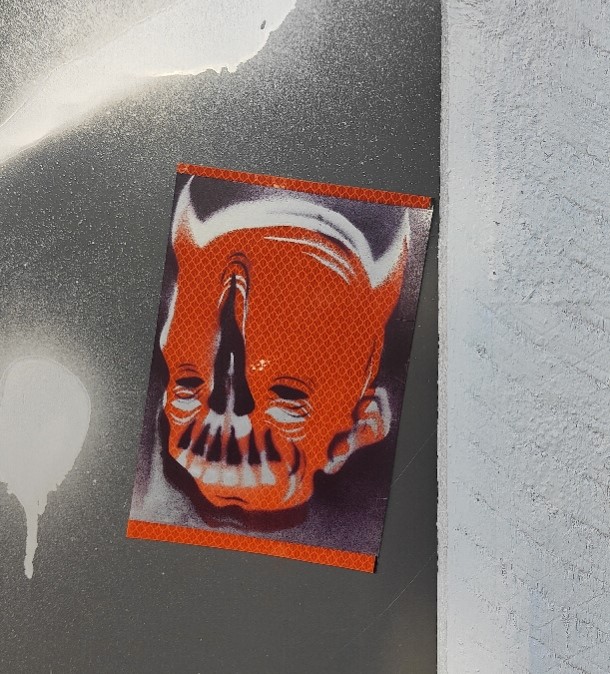
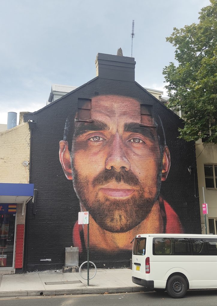
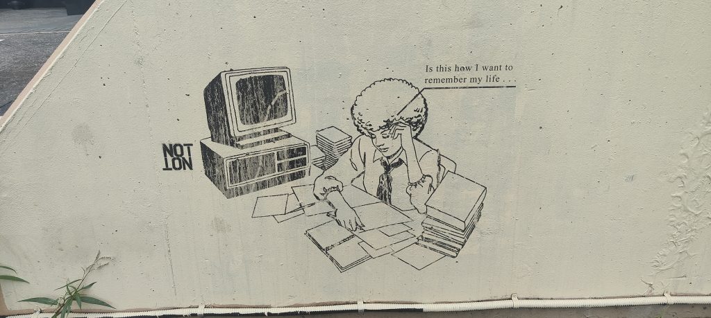
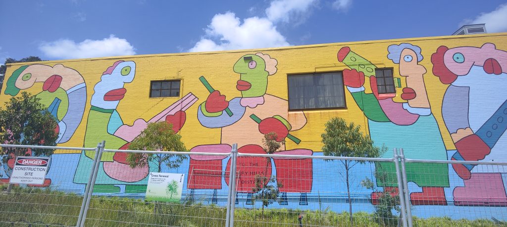
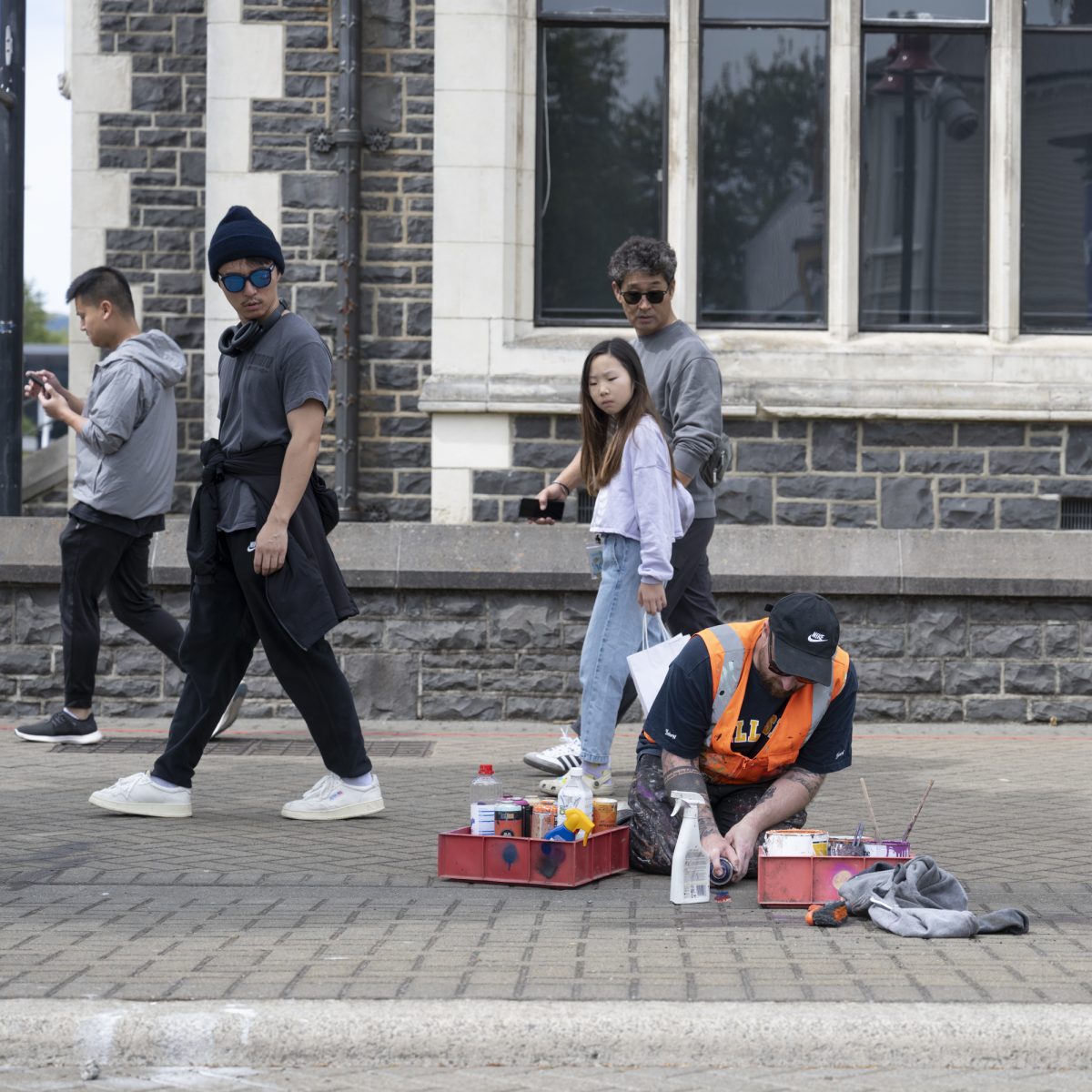
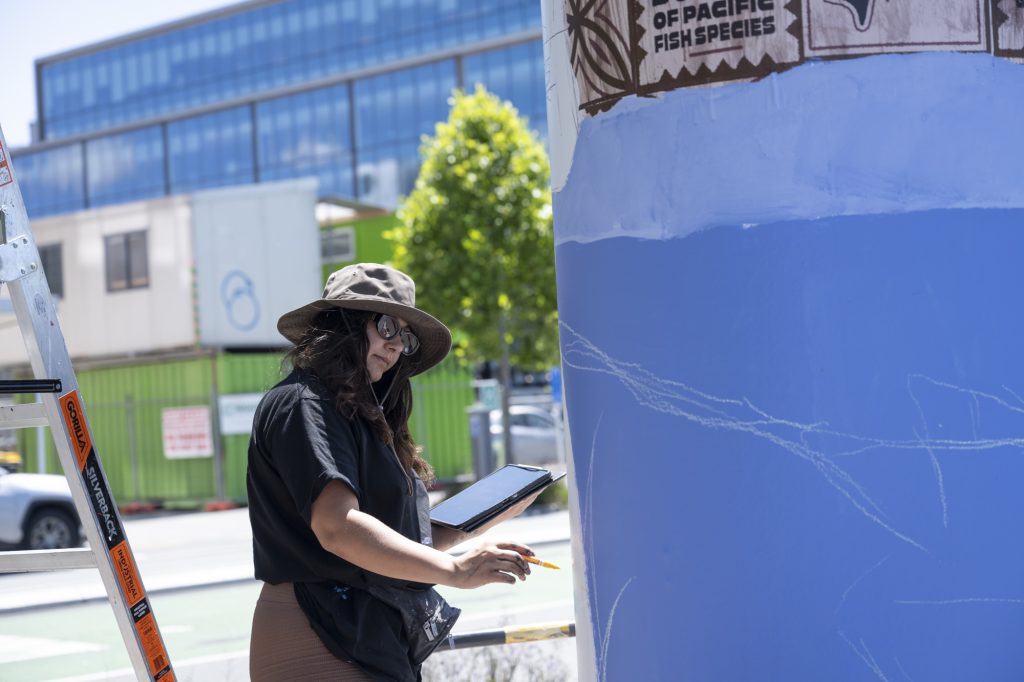
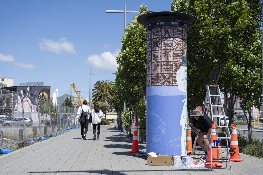
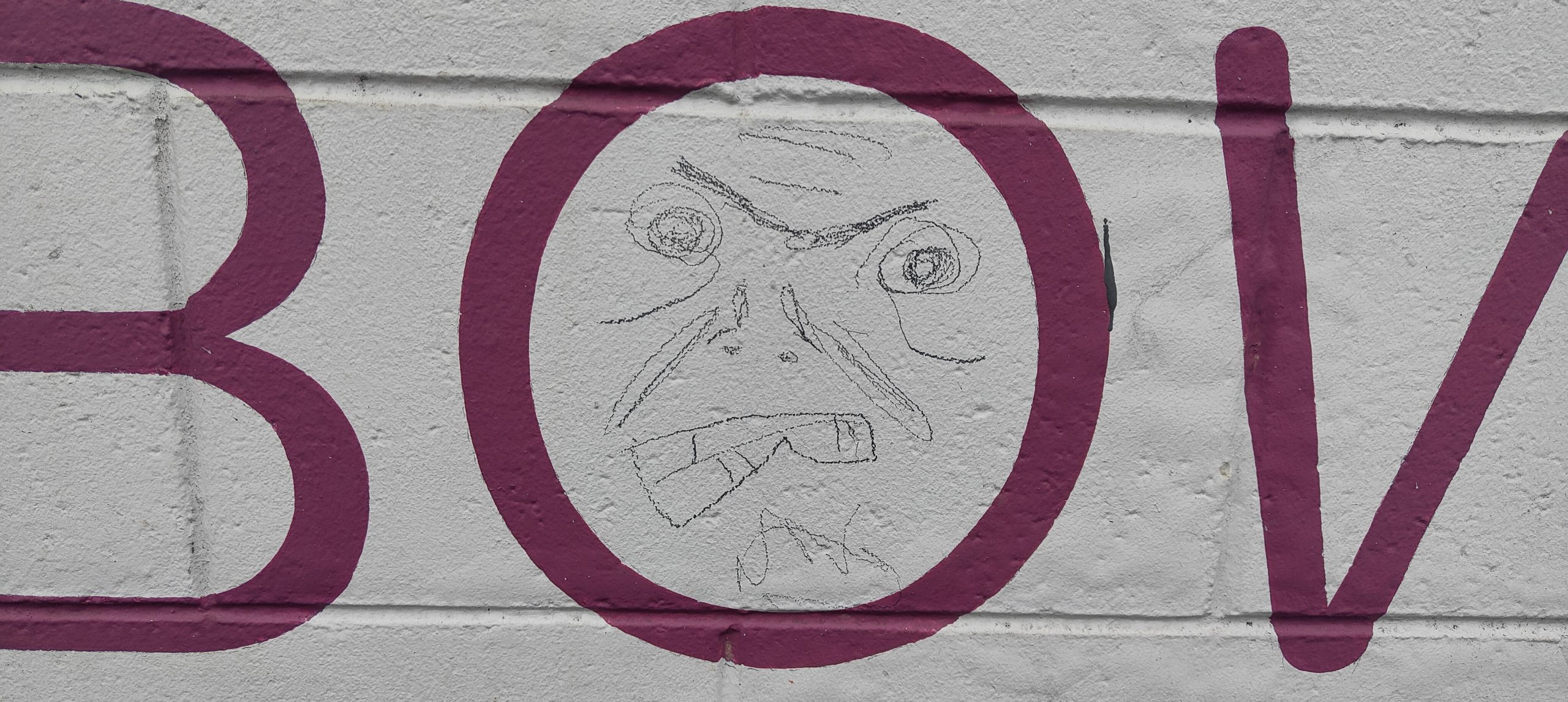
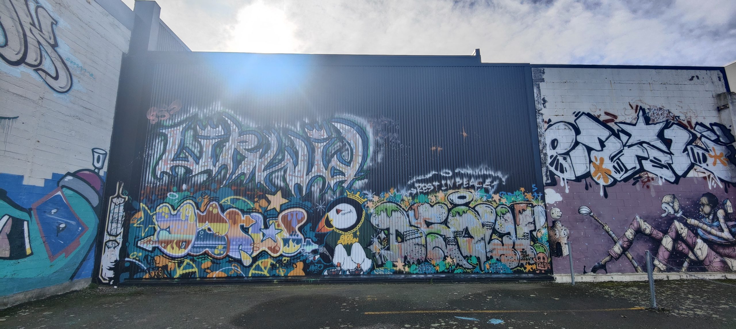
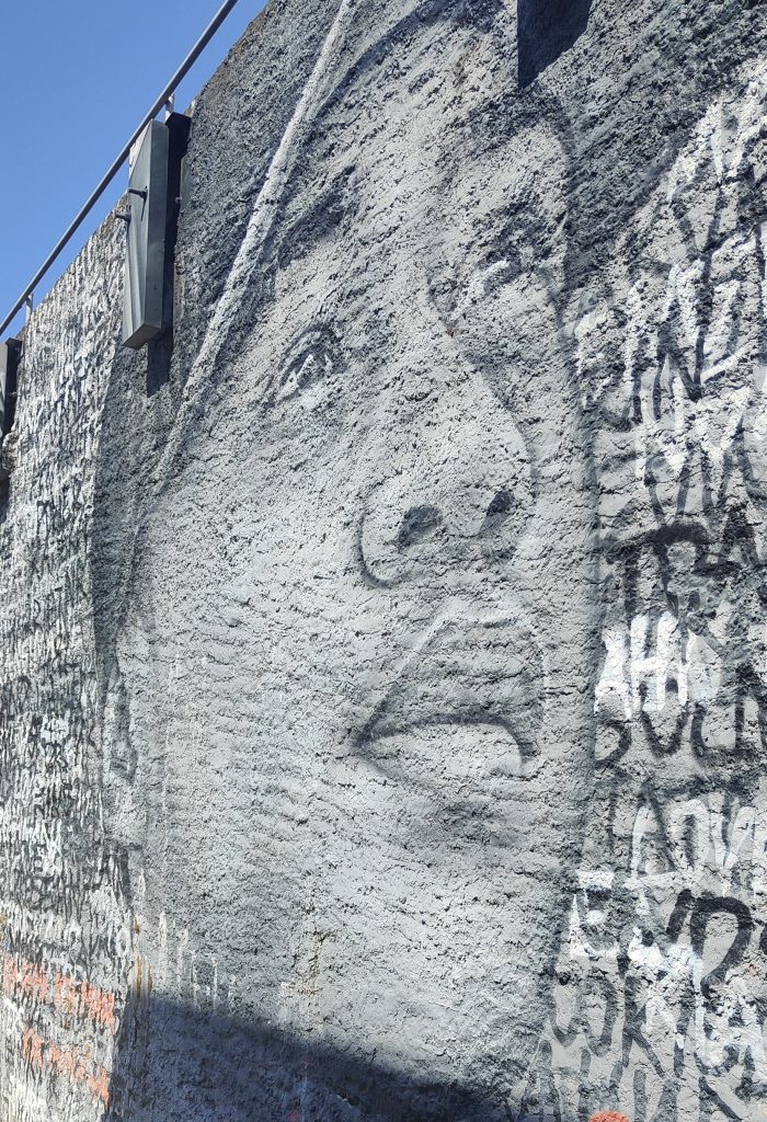
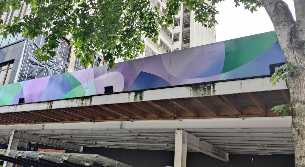
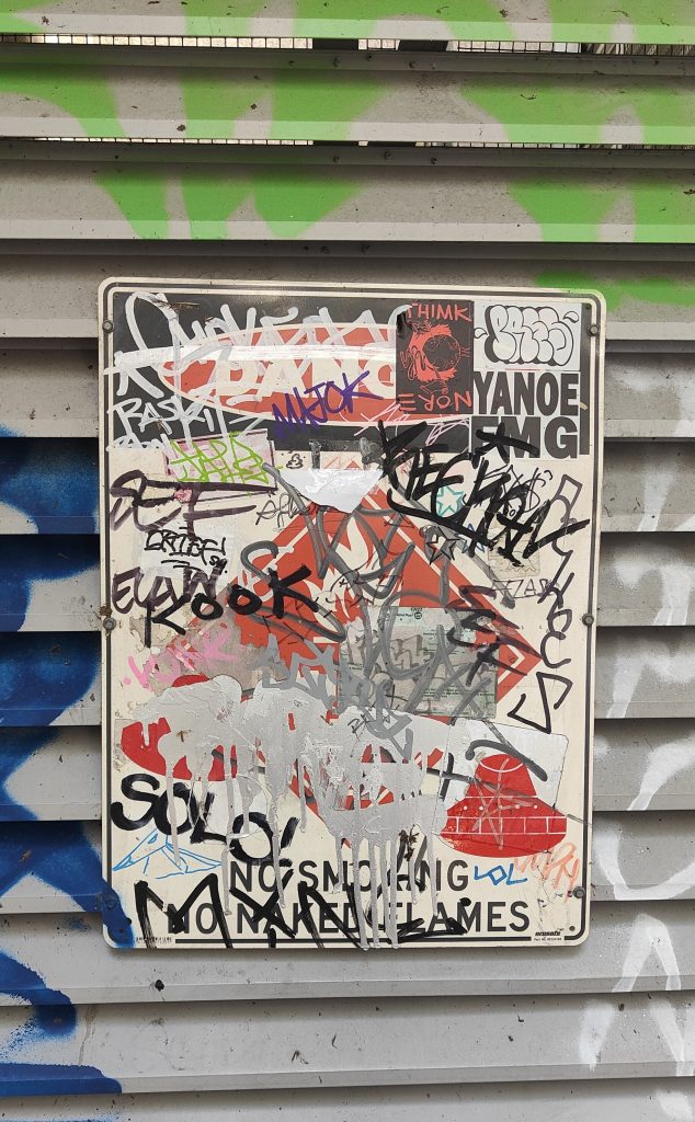
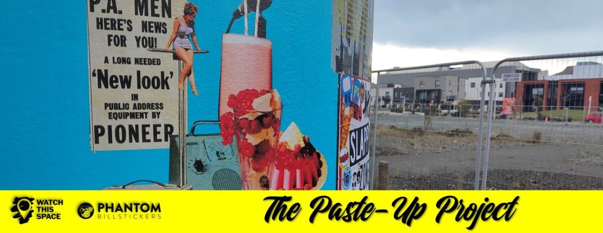
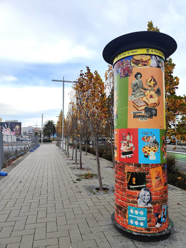
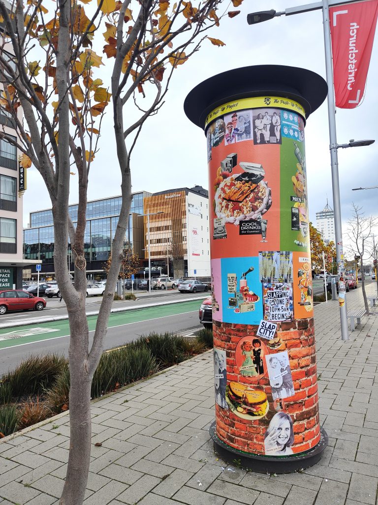
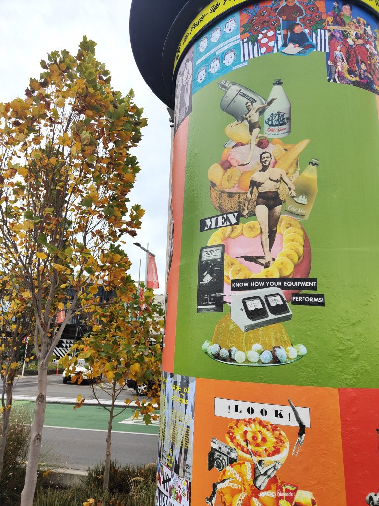
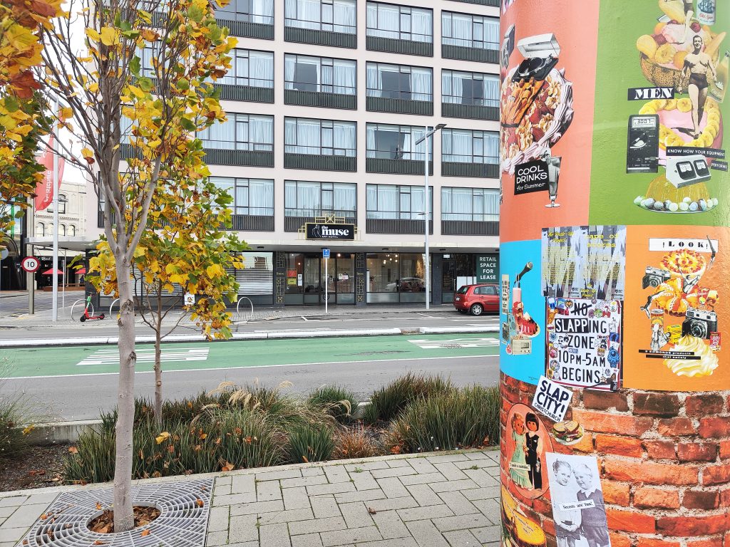
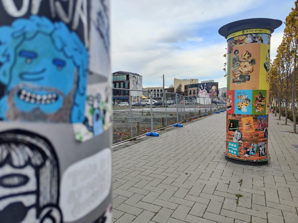
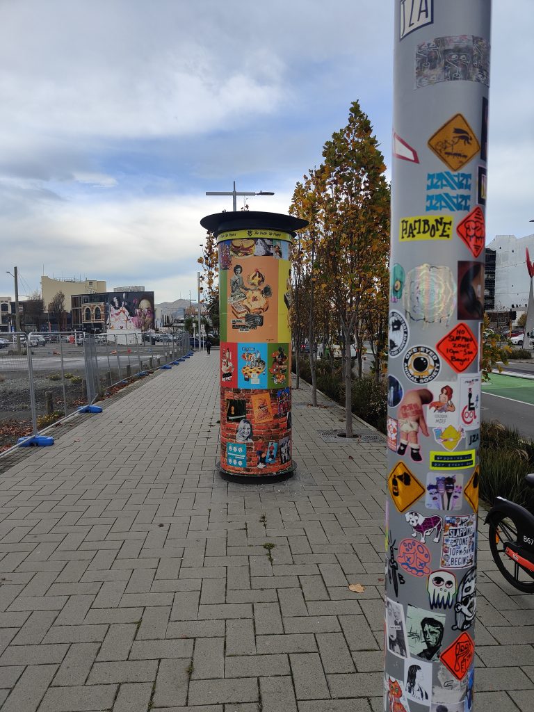
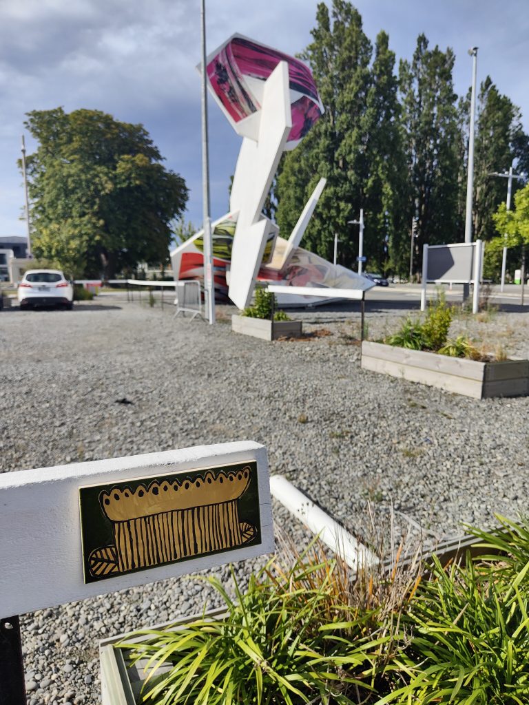
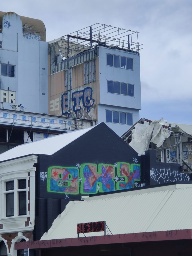
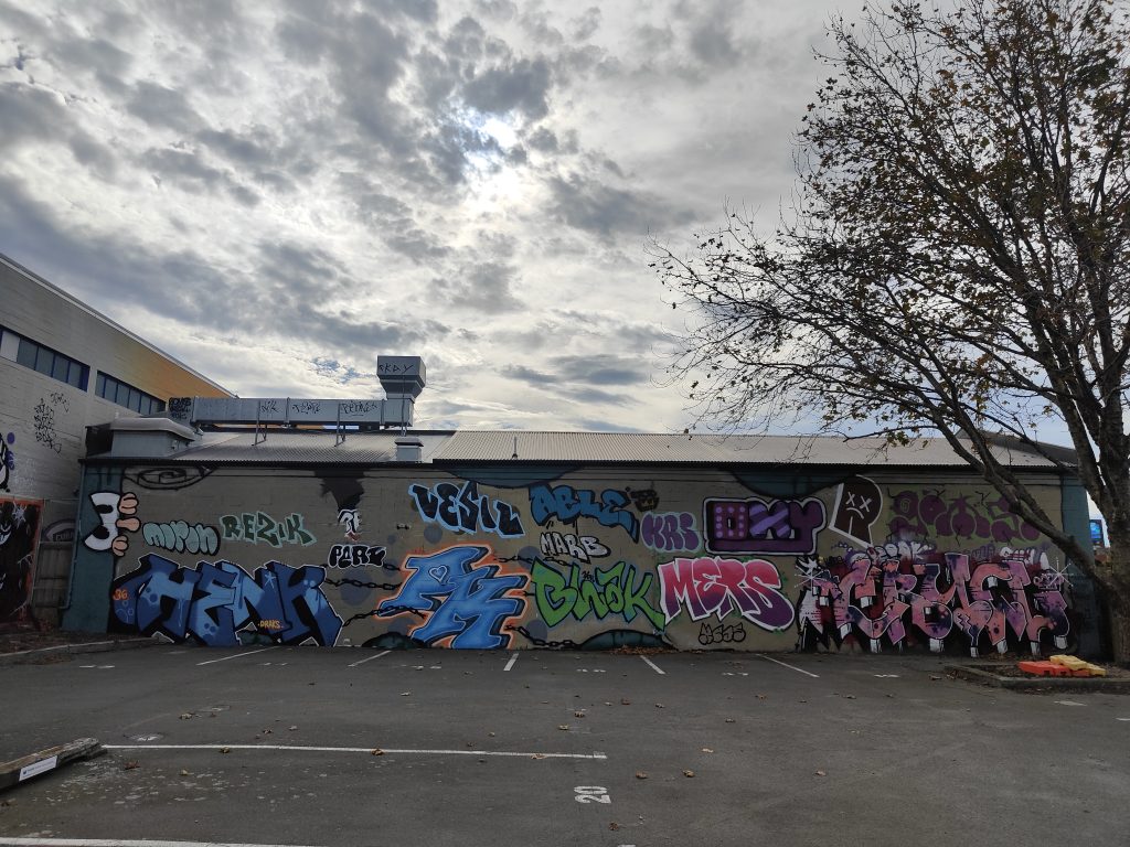
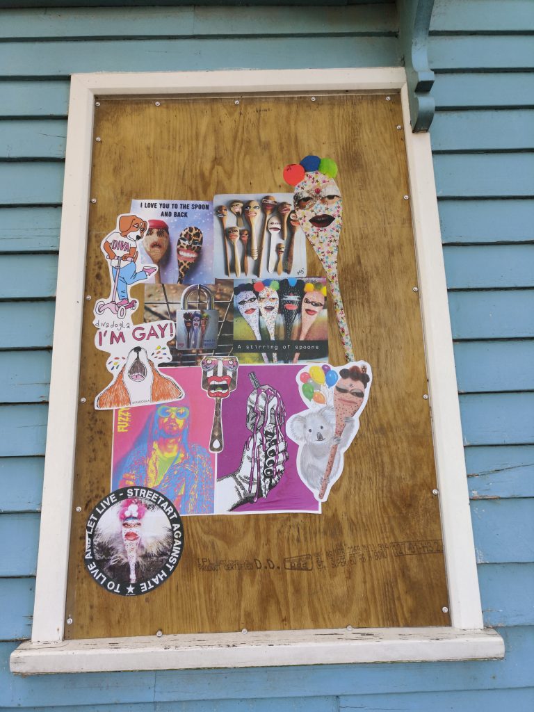
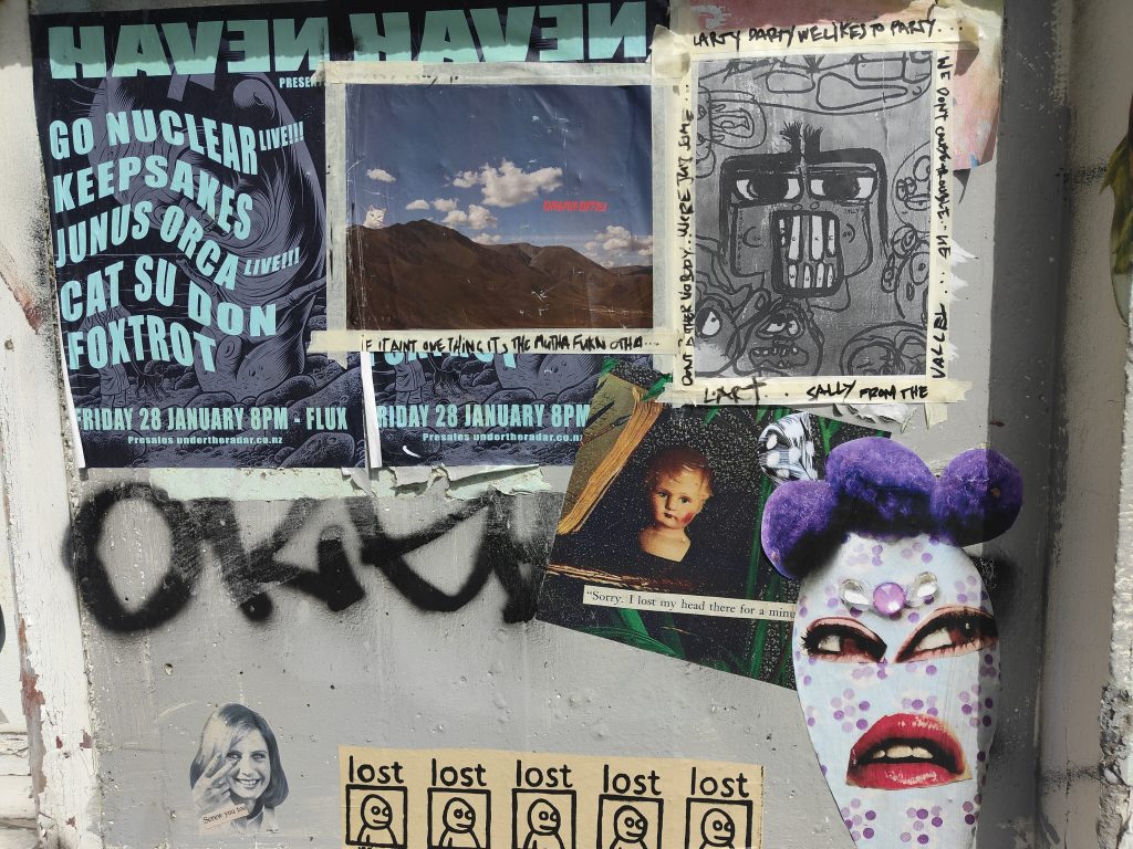
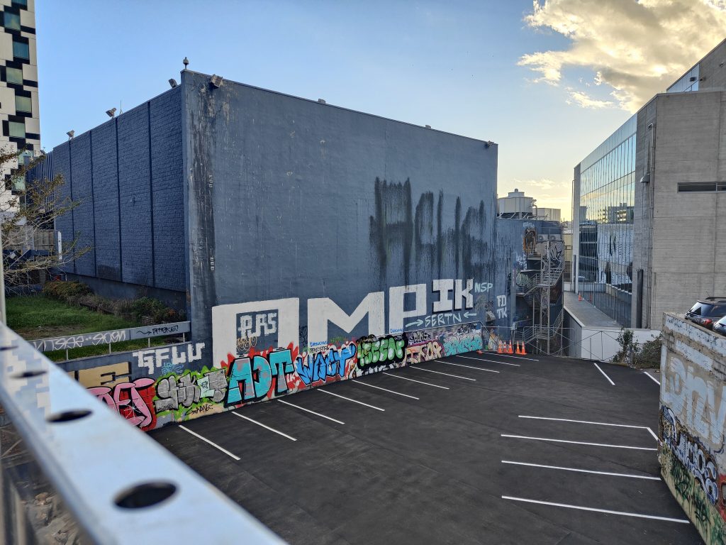
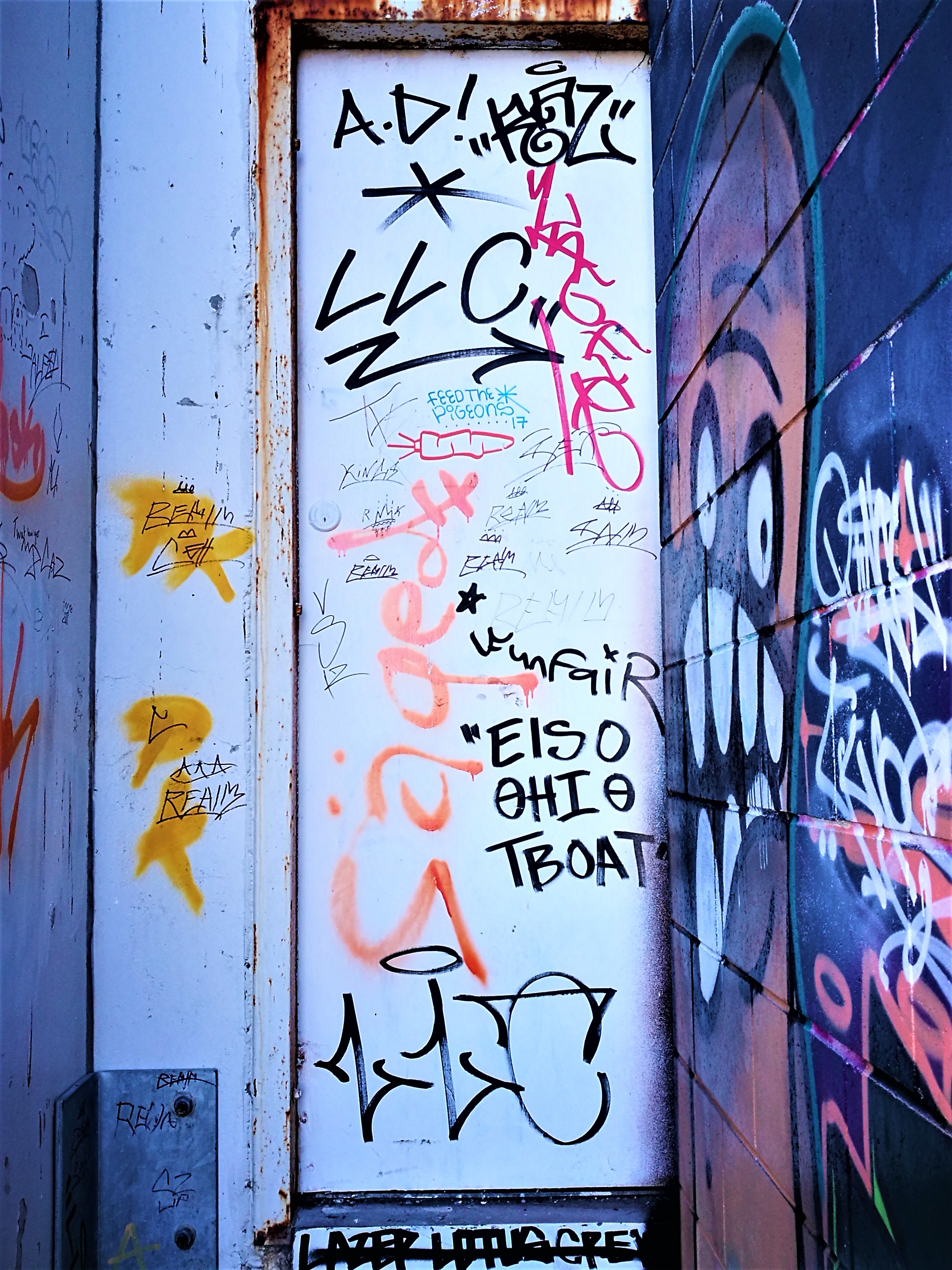
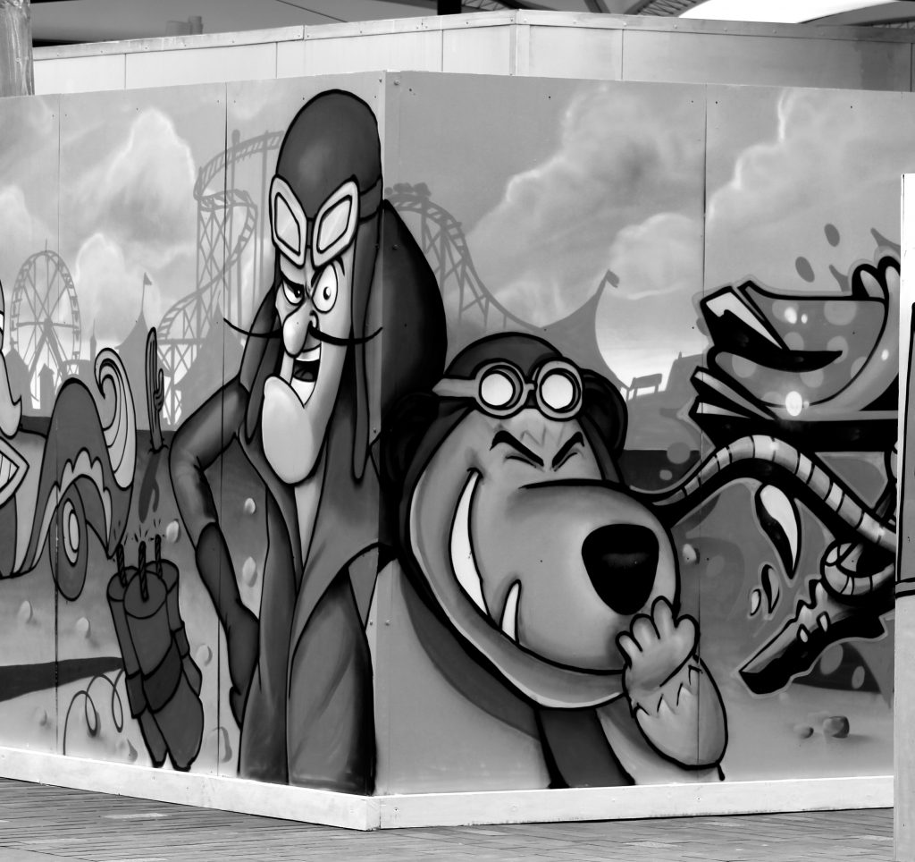
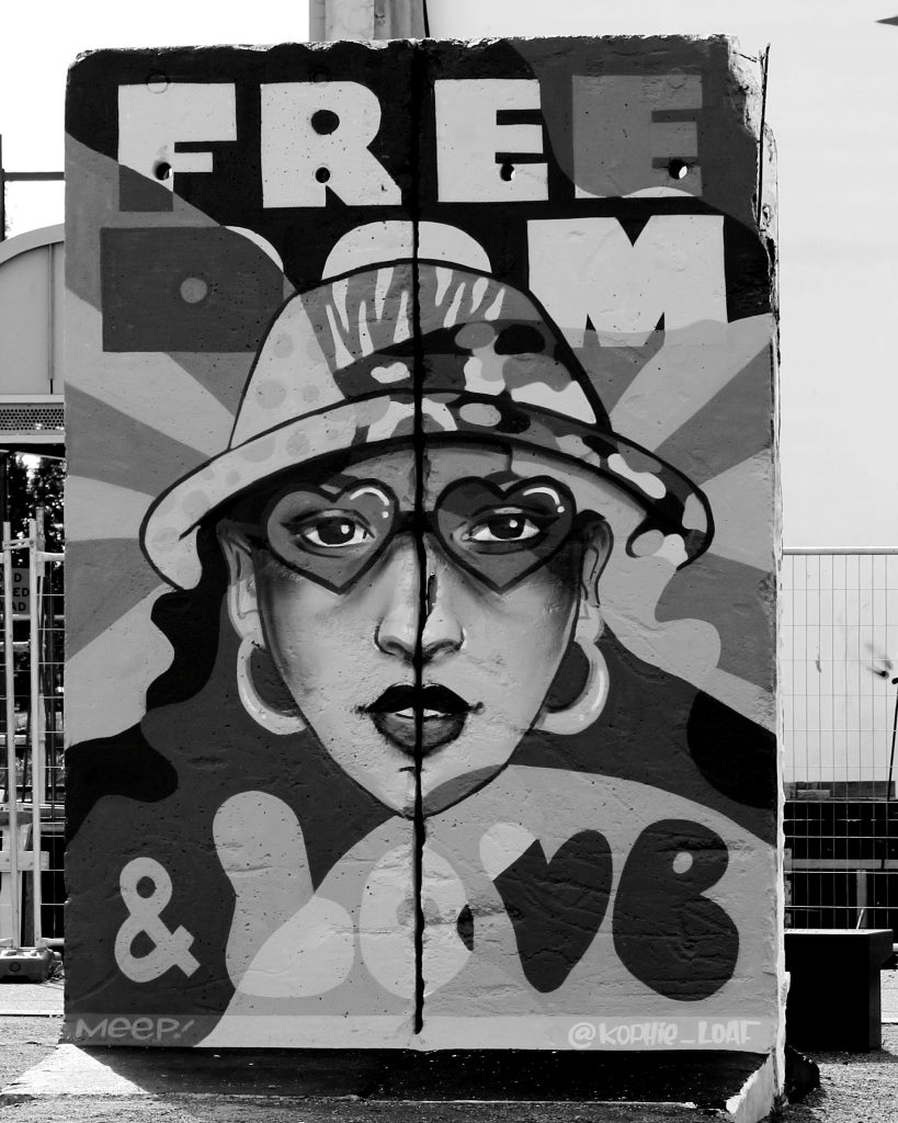
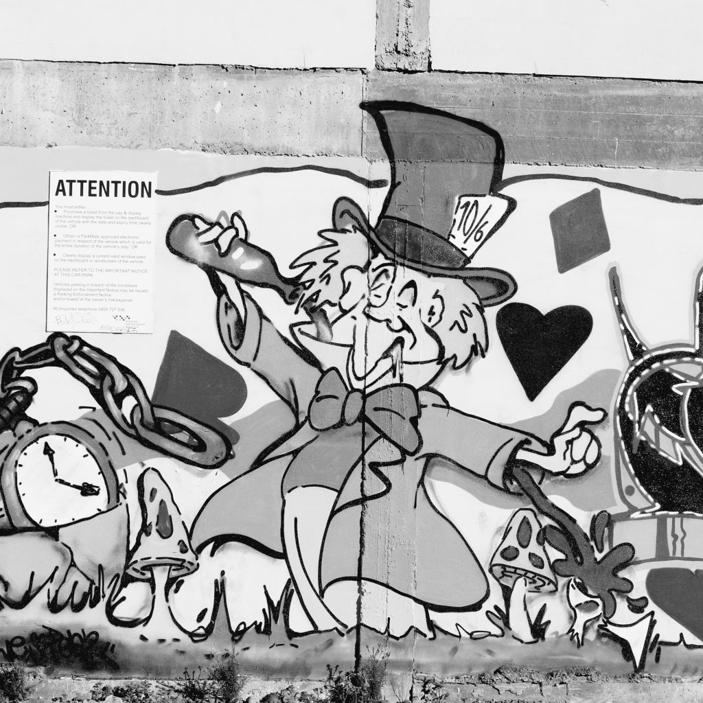
Urban collage artist Cape of Storms became the third contributor to the Paste-Up Project in early June, her bright installation completed in glorious sunshine. The concept, drawing on the artist’s experiences acclimating to life in Aotearoa through the lens of humorously juxtaposed vintage magazine and advertising imagery, provided a reflection of the advertising often found in our urban environment, almost tricking the passing audience into a sense of normality. Upon closer inspection though, the bollard was filled more playful and acerbic content, including a brick wall section packed with a wide range of images. The result was a bold production with electric colours gleaming in the sun, simultaneously covert and unmissable.

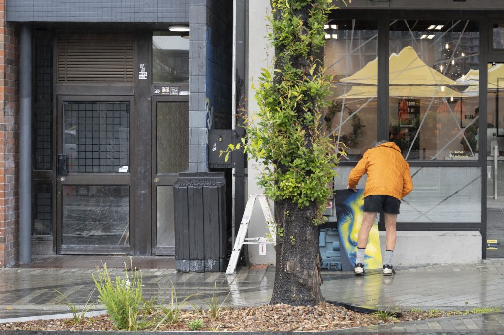
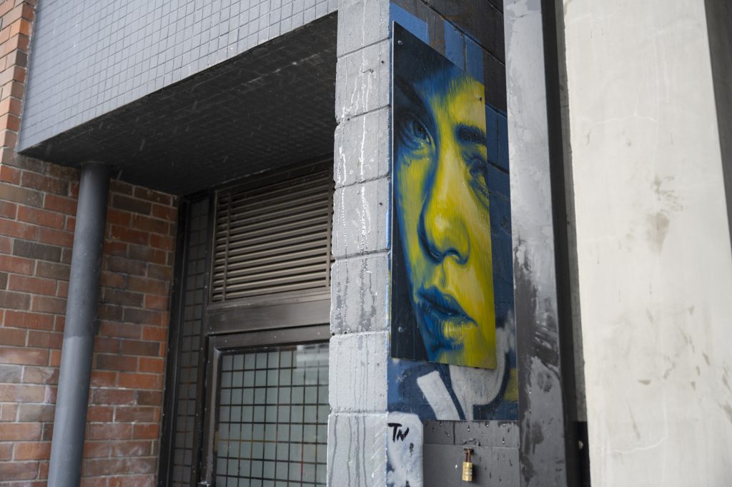
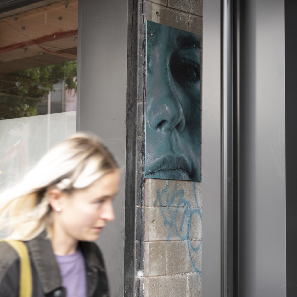
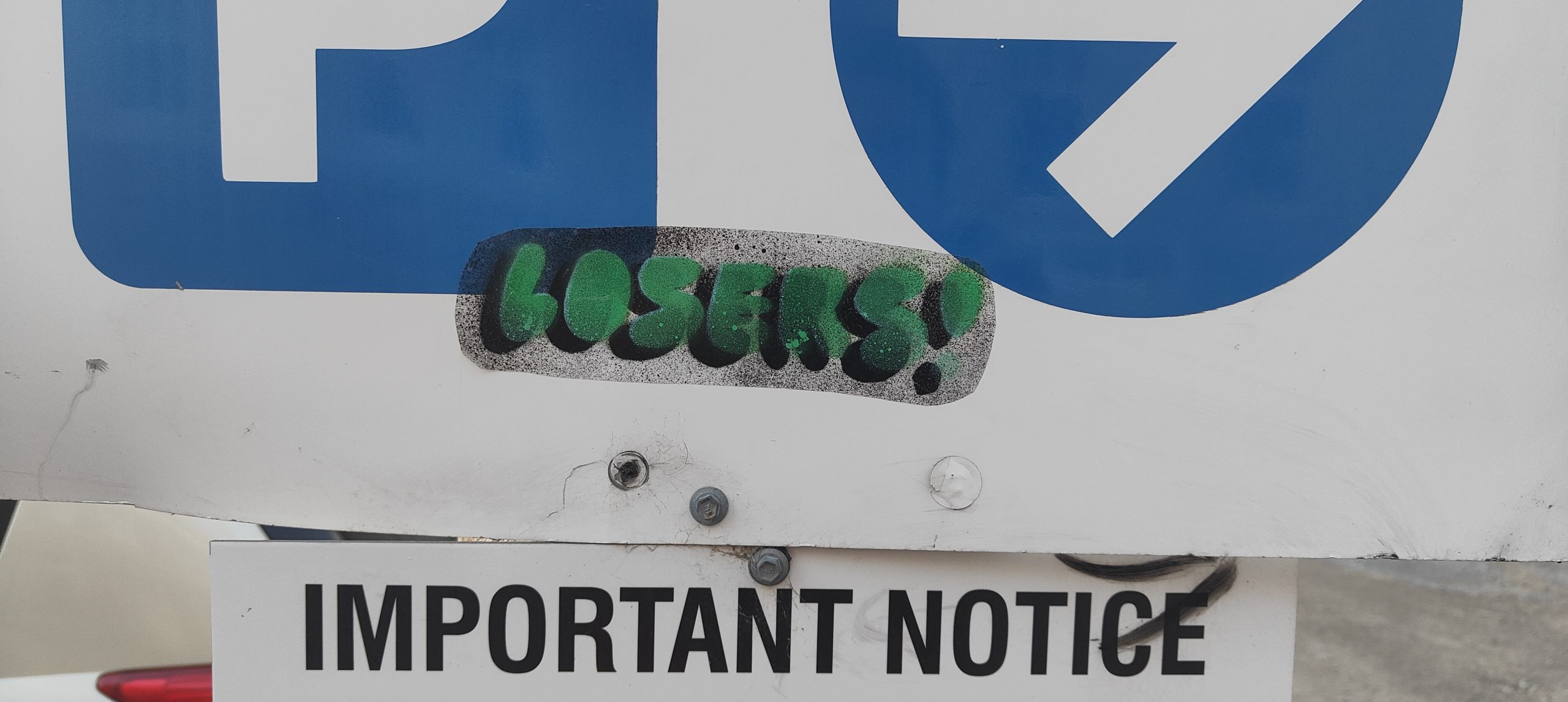
But, then the weather changed and the installation was faced with a slew of challenges. As torrential rain hit Christchurch, the paste-ups started to peel and soon, it seemed as though people had pulled the pieces off, leaving the bollard naked in places. Luckily, part of Cape of Storm’s concept was the incorporation of friends’ work to be added over time, and this unfortunate series of events provided the opportunity to refresh the bollard on a large scale.

Cape of Storm’s installation has not only provided a bold burst of colour, but a fascinating narrative that ties into the nature of both paste-up art and the process of making art in the urban environment…

____________________________________________

Kia ora! Would you like to introduce yourself?

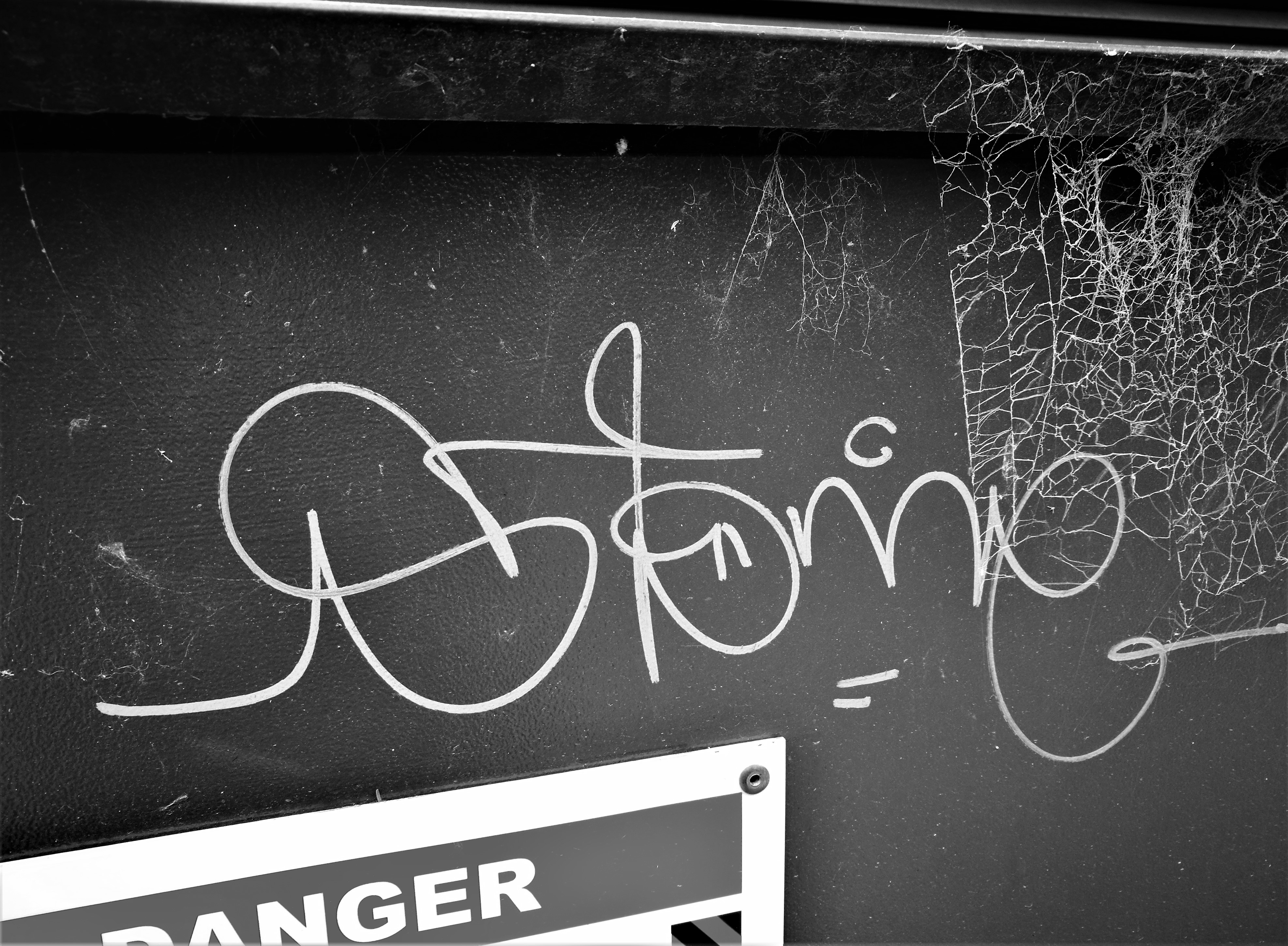
I am Cape of Storms, a Christchurch-based collage artist, I collect obscure retro images and phrases and put them together in a fun and quirky way.

What was your initial reaction to the Paste-Up Project proposal?

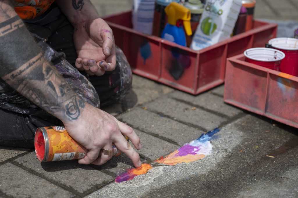
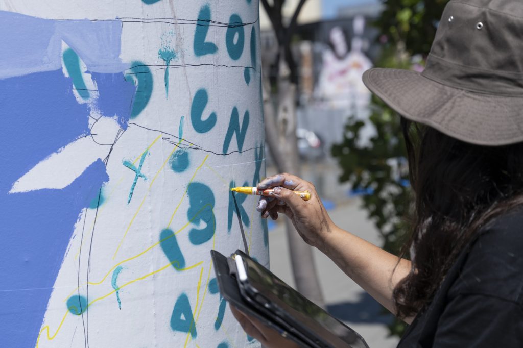
I was very excited by the concept, and also daunted in equal measure at the sheer size and scale of the bollard surface area.  I typically work no larger than A3-sized pieces and often very detailed and refined. It takes hours to hunt out and combine different images together into one cohesive new image.  I hand-cut and glue everything with just a pair of scissors or a small craft knife, arrange and overlap, and then carefully glue everything together.  Some of my pieces are comprised of 30 or more smaller images and words!  So, the challenge of this project was filling in all that open space.  In the end my approach was to try to go big, but also fill the space with as much as possible to keep it interesting and provide a piece of art that had several dimensions to it.

With two artists having already contributed to the project, were you primarily interested in doing something different?

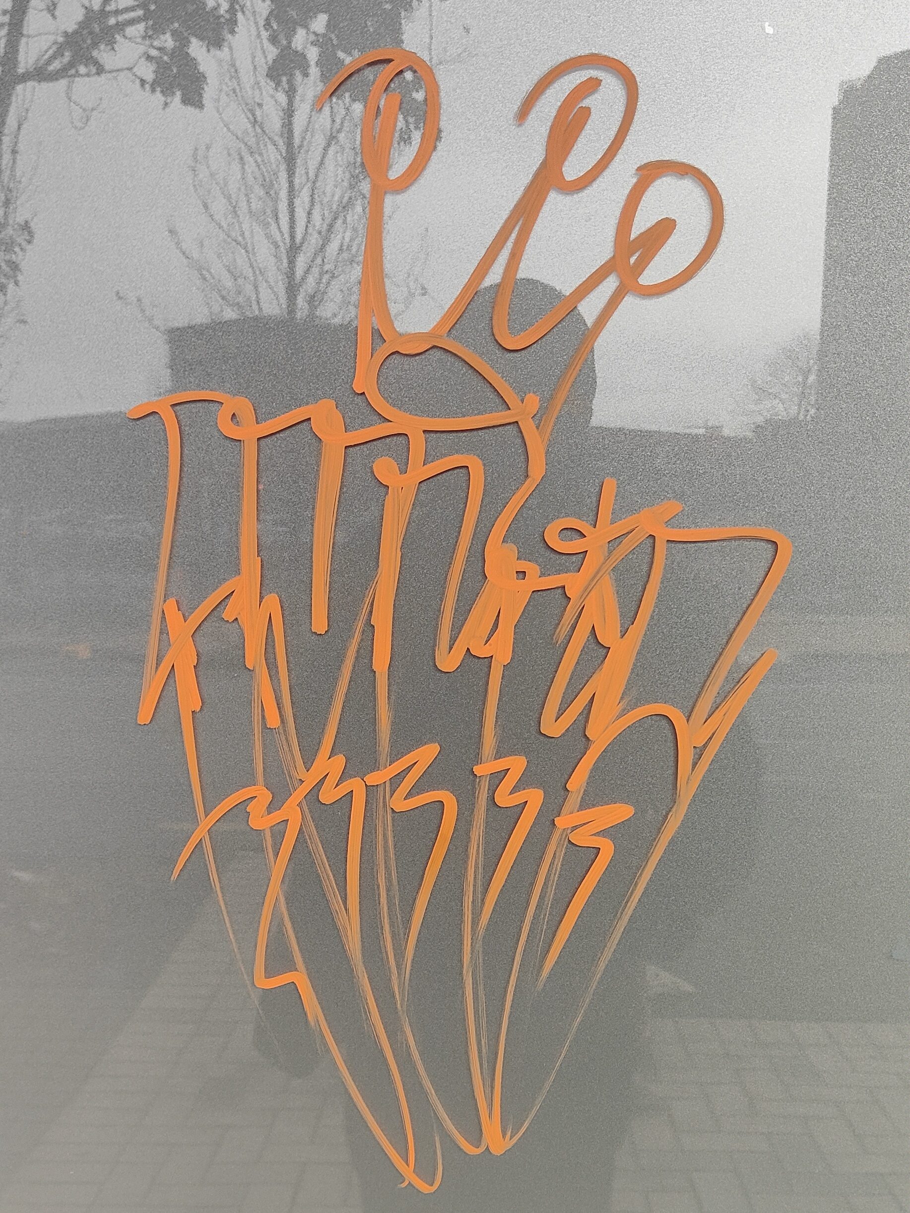
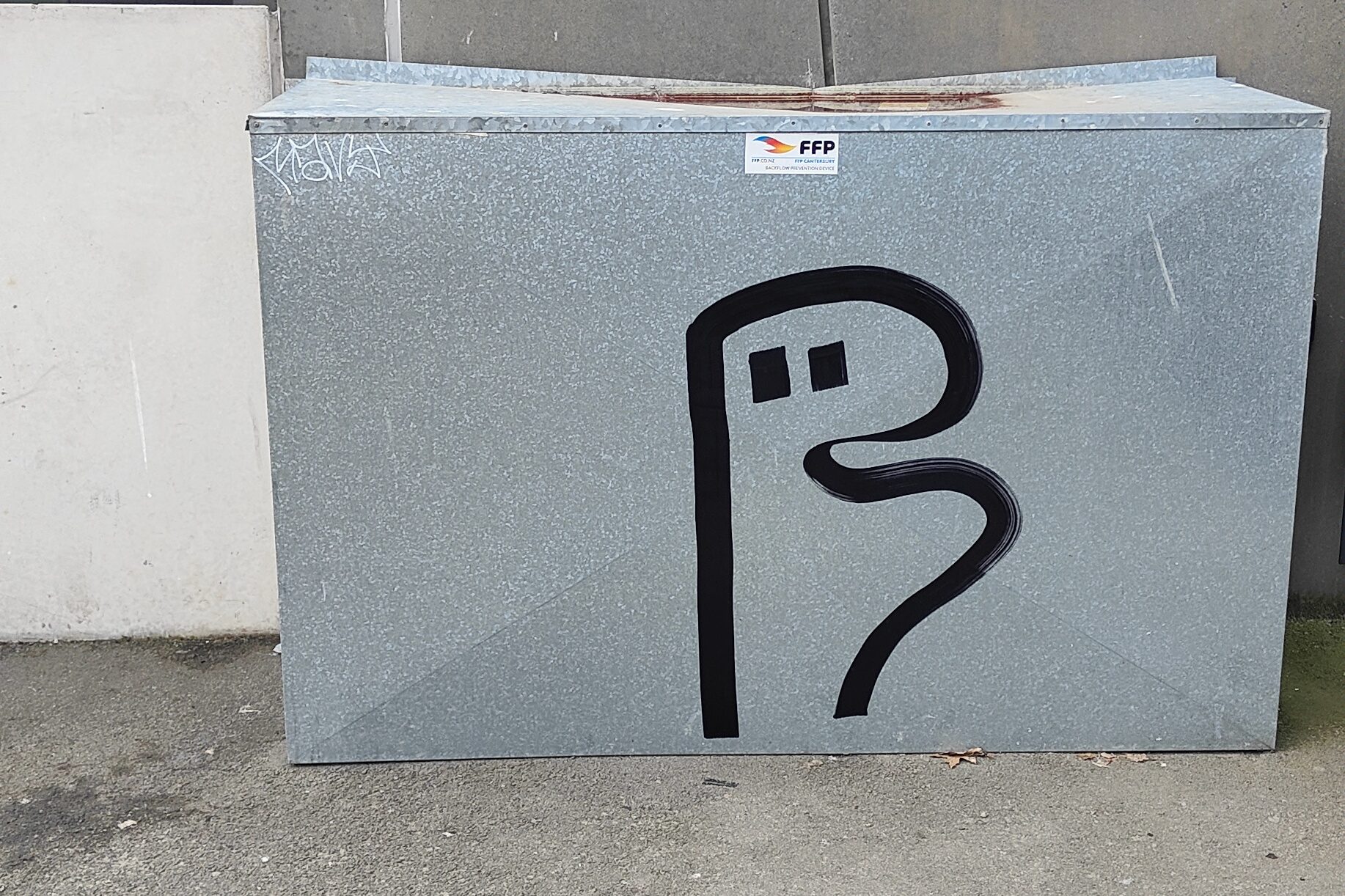
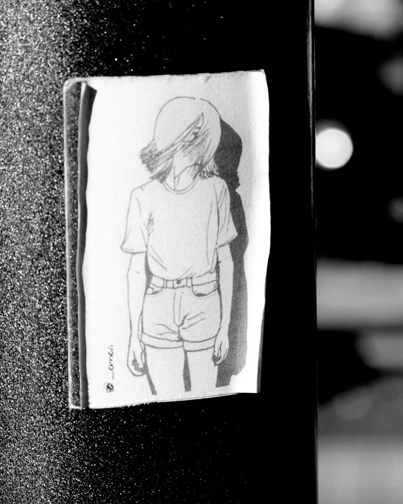
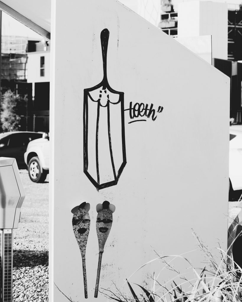
Yes, I was keen to do something unique to my style and stay true to that – I think my art style is so significantly different to both Teeth Like Screwdrivers and Bloom n Grow Gal‘s that it wasn’t too hard to be different!

What is the central theme of your installation and how does it relate to your existing work?  

The installation is a progression or continuation of a new style I have been working on for about a year now, which I am really enjoying.

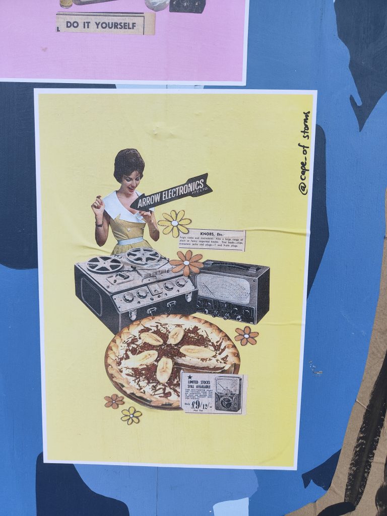
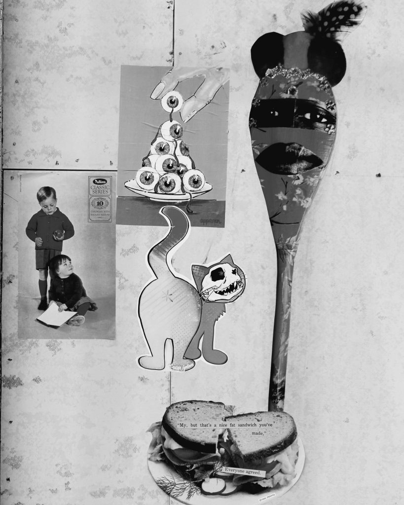
I have titled the series covering the bollard Foreign Objects.   Being a foreigner living in New Zealand, I am continually getting to grips with my identity and trying to relate to my surroundings, often times feeling like a fish out of water. As a  lover of nostalgia, I found myself combining these two themes.

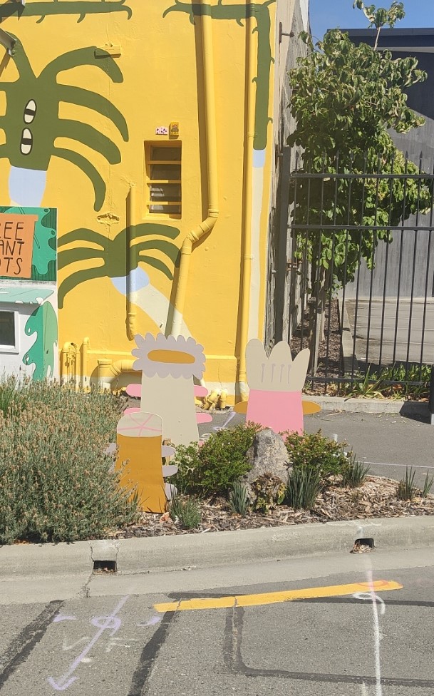
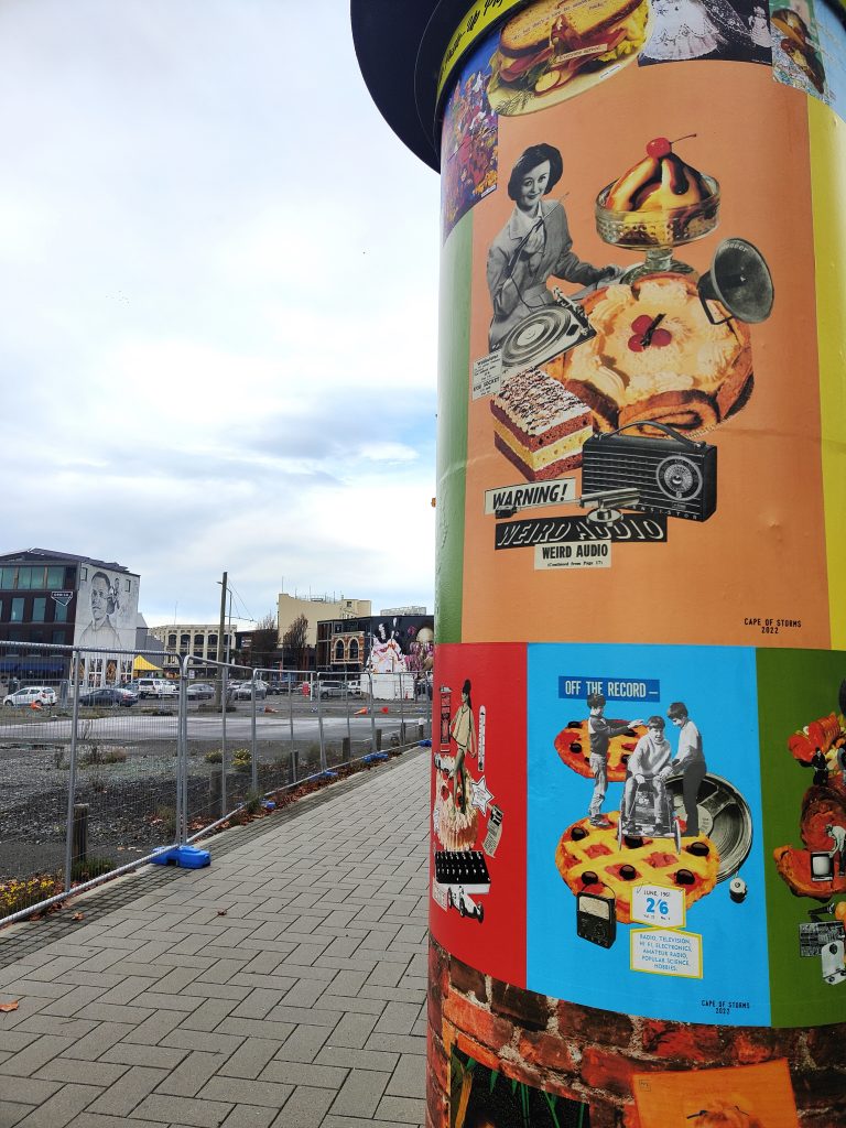
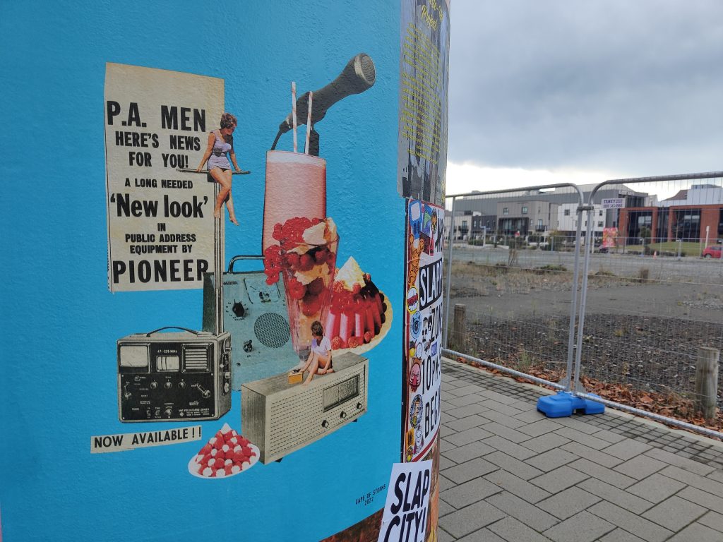
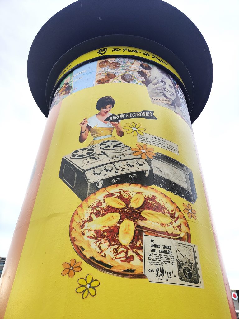
Throughout this series I intentionally tried to create a silly, nonsense, imaginary world that could reawaken nostalgic memories in the viewer.  Over a period of months I sourced hundreds of different found images  – from old cook books, special interest magazines, newspapers, catalogues and children’s books from bygone eras.  Things I remember seeing in my mother and grandmother’s house during my childhood growing up through the 90s.  To many younger people, these images might seem totally foreign or out of place in modern times, as they are simply just not in common use any more.  So through this use of retro “foreign” objects and arranging them together in weird, silly and fun ways, they all come together and are recognisable and familiar as a whole, something that the viewer can relate to.  I tried to select a range of bright candy colours for the background which would stand out on the grey inner-city street-scape around the bollard.  The candy-coloured palette also reinforced the nostalgic theme.  For me, this ended up being very effective at inviting the viewer in from a distance, to come up closer and look at the bollard in more detail, particularly in the heart of winter!

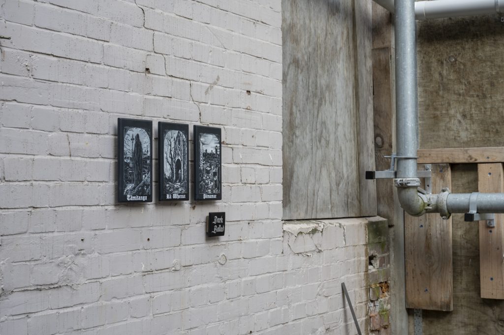
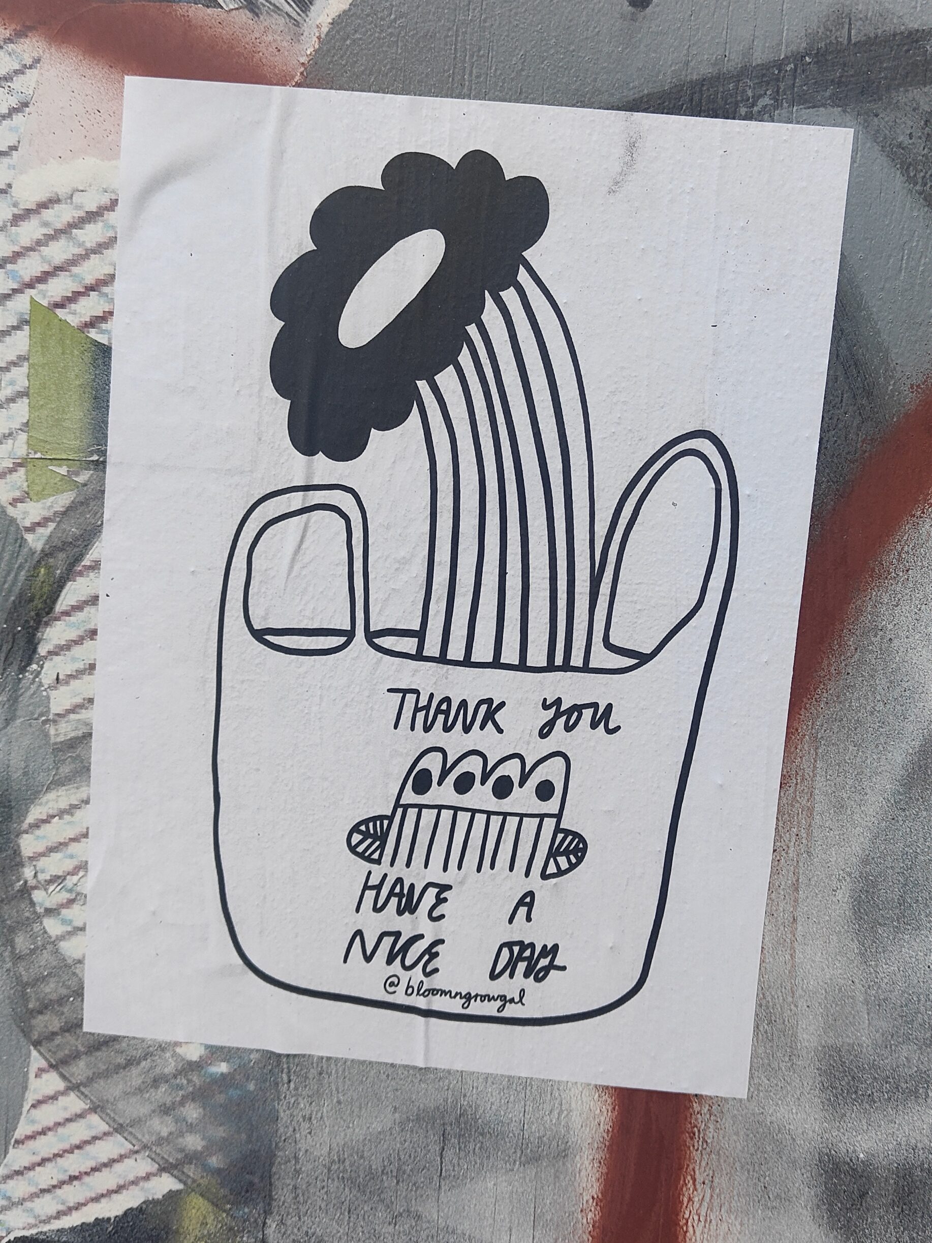
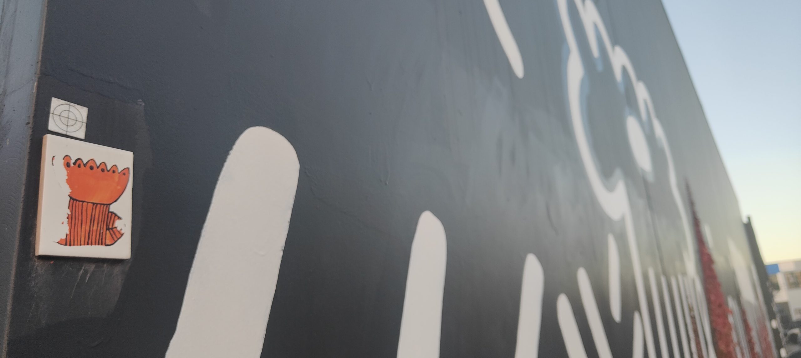
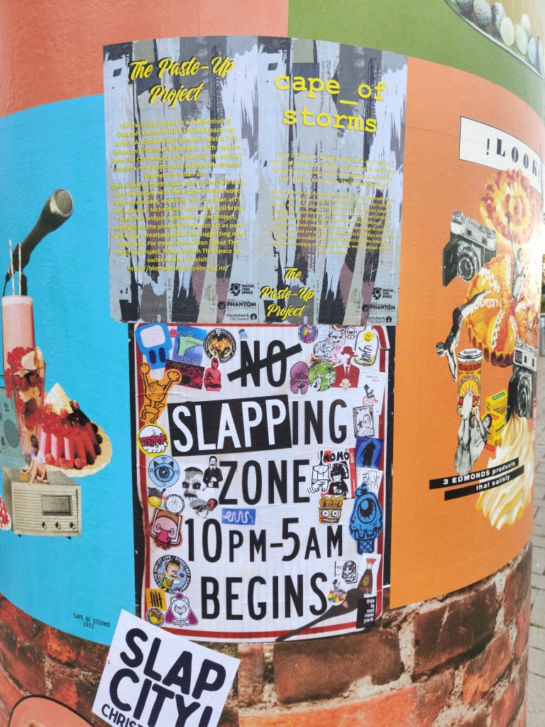
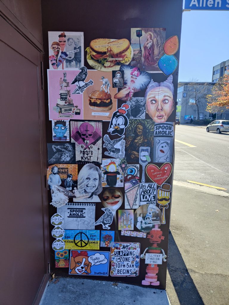
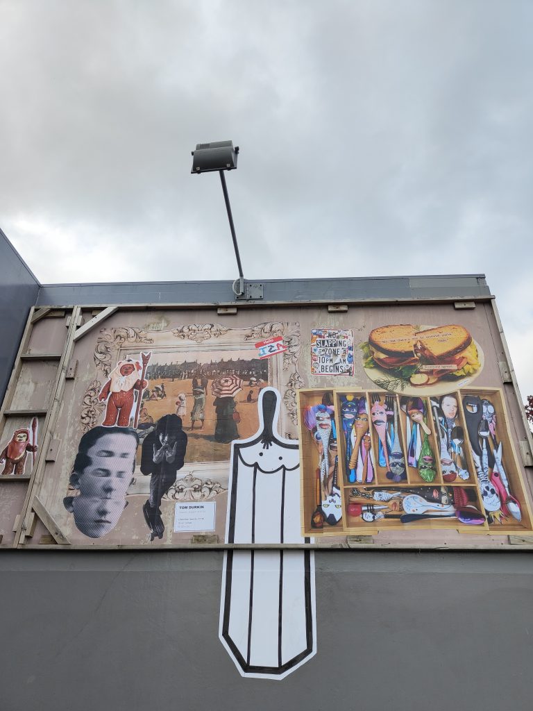
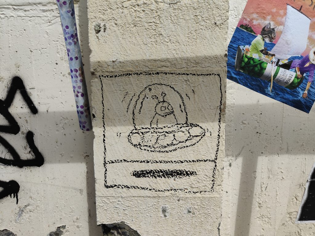
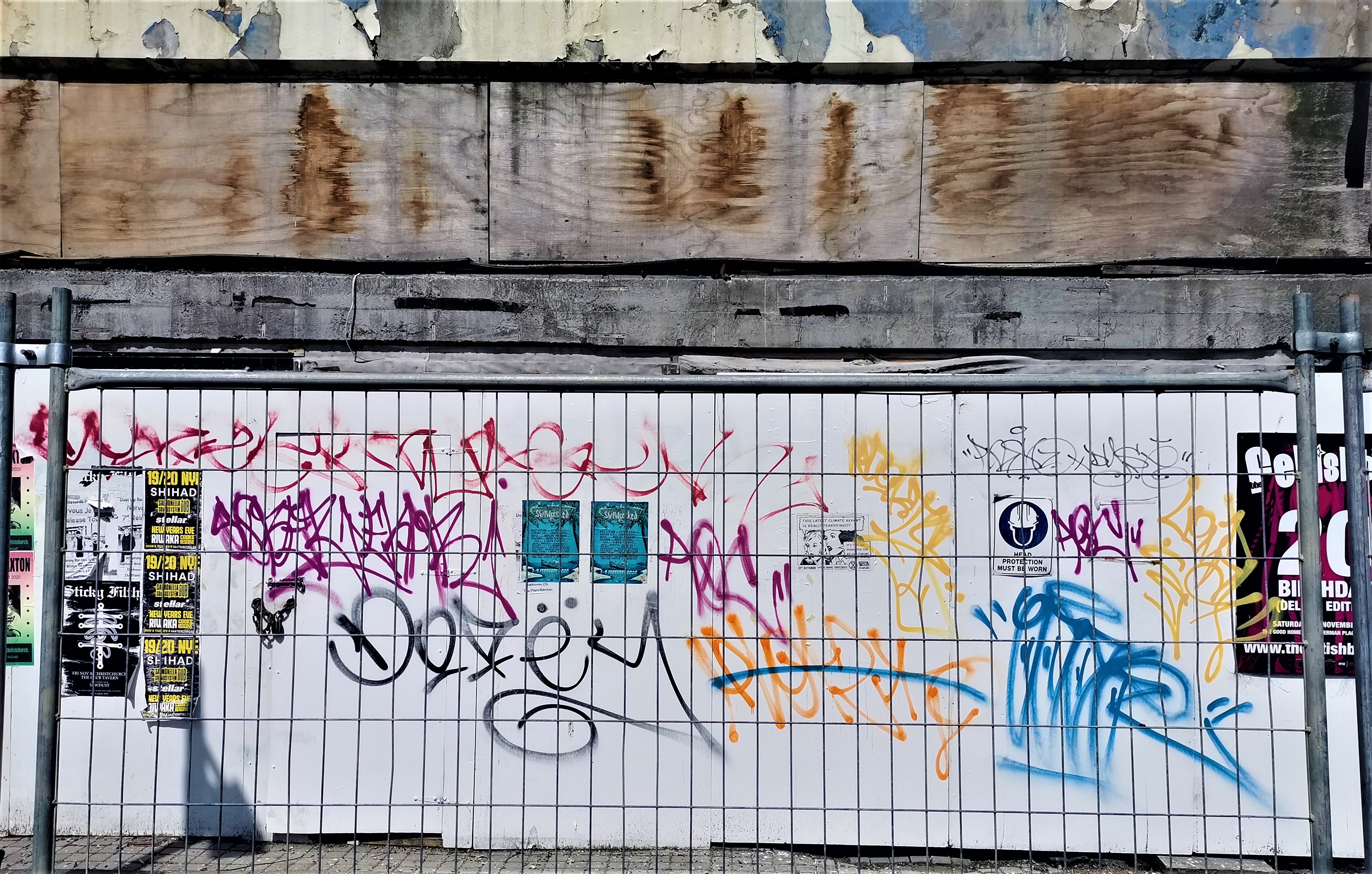
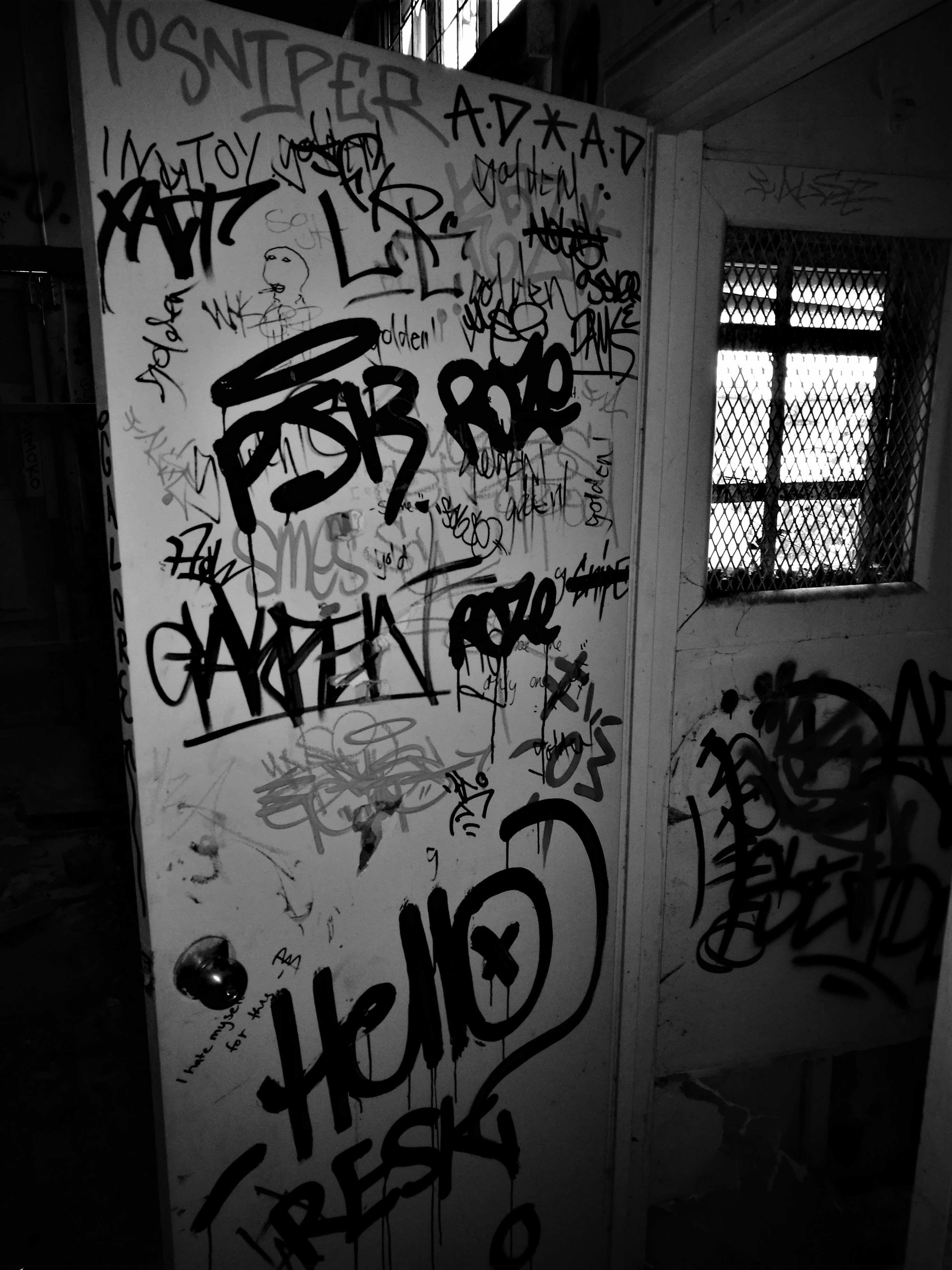
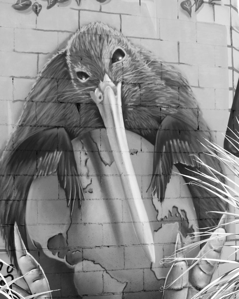
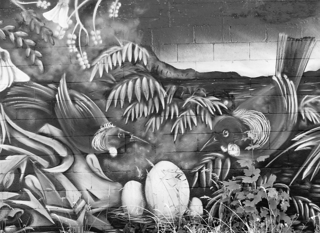
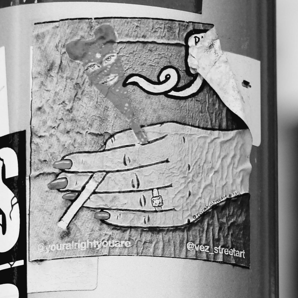
The brick wall section running along the bottom third of the bollard and the very top section running like a ribbon all around is a collection of my existing collage art that I have been pasting up on the streets of Christchurch over the past two years.  It was nice to include these on the bollard as well, alongside the more considered poster series that I created especially for this project.

You decided to remove the spacers on the bollard, making it one consistent 360 degree surface – which makes the experience more continuous, was that the thinking?

I didn’t like the “frames” or physical boundaries the spacing strips created, I wanted each individual poster to look like another part of the imaginary world I was creating. I also wanted to encourage the viewer to walk right around the bollard and see the image as one continuous surface.

You have included some big prints but also some collaborative spaces, what was the intention of the brick wall?

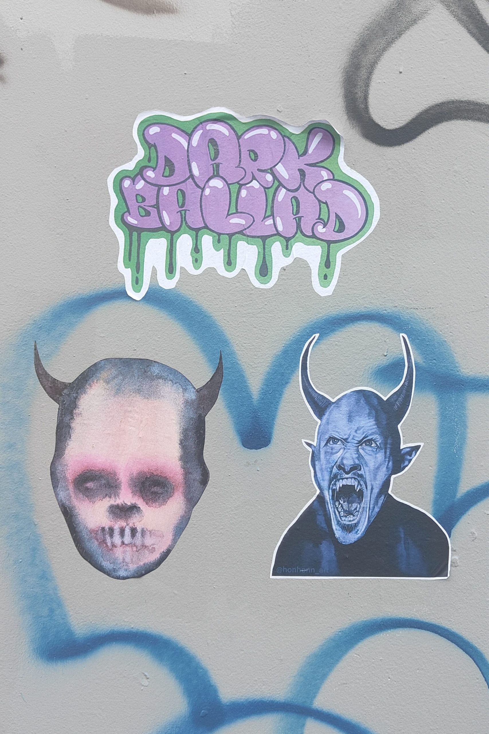
The brick wall section was intended to be a space where the wider Slap City collective group of artists would jump in and slap up various individual pieces, just as we do on our regular paste-up missions around the city.

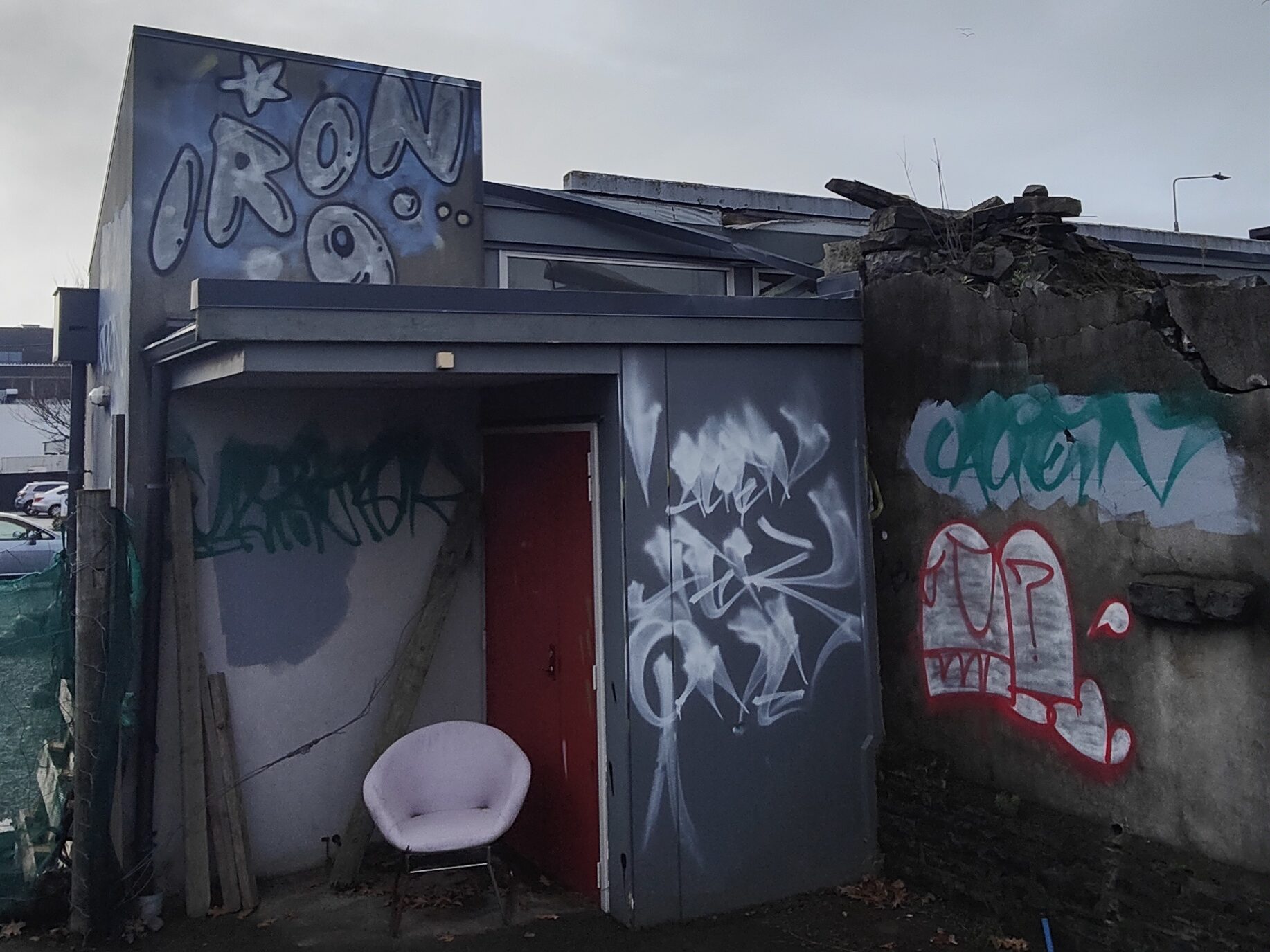
Unfortunately due to the intense winter weather over the last month and the group not being able to meet up so frequently, we weren’t able to get in and fill that area before about 80% of the bollard surface was damaged in the torrential rain.

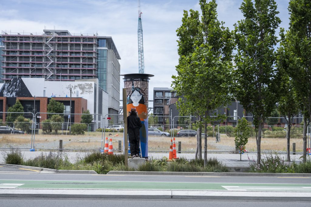
But the damage to the bollard has now cleared even more space, so if we are able, we will try and cover the empty spaces up again in between now and when Mark Catley inherits the bollard – I’m very excited to see what he’s got planned!!!

Printing the large posters became quite a process, working with the team from Phantom, has that changed your thinking around your work more widely? And what other challenges did the whole process throw up?

I knew I wanted to print everything with Phantom – they are the experts and their prints are of amazing quality and designed to be more durable and last out in the elements (sadly the record-breaking wet weather we’ve experienced over the last month took its toll!).  The trickiest part was maintaining resolution when scaling up from original A4 or A3 size to A0 size.  I was really worried that the images would look pixelated and poor quality.  In the end I put all my scanned images through a free online tool called The Rasterbator which I hadn’t previously used much before, but is very popular among paste-up artists, especially Teeth Like Screwdrivers, who encouraged me to get into using it. Luckily this helped tremendously in keeping the images sharp and looking half-decent.  I then asked the assistance of the very talented Tom Horton, the printer at Phantom, and he worked his magic, did some test-prints and the posters came out so much better than I could have ever imagined!

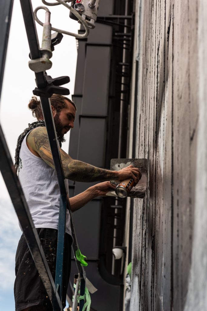
The next trickiest part was the installation itself, which I found very challenging having never done anything of that size or nature before.  My design relied upon the posters going up very neatly and level, and the curved surface was seriously difficult to work with, and certainly will not be under-estimated in the future.  I was so lucky to have the help of my partner who is a painter, as well as Vez and JZA who were able to help me paste up high (as I embarrassingly have bad vertigo when up on ladders!).  This project has again made me appreciate what a special, supportive group of people we have in the Slapcity collective, coming together to do awesome stuff, promoting our many and varied street art mediums and just generally have a cool time together.

What does the Paste-Up Project represent for you as an artist who works in the paper medium? Has it given you ideas for where you might be able to take your work next?

I was totally blown away by the opportunity to prepare a legitimate art installation all in paper-based form.  We have a lot of murals and graffiti/paint/spray-based pieces all around the city, so it was really encouraging to receive a project like this especially for paper-based art. For me personally, seeing the sheer scale of the prints, and printing on very high-quality paper has added a whole other dimension to where I think my art could go in the future, and I can see new possibilities for future projects with scaling up and going big. Finding a way to cost-effectively create large prints and in a format that is durable enough to withstand the winter elements and last a little longer out in the streets is a serious challenge for paper-based artists.

Is there anyone you want to thank?

Watch This Space for the support and patience, also for the help cleaning off and preparing the bollard surface ahead of the installation! Phantom Billstickers – Tom, Jake and the team. The Christchurch City Council’s Enliven Places fund for funding and the opportunity. Teeth Like Screwdrivers for the advice, tips and tricks. Vez and JZA for the help pasting up on the day and going high up on ladders when I wasn’t brave enough! Bongo and Neil Swiggs for the donation of some seriously good old books and magazines that I used in a few of the collages. The Slapcity crew for the support & a source of creative inspiration.

And my partner Fernando for allowing the complete take over of my time and helping with the installation!

Stay tuned for our next artist announcement for The Paste-Up Project!

Follow Cape of Storms on Instagram for more collage-y paste-y goodness!


Street Treats, Vol. 7

For the latest installment of Street Treats, we are serving up a selection of pieces, pastes, pixels, petals and beyond. From a reminder of an old pal’s legacy, to epic collaborations and tiny treats, the streets have provided a range of goodies. That is, of course, the joy of the urban environment as a setting for creative (and naughty) interventions, there is no curation. The result echoes the physical presence of our cities, where thousands, indeed millions of people interweave as they go about their own concerns, trials and aspirations. Any city is a collection of individual voices and the art of the streets reflects this diversity, each piece the compulsive expression of an individual that can be read in infinite ways by the passing audience. In a world where online communication has become increasingly toxic and antagonistic, the art in the streets provides something different, still capable of asserting beliefs and ideologies, but devoid of the escalating tensions or echo chambers of comment sections. Indeed, as one image attests, often the response to uninvited additions is not so much beautification as silencing, ensuring a monochromatic environment. So enjoy this platter of pictures and relax, our cities and our communities are not monolithic, and the streets provide the platform for that multiplicity…

Flare Festival- A Photo Essay by Centuri Chan

Flare Festival may have come and gone, but it’s legacy lives on – an array of amazing new murals and a bolt of energy in the local urban art scene putting graffiti and street art back in the limelight. The flurry of activity that saw a pop-up gallery, guided tours, panel talks, mural painting, graffiti jams and live painting sessions was a lot to take in – luckily we had our man, Centuri Chan, on hand to capture some of the magic…

____________________________________________

Centuri Chan is an Otautahi-based creative, photographer, tour guide, designer and LEGO builder…

Hands Up – A Photo Essay

The tag. Who would think that a name written on a wall could draw so much anger and vitriol? While we might romanticise lovers names carved into trees or those historical inscriptions that capture a certain time or event, contemporary tags are rarely given such status, viewed almost primarily as an affront to order and ownership and a symbol of wasted youth.

The tag is the basis of graffiti culture, the building block on which all else follows and evolves. For many traditionalists a solid tag outweighs all, a good hand-style is a necessity. Rendered in marker or spray paint, with clean lines or messy drips, appearing legible or incomprehensible, the humble tag can be as complicated and complex as the people executing them.

Yet, the beauty of a tag is often overlooked. In their various states tags can exhibit chaos, urgency, care, thoughtfulness, anger, humour, defiance, opportunism, and immediacy; a carefully planned dance or an impulsive act of disruption. But, beyond these readings, a tag is importantly a reflection of action, even when the writer has vanished, the legacy of their stealth movement remains, evident in the little details. The sense of flow and energy reveal the dance-like performance. Unlike more developed designs, a linear tag is about efficient movement and a familiarity with the required physical exertion. Watching a sweetly executed tag come to life can be enthralling as it unfolds.

This photo essay, compiled largely from Otautahi but also featuring some images from around Aotearoa, is not a collection of the best hand-styles or tags (it is not my place to determine anything other than knowing what I like), instead it attempts to capture this diversity and the way that in certain environments and frames, these forms can be beguiling and intriguing, aesthetic and appreciated…

Are you a photographer (or you know someone who is)? Do you have an idea for an urban photo essay? We would love to hear from you and potentially feature your work here! Email hello@watchthisspace.org.nz and let’s talk!

Black and White – A Photo Essay by Graeme Russell

We first noticed Graeme Russell’s photography on Instagram, his striking black and white street imagery bringing to mind the observations of a flaneur, distanced yet right in the heart of the city. Street art has been a recurring subject of his photographs, often exploring close up details, re-framing larger works as disconnected and intriguing snippets. When we asked Graeme if he was interested in putting together a survey of his images as a photo essay, he revealed he was about to move to Oamaru. It therefore made this piece a fitting farewell to a city that the photographer has come to adore for the creativity on its streets…

____________________________________________

As a recent newcomer to Christchurch (I guess three years makes me a newcomer?), one of the things that I absolutely adore is the vast array of street art around town, it brings the city to life and adds a new perspective to the city. Those behind the art deserve a huge pat on the back. Almost daily I pop out with my camera to capture what is going on in town, what is new on the walls and, of course, on the lampposts.

Seeing something new around town brightens my day and gives me inspiration to shoot. Watching the looks on people’s faces when I’m taking pictures is interesting – they vary from smiles to a look of disgust, people commenting that I am encouraging graffiti.

For those not familiar with the Christchurch street art scene, it’s awesome. It brings the city to life, and every piece around town has a story to tell. So, if you’re in Christchurch or visiting from out of town (or when travel restrictions ease, from offshore), put on a good pair of walking shoes, wander around and take in the work of street artists. It is certainly worth your time!

People often comment about my photos on Instagram, saying that the content is great, and how they wish they had something similar in their town. I truly believe we need to get out there and encourage local artists to get to it and start producing art to liven up the streets of towns around the country.

So, what images have I taken that I want to share with this post? Yikes, I guess sharing 12,000 images isn’t possible, so here’s a small sample for your viewing pleasure…

P.S – Since being asked to contribute to this blog, I have moved to Oamaru, so I guess this is both a welcome and a farewell post. Thank you for the opportunity and an even bigger thank you to all the street artists who have enriched my viewing pleasure around Christchurch.

Follow Graeme on Instagram and keep an eye out for more photo essays!

If you would like to contribute a photo essay, drop us a message on social media or email hello@watchthisspace.org.nz